A kitchen remodel design is, at its core, a series of material decisions. Not just what looks good in a photograph. It also has to survive daily use, read as cohesive across different lighting conditions, and still feel right in a decade. After reviewing hundreds of kitchen renovations — from modest refreshes to full gut-and-rebuild projects — the ideas that separate genuinely designed kitchens from merely updated ones come down to about fifteen choices. Some are structural, some are finishing details, but all of them compound into an overall result that either holds together or doesn’t.
This list covers the full range. Some decisions shape the kitchen’s architecture: the waterfall island, the range hood, the flooring. Others are finishing choices — hardware, under-cabinet lighting, backsplash grout — that make the design feel considered rather than assembled from a mood board. Emery Adams draws on material science and surface design experience to explain not just what these choices are, but why certain combinations age well while others date quickly. The kitchen remodel design thinking here is systematic, not purely aesthetic. The goal is to help you approach a kitchen remodel design with the same material logic that professionals use. That means understanding how surfaces interact, reflect, and tell a story together.
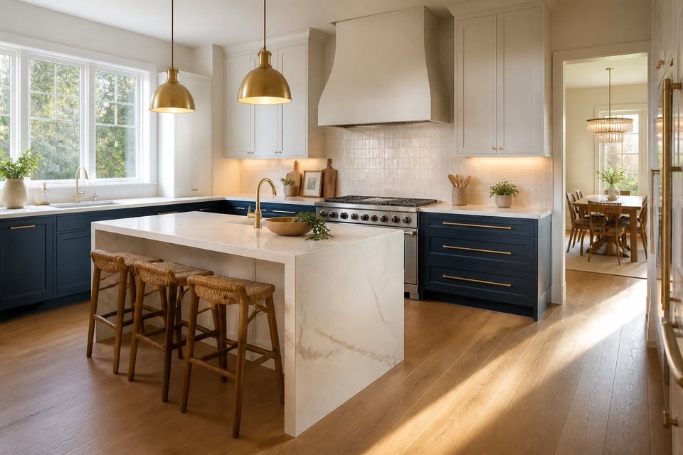
1. Quartz Waterfall Island as the Kitchen Remodel Design Centerpiece
There is a moment in every kitchen renovation when the island gets its waterfall edge and the whole room suddenly looks like something. That is not an accident of aesthetics. It is the result of a continuous surface doing exactly what architecture is supposed to do: making a statement without further decoration.
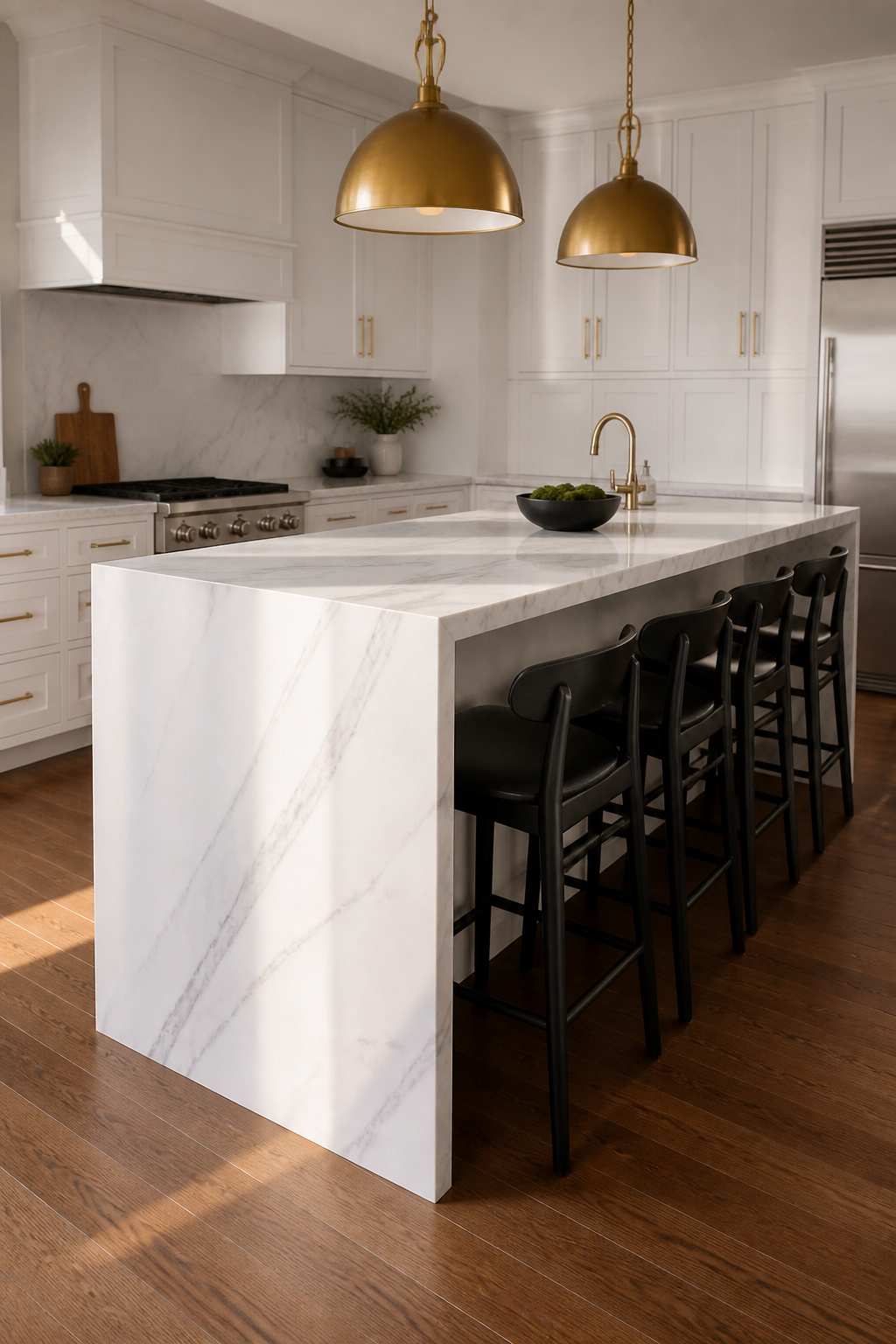
A waterfall countertop extends the island surface vertically down one or both sides, from counter height to the floor. The effect reads as sculptural because the material stops being a functional surface and becomes a structural element. Quartz is the preferred material here because engineered slabs are consistent in veining pattern. They can be book-matched: cut from a single slab and oriented so the pattern flows from horizontal to vertical without interruption. Natural stone can achieve this too, but quartz is more reliable and more forgiving. Natural stone can achieve this, but it demands careful slab-selection and fabricator expertise; quartz is more reliable and more forgiving.
Standard countertop thickness is 2cm or 3cm. For waterfall edges, 3cm is strongly preferred — the additional visual heft makes the drop panel read as architectural rather than thin. The mitered joint is cut at a precise 45-degree angle by CNC machine. When done well, the seam disappears entirely. Expect to pay 20-50% more than a standard countertop installation. The premium covers additional slab material and fabrication labor. It also pays for the seam placement decisions that separate a clean result from a visible one. For kitchen countertop ideas that complement the island, the waterfall is the logical starting point. Everything else responds to the material choice you make here.
Pro Tips for Waterfall Islands
The most common mistake is choosing a heavily directional large-scale vein pattern without confirming the fabricator can book-match it. Not every slab has enough usable material for the mirror-match. Confirm this before ordering; change the pattern if not.
2. Two-Tone Shaker Cabinets With Contrasting Upper and Lower Colors
White uppers and a colored lower — or colored island against a white perimeter — is not a new idea. But it is a remarkably durable one. It works because it follows the same visual logic as the horizon line: lighter above, grounded below. The eye reads this as stable without having to be told why.
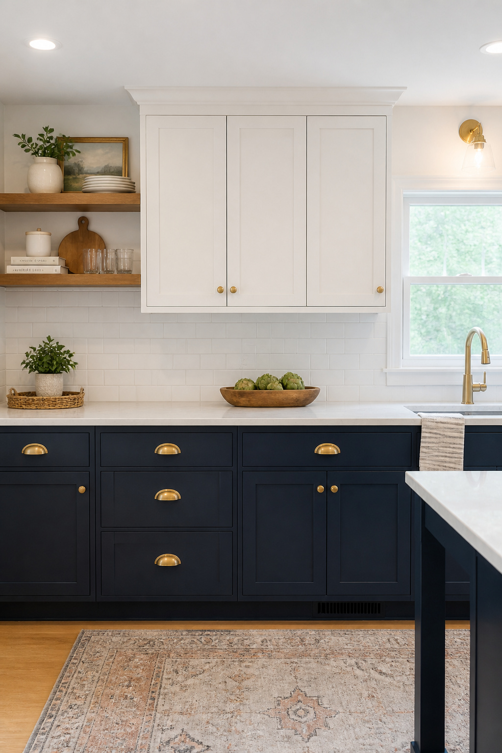
The most lasting pairings are also the least surprising. White or cream uppers with navy lowers: classic, reads as sophisticated without being trendy. White uppers with sage green lowers: this combination dominated kitchen color surveys in 2025, and for good reason. Sage sits at the boundary between green and grey. It functions almost as a neutral at distance while providing clear contrast up close. Forest green and deep charcoal are bolder moves. They suit kitchens where the lower cabinetry is meant to hold its own as a color statement.
The paint itself matters as much as the color. Standard interior wall paint on cabinet doors will chip at edges within months. Cabinet-specific formulations harden to a significantly more chip-resistant surface. Benjamin Moore Advance and Sherwin-Williams Emerald Urethane Trim Enamel are the most commonly specified — both are water-based alkyd hybrids. Factory-applied finishes (conversion varnish or catalyzed lacquer) outperform site-applied paint in durability, but they require ordering pre-finished cabinets. On existing cabinets, use cabinet-rated paint in satin or semi-gloss on lower cabinets — higher traffic, easier to wipe. Satin on uppers is fine where a slightly softer sheen works.
For kitchen cabinet colors that stand the test of time, the principle holds: choose the neutral-adjacent version of the color you love, not the saturated one. Sage rather than kelly green. Navy rather than royal blue. The toned-down version will feel right for longer.
3. Mixed Metal Fixtures That Tie a Kitchen Renovation Together
Two metals is comfortable. Three is interesting. Four is indecision. That is the rule professional designers use. The temptation to add every appealing finish at once is real. The consequences are kitchens that read as unsettled rather than layered.
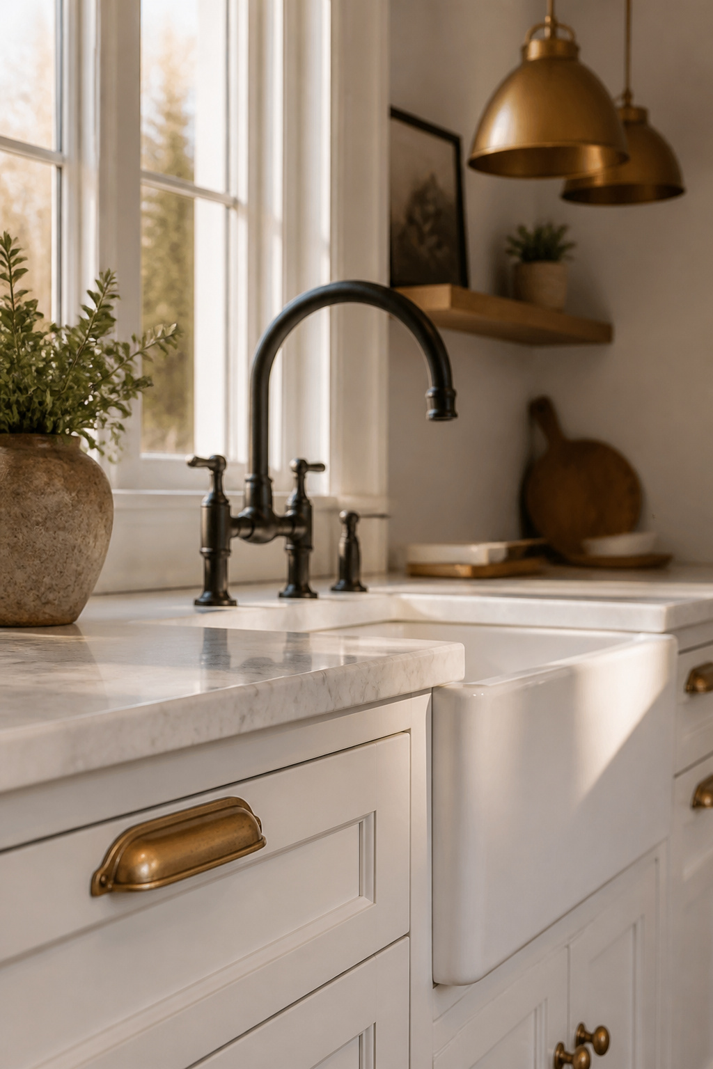
The dominant metal should appear on approximately 60-70% of the kitchen’s metal surfaces. Specifically, it belongs on the items you touch most: cabinet hardware and the faucet. These are the tactile anchors of the kitchen’s material story. The secondary metal belongs in a different functional category. If hardware is brass, pendants might be matte black. If the faucet is chrome, the lighting fixtures might be unlacquered brass. The logic is separation by function, not by random distribution.
Warm metals (brass, copper, gold) share yellow and red undertones and naturally coexist. Cool metals (nickel, chrome, stainless) share silver undertones and sit comfortably together. Mixing warm and cool can work brilliantly, but it needs a bridge. Matte black functions as that bridge — it sits between warm and cool without competing with either. Unlacquered brass hardware plus matte black pendants plus stainless appliances is a proven formula: three metals, clear hierarchy, no competition.
On the finish durability question: unlacquered brass will develop a living patina within 3-6 months in a kitchen. It is fastest on the most-frequently-touched pulls. This is a feature to some, a maintenance task to others. PVD coating creates a hard titanium-based surface that stays consistent and requires no maintenance. It lacks the evolving warmth of raw brass, but that trade-off suits many kitchens. Neither choice is reversible without replacing the hardware — decide which character serves the kitchen before purchasing, not after. For modern kitchen renovation features worth the investment, hardware finish is what most distinguishes a renovation that was designed from one that was assembled.
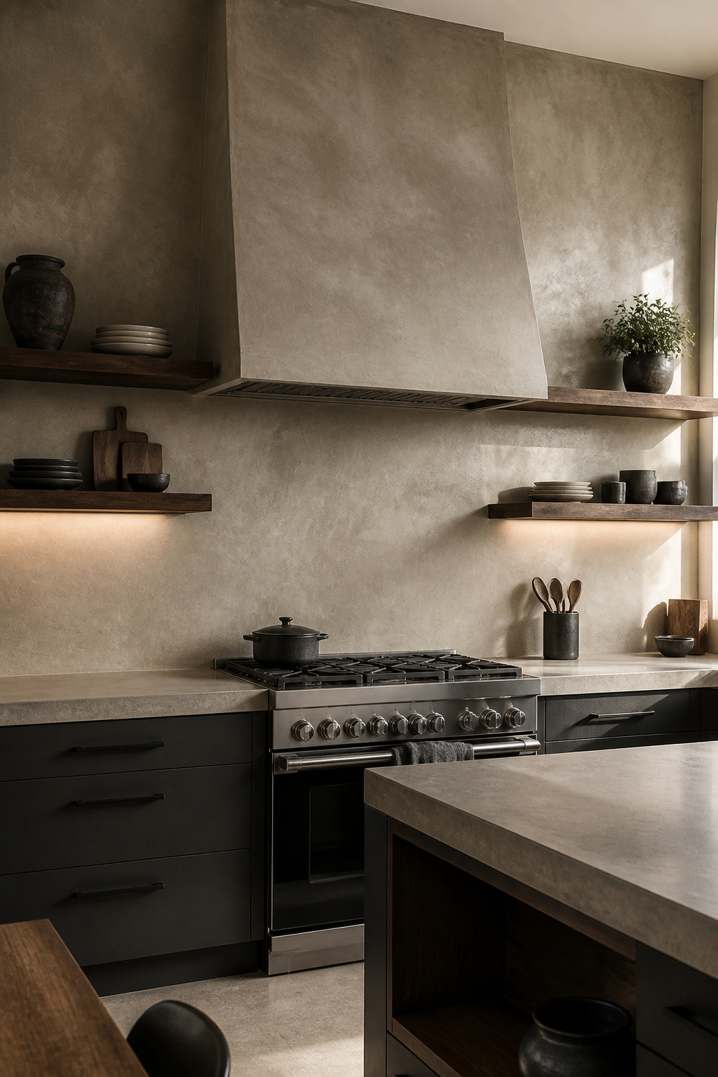
4. Statement Range Hood Built From Custom Stone or Plaster
The range hood used to be a ventilation requirement that designers worked around. In contemporary kitchen remodel design, it has become the room’s architectural focal point. It commands the space the way a fireplace surround commands a living room.
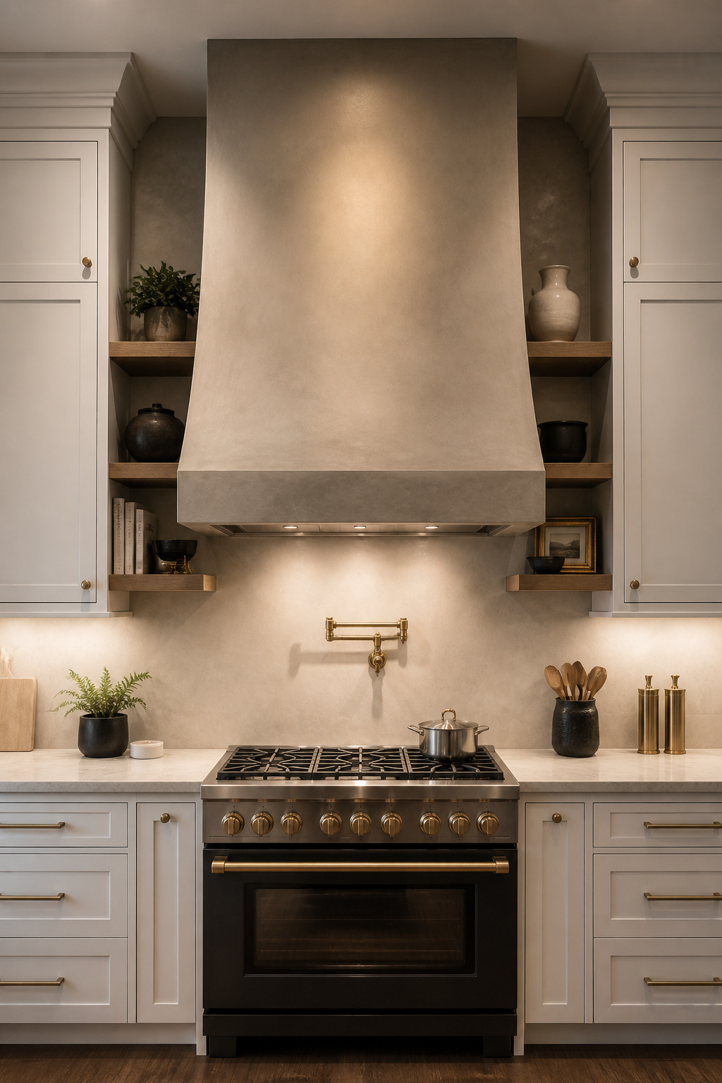
The shift makes material sense. A custom stone, plaster, or wood hood occupies the largest vertical surface area in most kitchens. It connects counter height to ceiling height and gives the eye a place to land that isn’t cabinetry. A stock metal hood signals a budget decision. A custom plaster or concrete hood signals deliberate design. The two read differently from the first moment you walk into the space.
Venetian plaster hoods are built on a wood frame around a liner insert. They’re finished with 2-3 coats of plaster, then burnished. The result is more achievable as a DIY project than most people expect. Portola Paints’ Roman Clay and similar products produce genuinely beautiful surfaces with patience and technique. Natural stone hoods (limestone, marble, soapstone) are pre-fabricated by specialists, typically in the $3,000-$8,000+ range before installation. GRC (glass reinforced concrete) panels offer a lightweight alternative where raw concrete appearance is the goal but full poured weight is not practical.
Sizing is non-negotiable: the hood should be at least as wide as the cooking surface, with 3-6 inches of overhang on each side. A 30″ range deserves a minimum 36″ hood. Clearance above gas cooktops is 24-30 inches; combustible hood materials like wood require an additional 6 inches of clearance above standard code. A hood that is too narrow misses smoke and grease at the edges. A hood installed too close to a gas flame creates a code and safety problem.
5. Open Shelving With Floating Wood Brackets for Visual Lightness
Open shelving succeeds in kitchens where the owner genuinely edits what lives on those shelves. It fails everywhere else. This is not a judgment — it is a practical observation that determines whether open shelves add to a kitchen or become its most visible problem.
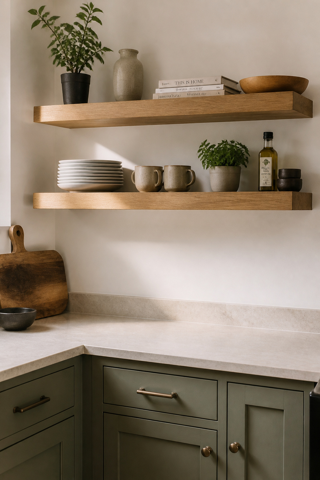
White oak is the most requested species for kitchen shelves. Its open grain takes stain beautifully, and its hardness (1360 on the Janka scale) resists dents. Its warm grey-brown tones work with nearly every cabinet color from white to navy to charcoal. Walnut is the premium alternative — richer, darker, with slightly less hardness but perfectly adequate for the application. Shelf thickness should be 1.5″ for 10″ deep shelves, 1.75″ for anything deeper — undersized thickness sags visibly under a full set of dishes.
Heavy-duty hidden floating brackets rated for 150 lbs at two-stud installation handle kitchen loads without drama. They’re the right choice for most kitchen shelving applications. Visible iron brackets offer the same strength with a different aesthetic — the exposed bracket becomes part of the industrial or farmhouse language rather than something to hide behind the wood. The decision between hidden and visible is purely stylistic.
The open shelving vs upper cabinets debate comes down to maintenance commitment. Open shelves near a cooking surface collect grease and dust on a timeline that cabinet doors simply do not. The designer’s rule of thumb: style the shelf as if a photograph is being taken, then remove 30% of what you placed. Kitchen shelves need breathing room. The items stored on them should earn their presence on a surface that is essentially always on display.
6. Bold Backsplash Tile That Defines Your Kitchen Remodel Design
Every kitchen has one element that tells you what the design is about. The backsplash is often the one given the most freedom, and the most responsibility.
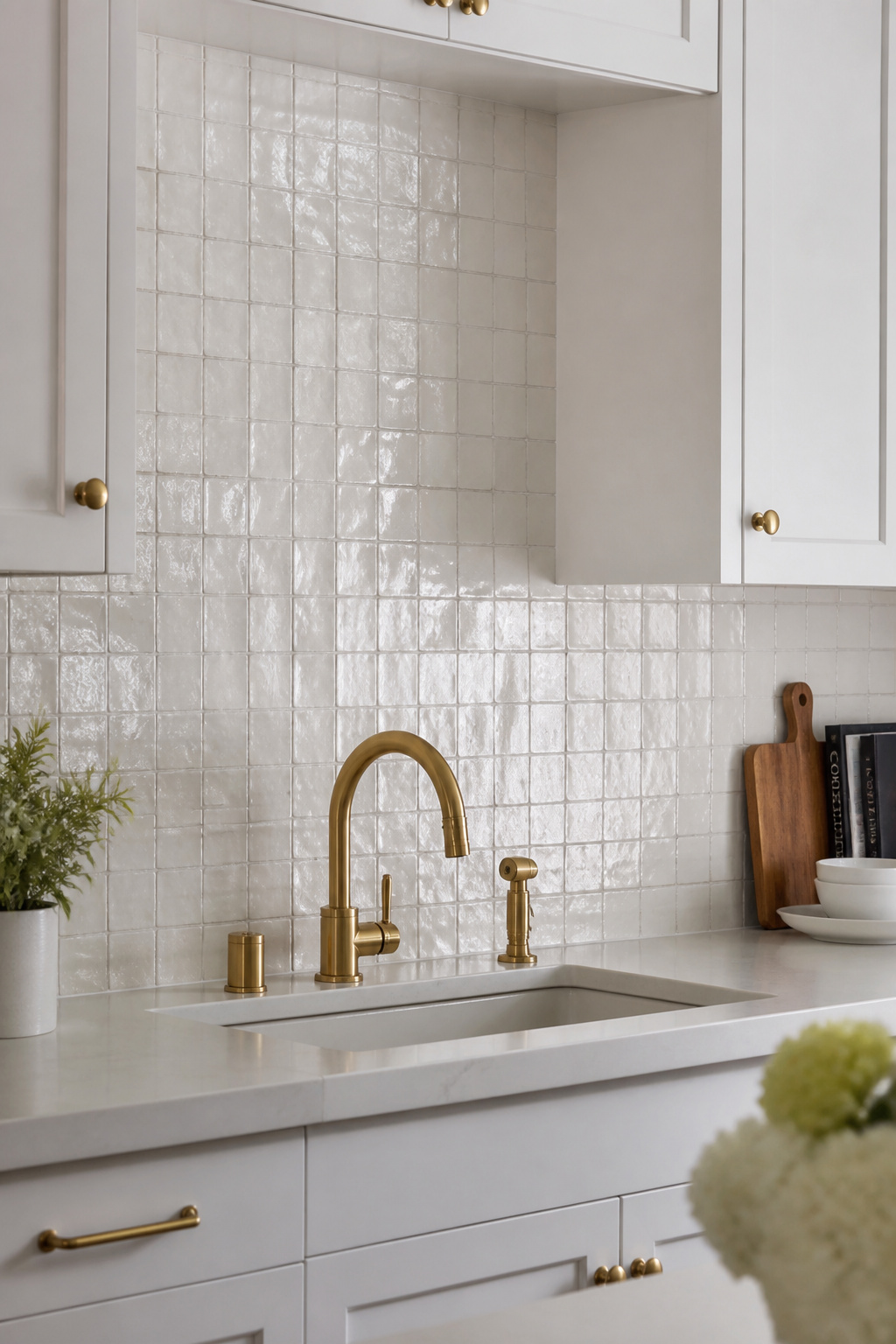
The distinction that matters most is between a backsplash that supports the kitchen’s design and one that leads it. A supporting backsplash — white subway, neutral ceramic — defers to the cabinet color and countertop. It lets other surfaces lead. A leading backsplash is what the eye lands on first. It requires the surrounding materials to step back. The mistake is running two leading elements at once: a zellige backsplash and a dramatic waterfall countertop, for instance, or a bold tile paired with a statement range hood. One should lead. Two should support. Three competing focal points produce a kitchen that reads as unsettled rather than designed.
Zellige and Other Stand-Out Backsplash Tile Options
Zellige is the backsplash material that has defined kitchen remodel design in recent years, and for good reason. Traditional Moroccan handmade zellige ($20-45/sf for authentic pieces) is irreplaceable in character. Each tile varies in color depth, surface texture, and glaze in ways no manufactured tile can replicate. The light-catching, slightly irregular surface changes across the day in a way that flat tile simply does not. Zellige-look ceramic tile ($8-15/sf) delivers perhaps 80% of this effect at far lower cost. It is non-porous, easy to clean, and manufactured to consistent specs that make installation straightforward. For kitchen backsplash tiles that spark the whole design, zellige is the most honest expression of what handmade materials bring to a modern kitchen.
Grout color is as consequential as tile selection. Matching grout (tone-on-tone) minimizes the grid and lets the tile’s surface carry the visual. This is right for zellige and handmade ceramic, where the tile is the point. Contrasting grout emphasizes the grid pattern. That is a deliberate graphic choice that suits geometric tile but fights the organic surface of handmade tiles.
7. Integrated Panel-Ready Appliances for a Clean Built-In Look
The panel-ready appliance is a material science move disguised as a luxury purchase. What it actually does is remove the visual break that a stainless refrigerator front creates in an otherwise continuous cabinet run. In a kitchen where cabinetry is the primary surface material, that break is more disruptive than it sounds.
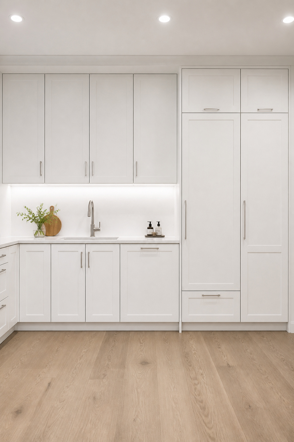
Panel-ready appliances have recessed front faces that accept a custom panel, fabricated by the cabinet maker to match the surrounding cabinetry. When closed, the appliance is effectively invisible. This requires two things. First, appliance bodies shallow enough that the panel face sits flush with the cabinet faces, not proud of them. Second, commercial-grade hinges that carry the additional door weight over years of daily use. Brands designed for the true flush-integrated look include Miele, Bosch, Fisher & Paykel, Asko, and Beko. A Bosch refrigerator with a panel added will not look the same as a Fisher & Paykel column designed for integration — the appliance body depth is the difference.
The price is real: panel-ready refrigerators start around $4,000 for Fisher & Paykel 24″ models and climb to $7,000-$15,000+ for Sub-Zero and Thermador. The panel itself adds $500-$2,000 in fabrication and installation. For anyone weighing whether to pursue the integrated look: the refrigerator is where it matters most. It is the largest vertical surface in most kitchens. A stainless door in an otherwise panel-consistent kitchen commands the eye in a way that can undermine the entire design investment. The dishwasher panel is secondary. The range hood even less so.
For luxury kitchen ideas worth the renovation budget, panel-ready appliances offer the highest design-to-square-footage return of any single specification change.
8. Pull-Out Drawer Base Cabinets Instead of Door-Swing Storage
Door-swing base cabinets ask you to crouch and reach and guess what’s at the back. Drawers ask you to pull once. The ergonomic difference is felt every single day. In a kitchen remodel design, there is almost no reason to specify door-swing lower storage when drawers are an option.
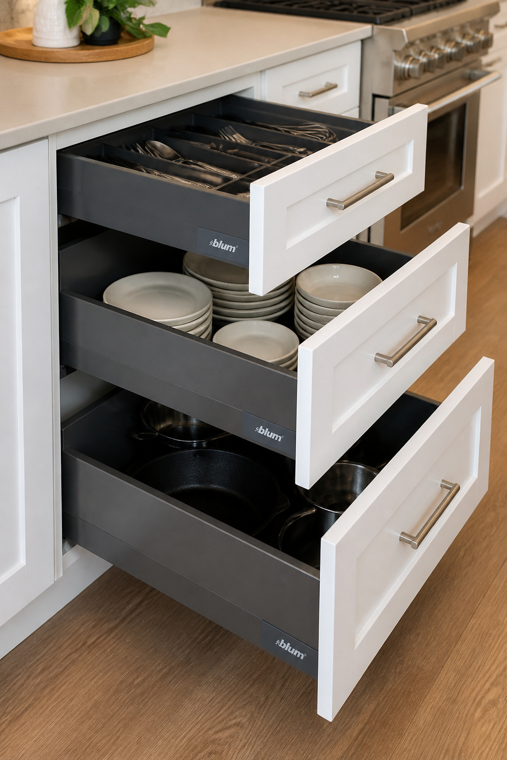
With full-extension soft-close drawer slides, every item stored at the back of a 24″ deep base cabinet comes forward in one motion. This is the working definition of accessible storage, and it changes how a kitchen is used. No more lost pots behind other pots. No more stacking and restacking just to reach the casserole dish at the back.
The hardware quality determines the experience. Blum’s Legrabox system is the industry benchmark: metal drawer sides with near-zero opening force, load capacity to 70 kg, and BLUMOTION soft-close built into the runner. The movement is genuinely feather-light in a way that average soft-close hardware is not. Dovetail hardwood drawer boxes — typically maple or poplar with hand-cut dovetail joints — prioritize the warmth and authenticity of real wood joinery. They are equally functional and slightly more traditional in character. For kitchen storage ideas that reclaim every inch, the drawer-vs-door question is settled. Drawers win for virtually every base cabinet application.
The three-drawer stack converts a standard 30″ base cabinet into its most functional form: a 3″ shallow top drawer for utensils, a 7-8″ mid drawer for plates and lids, and a 14-15″ deep bottom drawer for pots and large cookware. This replaces the traditional one-shelf door cabinet. It provides three times the accessible storage in the same footprint. The most impactful upgrade available in a cabinetry remodel, and not the most expensive one.
9. Engineered Hardwood Floors in a Kitchen Remodel — A Smart Design Choice
Solid hardwood and kitchens have a complicated relationship. The moisture cycling from cooking steam, dishwasher use, and spills creates conditions that solid wood floors resist poorly. They cup, gap, and buckle in ways that require expensive remediation. Engineered hardwood solves this through structure rather than coating.
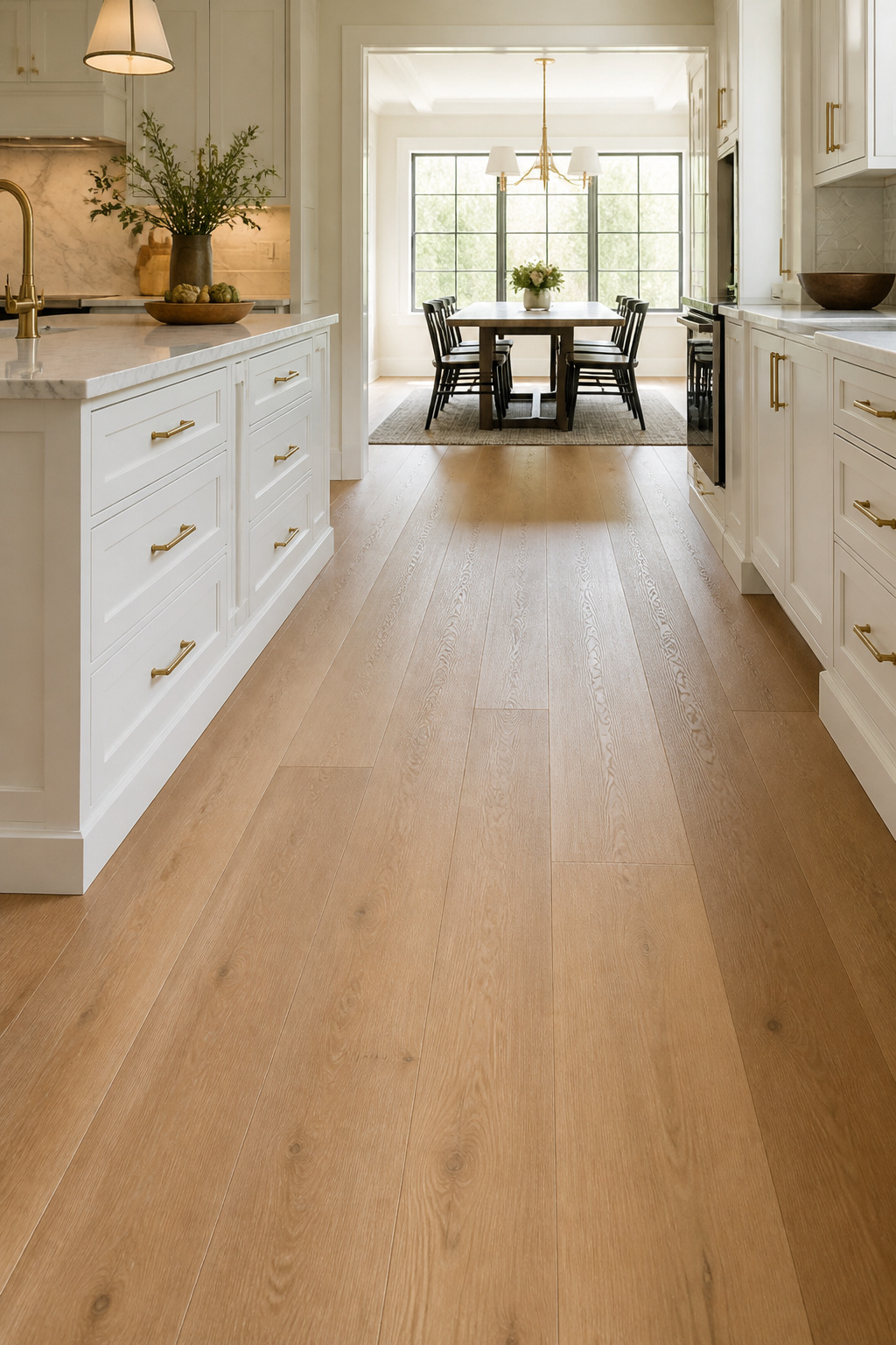
The cross-ply core of a quality engineered hardwood board — ideally 7-9 alternating wood layers — resists dimensional change across humidity swings. A solid plank cannot match this. This is the physical result of alternating grain directions in the laminated core. It creates a panel that pushes back against the forces that cause solid wood to move. Water-resistant does not mean waterproof. Standing water left unaddressed will still cause damage. The advantage over solid wood is time tolerance and stability, not immunity.
Choosing the Right Species and Wear Layer
Species selection for kitchen environments should start with hardness. Hickory leads at 1820 on the Janka scale — nearly bulletproof for busy kitchens. Its pronounced grain variation disguises scratches better than straight-grained species. White oak at 1360 Janka is the current design preference. Its open grain, tonal range, and compatibility with every cabinet color from white to charcoal has made it the default species for contemporary kitchen remodel design projects. The wire-brushed or hand-scraped surface textures available in both species add visual depth and further disguise everyday wear.
Wear layer thickness is the specification that most affects long-term value. A 2mm wear layer allows at most one refinish; 4mm allows three to five, extending the floor’s usable life to 50+ years. For a kitchen floor with significant daily traffic, a 4mm wear layer minimum is the right call. Running the floor continuously through the adjacent dining or living space is the most impactful move for making an open-plan kitchen feel resolved. The unified floor eliminates the visual boundary between rooms without any additional design work.
10. Large-Format Porcelain Tile With Minimal Grout Lines for a Sleek Kitchen Design
The case for large-format porcelain tile in a kitchen remodel design comes down to one observation. Fewer grout lines means a surface that reads as one material, not a grid. A standard 12×12 tile layout divides the floor into a visible network. A 24×48 rectified tile layout reads as nearly clean and significantly more contemporary.
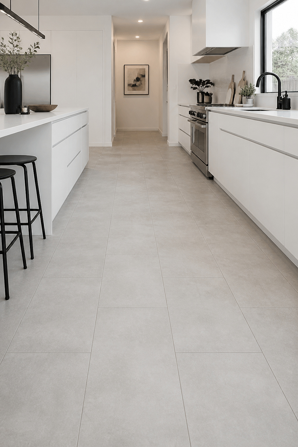
The scale effect is real: larger tiles have fewer joints, which means less visual interruption. In kitchens where the countertop or backsplash is the design statement, a quiet continuous floor supports rather than competes. The 24×48″ format is currently the most specified for contemporary kitchen floors. It is large enough to read as genuine large-format, manageable enough to install without industrial equipment.
Rectified tiles are machine-cut to precise dimensions after firing, which allows grout joints as narrow as 1/16″ to 1/8″. Non-rectified tiles vary slightly in size and require wider grout joints (1/4″+). The visual result is a more obviously gridded floor that undermines the large-format effect. All large-format porcelain used for the near-clean look must be specified as rectified. For kitchen tile design concepts that master the space, rectification is what separates a contemporary result from an ordinary one.
Installation Requirements for Large-Format Tile
Installation quality matters more for large-format tile than for any other kitchen surface. Lippage — one tile edge sitting higher than its neighbor — is barely noticeable on a 12×12 tile. On a 24×48, it is glaring. Tile leveling systems (Raimondi Levelmaster, Tuscan Leveling System) hold tiles in plane during setting. 90% mortar coverage under each tile, including back-buttering, is required to prevent hollow spots and cracking. The result depends entirely on the installer’s experience with large format.
A finishing note on finish: matte is almost always the right choice for kitchen floors. Polished porcelain shows every scuff, footprint, and water mark in a way that makes a kitchen floor look permanently dirty regardless of how recently it was cleaned.
11. Under-Cabinet LED Lighting as a Layered Kitchen Design Element
Of all the lighting decisions in a kitchen remodel design, under-cabinet lights deliver the highest ratio of impact to cost. They add task illumination exactly where food prep happens. They eliminate the shadow the cook’s body casts under overhead lighting and transform the kitchen’s atmosphere at night in a way overhead fixtures alone cannot.
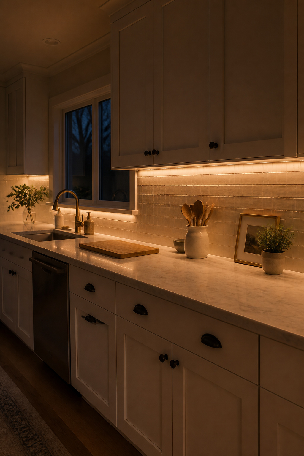
The specification professionals never compromise on is CRI — Color Rendering Index. It matters more than most people realize. CRI measures how accurately a light source renders color compared to natural daylight. Higher is always better. At CRI 90+, food looks like food. Tomatoes are actually red, herbs are genuinely green, and wood grain has depth. At CRI 80 and below, everything flattens. Kitchen task lighting at CRI below 90 is not acceptable. Color temperature should sit at 2700K (warm white) for most residential kitchens. It pairs naturally with wood tones and warm materials. 3000K (soft white) suits contemporary all-white kitchens. Anything above 3500K starts to feel clinical.
For kitchen lighting ideas that transform the space, under-cabinet lighting changes the kitchen from a single lighting environment to a layered one. The professional installation is hardwired: strips concealed behind the cabinet’s front lip, on a dimmer switch separate from the overhead circuit. Dimming allows the kitchen to shift from bright task mode to ambient evening mode. Plug-in systems, with their visible cords and outlet requirements, cannot replicate this shift cleanly.
Toe-kick lighting — LED strips at the base of cabinets — extends the layered lighting concept and creates a floating-cabinet effect at night. It costs very little relative to its visual impact. The effect distinguishes a designed kitchen from one that simply installed the required fixtures.
12. Contrast Island Color Against White Perimeter Cabinets in a Kitchen Remodel
The colored island against white perimeter cabinetry is not a trend — it is a structural design decision that works because it follows the logic of furniture. An island reads as a separate object within a kitchen. It is not part of the shell. Giving it a different color confirms that reading. It also creates a visual center that a monochromatic kitchen lacks.
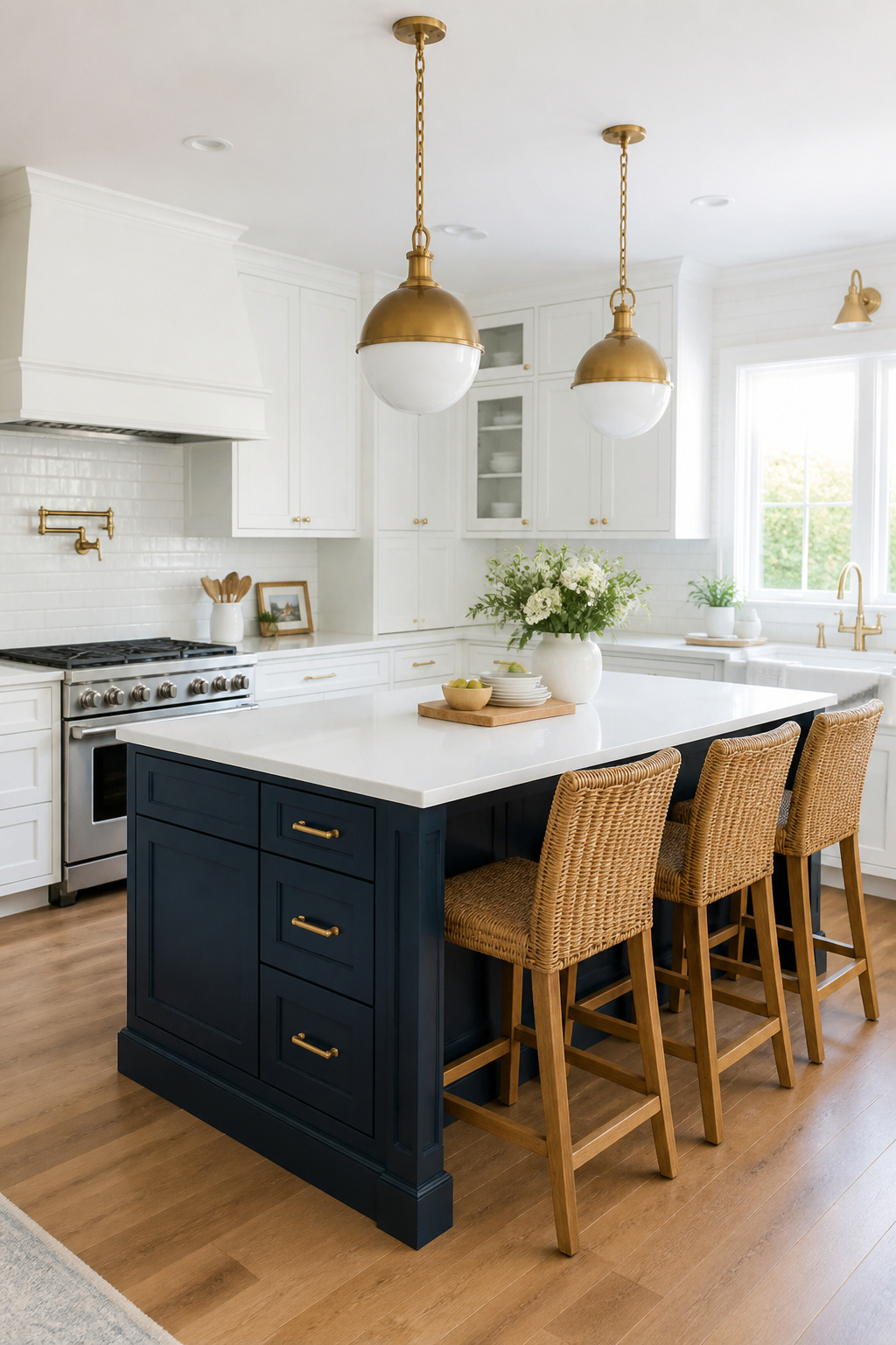
The most lasting island colors are the ones that function as rich neutrals at scale. Navy is consistently proven. It pairs with brass hardware for a warm traditional read, with matte black for a sharper contemporary effect, and it resists dating because it reads as a classic dark neutral. Sage green dominated kitchen color surveys in 2025 for good reason. It sits at the boundary between green and grey, functioning almost as a neutral at distance while providing clear contrast up close. Forest green is a bolder commitment, better suited to larger islands where the color has room to be itself. Deep charcoal is the industrial kitchen’s version of this move: softer than black but with the same grounding effect.
Pairing Hardware and Countertops With Your Island Color
For kitchen island colors that lift the space, the hardware and countertop selections should reinforce rather than fight the base color. Navy island: choose brass hardware (warm against cool blue), with a white or light grey countertop. Sage green island: either brass or matte black hardware works. White, cream, or warm wood countertop keeps the palette from reading cold. The countertop on the island should be lighter than the island base. A dark countertop on a dark island creates a silhouette, not a focal point.
The practical upside: if the island color proves wrong, it can be repainted in a weekend with cabinet-rated paint. The same reversal on 40 linear feet of perimeter cabinetry is a far larger project.
13. Unlacquered Brass and Matte Black Hardware in a Kitchen Redesign
Hardware is the element in a kitchen remodel that most people underspecify and most professionals overinvest in. The reasoning is simple: you touch hardware dozens of times a day. Its quality is felt before it is seen.
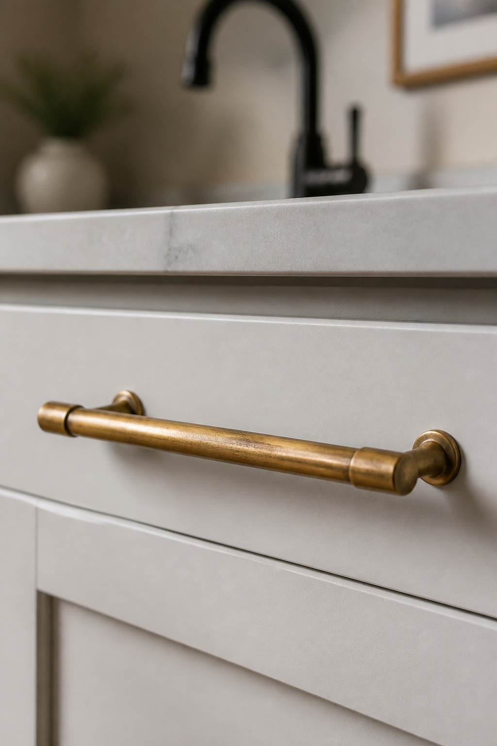
Unlacquered brass has no protective coating. In a kitchen, it develops a honey-to-dark-amber patina within 3-6 months. The aging is fastest on the most-frequently-touched pieces. The pull on the most-used cabinet door will darken before the one opened twice a week. The lower portion of a long pull will show more patina than the top, from hands reaching slightly lower. This is a living material in the most literal sense. Care is straightforward: mild soap and microfiber cloth for regular cleaning; Bar Keepers Friend or Brasso to restore brightness; periodic wax to slow the patina. Choose the approach before purchase, not after the patina arrives.
Matte black PVD hardware is the low-maintenance alternative that reads as equally deliberate. The ‘PVD’ specification matters. PVD-coated matte black uses a hard titanium-based surface that resists scratching and holds its color through years of use. Painted matte black hardware chips at edges within a year on heavily used cabinets. It is not an acceptable substitute. Matte black reads most naturally in contemporary, industrial, and Scandinavian kitchen aesthetics. In warmer, more traditional kitchens, brass or unlacquered nickel is the more coherent choice.
For traditional kitchen design ideas that last the years, hardware brand tier matters. Premium brands like Emtek, Top Knobs, and Rocky Mountain Hardware use solid brass construction and genuine PVD coatings that feel different to handle. Pull length should scale with door and drawer size: 3-4″ for standard drawers, 8-12″ bar pulls for full-height door panels. Undersized pulls on large drawers read as an afterthought, regardless of the finish quality.
14. Concrete or Venetian Plaster Feature Wall in an Industrial Kitchen Remodel Design
A kitchen is mostly flat surfaces: cabinet doors, countertops, tile backsplash. A textured plaster or concrete accent wall introduces something flat materials cannot provide: depth that changes with light, a surface the eye reads as alive rather than applied.
Venetian plaster is the most achievable version of this in a kitchen remodel design. It is applied in 2-3 thin coats with a steel trowel, then burnished to produce a polished, marble-like depth. The burnishing step creates the material’s signature quality. The slight variation in sheen catches light differently at different times of day. Portola Paints’ Roman Clay and Behr’s Venetian Plaster are accessible products that produce genuinely good results with patience. The application curve is real, but the technique is learnable.
Microtopping (products like SureCrete MicroTek) is a cement-based overlay that creates a raw concrete appearance without the weight or structural demands of real poured concrete. Coverage runs 200-300 square feet per 40 lb bag. The finish is flatter and more industrial than Venetian plaster — right for kitchens with a hard-edged contemporary or industrial aesthetic. Both microtopping and Venetian plaster are DIY-possible. Practice on a piece of board before touching the actual kitchen wall.
Neither material should go unsealed in a kitchen environment. Sealing is non-negotiable near cooking zones. Polyurethane or polyaspartic sealers provide the necessary protection. Topcoat sealers add a slight sheen and a more cleanable surface near cooking areas. Plan for resealing every 3-5 years in high-use zones. Applying too thick a coat in a single pass will cause cracking. Thin coats, patience, and proper drying time between applications are what separate a finished wall from a remediation project.
15. Glass-Front Upper Cabinets for Display and Visual Depth in Kitchen Remodel Design
A solid wall of upper cabinets creates a flat, opaque barrier. Two or three glass-front sections break that barrier. The eye reads through the glass into another plane, which adds perceived depth without removing any storage.
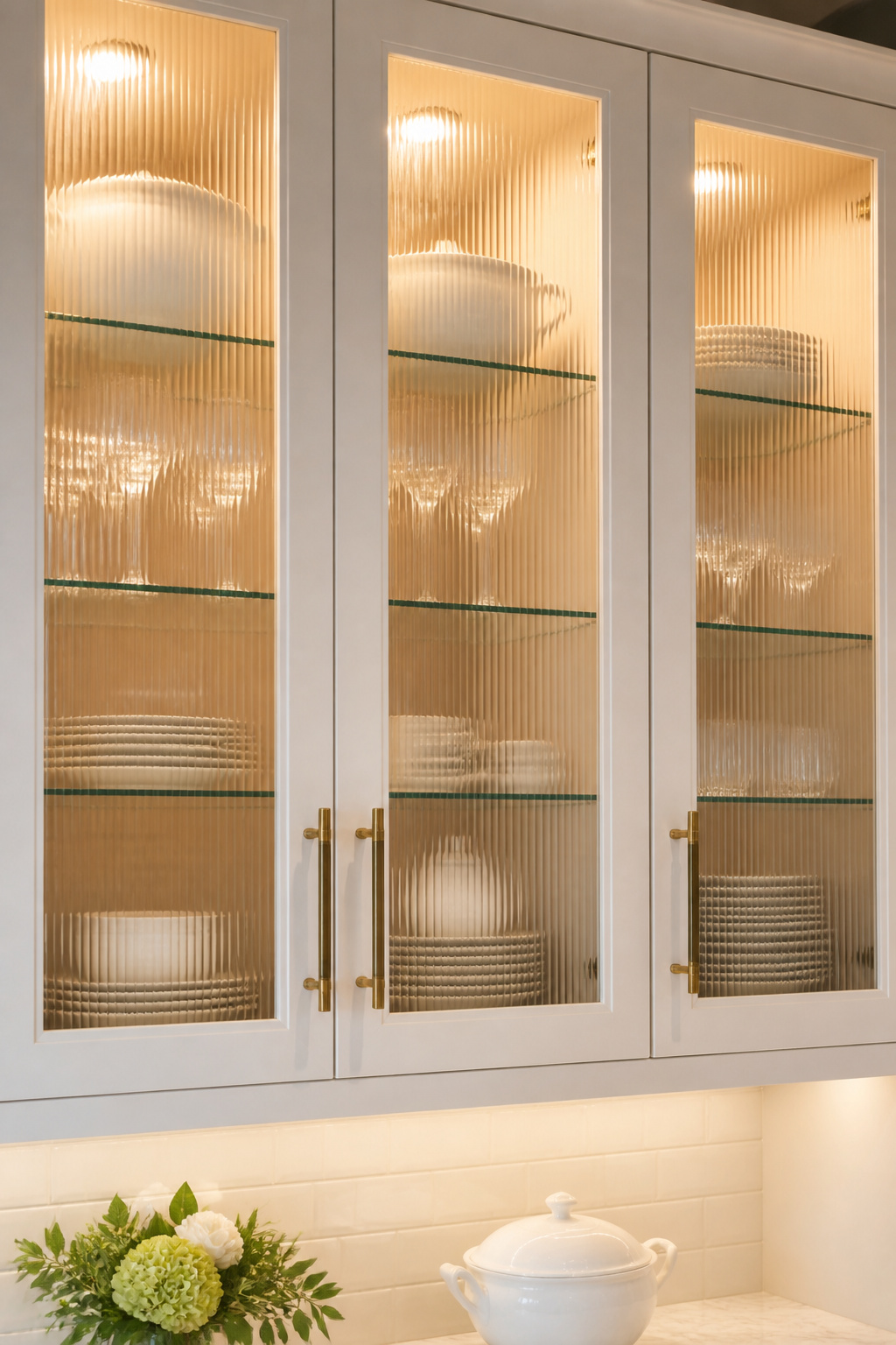
The glass type determines the relationship between display and concealment. Clear glass maximizes the display and requires the interior to be deliberately styled — plates, glassware, and stored items must all earn their place on view. Reeded (ribbed) glass is the practical and popular choice. Long vertical grooves diffuse the interior while still transmitting light, disguising storage that isn’t perfectly curated while preserving the visual break that glass provides. Frosted glass offers near-opacity with light transmission. It is good for the cabinet above the refrigerator or any run where the storage is purely functional. Seeded glass, with its small bubbles and vintage character, suits farmhouse and transitional kitchens where the artisanal quality of the glass is part of the design language.
Interior cabinet lighting is what separates glass-front cabinets that look intentional from those that look accidental. It is the detail most often overlooked. LED puck lights or strip lights at the top of the cabinet interior illuminate the contents. Without lighting, glass cabinets display whatever ambient light reaches, which is often insufficient and unflattering. Glass shelves are required if the lighting is to reach all levels. Wood shelves block light and the bottom shelves stay dim regardless of how bright the top-mounted fixture is.
Mullion Styles for Glass Cabinet Doors
Mullion patterns — the wood or metal dividers that create the lattice in a glass door — add a layer of visual detail. Prairie, mission, and simple divided-light patterns suit traditional and transitional kitchens. Frameless glass doors without mullions suit contemporary kitchens where the glass reads as a clean material plane rather than a decorative panel. The choice between mullioned and frameless should follow the kitchen’s overall architectural language.
How to Build a Kitchen Remodel Design Plan That Actually Holds Together
The fifteen ideas above cover a range of scales — from the structural (the island waterfall edge, the flooring material) to the finishing (hardware, glass fronts, under-cabinet lighting). The risk in any kitchen remodel design is treating each decision as independent. Collecting elements from different reference points and assembling them without shared material logic is how kitchens end up looking disjointed.
Start with an anchor material — one surface whose character sets the kitchen’s direction. If your starting point is overall kitchen decor inspiration, 18 Welcoming Kitchen Decorating Designs is a useful reference for seeing how individual elements combine into a coherent whole. This might be the countertop stone, the backsplash tile, or the cabinet color. The anchor sets the kitchen’s warmth, formality level, and aesthetic vocabulary. Every other decision should respond to it rather than compete with it. All secondary materials should share at least one quality with the anchor, whether that’s temperature, texture, or finish character. A warm anchor (walnut wood, zellige tile, unlacquered brass) calls for secondary materials that carry warmth or neutrality. A cool anchor (white quartz, grey porcelain, chrome) calls for secondary materials that stay cool or neutral.
Where to Spend and Where to Save
On budget: spend on items you touch every day. That means cabinet hardware, the faucet, and drawer systems. These are the tactile experience of a kitchen remodel design and quality is immediately felt. Save on items that are mainly visual from a distance. Zellige-look ceramic at $8-15/sf delivers most of the effect of authentic zellige at $20-45/sf. Never compromise on structural work. That means proper subfloor leveling before large-format tile, moisture barrier under engineered hardwood, and licensed electrical for hardwired under-cabinet lighting. These are the investments that prevent far more expensive remediation down the road. The kitchens that hold together — the ones that still feel right a decade after the renovation — are built on material logic first. Visual choices follow.