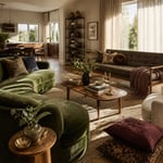
Kitchens accumulate slowly. You start with the basics — cabinets, countertops, appliances — and somewhere along the way realize the room still doesn’t feel like yours. The good news about kitchen decor ideas is that the most effective ones rarely require tearing anything out. They’re about understanding which surfaces set the visual foundation, which materials carry tactile weight, and how the kitchen’s hard, functional reality gets softened, warmed, or defined by the details layered in.
What follows are sixteen kitchen decor ideas drawn from material logic rather than trend cycles. Some are big moves that cost real money and repay you in daily satisfaction for a decade. Others are weekend decisions that change the kitchen’s character without touching a single permanent surface. The best kitchens — the ones that feel genuinely designed rather than assembled by default — almost always have both: an anchor material that gives the space its personality, and a set of carefully chosen details that respond to it.
The sequence matters less than the principle: know what each material does, know where it fails, and choose accordingly.
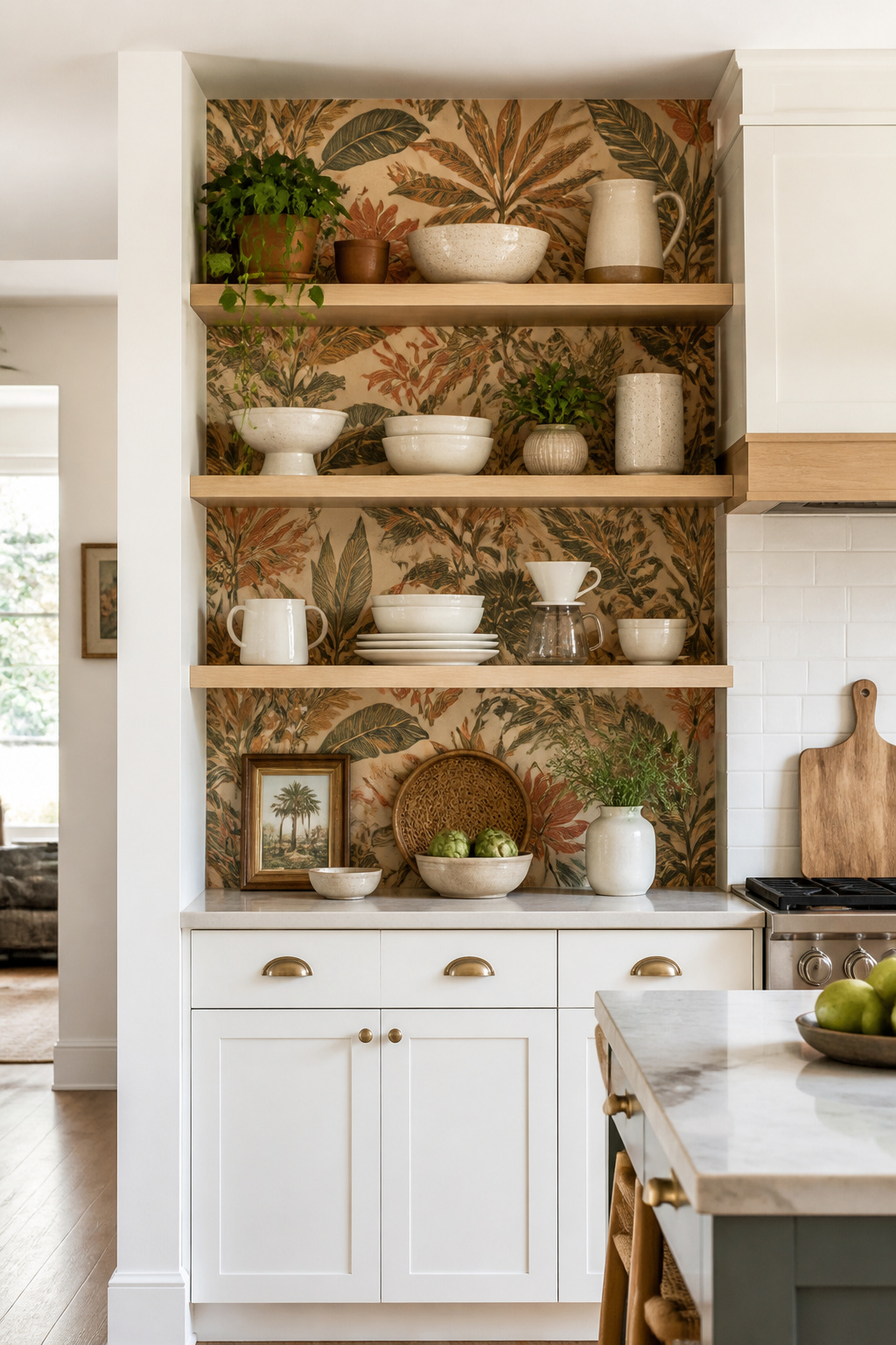
1. Open Shelving in White Oak That Brings Warmth Into the Kitchen
There’s a version of open kitchen shelving that looks cold and institutional — a painted MDF shelf with a few items scattered across it, telling no particular story. Then there’s the version done in white oak, where the grain itself is doing design work. The difference is structural as well as visual.
White oak’s tyloses — microscopic cellular structures that fill its pores — give it natural moisture resistance that painted or open-grained hardwoods like ash simply can’t match without heavy chemical treatment. In a kitchen, where humidity cycles with every pot of boiling water, that closed-cell structure matters. Its Janka hardness of 1,360 lbf means it resists dents from daily dish use, and the grain has enough figure to be interesting without being busy.
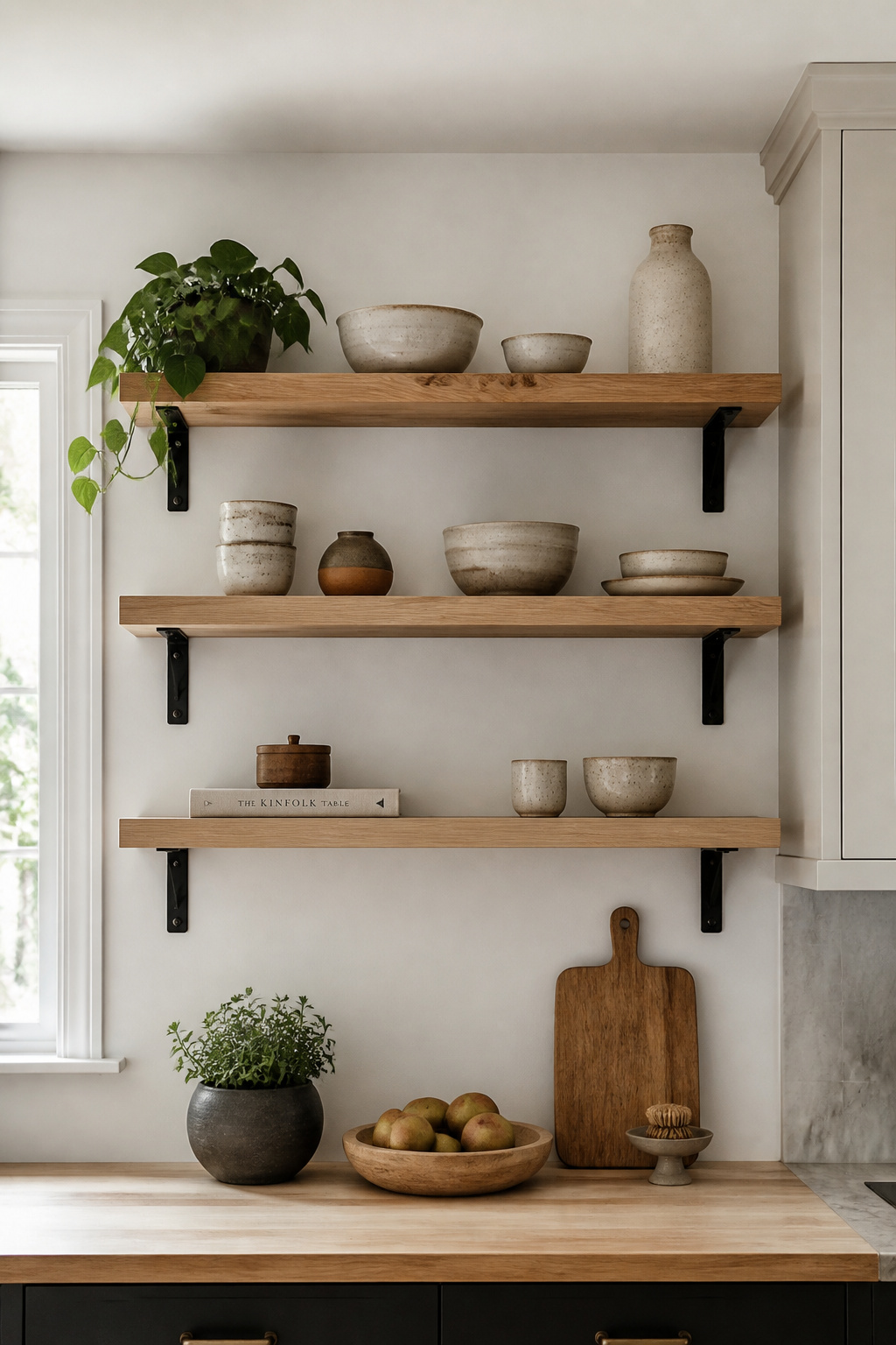
For weighing open shelving against upper cabinets, the visual weight of the wood plays a central role. White oak reads warm even in a cool-toned kitchen, which is why it’s become the default natural material for people who want the openness of floating shelves without sacrificing warmth. A 100% VOC-free hardwax oil — now the professional standard for residential wood shelving — provides a matte, moisture-resistant surface that can be spot-refreshed without full refinishing. For brackets, hidden rod systems give the cleanest visual result; black iron L-brackets add an industrial character that contrasts well with the wood grain.
As kitchen decor ideas go, this is one of the more forgiving ones to start with. Style shelves at about 60-70% capacity. The open grain of white oak is part of what you’re looking at. Pack the shelf to the edge and you’ve made expensive storage. Leave visible wood between groupings and the material becomes part of the display.
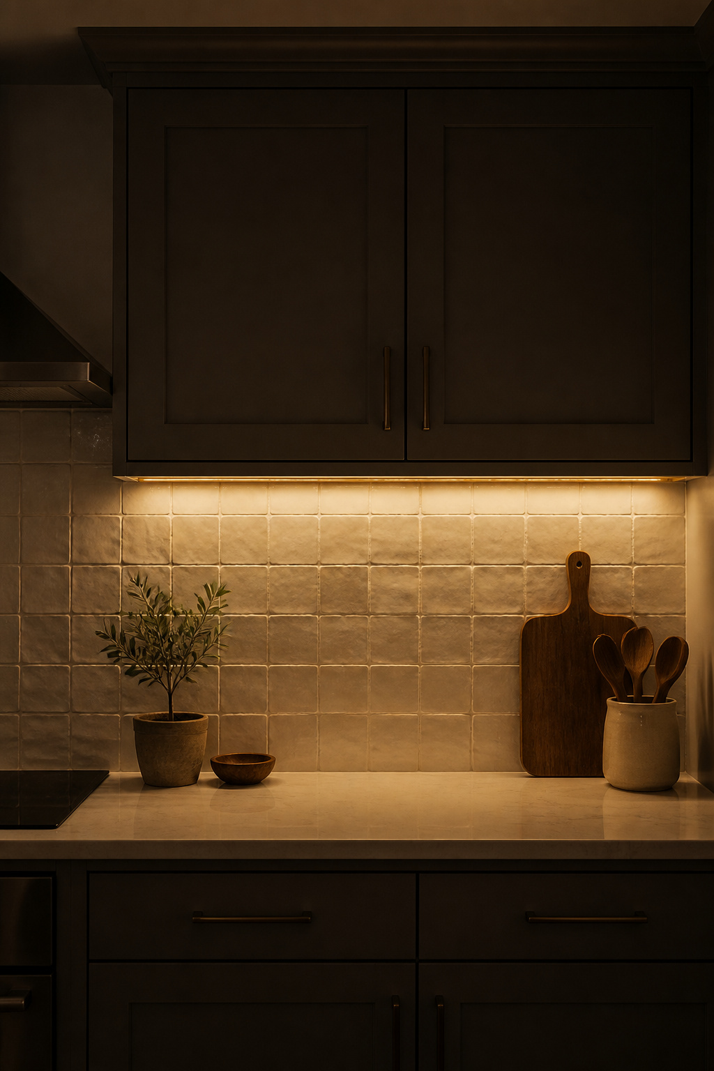
2. Statement Tile Backsplash: One of the Best Kitchen Decor Ideas
The backsplash occupies the most visible vertical surface in a kitchen, sits at eye level, and is the element that most kitchens treat as an afterthought. A full-height backsplash — running from countertop to the underside of upper cabinets, or all the way to the ceiling — changes the room’s proportion in a way that a standard 4-inch strip cannot.
Material Selection
The material difference matters more for backsplashes than durability — the visual effect of gloss versus matte versus crackled finish on the same ceramic tile is dramatic. Ceramic falls in the $2-$10 per square foot range; porcelain is about 30% more expensive but denser and less porous, which matters in the cooking zone around the range. Glass tile — at 0% water absorption — is genuinely impervious and reflects light in a way that can expand a small kitchen visually, though it requires professional installation. For kitchen backsplash ideas that go well beyond subway tile, handmade ceramic deserves serious attention: each tile shows unique variation in glaze and surface crazing that factory-made tile can’t replicate.
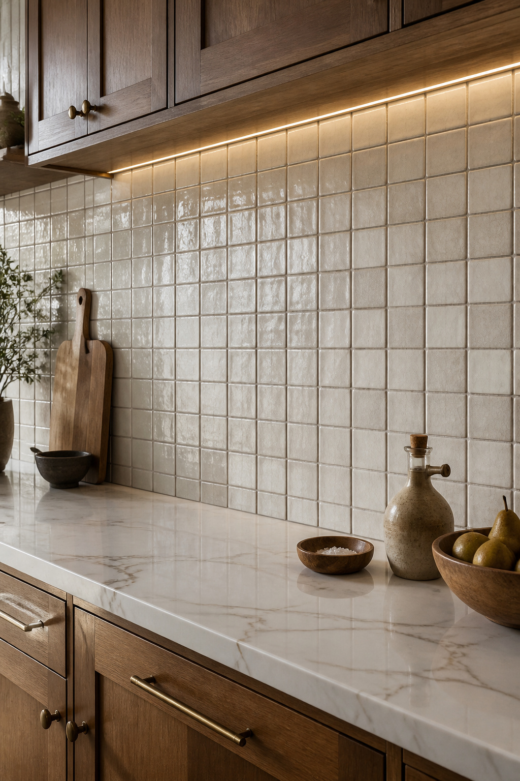
Grout and Layout
Grout selection is where most people underestimate the impact. Charcoal grout on white subway tile creates grid-forward definition; white grout in a cooking zone shows grease staining within months. A medium gray grout works as a universal mediator — equally effective with cool tiles, warm tiles, and neutral tiles, and forgiving in daily use. The layout pattern changes everything: horizontal running bond is classic, vertical stacking creates height, herringbone adds movement.
3. Matte Black Hardware for a Bold Cabinet Transformation
Hardware is the smallest decision with the most visible effect — you look at it every time you open a cabinet or drawer, and it appears in frame every time someone photographs the kitchen. Matte black is the finish that works consistently across the widest range of cabinet colors because it absorbs light rather than reflecting it. No color shift, no glare, no moment where it looks cheap in a particular light.
Visual and Practical Notes
On white shaker cabinets, matte black reads as high contrast and contemporary. On dark navy or forest green, it recedes and lets the color lead. On natural wood — white oak, warm maple — it grounds without competing with the grain. Bar pulls on flat-front cabinets feel architectural; cup pulls on shaker profiles feel transitional. The hardware shape matters as much as the finish.
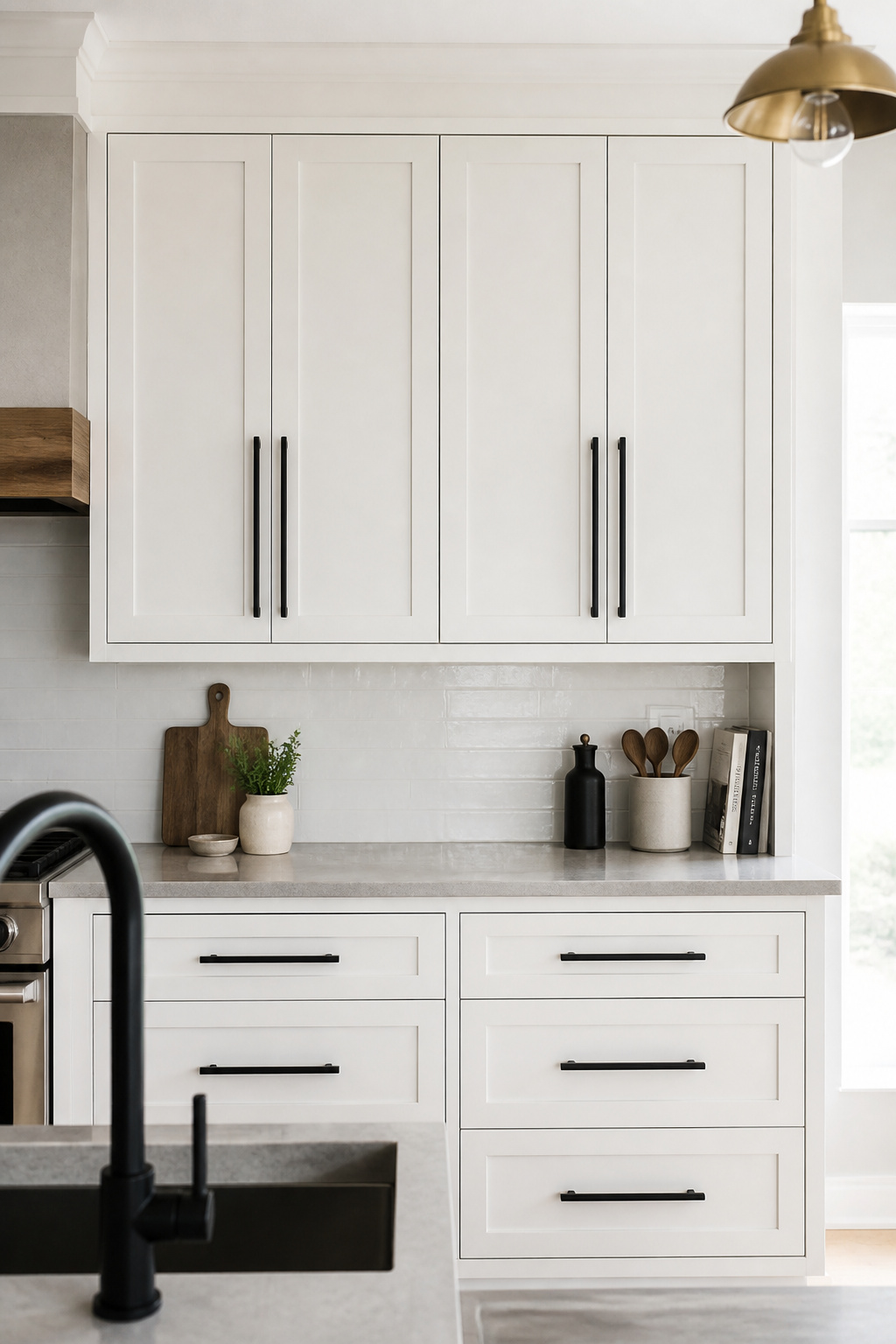
Durability depends on construction: solid stainless steel with a PVD coating holds the matte finish better than zinc alloy with a powder-coated surface, which chips at the edges within a year of daily use. Spend the extra few dollars per pull for stainless steel on a full cabinet set.
This kitchen decor idea is also a low-risk starting point for mixing metals. If adding a second finish — unlacquered brass faucet, brushed bronze light fixture — limit the palette to two or three metals. Let matte black serve 60-70% of the hardware. It coordinates with both warm metals (brass, aged bronze) and cool metals (brushed nickel) because it functions as a neutral.
4. Waterfall Edge Countertops That Add Drama Without Renovation
A waterfall edge countertop turns the island from a box with a top into a monolithic object. The stone doesn’t stop at the counter’s edge — it continues at 90 degrees to the floor, creating visual continuity between horizontal and vertical surfaces that makes the island read as a single slab of material rather than an installed piece of cabinetry.
Materials and Sizing
Quartz is the most practical choice: non-porous, no annual sealing, scratch-resistant, and the pattern can be aligned across faces for a seamless reading. Marble is more dramatic — the veining at scale is genuinely beautiful — but it etches from citrus and wine and requires annual sealing. In a cooking household, this is a real maintenance commitment. Waterfall edges add approximately $1,500-$2,500 per side to the island project cost.
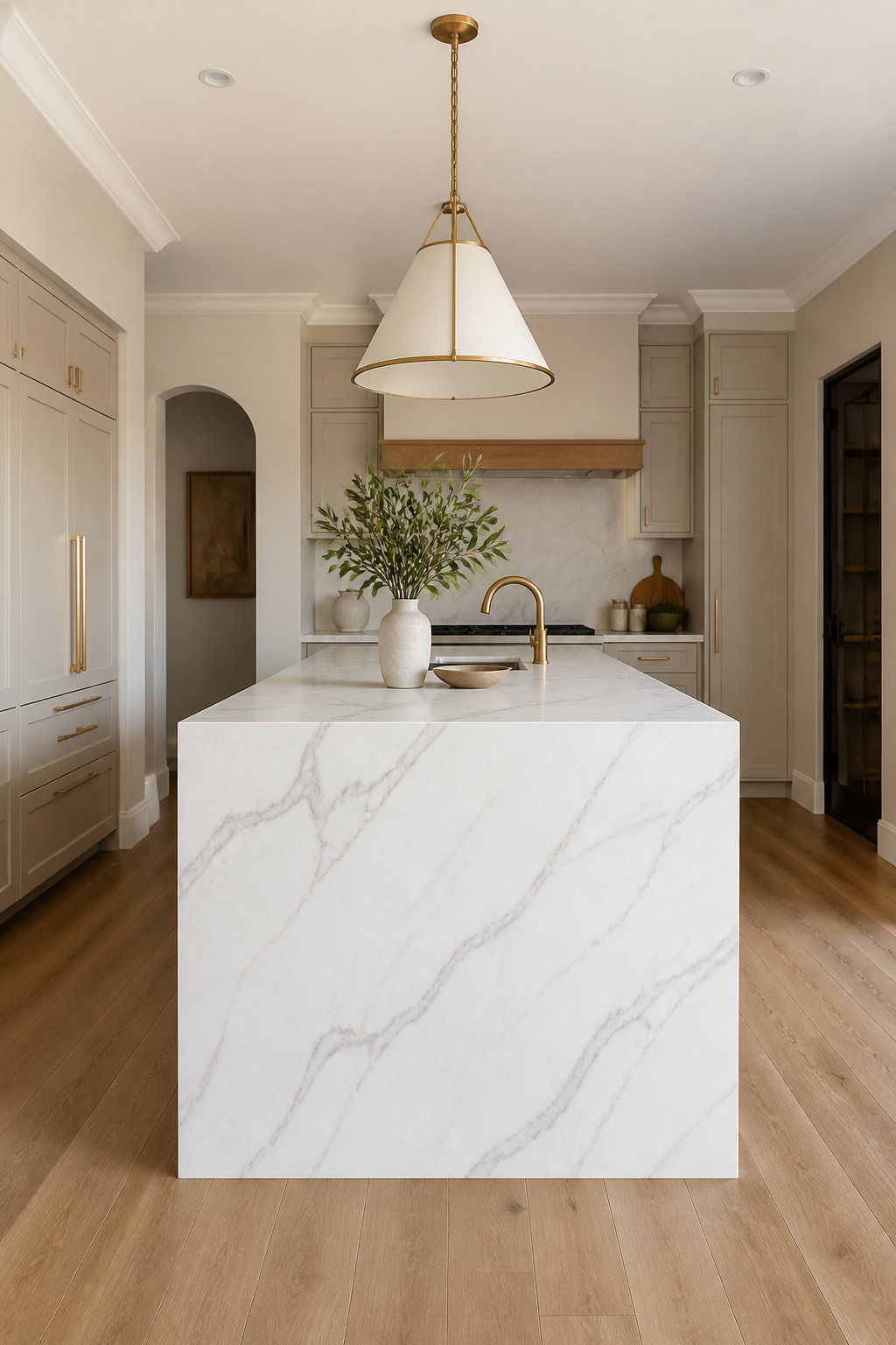
The size requirement matters: the island needs to be at least 3 feet by 5 feet for the waterfall detail to read as a design choice rather than a panel stuck to the side. The vertical drop height should match the cabinet height exactly — standard 36 inches. Gaps or misalignment look like a mistake rather than a design decision. As kitchen decor ideas for the island go, the waterfall edge is the one that pays the most visual dividends per dollar spent. The overhang on the seating side should be 12-15 inches; the waterfall side should have no overhang to maintain the clean vertical line.
5. Kitchen Decor Ideas That Start With the Island Pendants
Pendant lights over the island sit at the intersection of task lighting and decorative object. Unlike recessed can lights — functional but invisible — or a dining room chandelier — decorative but remote — island pendants operate at eye level, are visible from across the room, and shape the kitchen’s character with a hardware decision that can be changed in an afternoon.
A rattan shade pendant communicates something entirely different from an industrial cage in matte black, or a hand-blown amber glass globe, or a hammered brass schoolhouse fixture. Same ceiling, same island, completely different room. That’s the value of treating pendant selection as a genuine design decision.
The sizing rules are specific for good reason. Hang height: 30-36 inches above the countertop, high enough to clear sightlines across the island. Pendant diameter should be roughly half to two-thirds the island’s width — a 36-inch island calls for 16-20 inch pendants. Spacing: 24-30 inches center-to-center between pendants. For more specifics on getting the layout right, this guide to kitchen lighting over the island covers the technical variables in depth. The rule for quantity: two pendants for islands under 6 feet, three for anything longer. One pendant on a 7-foot island looks like a placeholder.
6. Vintage Brass Fixtures and the Warmth They Bring to Any Kitchen
Brass in a kitchen operates differently from chrome or matte black — it ages, and that aging is either the point or the problem depending on what you understand going in. Unlacquered brass is a living finish: the copper-zinc alloy oxidizes on contact with oxygen and humidity, shifting from bright gold toward warmer, deeper bronze tones over the first 6-12 months of use.
The Living Finish
A faucet handle touched dozens of times a day develops a richer, more accelerated patina than cabinet pulls on a pantry door. This records the kitchen’s use history in the surface — which is part of the material’s character, not a defect. Lacquered brass avoids this entirely: a clear coating locks in the original bright tone indefinitely, appropriate if you want that shine to stay consistent.
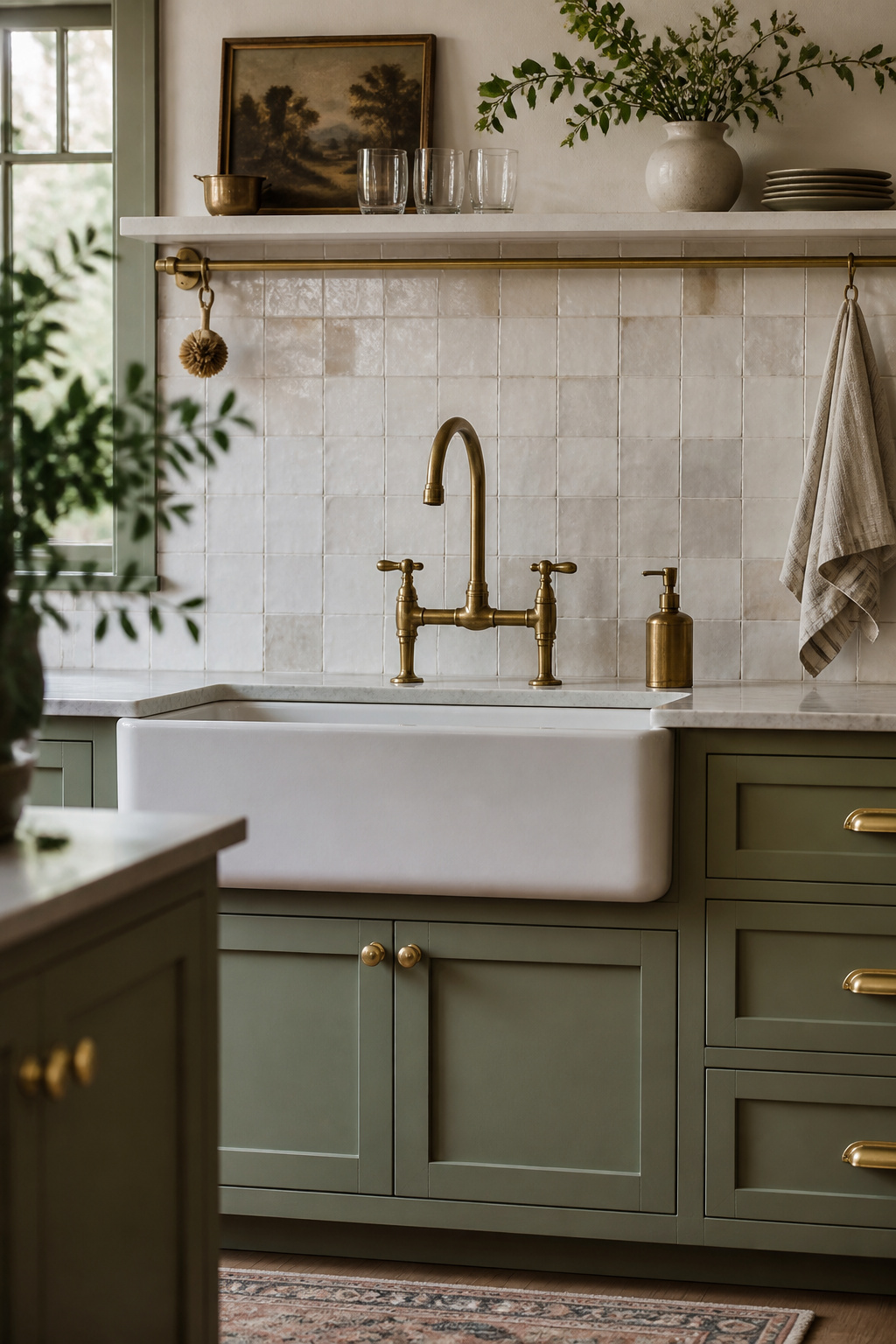
Warm metal like brass works best with warm cabinet colors — cream, warm white, sage, forest green. On cool grey or stark white cabinets, brass can look jarring rather than warm. Pairing unlacquered brass with matte black is the most common warm+neutral combination: the brass leads warmth while the black provides grounding. One critical rule: don’t mix unlacquered and lacquered brass in the same kitchen. The different aging rates produce mismatched tones within 6 months.
For maintenance: soap and water, thorough drying, and leave the oxidation to develop. Avoid abrasive scrubbers and acidic cleaners — they produce blotchy, uneven discoloration rather than the even patina that makes unlacquered brass beautiful.
7. Two-Tone Cabinets as a Standout Kitchen Decorating Idea
Two-tone cabinet design solves a visual problem that single-color kitchens often create: the cabinet mass dominates the room without any internal point of contrast to give the eye a resting place. The two-tone approach breaks that mass into readable zones.
Design Logic
The most legible approach: darker lower cabinets, lighter uppers. This grounds the room visually and creates the perception of a taller space by drawing the eye upward. The island contrast approach works differently — same color on all perimeter cabinets, contrasting island — making the island read as a piece of furniture rather than a built-in. The 2025 direction is toward muted contrasts rather than dramatic opposites: warm white uppers with sage lowers, greige perimeter with white oak island.
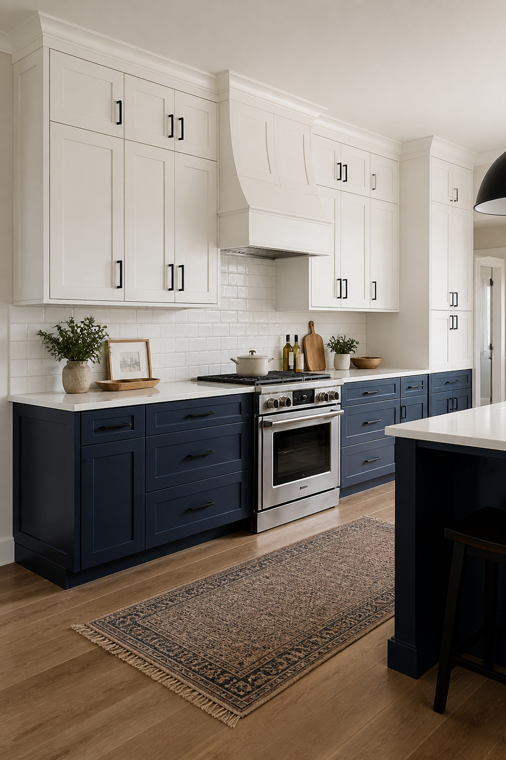
For kitchen cabinet colors worth committing to, the pairing logic follows undertone coordination — both colors share a warm or cool undertone even when they differ in value. Warm white and navy that leans slightly green (not purple) works because both occupy the warm side of their respective families.
Paint matters as much as color. Benjamin Moore Advance — an alkyd waterborne formula — is the professional standard for cabinetry, producing a furniture-like hard finish in satin, semi-gloss, or high gloss. The preparation sequence is non-negotiable: deglossing, sanding to 220-grit minimum, primer, two or three finish coats. Skip any step and you’ll be repainting within a year.
8. Butcher Block Sections for Warm, Tactile Kitchen Surfaces
The kitchen has more hard surfaces than almost any other room in a house. Butcher block breaks this reality in a way no other countertop material can match: it’s warm to the touch, it absorbs sound, and it develops a patina from use that makes it look more beautiful over time, not less.
Placement and Species
Butcher block belongs on the island or a dedicated prep area, not adjacent to the sink. Water is butcher block’s main adversary — the standing-water-pooling zone around a sink is the worst place for wood. A stone or quartz perimeter with a butcher block island is the correct functional hierarchy: quartz handles the sink and cooktop zones, butcher block handles the prep zone where warmth and wood grain are an asset.
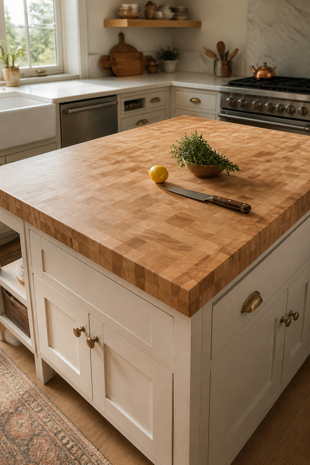
Wood species determines the character. Hard maple — pale, tight-grained, the industry standard — is harder than walnut (Janka ~1,450 vs. ~1,010) and resists knife wear better. Walnut adds drama and luxury: darker tones, more dramatic grain, slightly softer. Teak has exceptional moisture resistance from its natural oil content but dulls knife edges quickly from high silica content — treat teak as a non-cutting surface.
This kitchen decor idea repays the maintenance investment — sealing with food-safe mineral oil monthly for the first year, then quarterly. Never vegetable, coconut, or olive oil — these go rancid inside the wood and create bacterial growth risk. Waterlox sealer is the professional-grade alternative, hard enough to extend time between oiling.
9. Subway Tile in Unexpected Colors: Sage, Terracotta, or Navy
The subway tile silhouette — 3×6 or 4×8 inch rectangle — is so familiar it reads as visual shorthand for “backsplash” in any context. Which is exactly why changing the color works so dramatically: the format is background, and suddenly the color becomes the entire foreground.
Color and Finish
Warm terracotta brings Mediterranean warmth without requiring any other decorative commitment. Sage green operates in two modes depending on its undertone: grey-undertone sage reads minimal and Scandinavian; yellow-undertone sage reads farmhouse and cottage. Get a physical sample and look at it in your kitchen’s actual light before ordering. Navy subway tile behind white or light wood cabinetry creates depth; behind cream cabinets it reads as English country.
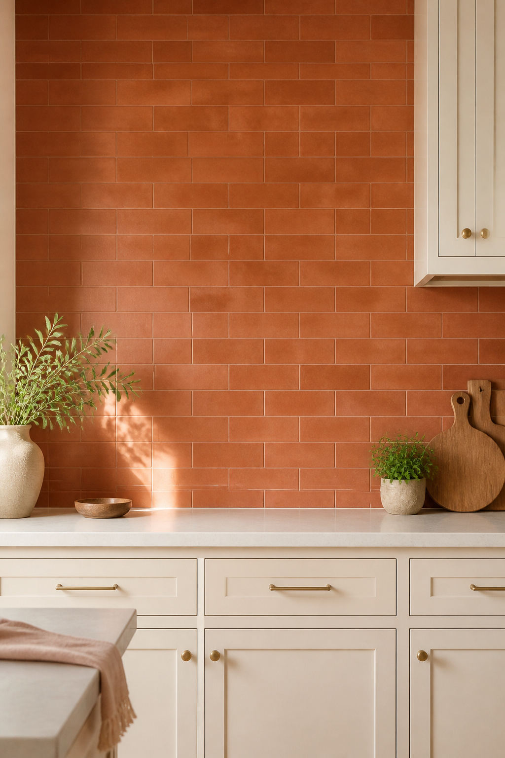
Matte finish softens any color — terracotta reads more like clay, sage reads more grey — and creates an artisanal, understated effect. Glossy finish amplifies saturation and reflects light, useful in darker kitchens. Crackled glaze introduces aged-ceramic variation particularly effective with terracotta or warm earth tones.
This kitchen decor idea is the lowest-commitment high-impact backsplash move available. For backsplash ideas that go beyond subway tile entirely, more radical options are worth exploring — but colored subway tile is the lowest-risk high-impact move in this category. The grout rule: use a near-matching grout if you want the color to lead; use a contrasting grout if you want the grid pattern to lead. White grout on colored tile in a cooking zone shows grease staining within months — avoid it.
10. Kitchen Design Ideas Using Two Countertop Materials Together
One material across all surfaces creates visual monotony — the eye has nothing to move between. Two countertop materials solve this by differentiating the zone that sees cooking heat and water from the zone you actually want to work on. The island naturally becomes the second-material location because it already reads as physically separate from the perimeter.
Pairing Logic
The material pairs that work consistently follow a simple logic: contrast in character, coordination in undertone. Warm-toned quartz (cream, golden vein) pairs with honey butcher block; cool-toned white quartz pairs with pale maple butcher block. Both contrast in texture and visual warmth while staying within the same warm or cool family.
The pairing that doesn’t work: two materials with strong competing patterns — dramatically veined marble alongside bold walnut grain. One material should be the lead, the other quieter. Honed and polished finishes can coexist when they’re on different horizontal planes — mixing both on the same counter level looks accidental rather than designed.
Functional placement logic aligns with design here: quartz belongs at the perimeter near the sink and cooktop. Butcher block belongs on the island, where warmth is an asset rather than a liability. Seams should land at natural breaks — a gap between island and perimeter, or where zones shift — never in the middle of a continuous counter run.
11. Indoor Herb Garden as Living Kitchen Decor Worth Tending
A kitchen herb garden works in exactly two situations: you have a bright south-facing window, or you’re willing to supplement with grow lighting. In any other scenario, it’s a slow-motion failure. Worth stating directly, because the idea is appealing enough that people try it without the conditions to support it.
Light and Container Requirements
Six to eight hours of direct light per day is the minimum for most culinary herbs. A south-facing window is the standard requirement; east or west exposures work for less light-demanding varieties. For north-facing kitchens, a plug-in 4-foot LED shop light positioned 6-12 inches above the plants provides adequate light for basil, thyme, chives, and parsley without any special electrical work.
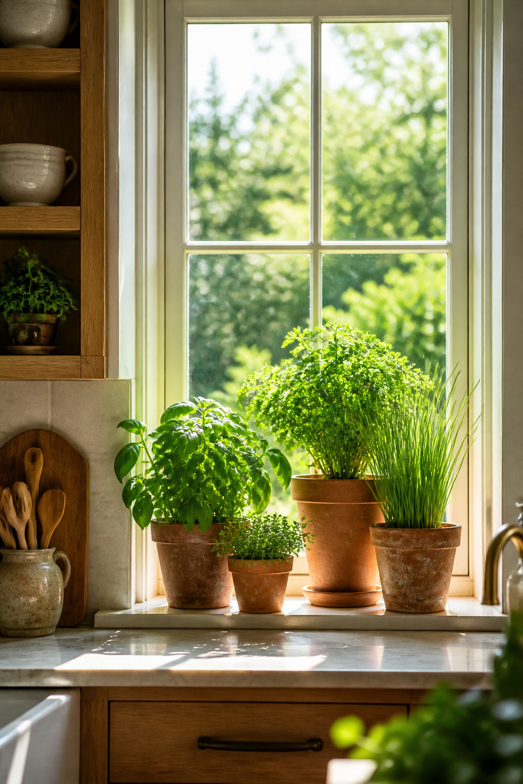
Terracotta is functionally the best container material — it’s porous, dries out between waterings, and suits kitchen humidity levels better than glazed ceramic. A uniform set of terracotta pots in the same size reads as a designed display; a collection of mismatched plastic nursery containers reads as neglected. Drainage holes are non-negotiable — herbs in sealed decorative pots will root-rot within weeks regardless of careful watering.
As kitchen decor ideas go, a herb garden is the only one that gives back. For reliability: basil, mint, thyme, chives, and parsley are the five most kitchen-survivable herbs. Rosemary and oregano need very high light and dry conditions between waterings. Cilantro and dill bolt quickly — treat them as seasonal rather than permanent residents. Keep mint in its own container; its root system spreads aggressively and colonizes neighboring pots within a single growing season.
12. Under-Cabinet Lighting to Complete Your Kitchen Decor Ideas
Under-cabinet lights don’t just illuminate the counter — they change how every surface in the kitchen reads after dark. The low-angle raking light reveals texture in tile grout lines, stone veining, and wood grain in a way that overhead recessed lights, pointing straight down, completely miss.
Type and Color Temperature
LED strip lights are the most flexible DIY choice: dimmable, cut to length, low profile. Puck lights create pools of light with gaps between — useful in awkward configurations but less even than continuous strips. Hardwired linear fixtures produce the cleanest result and are the standard in professional installations, but require an electrician.
Color temperature determines how every surface reads. At 2700K: granite appears entirely gold-brown, white countertops shift toward cream — atmospheric, but at the cost of color accuracy for food preparation. At 3000K (the recommended standard): stone shows its actual multi-color composition, whites stay white, food colors read accurately. Above 4000K shifts into clinical territory that suits commercial kitchens but feels cold in residential spaces.
One critical rule: match the under-cabinet light temperature to your recessed overheads. Mismatched temperatures create obvious color zones — the counter glows noticeably warmer or cooler than the rest of the room, and the effect is immediately visible to anyone who notices light at all.
13. Hanging Pot Racks That Make Cookware Part of the Design
A ceiling-mounted pot rack asks one thing of you upfront: it requires that your cookware actually be worth displaying. Stainless All-Clad or copper Mauviel hanging from a wrought iron grid reads as an intentional design feature. Mismatched hand-me-down pans from three different households look like overflow storage that ran out of drawers. The decision to install a pot rack is simultaneously a decision about which cookware you’re keeping.
Installation and Materials
Ceiling mounts work best in kitchens with 9-foot or higher ceilings. At standard 8-foot ceilings, a ceiling rack with hook length can bring pots below comfortable standing clearance. Wall-mounted pot racks sidestep this problem: mounted at 5-6 feet on a free wall, they keep cookware accessible without the overhead clearance issue. Anchoring is always into ceiling joists, never into drywall alone.
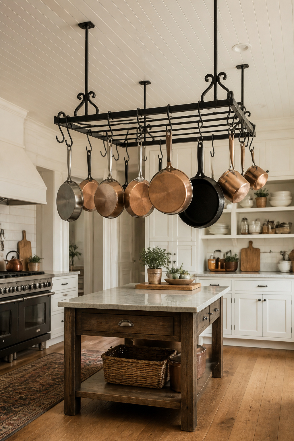
Wrought iron and hammered steel are the most popular materials — low maintenance, develop character over time, suited to farmhouse and rustic kitchens. Brushed stainless is the easiest to clean and the least visible material in a contemporary kitchen. Copper is the warmest choice, pairs naturally with brass fixtures and warm wood tones, but requires periodic polishing.
As kitchen decor ideas for functional objects go, this is one of the most honest — the pot rack works as storage and as display simultaneously. Group by size (largest to back and center, smaller pans to the edges), leave 20-30% of hooks empty. A packed pot rack reads as storage under pressure; a rack with intentional empty hooks reads as a display that happens to be functional.
14. Kitchen Decorating Ideas With Woven Baskets and Rattan Accents
Kitchen surfaces are almost exclusively hard: stone countertops, ceramic tile, painted cabinet faces, stainless steel appliances. There is no soft surface, no organic texture — unless you bring one in. Woven baskets and rattan accents are the most natural way to introduce organic texture into the kitchen environment because they don’t look out of place the way a throw pillow would. They belong there in the way a ceramic bowl belongs.
Placement and Materials
Most effective placement: open shelves (baskets as hidden-yet-textured storage), the counter (a large woven tray corralling oils and vinegars), and pendant shades over the island (rattan immediately warms the overhead view). A uniform set of rattan baskets on a shelf — same tone, same weave, same level — reads as a design decision rather than accumulated storage.
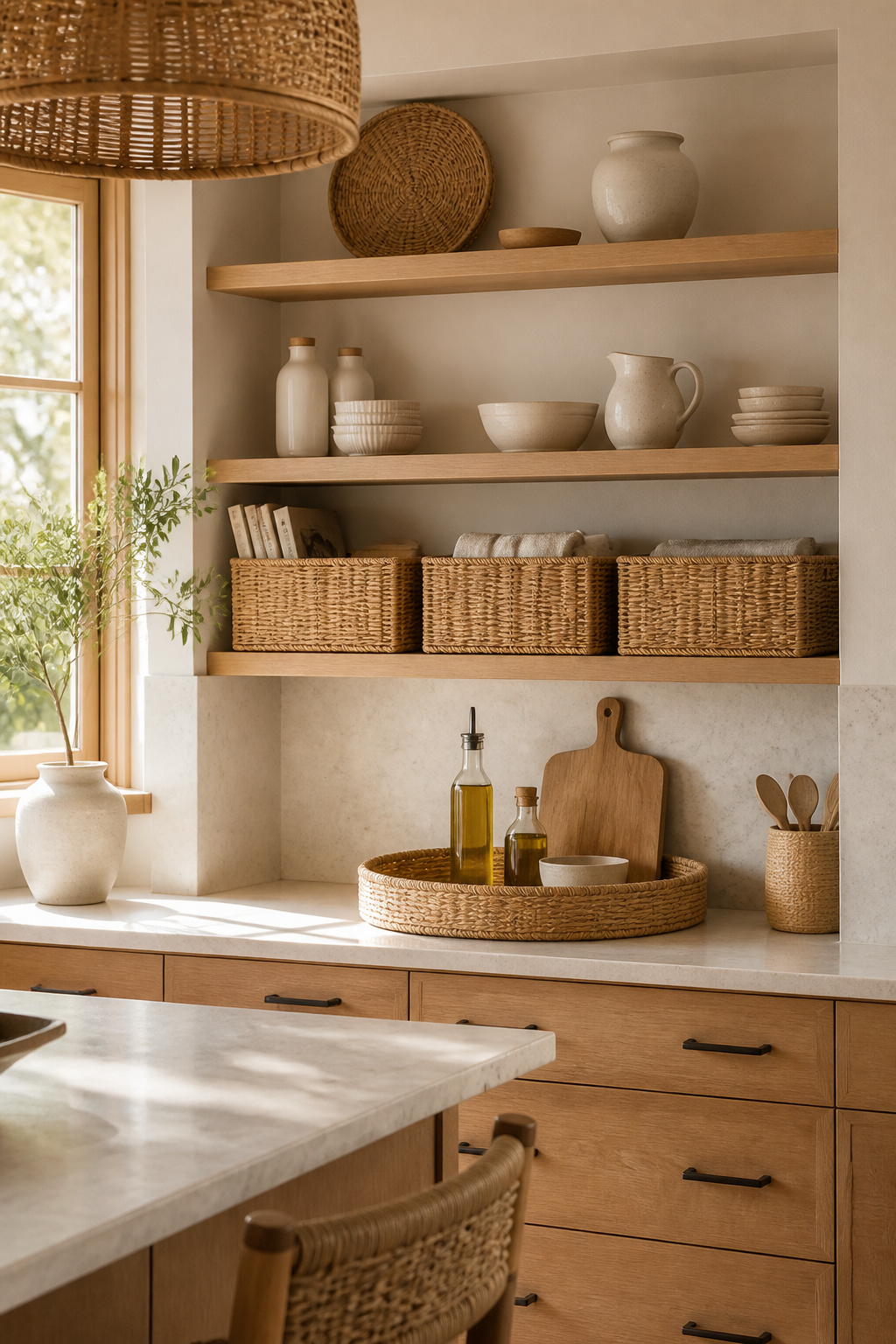
Rattan cabinet pulls add disproportionate impact as a direct hardware swap. Pulls with natural beech wood cores and hand-woven rattan wrapping bring warmth to white, cream, or light natural wood cabinets. They’re less effective on very dark cabinets (navy, charcoal) where the contrast becomes too stark.
Of all the kitchen decor ideas in this list, rattan and woven accents have the most forgiving price point — a basket swap is a $30 decision. Care note: rattan does not tolerate sustained moisture exposure. Keep it away from directly above the stovetop or the dishwasher end of the counter, where consistent steam causes warping and eventual structural damage to the weave. Ambient kitchen humidity from normal cooking is fine — rattan is a kitchen material by long tradition. Sustained high-moisture zones are the problem.
15. Sculptural Pottery and Ceramics as Kitchen Shelf Statements
Pottery and ceramics on kitchen shelves work differently from decorative objects in other rooms because they exist in a context that makes immediate sense for them. The range runs from purely functional (a handmade pitcher you actually use) to purely sculptural (a closed-form vase that holds nothing), and both belong on a kitchen shelf without apology.
Display Principles
The material quality that elevates ceramics above generic decor is visible imperfection. Handmade pieces — where you can see the slight asymmetry of throwing, glaze drips where color pooled during firing, variation in surface texture — carry a quality that machine-made tableware doesn’t approach regardless of price. A $30 handmade mug from a local ceramicist brings more visual interest to a shelf than a $120 factory-produced piece in a perfectly replicated glaze.
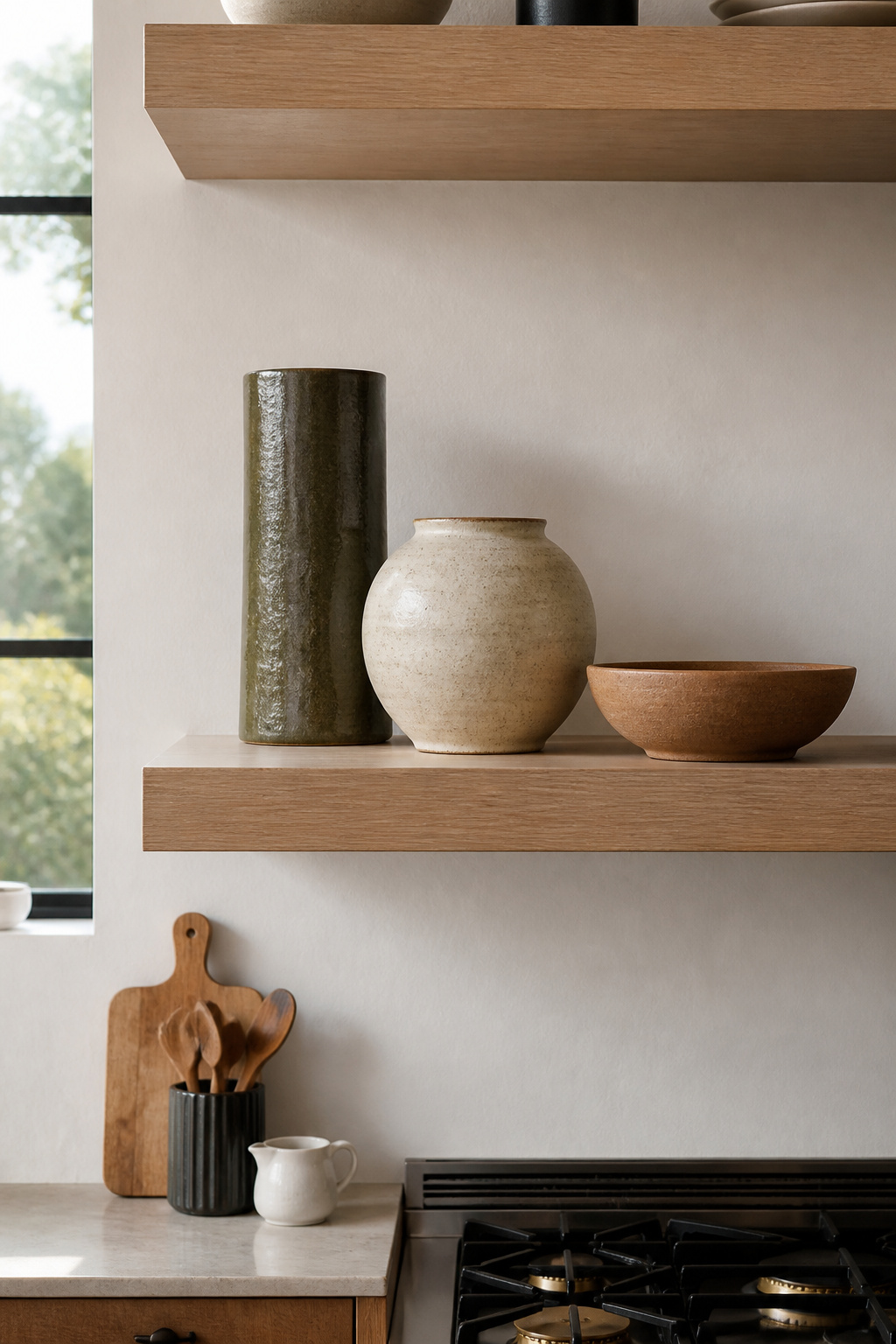
For kitchen shelves decor ideas that go beyond generic displays, the grouping principles make an immediate difference. Odd numbers — three, five, seven pieces — feel balanced but alive; the eye moves between objects rather than settling on a static pair. Layer in a visual triangle: tallest piece at the back of one side, medium at the midground, smallest in the foreground. Diagonal depth reads as more interesting than a flat horizontal line.
Negative space is the most underused tool in shelf styling. Fill a shelf completely and even beautiful ceramics read as a ceramics shop. Aim to fill 60-70% of the shelf area and let the wood grain be part of what you’re looking at.
16. Kitchen Decor Ideas: Bold Wallpaper in the Right Spots
Most kitchen wallpaper fails for a simple reason: it’s placed in the wrong location. On the wall directly behind a cooktop or in the main zone of cooking splatter and steam, even vinyl-backed wallpaper eventually bubbles, peels, or discolors. The correct location is somewhere that gets the visual benefit without the functional punishment — and the best of these is the back of open kitchen shelving.
Why the Shelf Back Works
The back of a shelf section is shielded from direct water and steam, with the shelf items providing further protection. A botanical print or marble-effect wallpaper on the back of white kitchen shelves creates layered depth that makes even minimal shelf styling look considered. Peel-and-stick vinyl in this location is genuinely reversible: when the pattern feels dated, the shelf back can be repapered in an afternoon.
For kitchen walls in general, the material matters. PVC-coated surface wallpaper resists steam, splashes, and humidity. Vinyl-backed on non-woven fabric is the current professional choice: highly washable, scrubable with a soft sponge and mild soap, mold and mildew resistant. Traditional paper-backed wallpaper has no place in any kitchen moisture zone.
Pattern scale needs to match the kitchen’s proportions. Large-scale botanicals read beautifully from a distance in open-plan kitchens; in a galley where you’re always within four feet of the wall, the same scale overwhelms. If the kitchen already has patterned tile, veined stone, and grain-heavy wood, choose a simple wallpaper. If the kitchen is uniformly plain — flat-front white cabinets, solid countertops — a bold pattern has nothing to fight with.
Starting Your Kitchen Decor Idea: Where to Begin
Most kitchens that feel unresolved have the same underlying problem: the permanent surfaces were chosen without a clear visual logic, and the decorative details were added afterward in an attempt to compensate. The accessories can only do so much. A kitchen’s character is largely set by its surfaces — the countertop material, the tile, the cabinet color — and the details respond to those foundations.
The sequence that works: commit to the most permanent decisions first. Tile, countertop material, and cabinet color set the palette that everything else must coordinate with. Choose one of these as your anchor and let it define the undertone of the entire kitchen — warm or cool, light or dark, textured or smooth. Every subsequent kitchen decor idea should respond to that anchor.
Reversible elements — shelf styling, woven accessories, pendant light selection, wallpaper on shelf backs — are best added last and refined over time. They don’t need to be decided in the same renovation weekend as the tile. Add one kitchen decor idea, live with it for a few weeks, and decide what it needs. A kitchen that develops deliberately ends up more coherent than one where every decision was made at once.
The practical budget split: allocate 70-80% of the kitchen decor budget to surfaces and hardware, 20-30% to accessories. Surfaces stay; styling can be refreshed. Choose your kitchen decor ideas in that order, and the room will look like it was designed rather than assembled.