Most living rooms don’t fail because of bad furniture choices. They fail because of bad material choices made before a single piece of furniture arrives. The sofa can be perfectly proportioned, the artwork can be well-chosen, the lighting can be layered with care — and the room can still feel wrong. What’s missing, almost always, is the tactile quality of the surfaces themselves: a floor that has real depth, a wall with something to say, upholstery that invites touch rather than merely tolerating it.
I’ve spent a decade working with material combinations in residential spaces, and the pattern I return to constantly is this: rooms that feel designed rather than decorated almost always start with a considered material decision — the one that gives the space a sensory identity it builds from. These 17 living room ideas are organized around exactly that principle, and each one is a living room idea that begins with what a surface is made of, not what it looks like in a photograph. Some are investments; some cost almost nothing. All of them work because they lead with material quality rather than following trend.
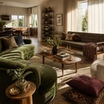
1. Layered Wool Rugs in Neutral Tones for a Grounded Living Room Feel
There’s a specific quality to a room with layered rugs that’s hard to name until you’ve experienced it. The floor gains a kind of topography — depth without height, visual weight without heaviness. It’s one of the most effective things you can do to a living room floor without touching the floor itself.
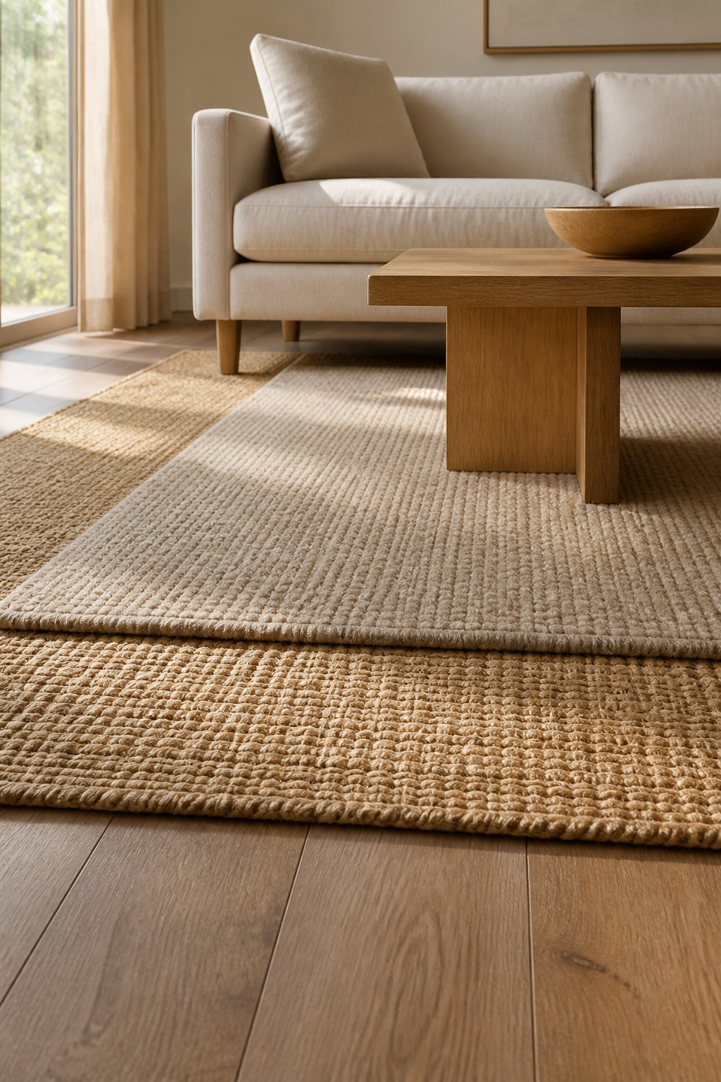
The formula is simpler than it looks. A large jute or sisal base rug — affordable, durable, and beautifully neutral — gives you the organic foundation. Over it, a smaller wool rug (roughly two-thirds the size of the base) introduces texture, warmth, and visual focus. An 8×10 jute with a 5×7 wool over it is the most common combination, and for good reason: the proportions feel resolved rather than improvised.
Wool is the right choice for the top layer because of what it does underfoot and in light. Its natural lanolin coating resists compression — pile springs back where synthetic fibers stay flat. At a low to medium pile height (0.25-0.5 inches), it won’t bunch or shift over the jute below. A flatweave kilim is an excellent alternative if you prefer pattern over plush: it adds texture at the same thickness as a bath mat and layers without any visual bulk.
The non-negotiable: a non-slip pad between layers. Jute is textured but not grippy enough on hardwood to keep a wool rug from migrating, and migrating layers unravel the whole effect within a week. Always use a pad between layers — even on carpeted surfaces, the friction alone is not enough to prevent drift over time.
2. Raw Linen and Slubbed Cotton Sofas as the Room’s Tactile Anchor
Performance fabrics have their place — households with young children and dogs are not obliged to suffer — but there’s a sensory experience that only natural fiber upholstery provides, and it’s worth understanding before you default to the synthetic option.
Linen is cool to the touch, even in warm rooms. This isn’t a metaphor for its visual quality; it’s a literal thermal property. Natural fibers conduct heat away from skin more readily than synthetics, which is part of why a linen sofa feels more comfortable in summer and why the material reads as effortlessly relaxed in a way that polyester-based performance fabrics, for all their practicality, don’t.
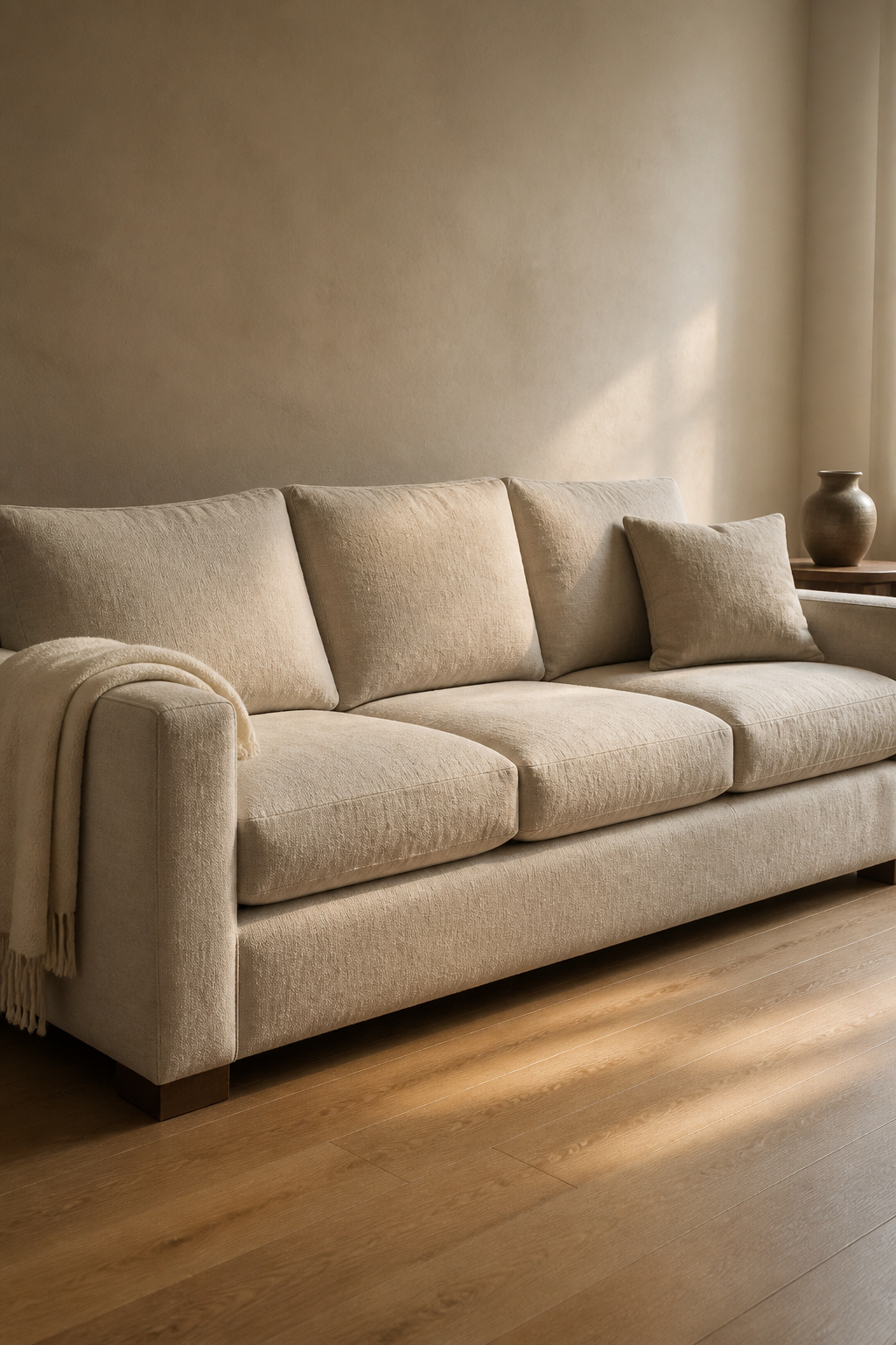
The slub texture is the other key quality. Slubbed cotton and linen have irregular yarn thicknesses woven into the fabric — visible as slight variations in the weave that catch light differently across the sofa’s surface. It gives the upholstery a life that changes throughout the day. The same sofa looks richer in afternoon sun and softer in lamplight. No other fabric behaves this way.
Practically, linen’s tensile strength is two to three times that of cotton — the fibers themselves resist snapping under upholstery stress. What it doesn’t resist is wrinkling, and this is a feature of the material rather than a flaw. As living room ideas go, choosing natural fiber upholstery over performance fabric is one of the few decisions that improves with time rather than merely holding up to it. A linen sofa with a light wrinkle at the seat cushion reads as lived-in and comfortable; a polyester sofa with no wrinkle reads as new. For renters or those thinking about color choices in a compact space, the principles of apartment living room decor apply directly — natural fiber upholstery in oatmeal or warm stone tones adapts across seasonal changes and different wall treatments more readily than bolder choices.
3. Warm-Toned Concrete and Reclaimed Wood Coffee Tables for Living Room Texture
Material contrast is a composition principle. When two materials share similar visual weight but opposing qualities, they hold each other in tension in a way that makes a room feel resolved. Concrete and reclaimed wood do exactly this: the cool density of the stone against the warm grain of the timber, the smooth manufactured surface against the rough natural one.
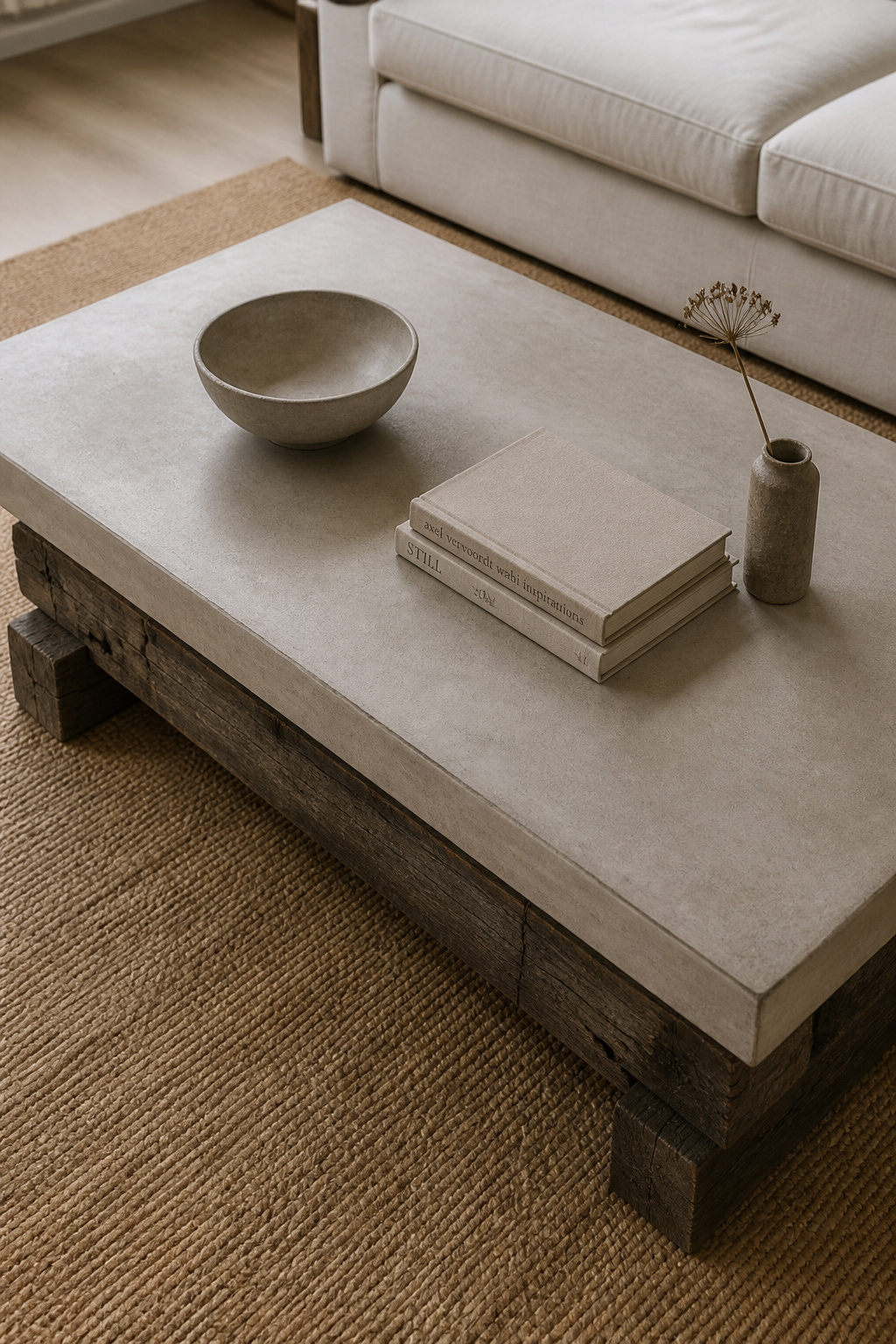
Concrete coffee tables come in three practical variants. Full cast concrete is the heaviest option; a 48-inch round piece can reach 180 lbs. It is also the most durable of the three. Micro-cement overlay tables use a thin concrete skin over a lighter MDF or steel substrate, achieving the same look at perhaps a quarter of the weight. GFRC (glass fiber reinforced concrete), the furniture industry standard, is approximately 75% lighter than solid cast and crack-resistant by design; this is what most quality concrete furniture makers use.
Reclaimed wood for the tabletop or base warrants sourcing care. Old-growth timber from pre-1940s buildings — barns, warehouses, factories — yields denser, finer-grained wood than anything available new-growth. Ask the supplier whether it has been kiln-dried post-reclamation to at least 8% moisture content. Undried reclaimed wood will warp and check as it adjusts to indoor humidity levels, and that process is neither quick nor attractive.
This is one of those living room ideas that works with what you already have — a concrete table placed on an existing rug or against a painted wall needs no other intervention to read as considered. Maintain the wood annually with tung or Danish oil. Leave the concrete to develop its natural patina — or seal it with a penetrating concrete sealer every couple of years if beverages tend to pool on surfaces in your household.
4. Limewash Plaster Walls for Low-Cost Organic Texture
Paint is a film. Limewash is something else entirely — a material that bonds chemically with the substrate over time, breathes with the wall, and produces a finish that shifts character as light conditions change throughout the day. It’s been applied to interior walls for more than 3,000 years, which is a reasonable indication that it works.
The two most accessible brands for DIY application are Portola Paints and Romabio. Portola’s formula is more forgiving — more open working time, more consistent results on first applications. Romabio requires precision with dilution ratios (the second coat should be 75% water, 25% product) but produces a particularly atmospheric, dimensional result when done correctly.
Cost is reasonable: expect $60-90 per quart, with each quart covering 100-150 square feet per coat. A single accent wall runs $120-180 in materials. The technique involves applying the paint in a loose crosshatch pattern with a large natural-bristle brush, working quickly across the wall before the first coat begins to dry. The second diluted coat settles into the texture of the first, creating that characteristic depth.
The critical prep step most people skip: limewash requires a porous, absorbent surface. Applied over standard latex or acrylic paint, it will bond inadequately and begin flaking within weeks. A mineral-based primer must go on first over painted walls — it creates a micro-porous surface that behaves like bare plaster. Allow this to cure fully before any limewash application. For living room ideas centered on low-cost transformation, limewash is the highest-impact option per dollar spent. The whole process requires patience, but the result is a wall that looks better at five years than it did at five days.
5. Mixed Metal Accents in Brushed Brass and Matte Black for Living Room Styling
The anxiety around mixing metals in a living room usually comes from imagining the worst case — a room that looks like a hardware store after an earthquake. The reality of doing it well is considerably simpler than the fear suggests.
The principle is contrast rather than competition. Brushed brass (warm undertone, matte surface, low reflectivity) and matte black (neutral, flat, minimal light reflection) don’t compete because they operate in entirely different visual registers. Polished brass and chrome, by contrast, both reflect light brightly and fight for attention — that’s the combination to avoid.
The 70-20-10 approach gives you a reliable structure. Seventy percent goes to the dominant metal: brushed brass in the primary pendant light, the main mirror frame, and larger decorative objects. Twenty percent goes to the secondary metal: matte black in table lamp bases, picture frames, and smaller hardware. The final ten percent is accent work — a third metal in small decorative pieces: a single candleholder, a bookend, a vase rim in unlacquered or aged brass. This last 10% is what makes the mix look collected rather than prescribed.
Distribute metals horizontally across the room rather than clustering. A brass mirror on one wall, a brass floor lamp in the center, a black-framed console on the opposite wall — the metals create a visual thread the eye follows across the space. One specific note on matte black: it functions as a neutral in this system. It reflects almost no light and therefore doesn’t compete with anything. When you’re unsure whether a third metal is working, replacing it with matte black almost always resolves the issue. This living room idea scales to any budget — a single brass pendant and two matte black frames are enough to establish the pattern.
6. Curved Velvet Accent Chairs That Break Up Right Angles
A room furnished entirely with rectangular objects reaches a visual equilibrium that reads as rigid. The eye bounces between parallel edges and right angles without finding anywhere to rest. A single curved form interrupts this — not with complexity, but with release.
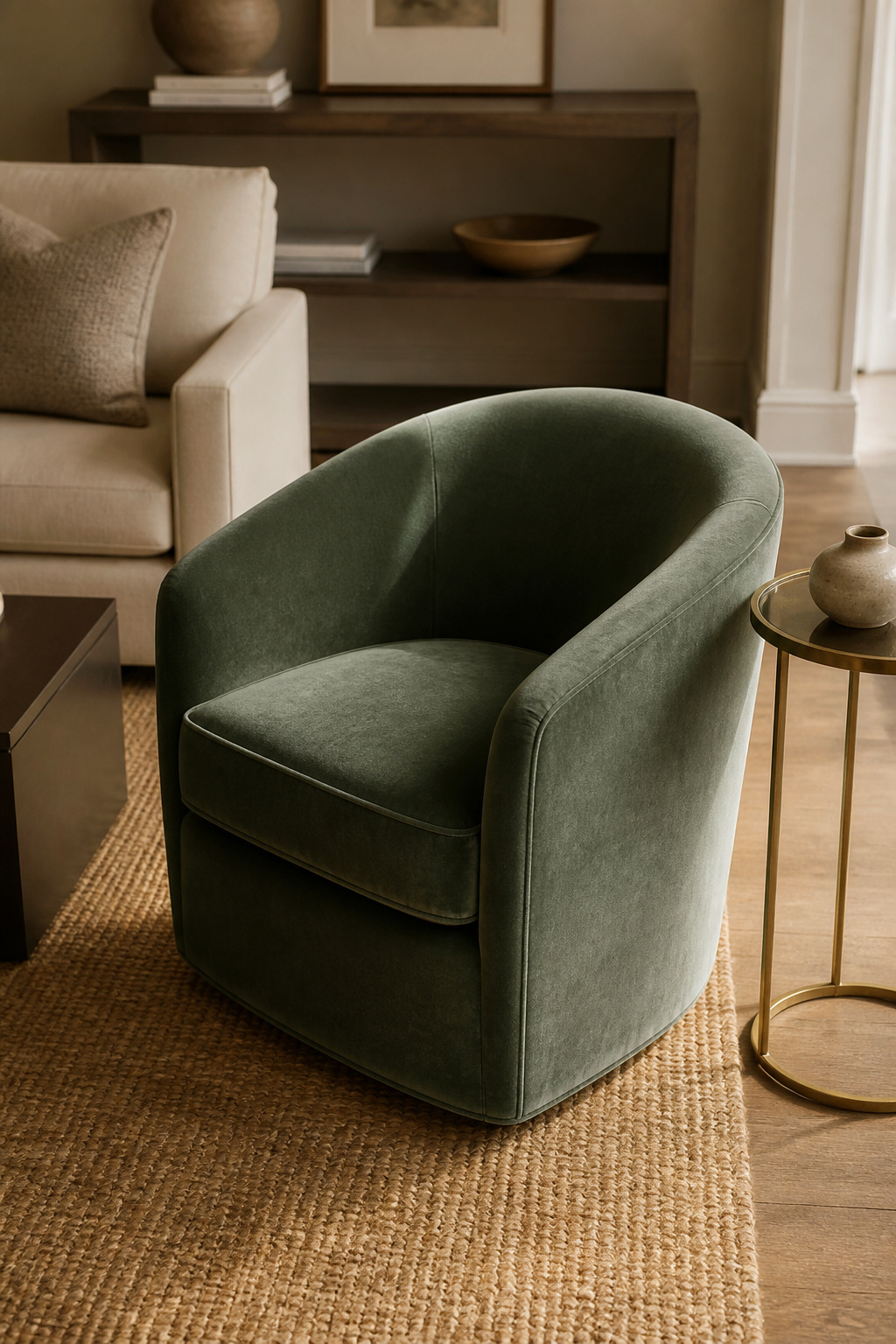
Barrel chairs, egg chairs, and bucket-style chairs all work for this purpose because their defining form is a rounded back that creates an enclosed, embracing shape. The curve guides the eye around the chair rather than stopping it at a corner. In a room where everything else is 90 degrees, this reads as genuinely restful.
Velvet is the right material for this role because of what it adds at the surface level. Its pile direction changes the perceived color from different angles — the same chair appears deeper from one side and lighter from another. This visual complexity makes it a more interesting object in the room than a flat-woven or solid-color equivalent. For performance, choose solution-dyed velvet (color embedded in the fiber before weaving) if the chair will receive direct sun — it resists fading significantly better than surface-dyed alternatives. Test crush recovery by pressing a thumbnail into the fabric: quality velvet springs back within 30 seconds.
For placement, position the chair at a 45-degree angle to the sofa rather than parallel to it. This creates a conversational triangle that makes the seating arrangement feel intimate rather than institutional. For full principles on how seating arrangements work spatially, the living room furniture layout rules are worth reading before you commit to positions — small placement shifts make more difference than most people expect.
7. Woven Rattan Pendant Lights and Cane Side Panels as Organic Details
Rattan has been in continuous Western use since Portuguese traders brought it back from Southeast Asia in the 17th century. William Morris made it a design statement in the Arts and Crafts movement. It peaked in glamour during the 1950s and ’60s, became associated with a specific hippie aesthetic in the ’70s, and has re-emerged with a more sophisticated material identity in the current era of warm minimalism and tactile interiors.
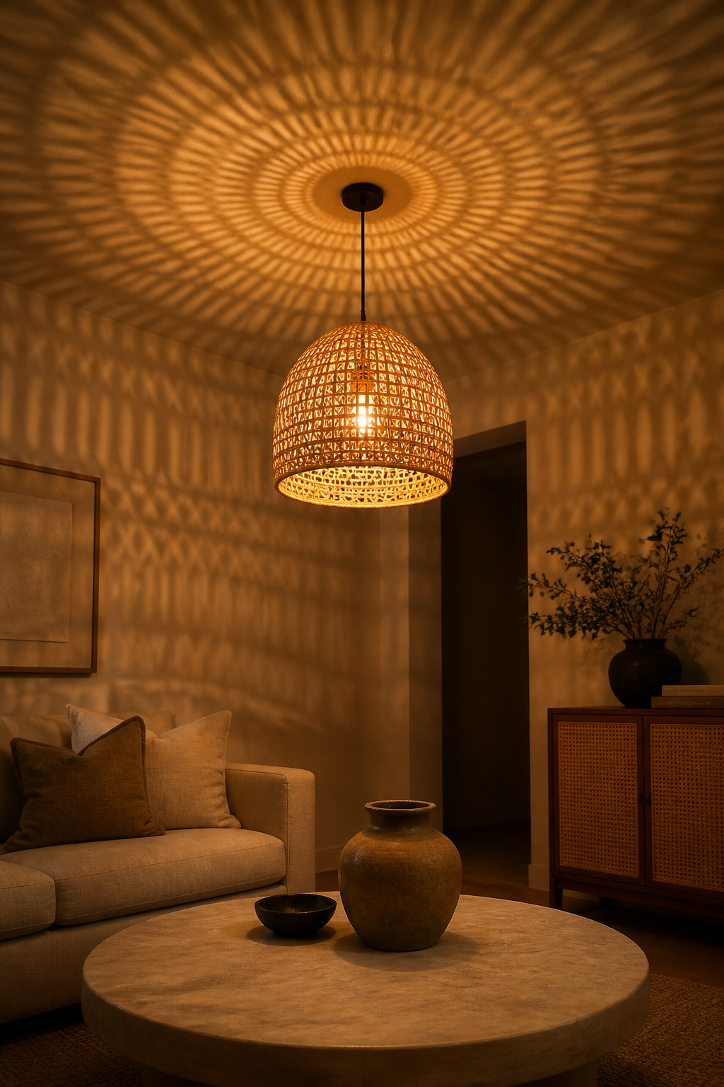
The reason it keeps coming back is straightforward: it grows to full harvestable length in 5-7 years, requires minimal processing, and produces a woven structure that does something to light that no other material quite replicates. A rattan pendant shade isn’t opaque — light filters through hundreds of small apertures in the weave, casting warm geometric patterns on walls and ceilings. The room gains texture without any intervention to the walls themselves.
Cane — the outer skin of rattan, stripped and woven into the open-grid pattern you see in cabinet panels and chair backs — has a more refined quality. Used as a panel insert within a painted frame on a sideboard or bookcase, it reads as an architectural inset rather than a decorative motif. This is the distinction between using natural materials thoughtfully and using them thematically.
As living room ideas go, this is one of the most underestimated — most people think of rattan as a decorative style, but it’s really a material note that earns its place through what it does to light. The limit: two or three contact points per room. A rattan pendant plus a cane-panelled cabinet is a material note. Add a rattan chair, a woven wall basket, and a jute table runner and the room becomes a genre exercise. Natural materials work best as one voice in a chorus, not the whole choir.
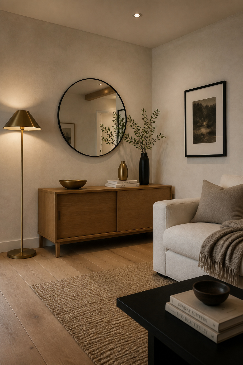
8. Honed Natural Stone Fireplace Surrounds as a Room’s Focal Point
A fireplace surround is the architectural center of a living room. Get it right and the room’s quality level lifts in a way that’s difficult to achieve through any other single intervention. Get it wrong — too small, wrong finish, wrong material for the room — and no amount of furniture or art will compensate.
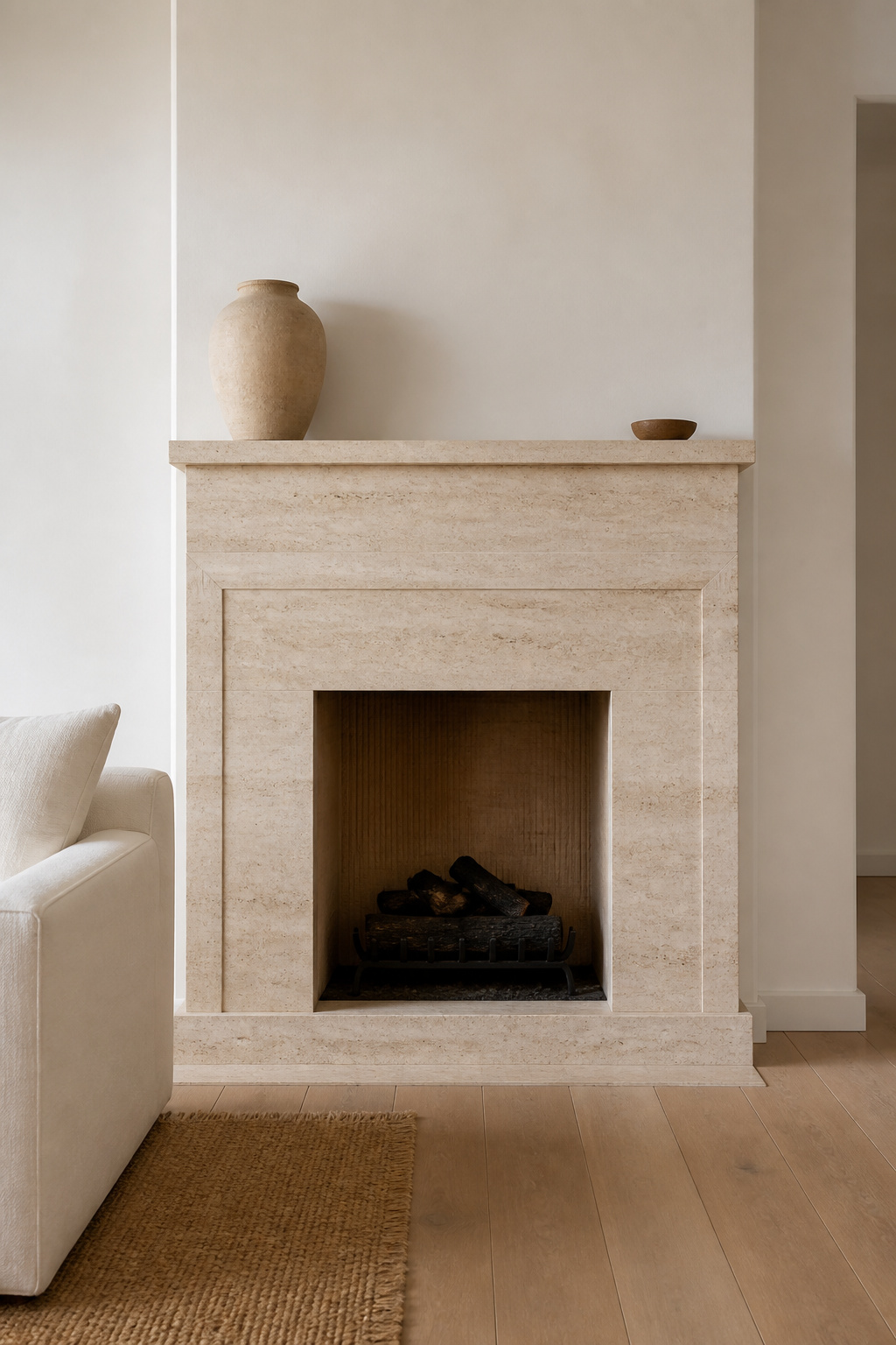
The case for honed over polished is primarily behavioral. Polished stone (marble, granite) reaches its gloss through progressive grinding to 3,000 grit and creates a mirror surface that reads as glamorous in certain contexts and clinical in most living rooms. It shows every fingerprint, every water mark, every speck of dust. Honed stone stops at 400-800 grit: flat, matte, absorbing rather than reflecting. It reads warmer, softer, and more architectural.
Of all the living room ideas in this article, a honed stone surround is the one I’d save toward if the budget wasn’t ready. The return on investment outlasts almost everything else on this list. For species, three are particularly suited to living room fireplaces. Limestone (Mohs 3-4) is beautiful but requires sealing twice a year and is vulnerable to acidic cleaners — acceptable maintenance for a surface that won’t be abraded daily. Travertine (Mohs 4-5) has its characteristic holes filled before honing, creating an even surface with subtle veining; it’s slightly more durable than limestone and the most commonly specified stone for residential surrounds. Soapstone is the practical outlier: non-porous, requiring no sealing, and thermally stable directly adjacent to a working fire. It develops a natural patina rather than deteriorating.
For proportions: the surround width should be roughly one-third of the wall on which it sits. For standard 8-9 foot ceiling heights, a surround height of 4.5-5 feet is correct. Allow at least 18-24 inches of clear wall on each side between the surround and any adjacent built-ins or window frames.
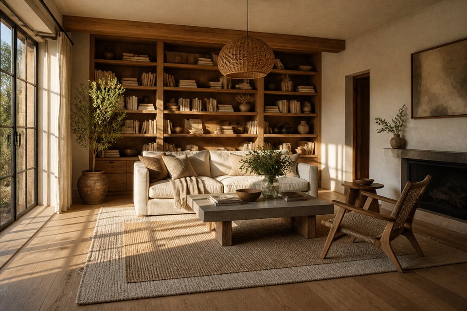
9. Living Room Ideas Built Around Floor-to-Ceiling Bookshelf Displays
A floor-to-ceiling bookshelf unit is both storage and architecture. Depending on how it’s specified and finished, it can be a quiet background feature or the room’s defining element. The material choice for the shelves themselves determines which it becomes.
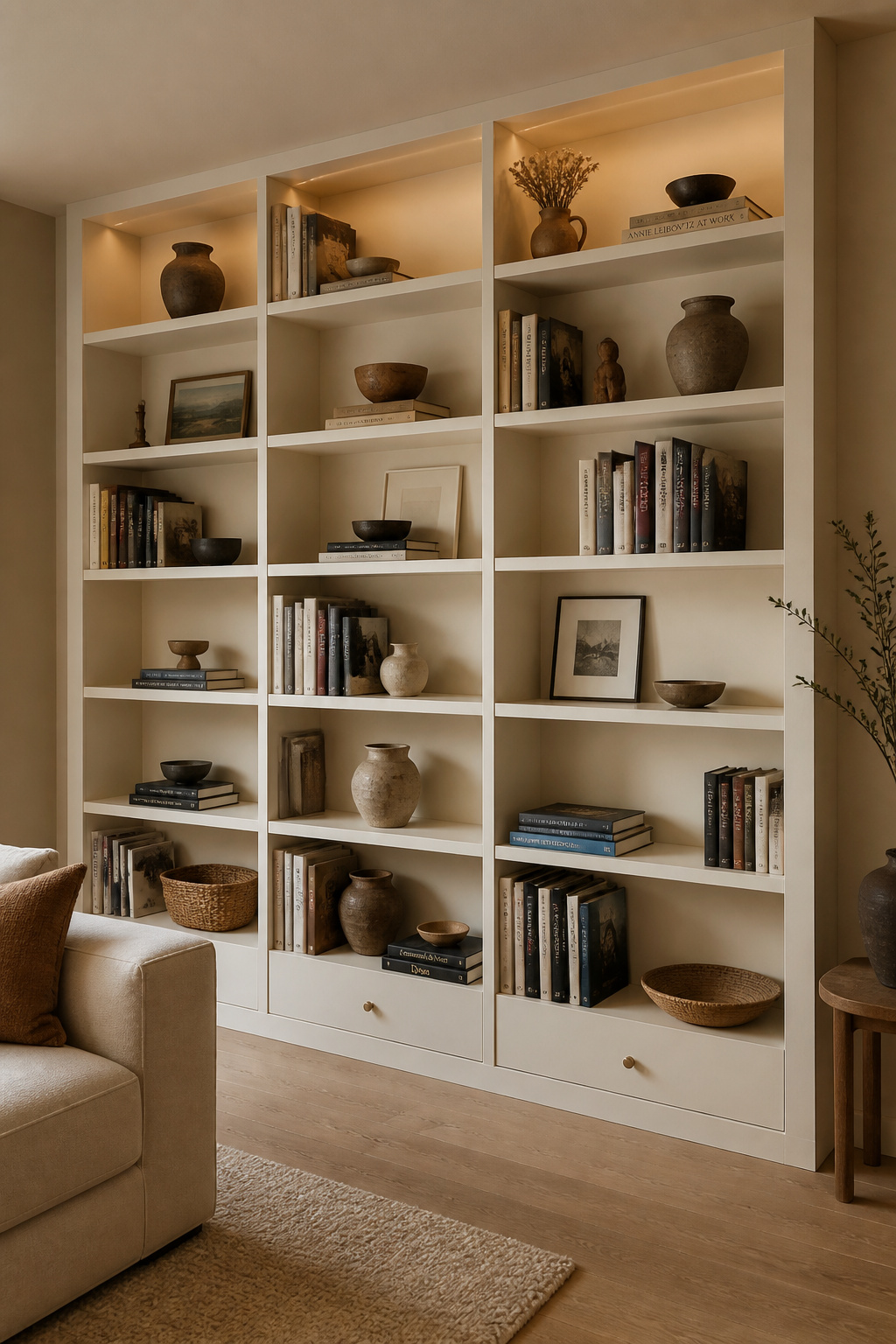
Painted MDF is the most economical option and achieves a crisper painted finish than any other material — it machines to clean, sharp edges and takes paint uniformly. At $300-600 per linear foot installed, it’s the choice for those who want the built-in look without the built-in price. When painted the same color as the surrounding walls, the shelves effectively become architecture — the wall develops depth without the unit registering as furniture.
Solid oak reads as an entirely different material decision. The grain is visible even through a painted finish; the slight irregularity of natural timber edges catches light differently than MDF; the shelf ends show the ring structure of the wood. At $600-1,200 per linear foot for custom work, it’s a genuine investment — but the resulting unit reads as a fixture of the house rather than a piece of furniture placed in it.
Styling the Display
Styling the display follows a simple and reliable structure: the two-thirds rule fills roughly two-thirds of visible shelf space with books and one-third with objects. Vary the depth of objects — bring some to the shelf edge, push others back — and the display gains three-dimensionality from across the room. Build in deliberate negative space: at least one empty section per three to four linear feet. This discipline makes the filled sections read as curated rather than crammed. The basic principles of arrangement apply here just as they do to furniture placement generally — intentional positioning makes the difference between a space that reads as designed and one that simply accumulated.
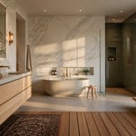
10. Wide-Plank White Oak Floors as the Room’s Material Foundation
The floor is the room’s largest continuous surface, and flooring is one of the living room ideas on this list most worth allocating significant budget to. It’s also, in most renovations, treated as the afterthought — chosen last, allocated the remaining budget, specified from whatever the supplier recommends in the right price range. This is a consistent mistake. The floor sets the material register for every other decision in the room.
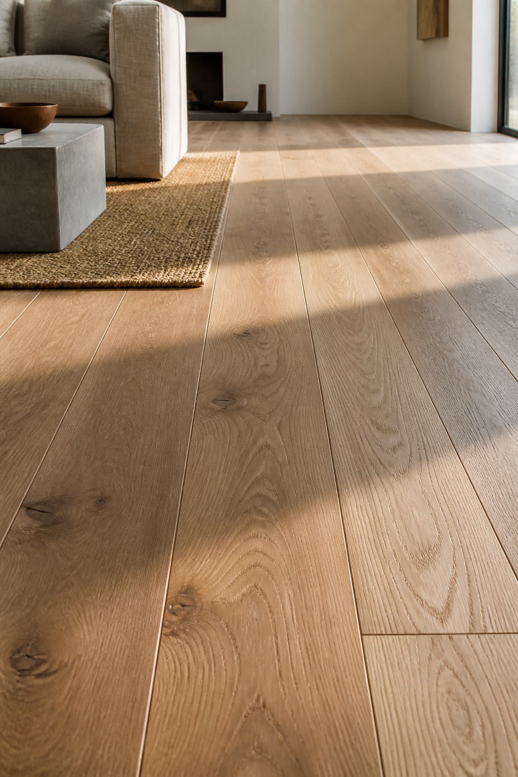
Wide-plank white oak — 5-9 inch boards — changes spatial perception in a specific and measurable way. Narrow strip floors (2.25-3 inches) create a busy, horizontally striped surface with dozens of visible seams that visually fragment the floor. Wide planks reduce those seams dramatically, creating a calmer, more expansive surface. At 8-9 inches per plank, each board reveals significant grain variation and natural character — the floor becomes a material statement rather than a neutral backdrop.
White oak’s Janka hardness of 1,360 lbf places it well above the 800 lbf threshold recommended for high-traffic living areas. Its tight, straight grain also makes it more dimensionally stable than red oak — it moves less with seasonal humidity changes, which matters significantly for wide planks where movement can cause gapping at edges.
For finish, hardwax oils (Rubio Monocoat, Osmo, Bona Hardwax) represent the best option for living rooms where the floor’s natural quality is part of the design intent. These penetrating finishes look and feel like bare wood but are fully protected, and spot repairs are possible without refinishing the entire floor. Polyurethane is more surface-durable in the short term but must be fully sanded back when it wears: an expensive, disruptive process that makes spot maintenance impossible. On white oak specifically, a water-based polyurethane will preserve the wood’s cool, almost silver undertones; an oil-based formula will push it warmer and more amber.
11. Gallery Walls With Mixed-Material Frames: Wood, Metal, and Resin
There is a visible difference between a gallery wall assembled from matched frames and one assembled from materials gathered over time. Matched sets achieve graphic impact — high contrast on a white wall, or an all-black grid that reads as intentional from across the room. But they tell only one story: the story of someone who bought a set. Mixed-material frames tell a richer one.
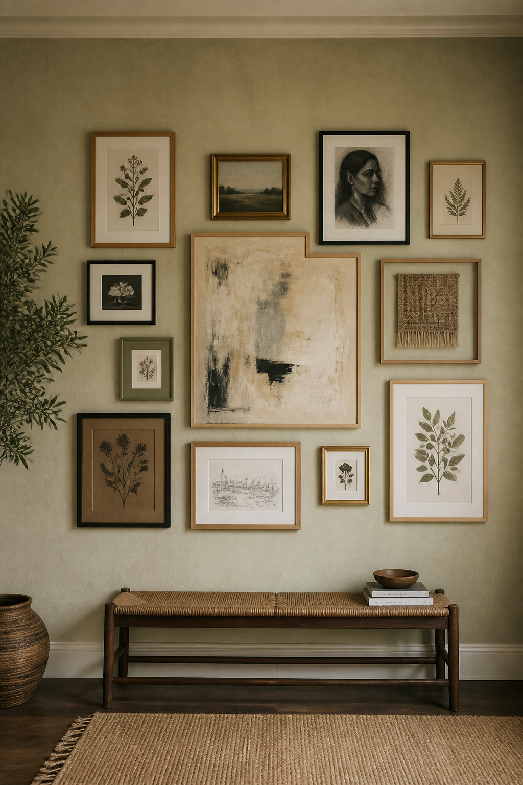
The anxiety most people bring to mixed-frame arrangements is about creating chaos — the fear that different materials will fight each other visually. The remedy is color value, not uniformity. Frames that share a similar tonal weight (all medium-dark, or a deliberate range from very light to very dark) read as a cohesive set even when the materials are completely different. A pale oak frame, an antique brass frame, and a matte black frame span the value range while sharing a warm undertone. The eye groups them together because their brightness levels are managed, regardless of what they’re made of.
Resin frames and painted wood frames allow for color. A single frame in dusty sage, terracotta, or pale slate among neutral materials acts as a palette anchor — it adds personality without overwhelming the composition.
Planning the Layout
For layout, trace each frame onto kraft paper or newspaper, cut out, and arrange on the floor to establish the composition before any holes go into the wall. Start with the largest piece positioned slightly off the wall’s true center — shifted 4-6 inches — and build outward. Centered large anchors feel static; slightly asymmetric ones feel more naturally assembled. Consistent gap spacing (2-3 inches for tight, 4-6 for loose) matters more than the specific measurement. For more on arranging art effectively, wall art decoration ideas apply many of the same composition principles, even outside a bedroom context.
12. Natural Fiber Drapery in Linen or Hemp That Filters Light Softly
Drapery is one of the most underrated living room design ideas available. The windows of a living room determine the quality of light in the room for every hour of daylight — and in most houses, they’re hung with synthetic panels that block that light, filter it into a flat blue-white, or both. Natural fiber drapery in linen or hemp does something genuinely different.
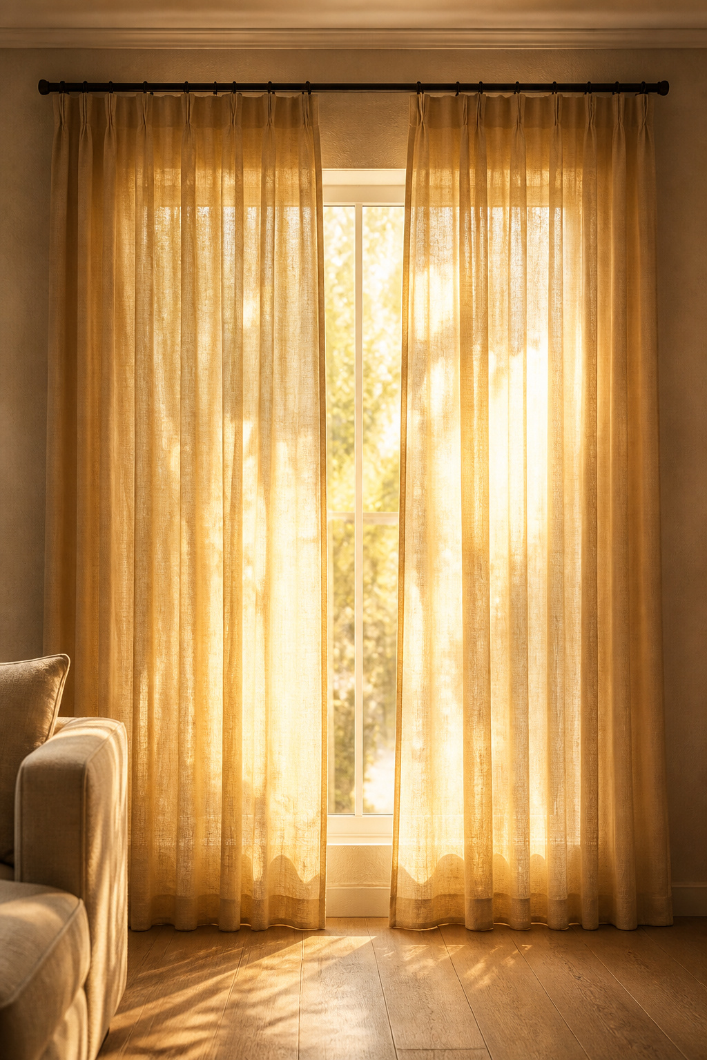
Unlined linen has a light transmission rate of 30-50% depending on weave density and yarn weight — enough to glow with diffused amber-gold light in the late afternoon while maintaining daytime privacy. That light quality is not something you can achieve with synthetic sheers, which tend to filter light into a cooler, flatter tone. Linen converts afternoon sun into something you want to sit in.
Hemp is the more sustainable choice and, for most living room applications, the more interesting material. At 220-280 GSM versus linen’s 180-220 GSM, hemp hangs with more weight and fullness, creating substantial, clean folds that suit a room with architectural ambition. It softens with each wash and develops a slightly nubbled texture over the first year of use. Specify pre-washed hemp to avoid post-installation shrinkage.
Hanging Height Rules
For hanging, mount the rod 4-6 inches below the ceiling — not at the window frame. The eye reads from the rod to the floor as the window’s height, making 8-foot ceilings appear close to 9 feet. Extend the rod 6-12 inches beyond the window frame on each side so the panels stack completely clear of the glass when open, maximizing light and making the window appear wider. The hem should rest 0.5-1 inch above the floor for a clean look, or puddle 3-6 inches if the room’s character is more relaxed — the latter works especially well with heavy hemp in an unlacquered, natural interior.
13. Handmade Ceramic Vessels as Living Room Decor Focal Points
This living room decor idea requires almost no installation and costs as little as $40 for a quality handmade piece. Mass-produced ceramics are technically adequate and visually forgettable. Slip-cast in molds to perfectly uniform specifications, they have smooth surfaces with no variation, glazes that behave consistently across every piece in a batch, and walls of even thickness from rim to base. They fill space without enriching it. (Spend time at a ceramics market even once and this difference becomes permanent — mass production never looks quite the same again.)
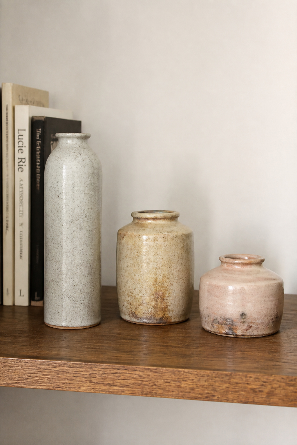
Handmade ceramics — wheel-thrown or hand-built — operate differently at every level. Wall thickness varies slightly from base to rim. Glazes behave unpredictably at high temperatures: ash glazes crawl, crystalline glazes grow formations, shino glazes blush in patterns no kiln controller can fully prescribe. These variations are what the eye reads as craftsmanship, and what makes a handmade vessel worth returning to look at a week after you placed it.
As living room decor focal points, ceramics work through grouping. Odd-number arrangements — three or five vessels — create triangular compositions that feel naturally dynamic. The critical variable is height: vary it dramatically. Heights of 12, 7, and 4 inches create a composition that registers from across the room; heights of 12, 11, and 10 inches look like you ran out of shelf space. Leave 4-6 inches between pieces within a grouping — touching objects lose their individual reading and merge into one visual mass.
For sourcing, entry-level artisan ceramics (Etsy studios, local craft markets) offer genuine handmade quality at $40-150 per piece. Mid-range studio pottery from named makers runs $150-500 and represents the strongest value — exhibition-quality work that develops character with age. One hero piece plus two supporting accents is the maximum for a single vignette; beyond three pieces, the arrangement begins to read as a collection on display rather than a composed grouping.
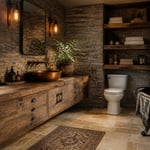
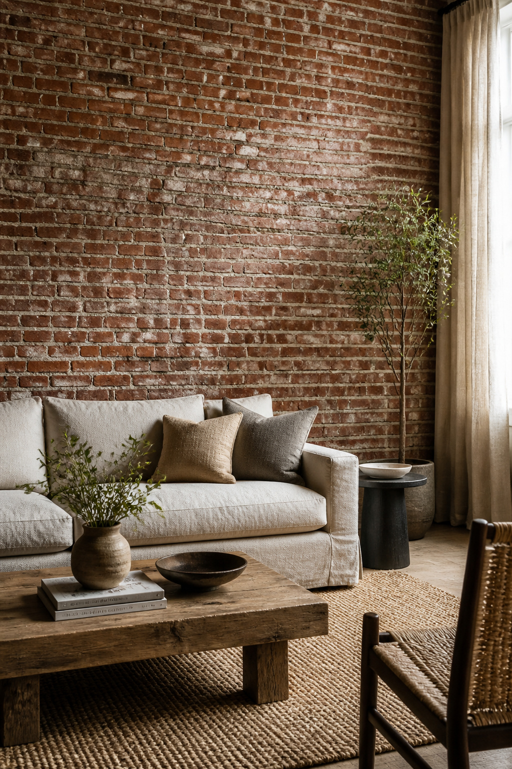
14. Raw Concrete or Exposed Brick as a Feature Wall Material
One raw material wall in a living room — genuine exposed brick or sealed concrete — is an architectural move. It changes the room’s fundamental character in a way that paint alone cannot, because it introduces a material with physical depth, textural complexity, and its own visual history. It also requires restraint: one wall, properly executed, is enough.
The choice between genuine exposed brick and brick-effect panels depends on what exists behind your walls. Genuine exposed brick — uncovering original brickwork by removing plasterwork — has authentic depth variation, mortar texture, and historical character that panels cannot replicate at close range. Brick slips (thin-cut genuine brick at 3/4 inch thickness, set in mortar) are the best alternative where original brick doesn’t exist — nearly indistinguishable from genuine exposed brick at normal room distance, and far more convincing than polymer panels.
Sealing is non-negotiable before furniture arrives. Unsealed brick dusts continuously — fine particles deposit on upholstery within days. Apply one coat of clear penetrating masonry sealer (not a surface film sealer) to eliminate dust while maintaining the wall’s natural appearance. For raw concrete walls, the same penetrating sealer logic applies; a specialist concrete paint in a flat finish can also be used if a more controlled result is needed.
Counterbalancing the raw wall with soft materials is the design principle that determines whether the result reads as designed or merely unfinished. A brick wall with a linen sofa, a wool rug, and natural fiber curtains achieves material balance. The same wall with leather seating on bare concrete floors reads industrial by default. For more on how to develop material layers in living room contexts, rustic living room material ideas work through exactly these pairings.
15. Oversized Statement Rugs That Define Living Room Design Zones
The single most common rug mistake in living rooms is buying the rug too small. A 5×8 rug under a standard 84-inch sofa leaves the sofa floating above the floor with no visual ground. The furniture has nothing to sit on. The room reads as under-furnished even when the rest of it is perfectly considered.

The minimum for a standard sofa-and-chairs arrangement is 8×10 feet. For most full sectional configurations, a 9×12 is what you need. Front legs on the rug (all front sofa and chair legs resting on the rug) is the designer compromise when a full 9×12 isn’t feasible — it anchors the furniture to the rug visually without requiring the rug to extend under all legs. What doesn’t work: a rug that only fits under the coffee table and leaves all the seating furniture floating above bare floor.
In open-plan spaces, an oversized rug does spatial work that walls cannot. A rug that clearly extends beyond the seating furniture on all accessible sides creates a visual room-within-a-room — the living area ends at the rug’s edge. This zone definition is particularly important when a living area shares floor space with a dining area: the rugs establish separate zones that anchor each function spatially. For a thorough understanding of how rug size relates to every living room configuration, the complete guide to living room rugs covers every scenario in detail.
Choosing the Right Construction
For material at this scale, hand-knotted rugs are the long-term investment (50-100 year lifespan, no adhesive or secondary backing, repairable by specialist weavers). Hand-tufted latex-backed rugs offer mid-range performance at lower cost but carry a 5-10 year replacement cycle as the latex backing degrades. Flatweave kilims and dhurries are the practical choice for high-traffic zones — reversible, easy to clean, and durable without any pile to crush or shed.
16. Vintage Oak Sideboards Paired With Contemporary Upholstered Seating
Of the living room ideas here that involve buying furniture, this is the one with the clearest argument for going vintage over new. There is a quality in old-growth oak furniture that cannot be manufactured new. The grain is finer — pre-1940s timber grew more slowly, producing annual rings twice as dense as modern plantation-grown lumber. The patina is genuine — decades of wax and polish build up a depth that fresh varnish doesn’t approximate. The slight imperfections in joinery and fit communicate craftsmanship in a way that machine-perfect modern furniture, for all its precision, never does.
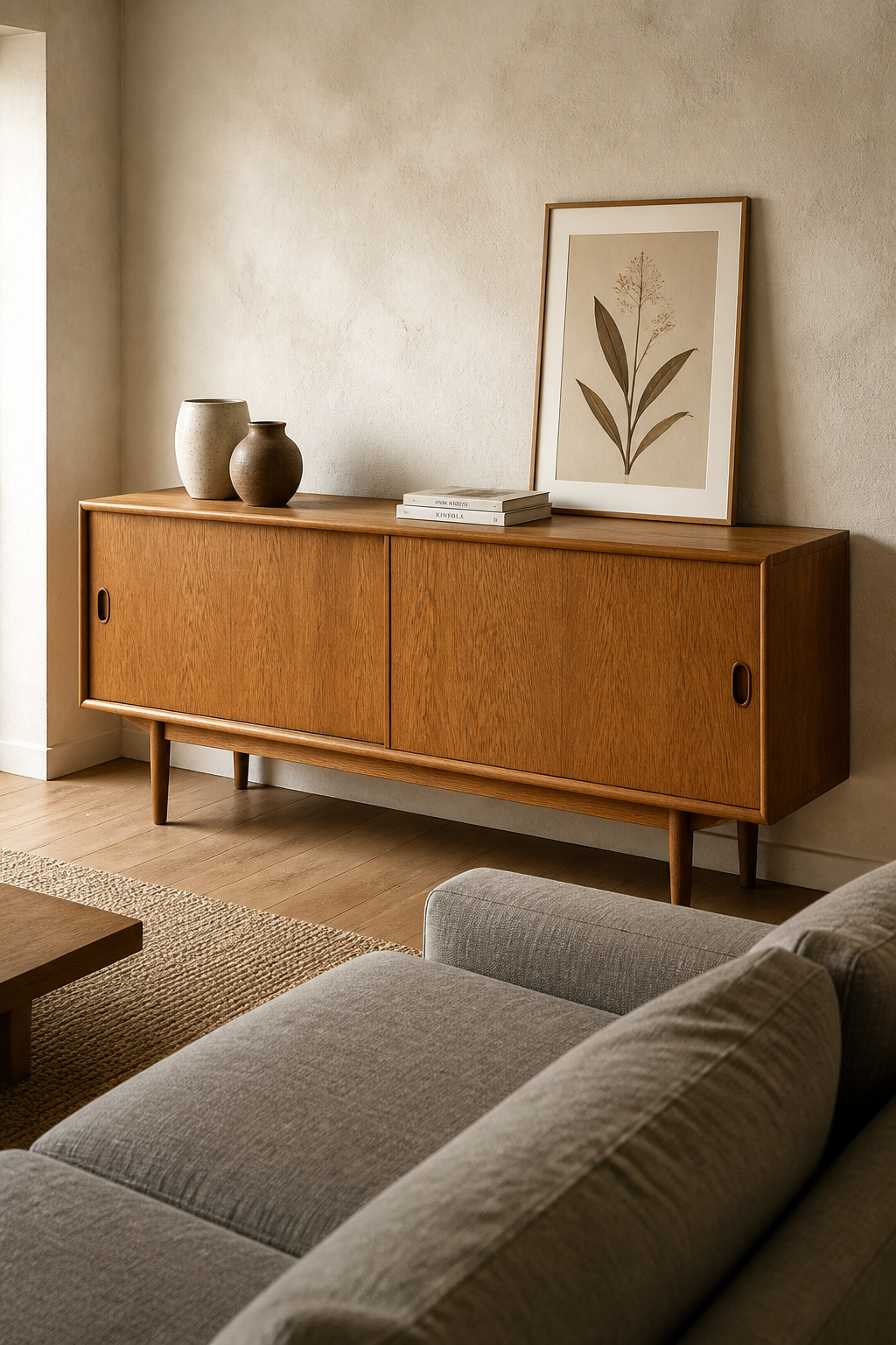
A vintage oak sideboard placed in a room with contemporary upholstered seating does something specific: it makes the room feel like it was assembled over time rather than purchased from a single showroom visit. This ‘collected’ quality is one of the most sought-after qualities in interior design and one of the hardest to achieve by intention — unless you actually incorporate genuine vintage pieces.
Source from Chairish, 1stDibs, or local estate sales for the best combination of selection and price. Check drawer runners (should slide without binding), veneer condition (bubbles indicate adhesive failure), and structural integrity at corner joints before buying. Most 1950s-1970s sideboards require only cleaning and a coat of Renaissance Wax to be fully revived — stripping old patina is almost always the wrong call. That honey-brown depth took sixty years to develop, and no refinishing job can fake it.
For pairing with contemporary seating, the 80/20 rule applies: 80% of the room’s furniture is contemporary, 20% vintage. This ensures the sideboard reads as an intentional statement rather than an unsold antique. The unifying thread is color value: a honey-oak sideboard belongs with seating in warm tones — camel, soft olive, warm gray. For more ideas on how vintage pieces integrate into residential settings, vintage furniture ideas across different rooms work through several of the same pairing principles.
17. Reclaimed Timber Ceiling Beams That Bring Living Room Character From Above
Ceiling beams are one of the few design interventions that change how a room feels the moment you enter, before you process anything else in the space. They add scale, warmth, and the sense of a room that has been considered from floor to ceiling — literally. They also, in most existing homes, don’t require structural work to achieve.
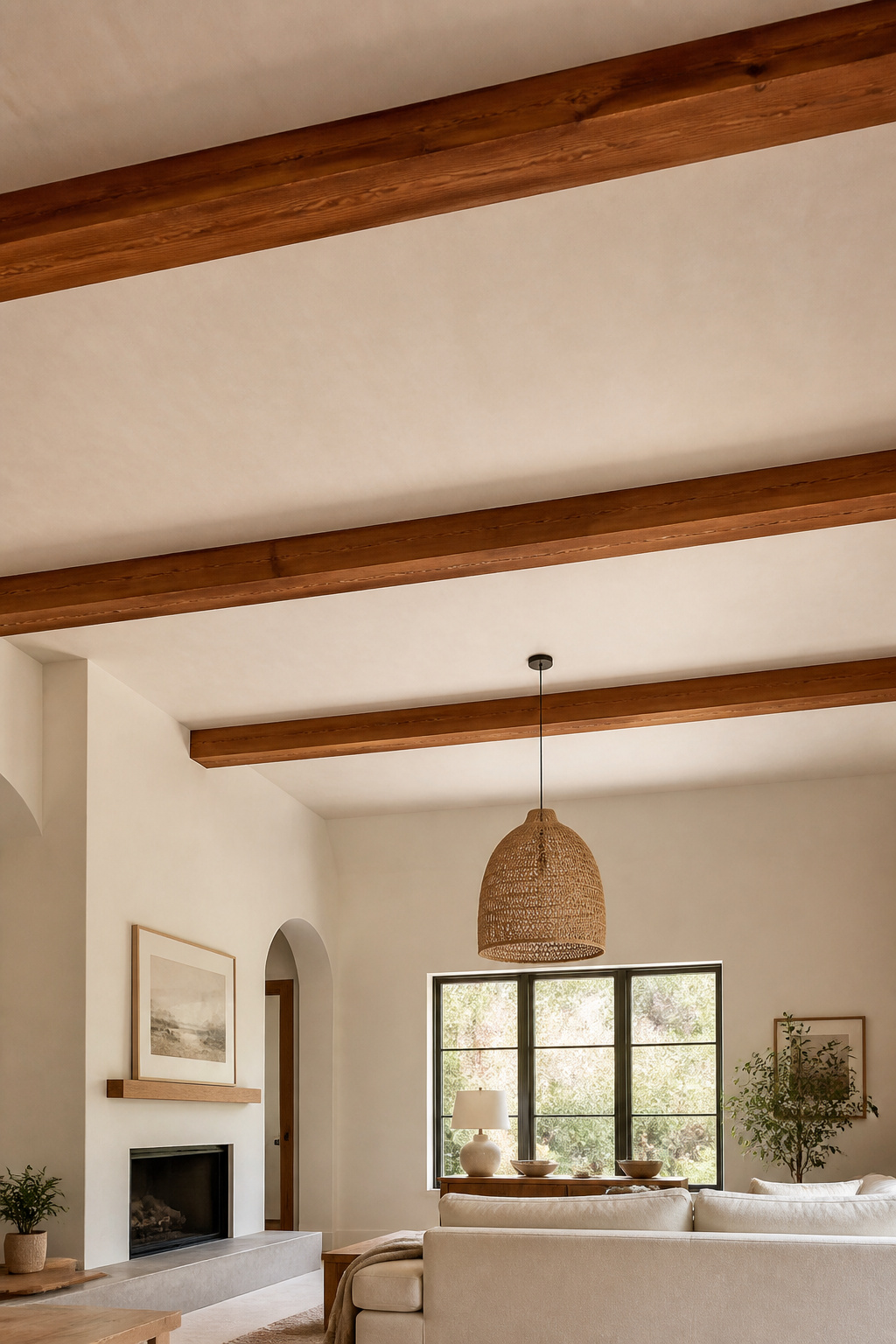
Decorative box beams — hollow structures assembled from three or four pieces of reclaimed wood faces around a mounting cleat — are the practical solution for almost all renovation contexts. They look like solid timber from the floor, install without engineering assessments, and cost $150-400 per linear foot installed. The visual difference between a hollow box beam and a solid structural timber at normal ceiling height (8-14 feet) is essentially undetectable.
For reclaimed wood species, Douglas fir from Pacific Northwest barn demolitions is the most commonly available: warm reddish-brown, straight-grained, Janka hardness of 660 lbf. Reclaimed heart pine from old Southern buildings is harder (1,225 lbf) with a more dramatic grain and a deep honey-amber color that deepens further with age — the most visually impressive option but less commonly available. White oak is the most design-flexible: its tight grain and silver-to-warm-brown color range suits both cool-toned contemporary rooms and warmer traditional ones.
Sizing and Spacing Rules
Sizing is where most people miscalculate. On 8-9 foot ceilings, beam faces should be no wider than 4-6 inches and beam depth no greater than 3-4 inches — larger beams on low ceilings compress the perceived height significantly. Depth should not exceed 1/12 of ceiling height as a rule of thumb. Space beams 4-5 feet apart for an airy effect; 3-4 feet for a more intimate, coffered appearance. Acclimatize reclaimed wood in the room for 2-4 weeks before installation — it will check and move slightly as it adjusts to indoor humidity, and it’s better to let that happen before the wood is fixed to a ceiling.
How to Find Your Living Room’s Material Signature
The 17 living room ideas in this article share a single underlying approach: start with a material decision that gives the room a sensory identity, then build from it. That’s different from starting with a color palette or a style reference and shopping until the room matches the image. It produces spaces that feel more durable, more personal, and more interesting at close range than any showroom mood board can generate.
Where you start depends on what you’re working with. If you’re renovating from scratch, start with the floor — it anchors everything and is the hardest element to change later. Wide-plank white oak or a quality oversized rug establishes the material register before anything else enters the room. If you’re working with an existing space, the wall is where you’ll feel the change most immediately: limewash paint or a single raw material accent wall transforms the character of furniture you already own.
For renters or those on a restricted budget, three living room ideas deliver the most material quality for the money: a quality layered rug, natural fiber drapery hung correctly (floor to ceiling, wider than the window), and a grouping of handmade ceramic vessels. Together, these three interventions cost under $1,000 and change the room’s tactile identity more than most furniture upgrades twice the price.
Invest where things are touched and seen every day — floors, upholstery, the rug underfoot. Save where materials are viewed from a distance — wall treatments are reversible, decorative objects can be built up over time from a mix of price points. And when it comes to furniture, a well-sourced vintage piece often delivers more material quality per dollar than its new equivalent. That’s not nostalgia; that’s material science.