Most people plan a kitchen renovation the wrong way. They spend weeks choosing cabinet finishes, agonizing over countertop materials, scrolling through tile samples — then they pick a layout almost as an afterthought. The layout is the only decision that cannot be undone without tearing the whole kitchen apart and starting over. Every other choice is reversible. The layout is not.
After eleven years designing storage systems and optimizing spatial flow for everything from 80-square-foot Manhattan kitchens to 400-square-foot farmhouse renovations, I’ve watched the same mistake play out repeatedly: a beautiful kitchen that doesn’t work because the modern kitchen layout was never analyzed as a system. A floor plan is a workflow map — and the best ones are built around how the household actually cooks, not how a showroom looks.
These 16 layout ideas cover the full spectrum, from compact one-wall configurations for urban apartments to double island setups for serious home cooks. Each comes with the spatial logic and real dimensions you need to evaluate whether it fits your actual room.
1. The Classic L-Shaped Layout Redesigned for Open-Plan Living
The L-shape is the backbone of modern kitchen design for good reason. Two adjacent walls, an open floor plan on the remaining two sides, and a work triangle that distributes the fridge, sink, and range across both arms without pinching the aisle — it’s a configuration that works in a 10-by-10 room and scales gracefully into a 15-by-20 space.
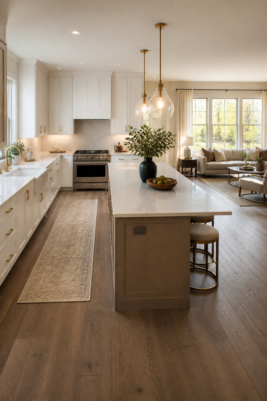
What makes today’s L different from its mid-century predecessor is what happens at the open end. Contemporary L-shapes are designed with an island or peninsula at the open corner, turning what used to be dead floor space into a fourth functional surface. The island becomes the social anchor of the open plan — the place where the cook faces the living room rather than a wall.
The dimensional decisions matter more than most people realize. Each leg of the L should run at least 10 feet — legs shorter than 8 feet limit appliance placement significantly. The corner where the two legs meet creates the trickiest spatial problem: two adjacent cabinet doors that want to open simultaneously. Plan the corner hardware at the design stage. A pie-cut lazy Susan ($100–250) works in most cabinets 28 inches or wider; diagonal corner bases eliminate the hardware problem entirely.
Per NKBA standards, the work triangle in an L-shape should keep each leg between 4 and 9 feet, with a total perimeter under 26 feet. In practice: fridge at one end, sink at the corner or mid-run of one arm, range on the other arm. An island at the open end adds prep surface and — critically — the storage density that two perimeter walls alone cannot supply.
2. Modern Kitchen Layout Ideas: The U-Shape for Maximum Counter Space
If counter space and storage density are your top priorities, the U-shape wins consistently. Three walls of cabinetry versus two for an L — simply more surfaces for the same floor area. The enclosed design also keeps the cook’s zone contained, which matters more than most people acknowledge: during serious meal prep, you want everything within reach.
The trade-off is openness. A U-shape is a deliberate choice to prioritize function over social flow. For households where cooking is a focused activity rather than a social performance, that’s a feature, not a flaw.
Aisle Width: The Most Consequential Decision
The math on aisle width defines whether a U-shape works or frustrates. NKBA guidelines require a minimum of 42 inches between facing counters for a single cook — measured from the counter front, not the wall. For two cooks working simultaneously, that rises to 48 inches. Below 42 inches, opening an oven door while standing at the opposite counter becomes genuinely awkward. Many U-shapes I encounter in older homes run 36 inches — fine for one person in the 1970s, frustrating for a modern household.
Rooms between 12 and 16 feet wide produce the most comfortable layouts. The appliance zoning strategy that works best: sink at the base of the U (back wall), fridge on one arm, range on the other. This distributes the work triangle evenly and prevents any single arm from becoming overloaded. Wall ovens and microwaves built into the upper section of one arm free the base cabinets below for pull-out pot storage and drawer stacks.
3. The Galley Kitchen With a Dedicated Prep Zone
The galley kitchen is borrowed directly from commercial cooking. Ships, aircraft, and professional restaurant kitchens all use parallel runs because they are measurably efficient for a single cook who needs everything within two or three steps. Kitchens organized into defined task zones within a galley footprint can reduce steps during meal prep by up to 20 percent compared to traditional triangle layouts.
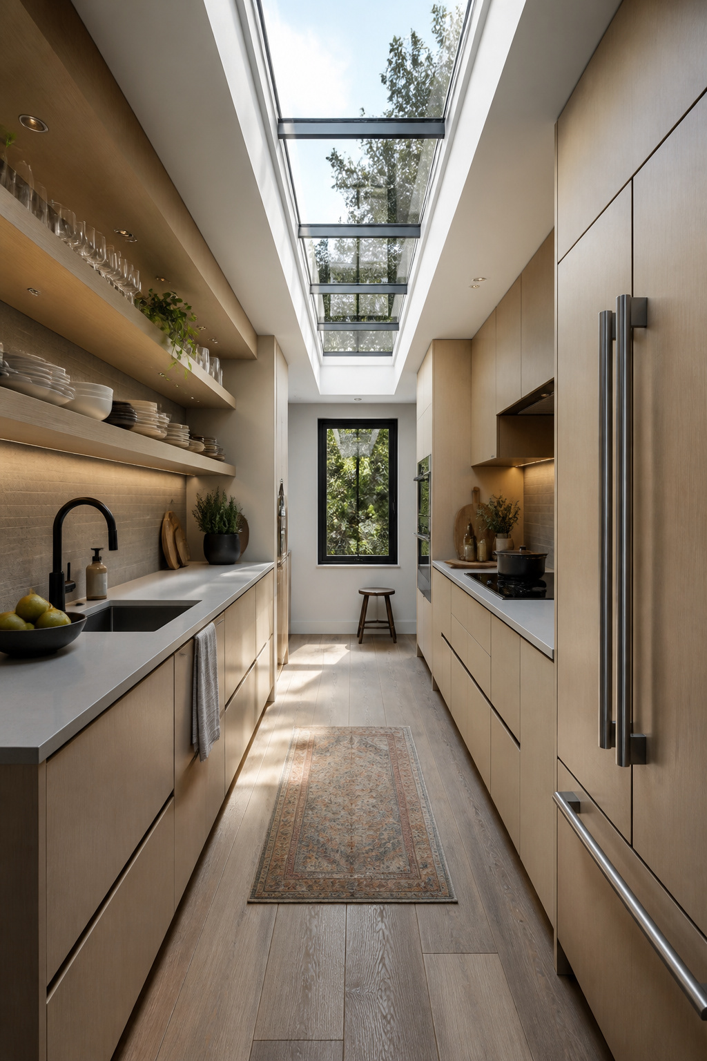
The residential galley works best in rooms 7 to 10 feet wide. Narrower than 7 feet and the aisle falls below the NKBA 42-inch minimum. Wider than 10 feet and you’ve essentially built two L-shapes facing each other.
The prep zone is the galley’s most important spatial decision: a clear, uninterrupted counter run of at least 36 inches between the sink and the cooktop. Sink goes at one end (cleanup zone), range mid-run on the opposite wall (cooking zone), refrigerator at the entry end so family can access drinks without entering the cook’s space.
Storage rewards vertical thinking. Floor-to-ceiling cabinetry on one wall doubles density without touching aisle width. Pull-out pantry towers — 6 to 12 inches wide — deliver remarkable density: a 6-inch pull-out stores as much as a 15-inch standard cabinet. One rule: avoid upper cabinets on both walls running full height. It creates a tunnel. Open shelving or glass-front uppers on one wall keep the space from feeling like a corridor.
The Traffic Problem Every Galley Faces
The galley’s persistent challenge: through-traffic. If the layout becomes a shortcut between two rooms, the cook loses their workspace every time someone walks through. A galley with a single entry, or positioned so circulation routes around rather than through it, solves this for good.
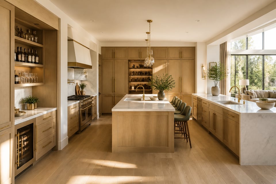
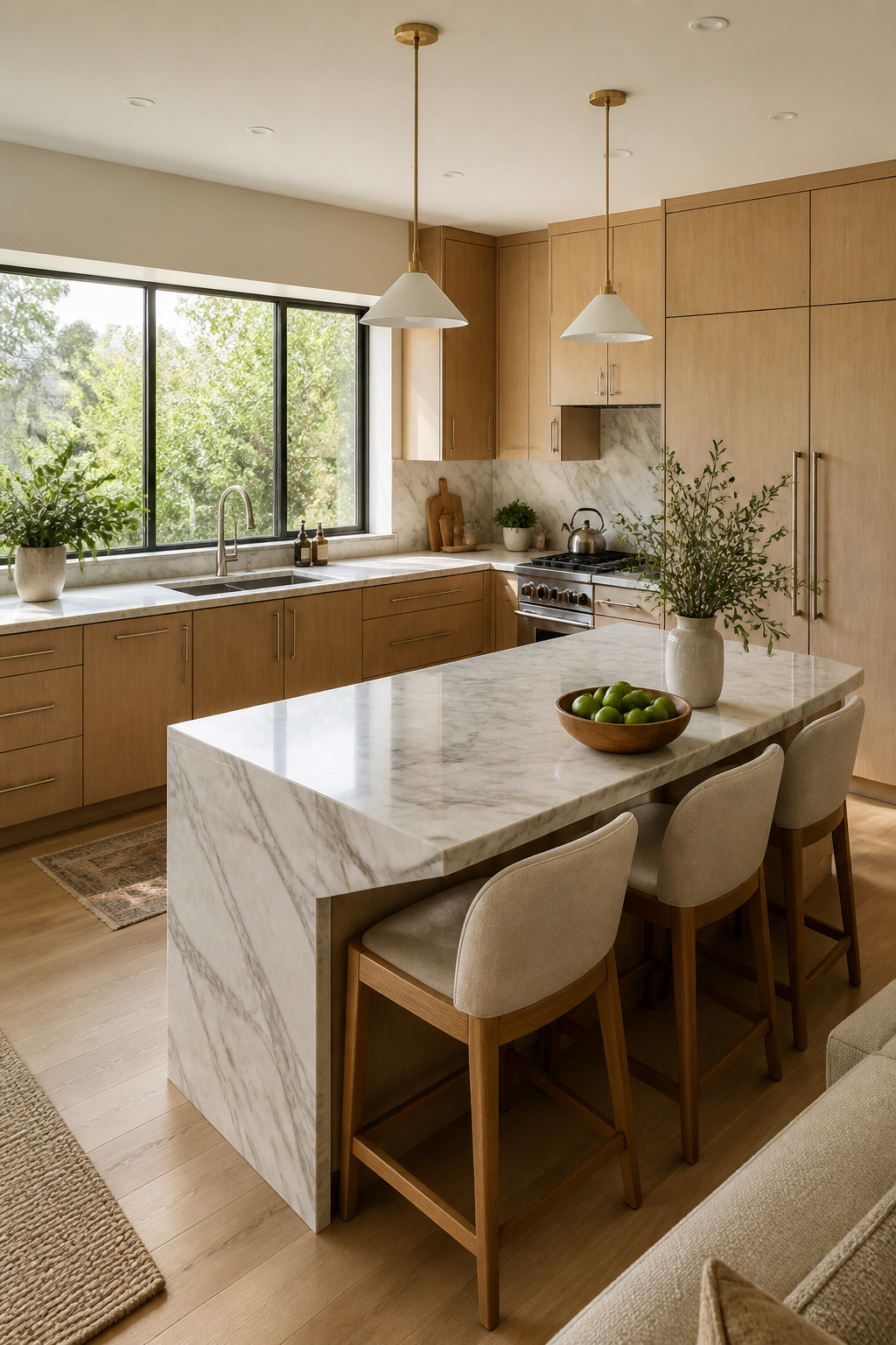
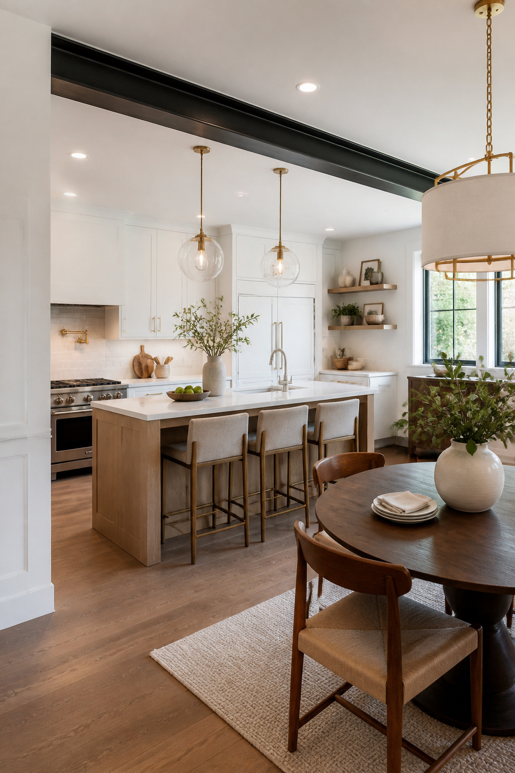
4. Open-Concept Island Kitchen Layout for Entertaining at Home
The island kitchen is the most fundamentally social layout available. When the cook faces the living room instead of a wall, preparing dinner becomes part of the gathering rather than a separate activity. For households that entertain regularly or have young children who need watching during prep, this shift in orientation changes the entire experience of cooking at home.
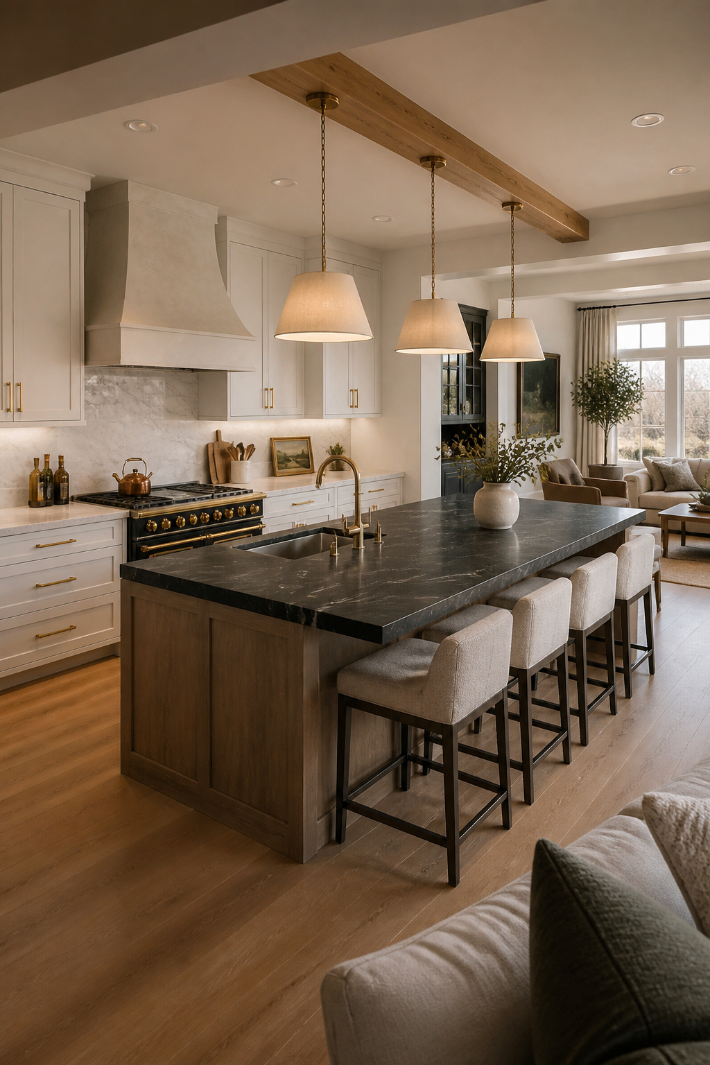
The spatial requirements are non-negotiable: 42 inches of clearance on all sides of the island (48 inches preferred) means the kitchen needs at least 12 to 13 feet of open width before an island is viable. Anything tighter and the island becomes an obstacle. When you see a kitchen where people squeeze past the island sideways, the clearance math was ignored.
Island sizing follows a clear hierarchy. Minimum functional size: 4 feet long by 2 feet deep. Seating overhangs need 12 to 15 inches of knee clearance depending on stool height. Each seat needs 22 to 24 inches of width along the bar.
The island’s function determines its configuration. A prep sink on the cook-facing side — typically 15 to 24 inches wide — gives the cook a second cleanup zone and lets a helper work alongside without crowding the perimeter. Prep sink on the cook side, seating on the guest side, separated by at least 24 inches of counter: this is the arrangement that actually works in a busy kitchen, not just in a showroom photo.
5. One-Wall Kitchen Layout Ideas for Small Urban Apartments
Every square inch counts in a one-wall kitchen. This layout lines everything — sink, range, refrigerator, dishwasher, counter — along a single run, leaving the rest of the floor plan open for living or dining. It’s the right answer for studios, lofts, and compact urban apartments where a multi-wall kitchen would eat the entire room.
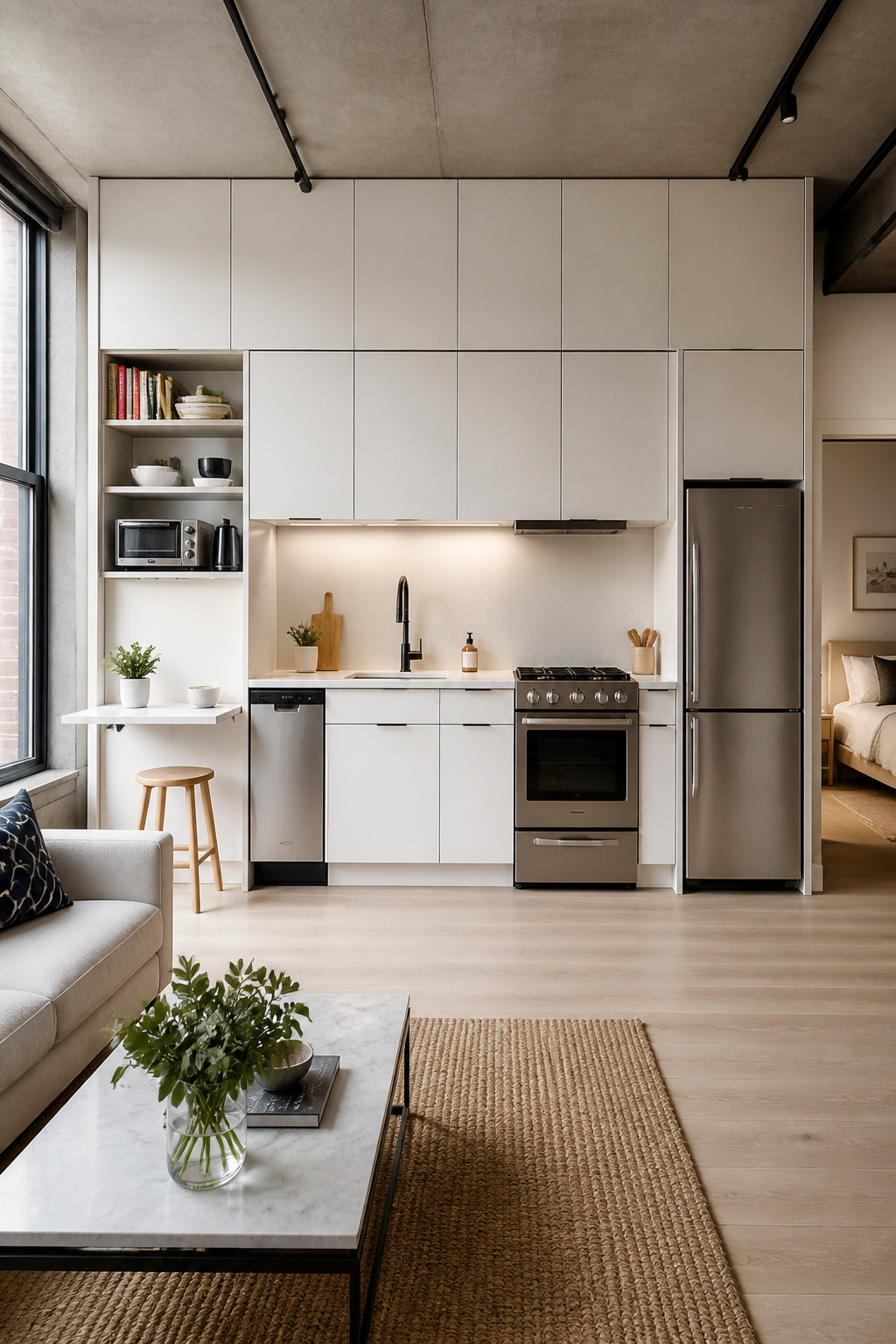
The minimum workable run is 8 to 10 linear feet. Below 8 feet, something gets left out — usually the dishwasher or adequate counter space between appliances. The sink should sit at center with the range to one side and the refrigerator to the other, creating a compressed work triangle within the linear run.
Extending the Counter
Vertical storage is where the one-wall kitchen reclaims what the counter can’t provide. Floor-to-ceiling cabinetry right up to the ceiling — rather than stopping at the standard 84-inch mark — adds meaningful storage without consuming a single inch of counter. For small kitchen storage solutions that actually work, going vertical is consistently the highest-return strategy per square foot.
Counter extensions are the most underused feature. A fold-down wall shelf at counter height, supported by locking brackets, extends prep area during cooking and folds flat when not needed. Pull-out cutting boards recessed under the counter (standard 18-inch version: $80 to $180) extend prep space without any visible addition. And for appliances: compact 24-inch ranges, 18-inch dishwashers, and counter-depth refrigerators make a cumulative difference across 10 linear feet.
6. The Work Triangle Reimagined for Modern Cooking Habits
The kitchen work triangle was developed in the 1940s. At the time, kitchens had three major appliances, one cook, no dishwasher, and no microwave. The triangle made sense for those conditions — but those conditions no longer describe most kitchens.
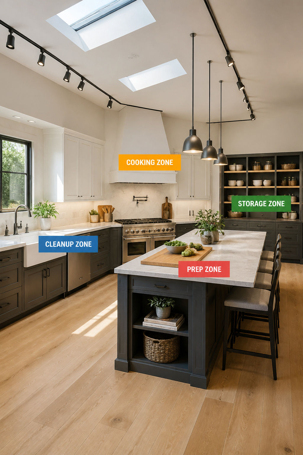
The NKBA’s 2022 Planning Guidelines retained the triangle as a baseline while formally introducing work zones for kitchens with more than three primary work centers. That’s an acknowledgment that the triangle is a starting point, not a destination.
The work zone model replaces three points with four distinct areas: prep (cutting board, mixing, knife storage, ideally between sink and range), cooking (range, wall oven, microwave in proximity), cleanup (sink, dishwasher, compost, grouped with adequate landing space on each side), and storage (pantry, refrigerator, dry goods). Each zone accommodates two people without the conflicts that arise when everyone operates within a single triangle.
The most practical thing anyone can do before finalizing a layout: spend a week logging every step during a typical dinner prep. Where do you go first? Where do you backtrack? In almost every kitchen I’ve analyzed, the answer is the same: the trash can and prep counter are on opposite sides of the room. Fixing that single inefficiency eliminates dozens of steps per session. Zone-organized kitchens reduce prep steps by up to 20 percent compared to triangle-only designs.
7. Modern Kitchen Floor Plan: Zoning for Prep, Cook, and Clean
Translating the work zone model into an actual floor plan means making specific decisions about counter length allocation, appliance grouping, and how food moves from storage to plate. These decisions determine whether the layout feels intuitive after six months.
Counter space allocation is the most consistently underspecified element. Prep zone: minimum 36 inches of uninterrupted counter, ideally 42 to 48 inches — enough for a cutting board, mixing bowls, and ingredient containers to coexist. Cooking zone: 12 inches of landing space on one side of the range (NKBA minimum), 15 inches on the other for plating. Cleanup zone: 24 inches on the primary side of the sink, 18 inches on the secondary.
The sink-dishwasher adjacency is where modern kitchen floor plans most often fail. NKBA specifies the dishwasher’s nearest edge within 36 inches of the sink — beyond this, pre-rinsing means carrying dripping dishes across the kitchen. The dishwasher should also open away from the sink. A right-hinged dishwasher placed immediately left of a right-mounted sink opens its door directly into the sink’s working area, blocking both simultaneously. Specify hinge direction when ordering.
Ergonomics and Fatigue Reduction
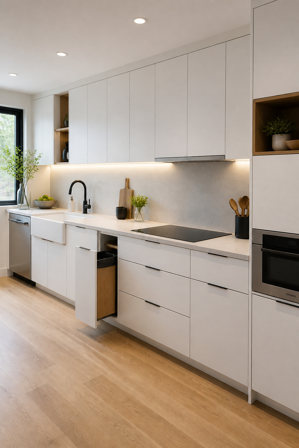
Zone placement affects physical fatigue more than most people expect. Standard 36-inch counter height works for most tasks, but a lowered 30 to 34-inch surface reduces shoulder and back strain for kneading dough or rolling pastry. Keeping the waste receptacle within the prep zone — an under-sink pull-out or island trash drawer — eliminates the most common cross-kitchen movement in poorly planned kitchens.
8. The Peninsula Layout as a Flexible Island Alternative
An island requires 42 to 48 inches of clearance on all sides, which rules it out for kitchens narrower than 12 to 13 feet. A peninsula solves this by attaching to an existing counter run and extending into the room — clearance is only needed on one or two sides, making it workable in kitchens as narrow as 10 feet.
The design language differs, too. An island floats in the room and draws attention from all directions. A peninsula attaches to the perimeter and creates a defined boundary between kitchen and dining — less dramatic, but often more appropriate for how the room functions. For kitchen island designs that reimagine your layout, the choice often comes down to floor plan: the peninsula earns its place in rooms where an island would leave insufficient clearance.
Sizing It Right
Peninsula length should be proportional to the kitchen’s width: no more than two-thirds of the kitchen’s full width. In a 10-foot kitchen, that means a maximum of 6 to 7 feet. Longer than this and the clearance past the open end becomes a bottleneck.
The peninsula’s structural connection to the cabinet run is actually an advantage over freestanding islands: plumbing and electrical can route through the junction without floor penetrations. A dishwasher or trash pull-out on the kitchen-facing base, wine storage or drawer stacks on the dining-facing side — it’s storage density the island can’t match. Seating on the dining side needs 12 to 15 inches for knee clearance and 22 to 24 inches per stool.
9. Double Island Kitchen Layout for Serious Home Cooks
Two islands are not twice as useful as one. That’s the most important thing to understand about the double island layout. The second island earns its place only when the first is fully committed to a specific function — a rangetop, say, or a dedicated prep sink — and a genuinely separate zone is needed for seating, baking, or bar service.
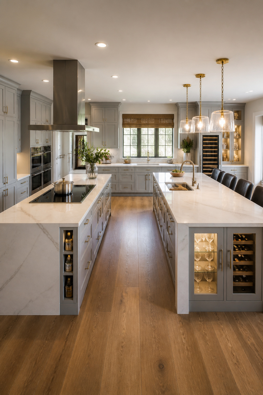
The spatial requirements are unambiguous: 48 inches minimum between the two islands, plus 42 inches from each island to the perimeter walls. Do the math: a functional double island layout requires at least 16 feet of kitchen width. The overall floor plan typically needs 200 square feet or more to absorb the footprint without the layout feeling crowded.
The functional split is what separates a well-designed double island from a trend that photographs well and cooks poorly. Island 1: cooking and prep — rangetop or prep sink, counter workspace, pot drawers below. Island 2: social and serving — seating overhang, bar storage, wine and glassware. During a dinner party, Island 2 stays clean and accessible while Island 1 operates as the working kitchen. For kitchen island ideas that suit a sleek modern home, this functional pairing is what high-end renovations actually aim for.
The Real Cost of a Rangetop Island
A rangetop on Island 1 requires a ceiling-mount chimney hood — starting around $400 and running to $3,000 or more for professional-grade. The ventilation duct must reach exterior air (not recirculate) via the most direct path possible — each 90-degree elbow reduces capacity by the equivalent of 10 linear feet of duct. Add a gas line or 240V electrical run through the floor slab ($1,500 to $4,000 depending on run length), and the real cost of a rangetop island becomes clear before you’ve priced the island itself.
10. Corner Storage That Transforms Any Modern Kitchen Layout
Every kitchen with two adjacent cabinet runs has a corner problem. A standard 36-inch base corner cabinet holds 8 to 10 cubic feet of volume — but only 4 to 5 cubic feet is practically accessible with standard shelving. In a U-shape with two corners, this dead zone can represent 20 square feet of lost cabinet volume.
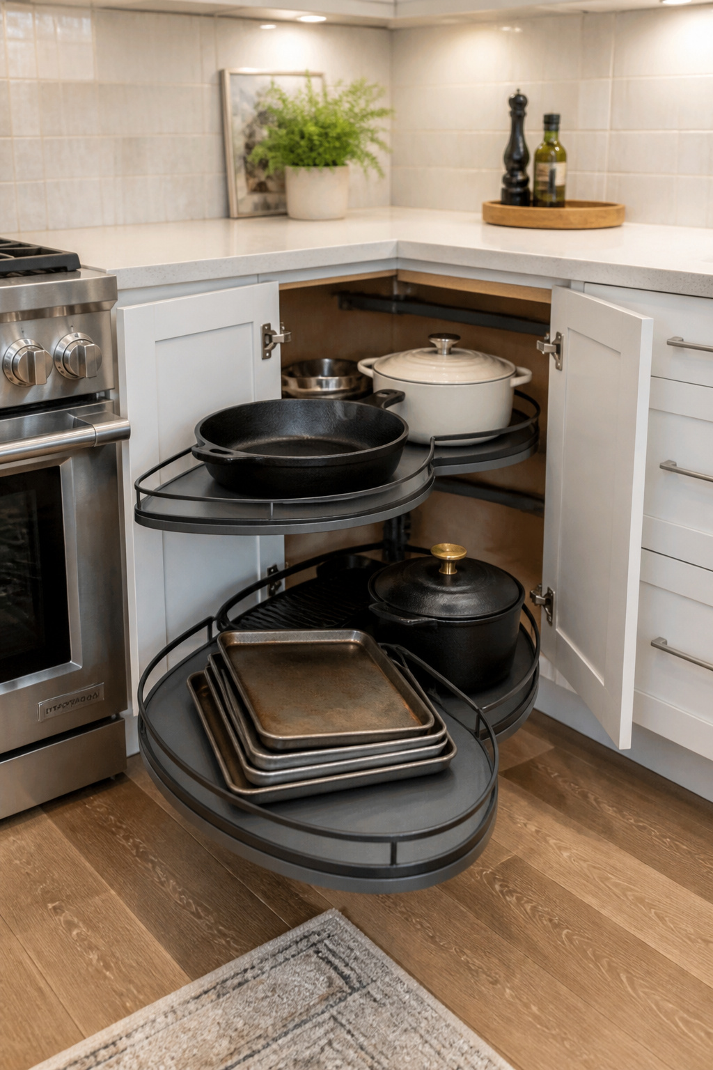
The three hardware solutions each attack the problem differently. Lazy Susan rotating carousel: lowest cost at $100 to $250 installed, zero learning curve, fits any cabinet 28 inches or wider — though some dead space at the back remains. LeMans pull-out: swing-out kidney-shaped trays that slide clear of the cabinet individually, $400 to $800 installed, higher weight capacity, better for pots and heavy appliances. Magic Corner synchronized slide-and-swing shelves: $600 to $1,200 installed, makes every cubic inch of the cabinet accessible, requires professional alignment — genuinely impressive but not a DIY project. For a full breakdown of corner cabinet hacks that maximize kitchen storage, the comparison goes deeper than cost — it’s about what you’re storing and how often you need it.
The Case for the Diagonal Cabinet
There’s a fourth option that hardware manufacturers don’t push: the diagonal corner cabinet. Instead of two standard doors meeting at a 90-degree collision, the cabinet face is angled at 45 degrees — a single door opening to a full-depth interior accessible from a natural reaching angle. No moving parts, no maintenance, no failures after five years. For heavy items used infrequently (a stand mixer, large stockpots, a pressure cooker that comes out twice a year), the diagonal cabinet is often the most honest and durable solution.
11. Modern Kitchen Layout Ideas: Building In a Full Pantry Wall
A floor-to-ceiling pantry wall reorders the visual logic of the entire kitchen. Instead of storage distributed across multiple wall sections at varying heights, one wall handles everything: dry goods, canned goods, small appliances, bakeware, the refrigerator. The remaining walls are freed for windows, open shelving, or simply less visual clutter.
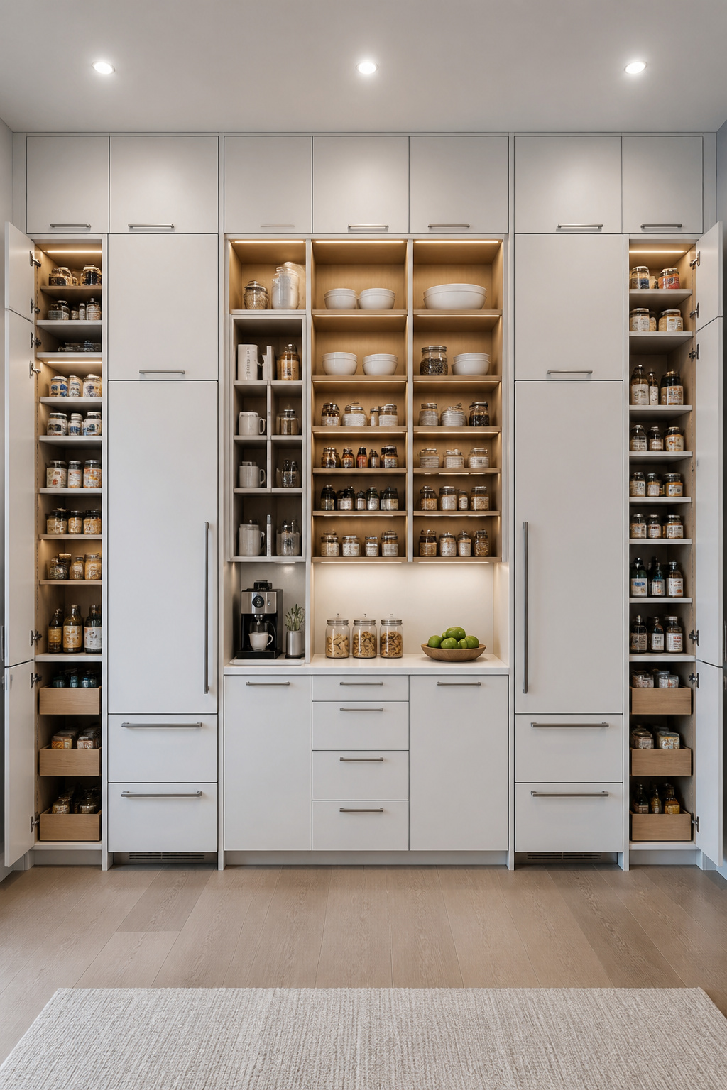
The dimensional specs matter. Standard tall pantry cabinet depth is 24 inches — matching base cabinet depth for a flush, continuous run from floor to ceiling. Heights come in 84, 90, and 96 inches; choose based on ceiling height and whether you want crown molding or a built-out soffit above. Shelf spacing inside: 12 to 16 inches between adjustable shelves for canned goods and dry storage, 18 to 24-inch bays for cereal boxes and small appliances, one 30-inch bay near the base for a stand mixer or air fryer. A pantry cabinet with uniformly spaced 14-inch shelves is surprisingly inflexible — diagram the shelf plan before ordering.
The refrigerator integration is what distinguishes a pantry wall from a pantry cabinet. Built-in refrigerator columns — typically 24 or 30 inches wide, 84 inches tall — integrate flush with the cabinetry. Side-by-side fridge and freezer columns with pantry towers flanking both sides is the most refined version of this approach. The kitchen storage cabinets that keep this kind of space organized work best when the pantry wall is treated as a single designed unit rather than individual cabinets placed in proximity.
The Door Swing Problem
One detail that consistently causes post-installation frustration: door swing clearance. A 24-inch-deep pantry cabinet door needs 24 inches of unobstructed swing in front of it. In a corridor placement or against a kitchen island, this can create a collision zone that makes sections of the pantry practically inaccessible. Verify clearances on a floor plan before finalizing cabinet placement.
12. Appliance Placement Strategy for a More Efficient Kitchen
Appliance placement is the detail layer where good layouts become genuinely livable and mediocre ones become subtly frustrating. Every major appliance needs a landing zone — a counter surface of specific dimensions immediately adjacent — and omitting those zones creates daily friction that compounds over years of use.
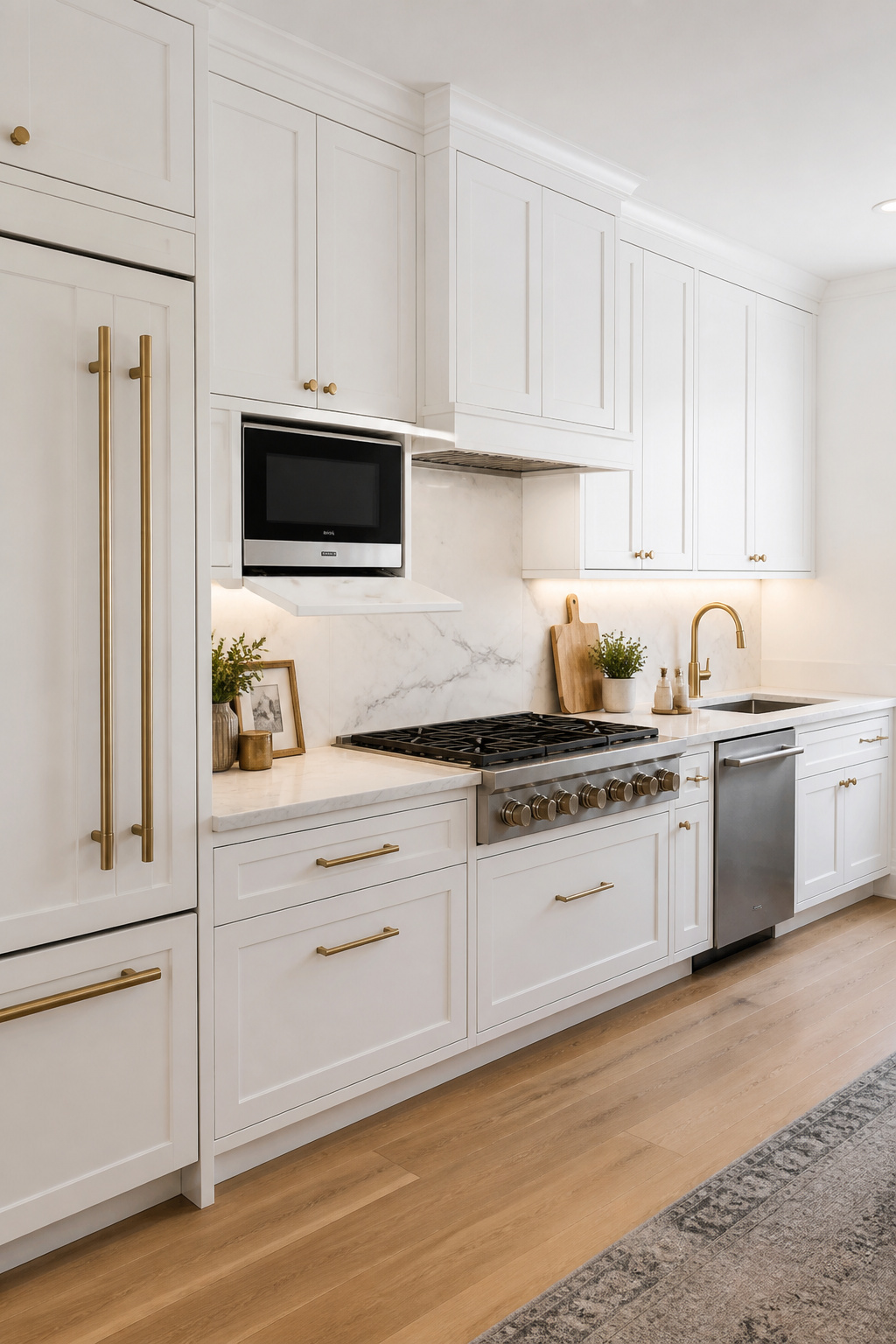
NKBA landing space requirements by appliance: refrigerator needs 15 inches on the handle side; range needs 12 inches minimum on one side and 15 on the other; wall oven needs 15 inches at the same height or on adjacent counter; microwave needs 15 inches beside or below. These aren’t generous suggestions — they’re the minimum dimensions required to set a hot pan down, to pull items from the fridge without holding them suspended, to plate food from the oven safely. A refrigerator with zero landing space on the handle side forces people to juggle items every single time they open it. That’s the kind of design failure that never shows up in a kitchen photo but defines the actual experience of living in a home.
Gas Lines and Ventilation Commitments
Range and ventilation placement involve structural commitments that are expensive to reverse. Gas lines and 240V circuits are not easily relocated — a gas line extension runs $800 to $2,500; a new 240V circuit adds $500 to $1,500. Decide the range position before framing begins. Ventilation should route to exterior air via the shortest, most direct path: every 90-degree elbow reduces capacity by the equivalent of 10 linear feet of duct. For kitchen remodel ideas that tackle functional planning, appliance placement with proper landing zones is consistently the difference between a kitchen that works and one designed for photographs.
The dishwasher position is the single most common placement mistake I encounter: positioned too far from the sink. NKBA specifies the dishwasher’s nearest edge within 36 inches of the sink — beyond this, pre-rinsing requires carrying dripping dishes across the kitchen. Hinge direction matters too: a right-hinged dishwasher placed immediately left of a right-mounted sink opens directly into the sink’s working area, blocking both simultaneously. Specify hinge direction when ordering.
13. Traffic Flow Planning in Open-Plan Kitchen Spaces
Open-plan kitchens solve one problem — isolation — and create another: traffic flow. When the kitchen shares space with dining and living areas, the paths people take often cut through the cook’s active zone. This isn’t abstract; it’s a safety issue during high-temperature cooking and a daily annoyance during any family meal.
The distinction between work aisles and walkways is the key spatial concept. Work aisles are the zones between the cook’s active surfaces — counter to counter, counter to island — where prep, cooking, and cleanup happen. Walkways are the general circulation routes between rooms. These should not overlap. A kitchen designed so the path from the hallway to the back door runs through the area between the range and prep counter will generate near-collisions every week.
Primary walkways — paths used multiple times daily — should be 42 inches wide: enough for two adults to pass without turning sideways. Secondary paths used occasionally can be 36 inches.
The Refrigerator Position Fix
The perimeter layout decision most directly affecting traffic is the refrigerator position. A refrigerator at the interior of the kitchen forces every family member accessing drinks to enter the active cook zone. Moving it to the kitchen’s perimeter edge — accessible without entering the work triangle — eliminates the most common traffic conflict in family kitchens without changing anything else about the layout.
An island parallel to the main traffic flow naturally separates the circulation path from the cooking zone: guests approach the seating overhang on the living-room side without entering the cook’s perimeter space. In L-shaped kitchens with an island at the open end, clearance on all four sides allows traffic to circulate around it without entering either arm of the L.
14. Modern Kitchen Floor Plan With a Dedicated Beverage Station
The beverage station is the most underrated dedicated zone in contemporary kitchen design. The concept: move the coffee maker, electric kettle, juice glasses, and a small refrigerator to a counter section that operates completely independently of the main kitchen — its own counter, its own power, accessible without entering the cook’s work zone.
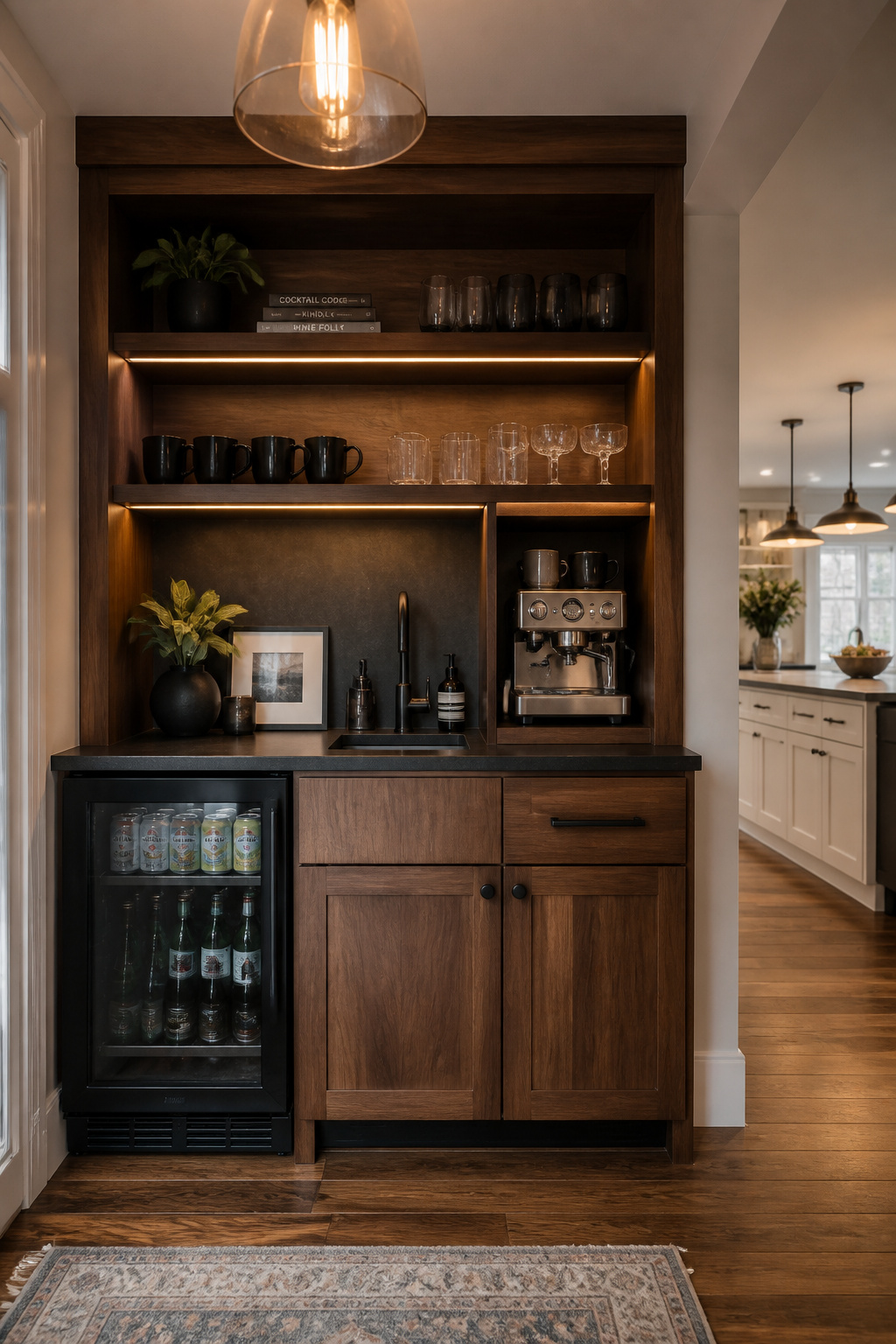
The payoff is most visible at the household’s most congested moment: the 7 to 9 AM window when coffee is being made, lunches are assembled, and breakfast dishes go into the dishwasher simultaneously. A beverage station outside the main prep zone lets one person handle coffee while another manages cooking — without either blocking the other. In households with three or more people on different morning schedules, the impact is real.
Electrical and Equipment Specs
Positioning logic: near the refrigerator (for drink access) but outside the main cooking zone — ideally at the kitchen’s entry end or on a short wing wall. A 15A circuit handles a drip coffee maker; espresso machines with dual boilers often need a dedicated 20A circuit per manufacturer specs. Plan this during rough-in.
Undercounter beverage refrigerators come in 15-inch, 18-inch, and 24-inch widths, standardized to 34 inches tall to align with counter height. The critical spec: front-venting models only for built-in applications where sides and rear are enclosed. Rear or side-venting units pushed flush against cabinet walls will overheat and fail. Open shelving above the station at 18 inches above counter height handles mugs and accessories. An espresso nook (24 inches wide, 18 inches tall, 14 inches deep, recessed into cabinetry) keeps the machine at counter level and plugged in permanently — a small detail that makes a premium kitchen feel genuinely thought through.
15. The Breakfast Bar Divide Between Kitchen and Living Space
A breakfast bar is the most space-efficient way to create a defined zone between kitchen and living or dining areas. No wall, no permanent separation — just a countertop extension with seating on the non-kitchen side that establishes where the kitchen ends.
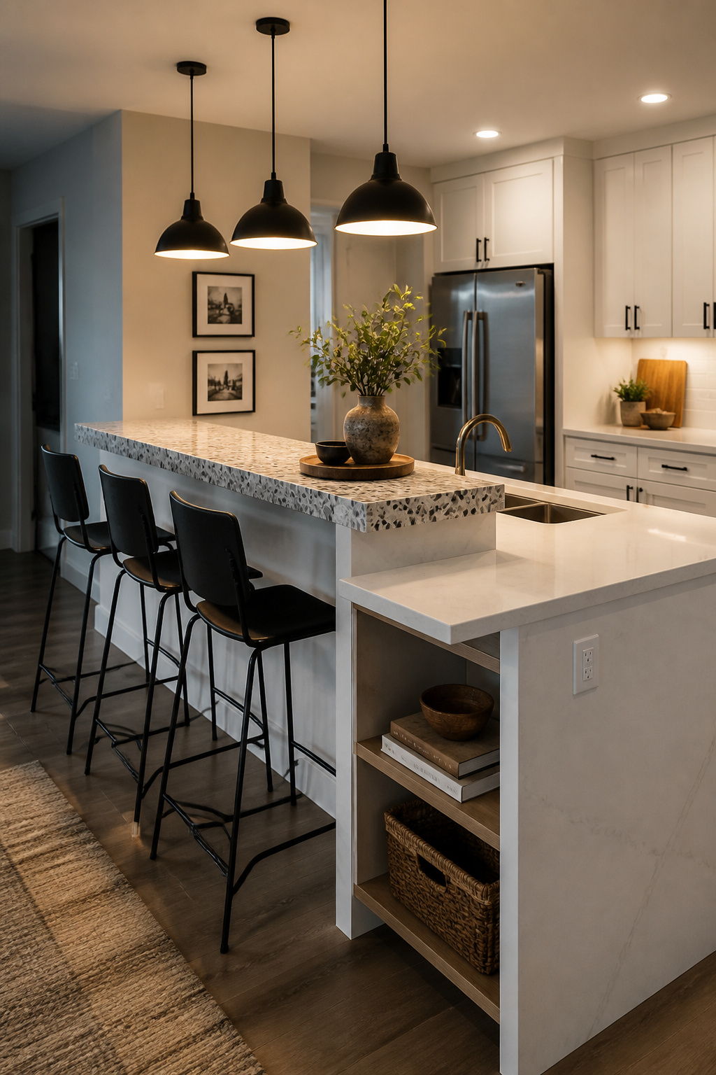
The height decision is the most consequential: 36-inch counter height or 42-inch bar height. At 36 inches, the breakfast bar reads as a continuation of the kitchen counter, feels more accessible, and pairs with 24 to 26-inch counter stools — the most comfortable height for extended sitting. At 42 inches, the bar creates more visual separation between the working surface and the social side, hides prep mess from seated guests, and pairs with 28 to 30-inch bar stools. The seat-to-underside gap — often overlooked — must be at least 10 inches, ideally 12 inches, for comfortable legroom regardless of height.
Overhang Depth and Seat Spacing
Overhang depth is where breakfast bars most commonly fail. The minimum for usable knee clearance at 36-inch counter height is 15 inches; at 42-inch bar height, 12 inches is workable because bar stools hold legs more vertically. A breakfast bar built with only 6 to 8 inches of overhang — done to “save counter depth” — leaves no knee space. The stools end up pushed back, people lean forward, and within a few months the breakfast bar is storing mail instead of people.
Seat spacing: 22 to 24 inches minimum between stool centerlines — 24 inches preferred to prevent elbow contact at a crowded bar. To size the bar: multiply intended seat count by 24 inches. Three stools need 72 inches minimum. Build in structural support for the overhang at the planning stage, not after the counter is installed.
16. Adapting a Traditional Floor Plan to Contemporary Kitchen Design
Most pre-1990s homes have enclosed kitchens. A wall — sometimes load-bearing, sometimes a simple partition — separates the kitchen from dining and living areas. Getting to a contemporary open kitchen layout requires a structural conversation that renovation budgets almost universally underestimate.
Non-load-bearing wall removal is the simpler case: $1,000 to $3,000 covering drywall repair, electrical rerouting, and paint. Load-bearing wall removal is a different category entirely: $10,000 to $20,000 for a typical single-story home, $25,000 to $35,000 for two-story homes where the wall supports floor joists above. The hidden costs — rerouting electrical ($1,000 to $3,000), relocating HVAC ducts ($1,500 to $5,000), plumbing rerouting if the wall contains water lines, and flooring patching — regularly add 30 to 50 percent to the initial quote. For modern kitchen designs that honestly assess this transformation, the structural conversation has to come before anything else.
The structural engineer assessment ($300 to $700) is non-negotiable before any wall comes down. Signs a wall is load-bearing: it runs perpendicular to floor joists (check from the basement or attic), sits directly above a foundation wall or beam, has a wall directly above it on the next floor, or sits at the house’s center. A partial wall removal — taking the top half while leaving a knee wall — sometimes threads the needle between structural requirements and openness goals.
What Changes When Walls Come Down
The transition from closed to open surprises many homeowners. The enclosed kitchen contained cooking odors, muffled noise, and hid the visual mess of active cooking. An open contemporary kitchen layout requires a powerful range hood — at least 600 CFM for serious cooking — that was unnecessary before. Islands and peninsulas take on the wall’s zone-defining function: without them, the kitchen, dining, and living areas blur into something less functional than the original closed layout. And the lighting needs a complete redesign: the old kitchen fixtures only served the kitchen; the new open plan requires a coordinated scheme across kitchen, dining, and living zones.
Choosing the Right Modern Kitchen Layout for Your Home
The layout decision comes down to three things: how you actually cook, who you cook with, and what the room’s dimensions will physically support.
Match the layout to your real cooking habits. Solo cooks in compact spaces get the most from a galley or one-wall configuration — efficiency is the priority, not social flow. Multi-cook households or frequent entertainers need the separation of an L-shape with island, a U-shape, or a peninsula — the cook’s zone and the social zone should not be the same space. Large renovations with significant square footage can justify a double island, a U-shape with pantry wall, or a full open-concept island layout — provided the structural and budget math supports it.
Dimensional constraints are real before any aesthetic preferences enter the conversation. Confirm ceiling height for tall pantry cabinetry. Measure available width for work aisles before committing to a U-shape or island. Identify load-bearing walls before an open-concept modern kitchen layout goes further than a sketch. These are binary — the room either has the space or it doesn’t.
For layouts with no structural changes and standard appliance placement, planning software — IKEA Home Planner, RoomSketcher, SketchUp — is a reasonable starting point. For anything involving wall removal, new island footprints, or budgets above $30,000, an NKBA-certified kitchen designer ($150 to $500 per hour) is worth engaging early. Their familiarity with all 66 NKBA planning guidelines — covering clearances, lighting minimums, storage requirements, and accessibility — catches the errors that cost twice as much to fix after construction than before it.
The layout is the only decision you make about your kitchen that you cannot affordably change your mind about. Pick the right modern kitchen floor plan first, and everything else becomes easier.