Here is the counterintuitive truth about minimalistic kitchen design: it takes more decisions, not fewer. Every element has to earn its place. There is no pattern to hide behind, no collection of objects to balance out an awkward corner, no decorative hardware to give a cabinet face something to say. What remains has to be right, because it is all there is.
After years of designing storage systems for kitchens that never seem to stay tidy, I have come to see minimalism not as an aesthetic preference but as a systems problem. The kitchens that look effortlessly clean are the ones where every object has a designated home inside a cabinet before the first item goes on a counter. The visual calm follows from the organizational structure. Get the structure wrong and no amount of handleless cabinetry will save it.
These 15 ideas cover the full range of a minimalistic kitchen design — from how your cabinets open to what goes on the floor — with specific details you can actually use. No vague advice about “editing ruthlessly.” Real specs, real trade-offs, and the mistakes worth avoiding before you commit.
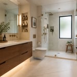
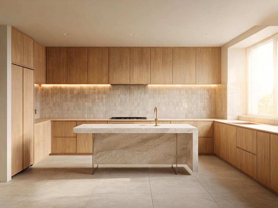
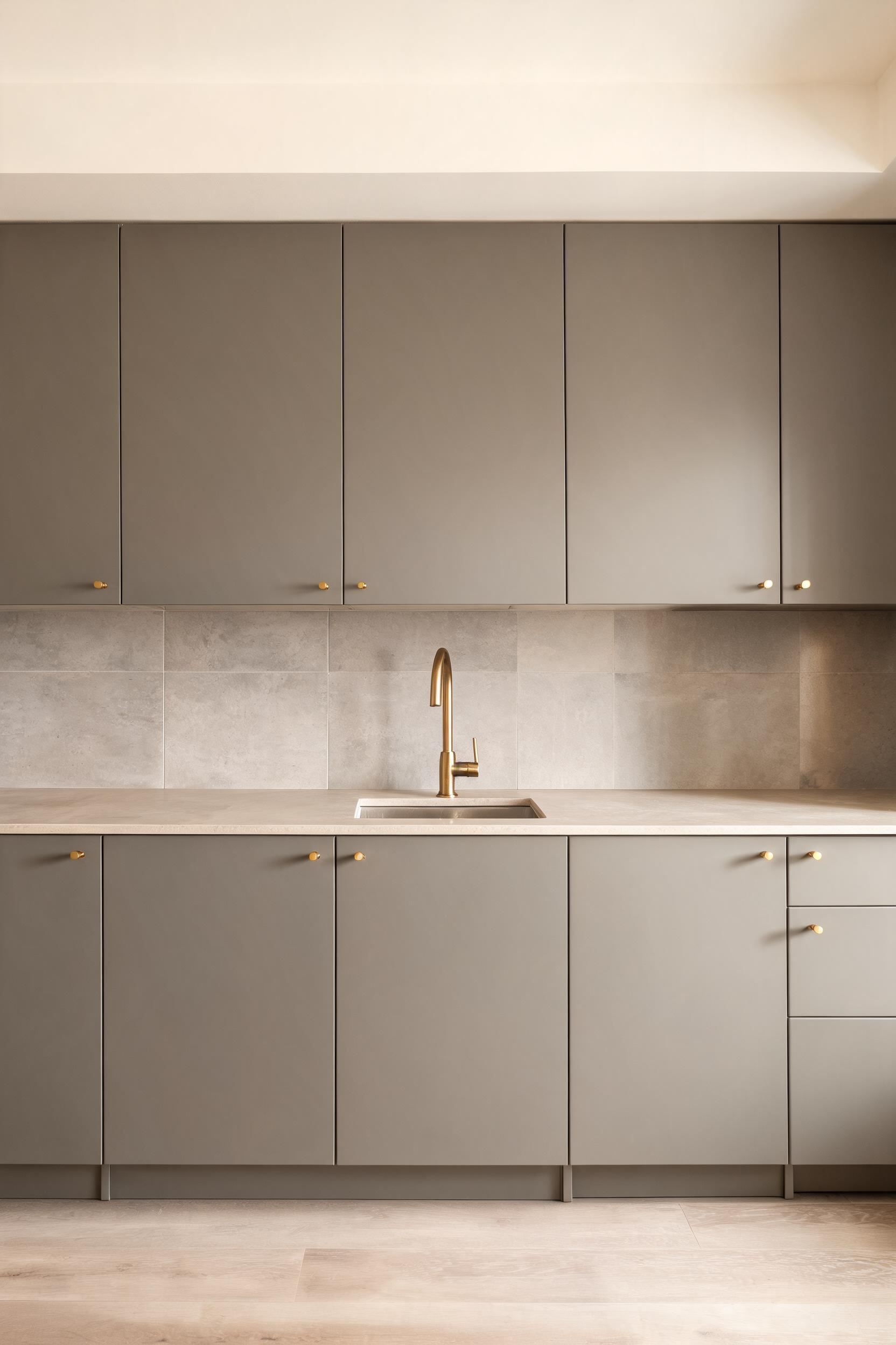
1. Handle-Free Flat-Front Cabinets for a Sleek Surface
The single biggest visual change you can make to a kitchen is removing the hardware. Not replacing it with something more minimal — removing it entirely. When every cabinet opens with a push or a finger run along a recessed channel, the face of the kitchen becomes a continuous plane rather than a collection of individual boxes with handles pointing in every direction.
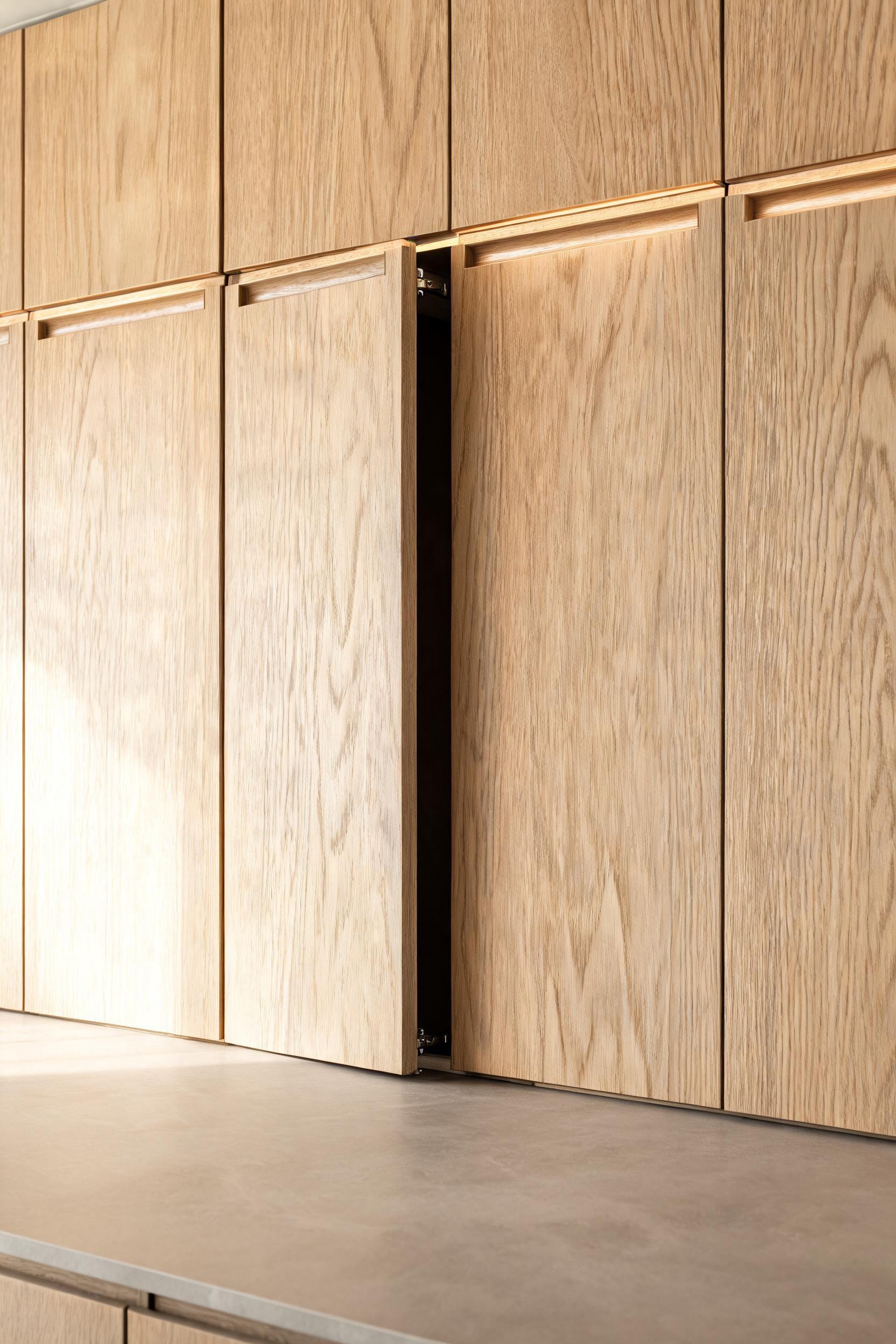
Push-to-open systems use a touch-latch mechanism — Blum’s TIP-ON is the industry standard — that releases with a light press and lets the door glide open on its own weight. The alternative is an integrated groove channel routed into the top or underside of the door, typically 18-25mm deep and wide enough for four fingers. Both systems require soft-close hinges to prevent the rebound that would otherwise send a push-to-open door clicking back at you.
The door style that works best here is a true slab: a completely smooth face with zero framing. For those who have worked with cabinet installers, the alignment tolerance warning is worth taking seriously. With no handle to draw the eye away from uneven gaps, every door reveal needs to be 2-3mm and consistent. A shadow-line flat-panel door — a very thin border (10-15mm) around a flush center — gives installers slightly more margin while staying visually quiet.
For the finish, skip high-gloss acrylic. It shows every fingerprint and reads as commercial rather than architectural. Textured wood veneers — oak, walnut, ash — are the dominant choice in 2025 because they are beautiful and forgiving. For any minimalistic kitchen design that relies on the cabinet face as its primary visual element, that surface needs to be one you can live with under real daily conditions. If you want to understand how different kitchen cabinet door styles compare before committing, that research is worth doing before the cabinet order goes in.
2. Integrated Appliances That Anchor a Minimalist Kitchen Design
A kitchen where the refrigerator, dishwasher, and cabinets read as one continuous surface is not achieved by accident. Panel-ready appliances accept a custom cabinet-matched panel attached to the door front — when closed, the appliance is visually indistinguishable from surrounding cabinetry.
The most impactful applications are the refrigerator and dishwasher. These are the two largest visible surfaces in most kitchens, and both are typically covered in stainless steel that bounces light and breaks the cabinet run. Paneling both in one move transforms the kitchen from a modern kitchen with stainless appliances to a kitchen where the storage system is the dominant visual element. That is what a minimalistic kitchen design actually requires.
The cost reality is not minor: panel-ready appliances run 2-3x more than their standard counterparts. Installation runs $400-$2,500 versus $123-$299 for a standard unit. For the dishwasher alone, a panel-ready Bosch 500 Series costs $900-$1,200, plus $200-$400 for the custom panel. The budget compromise worth making: panel the dishwasher and refrigerator and leave the oven as a built-in but unpaneled. Eliminating two large stainless faces does the heavy lifting.
Built-in wall ovens and induction cooktops are the other side of the equation. An induction cooktop set flush into the countertop disappears completely when not in use — a glass surface indistinguishable from the counter at a glance. Combined with a built-in wall oven at eye level, the cooking zone stops competing with the cabinetry for attention. Freestanding ranges, even expensive ones, always create a visible break in the cabinet run. In a strict minimalistic kitchen design, that break is a compromise worth thinking through before you finalize the layout.
3. A Monochromatic Color Palette That Unifies the Space
Greige has replaced white as the default for minimalist kitchen ideas in 2025 — and the reason is not fashion. Pure white reads cold under artificial light and yellows with age. Greige (grey and beige in roughly equal proportions) offers grey’s sophistication without the chill, reads warmer under LED light at 2700-3000K, and photographs more naturally. It is also the most compatible base for warm wood accents and brushed brass metalwork, which are the two most common elements added to soften a clean kitchen aesthetic.
The discipline of a monochromatic palette is not about using one color. It is about using one color in multiple finishes. Matte cabinet fronts, honed stone countertops, and a brushed-concrete-look backsplash tile can all sit in the same greige family while reading as three distinct surfaces with completely different textures. The eye reads depth and layering from the finish variation; the palette holds everything together.
Three tonal values is the maximum: a light (walls and upper cabinets), a mid (lower cabinets or island), and a dark anchor (countertop or flooring). Beyond three values the scheme starts reading as busy rather than considered. And for accent color in a monochromatic minimal kitchen, one is enough: the metal finish on the faucet and drain. Brushed brass against warm greige is the leading pairing in 2025 — it reads as warm and organic against that tone rather than as decoration. For a minimalistic kitchen design, the restraint is the point.
One practical note: never choose a paint color under fluorescent showroom lighting. Take physical samples home, tape them to the wall, and observe them at different times of day. The same greige that looks perfect under a paint store’s lighting can read green or purple under your kitchen’s LED downlights.
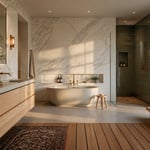
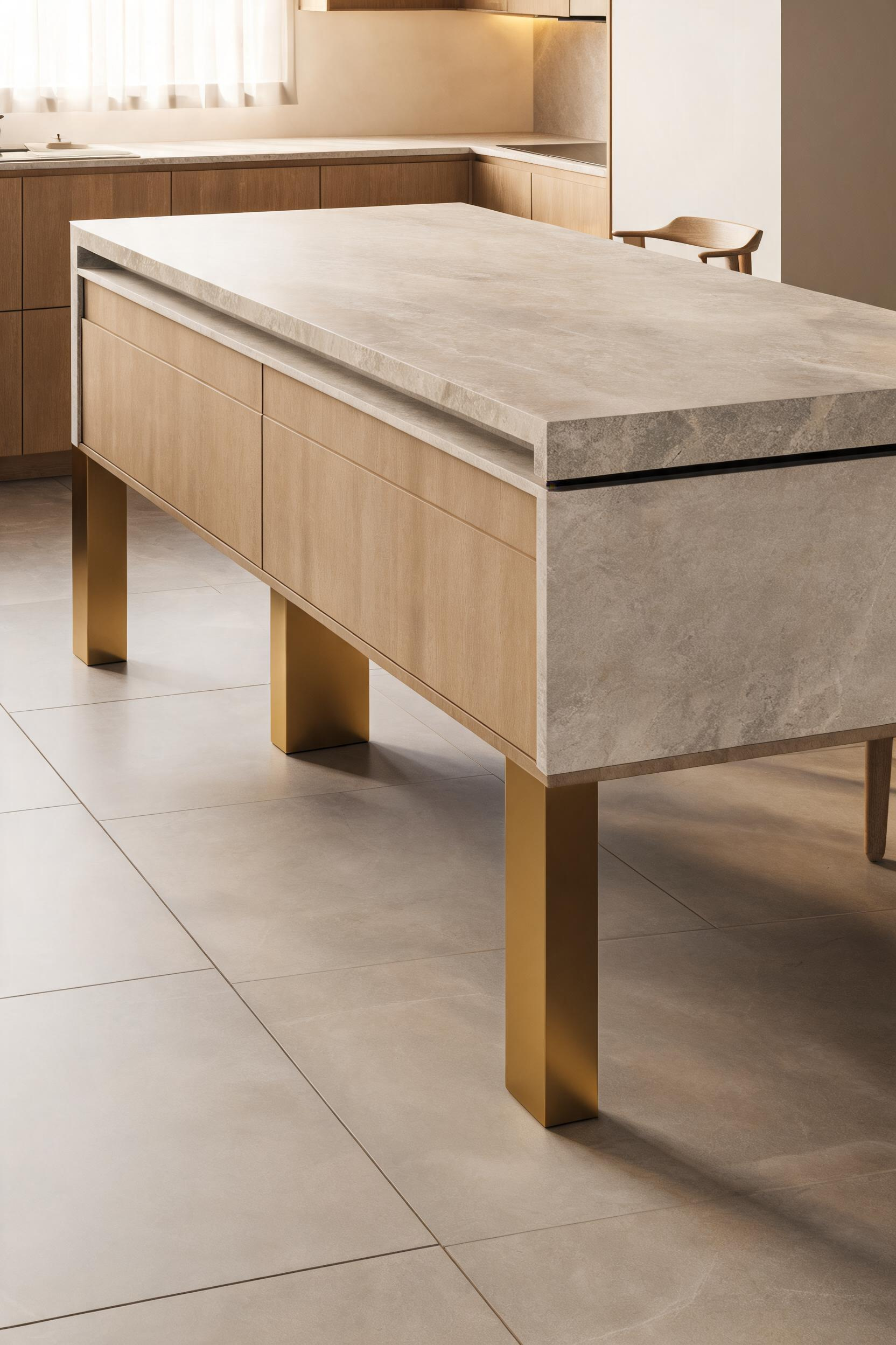
4. Waterfall Countertops for Uninterrupted Visual Flow
A waterfall countertop drops the countertop material continuously down the side of the island, from the horizontal surface to the floor, without interruption. It replaces what would otherwise be a painted or wood cabinet end panel with exposed stone. The result is that the island reads as a single sculptural object — a slab emerging from the floor — rather than a counter balanced on a box.
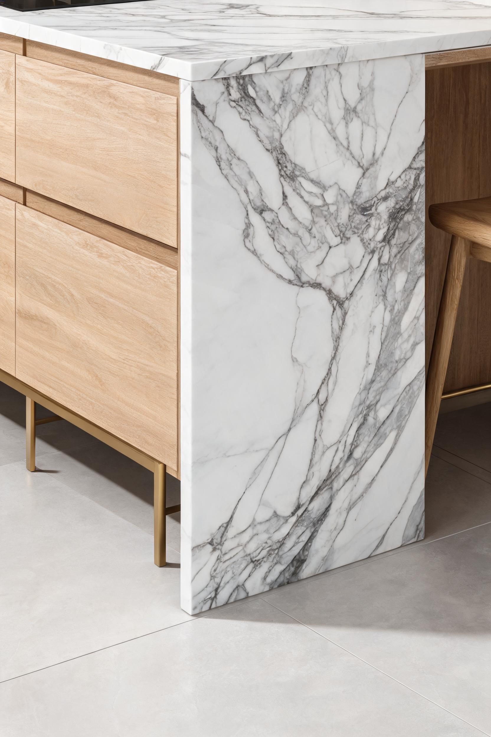
The material choice matters more here than almost anywhere else in the kitchen. For quartz, brands like Caesarstone and Cambria produce slabs large enough (up to 130×63 inches) to run a waterfall on most island sizes without a seam on the vertical panel. That seamless vertical face is what makes the effect work — a seam midway down the waterfall breaks the very visual continuity it is meant to create.
Quartzite is the premium natural stone option at $65-$220 per square foot installed, and each slab is genuinely unique, which makes vein-matching a challenge at fabrication. For vein-matched waterfalls — where the stone pattern flows continuously from horizontal to vertical — the fabricator uses a CNC mitered cut at exactly 45 degrees. This adds $20-$100 per linear foot and requires a specialist. Dekton and Neolith (ultra-compact sintered surfaces) are available in very large slab formats and are practically bulletproof against scratching and heat; at 12mm they also have a slimmer profile that reads more refined.
What the Material Choice Means for Your Budget
Each waterfall side adds $1,500-$2,500 to fabrication; a two-sided waterfall on a quartzite island adds $3,000-$5,000 before installation labor. For anyone researching the full range of kitchen countertop ideas before making this call, the waterfall earns its cost in kitchens where the island is the room’s centerpiece — and costs more than it delivers when the island is secondary to a long run of perimeter cabinetry.
5. Concealed Storage That Keeps the Minimalistic Kitchen Clutter-Free
The storage audit comes before the cabinet layout. Not after. The sequence matters: list every item that currently lives on your countertops, then design a specific location for each one before the layout is finalized. A kitchen designed around what it needs to hide will hide things effectively. A kitchen designed around what looks good will never stay tidy.
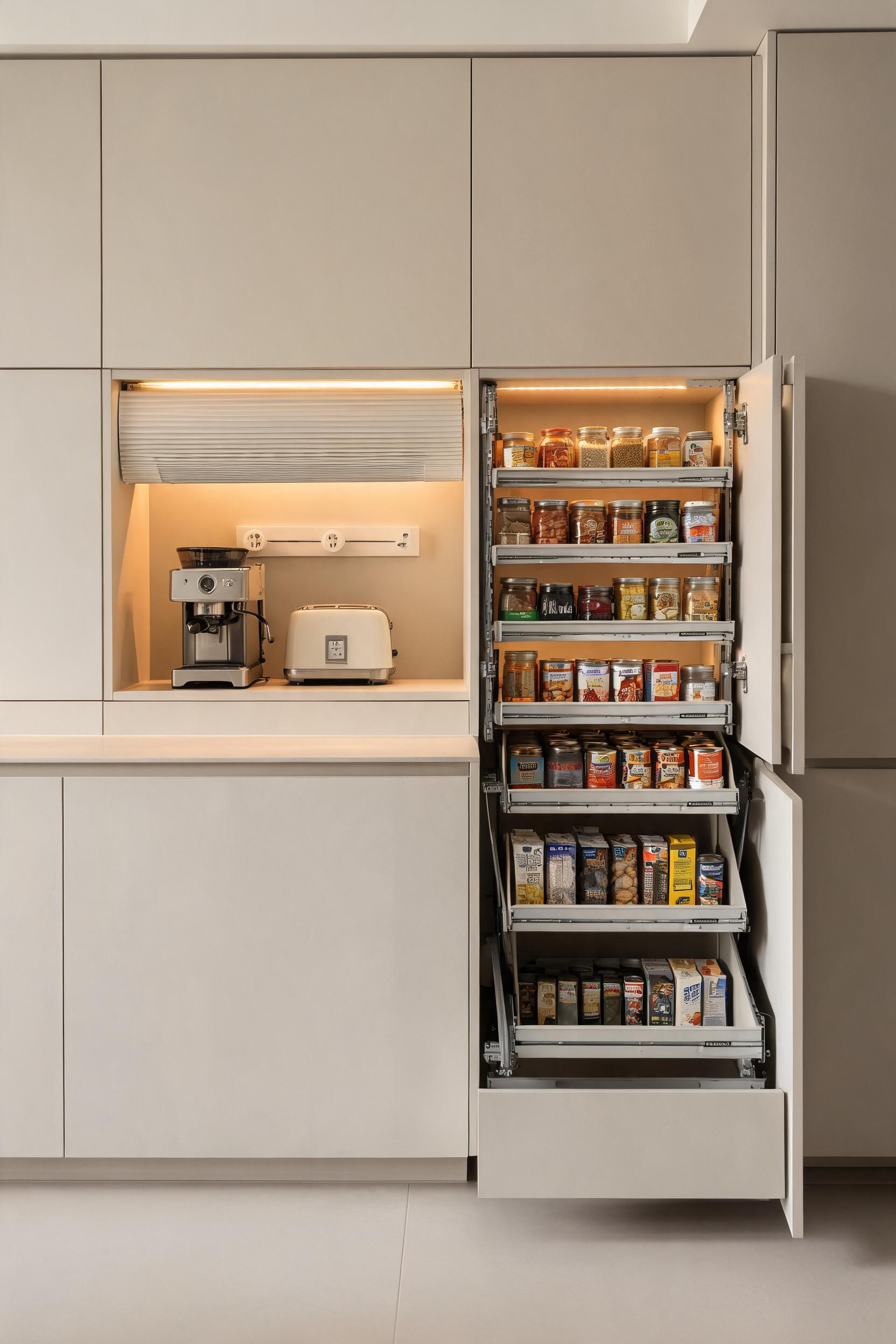
The framework is straightforward. Every countertop appliance needs three things: a home inside a cabinet, power at that location, and enough clearance to use the appliance without moving it. Appliance garages — upper cabinet sections with a tambour roll-up or pocket door in front — solve all three. The interior needs a dedicated outlet and under-cabinet lighting; the pocket door style is preferable because it does not require vertical clearance above the opening, which matters in kitchens with low upper cabinets.
Deep drawer pull-outs are more useful than upper cabinets for almost everything. Three 24-inch deep drawers stacked in a base cabinet hold more accessible, visible storage than the equivalent upper cabinet volume. You can see and reach every item without bending or stretching. For pots, pans, and baking sheets, a full-extension pull-out with a peg system (Blum’s ORGA-LINE insert keeps items vertical and separable without stacking) is the right solution. The shift in 2025 kitchens is clearly toward drawer-heavy lower cabinets and blank walls above the counter — and that blank wall above is precisely what makes the kitchen read as minimalistic.
For kitchen storage ideas that go beyond the appliance garage, the most effective hidden storage move is a floor-to-ceiling pantry cabinet run along one wall, with every interior shelf on full-extension runners. Nothing buried, nothing stacked, nothing requiring a second look to find.
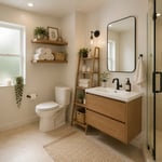
6. Open Shelving as Intentional Display — Not Storage
Open shelves work in a minimalistic kitchen when they hold less than you think they should. The discipline is the odd-number rule and the 40-50% empty principle — group items in threes or fives, never twos or fours, and keep at least half the shelf surface clear. In a kitchen where every other surface is already bare, a shelf with six objects reads as cluttered. A shelf with three does not.
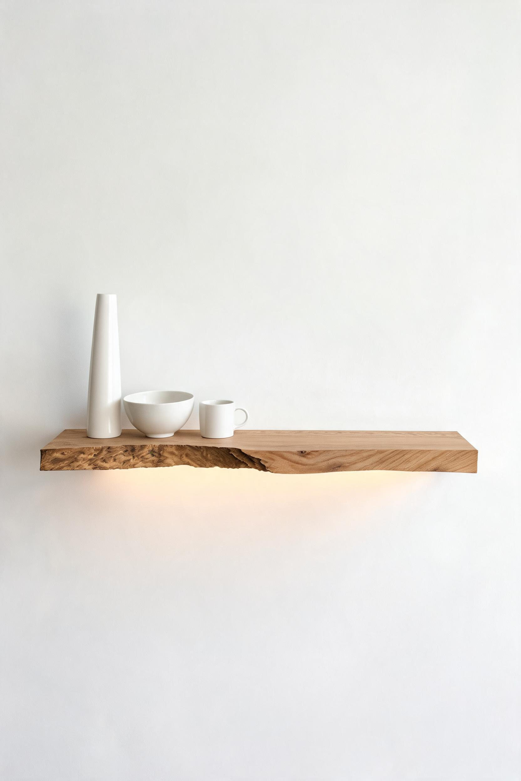
The palette on an open shelf needs to be as tight as the color palette of the kitchen: two materials maximum. White ceramics and warm wood cutting boards. Plain glass bottles and a single plant. Anything more complex than that and the shelf stops being a curated moment and starts looking like a display case. The difference is visible from across the room.
Weight capacity is worth knowing before installation: floating shelves hold 50 lbs per stud the bracket connects to. A 3-foot shelf anchored to two studs safely supports 100 lbs — enough for ceramics and cookbooks, not enough for cast iron. For the most architectural result, recessed niche shelves (cut into the wall rather than projecting from it) add zero depth to the room and look as though they were always there.
The Maintenance Commitment
The open shelving vs upper cabinets decision is really a question about curation commitment. Everything that lands on an open shelf is visible. A monthly editing session is not optional — it is the price of open shelving in a minimalist kitchen ideas context. If that is not a commitment you can keep, closed cabinetry is the better minimal choice. A tidy closed kitchen is more minimalistic than open shelves that become a clutter surface within a fortnight.
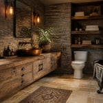
7. A Statement Material That Defines the Minimalistic Kitchen Design
When there is no pattern, no decoration, and no hardware, one bold material carries all the visual interest the room needs. Fluted oak, honed marble, raw concrete — any of these applied to a single surface does more than most decorated kitchens achieve with five competing elements.
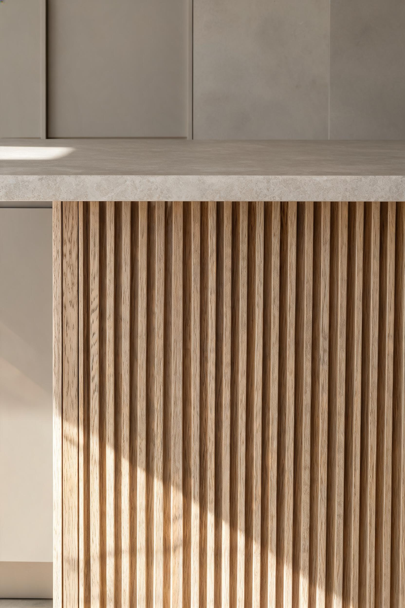
Fluted (reeded) cabinet fronts are the dominant texture trend in 2025. The vertical channels cast shadows that shift as the light moves through the day, creating a surface that is never quite the same hour to hour. The discipline is to use fluted fronts only on one cabinet section — typically the island — and keep everything else smooth. Two textured surfaces in the same kitchen compete rather than complement. White oak and walnut work best for fluted applications because the grain direction reinforces the channel rhythm; ash is lighter, slightly more affordable, and just as effective.
If you are curious how this material-first thinking plays out in kitchens with a very different aesthetic, the principles behind historic kitchen design decor apply the same logic: one dominant material does the expressive work, and restraint elsewhere lets it speak. The approach is the same; only the material choices differ.
Honed marble reads completely differently from polished marble. The flat, non-reflective surface is softer and more architectural; it is also more forgiving in daily use because it does not amplify every scratch. Honed marble on a countertop with visible veining provides movement without shine — the combination of a matte surface and natural pattern means the material works as both texture and artwork, which is exactly the role a minimalistic kitchen design needs it to play.
Concrete — either poured, or applied as a micro-cement finish like Ardex Feather Finish or Tadelakt — can go over existing drywall or tile without structural work. Applied to one island face or accent wall, it provides an industrial backbone that works particularly well against warm wood cabinetry. The temperature contrast between the cool grey concrete and the warm wood is the statement. Everything else in the room stays silent.
8. Matte Surfaces Over Gloss for a Quieter Aesthetic
Gloss surfaces reflect everything around them: light, neighboring objects, movement, fingerprints. In a kitchen with multiple gloss surfaces, the room is technically clean but never visually quiet — there is too much activity in the reflections. Matte finishes absorb light rather than bouncing it, creating a surface that reads as calm regardless of what is happening in the room.
The aesthetic advantage of matte is real and consistent. Paired with the right color — greige, warm white, deep sage — matte cabinet faces are what give a modern minimalist kitchen its signature settled quality. The practical tradeoff is also real and worth stating plainly: matte cabinet surfaces are harder to clean than satin or gloss. The slightly porous texture that makes them look so good also allows grease, dust, and food splatter to stick more readily. Cleaning requires a damp microfiber cloth with mild soap — not abrasive pads, not degreaser spray, not anything that strips the finish.
Around the cooktop and sink, where daily splashing is inevitable, satin is the smarter choice. Satin sits between matte and semi-gloss in sheen level; it wipes clean easily and is far less reflective than semi-gloss, which makes it the best compromise in high-use zones.
The practical zoning rule: matte for upper cabinet doors and wall paint (away from direct water and heat sources), satin for lower cabinet doors adjacent to the cooktop and sink, polished or semi-gloss for countertops and backsplash tile where cleaning frequency demands it. This approach maintains the visual quiet of a matte-dominant minimalistic kitchen design while acknowledging that the surfaces nearest to cooking and cleaning have different maintenance requirements. One terminology note: “eggshell” is not matte. Eggshell has a slight sheen closer to satin; true matte has zero reflectivity.
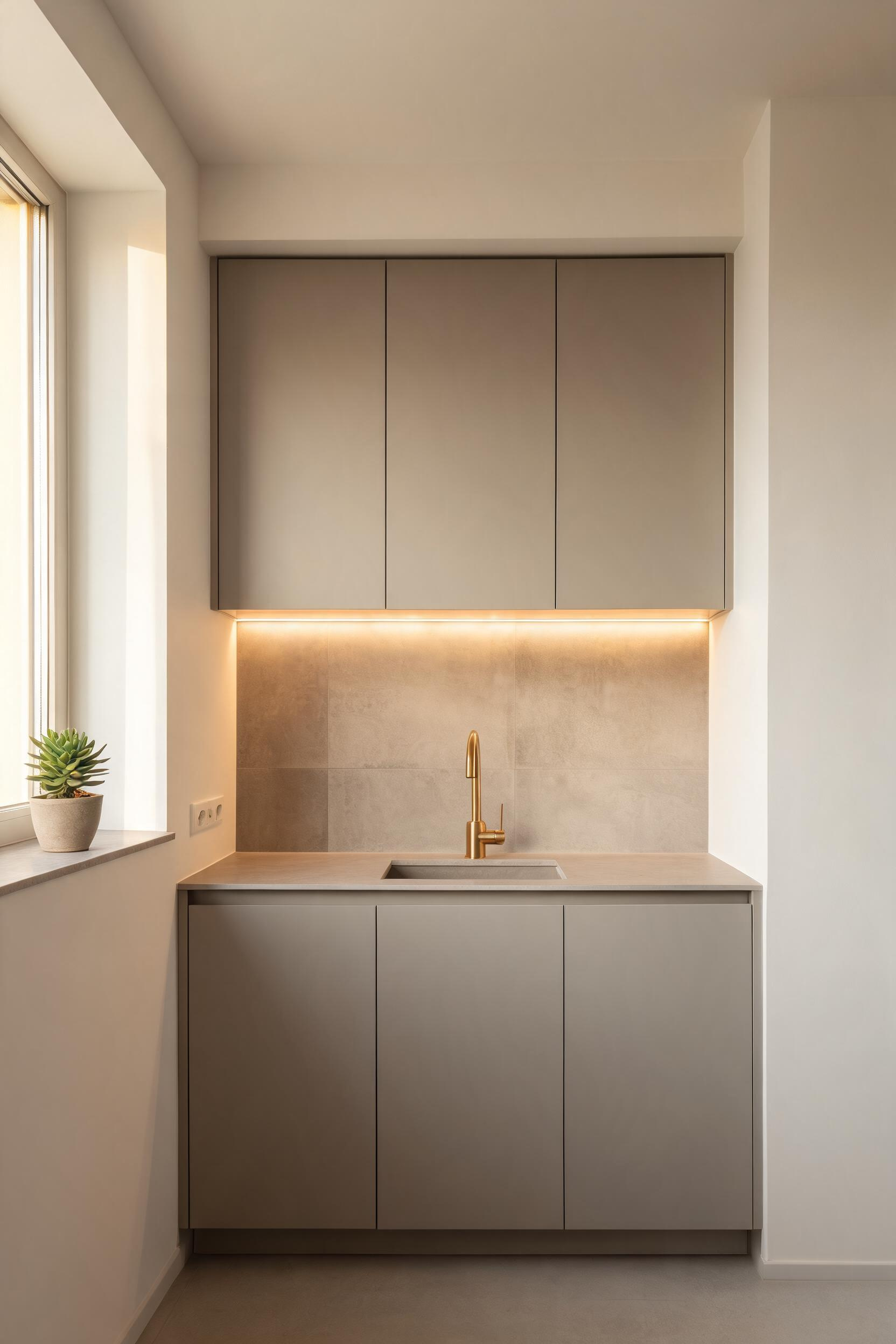
9. Under-Cabinet and Toe-Kick Lighting Instead of Overhead Clutter
The ceiling of a minimalistic kitchen design should have as few fixtures as possible. Every visible fixture is a visual element — and in a kitchen where the discipline is to reduce visual elements to the essential minimum, a ceiling covered in five downlights and a pendant over the island starts to work against the design. The solution is to move the light sources into the architecture: under the cabinets, inside the cabinetry, and into the toe-kick at floor level.
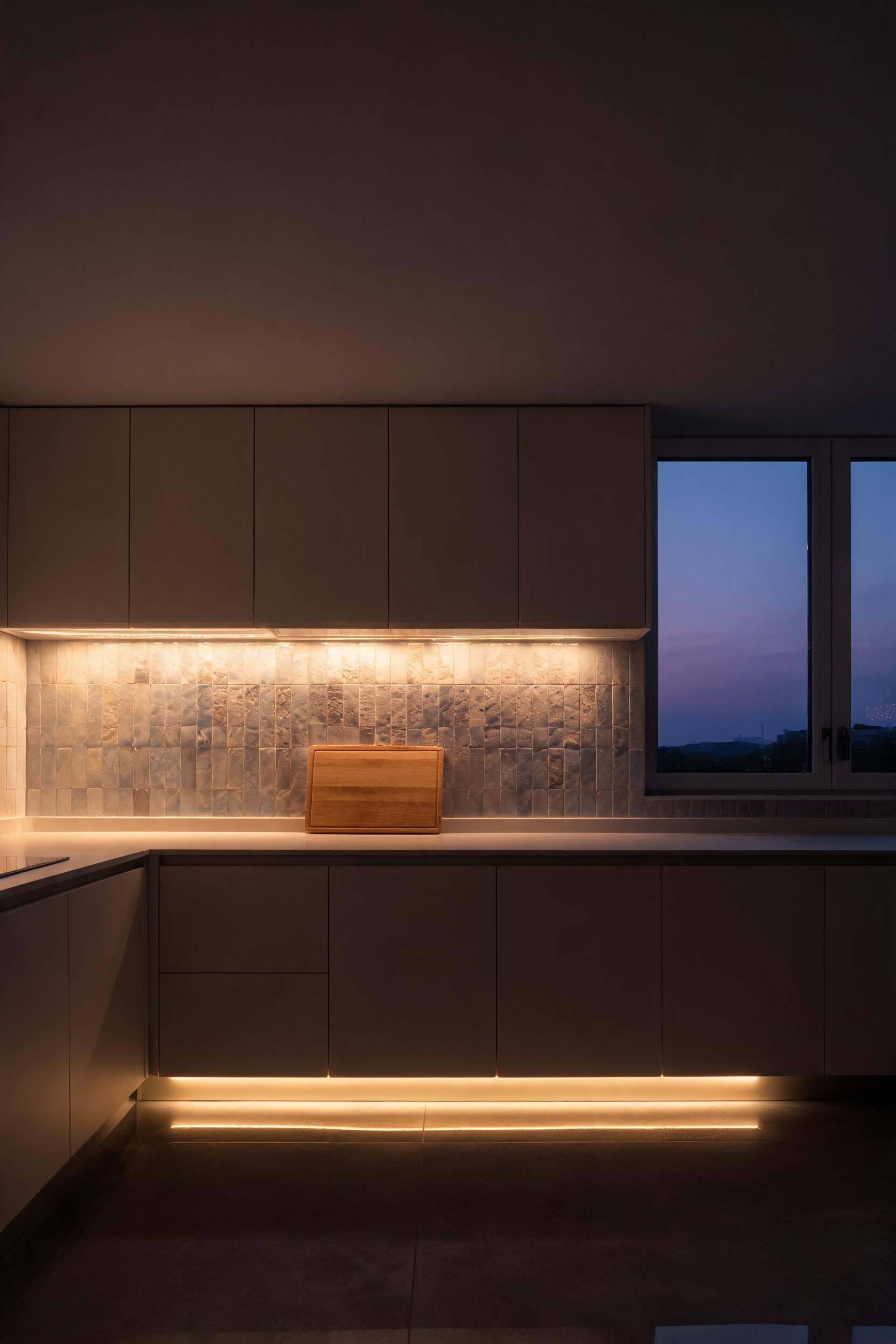
Under-cabinet LED strips, positioned at the front edge of the cabinet base (not the rear — the front position projects light onto the counter; the rear lights the underside of the cabinet instead), deliver more effective task lighting than a ceiling fixture that casts your own shadow directly onto the work surface. The spec that matters most is CRI (Color Rendering Index) — aim for CRI 90+ so stone, wood, and food colors read accurately under the light. Cheap strips at CRI 70-80 make greige countertops look greenish and raw vegetables look washed out. Color temperature: 2700K for a warm, residential feel; 3000K for a slightly crisper look that is still warm.
For kitchen lighting fixtures and designs that go beyond the standard pendant-and-downlight arrangement, toe-kick strips deserve serious consideration. Installed at the base of lower cabinets facing the floor, they create a glow that makes the cabinetry appear to float. In a smaller kitchen, this effect is genuinely significant. At 3000K, the tone reads as architectural rather than decorative. An added bonus: a motion-triggered toe-kick strip provides low-level night navigation without waking anyone with full overhead lights.
Dimmer Compatibility — The Spec That Gets Skipped
LED strips require a trailing-edge (electronic) dimmer rather than a leading-edge (resistive) dimmer. Mismatching causes flickering and audible hum at low levels. Check the strip manufacturer’s compatibility list before buying the dimmer — this is a five-minute step that prevents a frustrating and expensive fix after installation.
10. A Single-Basin Undermount Sink With Minimal Hardware
A divided sink introduces a center ridge and a visual divider. In a minimalistic kitchen where every interruption to a clean surface is a deliberate design decision, that divider is rarely worth making. A single large basin — 32-33 inches wide — fits a full sheet pan lying flat, handles large pots without tilting them sideways, and from across the room reads as a clean, continuous opening in the countertop.
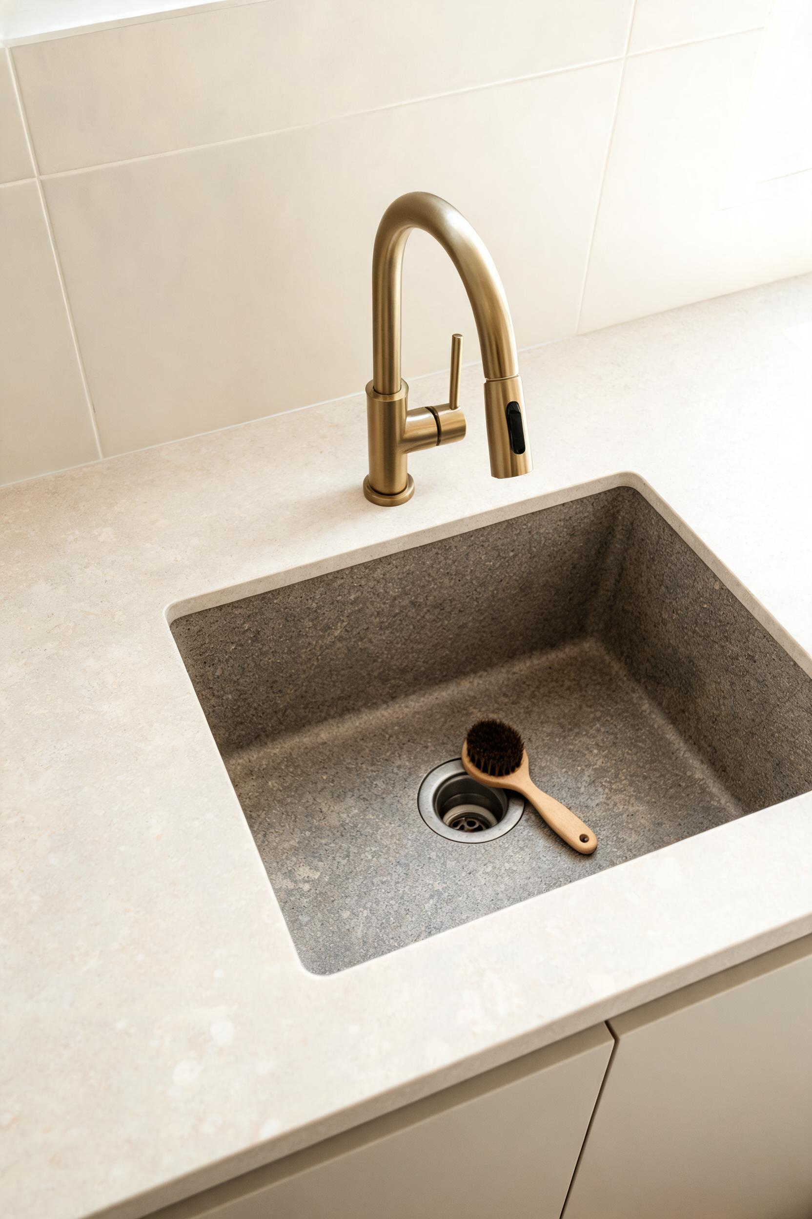
Undermount installation (the sink attached below the countertop rather than dropped in from above) eliminates the rim that collects grime and breaks the counter surface. The counter runs continuously to the sink edge, then drops away. That single detail changes how the counter zone reads — and costs nothing extra if specified at the start.
For material, granite composite is the practical top choice: it resists micro-scratches, handles the weight of heavy cookware, and at 40-50 lbs requires cabinet reinforcement for undermount applications but delivers a surface that looks almost as clean at five years as at installation. Stainless in 16-gauge or heavier is lighter and easier to install, but a brushed finish shows scratches over time. Fireclay is the warmest, most visually distinctive option — the glossy surface suits a simple kitchen design that leans toward warmth rather than pure industrial minimalism — but its weight (60-80 lbs for a large single basin) demands very solid countertop support, and a dropped cast iron pan can chip it.
Choosing the Faucet
Single-hole, deck-mount, with a pull-down spray head. One hole in the countertop, one fixture, no escutcheon plate. The cleanest possible installation. A wall-mounted faucet is the most architecturally pure option — the deck stays completely clear — but it requires the rough-in plumbing in the wall, which needs to be planned at the renovation stage, not added later. Avoid bridge faucets with two handles: the two-hole footprint conflicts directly with the minimalistic kitchen design philosophy.
11. Pull-Out Pantry Systems That Define Minimalist Kitchen Design
The conventional pantry is a series of static shelves that require you to reach into the back to find something pushed there six months ago. A pull-out pantry tower brings the entire cabinet contents forward when opened — every item is visible, every item is reachable, and the back of the cabinet is as useful as the front. In a minimalistic kitchen design, this is not a luxury feature. It is the mechanism that keeps the countertops clear.
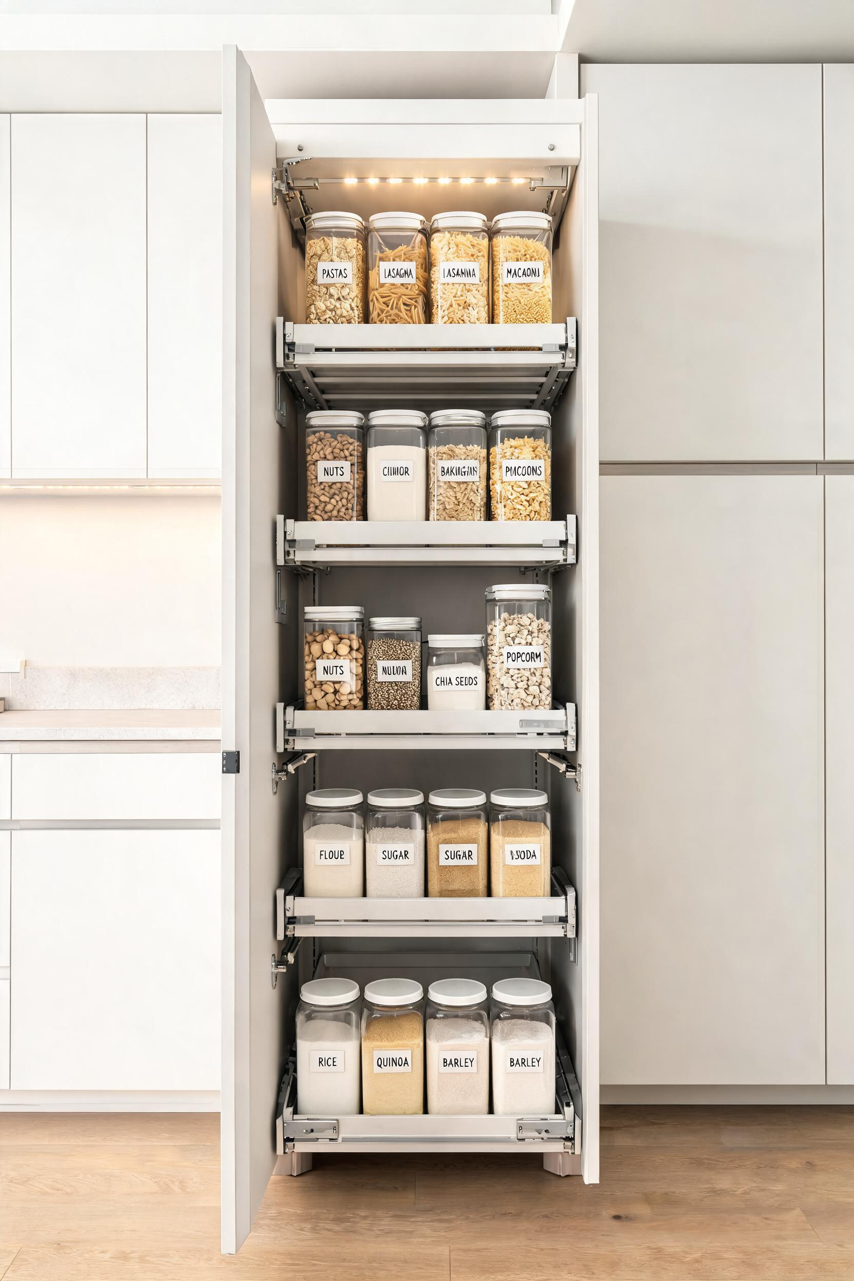
A full-extension pull-out pantry tower in a 12-18 inch wide, 84-96 inch tall cabinet provides accessible storage for an entire family’s pantry goods in a fraction of the footprint of a walk-in pantry. The interior has four or five adjustable shelf levels; the bottom shelf sits 4-6 inches from the floor to allow cleaning. Standard depth is 20-22 inches for bottles and cereal boxes; 24 inches (standard base cabinet depth) handles virtually everything.
Why Hardware Quality Matters More Here Than Anywhere Else
The hardware specification matters more for pull-out pantry towers than for any other cabinet in the kitchen, because the load is highest and the use frequency is daily. Blum LEGRABOX is the benchmark: drawer sides just 12.8mm thick, load capacity up to 70 kg (154 lbs) per drawer, full-extension runners with ball bearings that maintain zero side wobble even under full load, and BLUMOTION soft-close that works silently and consistently after years of heavy use. For handleless operation, TIP-ON activation means a light press releases the pull-out — no handle needed, which keeps the kitchen storage cabinets exterior as clean as the rest of the kitchen face.
Budget drawer systems use thicker metal sides, lower-grade bearings, and simpler soft-close mechanisms. They feel fine when empty. After two or three years of daily use with 50-70 lbs of pantry goods, the difference in feel compared to premium hardware becomes obvious and irreversible without replacing the runners.
12. One Consistent Metal Finish Across Every Touchpoint
In a kitchen with no decorative elements to balance competing finishes, mixed metals register as inconsistency rather than eclecticism. The eye travels from the faucet to the drain to the appliance trim to the oven handle and finds no resolution. In a minimalistic kitchen design, the single metal finish rule is how the room achieves the visual unity that makes it feel considered rather than assembled.

Every metal touchpoint in the kitchen falls under this rule: faucet, sink drain and strainer, pot filler (if fitted), hood vent surround, appliance trim, light fixture in the immediate cooking zone, and any visible hinge or cam mechanism on cabinet doors. This is a longer list than most people realize when they specify only the faucet.
For 2025 minimalistic kitchens in warm-neutral palettes, brushed brass with PVD (Physical Vapor Deposition) coating is the leading choice. PVD is 23x more abrasion-resistant than chrome plating — it will not tarnish, chip, or fade the way unlacquered or lacquered brass does, and the brushed texture masks minor surface marks. Matte black with PVD is the alternative for high-contrast kitchens; early matte black faucets from 5-7 years ago had corrosion issues that PVD has resolved. Satin nickel bridges warm and cool palettes most versatilely and ages gracefully; a quality satin nickel with 15-20 microns of plating over a brass base is the most durable option when longevity matters more than trend.
Practical note: finish names vary between manufacturers. “Brushed gold” from one brand does not look like “brushed gold” from another. Confirm every fixture from the same brand family or request actual samples from each manufacturer and compare side by side under your kitchen’s lighting conditions.
13. Floating Island With Hidden Drawers for a Minimalistic Kitchen Layout
An island that extends its base cabinetry to the floor creates a solid mass in the center of the kitchen. An island on legs allows sightlines and light to pass underneath. The difference in how a room feels — especially a kitchen under 200 square feet — is significant. The floating effect works by letting the floor continue visually under the island, expanding the perceived square footage. Leg styles for a minimalistic kitchen: tapered or square-section legs in the kitchen’s metal finish, or plain round or square column legs painted to match the cabinetry.
Getting the Aisle Clearance Right
The National Kitchen and Bath Association (NKBA) sets the minimum at 42 inches between the island and surrounding countertops for a one-cook kitchen; 48 inches for multiple cooks. The most common design mistake is sizing the island first and discovering the aisles are 36 inches — too late to change the layout without significant cost. Start with the aisle clearance requirement, subtract from the available floor space, and the maximum island dimension is what remains. Most functional islands are 4-7 feet long; for seating at one end, allow 24 inches of counter overhang per person and 12-inch knee clearance depth.
The draw of a floating island in a minimalistic kitchen layout is the chance to integrate drawers that operate without handles. TIP-ON hardware activates a pull-out with a light press — the drawer face can be in the same material as the island cabinetry and sit seamlessly against the waterfall stone edge on the end panel. A typical island drawer configuration: two 6-inch-deep drawers for cutlery and utensils, one 10-inch-deep drawer for cooking gadgets and placemats, with an optional deep file-depth drawer if the island doubles as a work zone.
14. Textured Backsplash as the Single Visual Statement
When every other surface is smooth, monochromatic, and undecorated, the backsplash becomes the kitchen’s one piece of art. It sits at eye level, it is well-lit by under-cabinet strips, and it is contained within a defined field between the countertop and the underside of the upper cabinets. A textured backsplash in this context does not compete with anything. It is the only thing.
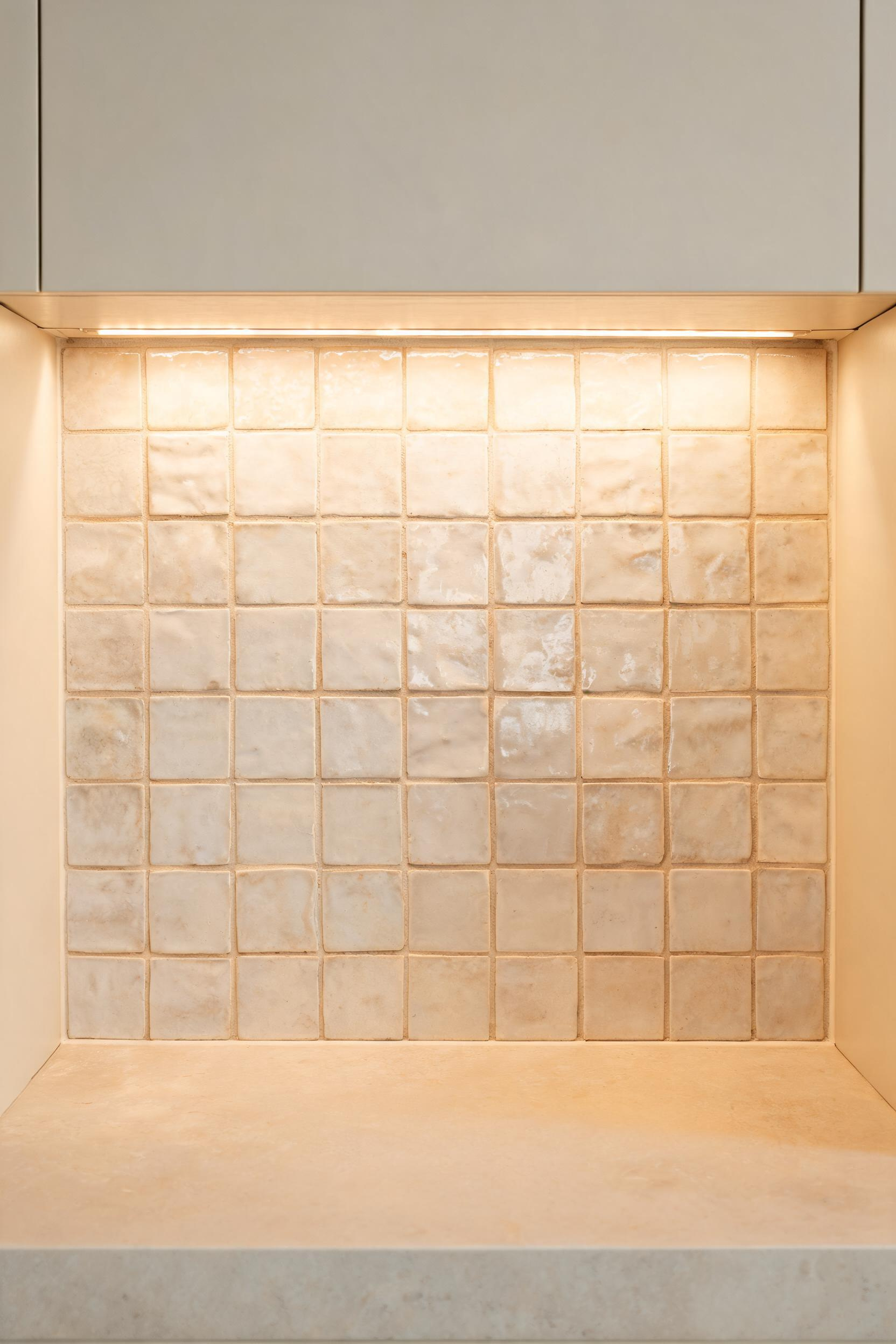
Slab backsplashes are the fastest-growing segment in kitchen design for 2025-2026. A single continuous slab of marble, quartzite, or sintered stone running from countertop to cabinet eliminates every grout line — the cleanest possible expression of the minimalistic kitchen principle on a vertical surface. The grout line is where kitchen backsplashes accumulate most of their visual noise and cleaning difficulty; removing it solves both problems at once.
Zellige tile is the textured alternative: handmade Moroccan clay tile with an irregular, slightly uneven surface and variable glaze. No two tiles are identical, which creates a subtly moving surface under changing light. In a warm-neutral minimal kitchen, white or off-white zellige delivers elegance without sterility. The grout choice is critical: use an unsanded grout in a tone that matches the tile’s mid-range color, not bright white. Contrasting grout doubles the visual pattern and makes the tile read as busy rather than textured. White grout on white zellige yellows within 2-3 years and becomes the dominant visual element.
For kitchen backsplash tiles beyond the standard subway option, fluted ceramic in large format (up to 12×24 inches) is a strong third choice: the raised channels create shadow lines that reinforce the vertical rhythm of a handleless kitchen at a lower price point than zellige or stone.
15. Continuous Flooring That Completes the Minimalistic Kitchen Design
A flooring change at the kitchen threshold creates a visible boundary that stops the eye. In an open-plan home, that boundary makes both the kitchen and the adjacent living space feel smaller and more segmented than they are. Running the same flooring continuously through kitchen into dining into living room eliminates the boundary entirely — the floor becomes one large field that expands the perceived square footage of both rooms.
Large-format porcelain tile is the most practical choice for this application. At 600x1200mm or larger, the tiles are waterproof, scratch-resistant, and available in finishes that convincingly replicate wood, stone, and concrete. The large format contributes to the clean, minimal effect: fewer grout lines per square meter means a quieter, more continuous surface. For grout, use a tone that matches the tile body as closely as possible — contrasting grout on large-format tile creates a grid pattern that directly contradicts the seamless visual goal.
Engineered hardwood is warmer underfoot and acoustically quieter — both qualities matter in open-plan spaces where hard surfaces amplify noise. A 6-9 inch wide plank in white oak reads as contemporary and suits the warm-neutral palette of a greige or warm white minimalistic kitchen design. Modern 12-ply birch-core engineered hardwood handles kitchen humidity fluctuations better than solid wood, though prolonged standing water remains a risk. The deciding factor: if the kitchen has any history of plumbing leaks — dishwasher, ice maker, under-sink — tile is the safer material through the kitchen zone even if engineered hardwood continues in adjacent spaces.
Getting the Details Right
For rectified large-format porcelain, 1/16-inch grout joints are achievable with an excellent substrate; Daltile recommends a minimum of 1/8-inch for most installations to account for substrate variation. Match the grout color as closely as possible to the tile body — epoxy grout in a matching tint is the highest-performance option and resists staining indefinitely. For tile direction, laying large-format tiles parallel to the longest wall creates a directional flow that reinforces the architectural lines of the space. In a minimalistic kitchen design, that parallel run is nearly always the right call.
How to Build Your Own Minimalistic Kitchen Design From Here
Not everything on this list requires a full renovation. The three highest-impact changes you can make without touching the layout: remove all existing cabinet hardware and add push-to-open latches (a weekend project with Blum TIP-ON), replace every metal fixture with one consistent finish, and install under-cabinet LED strips at CRI 90+. These three moves change how the kitchen reads before a single cabinet is replaced.
The high-cost items — panel-ready appliances, waterfall countertops, continuous large-format flooring — are renovation-stage decisions that are expensive to undo. So if you are planning a full remodel, prioritize the storage audit before the aesthetic decisions. A kitchen with perfect surfaces and inadequate storage becomes visibly cluttered within a week, and clutter is the most effective way to undermine everything a minimalistic kitchen design is trying to achieve.
The question worth asking before every purchase, every design decision, and every object that lands on a surface: does this earn its place here, or does it belong inside a cabinet? Applied consistently, that one question does more work than any combination of flat-front doors, matte finishes, and integrated appliances. The discipline is the design. Everything else is execution.