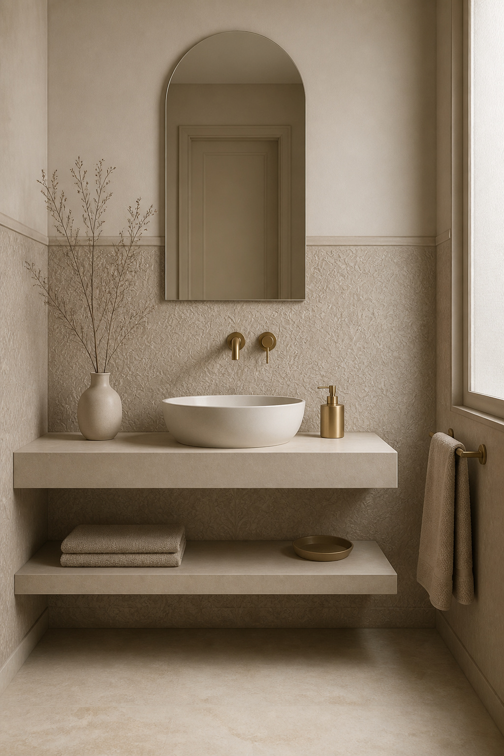
The bathroom wallpaper half wall is one of the most underestimated moves in interior design. It delivers the visual impact of a bold wallpaper choice without the performance anxiety of covering every surface in a humid room. Dividing the wall at dado or chair-rail height contains the pattern where it does the most work. The upper half stays free to breathe. The result is a room that feels considered and layered — the kind of finish that full-height wallpaper or plain paint alone rarely achieves.
What follows are 17 ways to execute this technique. They cover every style, material type, and budget. Whether you’re working with a steam-heavy family bathroom or a powder room where practically anything goes, the right approach exists for your space. Some of these ideas need almost nothing to install. Others call for a day’s work and a considered material decision. All of them will change how the room reads.
1. Classic Wainscoting-Height Wallpaper Panel Below a Timber Dado Rail
The dado rail is one of the oldest tricks in domestic architecture — and it earns that longevity. Install it at 32–36 inches from the floor. That’s roughly one-third of a standard ceiling height. At this position, the division reads as structural rather than merely decorative. The brain registers it the same way it reads a skirting board or cornice: as an intentional architectural layer, not a wallpaper edge.
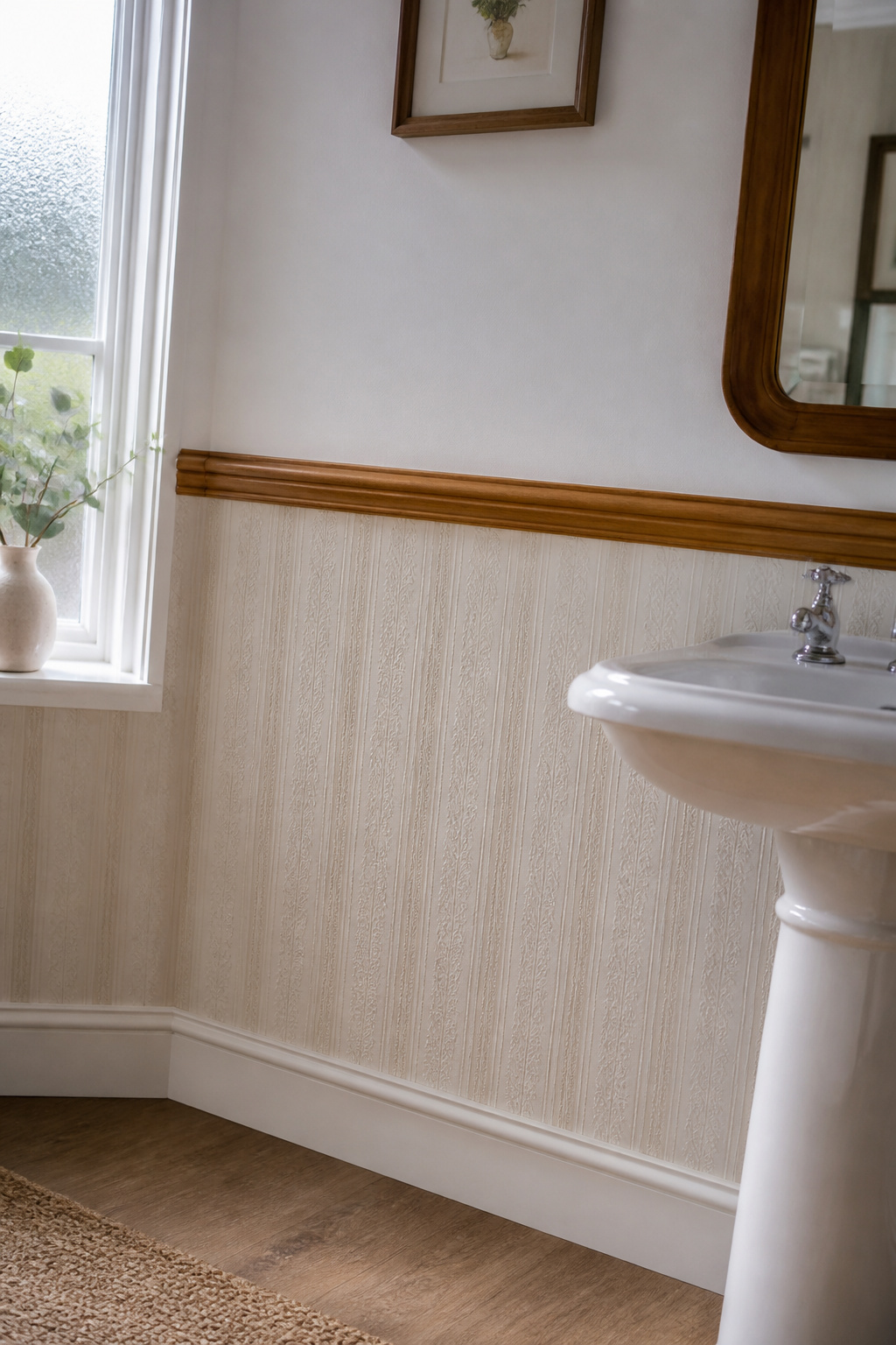
Timber gives the rail presence that a painted strip cannot match. Oak and ash are the workhorses for damp-adjacent spaces. Both are dimensionally stable enough to handle bathroom humidity without cupping or cracking. Fix through the wallpaper using construction adhesive plus countersunk screws. The rail then covers the cut edge of the paper — solving the most technically awkward installation moment in a single move.
Below the rail, choose a wallpaper with a vertical repeat. Narrow geometric patterns, ticking stripes, and subtle embossed panelling effects all align cleanly at corners. A straight-match vertical repeat avoids the dropped-repeat complications that create awkward partial patterns at the rail edge. For a convincing wainscoting illusion at low cost, border papers exist specifically for this zone. Some feature trompe-l’oeil moulding effects that photograph as convincingly as real raised panelling.
The common mistake is hanging the rail too high. Push it past 50% of wall height and the upper zone becomes awkwardly wide. The lower strip then reads as an afterthought rather than a structural decision.
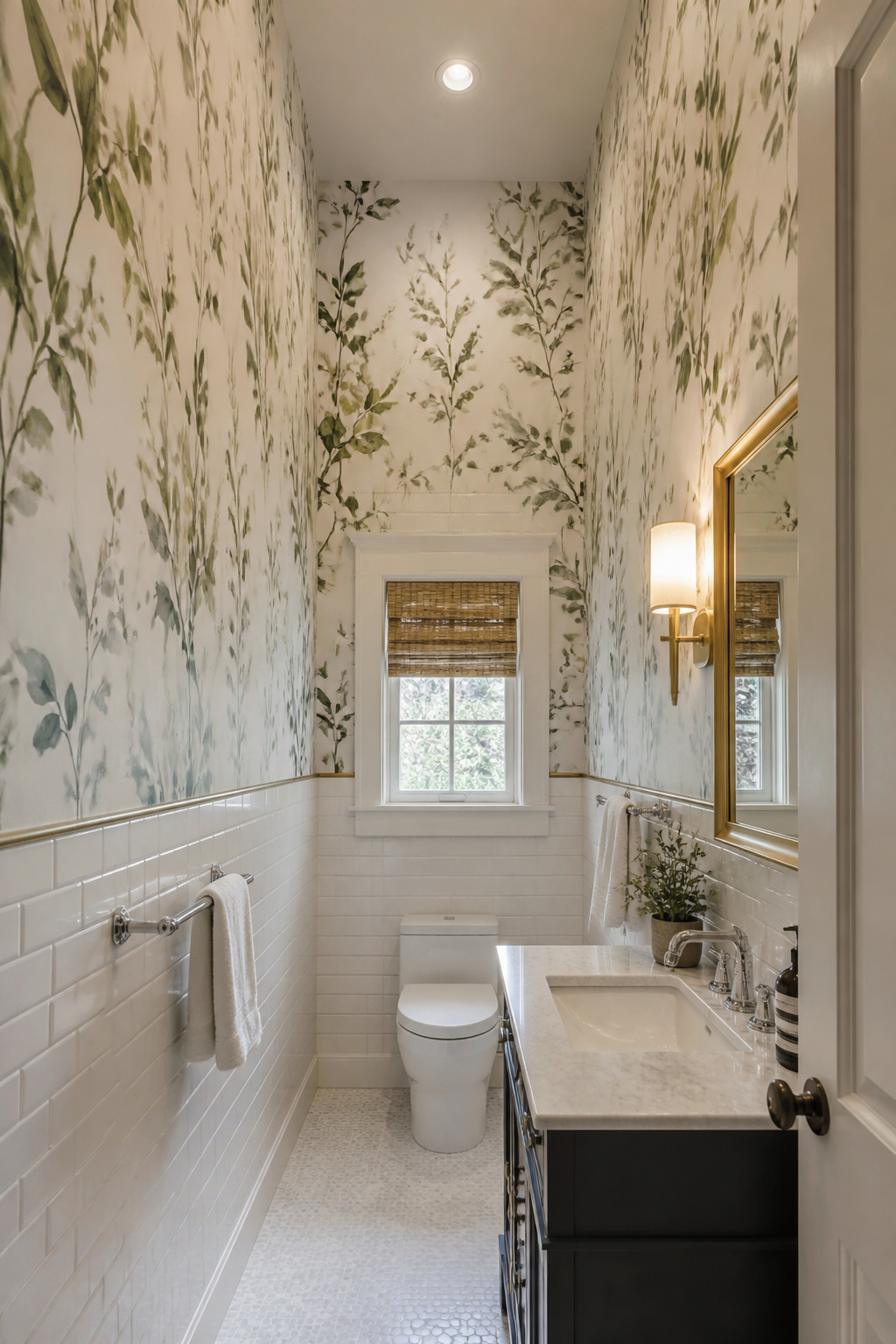
2. Bold Botanical Bathroom Wallpaper Half Wall for a Nature-Inspired Look
Botanical prints work on the lower half of a bathroom wall in a way that full-height application rarely matches. Contain a large-leaf tropical print below dado height and something shifts. The pattern reads more like framed botanical illustration than wallpaper. Plant life appears to grow from floor level upward with genuine spatial logic.
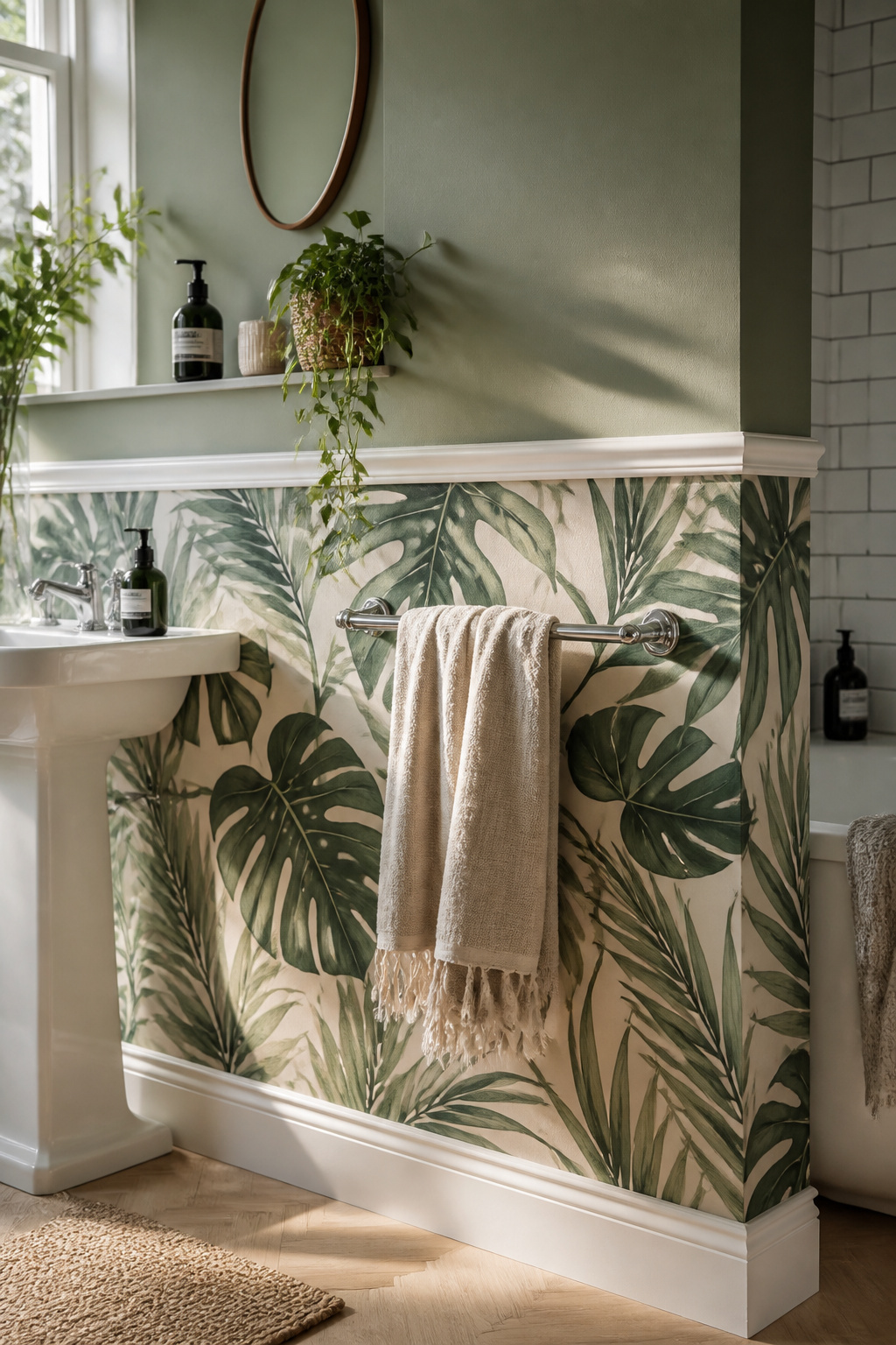
The material choice here is non-negotiable. For any bathroom with a shower, only a vinyl-coated paper belongs on the wall. The polyvinyl chloride layer creates an impermeable barrier. Standard ‘water-resistant’ non-woven papers will eventually lift at the seams under daily steam exposure. Look for Type II vinyl on the spec sheet for the highest moisture resistance. ‘Highly washable’ is the minimum rating to accept. Non-woven is acceptable only in a powder room with minimal humidity.
For bathroom organic ideas for a natural sanctuary, large-scale botanical prints with a 24-inch vertical repeat work better than small-motif papers. On a 36-inch lower half, each strip shows the full leaf composition once or twice — no repetition to the point of visual noise. Above the rail, pull one muted tone from the print’s background — a soft sage, a warm linen, a dusty eucalyptus — and paint it in an eggshell or flat finish. The contrast between vinyl sheen below and matte paint above creates a deliberate surface difference that reads as sophisticated rather than accidental.
A practical note: the above-rail paint finish also matters for maintenance. Eggshell above and vinyl below gives you two washable surfaces. Each handles the different kinds of mess that occur in the two zones of the room.
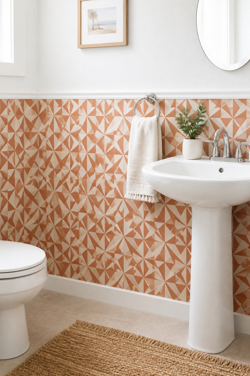
3. Geometric Tile-Effect Pattern From Skirting Board to Mid-Wall Height
Here’s a material deception that holds up in person. A tile-effect bathroom wallpaper half wall creates a convincing impression of real ceramic or stone tiling. The brain expects tile below chair-rail height in a bathroom context. A good photographic print exploits that expectation completely.
The cost comparison matters. Tile-effect wallpaper runs around $0.34 per square foot. MDF beadboard panels cost $0.56 per square foot. Real ceramic tile is higher still. That’s a 38% saving versus panelling — meaningful in a renovation where budget is squeezed in multiple directions. The installation advantage over real tile is also substantial: no cement board, no adhesive, no grouting, and no specialist cutting around pipework.
Success with a tile-effect paper depends entirely on the starting line. The floor is rarely level to the tolerance that a geometric repeat demands. Set a laser level at dado height before you begin and work to that reference — not to the floor. Use a fungicide-added paste and seal both the bottom and top edges with paintable waterproof caulk. The paper’s longevity in a bathroom depends more on those sealed edges than on anything in the middle of the panel.
In wet-adjacent zones — behind a basin or near a bath edge — apply a satin topcoat of decorator’s varnish over the hung paper. It adds a transparent protection layer that repels contact moisture.
4. Moody Dark Lower Half Contrasted With Bright Plaster or Paint Above
Dark-on-the-bottom reads as counterintuitive until you see it work. The spatial logic: a dark lower wall grounds the room visually. It creates a heavy plinth-like base. The eye finds this anchoring mass and travels upward toward the lighter upper wall and ceiling. Perceived ceiling height increases. In a compact bathroom, this trick is worth more than a skylight.
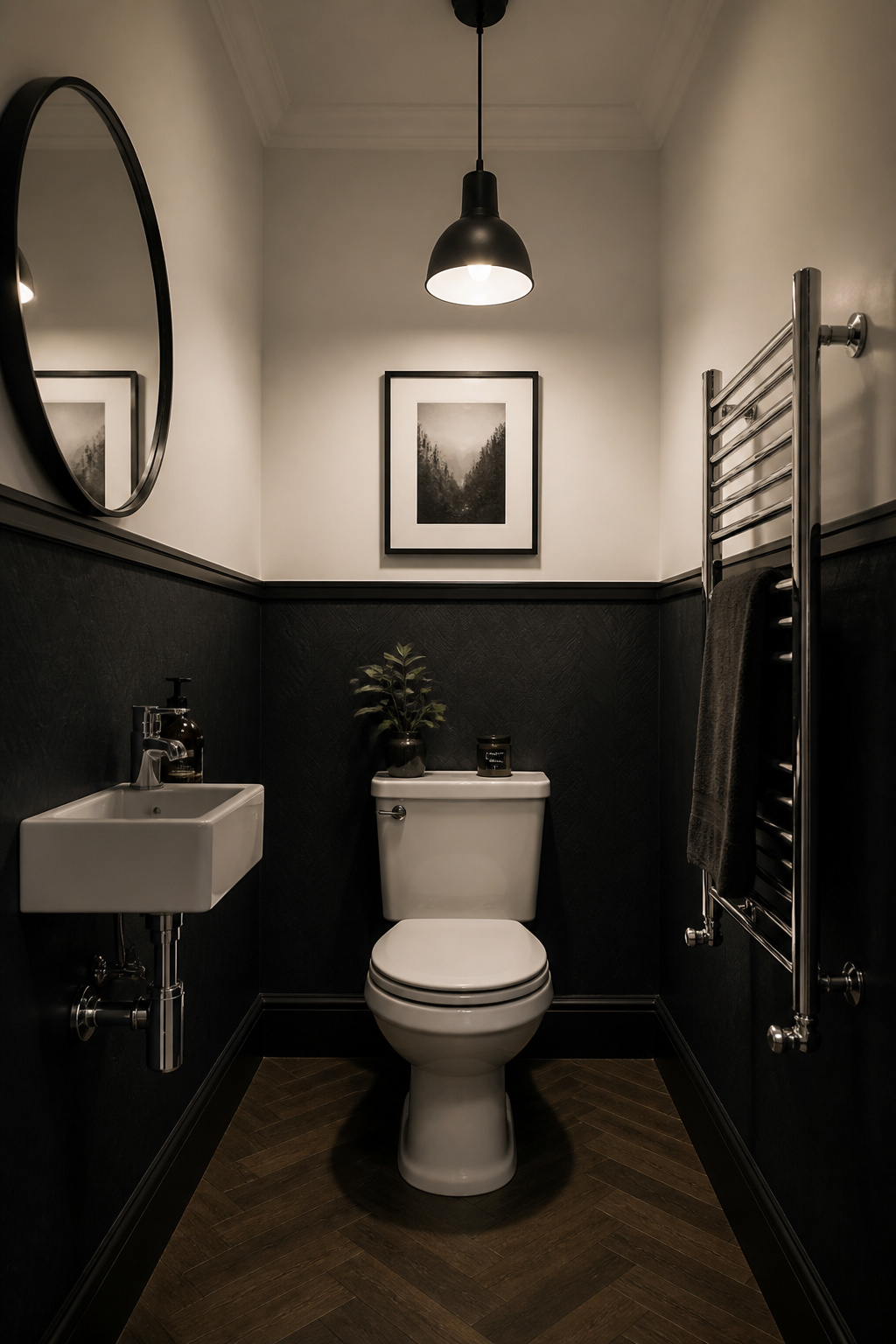
There’s a secondary benefit that often goes unmentioned. Dark walls make white fixtures pop. A white toilet or freestanding bath against a dark lower half reads with sharp clarity. The same fixture against a pale lower wall tends to disappear. If you’re keeping builder-standard white sanitaryware, a moody lower half is one of the cheapest ways to make it look intentional.
Charcoal, deep forest green, and inky slate blue are the strongest performers here. Matte or satin-finish papers work better than high-gloss in compact bathrooms. Glossy dark surfaces in small rooms amplify reflections to the point of feeling oppressive. Above the rail, choose an eggshell or satin paint in crisp white or warm chalk. The finish contrast — matte texture below, painted surface above — adds a tactile layer to an already strong colour statement.
Getting a clean horizontal cut line between paper and paint is the technical challenge. Hang the wallpaper first. Then apply low-tack painter’s tape along the exact top edge of the paper and paint above it. Remove the tape while the paint is still slightly tacky. This gives the cleanest possible line and avoids the ragged film-edge that fully dried tape can leave.
5. Grasscloth-Texture Wallpaper on the Lower Register for Organic Warmth
Real grasscloth does not belong in a bathroom that has a shower or bath. The natural sisal fibres absorb moisture. Even moderate humidity causes watermarking, dye bleeding, and eventually mildew. Every experienced paper-hanger gives the same advice: if there’s a shower, use faux.
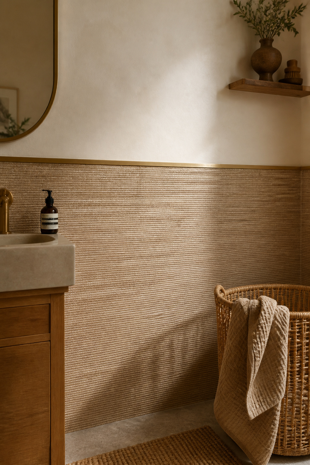
The faux grasscloth category has improved dramatically in the past decade. Vinyl-backed papers that replicate the woven-grass texture are now available at $15–35 per roll. Compare that with $40–150+ for real grasscloth. Seam visibility — the most common objection to grasscloth in formal spaces — is also dramatically reduced. Real grasscloth will always have visible seams; no two blades of grass are identical. Faux versions suppress this. In a lower-half application where seams sit at eye level, that suppression is significant.
The material pairing works on tactile principles. A grasscloth bathroom wallpaper half wall against smooth painted plaster above creates a binary of rough and smooth. The hand recognises this contrast even without touching — it’s the sensory relationship between two surfaces, and it’s what makes textured-below-smooth-above so persistently satisfying to be in. Warm neutral faux grasscloth papers pair with smooth chalk or warm white above for maximum textural contrast at minimum colour temperature risk.
Use a slim timber or metal dado rail to anchor the transition between the two surfaces. Without a mechanical connector, the join between grasscloth texture and smooth plaster tends to look provisional. Add the rail and both surfaces gain clarity.
6. Vintage Toile de Jouy on the Lower Half of a Powder Room
A powder room is the one bathroom environment where almost any wallpaper performs reliably. No shower, no bath — humidity is limited to handwashing. This is the room where you can use that expensive artisan-printed paper you’d never risk in a full bathroom. Toile de Jouy is the natural choice.
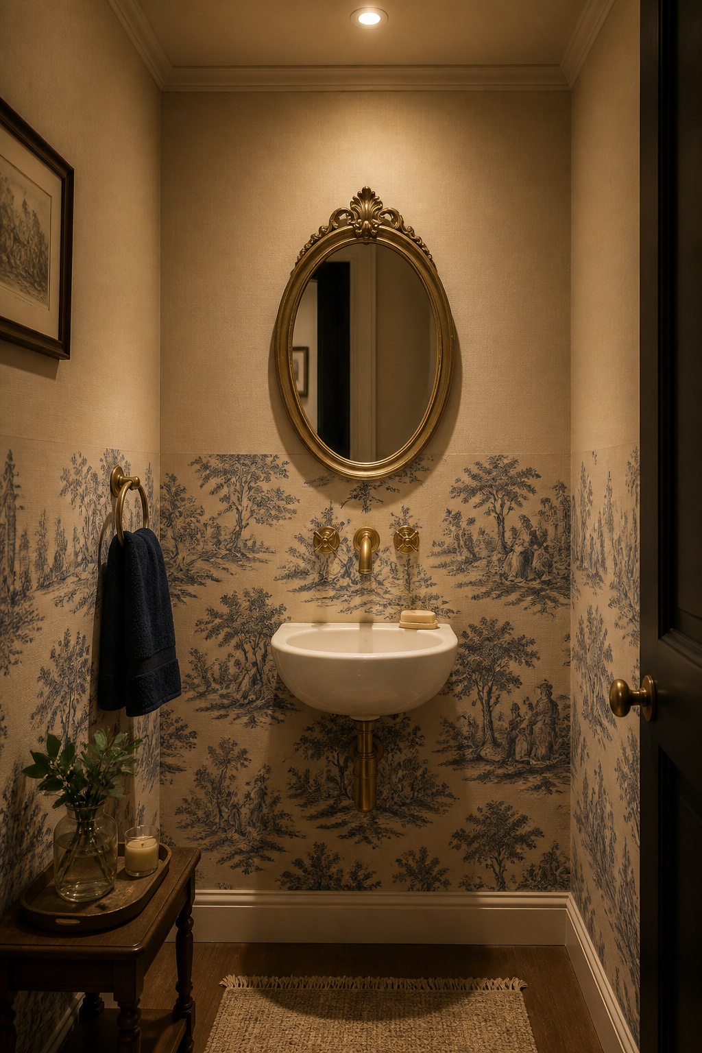
The pattern originated in Jouy-en-Josas, France in the 18th century. Single-colour pastoral and figurative scenes on a pale ground — the classic versions come in red on cream or blue on cream. The contemporary market has moved far beyond those colourways. Wallism’s patinated linen toile in terracotta, Decoralist’s navy interpretations, and Spoonflower’s archive of indie-designer patterns all read as knowing vintage references rather than inherited decor. Colourways now include forest green on ivory, deep charcoal on warm white, and dusty pink on natural.
In a powder room, a half-wall of toile requires very little paper. The typical powder room covers 18–20 square feet, meaning as little as two rolls for the lower half. This makes the bathroom wallpaper half wall an ideal testing ground for a premium wallpaper choice. The small scale also means figurative scenes read at the right proportion — in a larger bathroom, the same paper at the same scale might feel sparse. If the vintage wallpaper direction appeals beyond the powder room, a curated set of bathroom wallpaper vintage ideas covers antique-inspired patterns for full bathrooms too.
The most resolved approach: match the above-rail paint exactly to the toile’s background tone. In a navy-on-natural toile, the above-rail paint is that same natural linen tone. The motif appears contained within the lower register because the ground colour continues above it — making the division feel architectural rather than abrupt.
7. Faux Marble Half Wall Wallpaper to Anchor a Floating Vanity
Floating vanities work by exposing the floor beneath them. It’s a design move that makes the floor read as continuous and the room feel larger. But without something on the wall behind them, floating cabinets can appear unmoored. Too much space above, too much below — the cabinet hovers without relation to either zone. A dado-height band of marble-effect wallpaper solves this by creating a visual plinth.
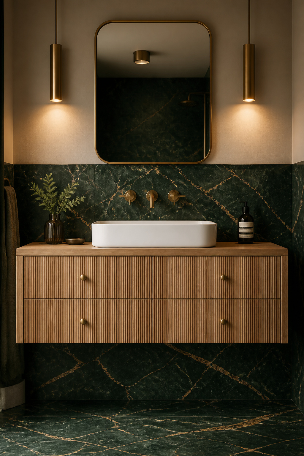
The approach mirrors how interior designers solve the floating-vanity anchor problem across a range of materials. Dark grasscloth, deep geometric tile, or marble cladding behind and below the vanity creates a heavy base that grounds the cabinet. Wallpaper at dado height is the accessible version of what would otherwise require cladding or tiling.
Choosing the Right Marble Pattern
Keep up with bathroom wallpaper trends to elevate your decor and you’ll notice the most current marble-effect papers are moving away from standard Calacatta grey. Nero Marquina-inspired papers — black ground with white veining — and Verde Guatemala-inspired prints — deep forest green with gold and white veining — are appearing across design portfolios as more forward alternatives. The rule: the more photorealistic the marble, the more obvious the wallpaper seam becomes. Choose papers that abstract the veining slightly rather than replicate it exactly.
The material intelligence move is to match the vein colour to a hardware finish. Gold-veined Calacatta pairs with brushed brass. White-veined Nero Marquina pairs with chrome or matte black. Gold-veined Verde pairs with unlacquered brass. The vein is the connector between the flat wall surface and the three-dimensional hardware. Get this right and the whole room reads as a single, considered palette.
8. Watercolour Stripe Running From Floor to Chair-Rail Height
The stripe is one of the oldest spatial tricks in interior design. Its half-wall application is among the most practical. Full-height vertical stripes in a small bathroom can create a cage-like enclosure when colour contrast is high. Stopping the stripe at dado height delivers the elongating effect without enclosing the upper space. The eye follows the vertical lines upward from the floor and continues past the rail toward the ceiling.
Research on stripe widths in small rooms suggests 5–10 cm (2–4 inches) for the coloured stripe. A moderate rather than extreme contrast between the stripe and its background works best. The standard starting ratio: a 4-inch coloured stripe at a 2-inch neutral interval. That’s a 2:1 proportion that reads as intentional without feeling repetitive in a tight space. In bathrooms under 7 feet wide, drop to 3-inch stripes at 1.5-inch intervals. The finer rhythm helps the pattern feel airy rather than relentless at close quarters.
Watercolour-edge stripes suit relaxed and contemporary schemes. The soft edge tolerates minor hanging imperfections — something a hard-edged stripe would expose immediately. Clean-edge stripes are more graphic and architectural, better suited to modern or Scandi-influenced bathrooms where precision is part of the aesthetic language.
Colour choice is where this look lives or dies. A single soft accent on a cream or warm white ground reads as artisan-made and fresh. Good options include sage, dusty rose, warm terracotta, and faded denim blue. Multi-colour stripes date quickly. The single-colour version is as at home in a bathroom today as it was in 1985 — and will likely still work in 2040.
9. Maximalist Jungle Print on the Lower Half of a Narrow Bathroom
Bold pattern in a small space is counterintuitive. But interior designers confirm it consistently: the eye given something complex to explore stops measuring the room’s boundaries. A jungle-print bathroom wallpaper half wall in rich greens and terra tones works not in spite of a narrow room’s tightness but because of it. The print fills the available visual field at floor level. The brain stops registering that the walls are close.
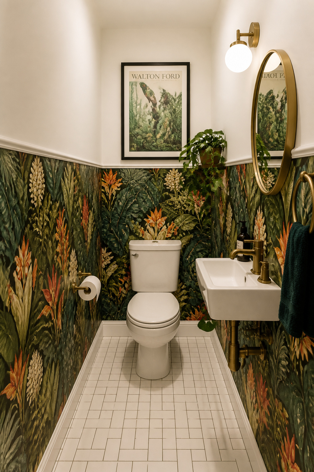
Pattern scale selection matters. Large botanical prints with a 24-inch or greater vertical repeat show the full composition once or twice per strip at dado height. The result is closer to a gallery of botanical illustration than a repeating tile. Small-scale jungle repeats subdivide the lower half into many tiny units and create visual noise rather than presence. Go large when going bold.
Moisture resistance must come first when choosing a jungle print for a bathroom. Look for ‘Type II vinyl’ on the specification sheet. Commercial-grade vinyl handles daily steam exposure without peeling or surface degradation. The spec sheet should state both ‘highly washable’ and ‘moisture resistant’ as minimum ratings. ‘Water-resistant’ is a weaker standard that may not hold up to years of shower steam. Use a fungicide-added paste and apply a satin decorator’s varnish over the finished paper in any splash-adjacent area.
Making maximalism function requires commitment to neutrality everywhere else. White ceiling, white fixtures, plain floor tile in a warm stone or dark charcoal tone. The above-rail paint should pick up the ground tone of the jungle print — not its accent colours. One surface tells the story; every other surface provides the stage.
10. Beadboard-Look Bathroom Wallpaper Half Wall for a Coastal Upgrade
Beadboard wallpaper is vinyl-textured to the same dimensions as real beadboard and comes on a roll. It’s waterproof, paintable, and costs around $0.34 per square foot versus $0.56 for MDF panels. That’s a 38% saving before you factor in the installation difference. Real beadboard requires cutting around pipework, a moulding gun to fix, and careful measurement at all corners. Beadboard wallpaper needs only the skills of a standard wallpaper application. Tricky plumbing cutouts are manageable with a craft knife rather than a jigsaw.
Colour Options After Installation
Colour is the critical design decision. All three coastal looks are achieved after installation by painting the hung vinyl with standard latex, preceded by a bonding primer on the vinyl surface. Crisp white painted beadboard reads as bleached-timber boarding and pairs with navy or cobalt above — the classic Hamptons look. Driftwood grey creates a more understated result. Pair it with pale blue-grey paint above for a contemporary coastal finish that avoids the overtly decorative. Sage green is the 2025 update: pair it with warm white above and natural rattan or weathered oak accessories for a coastal-meets-biophilic result.
For coastal bathroom ideas for a beachy retreat, the full material and colour palette goes well beyond the half-wall treatment. For the installation itself: seal the bottom edge of the paper where it meets the skirting or floor tile with paintable waterproof acrylic caulk. This edge is the most vulnerable moisture ingress point in any lower-half wallpaper installation. Skip this step and moisture will work its way under the paper within a year.
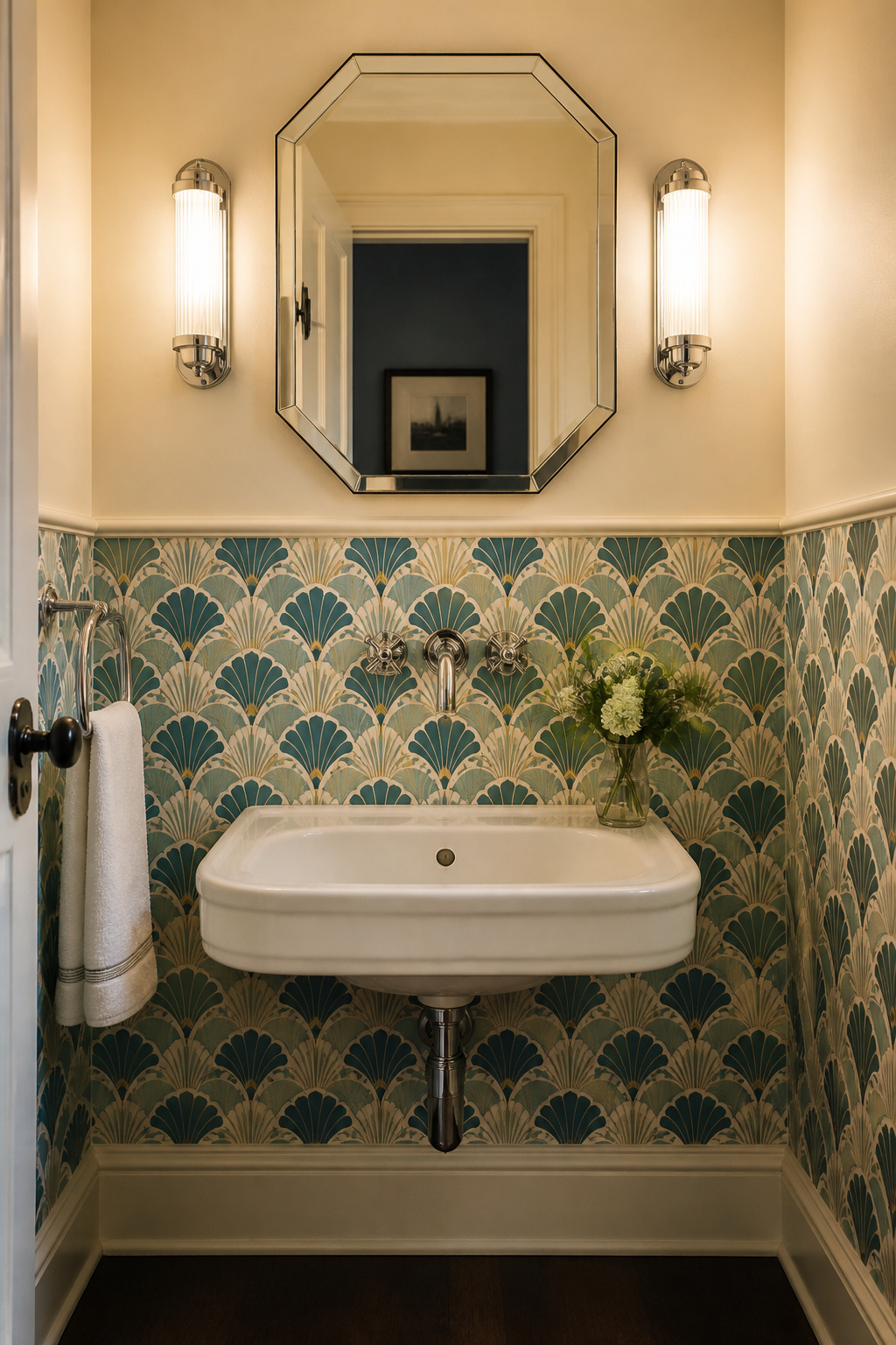
11. Scallop or Fish-Scale Repeat Pattern Along the Lower Register
The scallop repeat — overlapping arcs from shell geometry — has Art Deco origins dating to the 1920s and 1930s. But its visual logic is durable enough to read as entirely contemporary. The curves do something specifically useful in a bathroom wallpaper half wall application. They soften the hard geometry that dominates the space. Right-angle tiles, rectangular mirror frames, square-edged cabinets — the curved rhythm of a scallop repeat provides visual counterpoint to all of it without introducing a contrasting colour or a competing pattern.
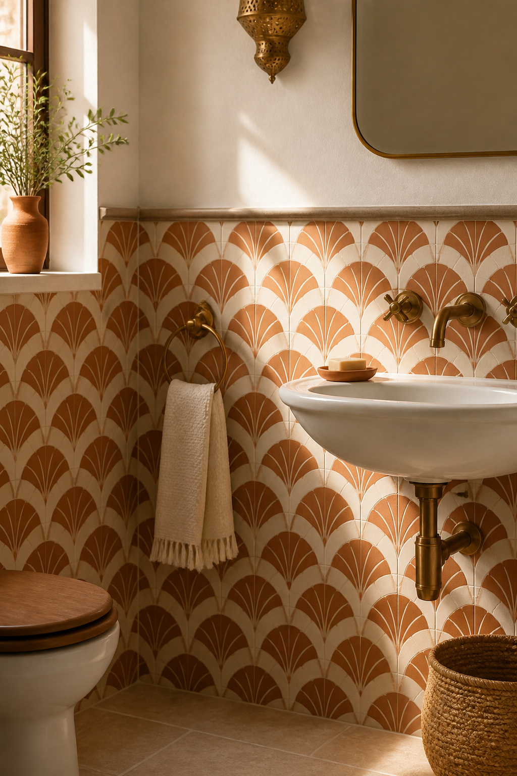
Scale is the primary decision. A 2-inch scallop reads as texture at normal viewing distance in a compact bathroom. The individual units blend into a surface pattern rather than asserting individual shapes. A 6-inch fan shape is a bolder, more graphic statement. It suits rooms with more space to absorb it: larger bathrooms, powder rooms with ceiling height, or an Art Deco-inspired scheme. The practical rule: the scallop’s arc width should not exceed one-quarter of the room’s shortest dimension. In a 6-foot-wide bathroom, 18 inches is the upper limit.
A scallop at dado height in terracotta or teal, with a complementary chalky solid above, creates a Moroccan-adjacent result without any ceramic tiling. Moroccan zellige and scallop wallpaper share a visual grammar — both use rhythmic, small-unit repeats to build a surface that feels intricate from a distance and geometric up close. The pairing works with unlacquered brass fixtures, warm stone floor tile, and woven storage. That’s a complete sensory material palette that the half-wall wallpaper initiates.
12. Colour-Blocked Wallpaper at Dado Height in Terracotta or Sage
A solid-colour textured wallpaper on the lower half creates an effect that paint cannot. Organic tonal variation within a single colour gives the surface the depth of limewash plaster. And it doesn’t require the technical skill that limewash actually demands. Greenly Living’s limewash wallpaper range — available in terracotta and sage green — describes its surface as having ‘organic hand-brushed strokes and soft tonal layers that bring depth and movement to flat walls’. That’s the quality benchmark to shop toward.
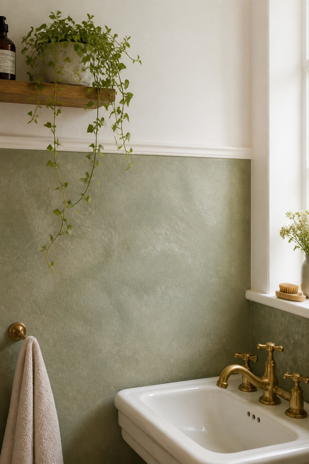
In 2025, three primary finish options dominate this category. Limewash-look papers offer faux plaster with organic tonal variation — currently the dominant trend. Linen-effect papers use a tight textile weave impression in warm neutral colourways; Livettes is a notable brand in this space. Micro-texture papers have a subtle embossed surface without strong colour variation, better suited to minimalist and Scandinavian-influenced bathrooms. All three are available in matte vinyl formats that perform well in humid environments.
Terracotta and sage are the pairing of the moment. Interior designers describe them as ‘cosy, timeless, and perfect for creating an earthy aesthetic’. A sage lower half with terracotta accessories — towels, glazed ceramics, a woven basket — sits at the intersection of the biophilic and warm-material trends without pushing either to an extreme.
If the bathroom includes a tiled shower zone, grout colour becomes part of the conversation. Terracotta limewash-look wallpaper with dark charcoal grout in a subway tile shower creates a punchy material contrast. The same wallpaper with cream grout reads as softer and more harmonious. The governing principle: find one element that bridges the wallpaper zone and the tile zone. A floor tile that echoes both, a hardware finish that picks up the wallpaper’s earth tone, or a grout colour that mirrors the paper’s ground — any of these creates cohesion.
13. The Inverted Half Wall: Wallpaper on the Upper Half With Tile Below
Convention places wallpaper below the dado rail and plain paint or tile above. Reverse this and something usefully different happens: the eye is drawn upward from the outset. Tile below a horizontal division grounds the room at floor level. Pattern above the rail draws the line of sight toward the ceiling. In tall, narrow bathrooms with a tube-like ceiling-to-width ratio, this effect is invaluable.
The practical case for the inverted arrangement is also strong. Many older homes and apartments have existing tiling to dado height. Retiling is expensive and disruptive. Applying wallpaper above the existing tile line — using it, in effect, as the dado rail — takes advantage of an existing horizontal division without touching the tile at all. The work is manageable as a DIY project; the result looks intentional.
Pattern choice for the upper half requires different thinking than the lower half. Heavy, busy patterns above eye level can feel oppressive. The upper half needs papers that carry visual interest without weight. Loose botanicals, cloud motifs in soft blues and whites, and tonal abstract patterns in a single colour family all work well. Dense tropical prints and strong geometric repeats are better kept below the rail. For any tile-to-wallpaper junction, a thin Schluter-type metal trim is a non-negotiable detail. Grout and tile adhesive at the top edge of the tile zone trap moisture that will wick sideways into the wallpaper’s backing without a waterproof barrier. A 0.5 mm stainless or brass-finish strip costs very little and resolves this moisture risk completely.
14. Art Deco Fan Motif Wallpaper From Floor to Mid-Wall Height
The fan or sunburst motif is Art Deco’s most versatile geometric element. It derives from shell geometry but is executed with architectural precision. In a bathroom, applied from floor to mid-wall height, it creates a surface that reads as both historically grounded and completely current. The pattern’s curved geometry has no obvious decade.
Bold Art Deco patterns in jewel tones and metallic accents should be applied on water-resistant vinyl. The specification for moisture performance remains the same as for any bathroom wallpaper. Pattern complexity is no reason to compromise on substrate quality. At bathroom scale, a fan motif with a 4–6 inch arc width reads cleanly without overwhelming the lower half. Larger repeats suit powder rooms or rooms with ceiling heights above 9 feet.
Three colourway approaches suit different room orientations. Black and gold is the most dramatic Deco interpretation. It pairs with polished chrome or antique brass and suits larger bathrooms or powder rooms where strong contrast can breathe. Blush and copper softens the palette. Warm tones suit north-facing bathrooms with limited natural light and pair with brushed copper or rose gold hardware. Teal and cream is the most liveable version — the teal reads as spa-like, the cream as refined. It pairs with chrome fixtures and white subway tile above for a complete period-yet-contemporary scheme.
Polished chrome provides an authentic 1920s reference. Chrome was the modern industrial material of the Deco era. Brushed brass is the warmer alternative — period-appropriate while avoiding the over-polished look that can feel fussy in a contemporary home. An octagonal mirror or pedestal-style vanity completes the period reference without requiring full period furniture.
15. Tone-on-Tone Textured Bathroom Wallpaper Half Wall for a Spa Feel
Of all the bathroom wallpaper half wall approaches in this list, tone-on-tone textured paper is the one that requires the most material intelligence to specify. Same colour family throughout, different surface character — it creates depth without disruption, tactile richness without visual noise. Done well, it’s the most refined version of this technique.
The mechanism is precise. A tone-on-tone embossed or woven-texture paper reflects light differently from a smooth painted surface. The matte recesses of the texture absorb light; the raised elements catch it. From across the room, this creates a surface that appears three-dimensional without any colour change to trigger that perception. In material design terms, it’s the subtlest version of the half-wall treatment.
Three Paper Types That Work
Three paper types perform this effect with different profiles. Embossed damask — a traditional decorative pattern pressed into a vinyl substrate — is the most widely available format. It performs well in steam environments when specified in a vinyl-backed version. Raised linen weave replicates the open-weave grid of natural linen and is available in vinyl-backed, moisture-resistant formats. The non-woven version should be reserved for powder rooms only. Silk-finish papers — what York Wallcoverings describes as ‘a dense array of threadlike detailing that adds chic dimension to the fabric-like beauty of silk-inspired patterns’ — are available in vinyl-backed formats suitable for bathrooms.
For creating a spa-like bathroom oasis with minimalism, the tone-on-tone approach works best when every material is in the same undertone family. Warm greige means warm tile, warm linen-tone wallpaper, warm white paint, and brass hardware — all together. Cool chalk means cool white tile, pale grey embossed wallpaper, cool white ceiling, and chrome hardware. Mixing undertone families creates a persistent low-level visual tension. That tension defeats the spa-calm objective entirely.
16. Metallic Accent Strip at Chair-Rail Height for a Luxe Bathroom Edit
Not every half-wall approach requires covering the full lower zone with pattern. A narrow band of metallic wallpaper — 12 to 24 inches wide, positioned at chair-rail height — acts as a border element rather than a half-wall treatment. It adds a luxe material reference without committing to a full-surface change. This bathroom wallpaper half wall alternative suits rooms where existing tile, paint, or panelling is already doing significant design work. A full treatment would compete rather than complement.
Three metallic wallpaper types have meaningfully different aesthetic profiles. Printed foil is a metallic-finish image on vinyl substrate — uniform, highly reflective, available in gold, silver, and rose gold. It’s the most budget-friendly of the three, but also the most obviously artificial in person. Mica-chip paper uses natural mica flakes embedded in the surface. This creates a fractured, stone-like sparkle rather than a uniform shine. It reads as more sophisticated in rooms with strong directional light. Brushed-metal texture is an embossed vinyl replicating brushed steel or brass. The matte-metallic finish photographs well and reads as premium without the harsh reflectivity of foil — the strongest performer in compact bathrooms with mixed lighting.
In a bathroom with multiple walls, restrict the metallic strip to a single feature wall. The wall facing the door or the wall behind the vanity mirror are the best candidates. A metallic band on all four walls in a compact space creates an intensity that tips quickly from luxe to overwhelming. The metallic strip is an accent that the rest of the room supports — not a treatment that the room is built around.
17. Peel-and-Stick Bathroom Wallpaper Half Wall for a Renter-Friendly Look
The performance gap between removable peel-and-stick wallpaper and traditional paste-the-wall paper has narrowed substantially. Modern commercial-grade vinyl peel-and-stick papers have been independently tested in frequently used bathrooms. Specialists like Tempaper have found no peeling or bubbling under regular steam and humidity exposure. In tested conditions, well-prepared walls extended the lifespan to 3–5 years in a standard bathroom — longer in a powder room.
The vinyl substrate is key. Non-breathable vinyl means moisture cannot work its way under the adhesive the way it penetrates a water-resistant but breathable paper. For bathroom remodeling on a budget that saves thousands, the removable format also means zero preparation for returning a rented property. Peel off cleanly, repaint the walls, done.
Surface Preparation
Surface preparation determines outcome almost entirely. The wall must be clean (no grease or dust), smooth (peel-and-stick does not tolerate wall irregularities that traditional paste can bridge), and fully cured. New plaster needs at least 30 days before any adhesive is applied. The wall must also be completely dry. Ventilation is the ongoing factor that most directly affects longevity. Run the exhaust fan during and after every shower. Skipping this on a vinyl peel-and-stick paper is the equivalent of not opening the windows in a freshly painted room.
The specific advantage of the half-wall application is that the lower portion of a bathroom wall is the furthest point from steam condensation. Steam rises and collects at the ceiling and upper wall. A lower-half application puts the paper in the most forgiving moisture zone in the room. The lower half also tends to be smoother — the upper portions are more likely to have old fixture anchors, repaired plaster, and paint-layer build-up that creates surface irregularities. Do not apply over existing wallpaper. Adhesion to a patterned surface is unreliable, and that shortcut shortens the paper’s lifespan from years to weeks.
Choosing the Right Bathroom Wallpaper Half Wall for Your Space
The central decision is always moisture zone first, aesthetic second. A powder room and a steam shower-equipped family bathroom are materially different environments. The wallpaper type appropriate for one is not appropriate for the other.
For a powder room or half-bath without a shower, almost any wallpaper type is viable. Non-woven paste-the-wall, premium printed papers, peel-and-stick vinyl, even real grasscloth in a well-ventilated space — humidity exposure here is limited to handwashing. For a full bathroom with a shower but careful placement away from direct spray, Type I vinyl or non-woven vinyl-coated papers are the minimum standard. Use fungicide-added paste and a satin topcoat in splash-adjacent areas. For a wet-room-adjacent zone or a bathroom with a walk-in shower and no enclosure, only Type II commercial-grade vinyl will do. Moisture-resistant adhesive, all edges sealed with waterproof caulk, and a Schluter-type metal trim at any tile-to-wallpaper transition are non-negotiable.
Division height is the second structural decision. At 30–33 inches (one-third of an 8-foot ceiling), the rail creates a furniture-scale base that aligns with the bottom of most bathroom fixtures. The standard chair-rail height of 36 inches integrates most naturally with existing cabinetry. For rooms with 9-foot or higher ceilings, 42–48 inches works well — but that height will make a standard room feel as if the lower section is eating the upper one.
Start with the moisture zone. Set the height. Then choose the material and pattern. In that order, the bathroom wallpaper half wall resolves from a question into a decision.