Tile gets photographed. Hardware gets obsessed over. Paint colours get entire Reddit threads. And yet, in kitchen design, the variable with the most power over whether a room feels assembled or genuinely designed is almost always the furniture — the pieces you chose, how they’re scaled, what materials they carry into the space, and how they converse with each other. Kitchen interior furniture is the translation layer between architecture and personality, and most people underspend the decision relative to its impact.
As someone who has spent years thinking about how materials combine and what surfaces communicate, I’ve noticed that the kitchens people remember — the ones that feel lived-in and deliberately considered at the same time — tend to get their furniture right in ways that go beyond matching wood tones to cabinet colours. The 18 ideas here span every budget, every spatial constraint, and several aesthetic territories: from a classic waterfall-edge quartz island to a Japandi sideboard that quietly defines where the dining zone begins. Some of these are investments. Some are surprisingly affordable. All of them are decisions worth making carefully.
1. Waterfall Edge Island in Quartz Over a Contrasting Walnut Wood Base
Few surfaces carry as much visual authority in a kitchen as a waterfall-edge island — and the material pairing you choose for it tells the rest of the room what it’s dealing with. Quartz over walnut is one of the most considered combinations you can make, because the two materials operate on opposite ends of the tactile spectrum. Quartz is non-porous, dimensionally stable, and cold to the touch; walnut is warm, mildly soft under fingertip pressure, and visually complex in a way that no engineered material can replicate. That contrast is precisely why they work.
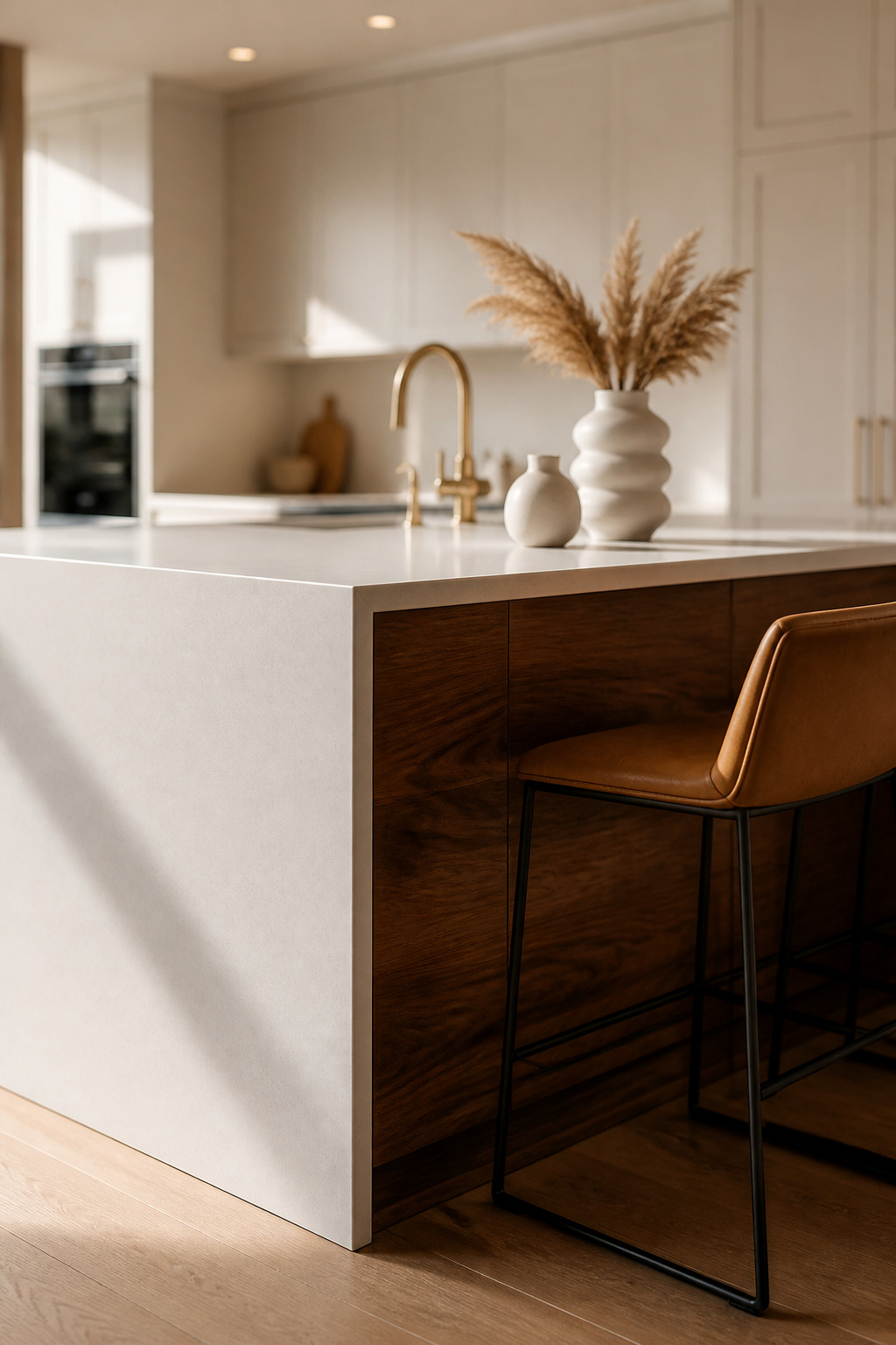
The material science matters here. Walnut sits at approximately 1,010 lbf on the Janka hardness scale — durable enough as a cabinet base to take daily knocks without denting, while its chocolate-brown tones create immediate visual warmth against the relative coolness of white or grey quartz. The waterfall panel itself — the vertical slab wrapping the island’s end — is typically 3/4 to 1.2 inch thick; thicker slabs read as more luxurious and add genuine weight to the room’s material story. For seating, plan a 12–15 inch overhang, which gives comfortable leg clearance at 24 inches of width per person. Bar stools at 42–48 inch counter height slot in cleanly.
Choosing Your Quartz Finish
On finish: honed quartz is almost always the better choice when it’s paired with walnut. Polished quartz amplifies light and reads as formal — right for some kitchens, but in combination with the organic texture of walnut grain, it can create a cold-versus-warm tension that tips into discomfort. Honed has a powdery, flat surface quality that allows the walnut to lead the warmth. For the brave: leathered quartz texture (between honed and polished) conceals fingerprints better than either and creates an even more tactile surface that rewards proximity. For kitchen island ideas for every layout, the kitchen island furniture choice almost always determines the room’s material personality more than any other single decision.
2. Leather-Wrapped Bar Stools on Blackened Steel Frames
There’s a particular quality to a bar stool that ages — that develops character rather than just wearing out. Leather wrapped over a blackened steel frame is the combination that delivers this. The two materials have a functional kinship: steel is structural, cold, and precise; leather is supple, warm, and biologically connected to time. Together, they create kitchen furniture that looks better at year five than it did at year one.
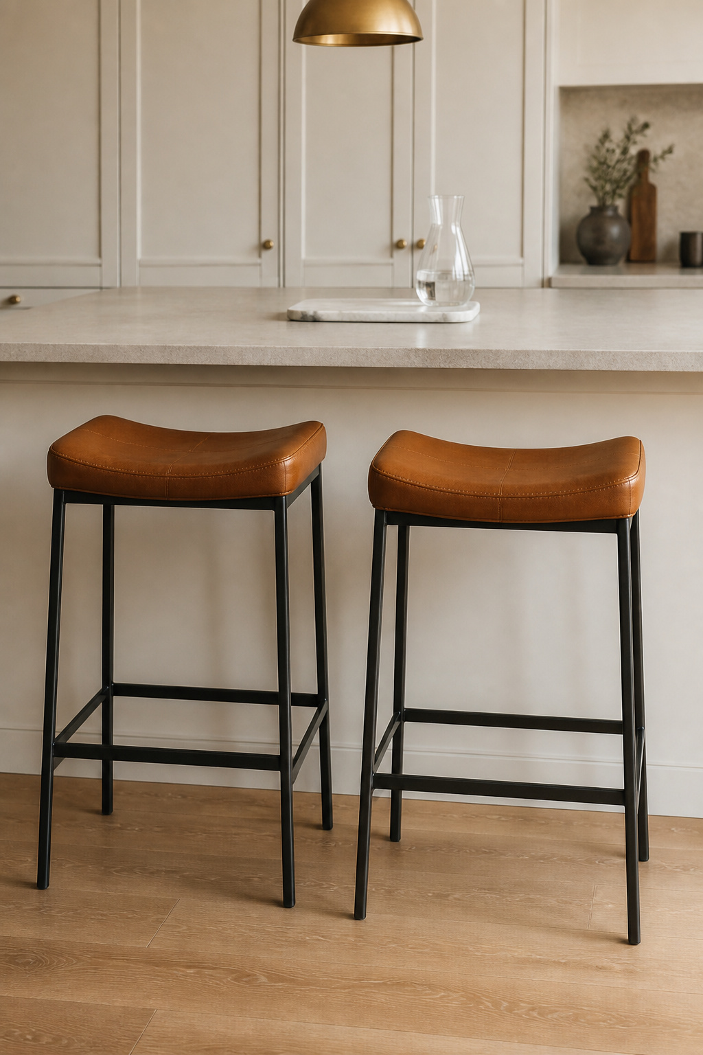
The leather grade you choose determines the trajectory of that aging. Top-grain leather — split from the hide’s uppermost layer — retains natural texture and develops a patina over use; full-grain (the premium above) is visually richer but costs 30–50% more. Aniline-dyed leather (dyed in a bath rather than surface-coated) lets colour develop depth rather than fade, which matters when you’re choosing seating for a kitchen where cooking oils and steam create the most honest test of any finish. Blackened steel, for its part, carries a quality that powder-coated matte black simply doesn’t — the oxidation process creates subtle surface variation and a lower sheen that reads as more crafted and less off-the-shelf.
Sizing and Long-Term Care
On sizing: counter-height stools (24–26 inches) pair with surfaces at 34–40 inches; bar-height stools (28–30 inches) are the right match for islands at 40–46 inches. The number to actually measure is the clearance between the underside of the countertop and the stool seat — it should be at least 10–12 inches. This is the measurement that gets ignored and the leading cause of bar stools that are comfortable to look at and miserable to sit in. For family kitchens where spills are daily reality, PU leather is the honest choice — it won’t develop patina, but it wipes completely clean and holds its look for 5–8 years without conditioning.
3. Reclaimed Oak Dining Table as the Kitchen’s Anchor Piece
New oak is a perfectly good material. Reclaimed oak used as kitchen furniture is something else entirely. The difference isn’t just visual — it’s structural: wood that has been kiln-dried by decades rather than kilns produces lumber with extremely stable, low moisture content that behaves far more predictably indoors than new-growth pieces. Reclaimed oak has already done its expanding and contracting. It’s arrived.
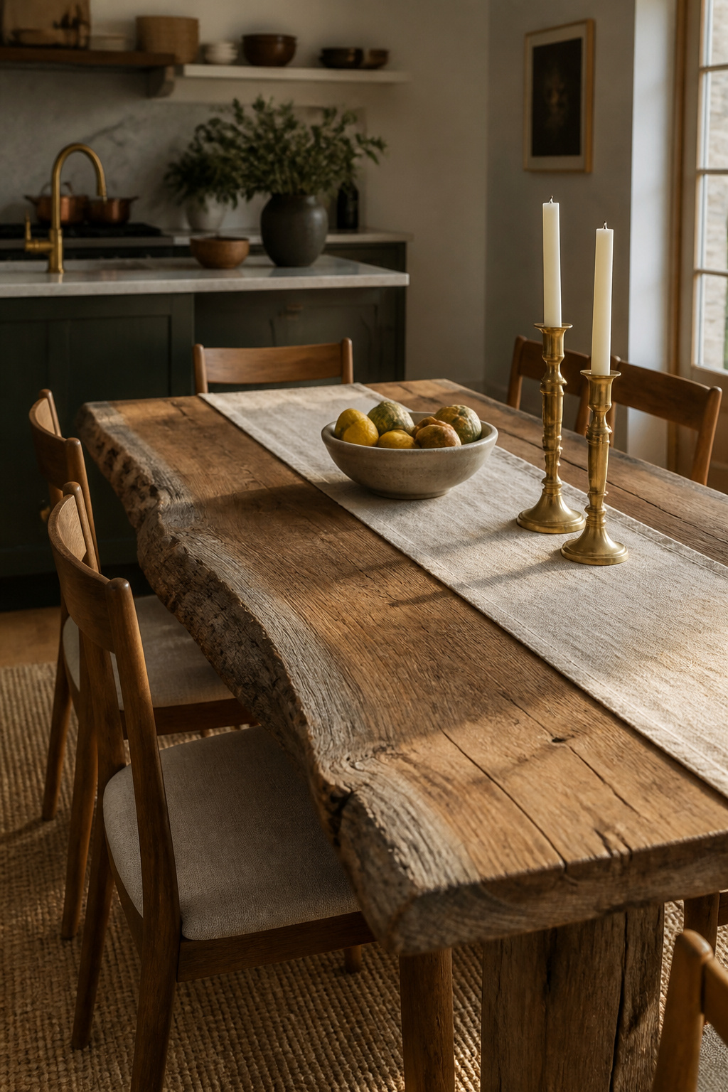
The colour tells this story immediately. Reclaimed oak carries a layered complexity — often a silver-grey surface patina scraped back to reveal honey-warm tones beneath, with grain that records slow, old-growth growth in tight, dense rings. Live-edge slabs preserve the natural outline of the original log, making every table entirely singular. Reclaimed oak reads as the antidote to the matching-set dining suite — it doesn’t coordinate with the kitchen so much as it grounds it.
Before buying, run a structural check: press firmly across the surface for soft, punky sections (wood stored damp can continue to deteriorate). Nail holes and saw marks are character, not problems — though large voids should be filled with epoxy before finishing. Ask specifically whether the wood has been kiln-dried after reclamation; air-dried reclaimed pieces are more variable in stability. For food-adjacent sealing, pure tung oil penetrates deeply, enhances grain with a natural satin depth, and is non-toxic when fully cured — apply 3–5 coats with 24 hours between each. Water-based polyurethane is the harder surface seal and FDA-considered food-safe when cured, lasting 10+ years before it needs attention. The critical step either way: let the wood acclimate to your indoor environment for 2–4 weeks before sealing, or you risk trapping moisture and warping a table you’ve paid considerably for.
4. Kitchen Furniture That Works Twice as Hard: the Rolling Butcher Block Cart
The most undervalued piece of kitchen furniture isn’t a cabinet — it’s a surface that moves. A rolling butcher block cart solves the problem of kitchens that have exactly enough fixed counter space and not quite enough for serious cooking. It’s also genuine kitchen furniture: a functional object with material character and a visible spatial role.
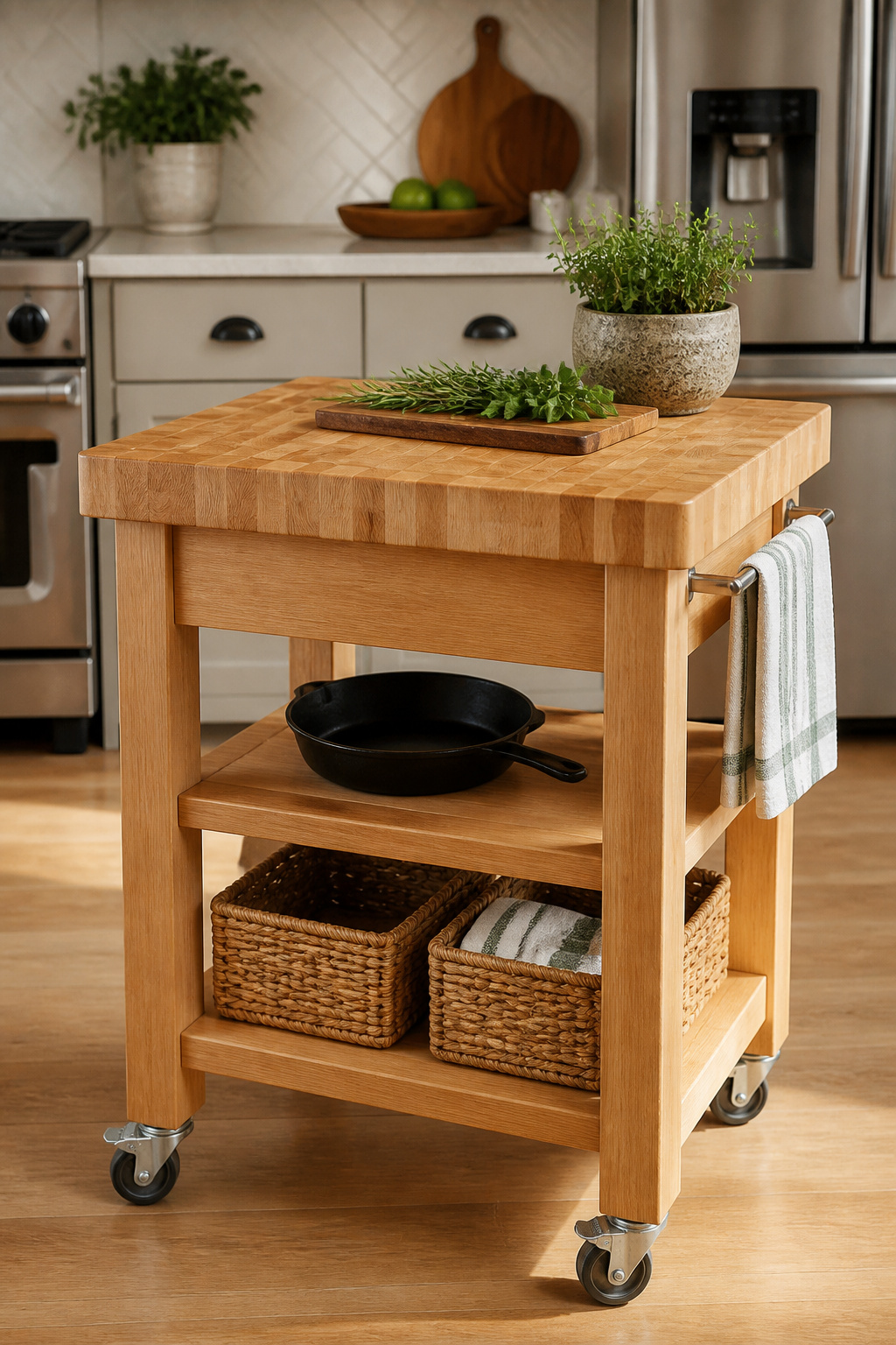
Hard maple is the standard butcher block material for good reason: a Janka rating of 1,450 lbf, a close grain, and a light colour that lets you see what you’re working with. End-grain construction — where the cross-sections of the wood face up — is the premium choice for surfaces used for direct cutting, because knife blades slip between wood fibers rather than across them, creating a self-healing effect that hides knife marks over years rather than accumulating them. Edge-grain (planks glued along their long edges) looks cleaner and more uniform and is preferred for prep stations used mostly for staging and chopping rather than heavy cutting. The cart that also functions as a prep surface is hard to beat — especially when the shelving underneath stores the items most used at that station.
Conditioning and Cart Maintenance
For casters, the stable configuration is two swivel-with-lock and two fixed — all-swivel carts drift during chopping. The 36×24 inch size hits the sweet spot: it fits through standard doorways and provides real prep space without dominating the kitchen. Set the height to match or sit 2 inches below your main countertop — lower prep surfaces reduce wrist and shoulder fatigue over long cooking sessions. Season a new butcher block five to seven times in the first month with food-safe mineral oil, letting each application absorb fully. After that, a monthly application of board butter (beeswax blended with mineral oil) maintains a water-resistant top layer. The one thing never to use: olive oil or any vegetable oil. They go rancid inside the wood and create an odour that no amount of sanding fully resolves.
5. Open-Back Wooden Shelving Units as Statement Kitchen Furniture
The difference between open shelving that looks considered and open shelving that looks chaotic usually comes down to one decision made before a single object is placed: the wood species. Get that right, and the shelves function as genuine kitchen interior furniture that anchors a wall. Get it wrong, and you end up with a surface that displays the problem of too much stuff rather than solving it.
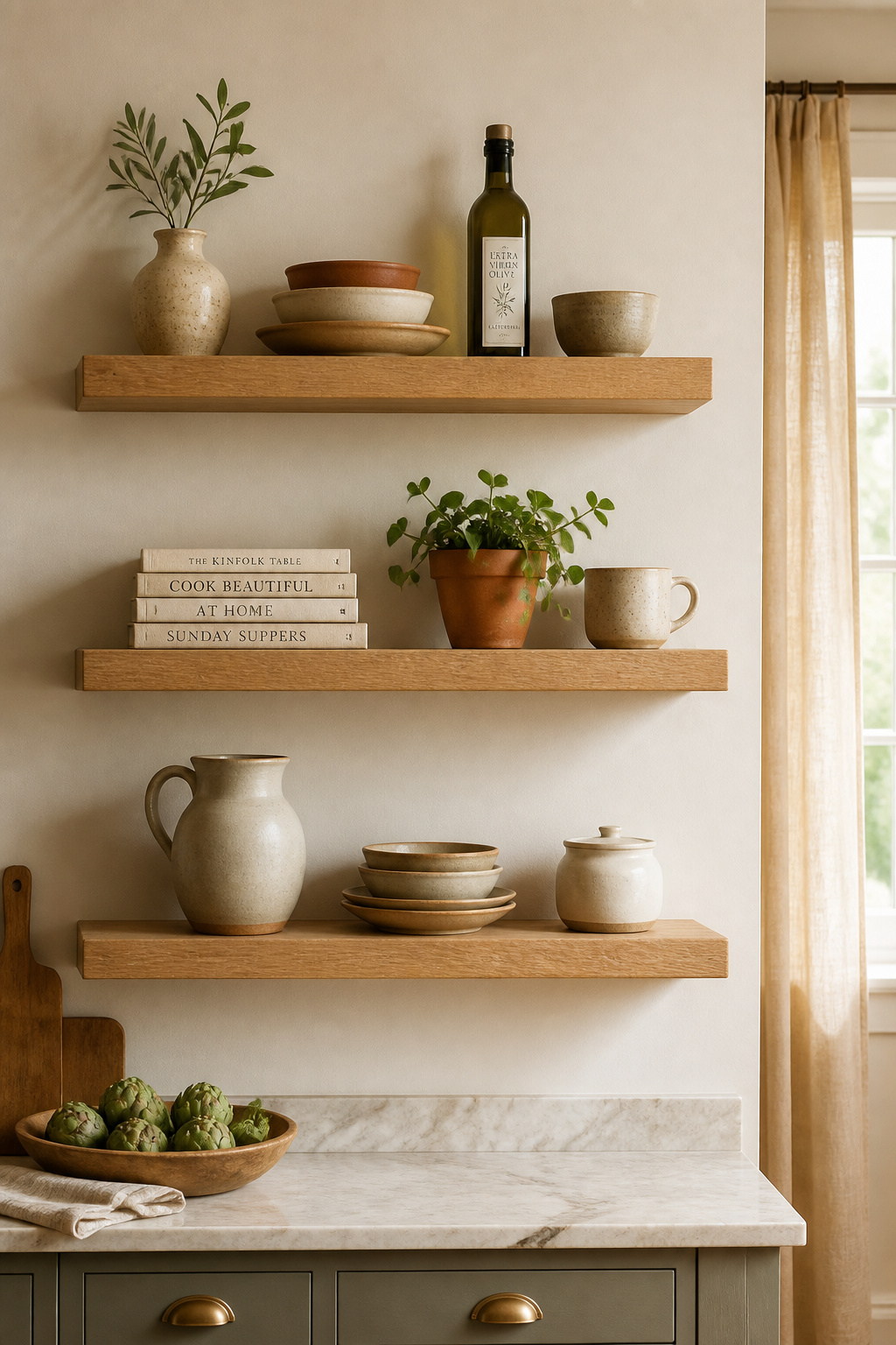
White oak is currently the dominant kitchen shelving species — its ray-fleck grain remains visible even under a natural oil finish, pairing with both warm palettes (walnut, brass, terracotta) and cooler ones (concrete, stainless, slate). Ash is a strong alternative: paler, more uniform in grain, slightly more affordable, and receptive to stain if a different tone is needed. Near a stove or sink, hardwood species resist humidity and steam significantly better than softwoods; pine (870 lbf on the Janka scale) is the budget choice but accumulates dings in a working kitchen. Ideal shelf depth is 10–12 inches — enough for a standard dinner plate’s 10.5-inch diameter while maintaining proportion against wall height. For styling approaches that translate to the wall, kitchen shelves decor that transforms the room is worth consulting before committing to a layout.
Styling Principles That Actually Work
The styling principles that make open shelving work are simple and consistent: group objects in odd numbers (three mugs, one bottle, two plates — odd arrangements read as deliberately styled); leave negative space (a gap between a stack of plates and a row of books creates visual breathing room that makes the whole arrangement look intentional); and vary heights within groupings (a tall olive oil bottle next to a short bowl next to a medium mug creates visual rhythm that a row of identical objects flatly cannot). The most common mistake: treating the shelves like a cupboard that happens to be open. Open shelving fails — and fails visibly — when every square inch is occupied. Less, always.
6. A Glass-Front Cabinet Hutch With Interior Strip Lighting
There is a particular shift that happens when a kitchen moves from functional to curated — and glass-front cabinetry is often the hinge point. The logic is simple: objects kept behind a closed door are storage. The same objects behind glass are a collection. The distinction matters because it changes how you arrange, what you keep, and how the room makes people feel when they walk in.
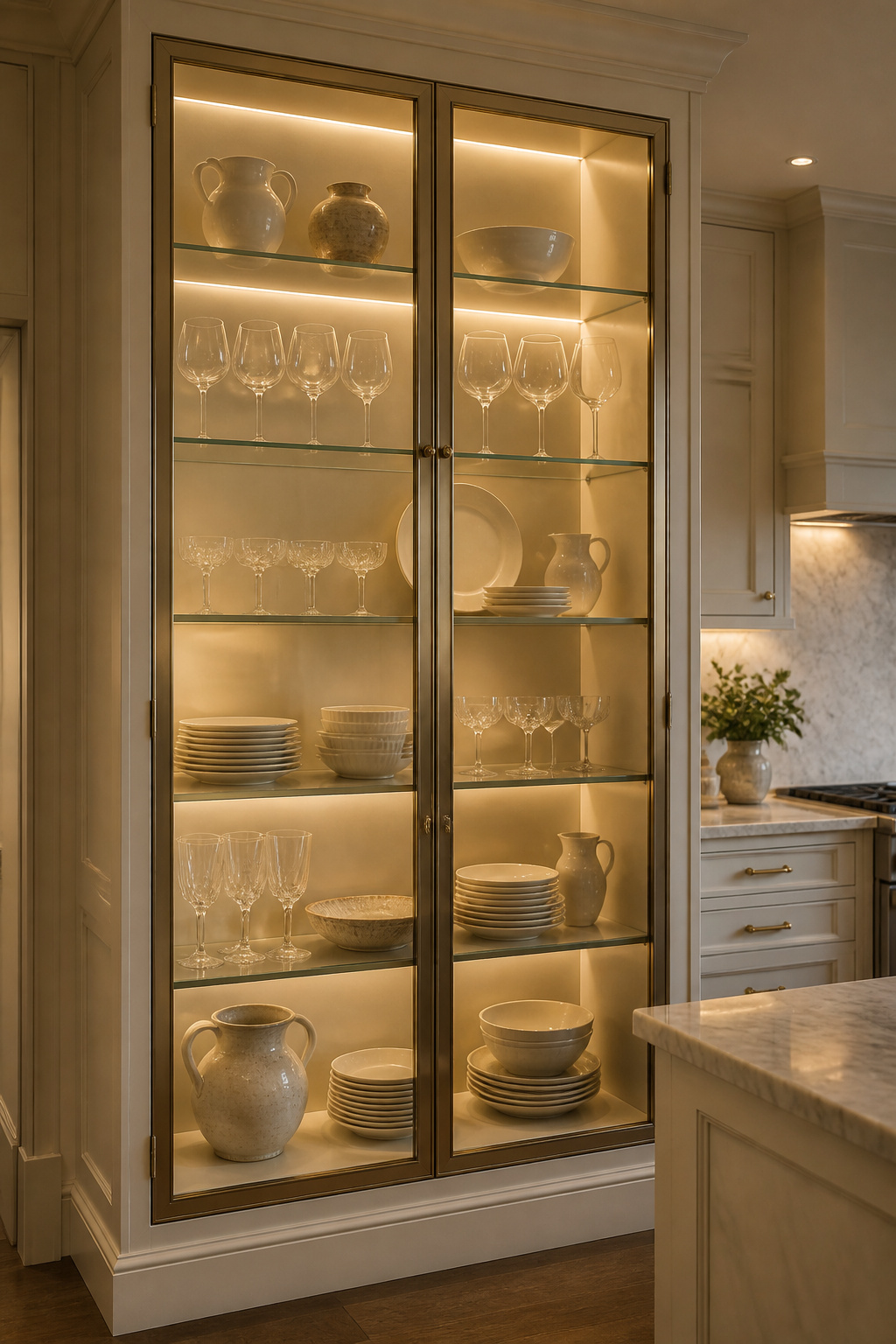
The glass type determines how the cabinet reads architecturally. Mullion glass (divided by wood bars into smaller panes) is traditional and architectural — right for shaker cabinetry, heritage tiles, and period hardware. Flat glass front (one uninterrupted pane) is contemporary and clean. Seeded or reeded glass (textured surface, embedded bubbles) diffuses light and partially obscures cabinet contents — useful for storage that is organised but not curated enough for direct display. Adding glass fronts to existing cabinets is one of the most straightforward kitchen furniture ideas for fundamentally changing a kitchen’s visual register.
Sizing the Hutch for Your Wall
Interior lighting changes the display entirely. LED strip lighting installed along the top and sides of the cabinet interior is the easiest retrofit — and colour temperature determines what the display looks like at night. At 2700K (warmest), ceramics glow amber and the display reads as warm and intimate. At 3000K (slightly cooler, more balanced), glassware renders as crystal-clear rather than amber-tinted, and stemware sparkles without the clinical edge of 4000K. For a hutch scaled to the wall, aim for 60–70% of the wall width — leaving breathing room on both sides keeps it reading as furniture rather than built-in. Frame choices run from painted MDF (most affordable, cleanest line) to solid wood (visible grain adds warmth) to metal-framed glass (most modern). One thing to get right from the start: avoid interior lighting below 2700K — warm yellow incandescent-equivalent light makes white dishes look cream and glassware look cloudy, undoing exactly what the display was designed to do.
7. A Narrow Console Table for Galley Kitchen Interior Flow
A console table is one of the more underutilised pieces of kitchen interior furniture. It reads as furniture rather than infrastructure — and that distinction matters, because even the most beautifully finished kitchen can feel like a room without personality when everything in it is counter-height cabinetry running wall to wall.
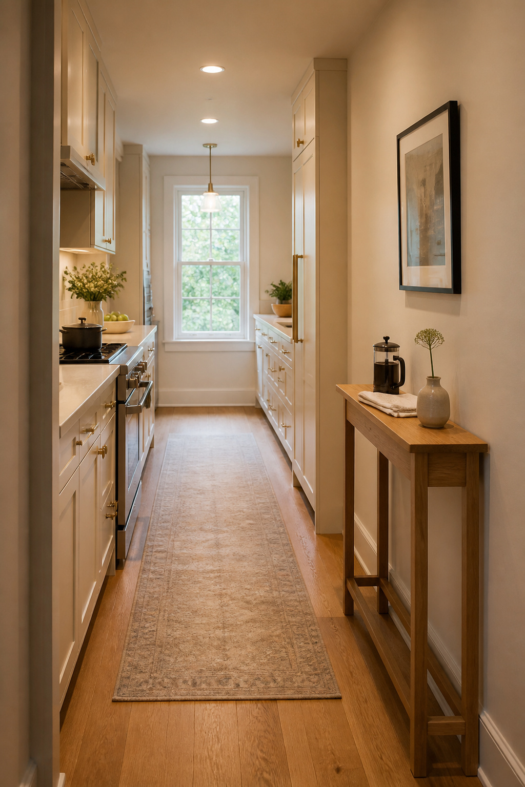
The console’s value is in what it provides that countertops don’t: a distinct visual zone at a different height (typically 28–32 inches versus the 36-inch standard counter height) and a narrower depth that doesn’t encroach on kitchen workflow. In practical terms, this is where a coffee station lives, where cookbooks get displayed, where a small trailing plant or a collection of olive oils can be staged without occupying prep space. In an open-plan kitchen, a console placed behind the island can serve as a visible serving buffer — keeping food staging distinct from the main prep zone.
Depth, Height, and Material Durability
Depth is the dimension that determines whether a console works in a galley kitchen or becomes an obstruction: 9–14 inches is the workable range, with 12 inches as the sweet spot wide enough to be useful, narrow enough to maintain corridor flow. You need a minimum 36-inch corridor width after the console is placed — any less and movement around a working kitchen becomes genuinely hazardous. For materials, metal-framed consoles (powder-coated steel or iron base, wood top) are the most kitchen-appropriate hybrid: the base is immune to humidity changes, and the top can be replaced or refinished independently. Solid hardwood works too if sealed against cooking moisture; lacquered MDF is the most vulnerable at corners and edges where traffic impact is inevitable in a galley kitchen. Don’t buy a console deeper than 14 inches for a narrow kitchen — corridor clearance is not a detail to gamble on.
8. Built-In Banquette Bench With Lift-Up Seat Storage
There is a social quality to a banquette that freestanding chairs simply can’t replicate. Booth-style seating brings people physically closer to the table surface and to each other — it removes the option of the half-turned chair, the pushed-back seat, the diner who is technically present but not really at the table. A banquette commits people to the meal — and as kitchen dining furniture and kitchen furniture go, it’s the option that makes the most of a corner that chairs would waste.
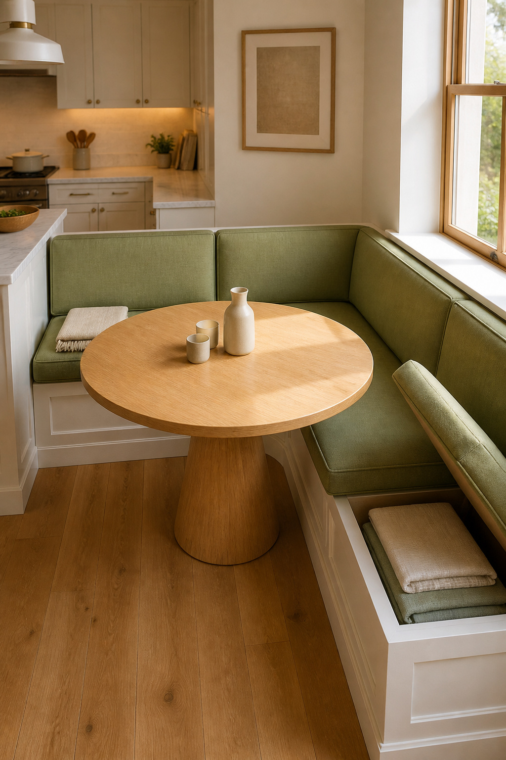
The storage case is equally compelling. A 48-inch banquette bench seats three adults comfortably (16 inches per person) and requires less floor space than three chairs with clearance for pulling them back. Lift-up storage under the seat — hinged with full-length piano hinges for even weight distribution — typically yields 4–8 cubic feet of accessible storage for linens, small appliances, or seasonal items that shouldn’t live in prime kitchen real estate.
Upholstery That Survives a Kitchen
Standard dimensions that translate to actual comfort: seat height 18 inches, seat depth 17–20 inches, back height 12–20 inches above the seat. High-density foam (2.5 lb density minimum) for the seat cushion is non-negotiable — lower density compresses within a year and the bench becomes something people avoid rather than seek out. Seat depth over 20 inches creates a different problem: diners end up resting their back against the wall rather than against the cushioned back, which is exactly as uncomfortable as it sounds. For upholstery near a kitchen, Crypton fabric (stain-resisting polymer woven at the fiber level) handles wine, grease, and daily life; Sunbrella (originally outdoor fabric) is UV-stable, mildew-resistant, and available in patterns that don’t read as outdoor furniture. Marine-grade vinyl is the easiest surface to clean but feels institutional — best reserved for heavily used family kitchens where performance has to outweigh all other considerations.
9. Fluted-Front Island Cabinet Paired With Antique Brass Hardware
Fluting is a thousand-year-old architectural detail that arrived in kitchen design relatively recently, and its persistence is a sign that it’s doing something real. What it does is add shadow. Each parallel vertical groove across a cabinet front catches light differently from the next, creating a line of shadow that shifts with the angle of daylight throughout the day — a cabinet that reads differently at 9am than at 5pm, and differently again under artificial light in the evening.
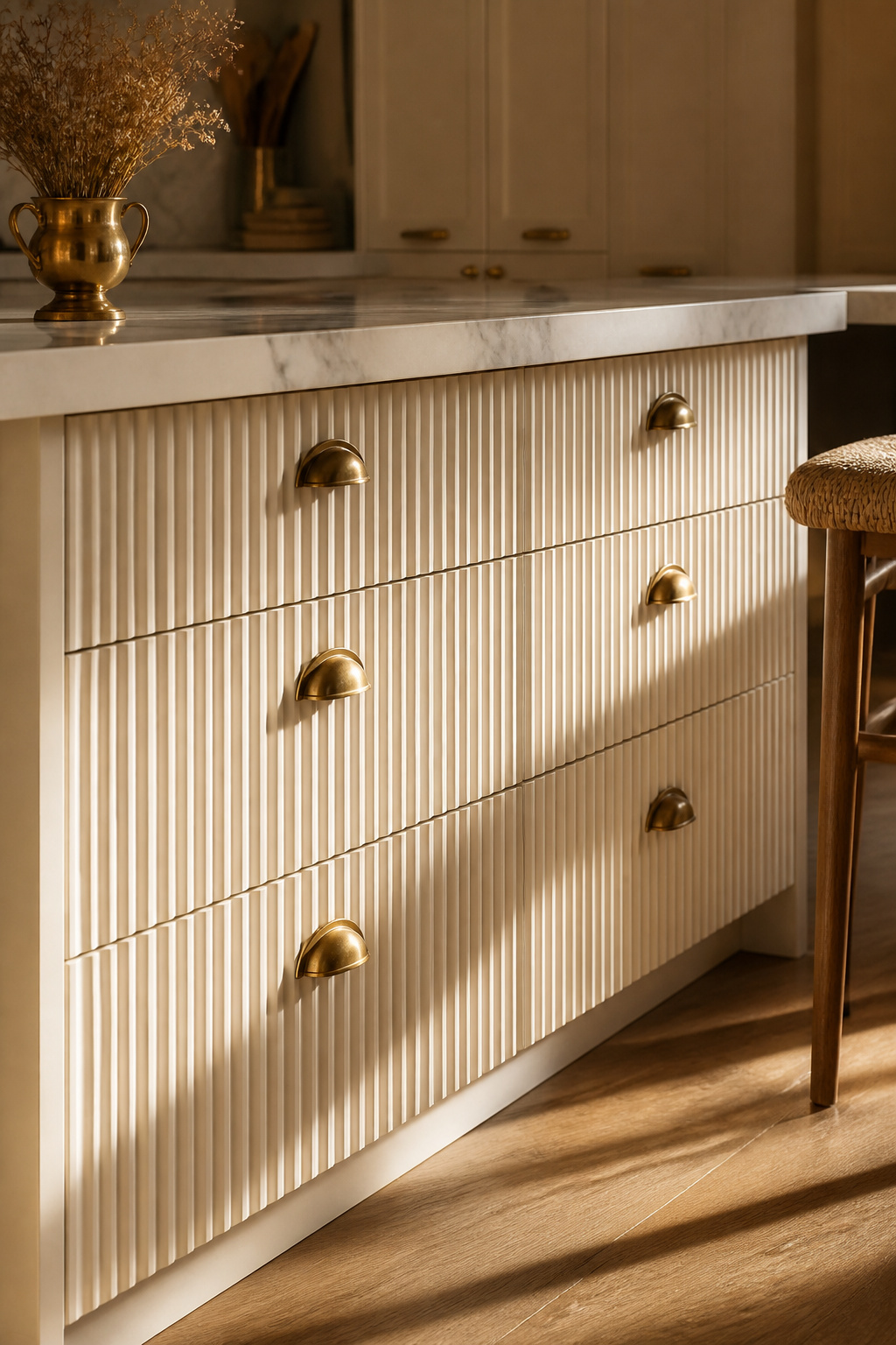
The effect is richest on natural wood veneers, where each fluted groove reveals different grain direction within the same panel. On painted MDF, the shadow lines are more uniform and more subtle — still effective, but the magic is in the relationship between the shadow line and the material’s own texture, and painted surfaces have less of that to offer. There are two ways to achieve fluting: router-cut (machined directly into the panel, creating crisp channels with no seam lines, more expensive) and applied (thin moulding strips glued to a flat panel to simulate flutes, significantly more affordable and DIY-viable, but joins can become visible over time as wood expands and contracts seasonally). For a kitchen island where daily use is real, router-cut fluting is worth the investment; applied fluting is appropriate for lower-traffic storage pieces. For kitchen island colors that make a statement, adding fluting to an island base is the textural detail that transforms a standard cabinet into something that reads as deliberately designed.
The Case for Antique Over Polished Brass
The pairing with antique brass hardware is earned, not arbitrary. Antique brass (factory pre-aged to simulate unlacquered brass that’s been handled for decades) carries a warm, mottled reflectivity that plays directly against the cool shadow lines of the fluting — high-contrast textural play that reads as designer-grade. Unlacquered brass is the more serious choice: it develops a natural patina over time through contact with fingerprints, cooking oils, and humidity, growing darker and more complex. Polished brass hardware is the one thing to avoid — its mirror-brightness overwhelms the subtle shadow-line effect entirely.
10. Boucle Dining Chairs: Soft Kitchen Furniture for a Hard-Surface Interior
Most kitchens are acoustically unforgiving. Tile floors, stone counters, painted walls, glass cabinet fronts — they’re all hard surfaces that reflect sound rather than absorbing it. Meals in these kitchens feel louder and less intimate than the food warrants. Introducing upholstered seating is one of the few things a furniture decision can do to genuinely change the acoustic quality of a kitchen interior, not just its visual one.
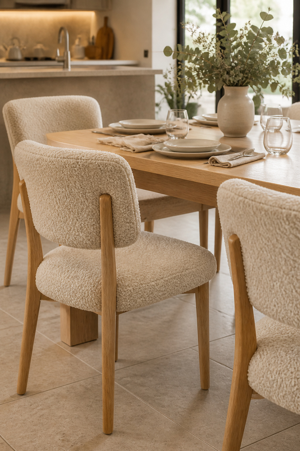
Boucle (from the French for ‘loop’ or ‘buckle’) is a yarn structure, not a specific fibre — it’s made with looped, curled strands of wool, cotton, or synthetic blends that create a knotted, textured surface. Those loops absorb more sound than smooth upholstery because more fibre surface area is exposed; paired with a dining table in a hard kitchen, four boucle chairs create a measurable difference in reverberation. The downside of that same texture is its relationship with crumbs and fine debris, which settle into the loops and require weekly vacuuming with a soft brush attachment to remove. For kitchen dining chairs — as distinct from island stools — this maintenance trade is reasonable: dining chairs are further from the direct cooking zone and are used for sitting, not casual hovering-and-grazing.
Choosing the Right Chair Configuration
Boucle belongs at the dining table, not at the island. At the island, where cooking splatter is a regular hazard, it’s the wrong material for the job. For dining configurations: fully upholstered chairs (seat and back in fabric) provide the maximum comfort for long meals but require the most maintenance; seat-only upholstery on a wooden-frame chair is the practical kitchen compromise — wood back and legs wipe clean, only the seat pad needs fabric care. Dining chair seat height standard is 17–19 inches, pairing with a table at 28–30 inches for a comfortable 10–12 inch knee clearance. Don’t rush this pairing — the ergonomics of sitting at a kitchen table for dinner should be identical to sitting at a dining table for a dinner party.
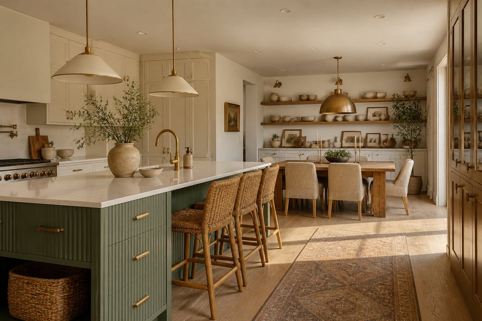
11. A Two-Tone Kitchen Island With a Navy or Forest Green Base
The single design decision that most reliably makes a kitchen island look like furniture rather than cabinetry is colour. When the island base is a different colour from the perimeter — darker, typically, and more saturated — it creates a visual anchor that draws the eye to the room’s centre in a way that an all-white kitchen simply cannot replicate. Navy and forest green are the two shades that have proven the most durable in this role: navy reads as sophisticated and timeless; forest green has an organic, almost botanical quality that references both nature and the craftsman tradition.
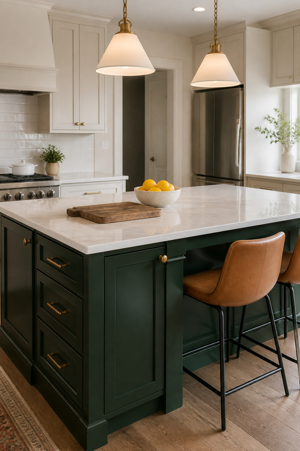
The colour break at the countertop level is what makes the two-tone effect work. The top surface acts as a horizon line, dividing the darker base from the lighter upper cabinetry — and the choice of countertop material at that horizon point determines everything. White quartz with subtle grey veining is the most versatile pairing, lightening the visual weight of a dark base without competing with it. Butcher block (maple or white oak) over a navy or green base creates a warm-cool contrast that references both kitchen tradition and contemporary design simultaneously. The pairing to avoid: black granite over a dark island base — it merges the cabinet colour and eliminates the horizon-line contrast that makes the effect work. The principle applies whether you’re going navy, green, or any other departure from perimeter cabinet colours.
Paint and Countertop Pairings
On paint: both Sherwin-Williams Emerald Urethane Trim Enamel and Benjamin Moore Advance are the professional choices for cabinet furniture — both cure to hard, washable surfaces that block grease and resist knocks. Both require 21–30 days of full cure time before heavy use. And both should be applied in satin or semi-gloss rather than high-gloss: full-gloss on island cabinetry makes every surface imperfection — every brush mark, every dent — visible in a way that undermines the whole exercise.
12. Freestanding Kitchen Pantry Cabinet in Shaker Style
The Shaker door style has been in continuous production since the 1770s, and its survival is not sentimental — it’s proportional. The five-piece construction (two stiles, two rails, a flat inset panel) produces a door so balanced between its component parts that it reads as correct in almost any kitchen aesthetic. Contemporary Shaker kitchens use narrower rails (2.25 inches) for a more spare, modern interpretation; traditional versions use wider rails (3.5 inches or more) for a heavier, more period-appropriate presence. The same door, differently proportioned, spans two centuries of style.
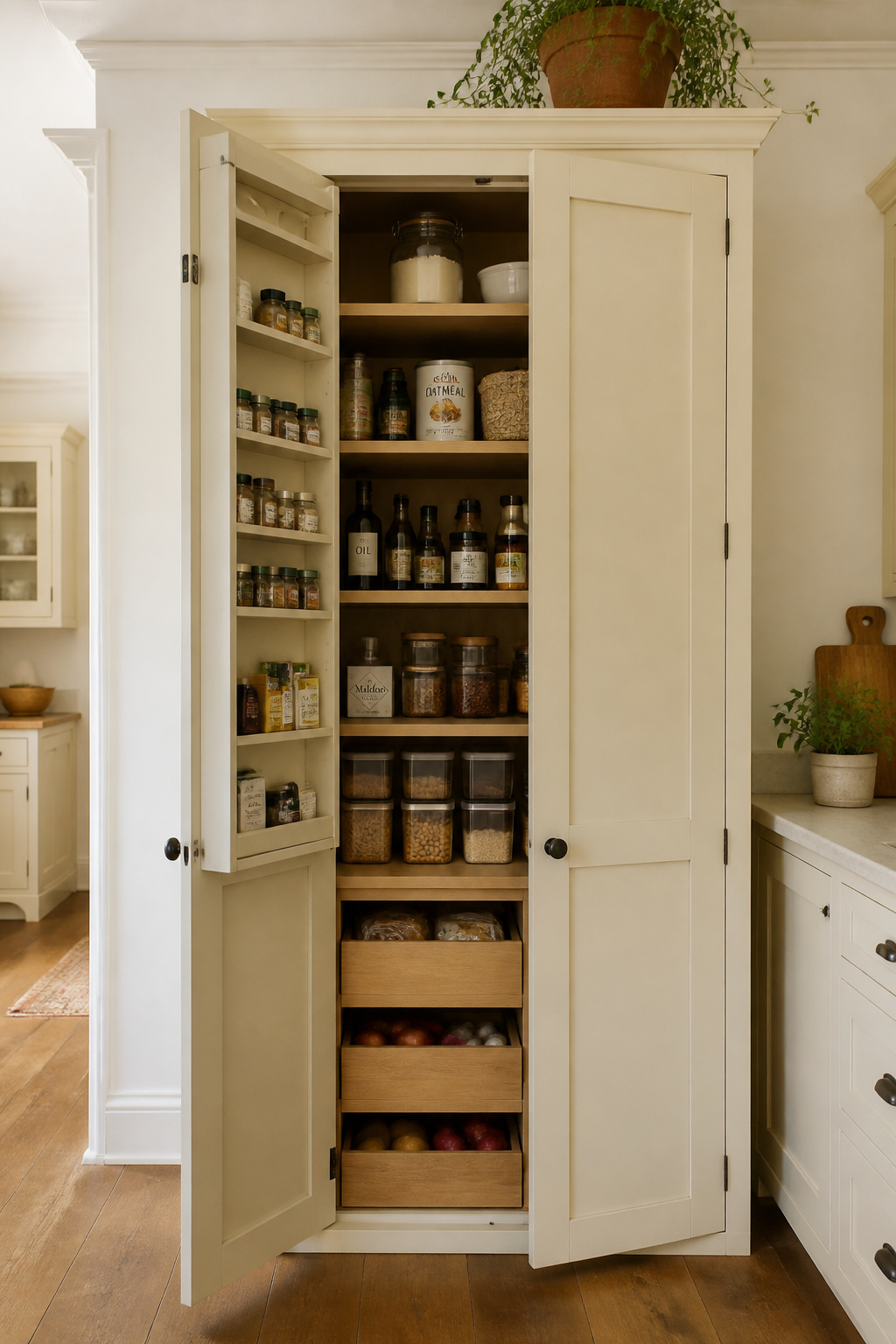
A freestanding Shaker pantry is the kitchen storage furniture that doesn’t need to be integrated into the kitchen’s built-in cabinetry to feel intentional. It can sit freestanding against a wall, move with you, and accommodate reorganisation without a cabinet-maker’s invoice. Sourcing options span a wide range: IKEA’s PAX system configured with Semihandmade Shaker fronts can land a full 79-inch pantry around $800–1,200; freestanding units from Pottery Barn or Restoration Hardware run $1,800–4,500; custom from a local maker hits $300–600 per linear foot installed. For kitchen storage cabinets that stay organised, the Shaker pantry at any price point outperforms most alternatives when the interior is properly configured.
Interior Organisation That Works
Interior organisation determines whether a pantry cabinet actually works or simply relocates the clutter. Pull-out shelving (full-extension drawer slides under fixed shelves) eliminates the dead zone at the back of deep shelves — approximately 65% of pantry storage is practically unreachable without pull-outs. Door-mounted spice racks and bottle holders (1.5-inch deep organizers on the inside of the pantry door) add storage without encroaching on shelf space. The one feature to insist on: adjustable shelf pins at 1-inch increments. A fixed-shelf pantry becomes obsolete the moment your storage needs change — and they will.
13. Industrial Pipe Shelving as Kitchen Interior Furniture for Open-Plan Homes
Industrial pipe shelving arrived in home design through the renovation of loft apartments and converted warehouses, where exposed infrastructure was made into a design feature rather than concealed. What made it persist beyond that origin story is that the pairing — matte black iron pipe against warm wood planks — is a contrast that works almost regardless of context. The material authenticity matters: 3/4 inch black iron pipe is the same material used in commercial plumbing and gas supply lines, not a decorative replica. That genuineness is part of what makes it read as more than a trend.
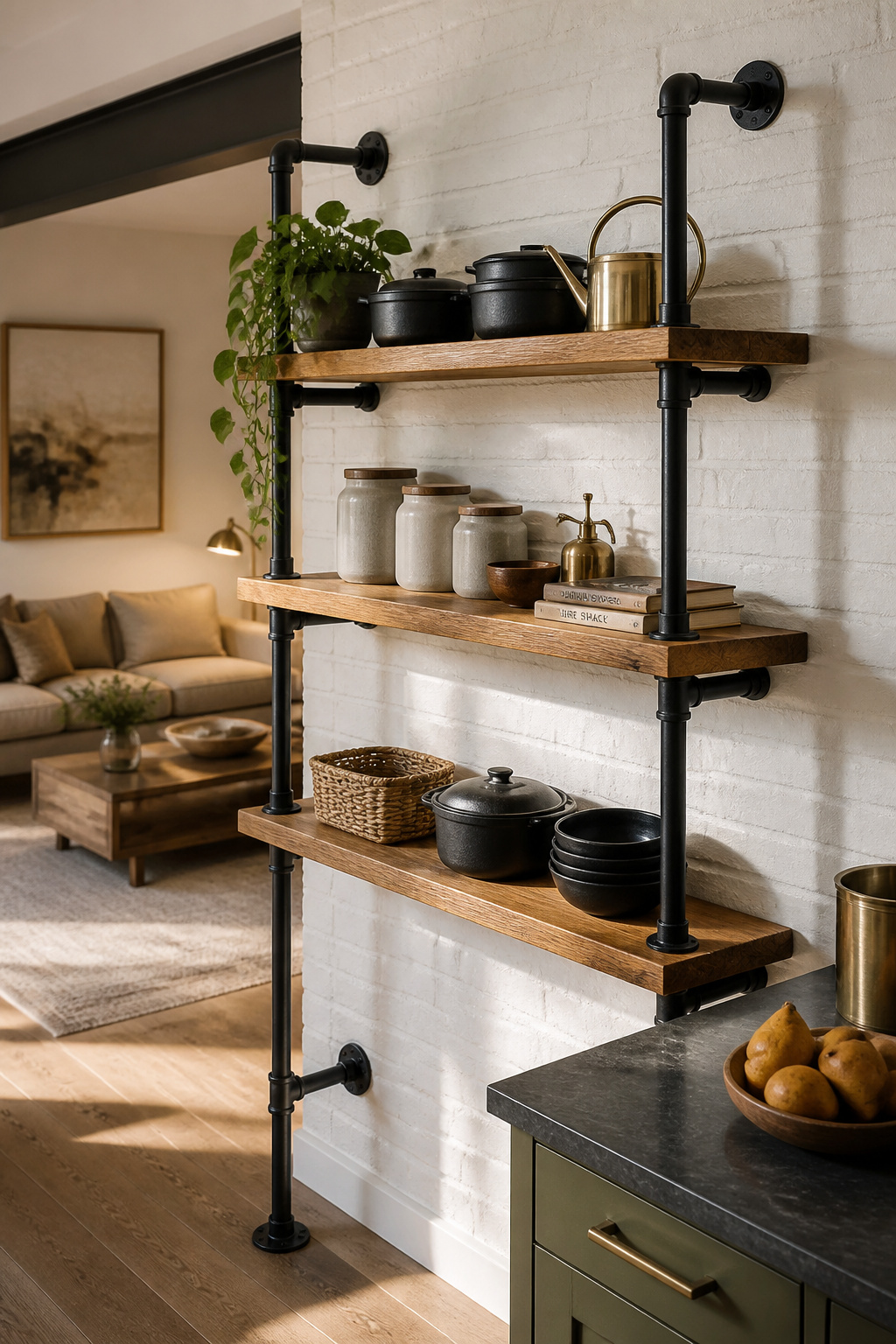
The structural basics are worth understanding before purchasing. Floor flanges — the disc plates that mount the pipe to the wall — are the critical component; those secured into studs or with toggle bolts into solid masonry can support 66+ lbs per bracket. Most commercial pipe shelf systems hold 44–66 lbs per shelf depending on bracket placement and anchor quality, which is more than sufficient for kitchen storage that includes cast iron and heavy ceramics. This is also where the most common installation failure happens: mounting into drywall without hitting studs or using appropriate anchors. A shelf loaded with kitchen items pulling away from a drywall anchor is a real consequence, not a theoretical risk.
Keeping It from Reading Too Cold
The risk with industrial pipe shelving in a kitchen is a space that reads as cold, contract-grade, and cheerless — the restaurant back-of-house problem. The solution is consistently the same: pair with warm wood species (walnut over pine, white oak over maple; 1.5–2 inch thick planks at 10–12 inch depth), and introduce warmer materials elsewhere — upholstered seating, natural linen, ceramic objects, brass hardware. Mixing pipe shelving with furniture in warmer tones is the edit that stops a kitchen from reading as industrial for industrial’s sake. The pipe-and-plank combination is one of the more durable design decisions you can make — in both aesthetic and structural terms.
14. A Vintage Apothecary Cabinet Repurposed as Kitchen Island Storage
There’s a category of vintage furniture that brings something to a kitchen no contemporary piece can match: a design history so distinct it becomes a conversation in itself. Original apothecary cabinets — built for 19th-century pharmacies and medical supply companies — carry this quality in their small-drawer system, their original brass pull hardware, and the patina on surfaces handled by decades of hands. They read as collected rather than purchased — a quality that separates the best kitchen furniture from the rest. In a kitchen where the island is the room’s centre of gravity, that distinction matters enormously.
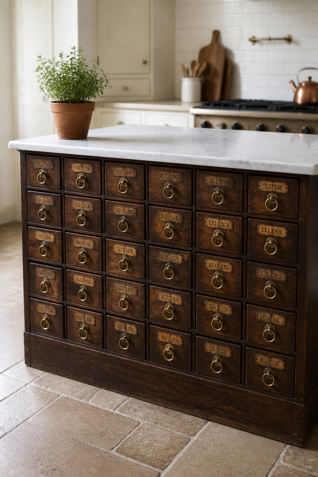
The structure is worth understanding before you buy. Original pieces feature anywhere from 20 to 120 small drawers (typically 4–8 inches wide, 4–6 inches tall, 12–20 inches deep), each originally labelled for pharmaceutical storage. The original brass drawer pulls are the piece’s visual signature and nearly impossible to replicate convincingly — intact original hardware significantly increases value and character. Structurally, check for wooden drawer runners that need beeswax to slide smoothly; drawers that bind under load will frustrate daily kitchen use fast. Height is the detail that complicates repurposing: original apothecary cabinets often sit at 28–34 inches — below standard counter height of 36 inches — which a thicker countertop or a base platform can correct.
Countertop Options for a Vintage Base
Countertop selection for a vintage base deserves as much thought as the base itself. Honed Carrara marble (1 inch thick) looks historically appropriate — marble and pharmacy furniture share a visual lineage from the same century. Edge-grain maple butcher block (1.5 inches thick) is the most practical choice: it won’t crack under temperature changes and can be removed and refinished independently of the cabinet beneath. Tempered glass over the top is the museum option — protecting the apothecary surface completely while displaying it. Wherever you land, seal the cabinet exterior against kitchen humidity before installing it; old wood furniture was finished for dry environments, not for a room that steams regularly.
15. A Kitchen Dining Table With a Sintered Stone or Marble Inlay Centerpiece
The dining table in a kitchen that doubles as a dining room carries more visual responsibility than a table in a dedicated dining room — it needs to be beautiful under the kitchen’s everyday scrutiny, not just at dinner. For a surface that is genuinely permanent in feel, the choice between sintered stone and natural marble is the material decision worth making carefully, because they perform completely differently under the conditions a kitchen table actually faces.
Sintered stone (Dekton, Neolith) achieves near-zero porosity — typically below 0.1% — through a manufacturing process that combines raw minerals under extreme heat and pressure. Wine, olive oil, citrus juice, vinegar: none of it penetrates. It scores 6–8 on the Mohs hardness scale, making it significantly more scratch-resistant than marble (which typically sits at 3–4). Marble, for its part, is naturally porous and requires sealing every 6–12 months — and even sealed marble etches from acids, the chemical burn appearing as dull patches in the polish that no amount of polishing reverses. For a contemporary dining table ideas worth the investment, the material choice should be front and centre: sintered stone is the practical answer; marble is the beautiful one with maintenance obligations attached.
Sizing for a Kitchen Dining Zone
For the base, pedestal styles (single central column) are the most formal and allow seating around the full table without leg interference — particularly useful in kitchens where every inch of seating matters. Trestle bases suit longer tables (72+ inches) and create a farmhouse aesthetic that contrasts interestingly with a smooth sintered surface. Hairpin legs (bent metal rods in V shapes) pair best with smaller tables in a mid-century key. In kitchen sizing: allow 36 inches minimum around the table for chair pull-out and circulation — 42 inches is the comfortable standard. Round and oval tables are often more space-efficient than rectangular for kitchen dining; an extension table (butterfly or draw leaf mechanism) is the practical solution for daily use that expands for guests.
16. Minimalist Kitchen Furniture: The Handle-Free Slab-Front Island
Handleless kitchen design is a commitment — not just an aesthetic choice, but a precision requirement. The visual case for a flat cabinet front is straightforward: without hardware interrupting the surface, a slab-front island reads as a single continuous plane, giving it the furniture-quality weight of a monolith rather than the utilitarian look of a run of cabinets. Whether that effect succeeds or collapses comes down to the mechanism quality and the installation precision.
Push-to-open magnetic touch-latches release cabinet doors with a gentle press — spring-loaded, no hardware visible. Integrated finger pulls (a routed channel in the door edge or underside) are the cleaner refinement: reliable grip without the mechanism. Aventos HF (Blum’s lift system for upper cabinets) is the designer-specified choice in handleless kitchens — it lifts the door upward rather than swinging outward, essential in compact kitchens where a swinging door at face height is a daily hazard. For slab-front materials, the cost and quality hierarchy: high-gloss acrylic (most reflective, every fingerprint visible, repairable), thermofoil (most affordable, moisture-resistant, but vulnerable to heat near an oven), and real wood veneer over MDF (natural grain, refinishable, 30–50% more expensive than thermofoil). Each creates a different relationship with the kitchen’s light and the room’s overall warmth.
Precision in Every Surface Detail
The precision requirement bears emphasis: a handleless slab island amplifies every installation detail — uneven reveals between doors and drawer fronts, inconsistent gaps, toe kicks that aren’t perfectly level — because there’s no hardware to distract from alignment. A floating toe kick (base appears to hover above the floor) is the ultimate minimalist detail, requiring structural engineering but creating the illusion that the island carries no weight. Countertop edge profiles should be pencil or eased (nearly square) — ogee or bullnose directly contradicts the flat-plane intent. Push-to-open mechanisms require precise hinge calibration to avoid a bouncing door; this is a calibration task, not a defect, but it needs addressing before the kitchen is signed off.
17. Wicker and Rattan Counter Stools for a Coastal Kitchen Interior
Rattan and wicker occupy an interesting position in kitchen design — materials with a strong stylistic association (the coastal kitchen, the beach house aesthetic) that can read completely differently when the surrounding context shifts. Understanding what you’re actually buying when you choose a rattan counter stool matters both for longevity and for styling versatility.
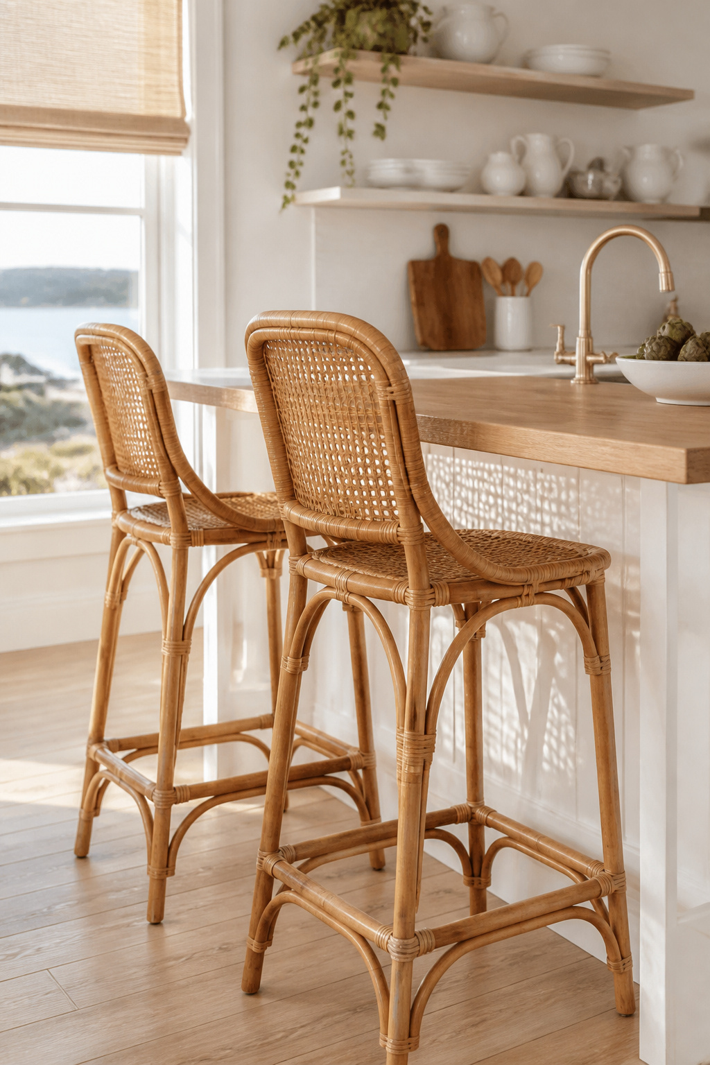
The terminology first: rattan is the plant material — the stem of the Calamus rotang vine — while wicker describes the weaving technique, which can be performed with natural rattan, seagrass, or synthetic resin. Natural rattan absorbs kitchen humidity, can develop mildew in persistently damp conditions, and is vulnerable to cracking in very dry environments. In kitchen proximity, lifespan typically runs 3–8 years. HDPE resin wicker is 100% waterproof, UV-stable, and cleans with a damp cloth; it’s the same material used for high-end outdoor furniture, and it is the practical choice for counter stools in an active kitchen. The two look nearly identical from any normal distance. Always confirm the material before purchasing — this is the distinction that determines whether the stool survives the kitchen environment or doesn’t.
Care and Styling Versatility
The coastal association is a styling cue, not an inherent material property. In a kitchen with walnut cabinetry, terracotta tile, and iron hardware, natural rattan reads as organic and artisan rather than coastal — the material takes meaning from its surroundings. Paired with concrete countertops or raw steel, rattan shifts away from the beach house entirely and toward contemporary-artisan. Caring for natural rattan in a kitchen: wipe monthly with a slightly damp cloth (never saturate it; excess moisture accelerates mould growth at woven joints); annual application of teak oil or clear furniture wax maintains flexibility and prevents brittleness. HDPE resin requires only occasional washing with mild soap and water — in a kitchen, wiping after cooking sessions is sufficient.
18. A Japandi Kitchen Sideboard: The Kitchen Furniture That Defines Your Dining Zone
Japandi — the shorthand for the intersection of Japanese minimalism (wabi-sabi: beauty in imperfection) and Scandinavian simplicity (hygge: warmth and comfortable presence) — has produced a furniture language particularly well-suited to the kitchen sideboard. In practice: clean lines without decoration, natural wood left close to its original colour, visible grain texture, hardware either hidden or in matte black or brushed brass. A Japandi sideboard is typically low-profile (30–36 inches tall), wide (60–80 inches), and finished in a way that makes you feel the wood rather than its coating.
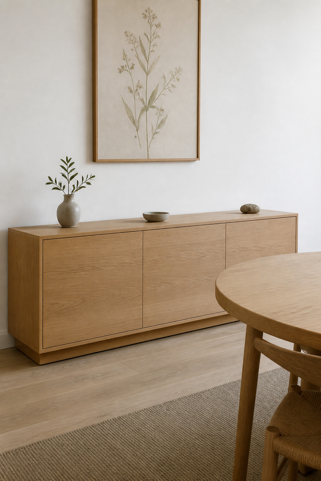
White oak is the defining Japandi wood — its ray-fleck grain reads as both natural and refined, pairing with warm and cool palettes equally. Ash is the slightly more accessible alternative: paler, less distinctive, but it takes oil and stain well. Hardwax oil is the preferred Japandi finish — it penetrates rather than coating the surface, leaving a near-matte sheen that makes grain the point. Unlike lacquer, it feels like touching wood; like lacquer, it protects against kitchen humidity. For dining room decor ideas with lasting design integrity, the Japandi sideboard is the piece that most reliably bridges kitchen utility and considered aesthetics — functional in its storage, architectural in its placement, restrained in its design.
In an open-plan kitchen-dining layout, a sideboard against the wall adjacent to the dining table creates a visual perimeter that defines the zone without closing it off. The top surface is the serving buffer — dishes staged here before reaching the table, keeping dining spatially distinct from cooking. Proportion matters: over 36 inches tall, it obstructs sight lines; at 30–32 inches it maintains openness while establishing the spatial hierarchy that makes the zone feel designed rather than implied. Over-styling is the one consistent mistake: three objects maximum on the surface, with significant negative space between them. The Japandi aesthetic demands restraint, and restraint in a sideboard display is what separates a room with a point of view from one that’s merely decorated.
Choosing Kitchen Interior Furniture That Still Feels Right in a Decade
The instinct when furnishing a kitchen is to solve all the problems at once — to buy the island, the stools, the dining table, the pantry cabinet, and the shelving in a concentrated burst of decision-making that feels decisive and complete. The rooms that result from this approach tend to look like a photograph of a specific moment in design time. The kitchens that feel genuinely considered, visited and revisited, typically took longer to finish — and they’re better for it.
The most reliable test for any piece of kitchen interior furniture is whether it’s defined by its material or by a trend association. A solid white oak sideboard will read as intentional in five years and in fifteen; a colour or silhouette that feels urgent right now is harder to predict. Large fixed pieces like islands, banquettes, and built-in shelving should be conservative in their material decisions because they’re difficult to change. Moveable pieces (bar stools, counter stools, dining chairs) can absorb more design risk because they’re easy to swap when the room evolves.
Anchoring the Open-Plan Dining Zone
Start with the largest piece of kitchen interior furniture — the island or the dining table — and let every other decision respond to it. Choose the island’s material and finish first, then select seating that complements rather than matches; identical materials (walnut island, walnut stools) read as a furniture set, not a room that developed character. Allow the kitchen to breathe between purchases: an 18–24 month horizon for furnishing a kitchen produces spaces that feel collected rather than curated in one shopping session, with depth that no single moment of decision-making can manufacture. The furniture that defines your kitchen interior isn’t the piece you loved immediately — it’s the piece that earns its place over time.