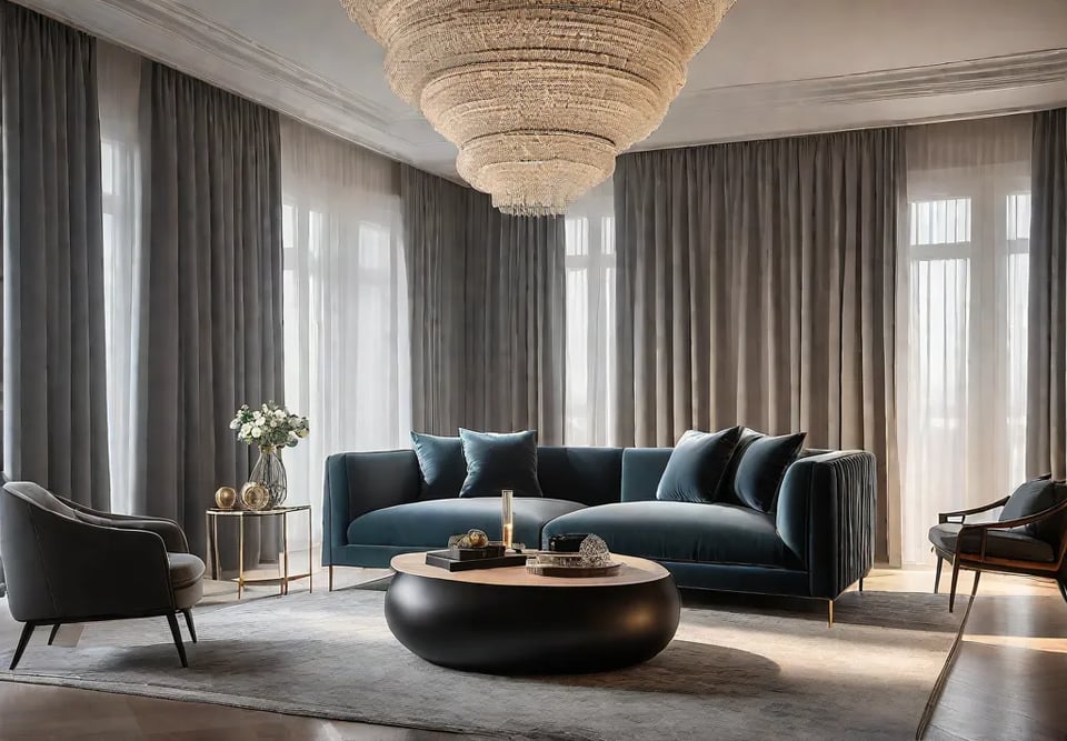
Have you ever walked into your living room and felt a twinge of disappointment? That all-too-familiar sensation that your space lacks that certain je ne sais quoi? Fear not, dear reader, for we’re about to embark on a transformative journey from bland to grand, guided by the wisdom of design luminaries and the timeless principles of aesthetic alchemy.
In this exploration of living room elevation, we’ll delve into five effortless upgrades that promise to breathe new life into your space. From the dramatic impact of lighting to the subtle power of textiles, we’ll uncover how small changes can yield magnificent results. So, pour yourself a cup of Earl Grey, settle into your favorite armchair (soon to be even more fabulous), and let’s turn the page on mediocrity. After all, as the great Billy Baldwin once said, “Be faithful to your taste, because nothing you like is ever out of style.”
Let There Be Light: Upgrading Your Lighting Fixtures
In the grand theater of interior design, lighting plays a starring role. It’s not merely about illumination; it’s about creating ambiance, setting moods, and sculpting spaces with shadows and highlights. As we embark on our journey to elevate the living room from bland to grand, let’s turn our attention to the transformative power of lighting fixtures.
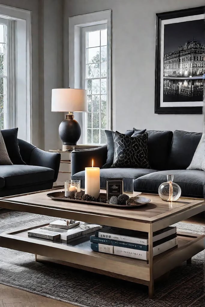
Choosing the Right Lighting for Your Style
The quest for perfect lighting begins with introspection. What story does your living room wish to tell? Is it a tale of modern minimalism, or perhaps a narrative steeped in vintage charm? Your lighting fixtures should be the exclamation points in this visual dialogue.
For those drawn to contemporary aesthetics, consider the clean lines of a sleek pendant light. Imagine a George Nelson Bubble Lamp suspended above your seating area—its organic form is a nod to mid-century design, yet timeless in its ability to complement modern interiors. Or perhaps you’re enticed by the industrial chic of exposed bulbs and metal finishes, reminiscent of New York lofts in their heyday.
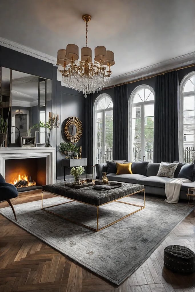
If your tastes lean towards the traditional, a crystal chandelier can infuse your space with timeless elegance. Picture the way light dances through cut glass, casting a symphony of sparkles across your walls—it’s akin to having your private galaxy within reach.
Placement and Layering for Maximum Impact
Lighting, like life, is all about balance. A well-lit room is a composition of light sources at different heights, creating a harmonious interplay of illumination. Here’s how to orchestrate your lighting ensemble:
- Ambient Lighting: Your main ceiling fixture sets the tone. Whether it’s a statement chandelier or a modern flush mount, ensure it provides enough general light for the room.
- Task Lighting: Add table lamps on side tables or a sleek floor lamp next to your reading chair. These focused light sources are the supporting actors, ready to spotlight your activities.
- Accent Lighting: Use wall sconces or picture lights to highlight artwork or architectural features. These are the subtle notes that add depth to your lighting composition.
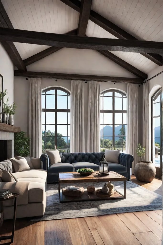
Remember, the key to a well-lit space is variety. Mix and match different types of fixtures to create visual interest and functionality. And don’t underestimate the power of dimmer switches—they’re the conductors of your lighting orchestra, allowing you to adjust the mood from vibrant to intimate with a simple slide.
The Latest in Luminous Trends
As we step into the future of home lighting, smart technology takes center stage. Imagine controlling your entire lighting scheme from your smartphone or with a simple voice command. LED fixtures with color-changing capabilities offer a palette of possibilities, allowing you to shift from warm amber for cozy evenings to cool daylight for productive afternoons.
For those with an eye for eco-friendly design, solar-powered pendant lights are making their way indoors, bringing a touch of sustainability to your living space. And let’s not forget the resurgence of artisanal lighting—handblown glass fixtures and sculptural forms that blur the line between functional objects and art pieces.
Sizing Up Your Space
When it comes to selecting the right size fixture for your living room, proportion is paramount. Here’s a quick guide:
- For chandeliers, add the length and width of your room in feet. The sum in inches is the ideal diameter for your fixture.
- Pendant lights should hang about 12-20 inches below a standard 8-foot ceiling. Add 3 inches for each additional foot of ceiling height.
- Table lamps should be proportionate to the surface they’re on. The bottom of the lampshade should be at eye level when you’re seated.
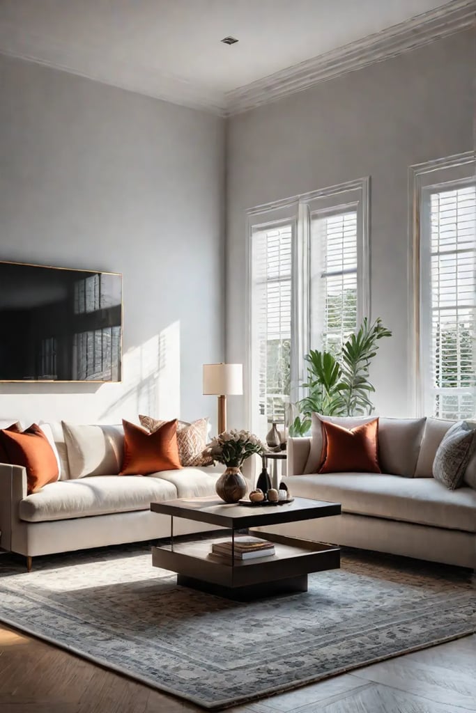
For open-concept spaces, use lighting to define different areas. A large pendant over a coffee table can create a visual anchor for your seating arrangement, while a series of smaller pendants can guide the eye along a console table.
Upgrading your lighting is more than a mere facelift for your living room—it’s an investment in the very atmosphere of your home. With thoughtful selection and placement, your new fixtures will not only banish shadows but also cast your space in its best light, creating a living room that’s truly illuminating.
As we bask in the glow of our newly lit space, let’s turn our attention to another element that can add depth and comfort to our living room. The next section, “The Power of Textiles: Adding Texture and Warmth with Throw Pillows and Rugs,” will explore how soft furnishings can transform the tactile experience of your space, creating layers of coziness that invite you to linger and relax.
The Power of Textiles: Adding Texture and Warmth with Throw Pillows and Rugs
Textiles are the unsung heroes that can transform a living room from bland to grand with minimal effort and maximum impact. Let’s explore how throw pillows and rugs can inject life, warmth, and personality into your space, creating a symphony of textures that dance before the eye.
Choosing the Right Throw Pillows for Your Sofa and Style
Throw pillows are the jewelry of your living room, adorning your sofa with pops of color and inviting textures. When selecting these decorative accents, consider the following:
- Size and shape: Mix and match different sizes and shapes to create visual interest. A combination of 18-inch squares, 22-inch squares, and lumbar pillows can make your sofa look more inviting and professionally styled.
- Color palette: Choose pillows that complement your existing decor while introducing new hues. For 2023, we’re seeing a resurgence of earthy tones like terracotta and sage green, as well as rich jewel tones like sapphire and emerald.
- Texture play: Introduce a tactile experience with velvet, faux fur, or chunky knit fabrics. These textures not only add visual depth but also create a cozy, touchable environment.
Remember, the key to successful pillow arrangement is balance. As the great designer Florence Knoll once said, “Good design is good business.” Apply this principle by ensuring your pillow selection enhances rather than overwhelms your living room’s aesthetic.
Selecting a Rug that Complements Your Space
A well-chosen rug is the foundation of a cohesive living room design. It anchors your furniture, defines the space, and adds a layer of comfort underfoot. Consider these factors when selecting your rug:
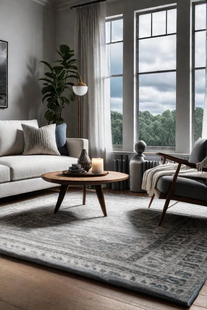
- Size matters: Choose a rug large enough to accommodate all or most of your furniture. In open-plan living areas, a generously sized rug can help delineate different functional zones.
- Pattern and texture: Bold geometric patterns are having a moment in 2023, offering a contemporary edge to traditional spaces. For a more subtle approach, consider rugs with interesting textures like sisal or shag.
- Color coordination: Select a rug that ties together the colors in your room. It doesn’t have to match perfectly – a rug that picks up accent colors from your pillows or artwork can create a harmonious look.
Mastering the Mix: Patterns and Textures in Harmony
The art of mixing patterns and textures without clashing lies in understanding the principles of scale and color. Here’s how to achieve a curated look:
- Vary the scale of patterns: Pair large-scale patterns with smaller, more intricate designs.
- Stick to a cohesive color palette: Choose patterns that share at least one common color.
- Balance bold with neutral: If you opt for a statement rug, keep your pillows more subdued, or vice versa.
Remember, as the iconic designer David Hicks once noted, “The best rooms have something to say about the people who live in them.” Let your textile choices reflect your personality and style preferences.
Care and Maintenance: Preserving Your Textile Investments
To ensure your textiles stand the test of time:
- Rotate throw pillows regularly to prevent uneven wear.
- Vacuum your rug weekly, and have it professionally cleaned annually.
- For delicate fabrics, spot clean with a gentle detergent and water solution.
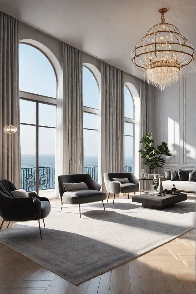
By incorporating these textile elements thoughtfully, you create a living room that’s not just visually appealing but also inviting and comfortable. The interplay of textures and colors can evoke emotions and memories, turning your space into a true reflection of your style.
As we move from the soft embrace of textiles to the framing of your living room’s view, let’s explore how updating your curtains can provide a dramatic transformation that complements your newly enhanced textile landscape.
Framing Your View: Updating Your Curtains for a Dramatic Transformation
Curtains, often overlooked, hold the power to transform your living room from bland to grand with a simple swish. As the legendary designer Billy Baldwin once said, “Be faithful to your taste, because nothing you like is ever out of style.” Let’s explore how to frame your view with curtains that not only complement your space but elevate it to new heights of sophistication.
Selecting the Right Curtain Fabric and Length
The journey to curtain perfection begins with fabric selection. Consider the mood you wish to evoke:
- Linen for a relaxed, coastal vibe
- Velvet for opulent luxury
- Sheer voile for a dreamy, ethereal atmosphere
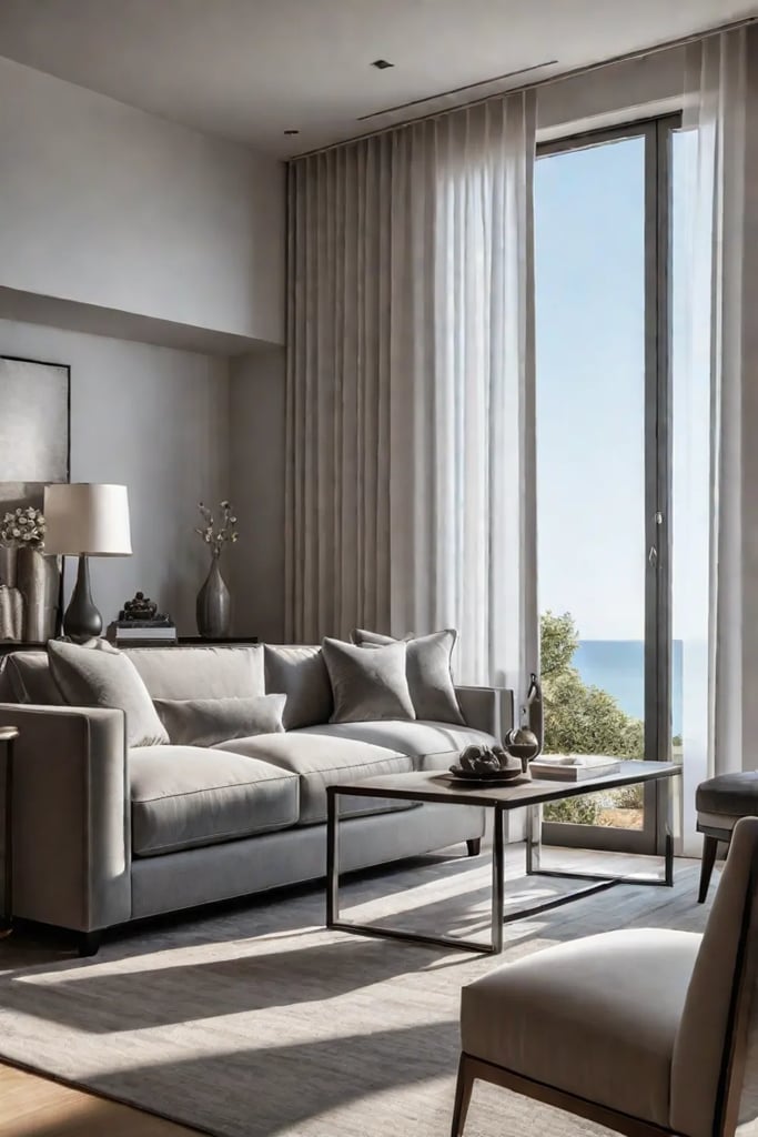
Length is equally crucial. Floor-to-ceiling curtains create an illusion of height, much like the soaring columns of ancient Greek temples. For a truly dramatic effect, allow your curtains to “puddle” on the floor, creating a sense of old-world elegance reminiscent of 18th-century French salons.
The Art of Hanging: Headings and Hardware
Curtain headings are the unsung heroes of window dressing. Popular options include:
- Pencil pleats: Crisp and tailored, perfect for contemporary spaces
- Pinch pleats: Offering a more formal, traditional look
- Eyelet or grommet: Modern and minimalist, ideal for sleek interiors
When measuring for curtains, remember this golden rule: extend your curtain rod 4-6 inches beyond the window frame on each side and 4-6 inches above. This simple trick, favored by designers like Dorothy Draper, makes windows appear larger and ceilings higher.
Layering for Luxe
To truly elevate your living room, consider layering your window treatments. Pair sheer curtains with heavier drapes for a look that’s both functional and fabulous. This combination allows you to modulate light throughout the day, creating a living space that’s as dynamic as a Calder mobile.
Accessorizing Your Drapery
Accessories are the jewelry of your curtains. Consider:
- Tiebacks: From simple fabric bands to ornate tassels
- Holdbacks: Elegant wall-mounted options for a polished look
- Valances or pelmets: Add a touch of formality and hide curtain hardware
Care and Maintenance
Invest in quality curtains, and they’ll reward you with years of beauty. Regular gentle vacuuming and occasional professional cleaning will keep your drapery looking fresh. For delicate fabrics, consider lining your curtains to protect them from sun damage – a trick employed in many historic homes to preserve precious textiles.
As we draw the curtains in this section, remember that the perfect window treatment is a balance of form and function, much like the iconic Barcelona chair. It should frame your view, enhance your space, and reflect your style.
As we move on to our next topic, “Accentuate the Positive: Infusing Personality with Accent Furniture,” let’s carry forward this idea of personal expression. Just as your curtains frame your windows, accent furniture frames the narrative of your living space, telling the story of who you are and what you love.
Accentuate the Positive: Infusing Personality with Accent Furniture
Have you ever walked into a room and felt an immediate sense of intrigue, as if the space itself was telling a story? That dear reader, is the magic of well-chosen accent furniture. These pieces are the punctuation marks in the language of interior design, adding emphasis, personality, and functionality to your living room’s narrative.
Choosing Accent Furniture that Reflects Your Style
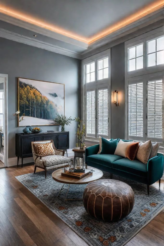
When selecting accent pieces, consider them as characters in the ongoing drama of your home. Each should play a distinct role, whether it’s the show-stopping vintage trunk that doubles as a coffee table or the quietly elegant side table that whispers of mid-century sophistication.
- The Charismatic Ottoman: Opt for a brightly upholstered piece to inject a vibrant pop of color. It’s like adding an exclamation point to your decor!
- The Enigmatic Side Table: A mirrored surface can introduce a touch of glamour, reflecting light and creating the illusion of space. Think of it as the mysterious supporting actor in your living room’s ensemble cast.
- The Scholarly Bookshelf: Display your literary treasures and objets d’art on a stylish bookshelf. It’s not just furniture; it’s a window into your intellectual and aesthetic pursuits.
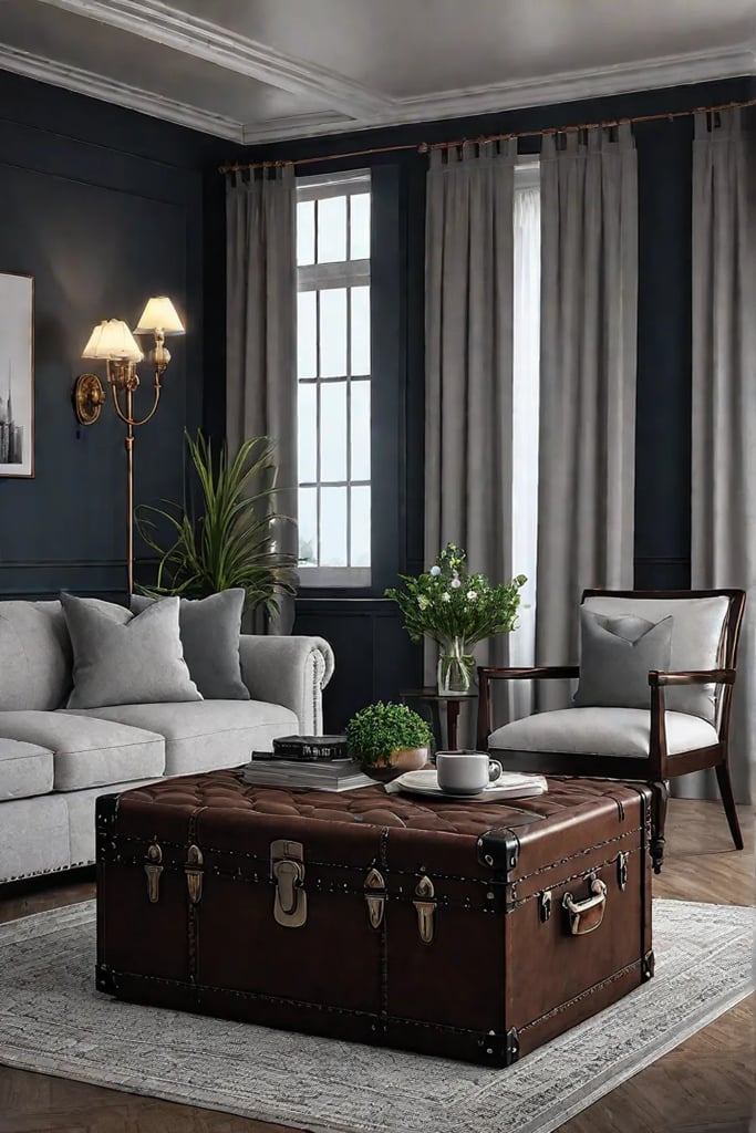
Remember, the best accent furniture is a reflection of you. Don’t shy away from pieces that spark joy or ignite conversation. After all, as the legendary Florence Knoll once said, “Good design is good business.” In this case, the business is creating a living space that truly feels like home.
Placement and Arrangement for Maximum Impact
The art of arranging accent furniture is akin to composing a visual symphony. Each piece must harmonize with the others while maintaining its unique voice.
- Create Conversation Areas: Use a pair of striking armchairs flanking a small side table to craft an intimate tête-à-tête space within the larger room.
- Fill Empty Spaces: That awkward corner? Transform it into a cozy reading nook with a sleek floor lamp and a sumptuous chaise longue.
- Showcase Your Style: Group candles, vases, and personal mementos on a console table to create a stylish vignette that tells your story.
When it comes to current trends, we’re seeing a delightful resurgence of organic forms and natural materials. Curved sofas that echo the sinuous lines of Vladimir Kagan’s iconic designs are making a comeback, while rattan and wicker pieces add texture and a touch of bohemian chic.
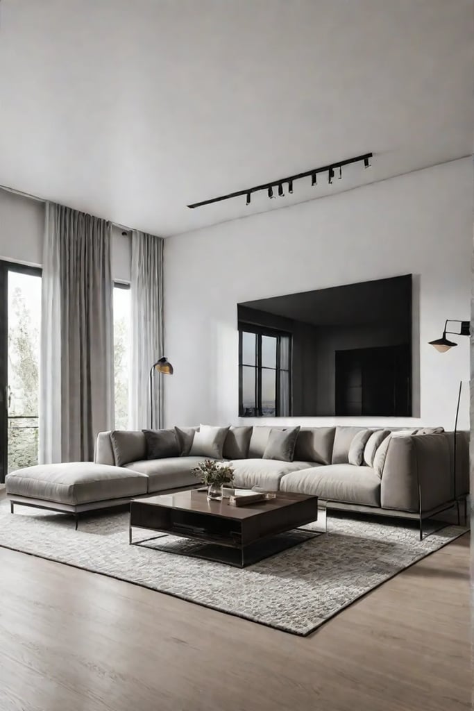
To create a focal point, consider an oversized piece of art or a statement chair. The Eames Lounge Chair, for instance, has been turning heads and cradling bodies in supreme comfort since 1956. Paired with a bold area rug, it becomes the gravitational center of your living room’s design universe.
As you embark on your accent furniture journey, remember these key takeaways:
- Choose pieces that resonate with your style and bring you joy.
- Don’t be afraid to mix and match different styles and materials. The juxtaposition of a sleek modern side table with a weathered antique chest can create captivating visual tension.
- Always consider functionality. The most beautiful accent piece is the one that enhances your daily life.
For those venturing into the world of vintage and antique shopping, arm yourself with knowledge. Research periods and styles that appeal to you, and don’t hesitate to ask dealers about an item’s provenance. Remember, every scratch and patina tells a story, adding depth and character to your space.
As we transition from the bold statements of accent furniture to the finer details of display, let’s turn our attention to the art of styling your coffee table and shelves. These smaller surfaces offer a canvas for your creativity, allowing you to curate vignettes that capture the essence of your style.
The Art of Display: Styling Your Coffee Table and Shelves Like a Pro
The living room is the heart of your home, and its focal points—the coffee table and shelves—offer prime real estate for self-expression. But how do we transform these surfaces from mere functional spaces into captivating vignettes that tell our story? Let’s explore the art of display, where form meets function in a dance of personal style and design principles.
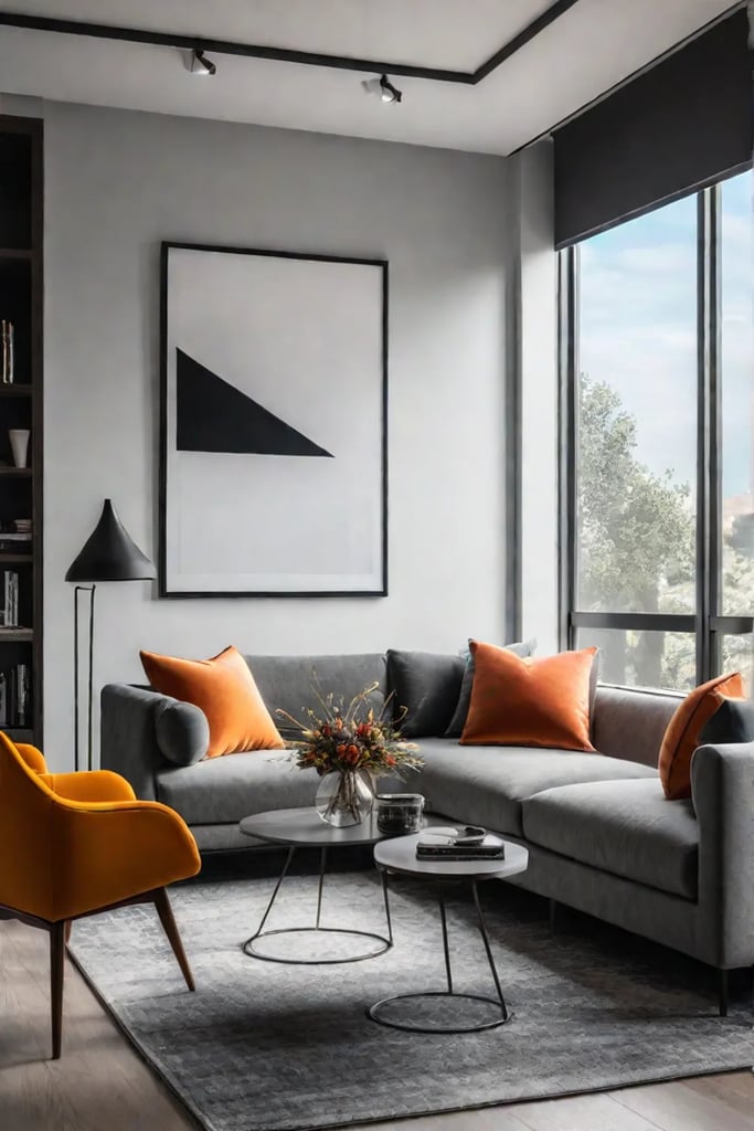
Creating a Balanced and Stylish Coffee Table Display
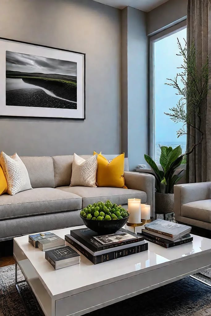
Your coffee table is more than just a place to rest your cup of joe—it’s a canvas for creativity. The key to a successful display lies in the interplay of objects, much like the careful composition of a still-life painting.
- Start with a tray: Use a sleek, mid-century-inspired tray to corral smaller items. This not only creates a sense of order but also allows for easy removal when you need extra table space.
- Layer with books: Stack a few carefully chosen coffee table books. These serve as both conversation starters and platforms for smaller objects. Opt for titles that reflect your interests—perhaps a monograph on Eames or a collection of Slim Aarons photographs.
- Add height and life: Introduce a vase with fresh blooms or a sculptural plant. The organic forms will soften the hard edges of your table and books.
- Incorporate texture: Place a small, textured object like a carved wooden box or a rough-hewn ceramic piece to add tactile interest.
- Finish with something personal: A vintage lighter, a small sculpture, or a cherished memento will infuse the arrangement with your unique personality.
Remember, the goal is to create a composition that’s both visually appealing and reflective of your taste. Step back, assess, and don’t be afraid to edit. As the great Mies van der Rohe said, “Less is more.”
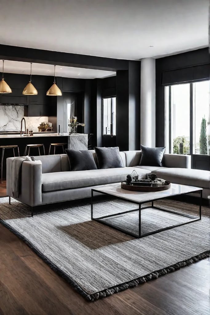
Styling Shelves for Maximum Visual Impact
Shelves are the gallery walls of the object world—a place where your treasures can shine. The challenge lies in creating a display that’s both cohesive and intriguing.
- Create a rhythm: Vary the heights and sizes of your objects to create a visual rhythm. Think of it as composing a silent symphony of shapes.
- Use books as risers: Stack books horizontally to create platforms of different heights. This not only adds dimension but also allows you to showcase smaller objects at eye level.
- Incorporate negative space: Don’t feel compelled to fill every inch. Space gives the eye a place to rest and can make your display more impactful.
- Mix materials: Combine different textures and materials—glass, wood, metal, ceramic—to create a rich, layered look.
- Tell your story: Display travel souvenirs, family photos, and meaningful artwork. These personal touches transform your shelves from a generic display into a curated collection that speaks volumes about you.
When styling shelves, consider the principle of triangulation. Arrange objects in groups of three, with the tallest item at the back, creating a triangular shape. This age-old design trick adds depth and interest to your display.
The Art of Cohesion
Creating a cohesive look when displaying diverse objects can be challenging, but it’s far from impossible. The key lies in finding a common thread—be it color, theme, or era—that ties your collection together.
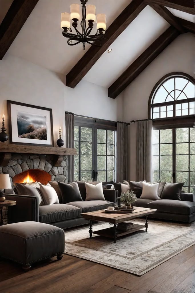
Consider curating your objects by color palette. Even disparate items can create a harmonious display when united by a shared hue. Alternatively, group objects by theme or origin. A collection of objects from your travels, for instance, tells a compelling story regardless of their styles.
Remember, the goal is not perfection but rather a curated imperfection that feels authentic and lived-in. As the legendary interior designer Billy Baldwin once said, “Be faithful to your taste, because nothing you like is ever out of style.”
In the end, the art of display is about creating moments of beauty in your everyday life. It’s about surrounding yourself with objects that bring you joy and tell your unique story. So experiment, rearrange, and most importantly, have fun with it. Your perfect display is waiting to be discovered.
As we conclude our journey through the art of elevating your living room, let’s turn our attention to the final thoughts on transforming your space from bland to grand. In our conclusion, we’ll reflect on the power of these simple yet impactful changes and how they can truly revolutionize your living environment.
Conclusion
As we draw the curtains on our journey from bland to grand, let’s take a moment to bask in the glow of our newly elevated living room. We’ve traversed the landscape of lighting, luxuriated in the embrace of sumptuous textiles, framed our views with carefully chosen drapery, and curated displays that speak volumes about our style. Each of these elements, when thoughtfully implemented, has the power to transform not just our living spaces, but our daily experiences within them.
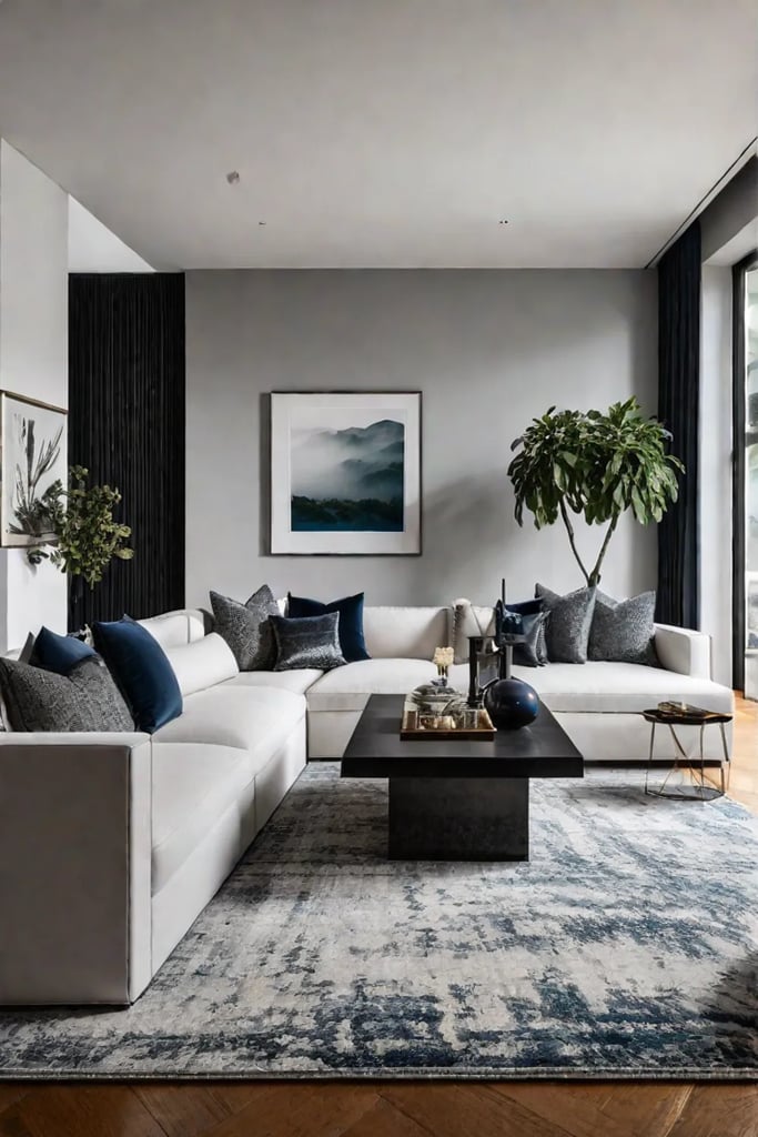
Remember, dear reader, that the true essence of a grand living room lies not in perfection, but in the authentic expression of your unique taste and lifestyle. As you move forward, armed with the insights and inspiration we’ve explored, don’t be afraid to experiment, to mix the old with the new, the high with the low. In the end, the most captivating spaces are those that tell our stories, reflect our journeys, and welcome us home with open arms. So go forth and create, for as the inimitable Elsie de Wolfe once proclaimed, “I am going to make everything around me beautiful – that will be my life.” Let this be your mantra as you continue to refine and reimagine your living room, transforming it from merely a space to truly a reflection of you.
