Have you ever wandered through a historic home and marveled at how each space seemed to flow seamlessly into the next, crafting one harmonious design narrative? As someone with an insatiable reverence for heritage design, I’ve spent decades studying the intricacies of creating interiors that feel genuinely collected over time. I’ve discovered that the true artistry lies in the details – those thoughtful touches that blur the boundaries between designated “rooms” and foster an immersive sense of story.
Every element can unify your kitchen with adjoining living areas, from backsplashes that set the color palette to lighting fixtures that cast a warm, layered glow. Imagine gliding effortlessly between spaces, your gaze following continuous surfaces and complementary finishes in one cohesive composition. This approach instantly expands even the most compact footprint, enveloping you in the rich ambiance of an authentically aged estate.

So, allow me to indulge my passion for the past as I reveal the secrets to extending your kitchen’s design language into a holistic interior experience. Whether you crave the timeless sophistication of monochromatic hues or the storied charm of repurposed architectural fragments, you’re about to unlock a world of possibilities for cultivating spaces brimming with tangible narrative. After all, crafting a truly enriching home means embracing heritage as the catalyst for modern livability.
Countertops that Flow
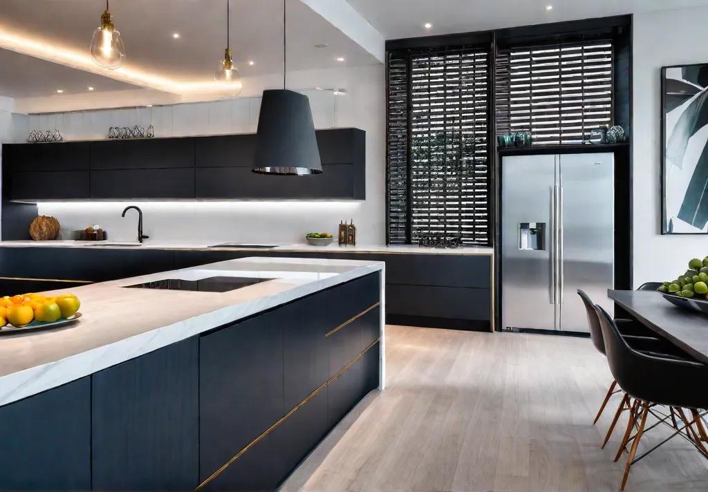
Have you ever felt confined in your kitchen, as the countertops boxed you in? Extending the countertop material beyond the traditional work zone allows you to create an effortless flow that instantly expands your space. It’s a simple yet transformative design move that harmonizes your entire floor plan.

Creating a Waterfall Edge
One dramatic way to amplify your counters is with a waterfall edge that cascades elegantly to the floor. This clean, vertical extension can make even a small kitchen feel loftier and more open. Imagine an immense slab of rich walnut or gleaming quartz enveloping your island in an unbroken stream. The waterfall anchors the island as a sculptural centerpiece while visually enlarging the footprint.
Extending to an Adjacent Bar or Island
If you’re craving more prep space or a casual dining nook, consider wrapping your countertop around a nearby peninsula or freestanding island. Using the same durable surface as your kitchen counters establishes a cohesive aesthetic and functional work zone. I recommend opting for a classic like soapstone or butcher block for the ultimate durability and timeless style.
Blurring Indoor and Outdoor Boundaries
For those lucky enough to have an open layout flowing to the outdoors, you can even extend the countertop material onto an exterior bar or grill station. Imagine warm summer nights spent entertaining, with guests moving seamlessly between the kitchen and a cozy lounge area unified by continuous stone or wood surfaces. It’s an organic way to expand your living space.

The beauty of this approach is that it transforms countertops from mere workhorse surfaces into design features that sculpt the flow of your floor plan. With creative thinking, you can turn the kitchen into the heart of an open, airy living space. But don’t just take my word for it—the next section reveals how to carry this cohesive aesthetic into your cabinetry.
Cabinetry Continuity
Have you ever wandered into an open-concept kitchen, only to feel a jarring disconnect as your gaze moves from the pristine cabinetry into the adjacent living spaces? A thoughtful, cohesive design flow is key to creating a harmonious ambiance that transcends room divisions.

Built-in Shelving and Storage
One elegant way to unite your kitchen with nearby living areas is through built-in shelving and storage in a matching style. Imagine warm wood shelves climbing the walls of your dining room, their gentle curves and cabinet detailing seamlessly echoing the kitchen cabinetry steps away. This establishes wonderful aesthetic continuity, and the open shelving lends an airy, expansive feel to the combined spaces.
Extending Cabinetry to Adjacent Walls
If you crave even more unity, consider extending your kitchen cabinetry along adjoining walls to form a built-in buffet or hutch. This architectural intervention creates storage sanctuaries while visually blurring the lines between designated “rooms.” I fondly recall the cozy charm of my grandmother’s home, where the kitchen’s pine cabinets flowed seamlessly into the dining nook, cradling both spaces in an inviting warmth.
In my 18th-century revival, we plan to install floor-to-ceiling cabinets along the far dining room wall. Their crisp white finish and simple Shaker lines tie back to the kitchen for one cohesive, heritage-inspired design narrative. This seamless cabinet connection promises to make even compact spaces feel generously expansive.

Whether you opt for open-shelving vignettes or extend your cabinets into the next chapter of your home’s story, maintaining a consistent design language is the thread that weaves separate spaces into one glorious, harmonious composition. Carry this visual melody into the next section for an even more immersive experience.
Flooring that Connects
Have you ever walked through a home and felt an inexplicable sense of flow and harmony as you moved from one space to the next? Chances are the flooring played a subtle yet powerful role in unifying the interior. Thoughtfully planned flooring creates visual pathways that allow our eyes to travel seamlessly while defining distinct yet connected living areas.

Seamless Transitions
In my 18th-century home renovation, we installed wide plank hardwood floors throughout the open-concept kitchen and living room. The warm patina of the antique chestnut boards lends an authentically aged look while providing a durable, timeless foundation. Extending the same rich hardwood into the adjoining spaces effortlessly allows the eye to transition from one area to another without interruption.
Defining Zones with Rugs
While consistent flooring establishes cohesion, area rugs can help delineate specific use zones within that unified space. In the dining area, just off the kitchen, we layered a vintage Oushak rug to anchor the table and chairs. Its muted jewel tones and traditional Persian motifs complement the warm wood tones underfoot, visually carving out an intimate dining destination within the larger, open layout.
The Perfect Blend
Of course, hardwood isn’t your only option for flooring continuity. Mixing different yet complementary materials like wood and tile can work beautifully, too. Finding floors with an underlying color palette or textural qualities to marry the spaces is key. In a recent kitchen redesign, I paired reclaimed antique oak with creamy terra cotta tile – rustic and refined surfaces that blend harmoniously.

Extending your kitchen’s flooring design into adjoining living spaces is an often overlooked yet impactful way to foster an enriching sense of flow and connection within the home. With the right material palette, you can create storied, layered interiors that feel genuinely evolved over decades rather than built overnight.
As we move beyond flooring, let’s focus on the lighting fixtures that can elevate and harmonize your kitchen’s overall design language.
Lighting Fixtures That Harmonize
Have you ever stepped into a dimly lit tavern, instantly enveloped by a cozy, convivial ambiance? That’s the power of thoughtful lighting. In a kitchen – the indisputable heart of any home – cohesive fixtures are vital for setting the right mood while enhancing the aesthetic vision.

Pendant Lights Over Islands and Bars
When restoring the original keeping room in my 1790s farmhouse, I knew pendant lights would be the perfect marriage of form and function over the reclaimed wood island. These sculptural pieces provide task lighting for chopping and meal prep and make a bold visual statement. I opted for hand-blown seeded glass pendants to evoke an aged, Colonial feel.
Coordinating Sconces and Chandeliers
To unify the lighting scheme, I flanked the entryway with a pair of brass sconces that shared the warm, honey patina of the pendants. Dimmable fixtures allowed me to shift the ambiance from a soft, romantic glow for intimate dinners to brilliant task lighting for boisterous family gatherings. The pièce de résistance? A showstopping antique chandelier above the dining table emitted a warm, candlelit radiance.
Mini-Chandeliers and Pot Rack Lighting
I love a petite crystal chandelier for more compact spaces like a butler’s pantry or breakfast nook. Hung at varying heights, these sparkling gems add an air of refinement. Wrought iron pot racks with built-in lighting are another favorite for cozying up a kitchen with rustic, utilitarian charm.

The right lighting fixtures can harmonize an entire design scheme while conjuring an inviting, layered atmosphere. With a thoughtful blend of moods and eras, your kitchen will feel like a timeless gathering place steeped in stories. Just don’t forget the dimmer for setting the perfect glow!
Speaking of cultivating an immersive ambiance, let’s explore how wall colors can visually expand and unify adjoining spaces.
Wall Color that Flows
How do you create a sense of cohesion in an open floor plan? The answer lies in your paint selections. With rooms flowing into one another, the wall color sets the unifying backdrop that ties your design together.

Monochromatic Schemes
For a seamless transition, opt for a tonal monochromatic palette. Begin with your desired hue in the kitchen, then carry it into adjoining spaces using graduating shades. A lighter variation in the dining area will gently expand the space, while deeper tones in the living room foster an intimate ambiance. This ombre effect is at once calming and intriguing.
Complementary Color Palettes
If you crave more visual dynamism, look to complementary colors that sit opposite each other on the color wheel. Anchor the kitchen with a terra cotta or sage green, then introduce accents of its complementary blue or plum tones in the living spaces. The interplay of warm and cool hues creates just enough tension to keep things interesting.
Tie It All Together
Whatever palette you choose, incorporate unifying elements like woodwork, textiles, and decor accessories in bridging colors. This layered repetition makes the transition feel intentional and grounded. After all, a thoughtful flow is the hallmark of heritage design.

Cohesive color can make your open-concept layout feel like a series of carefully composed vignettes rather than a cavernous jumble. With the right backdrop, you set the stage for a harmonious design that moves gracefully from room to room.
The next section is Decorative Accents that Bridge the Gap
Decorative Accents that Bridge the Gap
Have you ever wandered through an old New England home and marveled at how the decor flowed effortlessly from room to room? The secret lies in the thoughtful use of decorative accents that unify spaces while allowing each area’s unique character to shine through. As a devotee of historic preservation, I’ve learned that bridging the aesthetic gap between adjoining rooms is an artful dance.

Artwork and Wall Decor
One of my favorite techniques is to hang artwork that echoes the kitchen’s color palette in the adjoining dining space. This creates a subliminal thread connecting the two areas. For example, in my 18th-century fixer-upper, I framed a vintage botanical print with sage green mats to complement the handpainted tilework in the kitchen. The subtle nod adds cohesion without being too matchy-matchy.
Plants and Greenery
Lush greenery is another wonderful way to marry indoor spaces. Something is grounding about having touches of nature dotted throughout the home. I like to place potted herbs on the kitchen’s sunny countertops while trailing vines softly cascading from dining room shelves. Not only do plants purify the air, but their verdant hues create an effortless flow between rooms.
Incorporating thoughtful decorative accents is akin to adding delicate stitches to the rich tapestry of your home’s narrative. With a touch of whimsy and an eye for unifying details, you can craft an environment that feels as storied and welcoming as a historic New England estate.
The next section is Hardware that Unifies
Hardware that Unifies
Have you ever noticed how the smallest details can make the biggest impression? Cabinet hardware may seem like an afterthought, but those little knobs and pulls possess the power to unify an entire space. As a dedicated preservationist, I’ve learned that hardware choices are instrumental in crafting that elusive “collected over time” aesthetic.
Matching Metals
There’s an undeniable elegance in consistency. Whether your tastes lean toward the warmth of brass or the sleekness of polished chrome, carrying a single metal finish throughout interconnected rooms cultivates an air of sophistication. In my 18th-century treasure trove, I opted for oil-rubbed bronze hardware to grace the kitchen cabinetry, interior doors, and even the chandelier in the adjoining dining room. This subtle thread woven through the space imparts a sense of cohesion that feels intentional yet utterly timeless.
Complementary Finishes
Of course, rules were made to be broken – or at least gently bent. While matching metals exude a certain streamlined allure, I am also drawn to the depth and visual interest of complementary finishes. In a recent project, I juxtaposed matte black cabinet hardware with oil-rubbed bronze light fixtures and door knobs. The contrast added a touch of layered complexity, like discovering an heirloom in a contemporary collection.

Salvaged Treasures
For those who truly wish to embrace the patina of ages past, my heart beats fondly for salvaged hardware. Imagine the stories those tarnished brass knobs could tell after adorning the doors of a 19th-century mercantile. Or the weight of history imbued in those cast iron bin pulls, once tasked with securing rations on a colonial sailing vessel. Incorporating these timeworn artifacts into your design scheme pays homage to the artisans of yesteryear while injecting your space with a tangible narrative.
No matter which path you choose – sleek and modern or storied and antiqued – thoughtful hardware selections can impart an undeniable sense of intentionality and permanence. The little details elevate a space from merely decorated to truly enriched. The next section will explore how window treatments can further amplify that unifying thread.
Window Treatments as a Unifying Element
As an ardent admirer of heritage design, I’ve found that the smallest details can have the mightiest impact on evoking a sense of authenticity. Take window treatments, for instance – these oft-overlooked elements can be the unsung heroes that unify your kitchen’s aesthetic with adjacent spaces. After all, what could be more jarring than a sun-drenched farmhouse kitchen flowing into a dining room swathed in heavy velvet drapes?
Coordinating Fabrics and Colors
The key to a cohesive look is coordinating your window treatments’ fabrics and colors throughout the interconnected areas. For a classic New England feel, I’m partial to the timeless elegance of Roman shades crafted from sturdy yet sumptuous textiles like linen or wool. Imagine the warm, buttery hues of a heritage plaid harmonizing with your kitchen’s reclaimed wood countertops and antique stoneware.
Consistent Style Choices
Beyond fabric selections, maintaining a consistent style for your window treatments is equally crucial. If you’ve opted for the clean lines of roller shades in the kitchen, consider echoing contemporary minimalism in the adjoining spaces. A sleek, monochromatic palette can create a seamless visual flow, allowing your eye to glide effortlessly from room to room.
Embracing Imperfections
Of course, as a devotee of all things aged and storied, I’d be remiss not to advocate for the charms of imperfection. Seek out window treatments that embrace the gentle patina of years gone by – perhaps a set of vintage lace curtains or a lovingly preserved antique quilt repurposed as a valance. These subtle nods to the past can imbue your space with a sense of history and soul.

Ultimately, the window treatments you choose should be the harmonious threads that bind your kitchen’s design narrative to the surrounding spaces, creating a seamless tapestry of heritage and modernity.
As we step into the next section, we’ll explore how a well-chosen backsplash can become the springboard for your entire kitchen’s design direction.
Backsplash as a Springboard for Design
What if I told you that an unassuming tile backsplash in your kitchen could be the key to unlocking a harmonious flow throughout your home? More than just a practical surface protector, this humble accent area is brimming with untapped design potential.
Repeating Tile Patterns
Let’s start by considering the timeless subway tile—a versatile classic that effortlessly complements everything from farmhouse to contemporary aesthetics. Why not carry that linear rhythm into the adjoining dining space with a bar backsplash mimicking the same pattern? This subtle thread of continuity creates an understated yet sophisticated connection between rooms.
Drawing Color Inspiration
Of course, if you’re working with something more vibrant like a Moroccan-inspired cement tile, the backsplash color palette is your golden ticket. Pull out those dominant hues and echo them through accent pillows, artwork, or even a boldly lacquered ceiling in the breakfast nook. That eye-catching backsplash design suddenly becomes the unifying force tying the entire open concept together.
Layering in History
For those with an incurable penchant for preserving the past, why not source some reclaimed tiles or bricks to craft a one-of-a-kind backsplash? Then, extend that storied narrative by incorporating salvaged woodwork, vintage light fixtures, or repurposed architectural fragments into the surrounding kitchen and dining areas. It’s a masterclass in curating spaces that feel genuinely lived-in and collected over generations.

By thinking of your backsplash as the spark that ignites the overall design direction, you’ve just discovered a fresh pathway for instilling truly cohesive, intentional interiors. So embrace those tiles as your not-so-secret weapon for inspired style continuity.
Embracing heritage design principles with an innovative spirit opens the door to crafting spaces brimming with tangible narrative—and it all starts with that humble backsplash.
Conclusion
As we bid farewell to these musings on heritage design continuity, I am struck by the profound impact even the humblest of details can have on shaping a space’s overall essence. From cabinet knobs that echo through generations to backsplash tiles that ignite an entire color narrative, the path to crafting a harmonious atmosphere is lined with the most delightful of breadcrumbs.
So, I implore you, dear reader, to embrace those unifying threads as you envision your living tapestry. Let the warmth of an antique light fixture spill into the adjoining room, its gentle glow illuminating the stories etched into salvaged woodwork. Permit lush botanicals to trail from kitchen shelves into living spaces, their verdant tendrils symbolizing an organic flow between areas. And by all means, revel in the imperfect beauty of aged materials, for their very patina imbues your home with a soul steeped in human narrative.
Only by honoring the artistry of the past can we craft interiors that feel genuinely enriched – spaces where every vignette is a masterful composition, yet the overall ambiance exudes the effortless grace of having evolved organically over decades. This delicate balance separates a house from a haven, a cookie-cutter build from a dwelling brimming with spirit and authenticity. So go forth, fellow preservationist, and let the principles of heritage design be your guiding force for a life well-lived and surrounded by stories.
