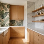
Many believe the all-white kitchen is merely a sterile, unimaginative relic. Critics often claim it feels cold, clinical, or impossibly high-maintenance. Indeed, the style historically originated from a 1920s desire to mimic the “surgical cleanliness” of a hospital. However, dismissing this aesthetic as a boring default ignores the sophisticated engineering hidden beneath the surface. In fact, complex material science drives the success of a luxury white kitchen design. Consequently, many overlook the functional power of a properly executed monochromatic space.
In reality, the modern white kitchen has transitioned from a passive backdrop to a high-performance engine. Early designs simply made dirt visible. However, contemporary material science actively eliminates it. For instance, nanotechnology and silver ions now allow surfaces to self-disinfect at a molecular level. Additionally, the physics of light reflectance creates “visual volume.” This makes small spaces feel psychologically expansive. Therefore, the choice of white is less about safety and more about advanced utility and architectural continuity.
This guide reveals the tangible benefits behind the “myth” of the sterile kitchen. We will analyze how high-albedo surfaces improve energy efficiency and reduce stress hormones. Next, we explore the shift toward “layered whites” that prioritize rich texture over flat minimalism. Ultimately, you will understand how to balance clinical hygiene with essential human warmth.
1. The Science of Undertones: Distinguishing ‘Hospital White’ from ‘Gallery White’
Distinguishing “Gallery White” from “Hospital White” requires understanding light physics, not just aesthetics. Specifically, this boundary determines whether a kitchen feels like a creative sanctuary or a sterile laboratory. It is a key consideration in modern kitchen design. The technical “tipping point” often lies in Light Reflectance Value (LRV). For instance, paints with an LRV above 94 reflect so much light that human eyes lose depth perception. Consequently, surfaces appear flat, creating that dreaded clinical atmosphere known as the “Sanitary Paradigm.”
Lighting plays a critical role in this perception. “Hospital White” usually stems from cool-toned LEDs (4000K+) interacting with blue-based paints. In contrast, “Gallery White” utilizes complex undertones, like microscopic drops of ochre or gray. Therefore, these whites anchor the space without feeling icy. This approach mimics the “White Cube” philosophy. Walls act as a warm frame rather than the subject.
Finally, texture prevents the “clinical void.” A sterile space typically features uniform, high-gloss finishes for easy decontamination. Conversely, a gallery-inspired aesthetic relies on sheen layering. For example, pairing matte cabinets with light-scattering zellige tiles creates visual friction. Ultimately, this friction transforms a white kitchen from a place of labor into a rich, sensory experience.
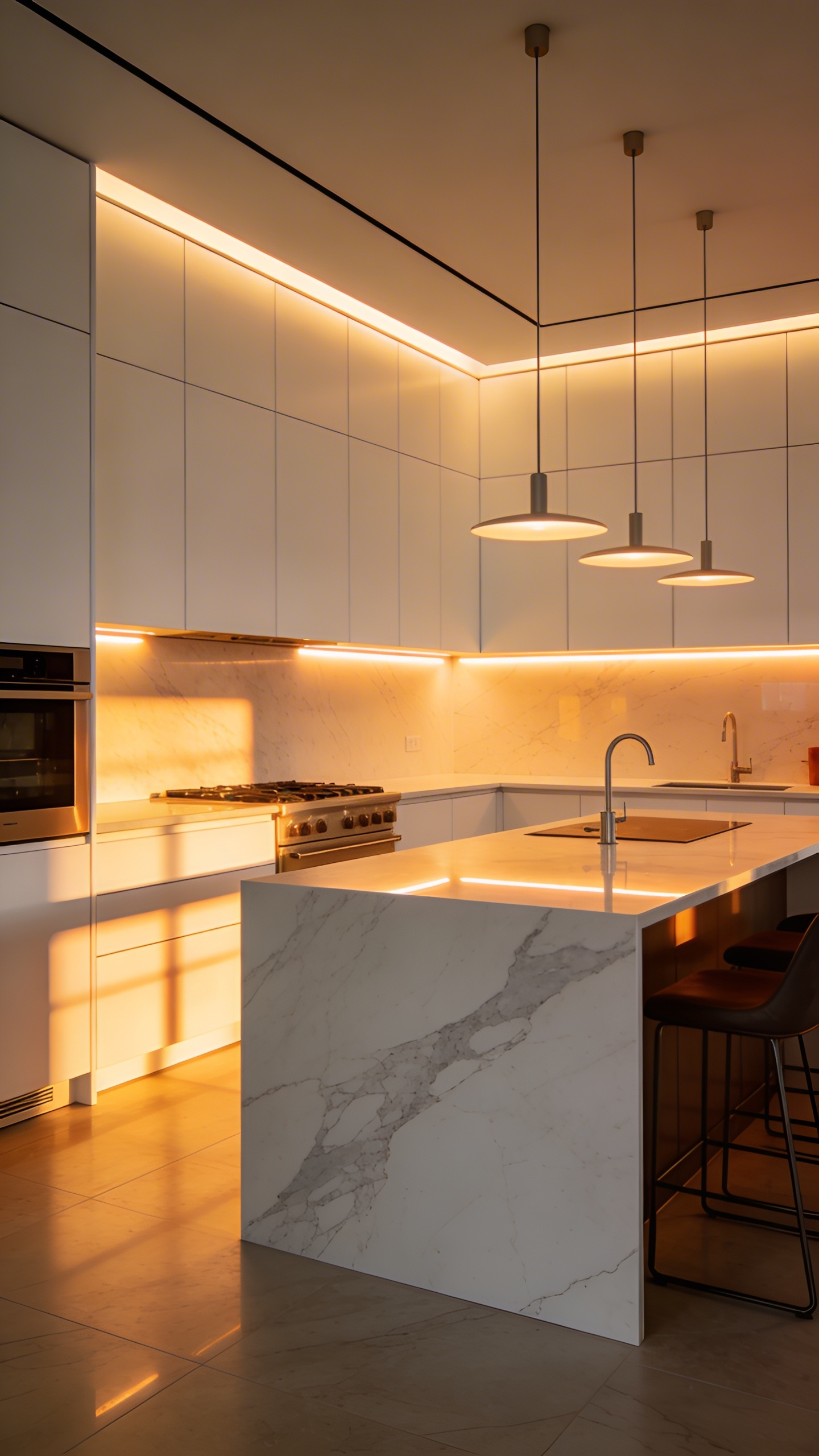
2. Surface Tension: Why Mixing Gloss and Matte Finishes Creates Depth
In the specialized world of white kitchen design, a common pitfall is the “whiteness trap.” This occurs when a monochromatic palette feels flat, clinical, or dimensionally confusing. To counter this, designers utilize a sophisticated concept known as “surface tension.” Specifically, this technique mixes gloss and matte finishes to manipulate the physics of light.
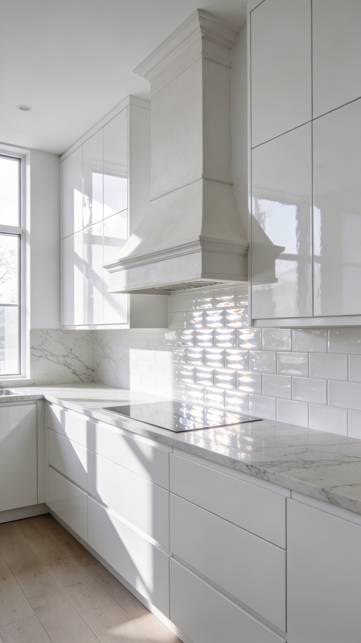
Technically, depth relies on managing two distinct types of light reflection. High-gloss surfaces create specular reflection, bouncing light directly back at the viewer. Consequently, these energetic highlights draw the eye immediately, much like a mirror. In contrast, matte surfaces produce diffuse reflection. They scatter light softly in many directions, effectively eliminating harsh “hot spots.” Therefore, placing a high-gloss island against a matte perimeter creates conflicting light signals from the same hue.
This visual conflict forces the brain to engage more deeply. In fact, neuroscience suggests our eyes constantly scan for “luminance-defined edges” to gauge distance. Without these textural shifts, the eye struggles to define where one cabinet ends and another begins. Also, this interplay engages what designers call the “tactile eye.” We psychologically perceive gloss as cool and slick, while matte feels warm and velvety. Ultimately, mixing these temperatures transforms a flat image into a dynamic, sensory landscape.
3. The Stone Strategy: Bookmatched Marble as Living Art
The “Stone Strategy” of bookmatching transcends simple surfacing. It treats raw geology as a high-definition canvas. Fundamentally, this architectural philosophy transforms a functional kitchen into an emotional gallery. Technically, the process begins in the quarry with rigorous precision. Specifically, quarriers slice a massive block of statuary-grade marble sequentially, much like a loaf of bread. Unlike standard slabs, pairs are polished on opposite faces. Therefore, when installed side-by-side, the veining meets at the seam to create a mirrored image.
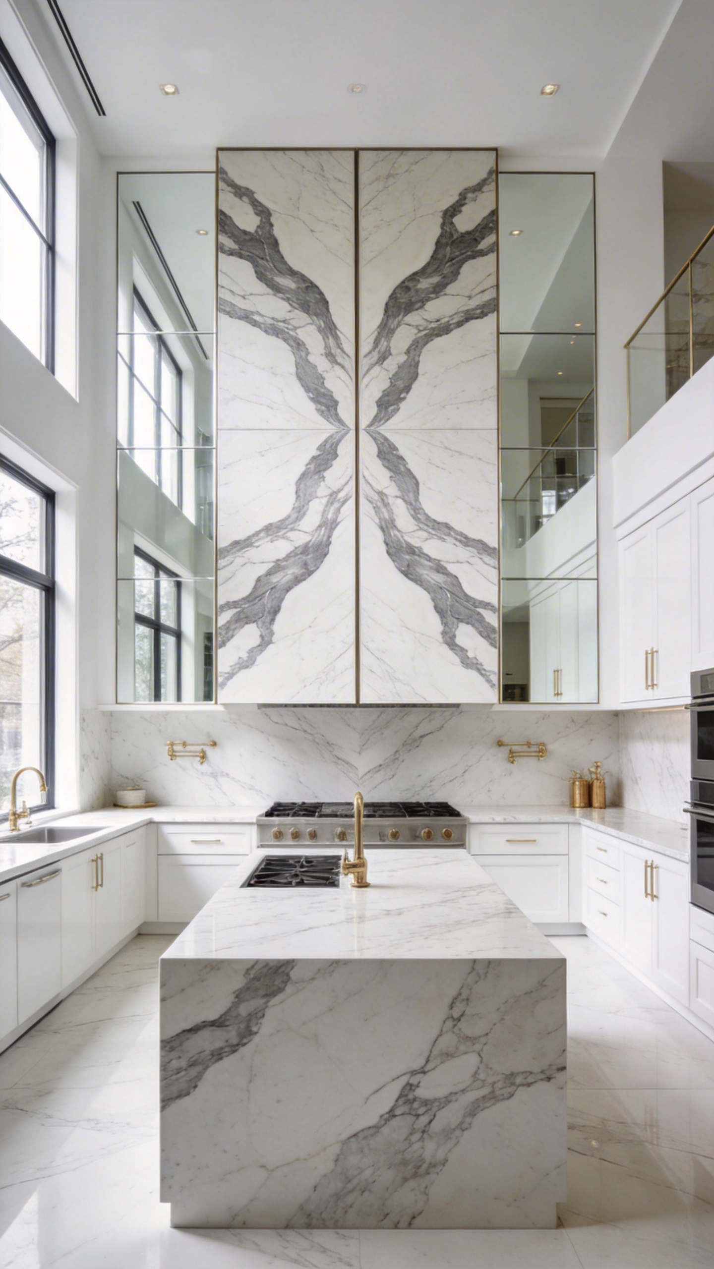
Consequently, this symmetry offers a profound sense of continuity. On waterfall islands, the stone appears as a single, fluid piece of fabric folded over cabinetry. This aligns with the “Ornament as Material” philosophy championed by pioneers like Adolf Loos. Indeed, Loos argued that noble materials were the only acceptable form of modern decoration. Similarly, Mies van der Rohe utilized bookmatched stone to anchor spaces with a sense of “floating” lightness.
Psychologically, the human brain actively seeks this order. In a monochromatic white kitchen, the organic “Rorschach” patterns provide a vital visual resting place. This is especially true when choosing high-end kitchen countertops with white cabinets. However, the choice of marble dictates the room’s energy. Specifically, Calacatta Gold offers high-contrast drama, acting as the kitchen’s “lead actor.” Conversely, Carrara features soft, feathery whispers for a more nuanced approach.
Finally, this material acts as “living art” regarding its lifecycle. Because white marble is translucent, it shifts from cool morning blue to warm sunset gold. Indeed, designers embrace the inevitable patina. Thus, etching becomes a narrative element, recording the memories of a life lived in the space.
4. Organic Grounding: Pairing Bleached Walnut and White Oak with Stark Surfaces
Organic Grounding represents a sophisticated evolution of the traditional white kitchen. Specifically, this design movement moves away from the clinical minimalism of previous decades. Instead, it embraces a soulful, tactile environment through advanced material science. For instance, designers are reimagining walnut, historically prized for its deep chocolate tones. Through a two-part industrial bleaching process, they strip the wood’s dark pigments away. Consequently, the material retains its iconic, silky grain integrity while shifting to a pale, ghostly tan.
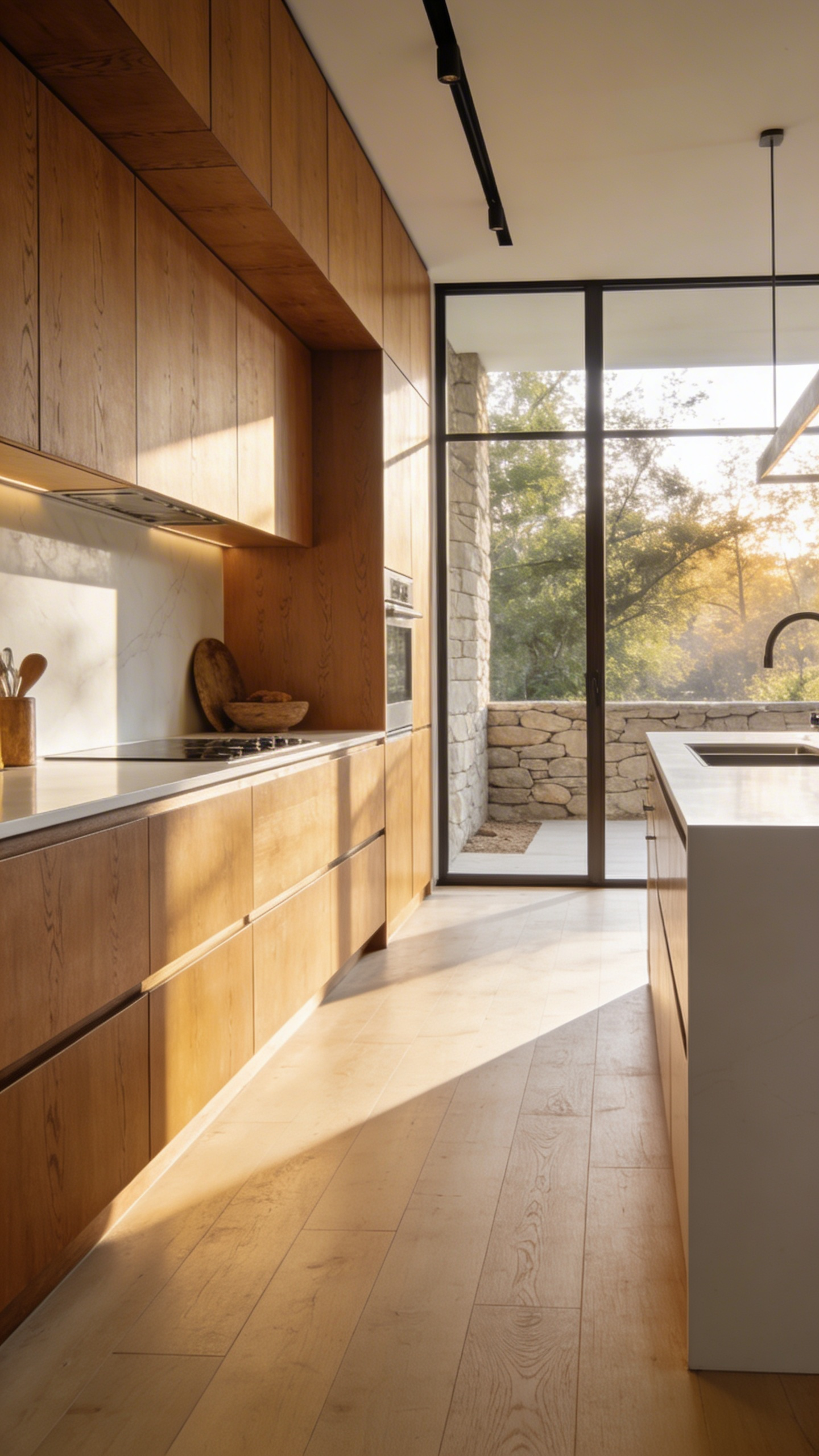
Next, this ethereal wood creates a dynamic dialogue with stark surfaces. Materials like architectural concrete or ultra-matte lacquers provide necessary industrial precision. Here, the true luxury lies in “sensory friction.” A cool, grey concrete island offers a heavy, permanent anchor within the room. Conversely, a run of bleached white oak cabinetry introduces breathable, rhythmic warmth. This careful layering prevents the space from feeling one-dimensional or sterile.
Moreover, this specific pairing serves a vital psychological function. Purely white, glossy kitchens often cause visual fatigue due to harsh light reflections. In contrast, natural wood surfaces act as acoustic and visual baffles. Research indicates that touching these organic materials can actually lower heart rates. Therefore, the inclusion of wood at key touchpoints provides a physical reconnection to nature. Ultimately, this approach transforms the kitchen into a restorative sanctuary that feels both cutting-edge and ancient.
5. The Imperfect Backsplash: Hand-Glazed Zellige Tiles for Light Refraction
Authentic Zellige tiles offer more than simple durability; they introduce a soulful history to modern spaces. Originating in Fez, these ceramic pieces represent a 1,000-year-old craft. Unlike mass-produced options, the *Maallem*, or master craftsman, intentionally embraces inconsistency. Consequently, each tile tells a unique story of its firing in ancient kilns.
Technically, this manufacturing process creates specific optical effects impossible to replicate by machine. Standard subway tiles produce a flat, mirror-like reflection. In contrast, Zellige surfaces are inherently undulating and uneven. Therefore, light hits the glaze at various angles simultaneously. This phenomenon creates a dynamic “shimmer” rather than a static shine. It is a perfect choice for a kitchen backsplash with white cabinets. As a result, the backsplash feels alive and shifting as the sun moves.
Furthermore, the installation technique enhances this watery aesthetic. Traditionally, installers use a “butt-jointed” method. Specifically, they place tiles tightly together to minimize visible grout lines. Thus, the wall appears as a continuous, rippling sheet of liquid white.
Finally, the material’s tonal depth prevents visual monotony. A single batch of “white” Zellige actually spans a rich spectrum. For instance, you might see cool blue-whites alongside warm, toasted parchment tones. Ultimately, these imperfections bridge the gap between clinical modernism and inviting warmth.
6. Architectural Shadow Lines: Using Shiplap and Tongue-and-Groove for Vertical Texture
An all-white kitchen often risks feeling sterile or one-dimensional. However, architectural shadow lines effectively solve this “visual flattening” through negative space. Specifically, vertical shiplap and tongue-and-groove introduce a rhythmic texture that engages the eye without adding color.
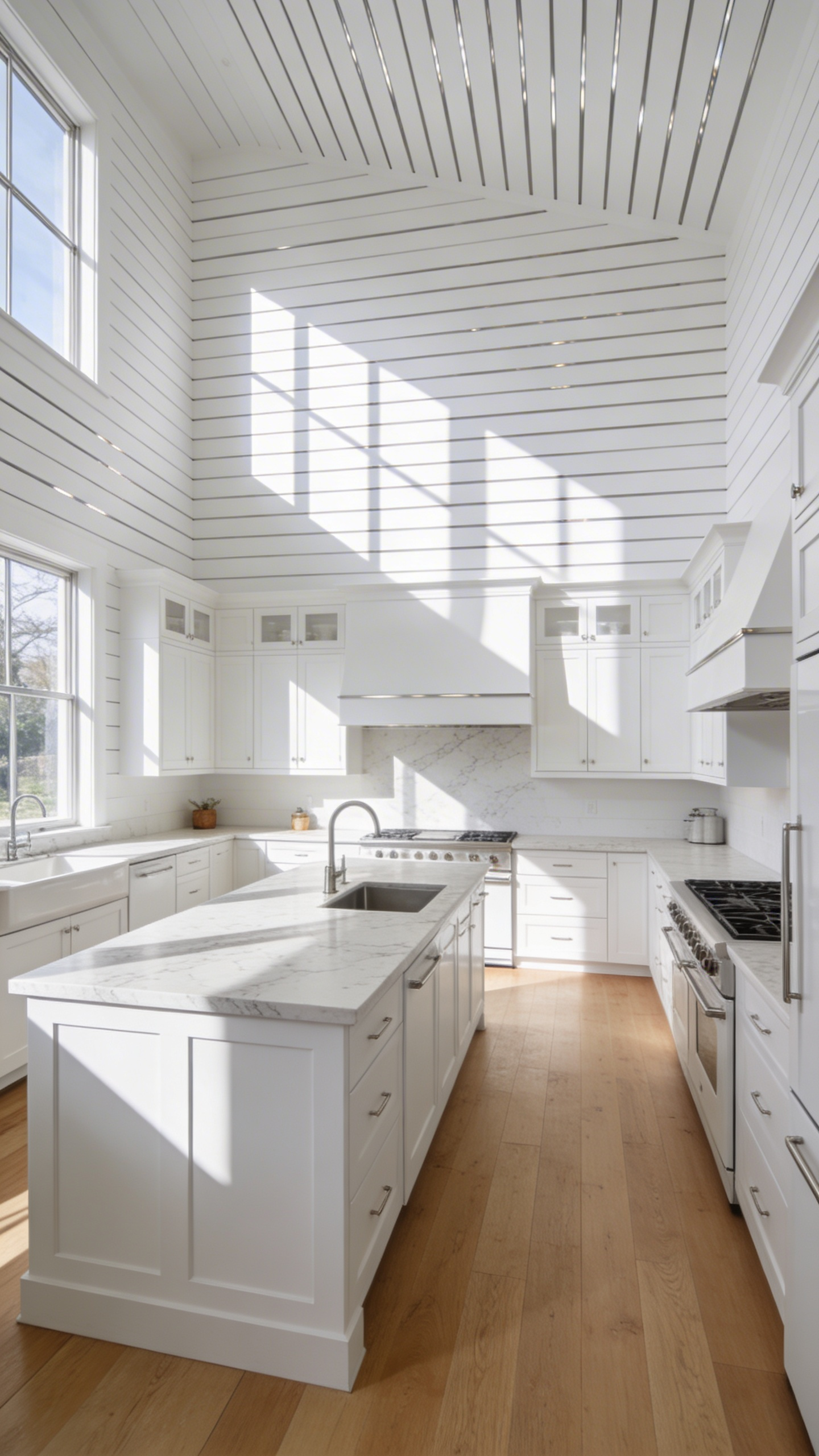
The visual impact relies heavily on the joint’s geometry. For instance, the “Nickel Gap” creates a crisp, precise line ideal for modern aesthetics. Conversely, V-groove milling produces a softer, graduated shadow suited for traditional or farmhouse styles. Beyond style, vertical lines act as an optical correction. Consequently, they draw the eye upward, making standard ceilings feel significantly loftier.
Furthermore, lighting is essential to maximize this material’s potential. During the “golden hour,” natural sunlight catches these edges to create sculptural depth. To maintain this effect at night, designers often use “wall-washing” LEDs. Therefore, the choice of paint sheen becomes critical.
In fact, high-gloss finishes can ruin the intended effect by reflecting light into the gaps. Instead, select a matte or low-luster finish. Ultimately, this absorbs light on the surface. This ensures the shadow lines remain deep, dramatic, and visibly rich.
7. The Plaster Hood: Softening Geometrics with Sculptural Curves
The rise of the plaster hood signals a return to the “hearth” concept. Historically, ventilation was architectural rather than just an appliance. Therefore, this design eliminates visual clutter by extending the wall material. It transforms a hanging box into a monolithic crown jewel.
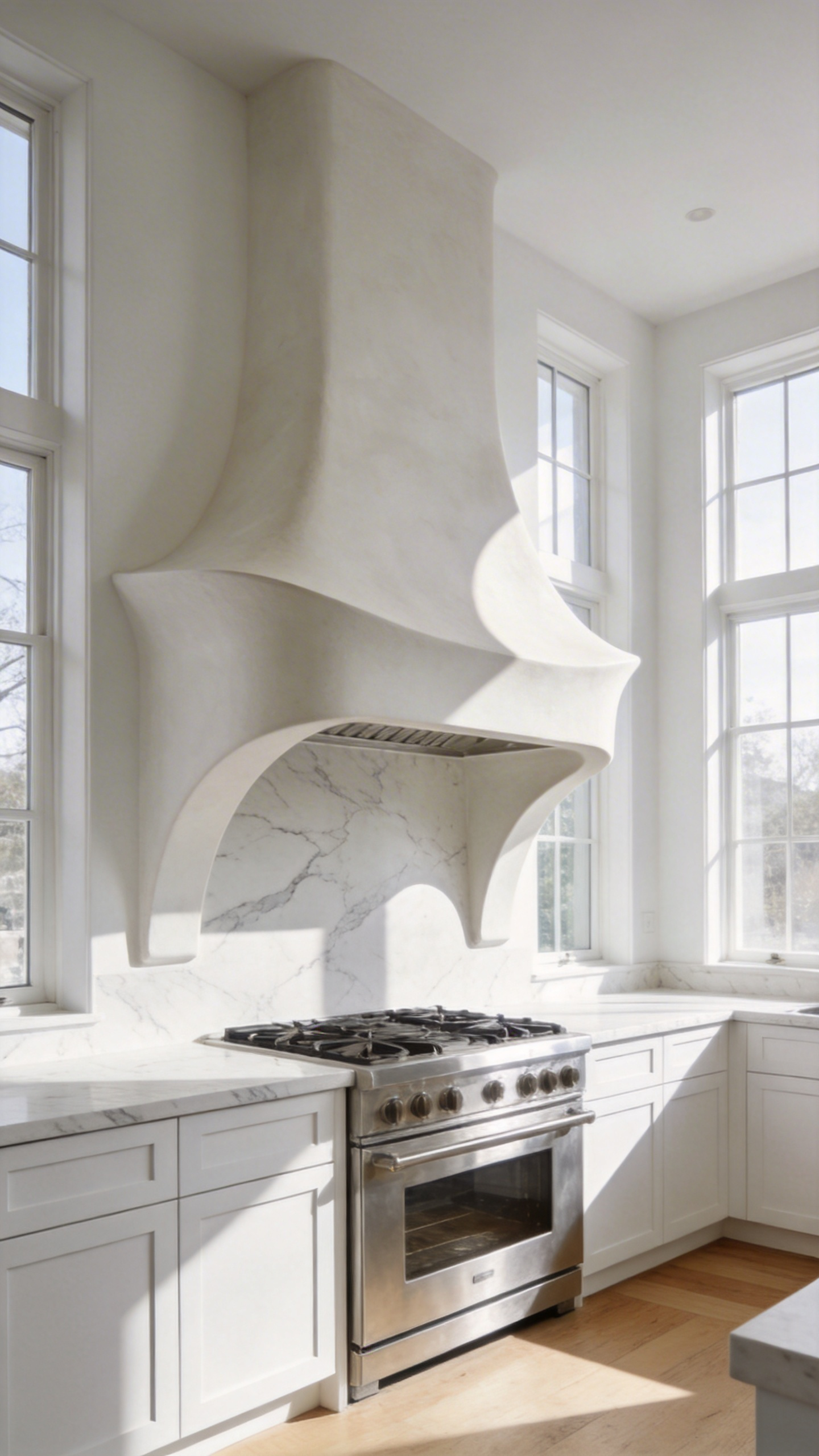
Specifically, these hoods serve to soften the room’s geometry. Modern kitchens usually rely on a rigid grid of cabinetry and tile. However, the plaster hood introduces organic curves and sloped flares. This approach aligns with Biophilic Design, evoking a sense of calm. Unlike stainless steel, which reflects harsh glares, hand-troweled plaster diffuses light. Thus, it creates soft gradients of grey and cream to prevent a flat appearance.
From a material science perspective, the medium matters significantly. For instance, lime-based Venetian plaster is often the gold standard. It creates a breathable, naturally mold-resistant surface. When burnished, it becomes dense and surprisingly easy to wipe clean. Alternatively, Roman clay offers a matte, cloudy finish. Yet, it requires a high-performance sealer to withstand cooking splatters.
Ultimately, this feature adds “tactile drama” to a white kitchen. Subtle imperfections from the trowel tell a story of craftsmanship. In fact, this texture prevents the space from feeling clinical. With proper sealing, the surface is durable and highly heat-resistant. It bridges the gap between modern minimalism and historical European artistry.
8. Metal Theory: The Warmth of Unlacquered Brass Against Cool Stone
“Metal Theory” explores a deliberate sensory tension within white kitchen design. Specifically, this concept pairs unlacquered brass with cool stones like marble or quartzite. Unlike static lacquered finishes, unlacquered brass acts as a “living finish” and an organic clock. Immediately, raw brass reacts with oxygen, shifting from mirror-bright to deep amber. Consequently, frequently touched areas remain polished while recessed edges darken. This visually records the home’s daily rituals.
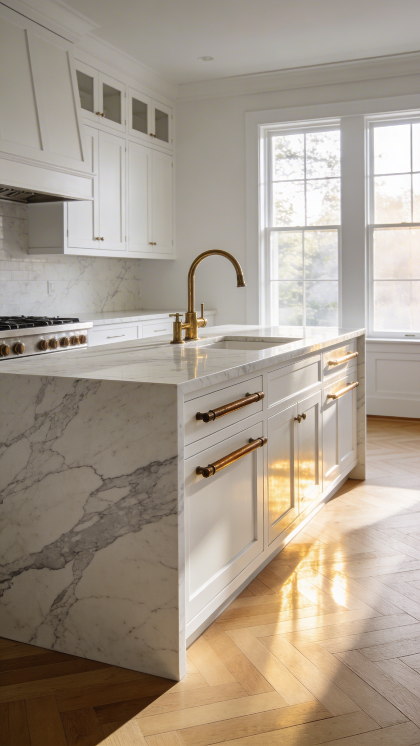
Beyond aesthetics, this combination offers a distinct thermal-tactile juxtaposition. While white stone feels cold and static, brass provides a warm, textured counterpoint. Therefore, moving a hand from a cool marble island to a brass latch creates a necessary sensory reset. This interaction grounds the user, preventing the space from feeling too sterile or institutional.
Surprisingly, this material choice also introduces a layer of functional hygiene known as the “Oligodynamic Effect.” In fact, copper ions in raw brass actively neutralize bacteria significantly faster than stainless steel does. Finally, brass introduces a crucial “glow factor” to the room’s color spectrum. By applying the 60-30-10 rule, the metal softens the clinical “hospital quality” of pure white. Thus, the golden tones mimic sunlight, effectively pre-warming the atmosphere before artificial lights are even engaged.
9. Transparent Texture: Reeded and Fluted Glass Cabinet Inserts
Reeded and fluted glass introduce essential “soft architectural” elements to a white kitchen. Specifically, they prevent the space from feeling flat or clinical. Although often used interchangeably, these profiles represent opposite geometric forms with distinct material properties. For example, reeded glass features convex ridges that capture light to create a shimmering, jewel-like effect. Conversely, fluted glass uses concave grooves to produce deep, rhythmic shadows. Therefore, fluted glass offers a structured verticality that visually grounds the room.
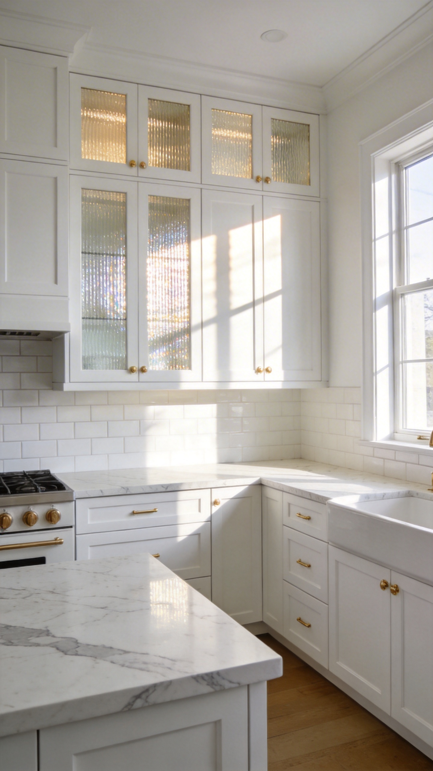
Furthermore, these materials solve the challenge of sterility through tactile rhythm. Large expanses of white cabinetry often appear as solid, heavy blocks. However, textured inserts break up these surfaces without adding the visual clutter of open shelving. Additionally, they facilitate a unique shadow play. By day, sunlight creates sharp linear patterns. In the evening, LEDs cast a soft, ambient glow. Thus, the cabinetry feels warm and lived-in rather than static.
Functionally, this texture creates a forgiving silhouette for storage. Unlike clear glass, reeded surfaces obscure the fine details of mismatched dishware. Consequently, stored items become a cohesive wash of color and shape rather than clutter. Moreover, this approach revives the glamour of Art Deco design while offering modern utility. In fact, the vertical grooves naturally mask fingerprints far better than clear surfaces. Ultimately, choosing these textures adds historical resonance and sensory depth.
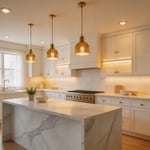
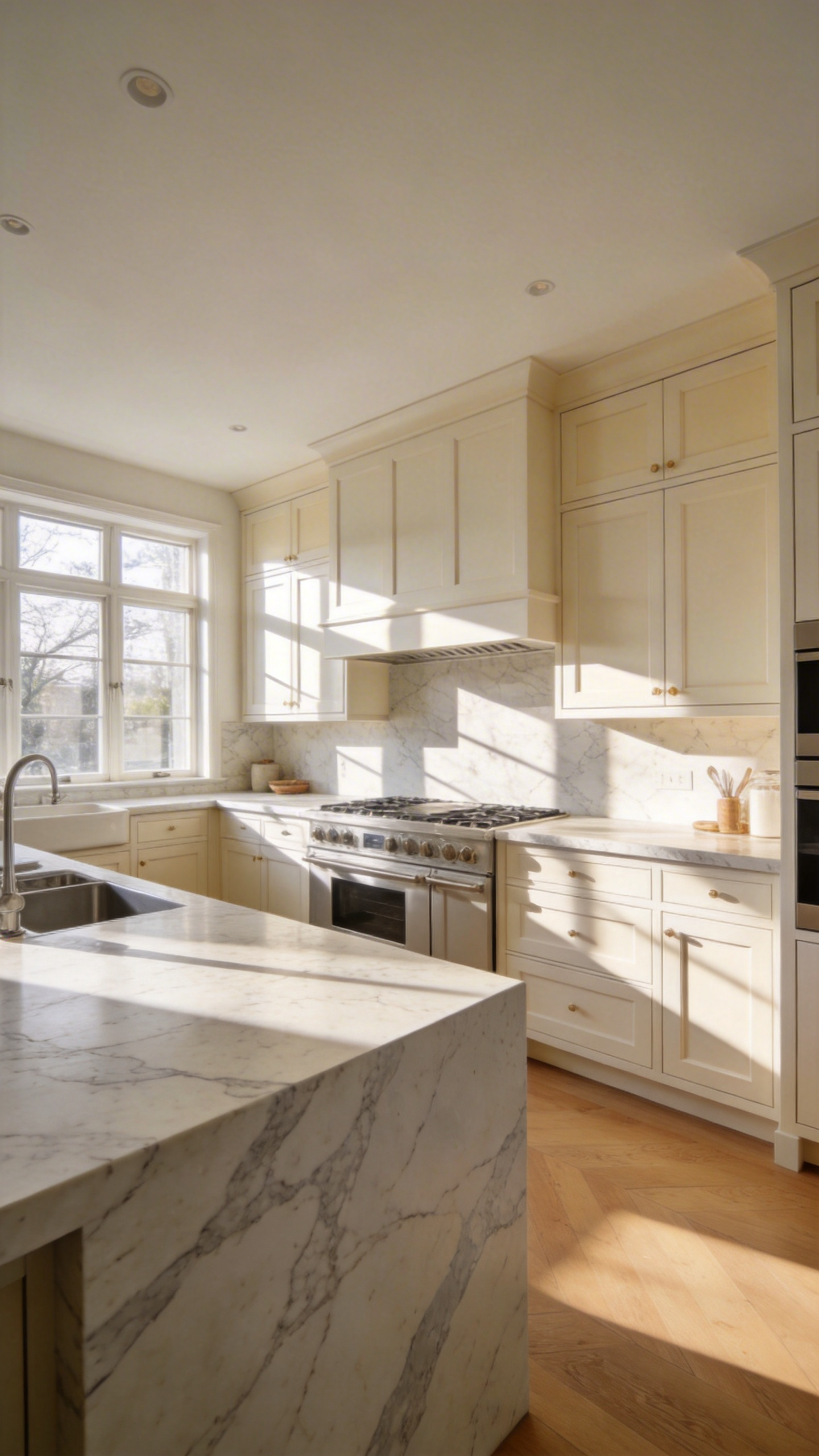
10. Countertop Continuity: The Waterfall Edge as a Monolith
The waterfall edge has evolved beyond a simple decorative trend. Instead, it now transforms the kitchen island into a monolithic sculpture. In a restrained all-white palette, this form serves as a crucial visual anchor. Indeed, without it, light cabinetry can often feel ephemeral or “floaty.” Therefore, the architectural intent is to mimic a solid block carved from a single quarry.
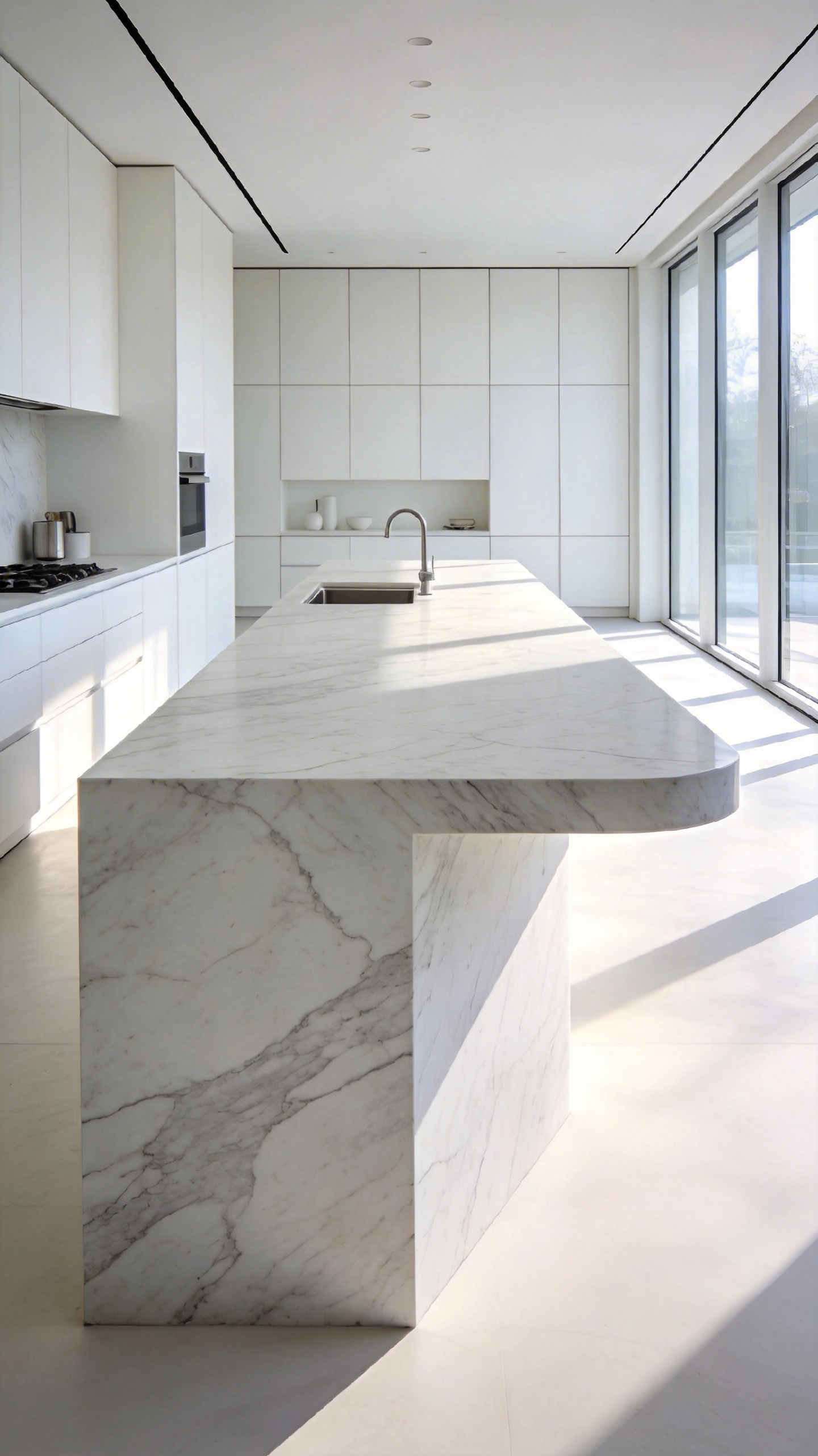
Achieving this illusion requires precise material science. Specifically, fabricators utilize a “folding” technique with 45-degree mitered edges. This creates a sharp, 90-degree corner rather than a standard seam. As a result, a thin slab appears as a heavy, solid volume. Furthermore, digital templating ensures veins cascade uninterrupted down the vertical face. Any misalignment here acts as a visual glitch, instantly breaking the monolithic spell.
Structurally, these hanging stone walls demand hidden steel subframes for support. This reinforcement prevents joint failure as the home settles over time. Visually, a polished white monolith functions like an “iceberg.” It reflects light from both the floor and ceiling. However, recent designs favor a “soft monolith” approach. For instance, incorporating fluted textures adds tactile warmth to the stone surface. Ultimately, this prevents the minimalist sanctuary from feeling like a clinical gallery.
11. The ‘Invisible’ Appliance: Paneled Fronts for Seamless Materiality
The modern kitchen has evolved into a continuous living space. Designers often refer to this as the “Domestic Pangaea.” Consequently, a massive stainless steel refrigerator acts as a jarring “visual speed bump” within a serene white design. Therefore, current trends prioritize “invisible architecture.” This treats appliances as structural columns rather than standalone machines.
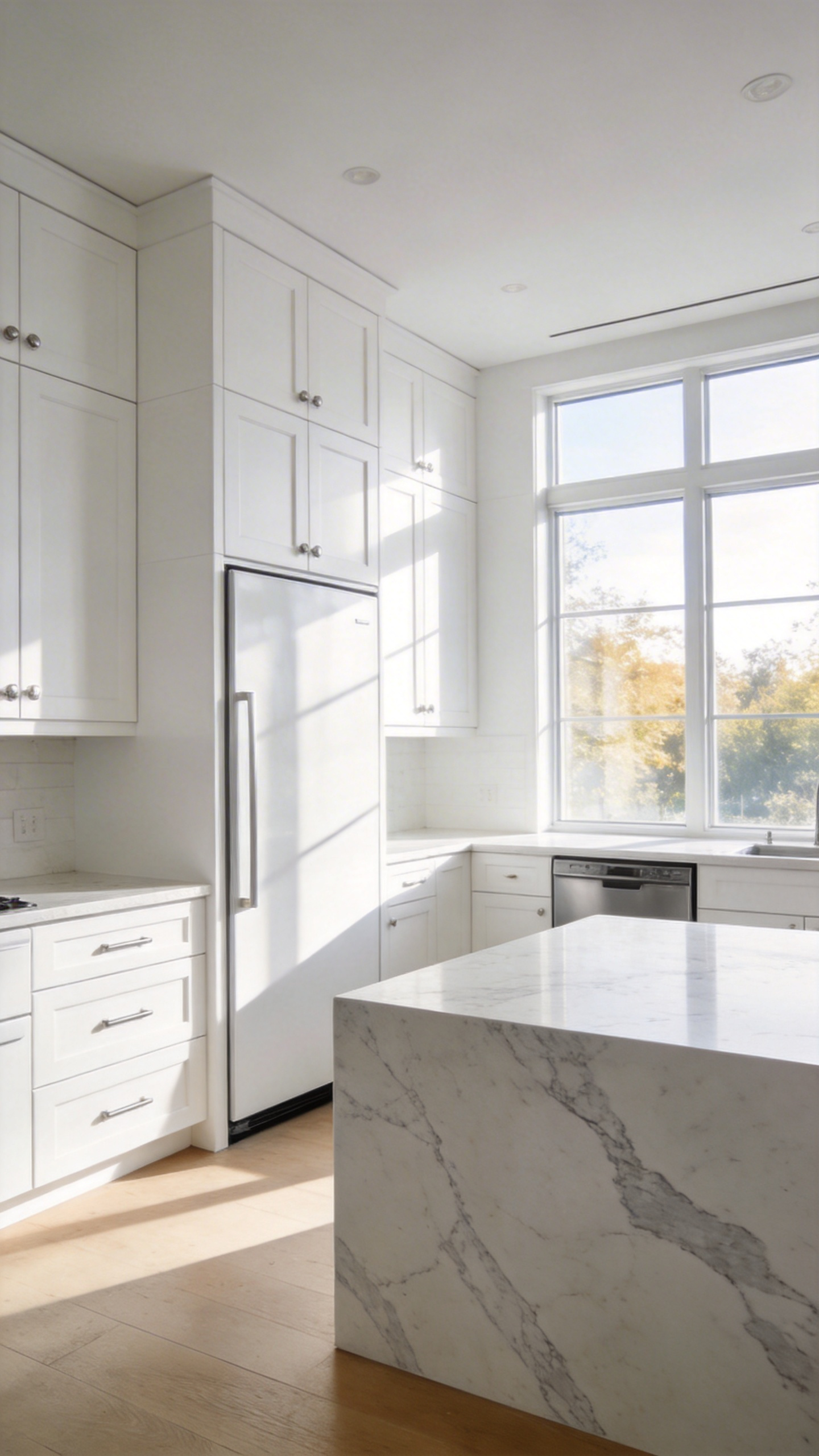
Achieving this seamless materiality requires precise engineering, not just carpentry. Specifically, appliances must be integrated rather than “proud-mount,” sitting perfectly flush with the standard 24-inch cabinet depth. Furthermore, the gaps between panels—known as reveals—must adhere to a strict 1/8-inch tolerance to maintain the illusion. Even the ventilation is carefully considered. Distinct shadow-gap detailing often hides airflow channels to preserve the monolithic look.
Beyond structure, texture plays a pivotal role in camouflage. For instance, designers frequently utilize reeded or fluted white panels on appliance fronts. These vertical grooves create a play of light and shadow, effectively masking the necessary seams of large units. Additionally, matte finishes are preferred over gloss because they absorb light. This helps the unit recede visually into the background.
Interestingly, this trend also enhances the auditory experience. Heavy custom panels act as acoustic buffers, significantly reducing the decibel level of running compressors. Moreover, “Knock-to-Open” technology eliminates handles entirely. This allows for a soft-touch interaction with the material. Ultimately, this enables a hybrid approach: concealing utilitarian units like dishwashers while allowing a sculptural range to shine.
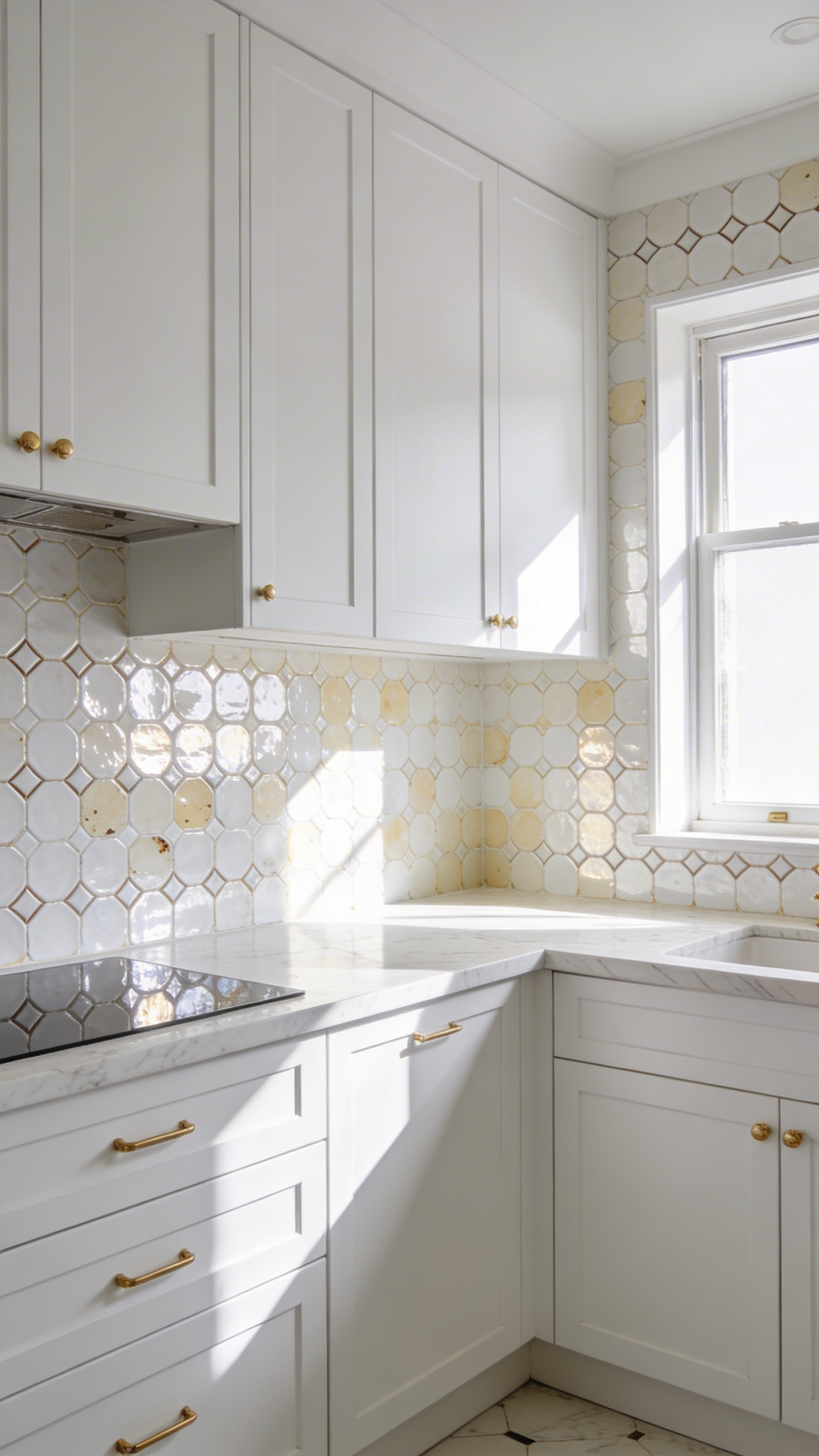
12. Grout Architecture: Using Contrast to define Subway Tile Geometry
Treating spaces between tiles as structural elements transforms a simple white kitchen. Specifically, “Grout Architecture” utilizes contrasting filler to draw the room’s geometry. Instead of a monolithic backdrop, the grout acts like a fine ink pen. Consequently, this shifts the aesthetic toward a high-contrast, rhythmic architectural feature.
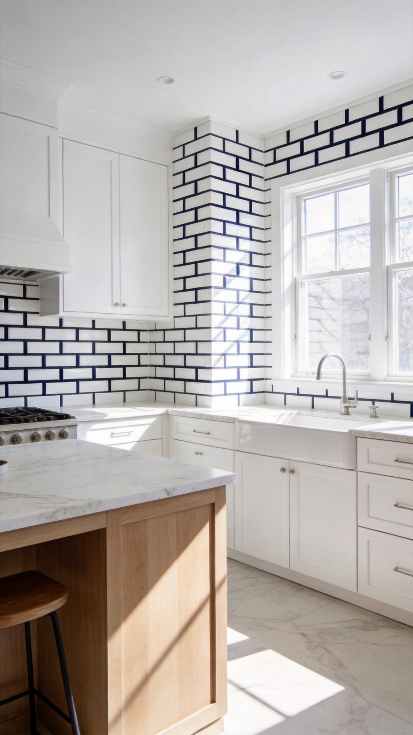
Material selection plays a crucial role in this tectonic look. By choosing deep shades like Charcoal or Raven, you celebrate individual components. Furthermore, precise joint profiling enhances this effect significantly. For instance, a “raked joint” is slightly recessed, creating a permanent shadow line. Therefore, the wall possesses a 3D relief that engages the senses rather than appearing flat.
However, this design philosophy demands exceptional craftsmanship. Dark grout serves as a visual highlighter for every tile edge. Thus, even minor spacing flaws become glaringly obvious. Additionally, the joint width alters the atmosphere. Micro-joints create a sharp, contemporary look, while wider lines suggest industrial weight.
Ultimately, this approach changes the kitchen’s sensory experience. The space feels grounded, enclosed, and permanent. Moreover, darker grout offers a practical advantage for high-traffic zones. It masks inevitable oils and stains, allowing the design to mature gracefully.
13. Mixed Material Lighting: Alabaster, Woven Rattan, and Iron Fixtures
To truly elevate a white kitchen, you must look beyond standard illumination. Specifically, the combination of alabaster, woven rattan, and iron offers a sophisticated alternative to clinical designs. Alabaster, a translucent mineral, does not simply reflect light. Instead, it captures and releases a soft, candle-like glow through its natural veining. In contrast, woven rattan acts as a textural filter. It casts intricate, graphic shadows across white cabinetry, effectively breaking up flat surfaces with organic movement. Consequently, this pairing creates a dual mood: formal elegance meets casual warmth.
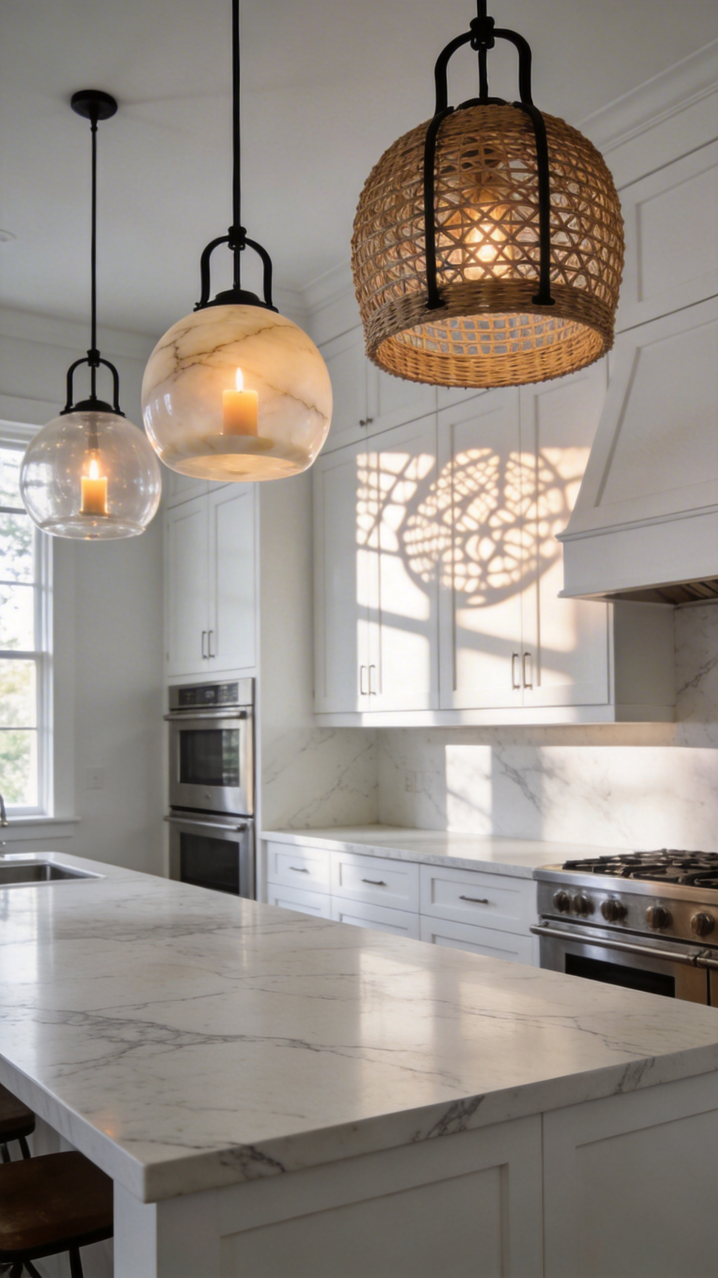
However, a predominantly white room can feel weightless without an anchor. Here, iron fixtures serve as “structural ink.” Visually, the dark metal defines the room’s bones against the pale backdrop. This grounds the airy aesthetic. Furthermore, this material mix allows for strategic layering within the space. For instance, rattan pendants over an island add a “lived-in” human touch. Simultaneously, alabaster sconces near a range hood offer sculptural beauty.
Technically, modern LED technology is the hero of this aesthetic. Because LEDs emit minimal heat, they preserve the natural oils in rattan and prevent alabaster from scorching. Finally, attention to undertones is crucial for a cohesive look. For cool white kitchens, select grey-veined alabaster to maintain crispness. In contrast, honey-toned stone enhances warm cream palettes. Ultimately, this trifecta transforms texture into color, adding depth without disrupting the monochromatic serenity.
14. Textile Integration: Softening Hard Surfaces with Linen Banquettes and Runners
The line between pristine and clinical is razor-thin in white kitchen design. Consequently, textile integration serves as the critical “soul” of the space. Specifically, integrating linen through banquettes and runners acts as a technical strategy. It effectively humanizes hard, non-porous surfaces.
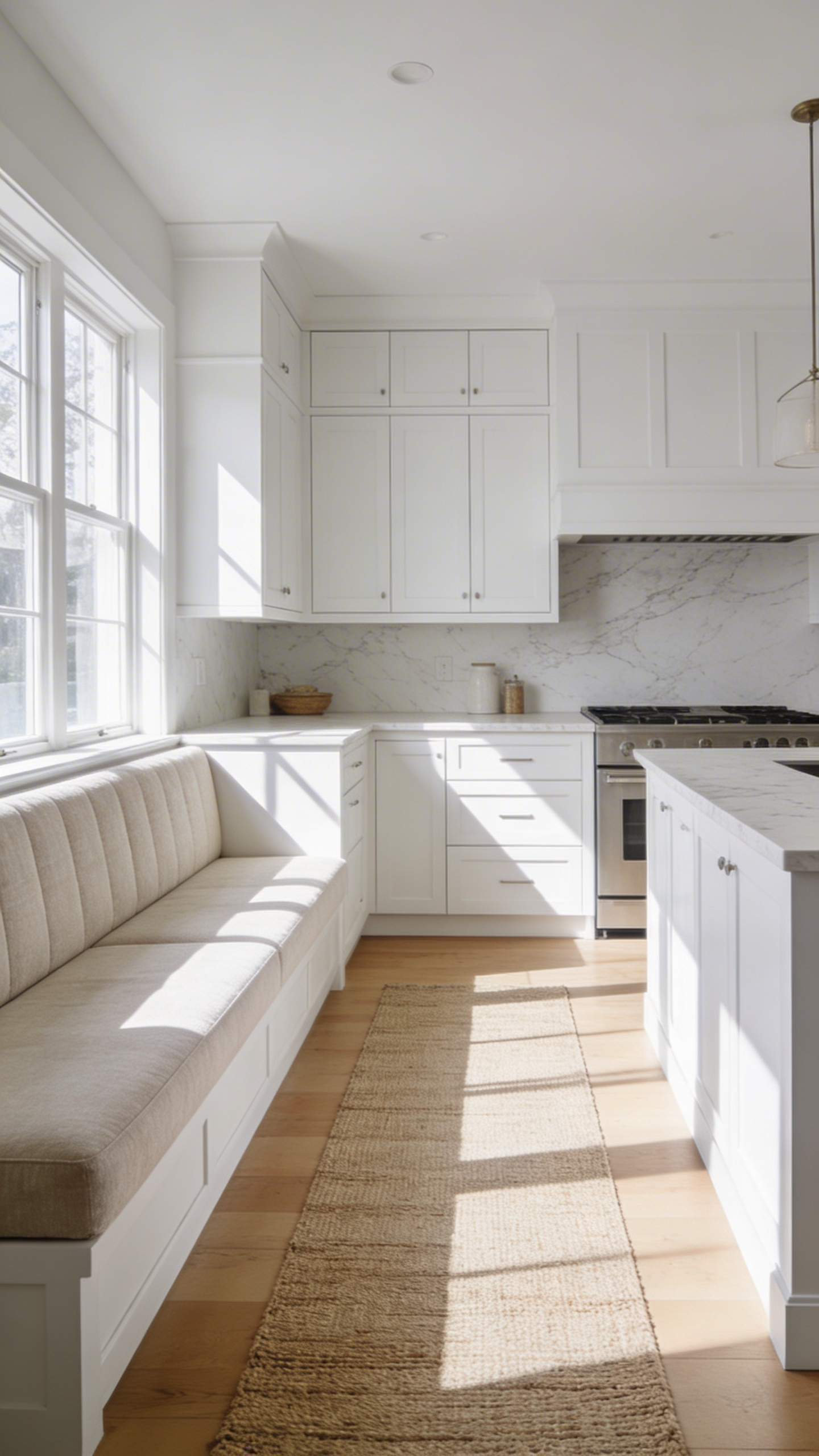
First, consider acoustics. Tiled floors and stone countertops often create an echo chamber. However, linen’s hollow fibrous structure effectively captures and dissipates sound waves. In fact, designers often utilize heavy-weight Belgian linen for banquettes to create a “bass trap” effect. This significantly lowers decibel levels and warms the room’s atmosphere.
Additionally, linen addresses visual fatigue caused by high-gloss reflections. Unlike polished marble, linen provides a visual “matte finish.” Its natural pectin sheen creates a soft, multidirectional diffusion of light. For instance, unbleached runners introduce a natural “slub.” This effectively breaks up the visual flatness of an island.
Furthermore, these textiles offer necessary zoning. A linen-clad banquette creates a “soft corner” for lingering. This contrasts nicely with the hard zones meant for labor. Nevertheless, durability remains a common concern. Therefore, the modern authoritative approach utilizes “Performance Blends.” By weaving linen with high-performance synthetics, you achieve a dry, organic hand-feel that is virtually stain-proof. Ultimately, this haptic variety transforms a sterile showroom into a tactile sanctuary.
15. Biophilic Contrast: Large-Scale Greenery as a Design Element
White kitchens frequently suffer from “aesthetic fatigue” due to their reliance on hard, non-porous surfaces. Consequently, large-scale greenery serves as a vital psychological “thawing” agent rather than mere decoration. Specifically, the organic, fractal patterns of large leaves offer necessary visual relief. According to Attention Restoration Theory, this soft sensory input reduces the cognitive load of high-intensity bright spaces. Thus, a deep emerald *Ficus* creates a sculptural focal point against a stark white backdrop.
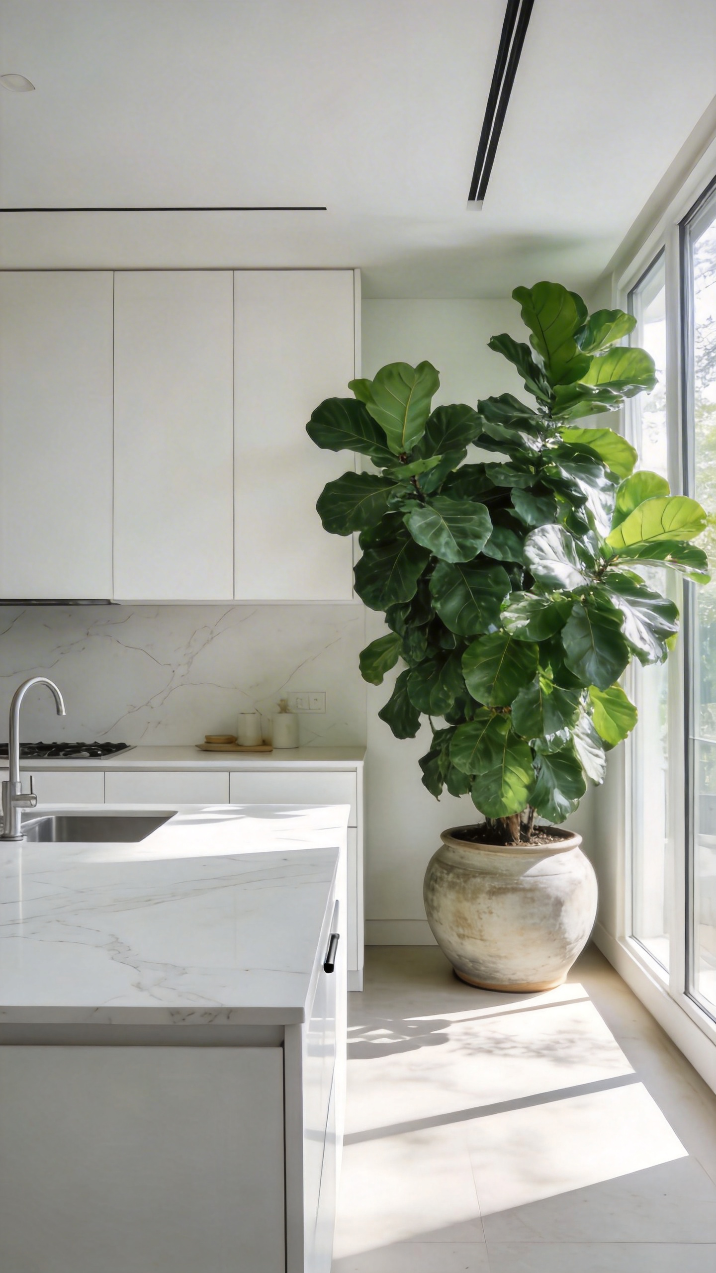
Moreover, a biological symbiosis exists between white finishes and indoor trees. Matte white surfaces possess a high Solar Reflectance Index. As a result, they act as giant reflectors to bounce diffuse light into a plant’s lower canopy. This scattered light prevents “hot spots” and encourages a full, 360-degree leaf density. Therefore, the room itself helps the plant maintain its architectural shape.
Beyond biology, these plants function as true structural elements. For instance, a six-foot indoor tree introduces verticality to break up the horizontal dominance of countertops. Furthermore, the expansive leaf surface area acts as a natural acoustic damper. Effectively, the foliage absorbs high-frequency kitchen clatter to soften the room’s auditory profile. Finally, the active kitchen creates a localized humidity plume through daily use. Therefore, large tropical varieties thrive here better than in dry living areas. This bridges the gap between design and function.
16. Floor Transitions: Limestone and Travertine for European Texture
Grounding a pristine white kitchen relies on the tactile “soul” of natural stone. Specifically, current trends celebrate the “living” patina of materials rather than sterile perfection. Therefore, designers favor “seasoned” limestone with matte finishes. Consequently, the floor absorbs light, creating a diffused glow that warms white cabinetry. For tonal weight, Belgian Bluestone is an exceptional choice. Interestingly, this fossil-rich stone provides a deep charcoal “visual anchor.” Moreover, its non-porous nature makes it technically superior for splash zones.
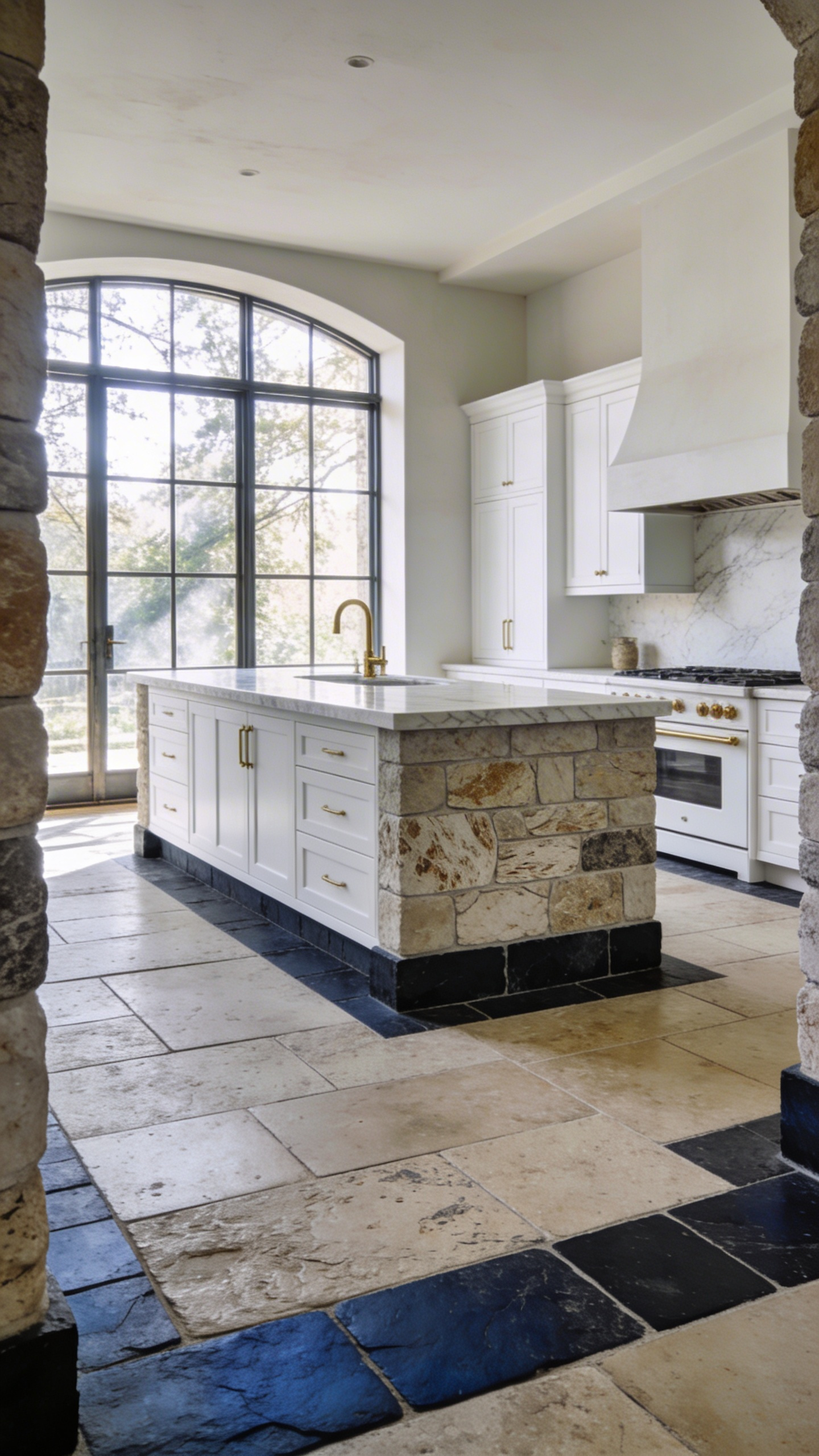
Next, consider travertine for a unique sensory experience. To maintain hygiene without losing character, utilize tumbled and filled varieties. Here, custom-tinted resin smooths the surface while revealing the stone’s inner honeycomb structure. As a result, the floor feels “buttery” and stays cool underfoot. Furthermore, authentic European texture requires breaking the grid. Thus, laying tiles in “random lengths” mimics historic French chateaux. This organic pattern effectively blurs the lines between functional cooking zones and social spaces.
Finally, the physical transition to adjacent wood flooring requires precision engineering. In fact, high-end designs reject chunky transition strips entirely. Instead, they employ a flush joint technique. A thin brass pinstripe or silicone line acts as a buffer. Consequently, this allows for natural expansion while maintaining a continuous, knife-edge finish. Ultimately, this “invisible” seam removes visual clutter. It allows the rich material textures to take center stage.
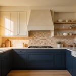
17. The Statement Island Base: Contrast Stains vs. Painted Finishes
The kitchen island has evolved beyond a simple utilitarian workstation. Historically, white kitchens prioritized clinical sterility. However, today’s statement island serves as a bespoke piece of furniture. Consequently, choosing a contrasting base effectively breaks the visual “sea of white.” It makes the island a focal point in any kitchen remodel designs. Specifically, stained wood introduces necessary organic warmth. This material choice triggers a biophilic response, effectively grounding the homeowner in the space.
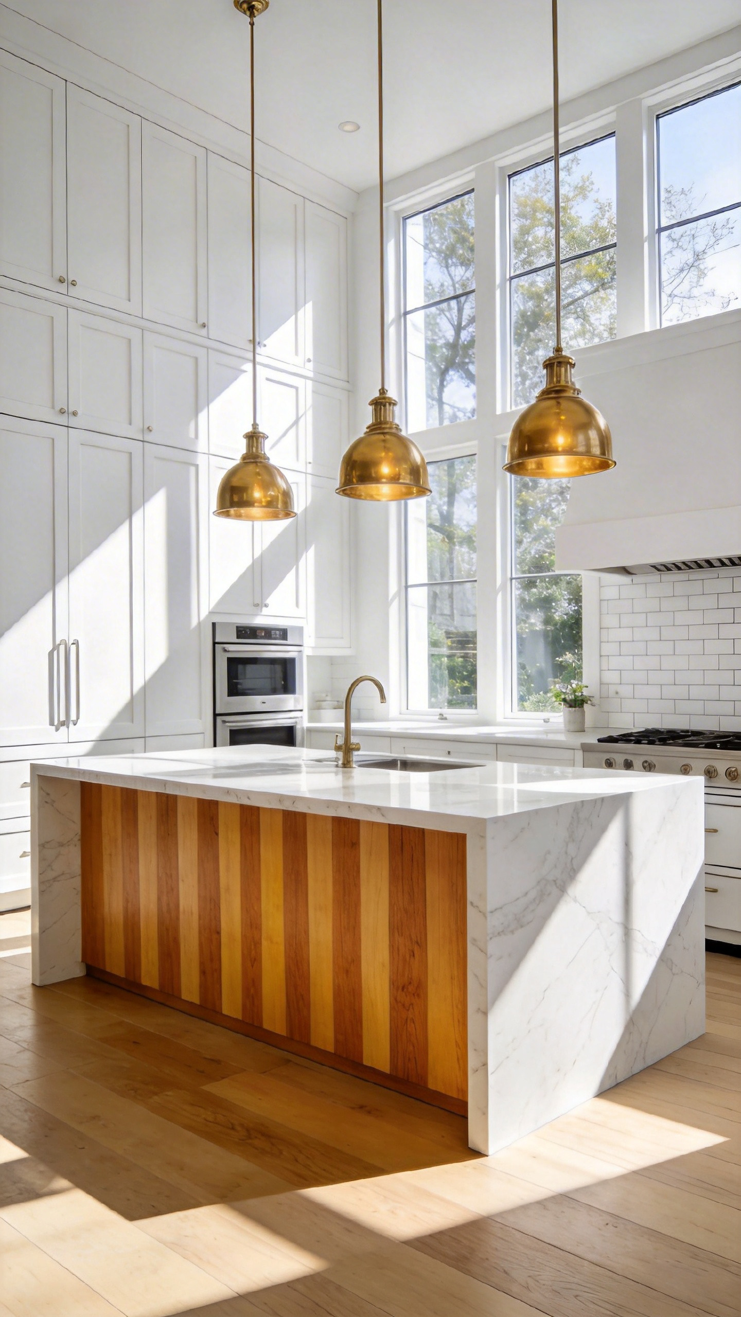
Specifically, Rift Sawn White Oak is the current gold standard for these stained bases. Its distinct linear grain provides superior dimensional stability against humidity. Furthermore, this cut avoids distracting wavy patterns found in plain sawn woods. Thus, it acts as a neutral texture that supports, rather than fights, intricate marble veining. Additionally, stained wood offers a significant durability advantage. Since the pigment penetrates the fibers, it hides natural joint expansion better than paint.
Conversely, painted finishes offer refined color precision. For example, deep Navy implies luxury stability, while Sage Green fosters tranquility. Yet, paint merely sits on top of the surface. Therefore, natural wood movement can eventually cause visible hairline cracks at the joints. Also, high-traffic islands often suffer from “shins and shoes” wear. In this context, stained wood is more forgiving, as scuffs blend naturally into the grain. Finally, applying an ultra-matte sheen adds crucial visual weight. This finish absorbs light, anchoring the airy room with a substantial, confident presence.
18. Lighting Temperature Physics: Managing Kelvin Ratings on Reflective Surfaces
Managing Kelvin ratings in a white kitchen requires understanding spectral power distribution. Effectively, surfaces act as mirrors for specific wavelengths rather than passive backgrounds. Therefore, choosing a bulb involves analyzing your material’s unique physics. Specifically, white paints are rarely neutral. Instead, they act as filters that interact with light. Consequently, a 3000K bulb selectively amplifies warm pigments hidden within bespoke cabinetry.
Furthermore, texture dictates how this light is physically perceived. For instance, high-gloss lacquer creates specular reflection. If you use 5000K bulbs here, distinct blue “hot spots” appear on the surface. Conversely, matte surfaces scatter light diffusely. This creates a soft, Lambertian glow that feels integrated rather than intrusive.
Indeed, you must consider secondary reflections from the floor. Rich timber creates a massive warm “bounce” upward. Thus, cool downlights often clash with this amber glow, creating a muddy split-tone effect. To bridge this gap, designers favor a 3500K “sweet spot.” By mastering these technical layers, a white kitchen design transcends its “sterile” reputation to become a high-performance sanctuary of light and texture.
Frequently Asked Questions
Does a white kitchen make a small space look bigger?
Yes. The physics of a white kitchen design rely on high Light Reflectance Values (LRV). White surfaces reflect more natural and artificial light than darker hues, which eliminates dark corners and visually pushes the walls outward. This creates “visual volume,” making even compact layouts feel psychologically expansive and airy.
How do you prevent a white kitchen from looking sterile?
The key is layering texture and varying light temperatures. By mixing matte and gloss finishes—such as pairing matte bespoke cabinetry with a shimmering Zellige tile backsplash—you create “surface tension” that engages the eye. Additionally, using warm-toned lighting (around 3000K) and organic materials like bleached oak or unlacquered brass prevents the space from feeling clinical.
Are white kitchens high maintenance?
While white shows spills more readily than dark colors, modern material science has made maintenance much easier. High-quality lacquers, non-porous quartz, and nanotechnology-driven finishes allow for effortless cleaning. In a luxury home, a white palette actually acts as a “diagnostic tool,” allowing homeowners to maintain a higher standard of hygiene that is visible and verifiable.