Most kitchen decorating designs advice tells you the same things: match your hardware, pick a neutral palette, don’t overcrowd your countertops. Most of it gets applied uniformly too — the same white subway tile, the same grey quartz, the same matte black faucet. One kitchen becomes indistinguishable from the next. Here’s what that advice gets wrong: a kitchen’s character doesn’t come from coordinating everything perfectly. It comes from specific material decisions, a few carefully chosen focal points, and the willingness to let one element be genuinely interesting while everything else supports it.
After ten years working with material combinations in residential spaces, I’ve watched kitchens transform not through renovation but through targeted changes. A leathered countertop instead of a polished one. A statement range hood where a basic box used to be. A ceiling color that turns a flat room three-dimensional. These aren’t dramatic overhauls. But they shift how the room feels, how you use it, and whether guests walk in and stop to look around.
These 15 kitchen decorating designs cover the choices that actually move the needle — with specific products, realistic costs, and the material reasoning behind each one.
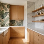
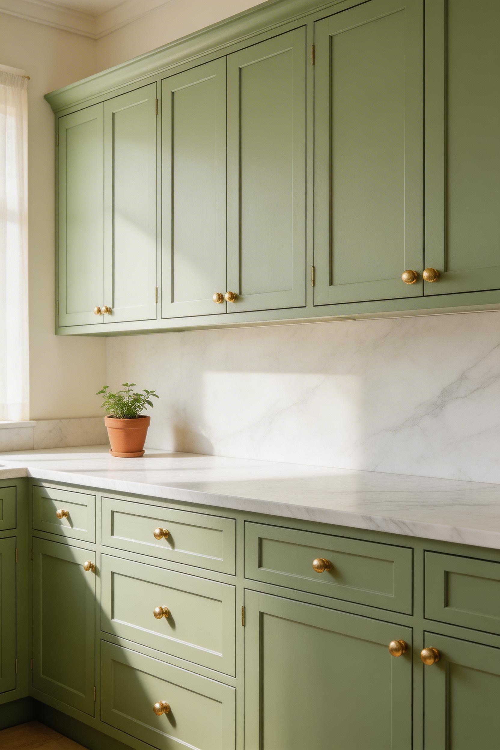
1. Two-Tone Cabinet Kitchen Decorating Designs That Balance Visual Weight
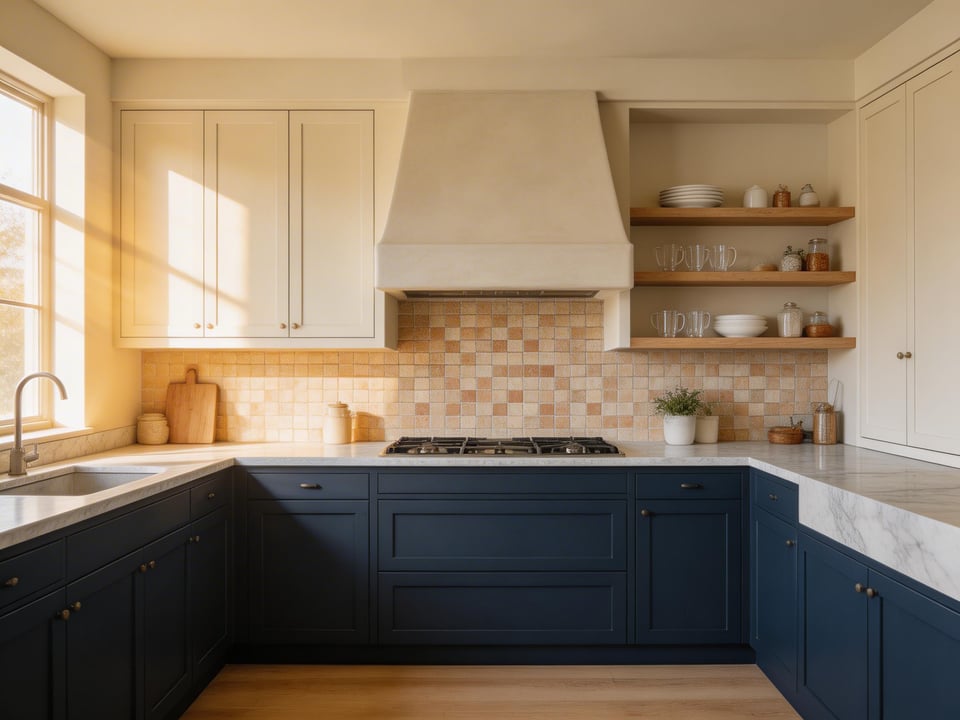
The idea behind two-tone cabinets is simpler than most guides make it. Dark lower cabinets visually ground a room. Lighter upper cabinets keep the space feeling open. But the effect only works when the colors share an undertone family. Pair a warm cream upper with a warm navy lower — and the combination looks considered. Mix warm and cool whites, or use colors from different temperature families, and the result looks like two separate decisions that happened to occupy the same room.
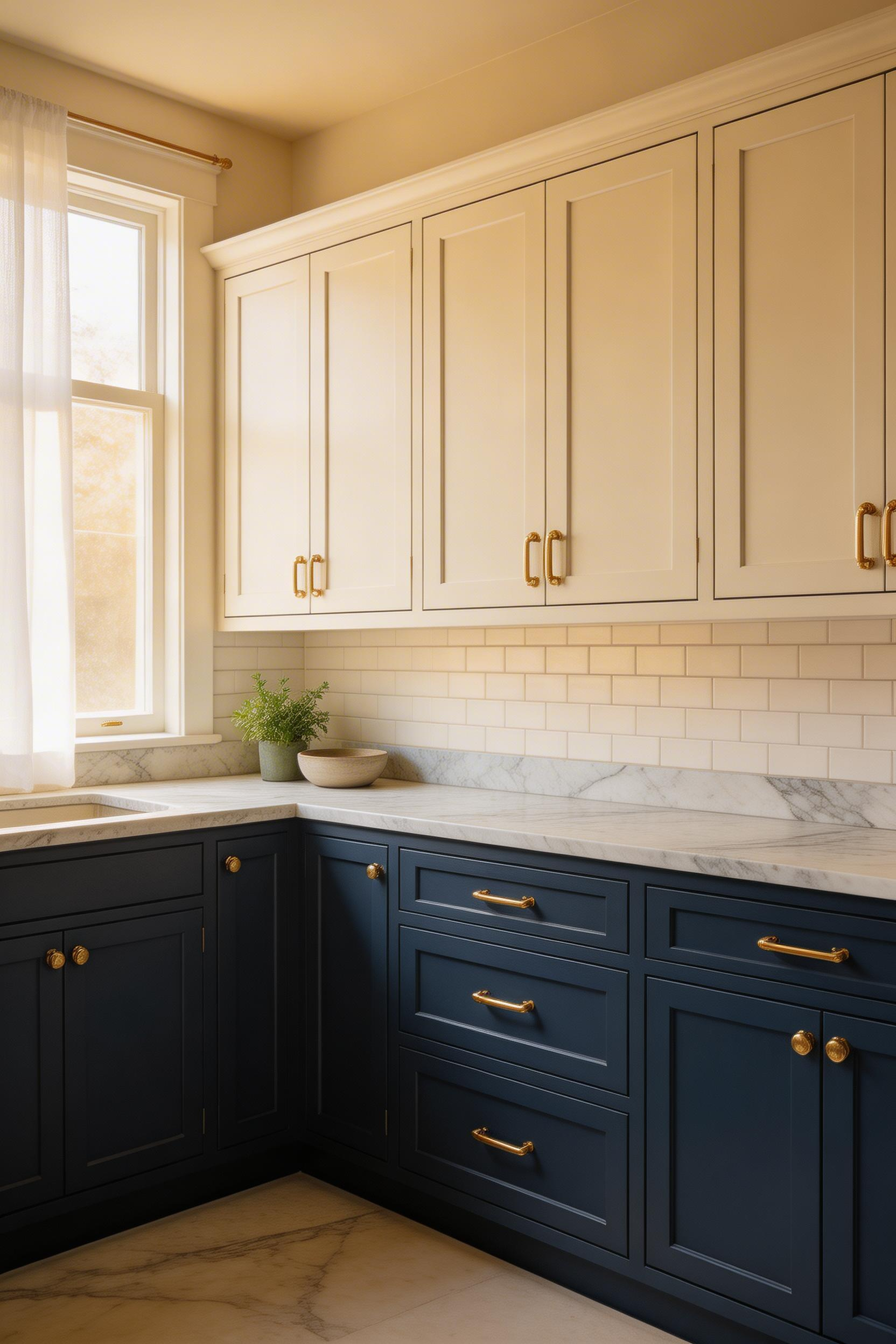
The most-requested two-tone combination right now is Benjamin Moore Hale Navy HC-154 for lower cabinets paired with White Dove OC-17 uppers. It’s a classic pairing because navy and warm white share the same slightly warm undertone. Sherwin-Williams Urbane Bronze SW 7048 with Alabaster SW 7008 creates a warmer, earthier version. Both retail for $70-85 per gallon. For a budget-friendly approach, IKEA’s SEKTION system with AXSTAD matte white uppers and LERHYTTAN black-brown lowers runs from about $150 per unit.
The 70/30 Rule for Two-Tone Balance
According to Houzz’s 2024 Kitchen Trends Study, 23% of renovating homeowners chose two-tone cabinet finishes — up from 14% in 2020. The most important technical detail is the finish. Lower cabinets should be semi-gloss or satin for easy cleaning. Upper cabinets can go to eggshell if you prefer less sheen. The color break should land at the countertop line, not above it.
There’s also a less-discussed trick worth knowing. If your upper cabinets run to the ceiling, paint them the same color as the ceiling. That makes the entire upper zone read as a single built-in element. It costs nothing extra and makes the kitchen look twice as architectural without touching the cabinets themselves.
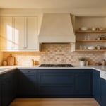
2. Statement Backsplash as a Kitchen Decorating Design Anchor
A statement backsplash does something no other kitchen element does as efficiently: it sets the room’s entire visual vocabulary from one surface. The right backsplash tells you the palette, the texture, the formality level. Every other decision in the room either supports or contradicts it.
Zellige tile — handmade Moroccan terracotta with reactive glazes — is the current benchmark for this approach. The natural variation in glaze creates a surface that catches light differently throughout the day. So the wall is never static. Clé Tile’s zellige in Ocean or Cotto runs $28-45 per square foot and requires proper sealing and careful cleaning. A more forgiving alternative is Fireclay Tile’s American-made handmade ceramics in sage or oyster at $15-22 per square foot — similar variation, easier maintenance. Houzz reports that 42% of renovating homeowners who chose a decorative backsplash used it as the starting point for their kitchen’s color palette.
Where to Focus Your Budget
Full-height slab backsplashes — where countertop stone continues up the wall to the hood — gained 40% more searches on Pinterest in 2024 compared to 2022. They read as expensive because they are. Ann Sacks large-format porcelain slab panels run $65-120 per square foot installed. But if budget is limited, the smarter approach is concentrating your statement tile in a single column behind the range. Roughly 3-4 feet wide, from counter to ceiling. Use a simple painted wall or basic subway tile elsewhere. That focused application has more visual impact than spreading a mid-range tile across the whole kitchen.
3. Mixed Metal Hardware That Looks Intentional, Not Accidental
Mixed metal hardware works when there’s a logic behind the choices — and fails when there isn’t. The logic is usually this: one finish on the faucet (the most visible, expensive, and hardest-to-change piece), one contrasting finish on cabinet hardware, and nothing else. Two finishes, clearly distributed, read as intentional. Three finishes spread randomly read as indecision.
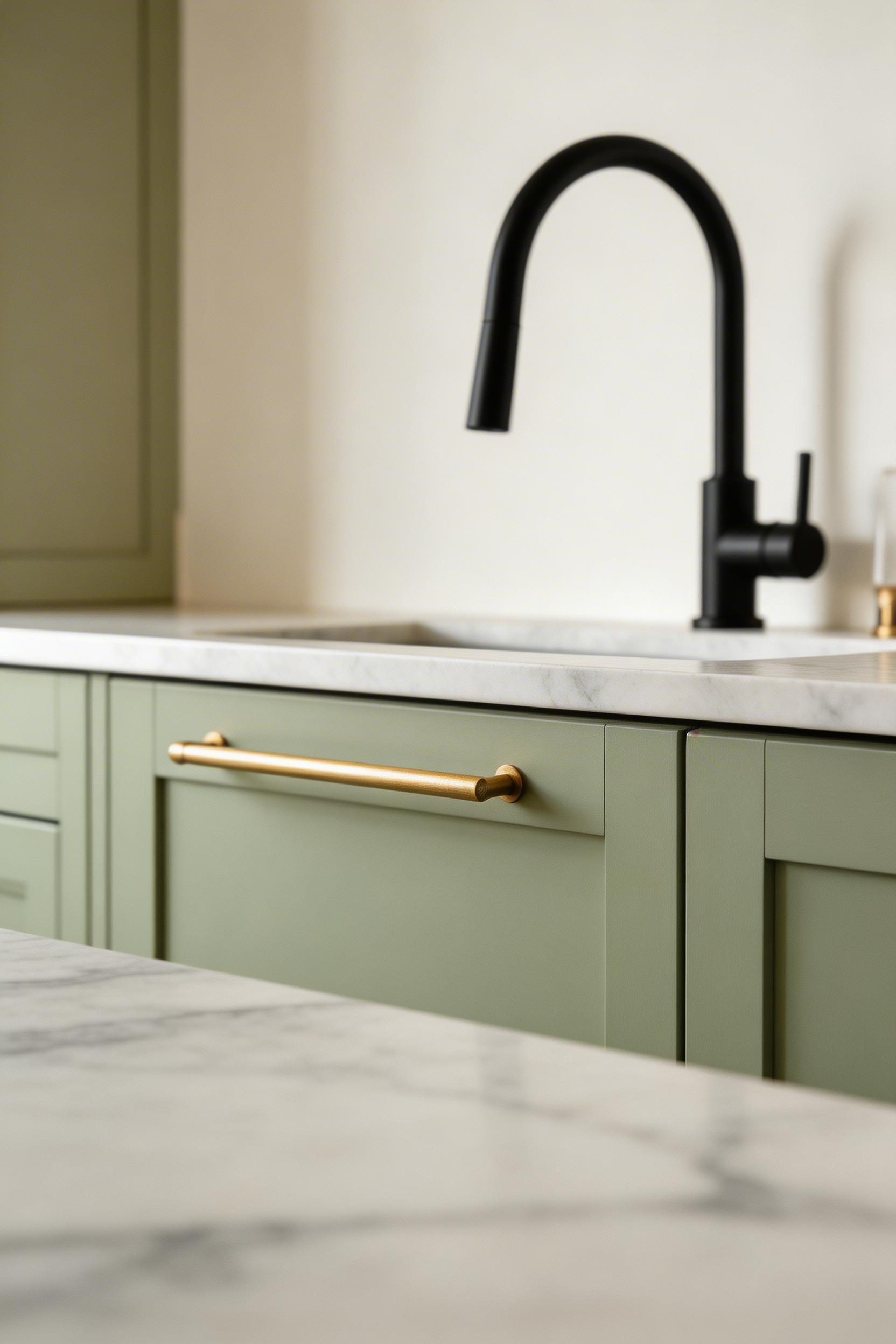
The three most commonly mixed finishes right now are unlacquered brass, matte black, and brushed nickel. Warm metals (brass, gold, copper) pair naturally with each other. Cool metals (chrome, nickel, stainless) also work together. Crossing temperature families — mixing brass with chrome — requires more skill. You’ll need a deliberate connecting element in the room, like a light fixture that contains both finishes. A 2023 National Kitchen and Bath Association survey found that 67% of designers reported clients requesting mixed metal finishes, up from 31% five years earlier.
Specific Hardware to Consider
Rejuvenation’s Classic Cabinet Pull in Unlacquered Brass runs $12-28 per pull. It’s true unlacquered brass that will develop a patina over 6-18 months. CB2’s Linear Cabinet Pull in matte black is $8-16 per pull and suits both modern and transitional kitchens. For a budget approach, IKEA’s ENERYDA matte black bar pulls at $3-6 per pull are surprisingly convincing. I’ve used them alongside expensive faucets in client kitchens and nobody questions them. Pick your faucet finish first. Everything else should support it.
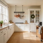
4. Open Shelving in Kitchen Decorating Designs: Curated Display, Not Overflow
Open shelving fails for one reason almost every time: too much on the shelf. The visual logic of a good open shelf is 70% objects and 30% empty space. That negative space is what separates a display from a storage dump. Most people load shelves to 90% capacity, then wonder why the kitchen looks chaotic rather than designed.
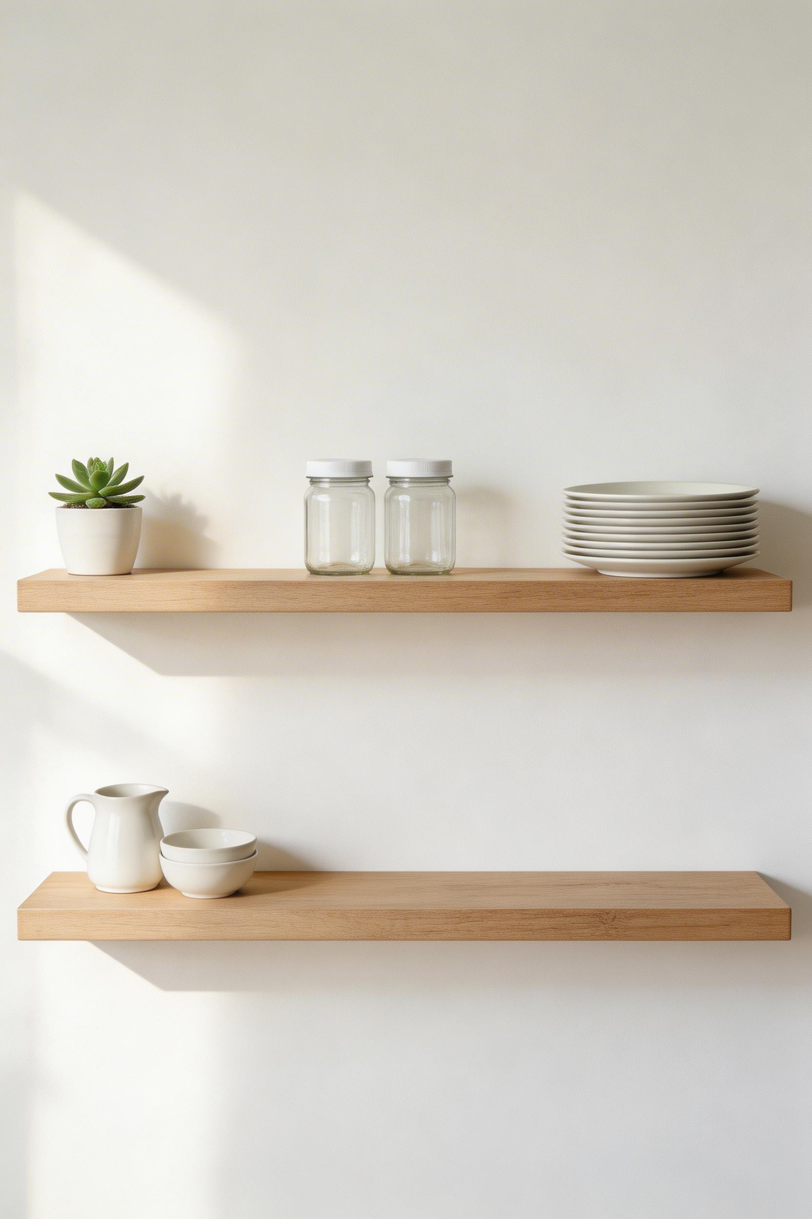
The shelf itself matters too. Shelf Made’s White Oak Floating Shelves ($85-145 for 36 inches) add warmth that metal bracket shelves cannot. The solid wood reads as a considered material choice rather than a utility installation. IKEA’s BERGSHULT shelf with GRANHULT stainless bracket runs $40-65 for a clean industrial look that coordinates with stainless appliances. Standard depth: 10-12 inches accommodates most plates and bowls standing upright. An 8-inch depth works for glasses and spice storage. Unsupported spans of solid 3/4-inch wood shouldn’t exceed 36 inches without a center bracket.
The Editing Process
A 2024 Apartment Therapy survey found that 44% of homeowners who installed open shelving said they would do fewer shelves if starting again. Only 12% said they would do more. That’s a meaningful signal. Take everything off the shelf first, then add back only what genuinely earns its place visually. If you can’t name one reason something should be on display beyond needing somewhere to go, it belongs in a cabinet. A shelf with eight beautiful objects beats one with twenty-four mixed ones every time. For more ways to treat kitchen shelves as a design feature, the kitchen shelves decor ideas in our other guide cover styling approaches in more depth.
5. Textured Countertops Beyond Polished Granite
Polished granite has been the default kitchen countertop for twenty years. That’s exactly why it now reads as a default. The more interesting kitchen decorating designs are using textured stone finishes — leathered, honed, and fluted — that bring a tactile quality polished stone completely lacks.
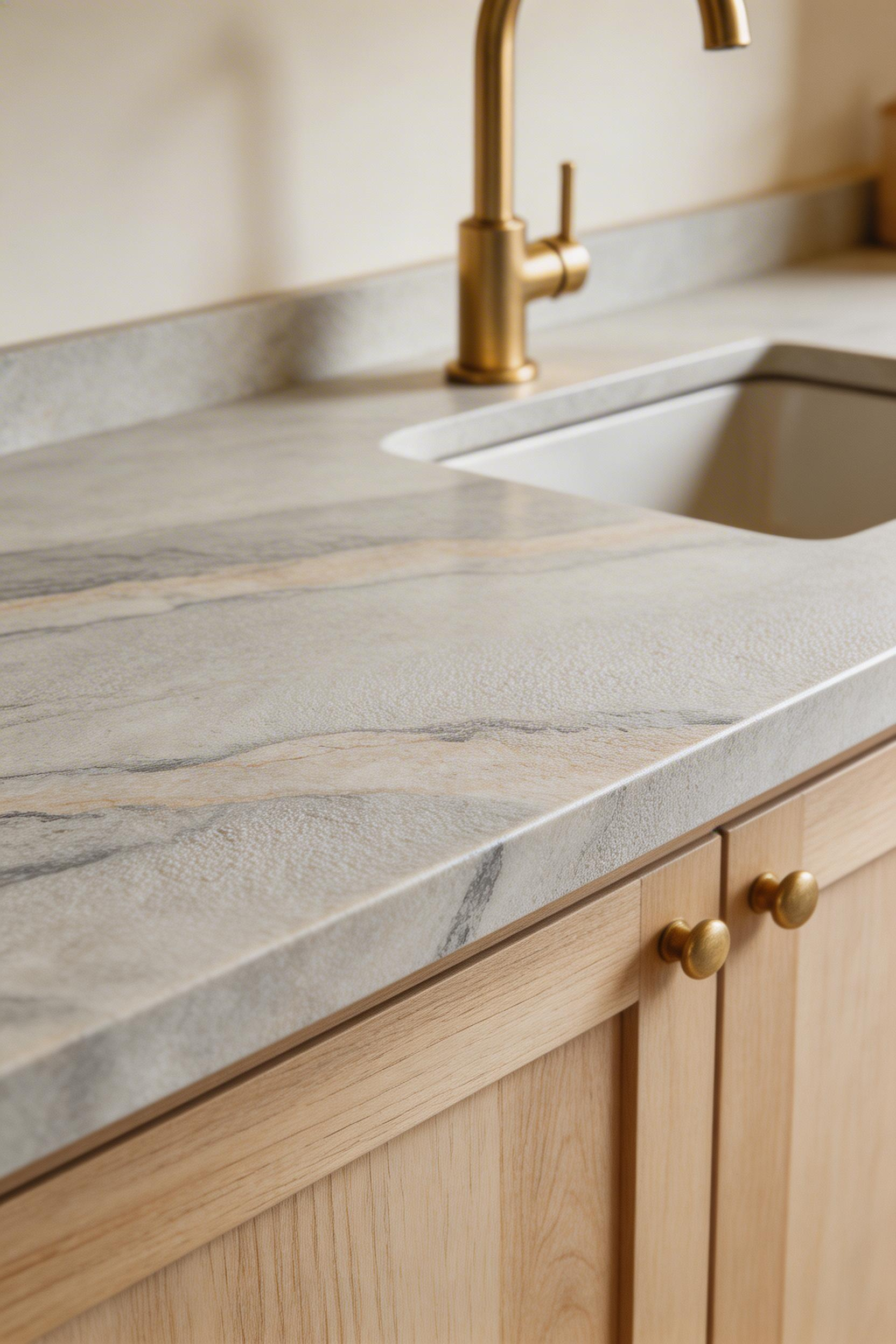
Leathered granite has a matte, brushed surface created by diamond-tipped tools after honing. It hides fingerprints and water spots better than polished stone — genuinely useful in a working kitchen. Arizona Tile’s Taj Mahal Quartzite in a leathered finish runs $75-120 per square foot installed. It’s creamy white with subtle gold veining, harder than marble, and more acid-resistant. MSI’s Ubatuba Granite in leathered finish costs $45-75 per square foot installed — a dark green-black with gold flecks that reads as luxurious without marble’s maintenance requirements. Stone World magazine’s 2024 industry survey found leathered finishes now account for 18% of residential stone orders, up from 6% in 2018.
Honed Marble: Beautiful, But Know What You’re Committing To
Honed marble etches from acidic foods regardless of sealing. The etch shows as a dull spot. It requires either acceptance as natural patina or professional re-polishing. If you love the look but not the maintenance, a practical approach is using honed marble on the island only. People are more careful about how they use an island because it’s the visible centrepiece. Use a more durable quartzite or engineered quartz on perimeter counters instead. Leathered and honed stone typically cost $5-15 more per square foot than polished versions of the same stone.
6. Kitchen Decorating Designs With Layered Under-Cabinet Lighting
Overhead kitchen lighting is functional. Under-cabinet and toe-kick lighting is transformative. The difference between a kitchen that looks like a working room at every hour and one that shifts character after dark is almost always this second layer of light. It’s a simple addition with a disproportionate effect. It’s also the lighting upgrade with the best return on investment by a wide margin. The American Lighting Association reports it as the number one lighting addition homeowners say they would add if renovating again, cited by 52% of respondents.
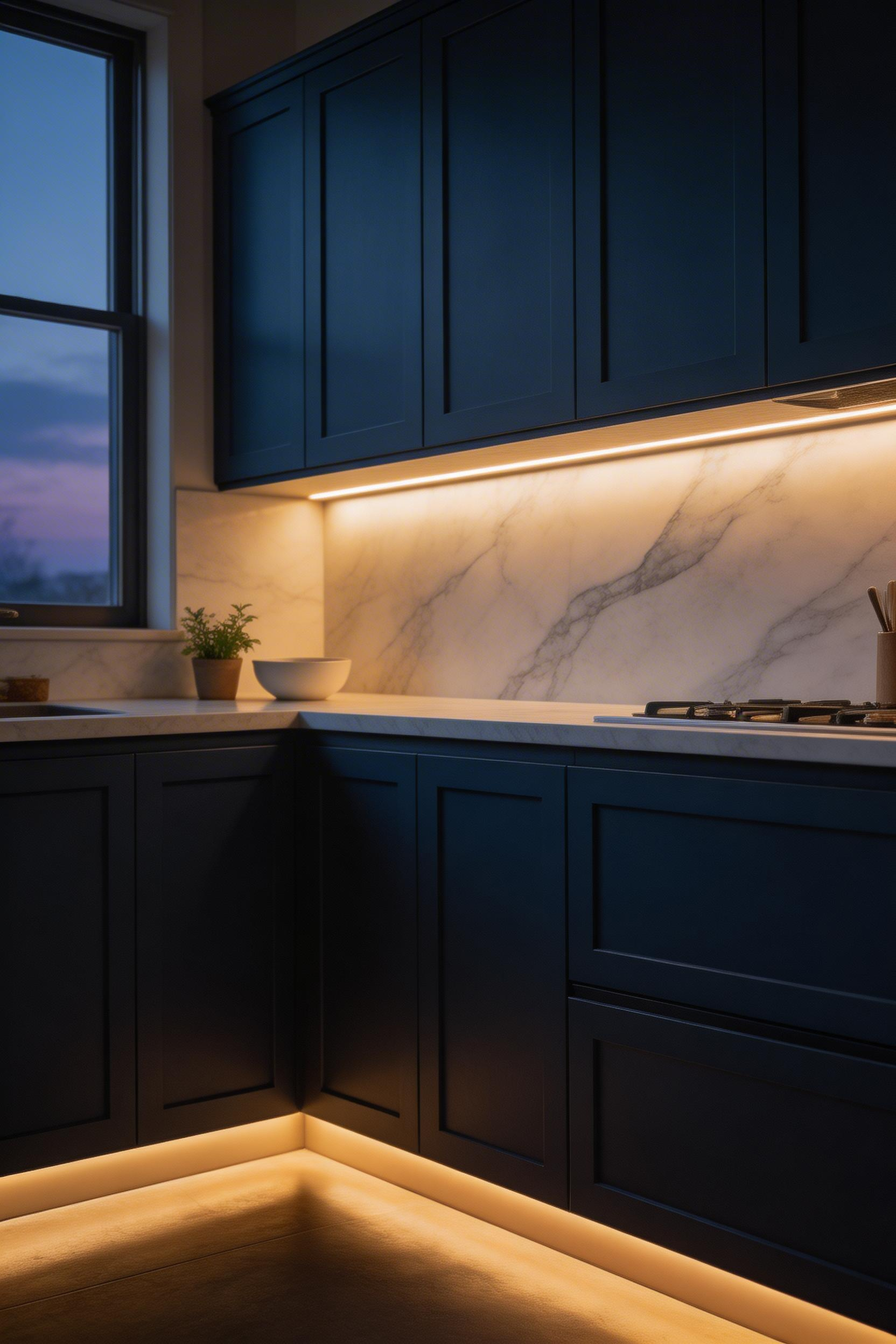
The colour temperature choice determines what the lighting does. 2700K-3000K (warm white) creates a residential atmosphere. 4000K (cool white) provides better task-light accuracy for food prep. Armacost Lighting’s RibbonFlex Home LED Strip at 2700K with 90 CRI runs $35-60 for a 16-foot reel. The Philips Hue Gradient Lightstrip at $80-130 for 6.5 feet allows colour temperature adjustment via app — useful for shifting between task mode and dinner mode.
Installation and Circuit Planning
Mount under-cabinet strips at the front of the cabinet underside, not the back. This directs light onto the work surface rather than the backsplash. Minimum for task lighting: 200 lumens per foot. For ambient-only use, 100 lumens per foot is sufficient. The most impactful technical decision is to run under-cabinet lights on a separate circuit from overhead lights. This lets you cook at night using only the under-cabinet task lighting. That experience is far more pleasant than overhead fluorescent. Adding toe-kick lights on a third zone, automated to come on after dark, completes the layering.
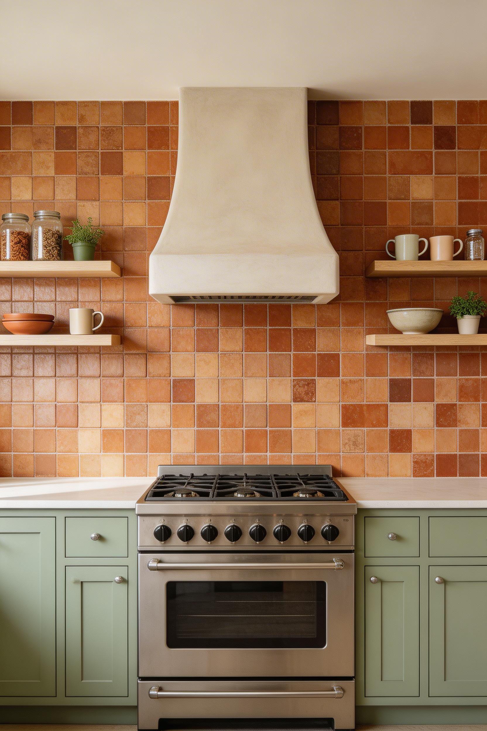
7. Statement Range Hood as Sculptural Architecture
A basic range hood box is one of the most reliably missed opportunities in kitchen decorating designs. A statement hood — plaster, tile-clad, or custom wood — turns the cooking wall into the room’s defining architectural moment. The ventilation is identical; only the surround changes. But that surround determines whether the kitchen feels designed or assembled.
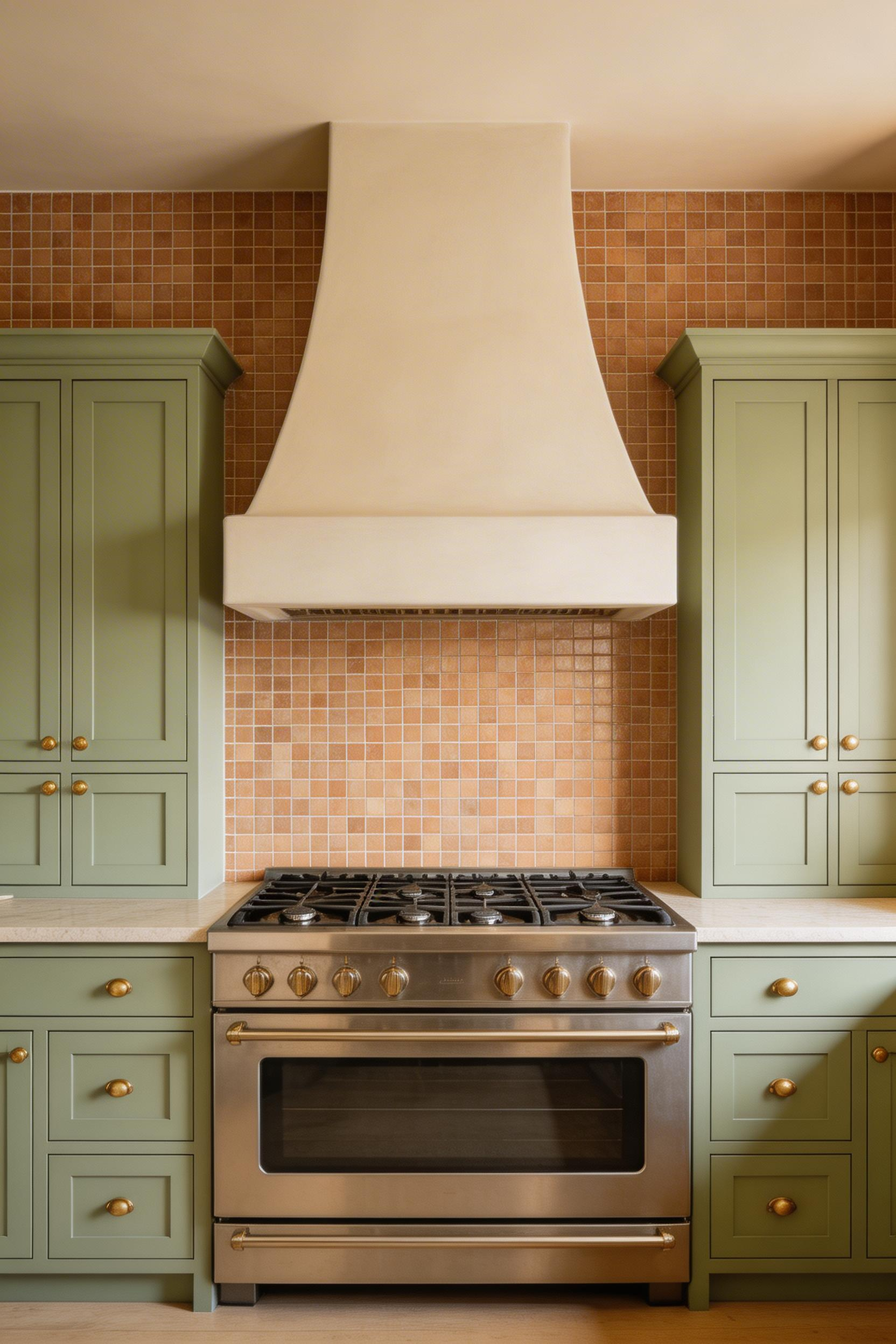
Plaster hoods are built on site over a wood or metal form and skimmed with lime or gypsum plaster. They integrate with painted cabinets in a way that metal hoods cannot. There are no visible seams, no appliance quality to the finish. A contractor-built plaster surround over a Zephyr Siena Pro insert costs $600-2,500 for the surround plus $800-1,200 for the insert. The insert handles ventilation; the surround is pure design. Custom tile-clad hoods — where the backsplash tile wraps onto the hood form — cost similarly. National Association of Home Builders data shows range hoods rank among the top five kitchen features that add perceived value during resale. 78% of real estate agents recommend an updated hood for staging.
Sizing and Clearance Rules
Hood sizing rule: the hood should extend 3 inches beyond the cooking surface on each side. This ensures effective grease and steam capture. A 30-inch range needs a 36-inch minimum hood width. Minimum clearance: 24-30 inches above electric surfaces, 27-36 inches above gas — check local codes for your area. Vent-A-Hood’s K-Series, available in any Benjamin Moore or Sherwin-Williams color at $1,200-2,400, is the option when you want a custom-painted hood without the construction involvement. Get the ventilation clearance right first. Then design the surround around those fixed dimensions.
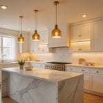
8. Kitchen Island Designs That Double as Design Statements
A kitchen island is often the first design upgrade homeowners think of, and also the most frequently over-specified. Zillow’s 2024 Kitchen Report found that homes with islands sold for an average 4.4% more than comparable homes without one — so the investment is defensible. But a waterfall-edge island in a kitchen with tight clearances adds visual weight while taking away working room. That’s the opposite of what good kitchen decorating designs should achieve.
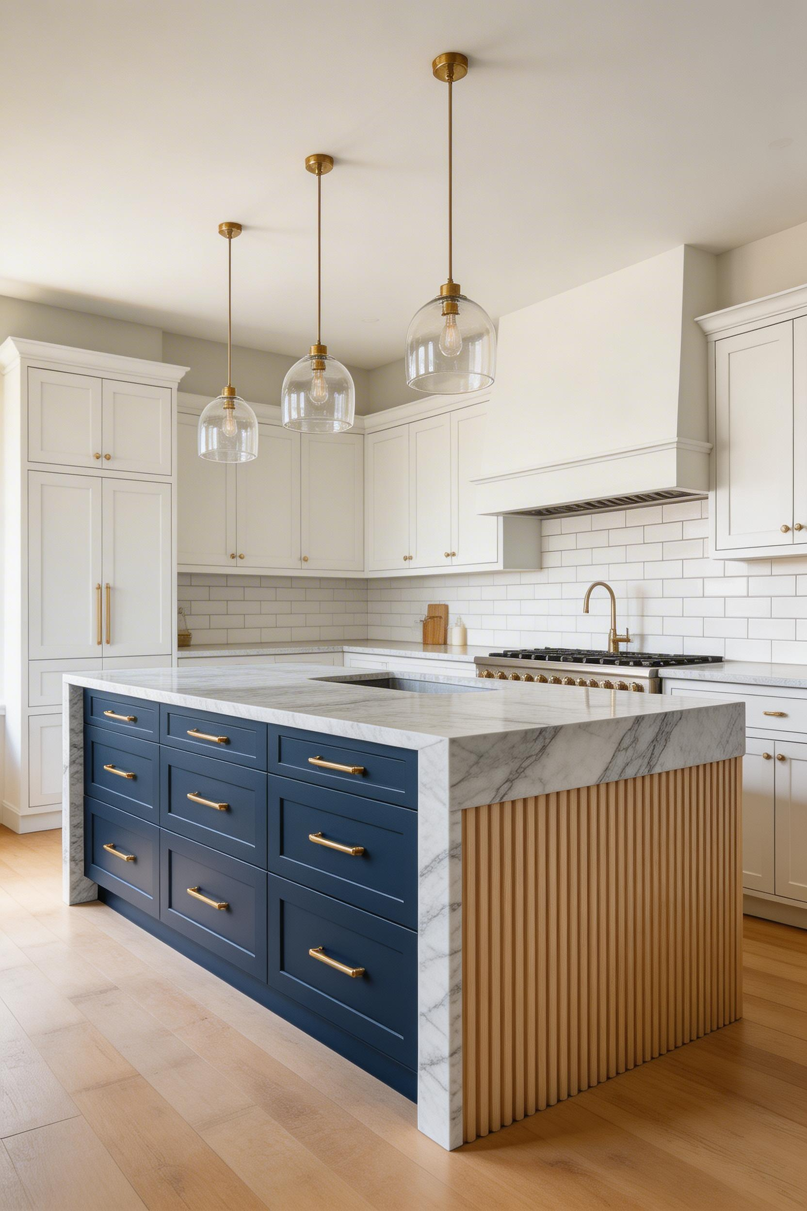
Three details make an island feel like a design statement rather than a box. First, a contrasting cabinet color — navy, forest green, or deep burgundy against white perimeter cabinets. Second, a waterfall countertop edge where the stone continues vertically down the sides (using 30-50% more material). Third, fluted or reeded panels on the visible island face. These vertical grooves add dimension to an otherwise flat surface. These vertical grooves add dimension to an otherwise flat surface. They’ve been a signature detail in premium kitchen design since around 2020. For IKEA SEKTION base cabinets, fluted MDF panels from Amazon at $45-80 per panel can be applied to the island face — a budget approach that reads surprisingly well.
Island Proportions That Work
Before committing to any island plan, tape its footprint on the floor and live with it for a week. The minimum clearance on each workable side is 42 inches. Traffic-only sides need 36 inches. For seating, the overhang needs to be 12 inches for counter-height stools (24 inches) or 15 inches for bar-height stools (30 inches). Anything less is genuinely uncomfortable for extended sitting. Minimum island length for two stools: 4 feet. More kitchen island decor options and proportion guidance are covered in our dedicated island guide if you’re working through island placement decisions.
9. Ceiling Treatments That Add Character From Above
Most kitchen decorating designs treat the ceiling as an afterthought — white paint, standard height, nothing to see. Yet the ceiling is the one surface with no functional competing demands. No appliances, no countertops, no storage to accommodate. It’s entirely available for a design decision, and most kitchens leave it blank.
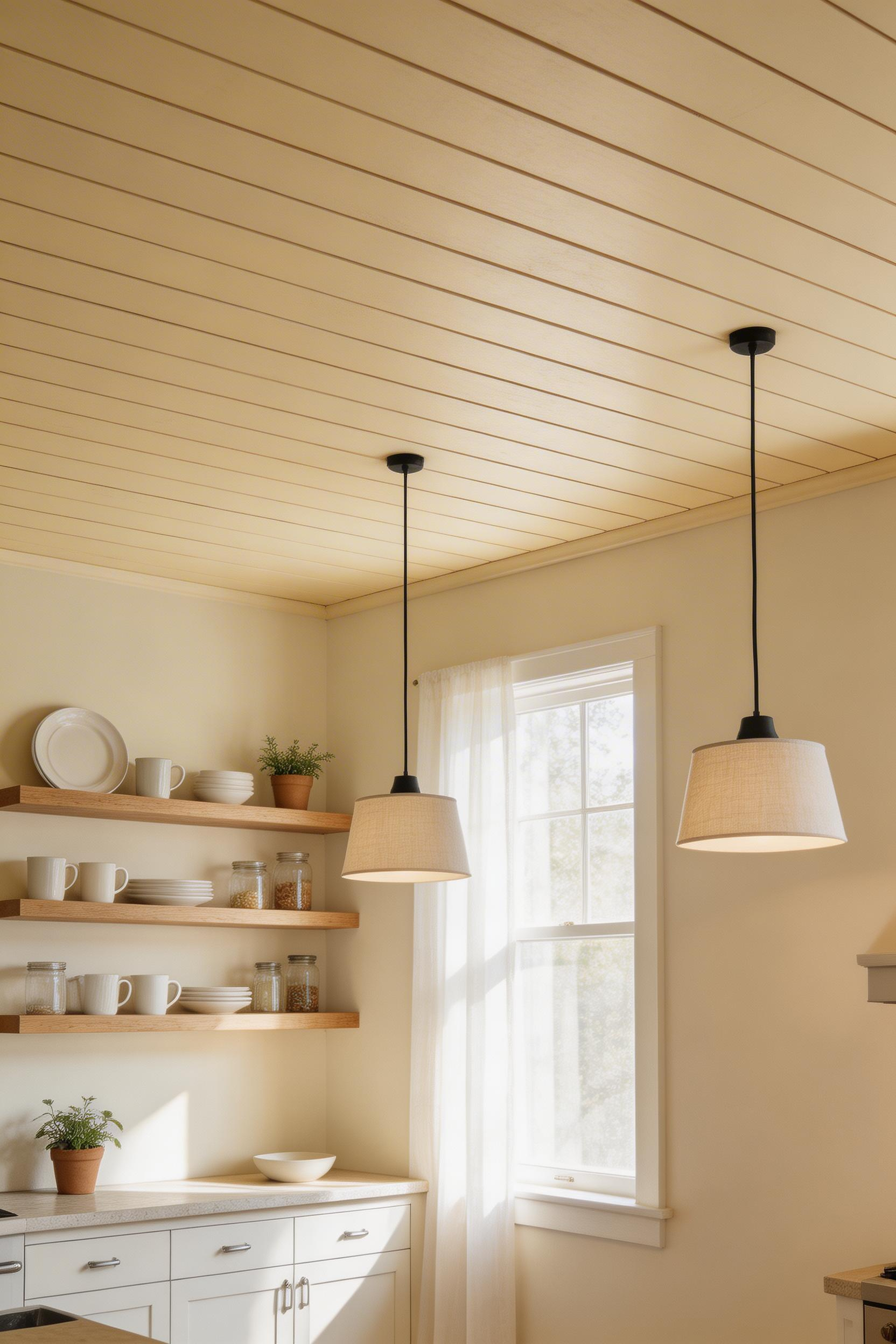
A 2023 Houzz survey found that homeowners who added ceiling details reported an average 8-point higher satisfaction score with their overall kitchen design than those who left ceilings unchanged. The most affordable approach is also the most impactful: paint the ceiling a color. A deep navy ceiling above white cabinets takes one gallon and one afternoon. It changes the room completely. Benjamin Moore Polo Blue works well for this purpose. The second approach — shiplap ceiling planks — costs $2.50-4 per linear foot for real wood. Armstrong Ceilings Woodhaven moisture-resistant planks run $1.50-2.50 per square foot and install over an existing ceiling.
Faux Beams and Structural Considerations
Faux beams deserve more credit than they usually get. Authentic structural timber exposure can cost $2,000 or more. Hollow faux beams from Barron Designs in rough-cut foam with realistic wood grain texture run $120-280 per beam installed. Mount them to ceiling blocking secured to joists — adhesive alone won’t hold over time. Ceiling paint should be flat or eggshell finish to avoid highlighting imperfections. In kitchens, a washable flat handles grease splatters better than standard ceiling flat.
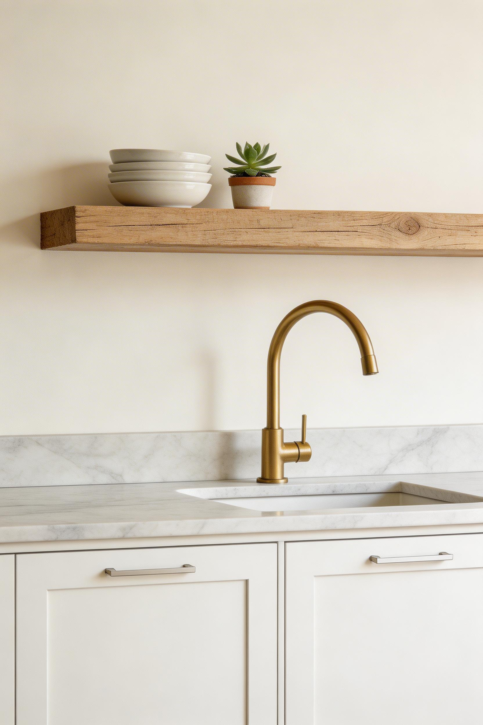
10. Integrated Greenery That Works With Your Kitchen’s Light Levels
Kitchen herb gardens are among the most frequently tried and abandoned ideas in home decorating. The problem is almost always light. Herbs need 6 or more hours of direct sunlight daily. Most kitchens don’t have a south-facing window with that exposure. The result is a cycle of dying basil plants — the opposite of the lush, productive herb wall in the original inspiration image.
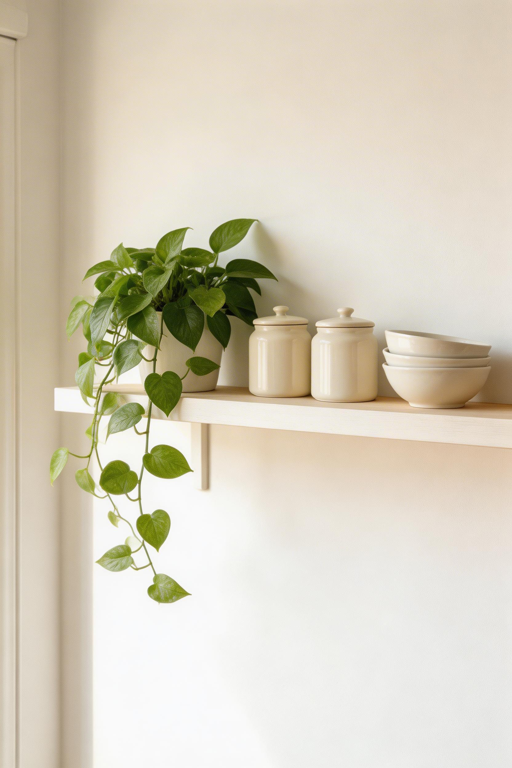
The plants that genuinely thrive in average kitchen conditions are pothos, snake plants, ZZ plants, and spider plants. All grow well in indirect light. All tolerate the irregular watering that kitchen busy-ness produces. A 2022 University of Exeter study found that houseplants in kitchen and living areas reduced reported stress levels by 37% compared to plant-free rooms, even when using low-light varieties. So the well-being case for kitchen greenery is real — it just requires choosing the right plants rather than the photogenic ones.
Placement and Product Options
Umbra’s Trigg floating shelf with a built-in ceramic planter runs $35-55 and works on any wall without requiring floor space. Lechuza’s self-watering Cubico 22 planter at $65-95 holds enough water for weekly rather than daily attention. If you genuinely want herbs, install a small LED grow light. The Kind LED K Series Mini costs $80-120 and provides the full-spectrum light herbs need regardless of window orientation. One large-format plant in a bright corner has more visual impact than a collection of small struggling plants. A fiddle-leaf fig or olive tree in a 12-14 inch pot is enough.
11. Floor Tile for Kitchen Decorating Designs That Tie Rooms Together
Floor tiles have a specific job in kitchen decorating designs: anchor the palette, add or reduce visual complexity, and transition the space from adjacent rooms. The most common mistake is treating the floor as an afterthought — choosing a safe neutral after everything else is decided. But the floor choice is actually one of the strongest design decisions in the room.
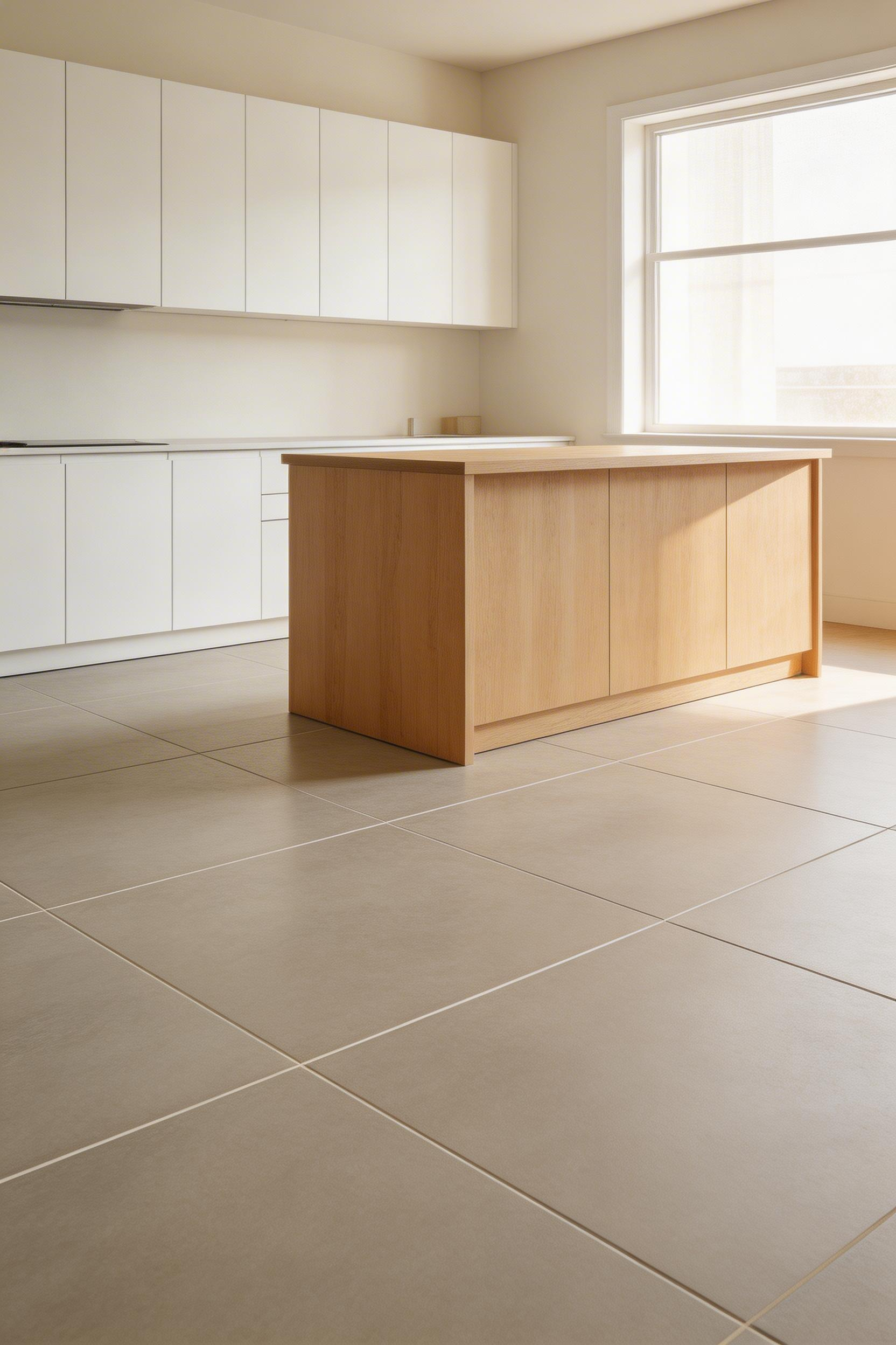
The Tile Council of North America’s 2024 market report shows large-format tiles (18×18 and above) now account for 54% of all residential floor tile sales, up from 31% in 2015. Larger tiles with minimal grout lines read as more expensive than they are. They also install faster and clean more easily. Arizona Tile’s large-format porcelain wood-look tiles in greige at $6-11 per square foot is among the most practical choices available. Warm enough to feel residential, durable enough to tolerate anything. For kitchens where more pattern is wanted, checkerboard (black and white or contrasting neutrals) is historically accurate and continuously fashionable. Herringbone adds directional movement that makes small kitchens feel more spacious, but uses approximately 10% more tile due to additional cuts.
The Grout Decision
Grout color is underestimated in kitchen decorating designs. Light grout on a kitchen floor requires more maintenance. Dark grout shows more over time in pale tiles. Epoxy grout in a mid-tone grey offers a practical compromise: it resists staining, doesn’t require sealing, and works with virtually any tile color. For kitchen tile designs beyond the floor, a full breakdown of backsplash and feature tile approaches is in our dedicated guide.
12. Window Treatments That Frame Views Without Blocking Light
Kitchen windows serve too many competing functions — privacy at night, light during the day, moisture resistance near the sink, and visual connection to the garden. No single treatment addresses all of them perfectly. Because of that, the best kitchen decorating designs either commit to one priority or use layered solutions.
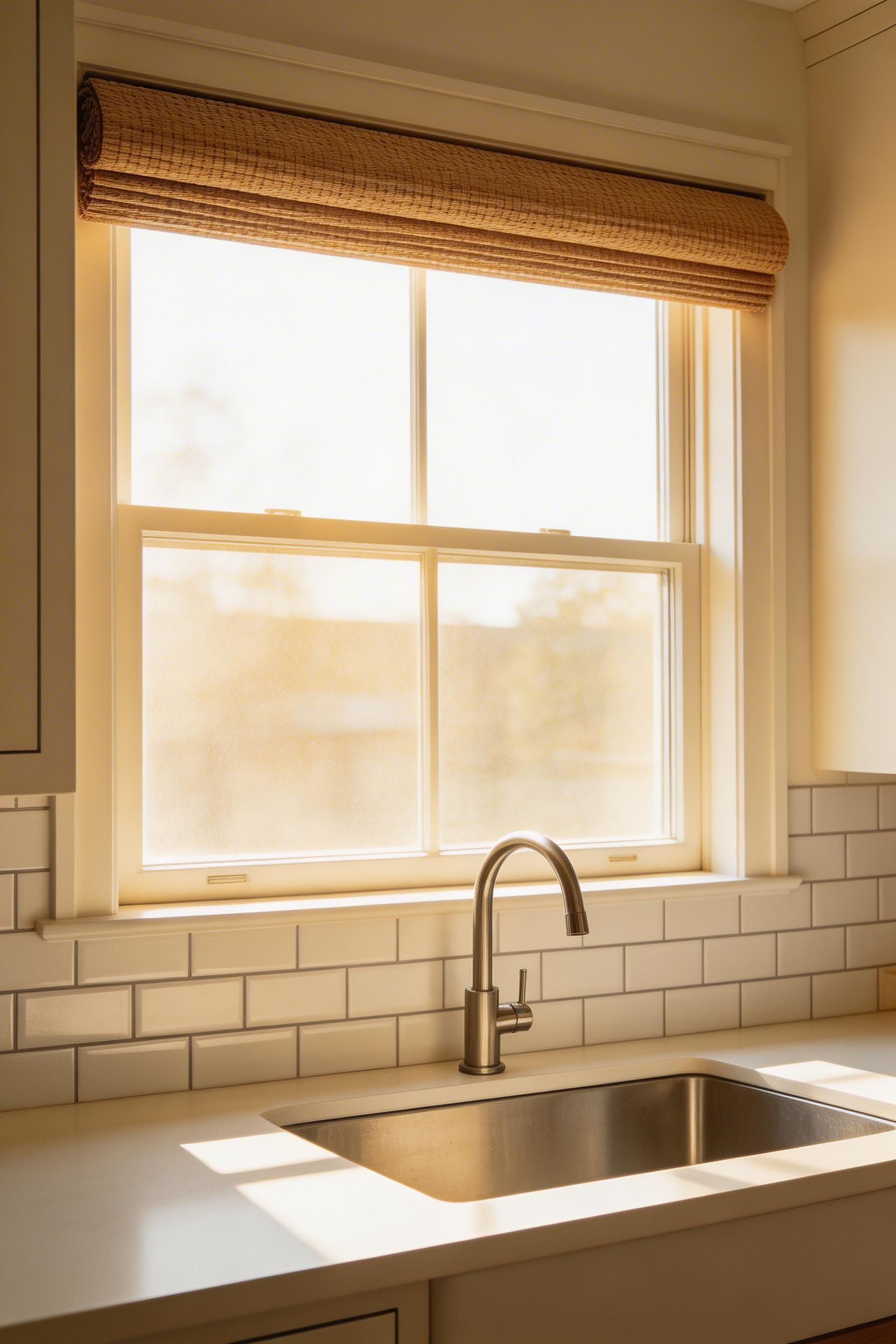
Roman shades in woven cotton or linen are the most versatile kitchen window treatment across all decorating styles. Smith and Noble’s Woven Wood Roman Shades run $120-280 per window. They can be specified inside-mount for any window near a sink — inside mounting keeps the treatment away from splash zones. When raised, they stack to 6-10 inches above the frame. Hunter Douglas’s 2024 Window Trends report shows motorized window treatments were specified in 34% of new kitchen renovations, up from 8% in 2018. The sink-area accessibility issue drives most of that growth.
The No-Treatment Option
The cleanest window treatment in certain kitchen decorating designs is no treatment at all. Privacy film applied to the lower pane of a window — 3M Privacy Window Film costs $25-40 for a standard window — diffuses views from outside while admitting full daylight. For windows with no privacy issue (backing onto a garden with no sightlines), bare windows are more honest than a treatment chosen out of obligation. Also worth noting: hang your roman shade at ceiling height rather than at the window frame. It makes the window appear taller and the ceiling higher, at no added cost. It’s a small trick that should be standard practice.
13. Artwork and Wall Decor That Belongs in a Kitchen
Kitchen wall art fails more consistently than wall art in any other room. Most of it is chosen without considering the kitchen’s physical environment. Humidity from cooking, grease vapor, and temperature fluctuations degrade paper-based art quickly. A canvas print or oil painting in a sealed frame survives these conditions; an unframed paper print or watercolor does not.
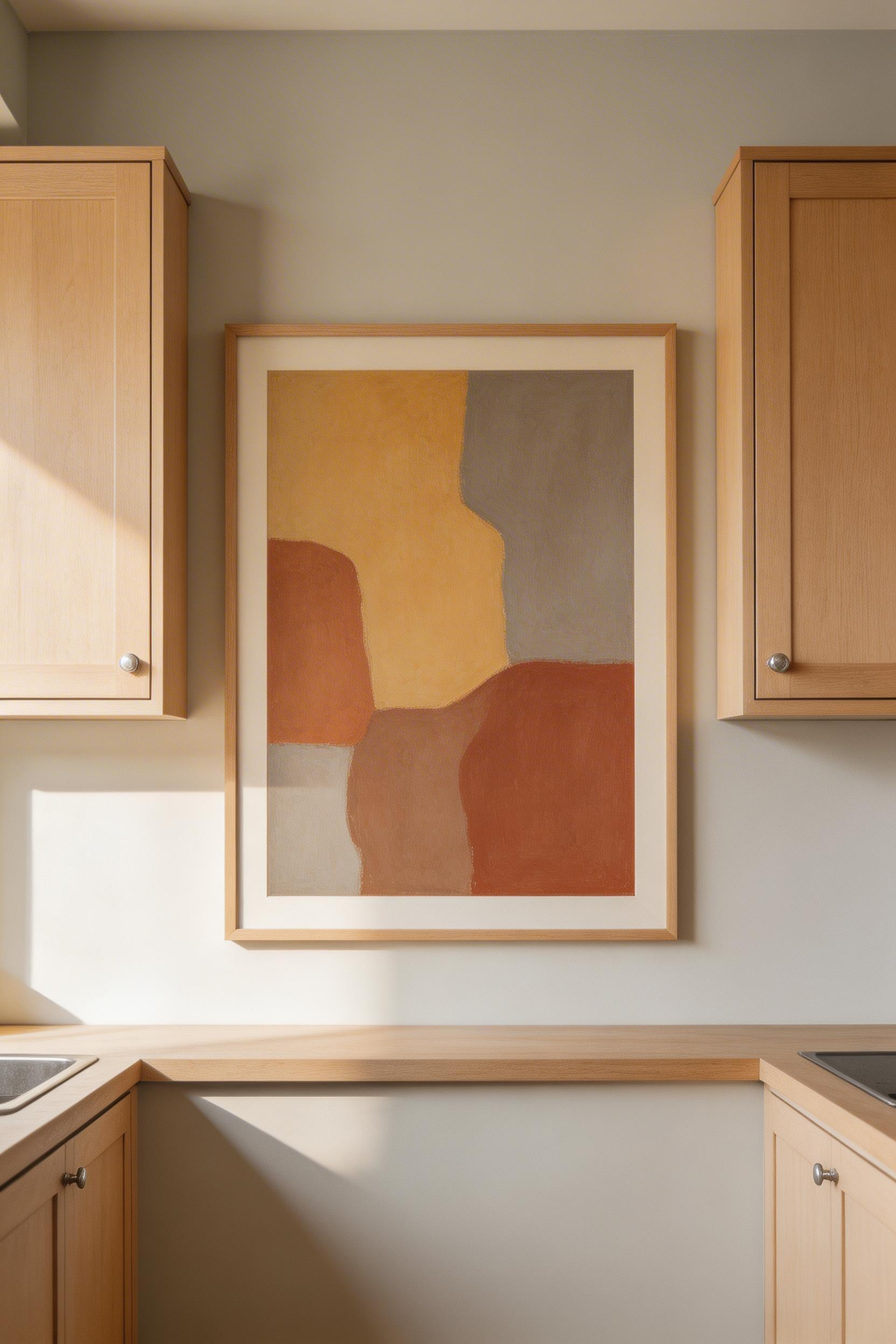
A 2023 survey by 1stDibs found that 61% of interior designers selected kitchen artwork with earthy or neutral tones — ochre, terracotta, forest green. The goal: bridging the material choices between cabinetry and countertops. That’s a sensible approach. The artwork connects to existing material tones rather than introducing a new color that needs defending. Scale is the other critical decision. A single print under 16×20 inches on a standard kitchen wall reads as an afterthought. One large-format piece — minimum 24×30 inches — has visual authority. Minted.com’s original artwork in acrylic mount at $150-350 for larger formats is moisture-tolerant and sourced from independent artists. Society6 canvas prints at $85-180 for a 20×28 work in any kitchen style and tolerate humidity well.
Placement and Practical Rules
Centre artwork at 57-60 inches from the floor — eye level for a standing adult. In kitchens where wall space is limited by cabinets and appliances, art works best on the wall facing the sink (where you spend time looking up) or on a narrow wall between windows. Maintain at least 3 inches clearance from any gas appliance. Three-dimensional ceramic wall objects — like Pottery Barn’s Ceramic Coral Wall Art at $90-140 — are also worth considering. They’re entirely immune to moisture and humidity, which most flat art is not. For more kitchen furniture design ideas that treat the kitchen as a curated space, our furniture guide covers complementary approaches.
14. Vintage and Reclaimed Elements That Ground Modern Kitchen Designs
The problem with entirely new kitchens is that they can feel like showrooms — everything pristine, everything matching, nothing with any history. A single vintage or reclaimed element changes that. It doesn’t need to be a major component. A salvaged pharmacy cabinet repurposed as a pantry works. So does a genuine antique butcher’s block as an island. Even a pair of vintage porcelain socket pendants rewired by an electrician makes a difference. Any of these introduce an organic quality that new materials cannot replicate.
Reclaimed barn wood sells for $8-15 per board foot at salvage yards. Antique heart pine salvaged from old factory floors runs $12-25 per board foot. Both offer grain density and variation unavailable in new timber. A 2024 Etsy Trend Report noted that searches for reclaimed wood kitchen elements rose 47% year-over-year. For sourcing, set alerts on Facebook Marketplace, Craigslist, and Chairish and wait — a reclaimed pine shelf that costs $150 new turns up for $25 with a week’s patience. Antique butcher blocks on Chairish run $450-2,500 depending on size and condition. They often need refinishing, but the patina is irreplaceable. Vintage electrical fixtures should always be rewired before installation — original cloth wiring deteriorates and is a fire risk.
The Over-Theming Risk
The risk in this approach is over-theming. Mixing too many vintage elements creates a kitchen that feels like a prop set rather than a contemporary kitchen decorating design. One or two strong vintage pieces against a clearly modern backdrop have far more impact than a space trying to be entirely vintage. White painted cabinets, clean-lined hardware, a contemporary faucet — that’s the backdrop the vintage piece stands out from. The old piece stands out because everything around it is new. That contrast is the point. Vintage sconces or pendants are particularly effective because they’re visible at eye level and don’t require clearances or installation complexity beyond an electrician visit.
15. Color Palette Strategy for Cohesive Kitchen Decorating Designs
A kitchen’s color palette needs a structure — not a rigid formula, but a guiding proportion that creates cohesion without requiring every surface to match. The 60/30/10 rule, adapted for kitchens, provides that structure. 60% is the dominant color: walls and perimeter cabinets. 30% is the secondary color: countertops, island, and large surfaces. 10% is the accent: hardware, small appliances, and textiles.
The most versatile kitchen color combinations right now: warm white uppers with navy or forest green lowers (the dominant trend since 2021), all-sage or all-olive with black hardware, and all-white cabinets with warm terracotta accents. The terracotta shows up in textiles, art, and small pottery pieces on the counter. Farrow and Ball’s 2025 trend data showed a 34% increase in requests for green kitchen palettes compared to 2023. Their Mizzle No. 266 at $120-145 per gallon has an earthy sage depth that most mainstream paints struggle to replicate. However, Sherwin-Williams Sage SW 2860 at $65-80 per gallon is a convincing budget alternative.
The Undertone Problem and How to Solve It
Color temperature consistency is the most common technical mistake in kitchen decorating designs. Mixing warm and cool whites — one cabinet in warm cream, another in a blue-white — reads as an error rather than intentional contrast. The eye perceives it as two whites that don’t match, not two design choices. Before committing to any color, paint a 12×12 inch section of a cabinet door and observe it across a full week. Check it in morning light, afternoon light, and evening artificial light. For cabinet paint, use an alkyd or water-based alkyd hybrid — Benjamin Moore Advance or Sherwin-Williams Emerald Urethane. Pure latex chips more readily on cabinet surfaces. Allow 30 days full cure before normal use. These kitchen design ideas address color selection in combination with layout and material planning if you’re working through a larger kitchen decorating project.
Pulling Your Kitchen Decorating Designs Together
The most useful insight from working with these elements across many kitchens is that impact comes from specificity, not scale. A painted ceiling takes less effort than replacing countertops. It also changes the room more dramatically than most renovations. Mixed metal hardware costs less than a new faucet alone if you already have one. Leathered stone feels like a completely different material than polished stone even when it’s the same rock.
The kitchen decorating designs that work over time share a common quality: they made one material decision well and let everything else support it. Five years after installation, they still feel right. Chose a backsplash that sets the palette. Found a hood that fits the cooking wall’s scale. Selected a floor tile that anchors the room without demanding attention. None of these are expensive decisions in themselves. But each one requires knowing what it needs to accomplish and choosing accordingly.
If you’re starting from a kitchen that feels generic, the most efficient first step is to identify the one element that currently reads as a default. The polished granite that everyone has. The plain white subway tile that matches nothing and doesn’t commit to anything. Replace it with the material version that actually reflects how the room should feel. That single swap, done with intention, tends to make every subsequent decision clearer.
For a broader look at kitchen renovation ideas beyond decorating decisions, our renovation planning guide covers structural changes that support or limit the design choices described here.