Can you smell the salty ocean breeze and hear the gentle waves lapping? If not, allow me to transport you to a breezy, sun-soaked paradise through the transformative power of color. Whether you crave vibrant hues that mirror the ocean’s radiant dance or soothing neutrals reminiscent of windswept dunes, your kitchen cabinets offer a blank canvas for infusing your space with that quintessential beachside ambiance.
Imagine lingering over morning coffee as dazzling blue cabinets evoke crashing waves while warm terracotta accents radiate the glow of a spectacular sunset. Or perhaps creamy white cabinetry whispers relaxation, conjuring up visions of lazy afternoons spent lounging in a breezy seaside cottage. Whatever your unique style sensibilities, embracing daring color combinations can instantly transform your culinary hub into a permanent vacation oasis.
So grab a frosty beverage, kick off your sandals, and embark on a journey through the bold and beautiful world of kitchen Cabinet Colors! From high-contrast statements to harmonious coastal-inspired palettes, I’m here to guide you in curating a space that feels like an endless summer escape.
The Power of Two-Toned Cabinets
What if I told you there’s a simple way to instantly amplify your kitchen’s visual appeal while allowing you to embrace daring colors? By contrasting sleek upper cabinets with richly-hued lower ones, the two-toned cabinet trend offers the best of both worlds – dashes of bold personality balanced with sophisticated restraint.
Creating Contrast and Balance
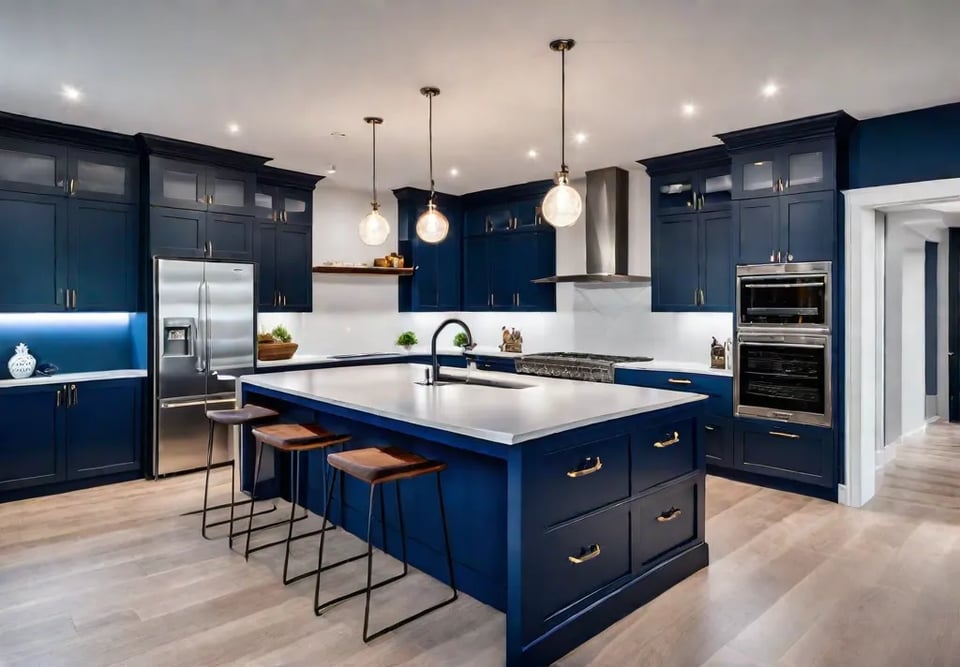
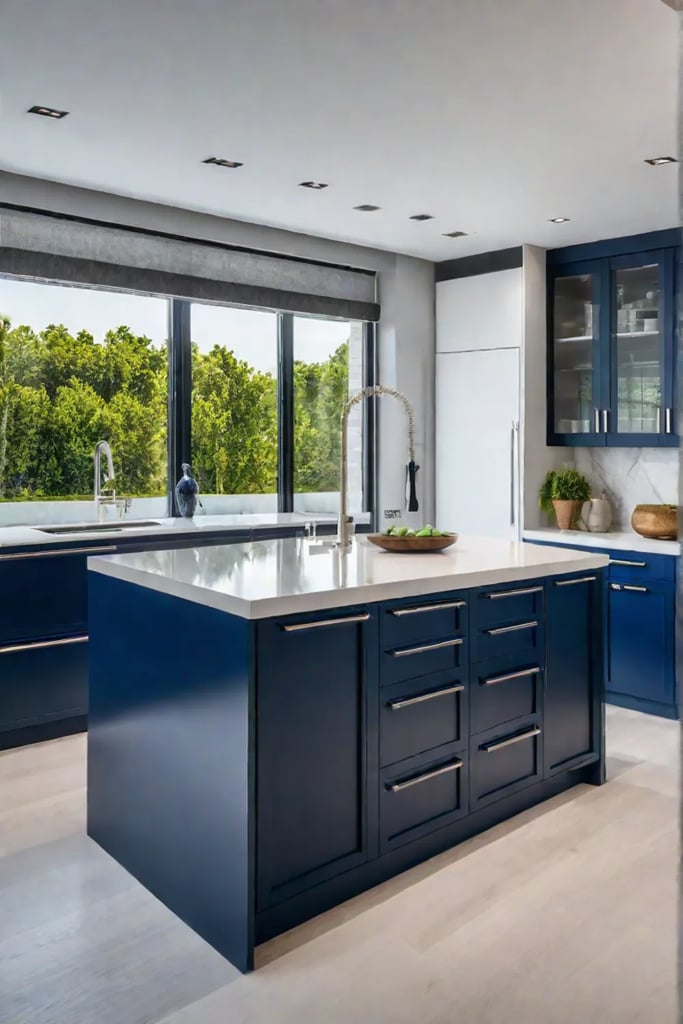
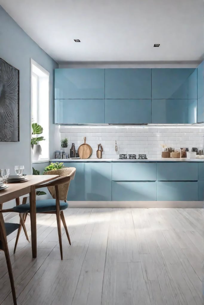
Regarding two-toned cabinets, the key perfectly juxtaposes light and dark shades. Picture creamy white uppers paired with moody navy lowers or sunny buttercup yellows complementing elegant charcoal grays below. This high-contrast pairing adds depth and dimension, preventing an all-over color from overwhelming the space.
At the same time, the two distinct tones help visually define different zones in an open-concept kitchen. The bolder lower cabinets anchor the space, while airier uppers keep things light and airy. It’s a balanced blend of cozy and breezy, epitomizing relaxed beachside living.
Popular Two-Toned Pairings
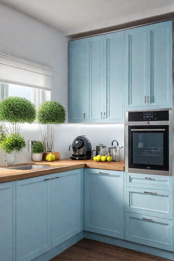
While you can get wildly creative mixing and matching any colors that speak to you, some classic two-toned combinations never go out of style. Fresh white uppers look dreamy when coupled with deep navy, forest green, or even jet black lowers infused with hints of warmth if you crave more vibrance, pair sunshine yellow or seafoam green uppers with driftwood gray or weathered blue undertones below.
Accentuating with Hardware
To make your two-toned cabinets pop, have some fun switching up the hardware. Gleaming brass or copper pulls on the lower cabinets can beautifully complement brushed nickel or matte black uppers. This added contrast layer creates even more visual interest and allows you to blend different metal tones seamlessly.
By embracing the power of two-toned cabinets, you’re opening up a world of color without compromising sophistication. This fresh, modern approach to kitchen design perfectly captures that quintessential beachy essence we all crave—relaxed yet refined, with just the right hint of glamour.
So feel free to color outside the lines and bring your dream bold, beautiful hues to life – after all, isn’t that what vacation-inspired living is all about? Speaking of which, the next section is all about embracing those vibrant, sun-soaked shades in even more daring ways.
Embrace Bold and Beautiful Colors
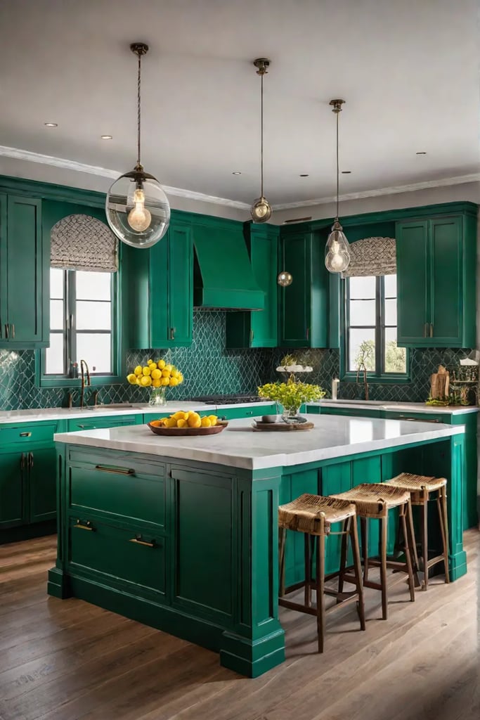
If you’re daring and ready to make a statement, why not embrace bold and beautiful colors in your kitchen? A vibrant set of cabinets can instantly energize the space and reflect your fun-loving, free-spirited side. After all, the kitchen is the heart of the home – it deserves to be dressed in hues that make you feel alive.
Choosing the Right Bold Hue
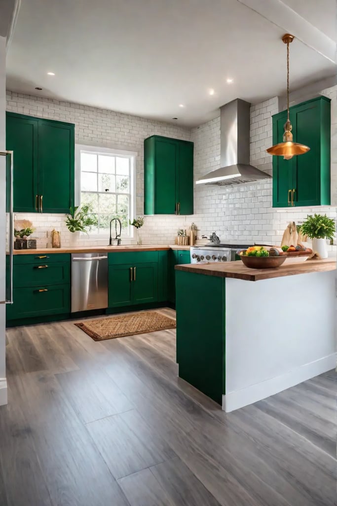
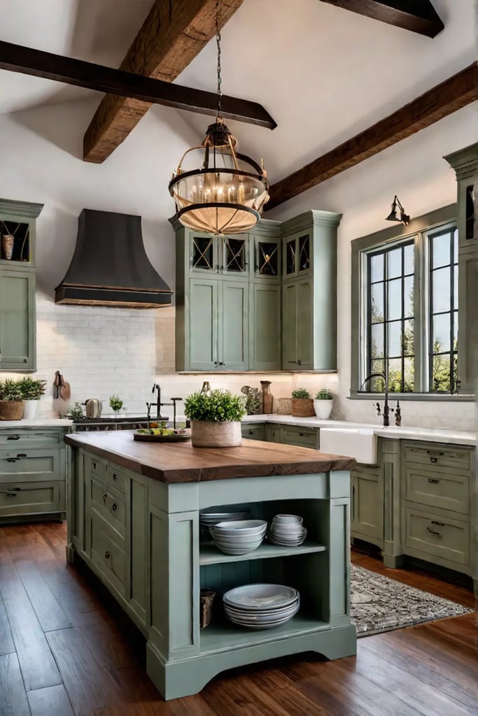
The first step is selecting a shade that resonates with your style and the overall mood you wish to create. Are you aiming for a lively, playful vibe or a more sophisticated elegance? Sunny yellows and fire engine reds can wake a sleepy kitchen, while rich emerald greens exude luxurious tranquility.
Incorporating Bold Colors Without Overwhelm
While bold colors undoubtedly make a strong visual impact, strategic use is key to preventing an overwhelming or chaotic look. Consider painting just a single wall or the island cabinetry in your daring hue of choice, allowing the rest of the kitchen to serve as a neutral backdrop. Ample natural light will also help balance out vivid colors and create an airy, open feel.
Playing With Complementary Tones
For a cohesive design, carry your bold color choice with complementary accent hues throughout the space. If you’ve fallen for dazzling sapphire blue cabinets, incorporate crisp white and sunny yellow splashes in textiles, dinnerware, and decor. The key is letting your chosen shade take center stage while harmoniously blending in supporting players.
Are you feeling inspired to step outside the expected neutral palette? Then, dive headfirst into the refreshing world of bold, vibrant kitchen cabinets that reflect your unique personality and zest for life. Just don’t be afraid to let those colors shine! Embracing a daring new hue may be the first step toward transforming your kitchen into a space that feels like your own waterfront oasis.
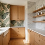
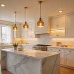
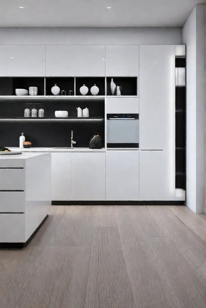
Neutral Palettes: Timeless Elegance
Have you ever strolled along a sun-drenched beach, mesmerized by the way the soft, neutral hues of the sand intertwine with the azure waters? That serene, harmonious interplay draws me to neutral kitchen cabinets. They offer a timeless foundation that effortlessly complements any style, from coastal-chic to modern minimalism.
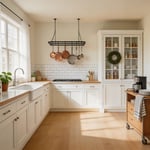
Beyond White: Exploring Neutral Options
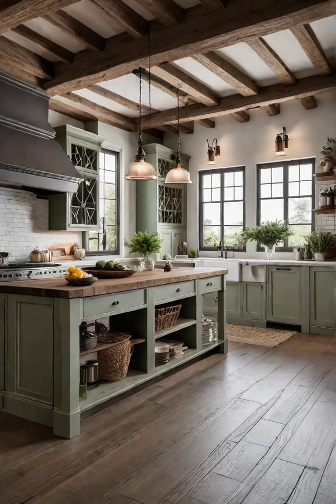
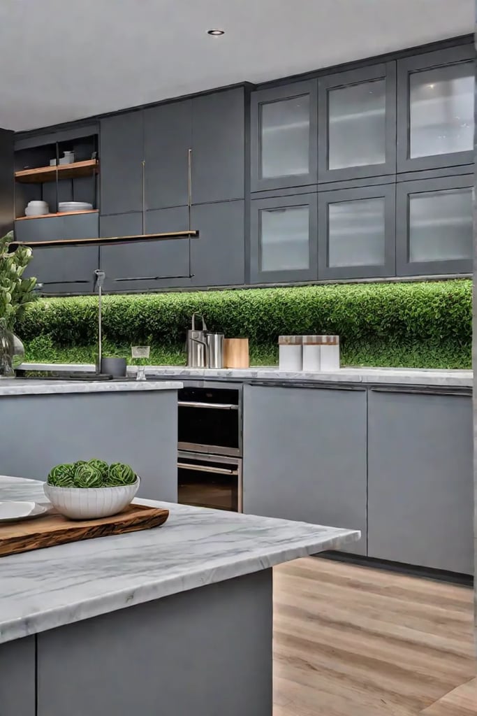
While white remains a classic choice, today’s neutrals extend far beyond that singular shade. Greige, a warm blend of gray and beige, has emerged as a favorite for its ability to create an inviting, cozy ambiance. Soft mushroom hues and warm grays exude sophistication while retaining a sense of tranquility. Rich taupes and creamy ivories can serve as neutral anchors, providing depth and dimension.
Adding Warmth and Personality to Neutral Cabinets
Contrary to popular belief, neutral cabinets need not be bland. Quite the opposite – they provide a blank canvas upon which you can layer textures, patterns, and pops of color to infuse your kitchen with warmth and personality. Imagine the warmth of brass hardware glistening against a backdrop of smoky gray cabinets or the rustic charm of a wood-plank backsplash paired with creamy off-white cabinetry.
The Versatility of Neutrals
One of the greatest advantages of neutral cabinets is their versatility. They seamlessly adapt to changing design trends, allowing you to refresh your kitchen’s look by swapping out accents and accessories. A cheerful citrus-hued backsplash can enliven greige cabinets, while jewel-toned countertops can add drama to soft taupe cabinetry. The possibilities are endless, and the foundation remains timelessly elegant.
With their calming presence and adaptable nature, neutral kitchen cabinets offer a sophisticated starting point for any design aesthetic. By thoughtfully layering textures, patterns, and pops of color, you can create a serene space brimming with personality – a true reflection of the effortless elegance that coastal living inspires.
Transitioning seamlessly from timeless neutrals, our journey takes us to harmonious color pairings, where complementary hues dance in perfect synchronicity.
Harmonious Design with Complementary Colors
Ever gaze out at the ocean horizon, mesmerized by the dance of vibrant oranges and blues as the sun meets the sea? That captivating contrast is the essence of complementary colors – hues that lie opposite each other on the color wheel, creating an electrifying energy combined. Imagine channeling that same visual verve into your kitchen design!
Understanding the Color Wheel
The first step in mastering complementary colors is getting acquainted with the color wheel. Those striking opposites like red and green or blue and orange are complementary pairs that naturally draw the eye with their high-impact contrast. Used thoughtfully, these bold color companions can infuse your kitchen with personality and vibrancy.
Successful Complementary Color Combinations
For a classic look brimming with coastal flair, you can’t go wrong pairing navy blue cabinets with pops of burnt orange in the backsplash or accessories. The deep blue evokes the calming waters of the sea, while the orange radiates warmth like a brilliant sunset. If an earthy, organic aesthetic speaks to you, try emerald green cabinets grounded by terra cotta red wood-tone accents.
Achieving Balanced Harmony
While the allure of complementary colors lies in their striking contrast, striking the right balance is key to avoiding visual overload. I recommend selecting one hue as the dominant shade for larger surfaces like cabinets or floors, then using its complementary partner as an accent through tiled backsplashes, kitchen islands, or decorative accessories. This interplay allows both colors to shine while creating a harmonious design.
Remember, the beauty of the ocean’s colorful dance lies in the fluid movement between hues – so have fun playing with different saturations and proportions until you’ve captured that perfect ebb and flow. Designing with complementary colors is all about vibrancy with restraint, energy with serenity – just like the ocean.
While contrasting colors create bold visual statements, there’s an art of layering tones that feel curated and intentional rather than chaotic.
Make a Statement with Contrasting Colors
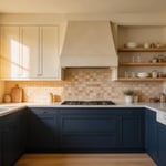
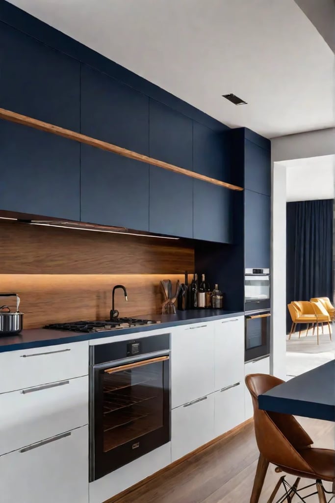
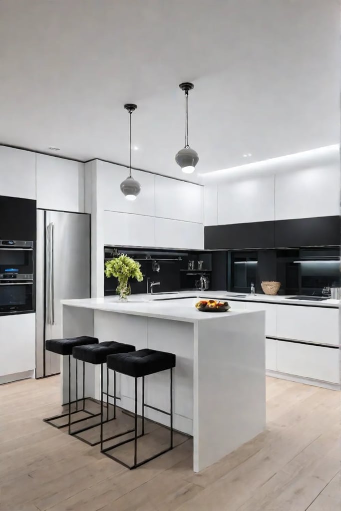
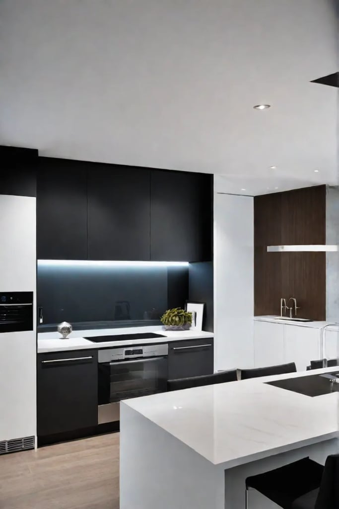
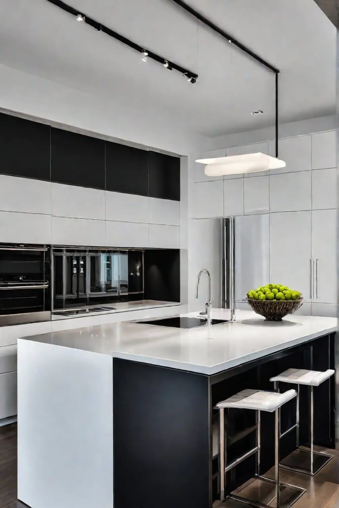
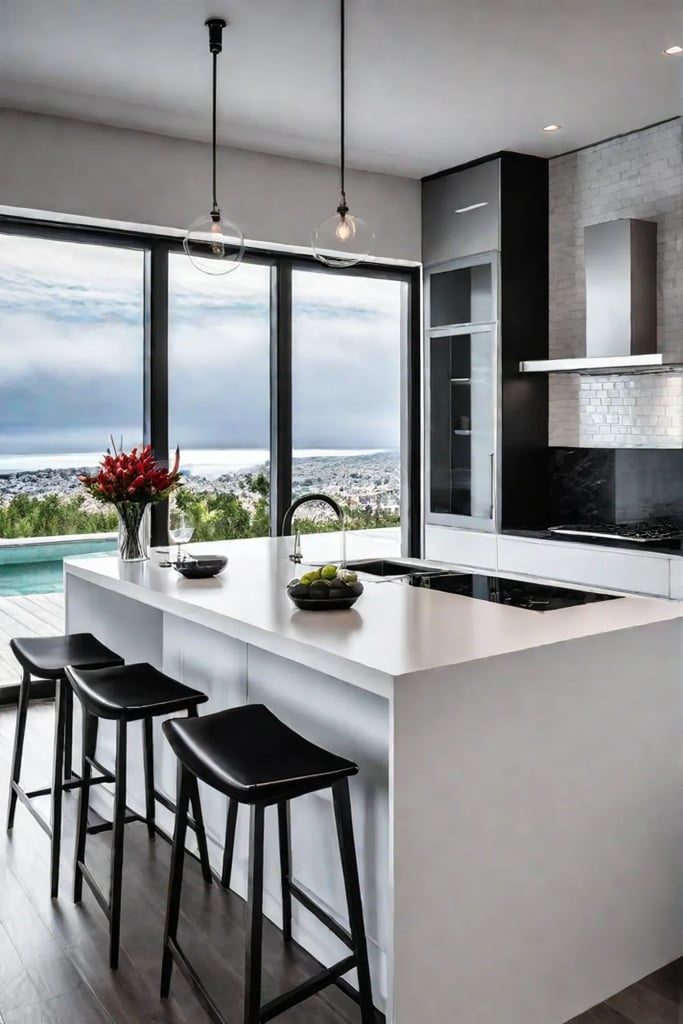
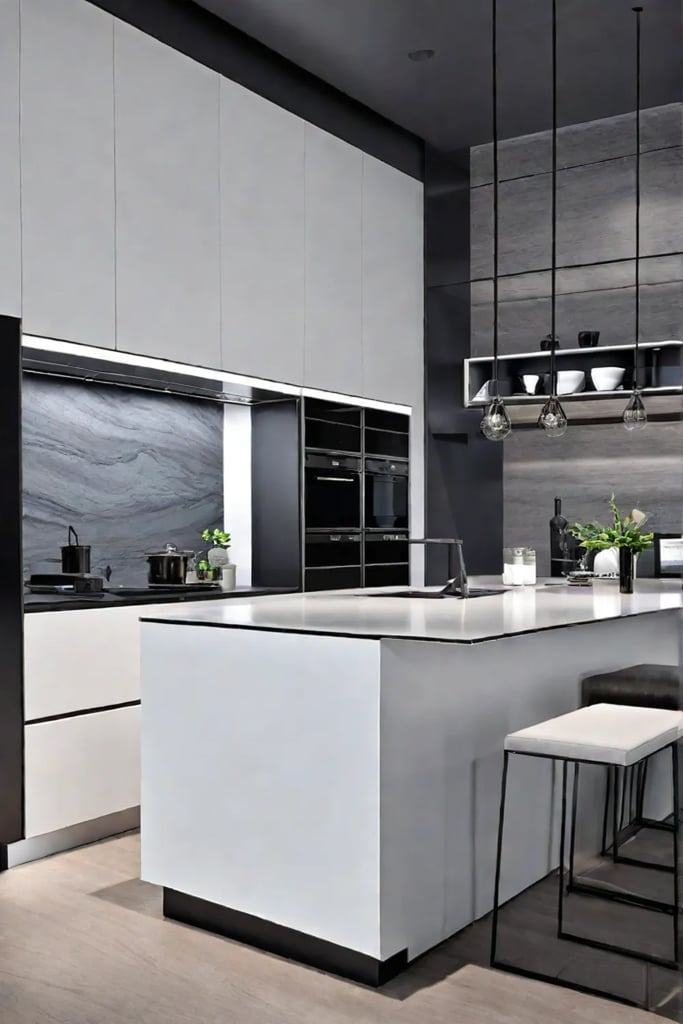
What if I told you the secret to an unforgettable kitchen design lies in the power of opposites? Contrasting colors can transform your cabinets into a captivating focal point, like the ocean’s mesmerizing dance of light and dark hues. Imagine the sophistication of ebony paired with crisp whites or the modern allure of charcoal grays juxtaposed with soft creams. These bold combinations create a sense of depth and drama, evoking the same feeling as watching the sun dip below the horizon, painting the sky with vibrant streaks of color.
High-Contrast Pairings for Maximum Impact
In high-contrast cabinet colors, timeless combinations like black and white reign supreme. This classic pairing exudes a sleek and sophisticated vibe, reminiscent of the chic Hamptons aesthetic. Pair glossy black cabinets with a crisp white countertop and backsplash for a look that’s both modern and timeless. Or, for a more subtle approach, consider light gray on the upper cabinets and deep charcoal on the lower—a perfect balance of cool tones that feels fresh and contemporary.
Using Contrast to Define Space
Contrasting colors aren’t just about making a statement; they can also enhance the functionality and flow of your kitchen. For instance, highlighting a kitchen island with a contrasting hue instantly transforms it into a striking focal point. This strategic use of color can help define different zones within an open-concept layout, creating a sense of separation without physical barriers.
Balancing Act
While bold contrasts can be visually arresting, it’s important to maintain a sense of balance. Look for colors with similar intensities to prevent one hue from overpowering the other. Don’t be afraid to introduce complementary shades or organic textures to soften the overall look, creating a space that’s both eye-catching and inviting—just like a cozy beachside retreat.
Imagine sipping your morning coffee while gazing out at the sparkling ocean, the sun’s rays dancing across your contrasting cabinets, creating a sense of depth and movement. With the right color combination, your kitchen can become a true oasis, a place where the beauty of the outdoors seamlessly blends with the comforts of home.
Choosing for your Style
What if I told you the secret to an envy-inducing kitchen goes beyond picking pretty colors? Choosing cabinet hues is about curating an immersive atmosphere that brings your unique style to life.
Matching Colors to Design Aesthetics
The color palette dancing across your cabinets should harmonize with the overarching interior design vibe you’re cultivating and craving a farmhouse-fresh space brimming with heirloom charm. Warm whites with distressed finishes and rustic hardware could be your soulmate shades. If modern minimalism speaks to your soul, perhaps sleek black cabinets with edgy matte finishes will open your heart. The key is aligning hues with the distinctive aesthetic you envision.
Creating a Cohesive Kitchen Design
Here’s my pro tip: think of your kitchen as a carefully composed art piece where every element is thoughtfully curated to work in concert. Your cabinet colors are just one brushstroke in the overall design masterpiece. Use a mood board to audition different palettes and visualize how the tones interplay with your countertops, backsplash, and decor accents. You’ll know you’ve cracked the color code when it all meshes in harmonious synergy.
Expressing Your Flair
Your cabinet color choices should vibrantly express your unique personality and style sensibilities. Embrace hues that whisk you away to your happy place, whether a sun-soaked boho beach bungalow or a sophisticated Parisian patisserie. Don’t be afraid to go bold and make a statement! When you infuse your kitchen with colors that set your spirit alight, you’ve mastered the art of curating a space that feels like home.
With a clear vision for your dream aesthetic, choosing cabinet colors that amplify your flair becomes an empowering act of self-expression. Trust your intuition as you embark on this deliciously vibrant design adventure! Ready to dive into the next phase of creating impact with color?
Creating Impact with Color
What if I told you the colors you choose for your kitchen cabinets could instantly transport you to a breezy waterfront paradise? By strategically playing with hues, you can craft a space that evokes the laid-back tranquility of an oceanside retreat, no matter how far from the coast you reside.
Color Psychology in Kitchen Design
The psychology behind color is a powerful tool in interior design. Lighter shades like crisp whites and soothing blues can create an airy, open atmosphere, perfect for small kitchens craving a spacious feel. In contrast, richer tones like deep teals and warm terracottas can cultivate a cozy, intimate ambiance in larger spaces. Consider the size and layout of your kitchen when selecting your cabinet palette.
Maximizing Visual Impact with Finishes and Textures
But color is just the beginning. Experiment with finishes and textures that add depth and dimension to capture the essence of coastal living. A high-gloss finish on light-colored cabinets will reflect natural light, creating a bright and breezy vibe. Or, opt for textured cabinet doors with raised panels or geometric patterns to introduce organic visual interest reminiscent of the rippling ocean surface.
Embracing the Undertones
Don’t forget to consider the undertones of your chosen hues. Cool undertones like green or blue can complement the natural lighting in your kitchen, while warm undertones like red or yellow may create a cozier, more inviting atmosphere. By embracing these nuances, you can ensure your cabinet colors harmonize seamlessly with the overall ambiance of your space.
With a thoughtful approach to color, finishes, and textures, your kitchen can become a tranquil oasis that whisks you away to a permanent vacation state of mind – no beach required.
Embracing bold, unexpected color combinations is the key to unlocking a truly daring and delightful kitchen design.
Closing Thoughts
As you can see, the colors gracing your kitchen cabinets can transport you to an entirely new realm – one where the stresses of the everyday melt away, and the soothing essence of oceanside living takes center stage. Whether you opt for vibrant hues that mirror Mother Nature’s kaleidoscope or serene neutrals that whisper tranquility, the shades you surround yourself with profoundly impact, cultivating an atmosphere of pure relaxation.
So, I encourage you to approach your kitchen cabinet color selection with a sense of adventure and an open heart. Don’t be afraid to color outside the lines and embrace daring combinations that ignite your spirit! After all, the beauty of coastal-inspired design lies in its carefree, anything-goes attitude – a celebration of the simple joys found in life’s most breathtaking natural wonders.
As you embark on this deliciously vibrant design journey, remember that the most envy-inducing spaces are those brimming with personal flair. So infuse your kitchen with shades that whisk you to your happiest place – a sun-drenched bungalow or a sophisticated oceanfront villa. When you let your color choices reflect your authentic self, you’ll have created an immersive, resort-worthy oasis that invites you to embrace that relaxed beachside state of mind every day.