The first thing I notice when I step into a space isn’t the color. It’s the light. I watch how it falls across a wall, how it catches in the weave of a blanket, how it shifts and softens as it moves through the air. The most common request I get is for a serene, white bedroom. And the most common mistake I see is treating white as a single choice, a simple coat of paint. In my work, white isn’t a color; it’s a medium. It’s a complex, multi-dimensional world of hue, texture, and form.
A truly successful white space is a layered experience. It’s the difference between the cool, smooth feel of percale sheets against your skin and the soft, embracing pile of a wool rug under your feet. It’s about understanding, on a material science level, how each surface interacts with light and touch to tell a story of comfort and calm. This isn’t just design; it’s about sculpting an environment that feels restorative on a profound level.
Forget the idea of a blank canvas. We’re going to explore how to build depth, character, and sensory richness using the nuanced power of white. This guide is your foundation for creating a layered, dynamic, and deeply personal sanctuary. Here are 20 strategies I use to transform a simple palette into an immersive experience—the kind of white bedroom inspiration that engages all the senses.
Deconstructing the Purity of Pallor: The Ethereal Baseline (Part 1)
Before we can layer textures or curate objects, we have to establish our foundation. This means understanding white not as a default, but as a scientific tool. We’ll look at the physics of light, the psychology of undertones, and the crucial first choices that determine whether a white room feels like a sterile box or a serene sanctuary.
1. Calibrating Hue Temperature: Selecting White Pigmentation for Psychological Resonance
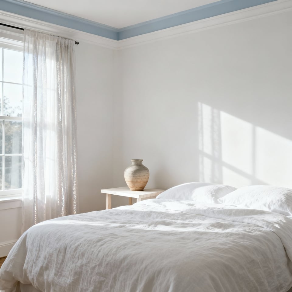
Most people think of ‘white’ as a single entity. But from a material science perspective, it’s a vast spectrum. The very first decision is always hue temperature—the subtle lean towards cool blue and grey or warm yellow and cream. This choice isn’t merely aesthetic; it’s about engineering a specific psychological response. Cool whites, like Benjamin Moore’s ‘Chantilly Lace,’ are crisp and expansive. Their molecular structure reflects more of the blue light spectrum, creating an alert, gallery-like feel that can make a small room seem larger. They are my go-to for south-facing rooms that get a lot of warm, direct sun, as they provide a necessary balance.
Warm whites, on the other hand, absorb a bit more blue light, reflecting the warmer end of the spectrum. Think of Sherwin-Williams’ ‘Alabaster.’ These tones create an enveloping, cozy atmosphere that feels like a gentle embrace. They’re indispensable in north-facing rooms, where the natural light is cooler and more ambient. A warm white here can prevent the space from feeling stark or chilly. The decision between them sets the entire emotional tone of your sanctuary. It’s the first and most important layer.
2. Embracing Subtlety: The Psychospatial Impact of Near-White Stratification
A single shade of white, no matter how perfect, can fall flat. The real artistry comes from layering several near-white shades to build subconscious depth. This is where a room gains its soul. Pure optical white has its place, but using it everywhere can lead to sensory fatigue. Our eyes are designed to seek variation, and by providing subtle shifts, you create a richer, more engaging environment that feels dynamic yet remains calm. It’s a technique of sculpting with shadow and light.
Think about graduating the tones. You might use a soft, slightly warm white on the walls, a crisper, cooler white for the trim and ceiling, and bedding that falls somewhere in between. This stratification fools the eye into perceiving different planes and greater dimension. In my experience with texture layering, this is what elevates a space from simply decorated to truly designed. It’s like the difference between a simple line drawing and a detailed charcoal sketch; the depth comes from the subtle gradations, not the introduction of bold color.
3. Foundation of Luminosity: Mastering the Interaction of Natural and Artificial Light with White Surfaces
A white room is, at its essence, a light-modifying machine. Every surface becomes a reflector, and your job is to direct how that reflection happens. Natural light is your primary tool, and its path changes constantly throughout the day, altering the perceived color and mood of the space. Understanding your room’s orientation—whether it faces north, south, east, or west—is non-negotiable for choosing the right white. You’re not just painting a wall; you’re creating a canvas for the sun.
Artificial lighting is your way of controlling the narrative after the sun goes down. A layered lighting plan is crucial. This means a mix of ambient light (soft overheads), task light (focused reading lamps), and accent light (to highlight a textured wall or a piece of art). Dimmer switches are an absolute must—they are the volume control for the room’s atmosphere. Critically, pay attention to the Kelvin temperature of your bulbs. A warm 2700K light will enrich creamy whites, while a more neutral 3500K will keep cooler whites feeling crisp. By choreographing light, you are truly activating the space.
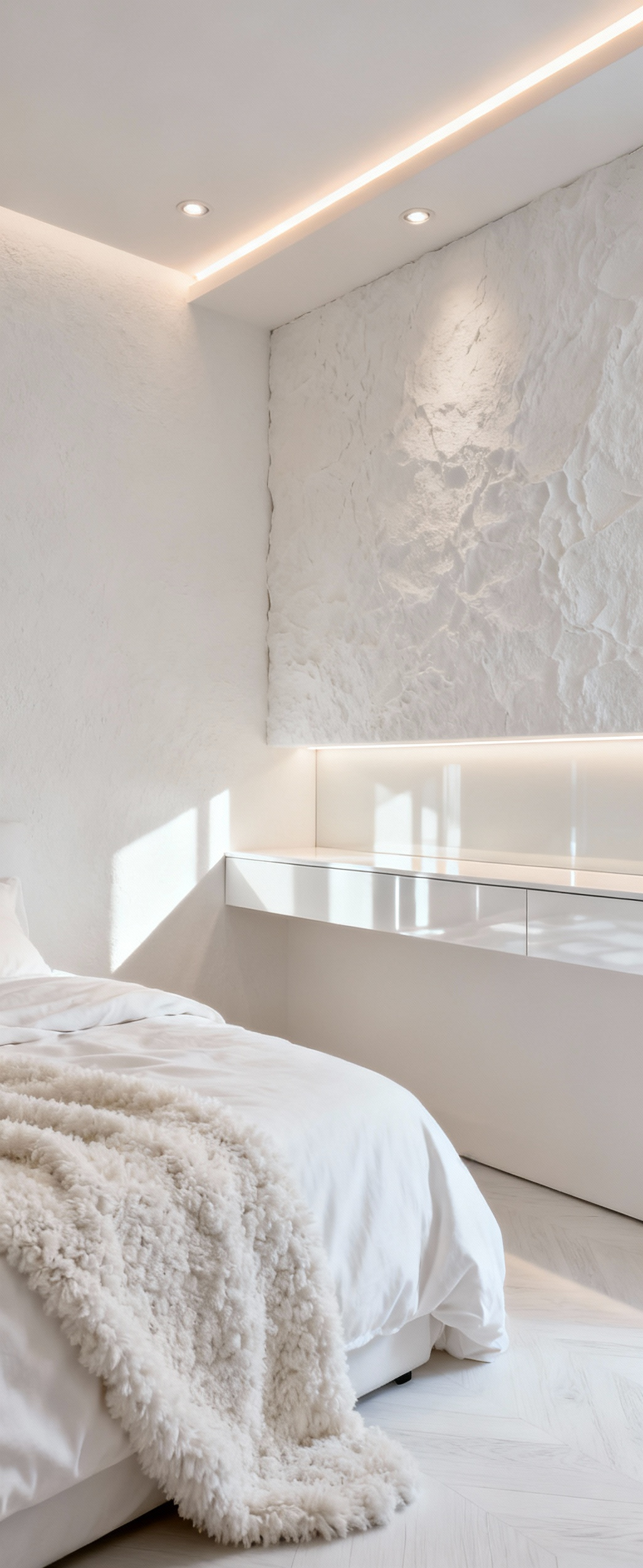
4. Artisanal Textural Substrates: Curating Core Surfaces for Tactile Richness
Color may draw the eye, but texture is what truly connects us to a space. Our subconscious registers tactile surfaces as signals of comfort and quality. So, once you’ve established your palette of whites, the next step is to curate the core surfaces for their feel. This is about creating a dialogue between smooth and rough, soft and hard, matte and gloss. It is the foundation of all my work in surface design. A flat, uniform room feels lifeless; a textured one invites you in.
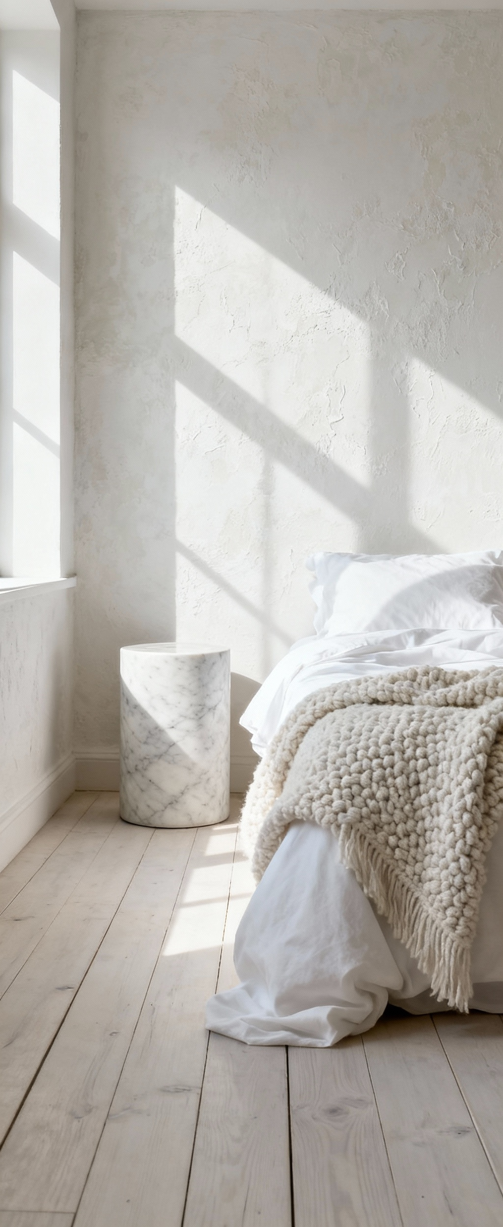
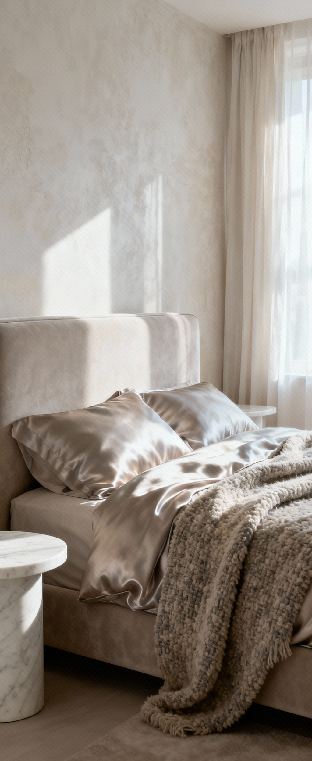
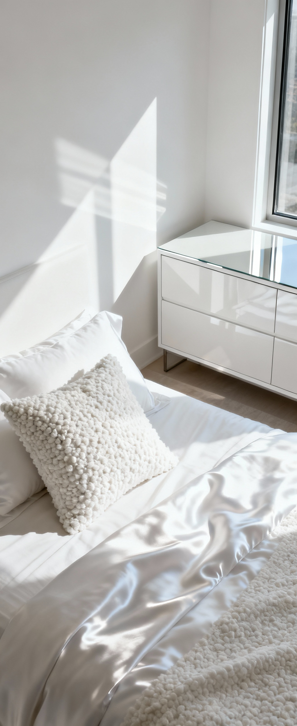
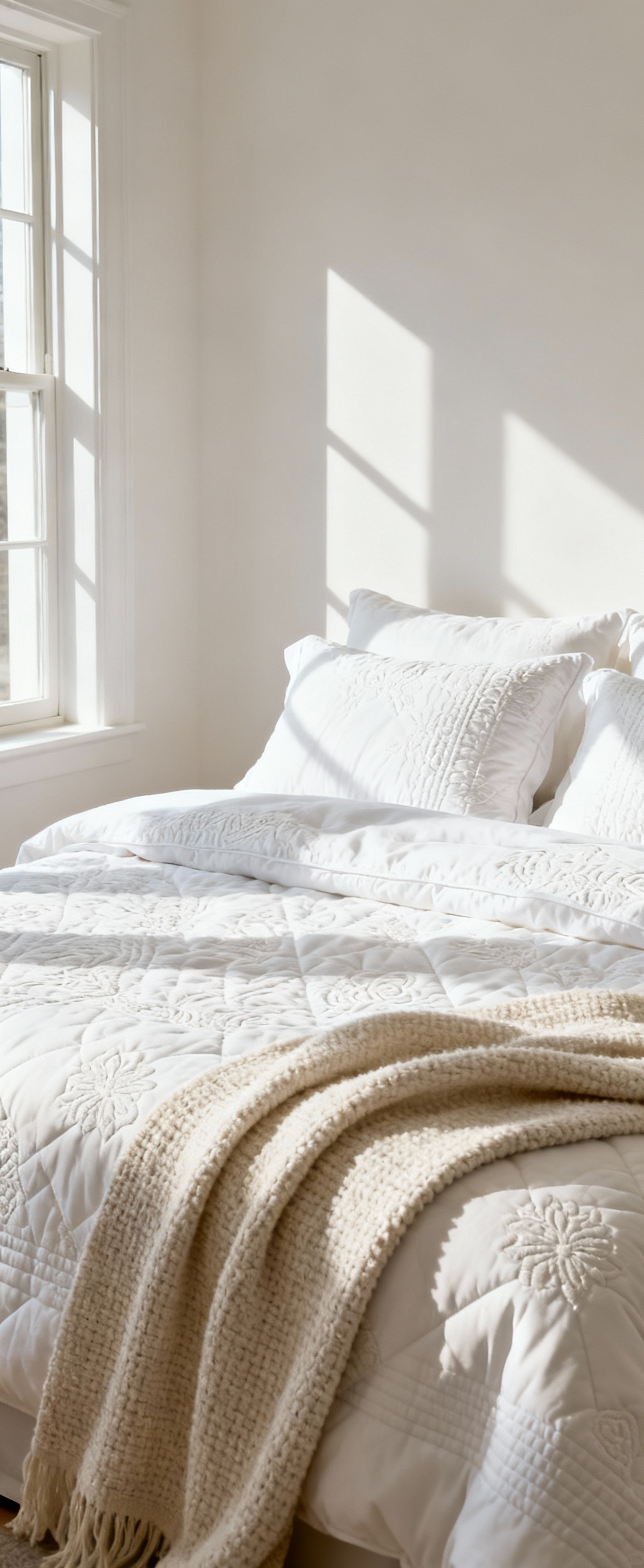
Start with the walls. A limewash or Venetian plaster finish provides a soft, chalky texture that absorbs and diffuses light in a way that flat paint never can. The subtle, mottled appearance adds an organic, handmade quality. For flooring, consider white oak that’s been lightly cerused, allowing the grain to provide a gentle, natural pattern underfoot. Your bedding is the most intimate texture of all, so layer it: the cool crispness of percale, the soft-slubbed feel of linen, and the heavy comfort of a chunky merino wool throw. These material choices aren’t just decorative—they are the building blocks of a truly sensory experience.
Deconstructing the Purity of Pallor: The Ethereal Baseline (Part 2)
5. Strategic Reflectivity Quotient: Employing Varied Finishes to Manipulate Spatial Depth
Every material in a room has a specific light-reflectance value (LRV), but that number only tells part of the story. The quality of that reflection—what I call the reflectivity quotient—is where real design magic happens. This is about strategically mixing finishes to sculpt the light and manipulate how we perceive a room’s size and depth. By varying finishes from matte to high-gloss, you create a subtle but powerful visual rhythm.
Here’s how I think about it. Matte surfaces, like chalk paint or raw linen, absorb light. They feel quiet, soft, and visually recessive—perfect for a wall you want to feel like a comforting backdrop. Satin or eggshell finishes offer a gentle glow, diffusing light without creating harsh glare. I often use these on trim or ceilings. Then you have high-gloss or lacquered surfaces. These are your amplifiers. A lacquered bedside table or a polished chrome lamp base will bounce light around the room, making the space feel brighter and more expansive. In a smaller room, a tall mirror or a glossy piece of furniture can be a game-changer. The key is balance. What I tell my clients is that one glossy object in a room of matte textures creates a focal point. It’s an intentional disruption that adds incredible sophistication.
Orchestrating Depth and Dynamics: A Symphony of White Stratification (Part 1)
Now that the foundational whites and finishes are in place, we can begin to orchestrate depth. This is about layering textiles and forms to create shadow, movement, and a sense of history within the room. This is where a simple white bedroom becomes a rich, dynamic composition.
6. Dimensionality through Topographical Variations: Sculpting Shadow Play with Embossed Textiles
Flat surfaces can feel monotonous. To create dimensionality without color, I turn to textiles that have their own topography—fabrics with raised or recessed patterns that physically sculpt the light. Think of a white matelassé coverlet with a quilted, puckered texture, or a duvet with a subtle jacquard weave. The pattern isn’t printed; it’s woven into the very structure of the fabric.
As light moves across these surfaces throughout the day, it creates a constantly shifting landscape of micro-shadows and highlights. This effect transforms a simple bed into a dynamic sculpture. You can introduce this on a large scale with bedding or a custom upholstered headboard, or on a smaller scale with decorative pillows in a dimensional damask or a cut-velvet pattern. From my work in surface design, I’ve learned this is one of the most effective ways to add luxury and complexity to a monochromatic scheme. It provides rich visual interest that beckons you to come closer and touch.
7. The Kinetic Properties of Sheer Draping: Infusing Serenity with Diffused Luminescence
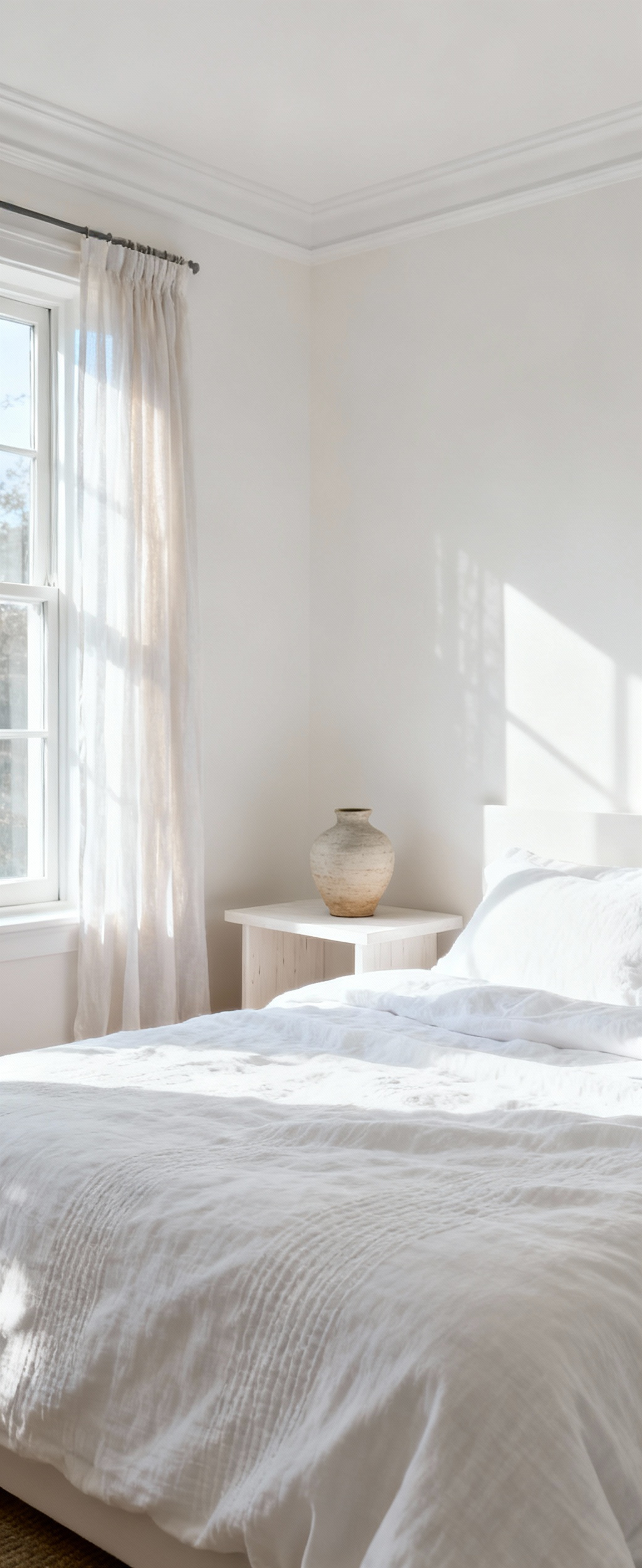
Window treatments do more than provide privacy; they are instruments for shaping light. Sheer curtains, particularly those made from fine linen or voile, possess a beautiful kinetic quality. They are not static. They move with the slightest breeze, filtering and diffusing sunlight into a soft, ethereal glow that blurs sharp edges and bathes the entire room in a calming luminescence.
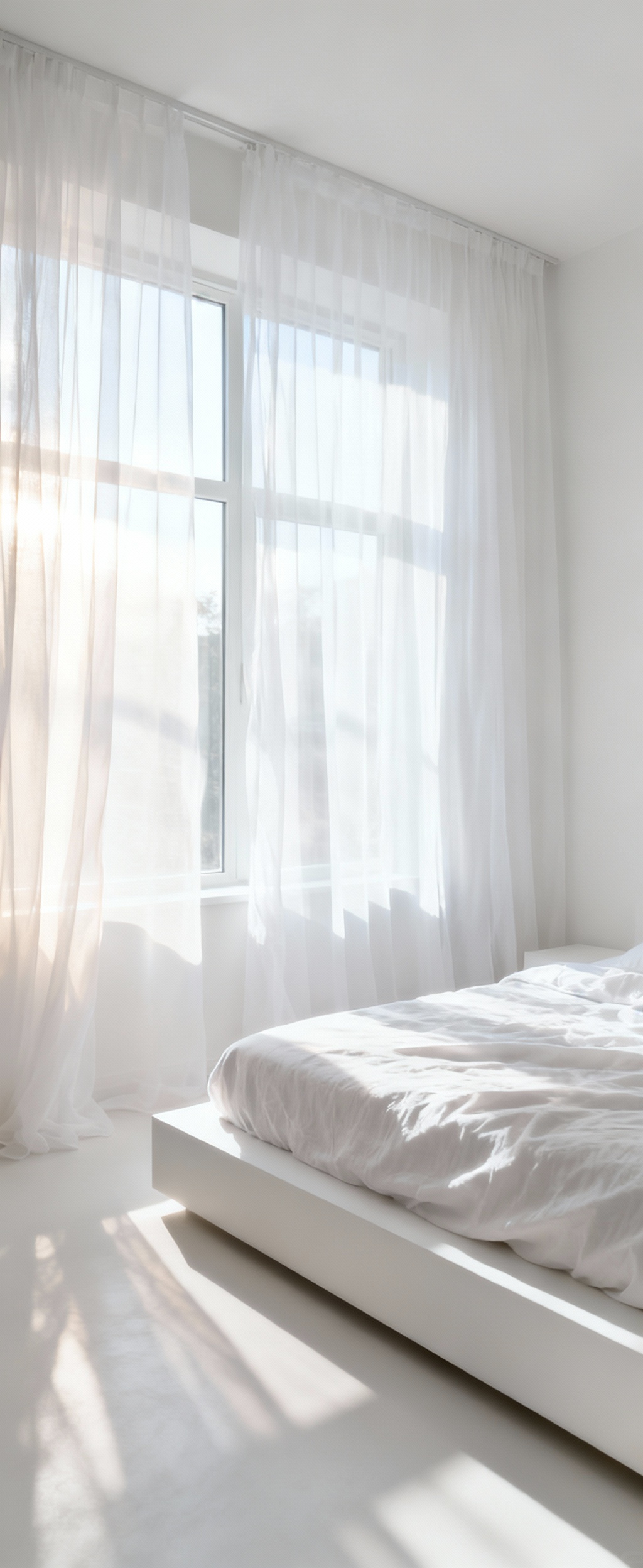
This gentle, constant motion prevents a white room from ever feeling static. It introduces a living element, a quiet dynamism that is incredibly serene. The light itself becomes a tangible presence in the room. I love layering sheers behind more opaque drapes, allowing you to control the light with precision. A sheer panel can soften harsh afternoon sun while still illuminating the space. For a truly luxurious touch, a four-poster bed draped in sheer white fabric creates a dreamy, cloud-like sanctuary within the larger room. It’s a simple material, but its effect is profound.
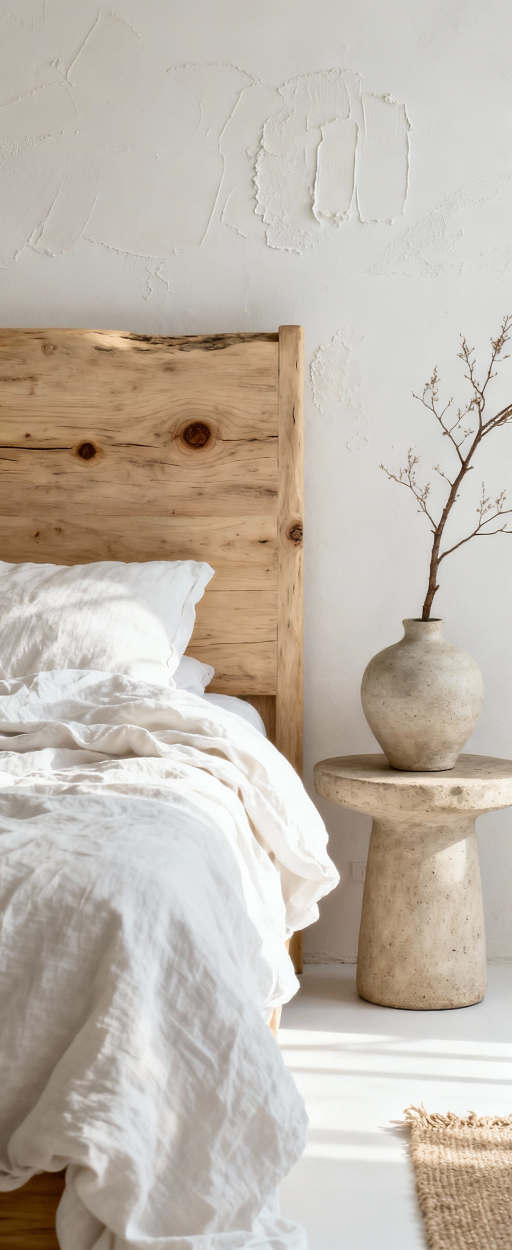
8. Incorporating Organic Irregularities: Introducing Natural Elements as Patinated Counterpoints
A perfectly pristine white room can sometimes feel cold or clinical. The antidote is to introduce organic, irregular elements that carry the beautiful imperfections of nature. This is about providing a patinated counterpoint to the clean lines and smooth surfaces, grounding the space with a sense of authenticity and warmth. These are the elements that keep a white room from feeling sterile.
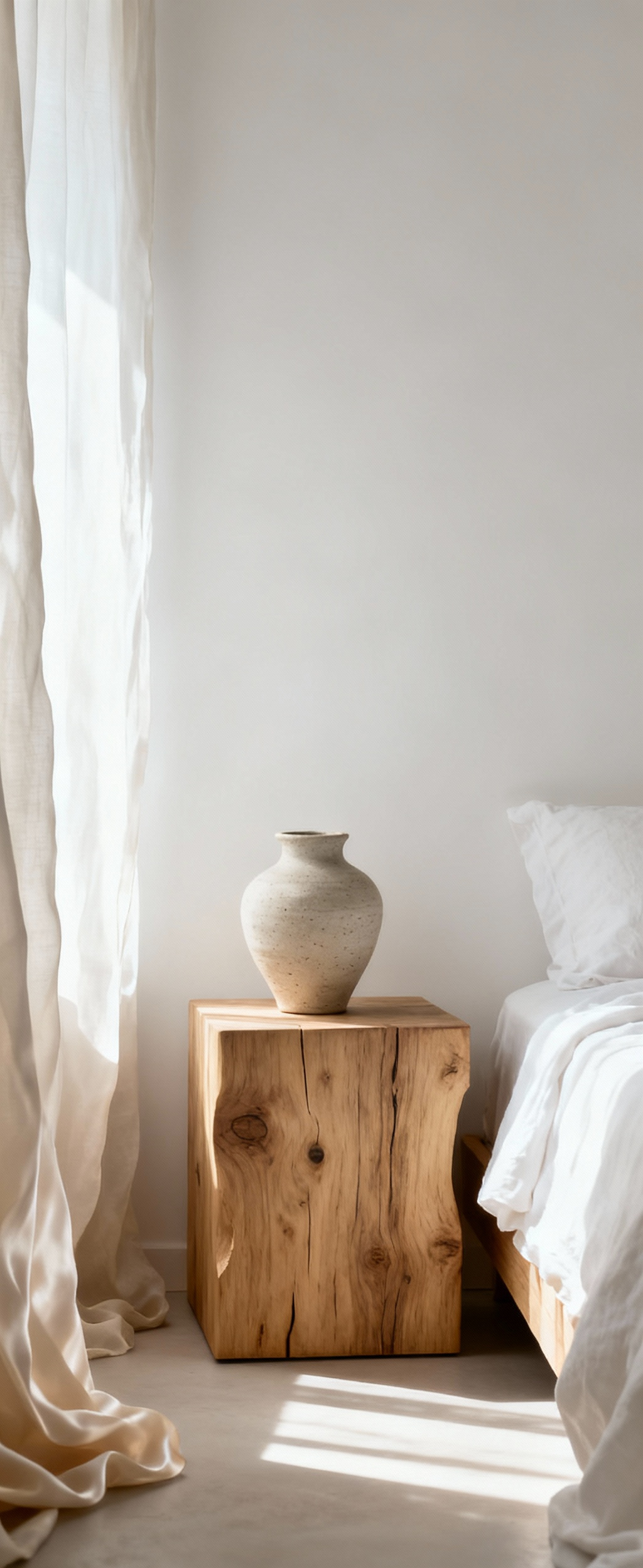
A piece of weathered driftwood on a dresser, a bedside table made from a slab of reclaimed, whitewashed oak, or a hand-thrown ceramic vase with an uneven glaze all bring an essential, earthy quality into the room. A jute or sisal rug underfoot provides a coarse, natural texture that contrasts beautifully with soft bedding. These materials have a history and a character that manufactured items lack. In my material combinations, I find these moments of raw, natural texture are what make a space feel honest and inviting. They remind us that beauty lies in imperfection.
9. Biomorphic Accents in Alabaster: Leveraging Curvature for Softened Visual Trajectories
Our brains are wired to respond positively to curves. They feel safer, softer, and more natural than sharp angles. In a predominantly white bedroom, where lines can easily become rigid, incorporating biomorphic—or nature-inspired—forms is a sophisticated way to soften the entire room’s visual trajectory. These fluid, organic shapes guide the eye gently through the space and create a sense of tranquil flow.
This can be achieved with a sculptural floor lamp that has an undulating base, or an armchair with a soft, cocoon-like curve. Even small accents make a big impact: a set of alabaster vases with soft, rounded silhouettes or a mirror with a gently curved frame. Rendered in tones of white, plaster, or stone, these pieces add sculptural integrity without introducing visual clutter. The focus remains on form and shadow. This is an advanced technique for crafting a space that feels both highly curated and deeply comfortable—a hallmark of great design.
Orchestrating Depth and Dynamics: A Symphony of White Stratification (Part 2)
10. Articulated Joinery & Seamless Integration: Harmonizing Architectural Details with Unified White Paneling
Architecture itself can be a source of texture. Rather than ignoring features like moldings, wainscoting, and door frames, I believe in integrating them into the design as an intentional layer. When these structural details are painted in the same family of white as the walls, they don’t break up the space with contrast. Instead, they create a subtle, sophisticated relief map of light and shadow.
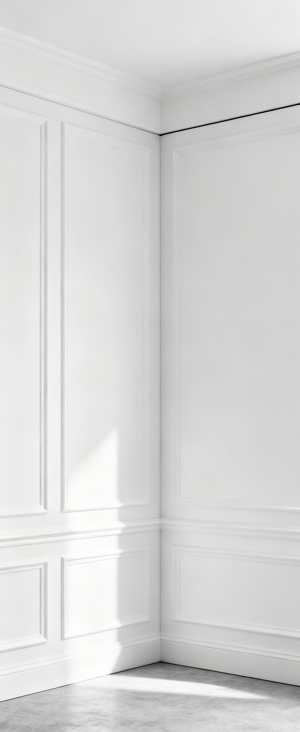
This articulation of joinery adds rhythm and depth to an otherwise flat plane. For a modern aesthetic, you might use minimalist shadow gaps instead of traditional baseboards, creating a clean line where the wall appears to float. For a more classic feel, detailed crown molding can draw the eye upward. The key is seamless integration—choosing a consistent finish or a subtle variation (like matte walls with satin trim) that allows these architectural bones to become part of the quiet, layered narrative of the room, adding a sense of history and permanence.
11. Optical Expansion Techniques: Harnessing Reflective Planes to Magnify Perceived Volume
Beyond the standard reflectivity of different paint finishes, you can use specific reflective planes to fundamentally alter the perception of a room’s size. This is where material science meets optical illusion. Mirrors are the most obvious tool, but how you use them matters. A large, floor-to-ceiling mirror placed opposite a window doesn’t just reflect the view; it effectively doubles the amount of light and visual space.
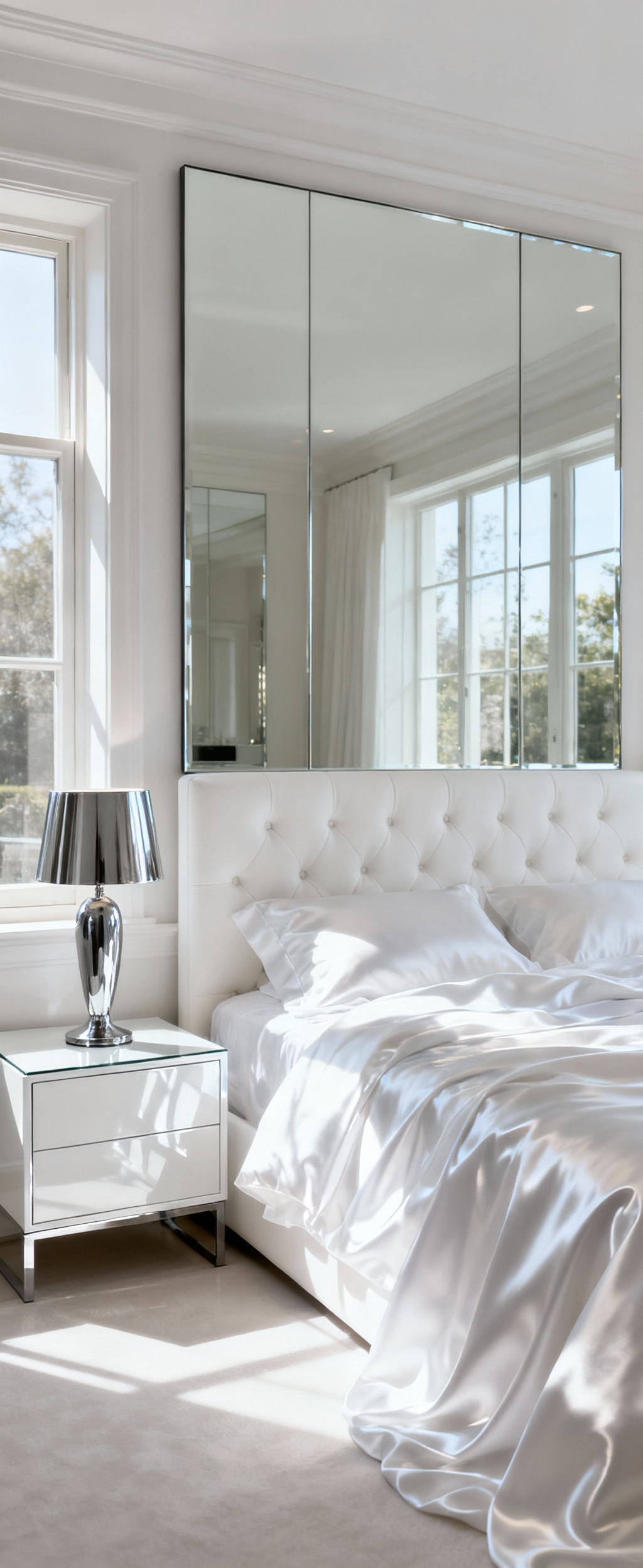
Other surfaces can achieve a similar effect. A wardrobe with doors finished in a high-gloss white lacquer will bounce light around, making a small room feel airier. Polished chrome hardware, a glass tabletop, or even sateen-finish bedding can introduce subtle, light-scattering surfaces that contribute to this feeling of expansion. I learned this when working on a compact urban apartment: by strategically placing a few key reflective elements, we made the white bedroom feel twice its actual size. It’s not about making a room flashy; it’s about using light as a tool to sculpt a more generous sense of space.
Curated Compositions: Experiential Blueprints in White Design (Part 1)
With a strong foundation, we can now assemble these elements into cohesive design languages. These “blueprints” show how different combinations of texture and form can create distinct atmospheres, all within the world of white. Each offers a different vision for your white bedroom inspiration.
12. Nordic Zen Minimalist Protocol: Achieving Hygge Through Unadorned Whites and Soft Grain Woods
This aesthetic is about more than just minimalism; it’s about achieving hygge—that Danish sense of cozy contentment—through radical simplicity. The protocol relies on unadorned, soft whites paired with the natural warmth of light-grained woods like pale oak, ash, or birch. This isn’t an empty space; it’s a purposefully quiet one, where every object has meaning and texture takes the place of ornament.
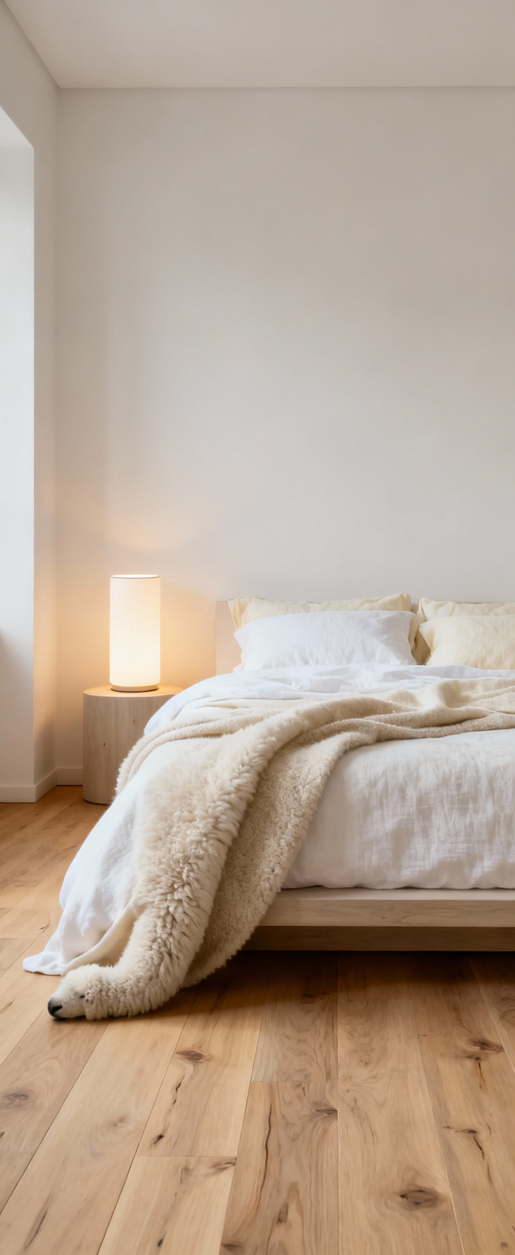
The whites here are typically matte and chalky, absorbing light to create a soft, non-glare environment. Textiles are key: layers of organic cotton, slubby linen, and soft wool in varying shades of natural white and cream create tactile warmth. The wood provides the essential grounding element—a simple platform bed, a sleek nightstand—its fine grain a whisper of nature against the calm backdrop. It’s a disciplined approach that results in a sanctuary of unparalleled calm and restorative quiet.
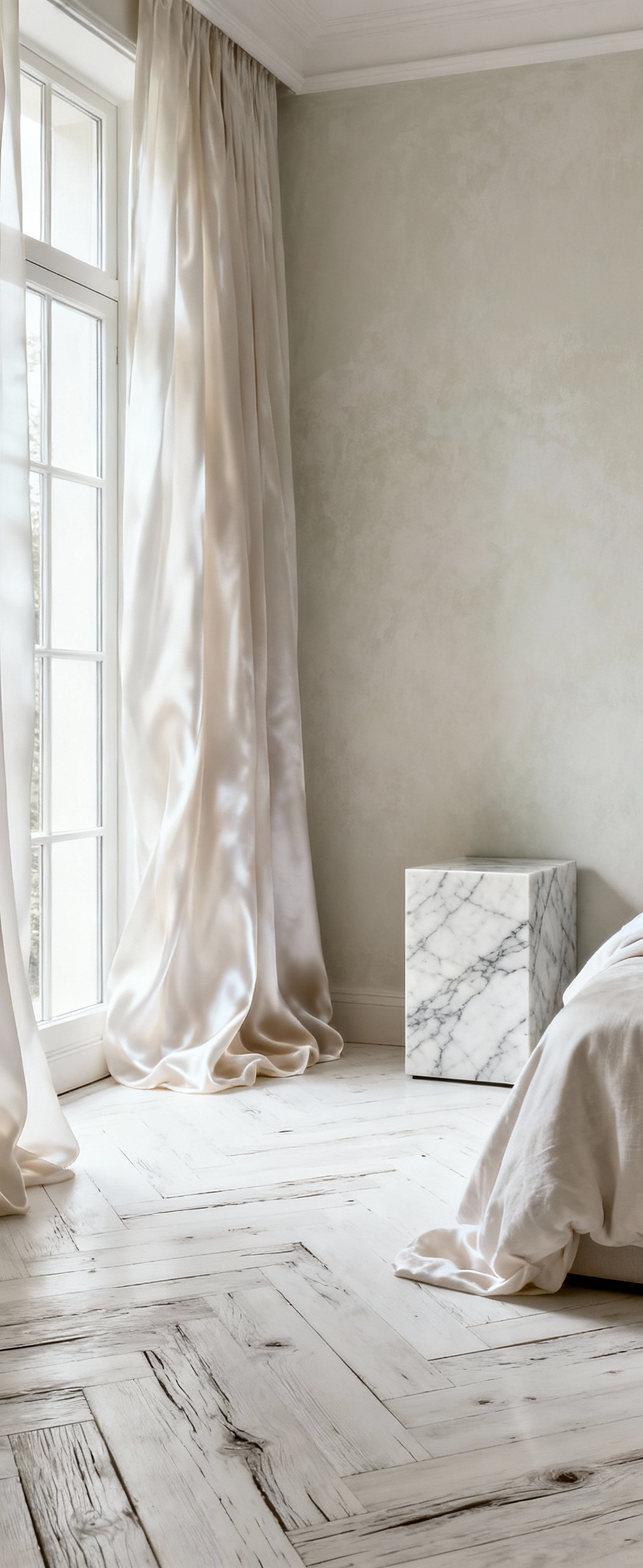
13. Parisian Chic Apotheosis: Interweaving Ornate Architectural Flourishes with Pristine Linen
This look is all about sophisticated contrast. It pairs the grandeur of ornate, Haussmann-era architectural details—think elaborate ceiling medallions, intricate moldings, and marble fireplace mantels—with the humble, relaxed elegance of pristine white linen. The tension between the formal architecture and the informal textiles is what makes this style so effortlessly chic.
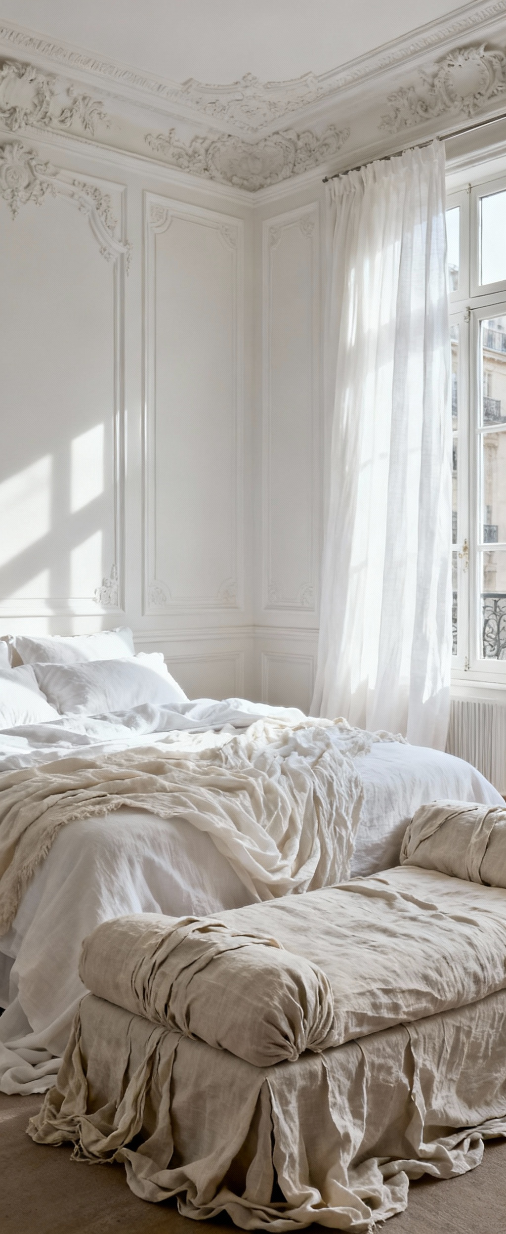
The ornate details are typically painted a crisp white to emphasize their sculptural form rather than their color. Against this grand backdrop, the bedding is simple and inviting: layers of soft, slightly crumpled white linen that feel luxurious but not pretentious. This is an aesthetic that honors history while feeling completely modern. I love adding a single antique gilded mirror or a crystal chandelier to complete the look. The result is a space that feels both romantic and refined, a testament to timeless style.
14. Coastal Modern Serenity: Synthesizing Weathered Timbers with Undulating Ceramic Forms
A modern coastal aesthetic sheds the nautical clichés and instead channels the elemental feeling of the shore: the texture of sand, the shape of eroded stone, the bright, airy light. This blueprint pairs weathered, sun-bleached timbers with soft, undulating ceramic forms, all set within a palette of warm, sandy whites. The goal is to create a space that feels as calm and restorative as a walk on the beach.
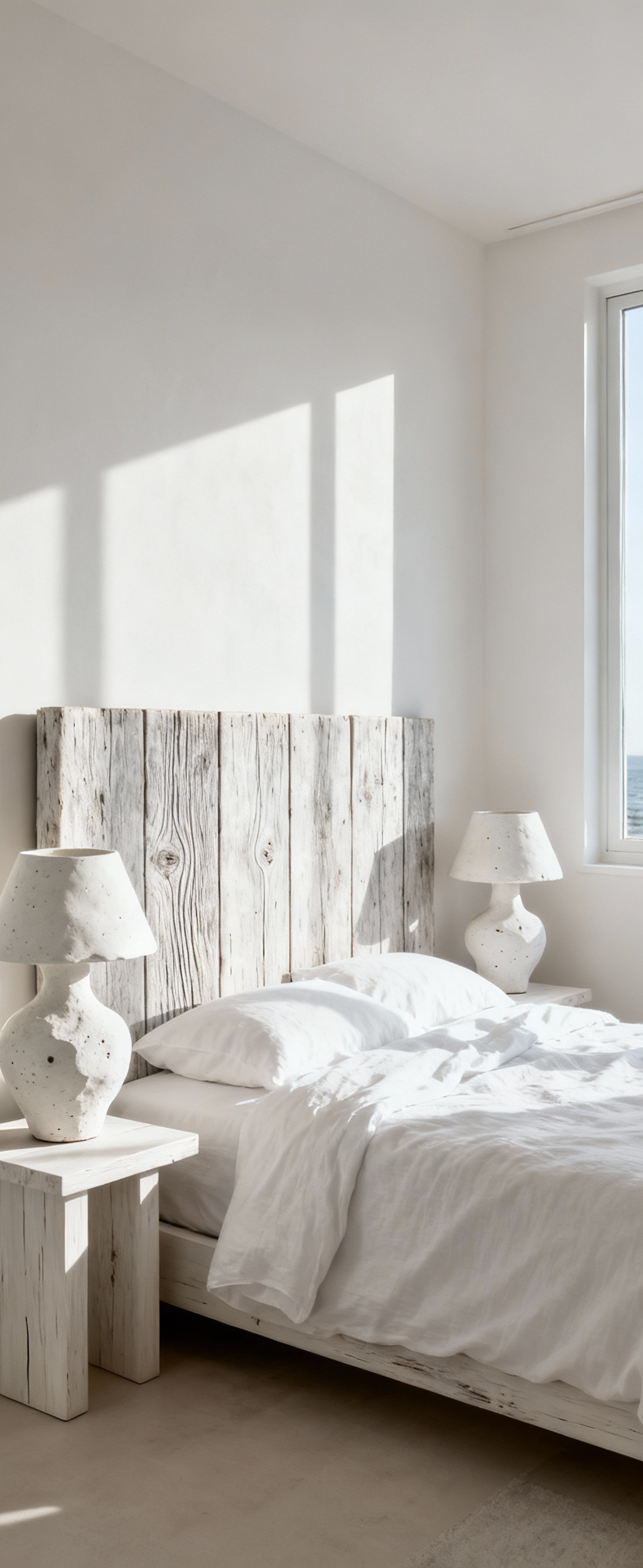
Use woods like bleached oak or reclaimed elm for a headboard or side tables, letting their rustic texture ground the space. The whites should have warm undertones to avoid feeling cold. Then, introduce sculptural ceramics—vases or lamps with organic, hand-thrown shapes that mimic pebbles smoothed by the tide. Textiles should be natural and breathable, like cotton and linen. The overall effect is a serene, tactile escape that brings the quiet rhythm of the coast indoors.
15. Urban Loft Epiphany: Industrial Rawness Juxtaposed with Velvety Blanc Fabrics
This style thrives on the powerful juxtaposition of raw, industrial materials with sumptuously soft, luxurious white textiles. It celebrates the honest bones of a space—exposed brick, polished concrete floors, steel beams—and then wraps them in unexpected comfort. This contrast between gritty and graceful creates a uniquely sophisticated urban sanctuary.
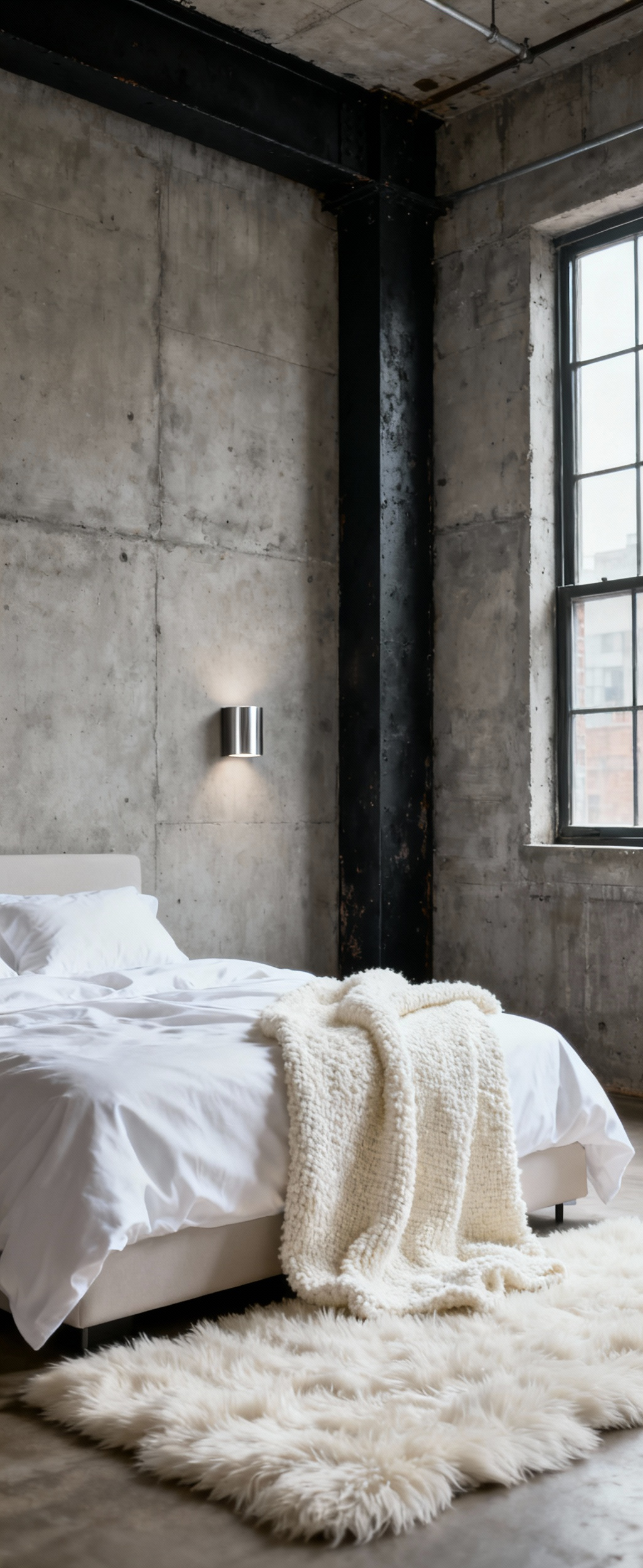
The key is to let the industrial elements provide the texture and then use plush white fabrics to soften the hard edges. Imagine a bed dressed in a decadent white velvet duvet set against a rough brick wall, with a deep-pile shag rug underfoot. The purity of the white allows the textural contrast to take center stage. Furnishings should be minimalist in form but chosen for their material—blackened steel, polished chrome, and raw wood—to honor the industrial context while maintaining a refined aesthetic.
Curated Compositions: Experiential Blueprints in White Design (Part 2)
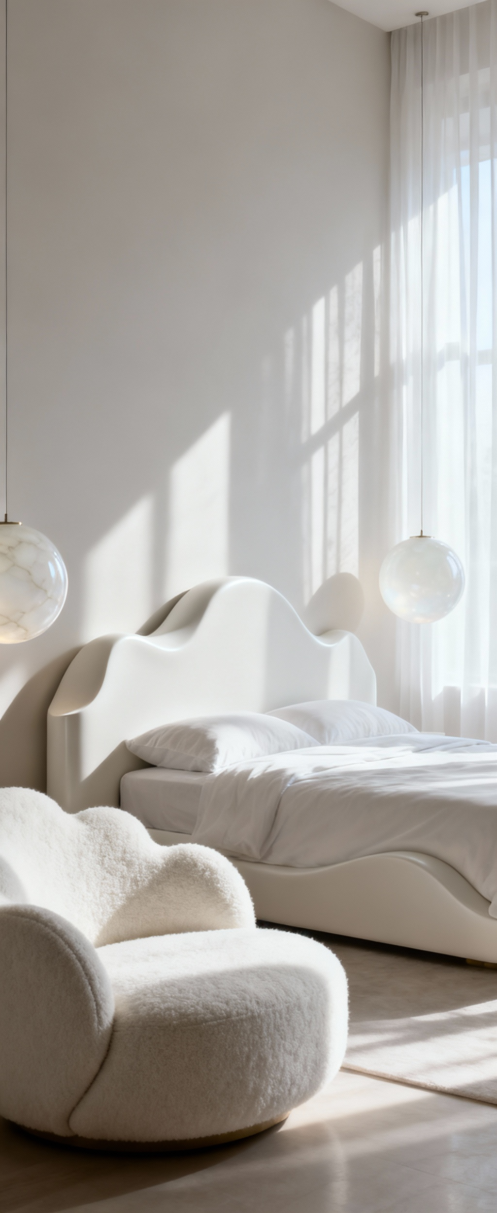
16. Sculptural Lumina Ensemble: Pairing Opaque Glass with Concentrated Spot Illumination
Lighting can be more than just functional; it can be sculptural. This advanced strategy pairs the soft, diffused glow of opaque or frosted glass fixtures with the precision of focused spotlights to create a dramatic, gallery-like effect. The opaque glass provides the ambient, ethereal light, while the spots act like theatrical lighting, highlighting specific textures and forms.
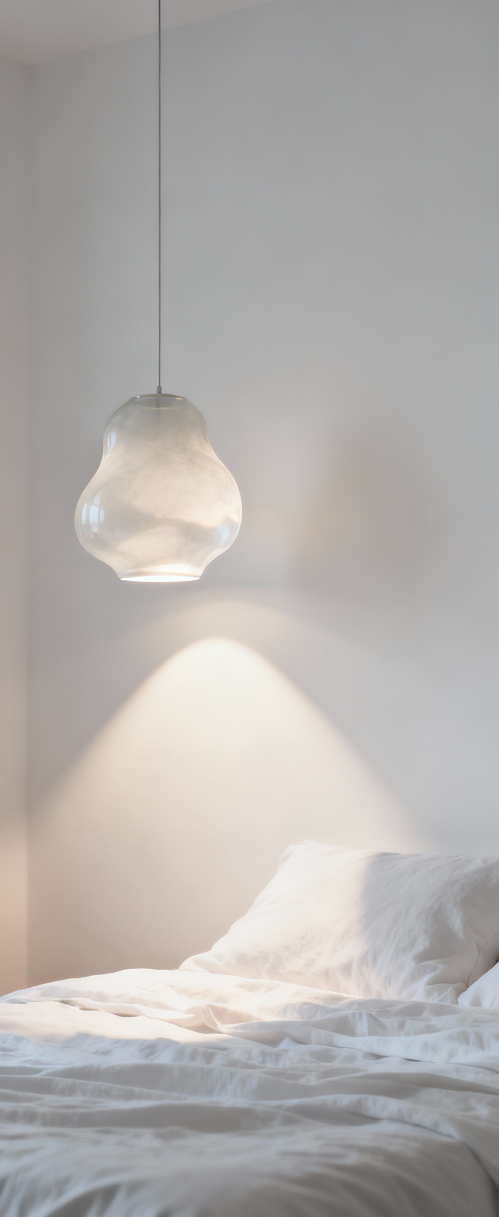
Picture a row of milky glass pendant lights casting a soft glow over the bed, while a narrow-beam spotlight grazes a limewashed wall, revealing its subtle texture. Or a single, focused light trained on a beautiful ceramic object on a nightstand, turning it into a piece of art. This play between diffuse and concentrated light adds incredible depth and a layer of intentionality to the room. It transforms the space into a curated light installation, making the white environment feel dynamic and alive, day or night.
The Ephemeral Essence: Cultivating White’s Enduring Allure
A truly successful white bedroom isn’t static. It’s designed to evolve, to feel inviting not just on day one, but for years to come. This final section is about cultivating that lasting appeal, ensuring the space remains engaging and avoids the pitfalls of monotony.
17. Perceptual Resilience: Proactive Material Selections for Longevity and Patina Evolution
The most luxurious materials are not always the most delicate. True luxury is about durability and the ability to age gracefully. In a white room, this is critical. I always select materials based on their “perceptual resilience”—how they will wear over time. The goal is for them to develop a beautiful patina, not just show signs of wear.
For example, high-quality, tightly-woven linen gets softer and more beautiful with every wash. Honed marble, rather than polished, will develop a soft, matte character over years of use, its tiny etches telling a story. Performance fabrics like those with Crypton technology mean you can have a truly white headboard or chair without fear. This is about making smart, science-backed choices upfront so the room’s beauty is sustainable, not fleeting.
18. Avoiding Monochromatic Apathy: Strategic Infusions of Ephemeral Tint to Prevent Visual Fatigue
To keep an all-white room from feeling flat, I employ what I call “ephemeral tint.” This is the practice of layering whites that have nearly imperceptible undertones of other colors—a hint of grey, a whisper of pink, a touch of cream. These subtle shifts are often not even consciously registered, but they prevent visual boredom and create a much richer experience.
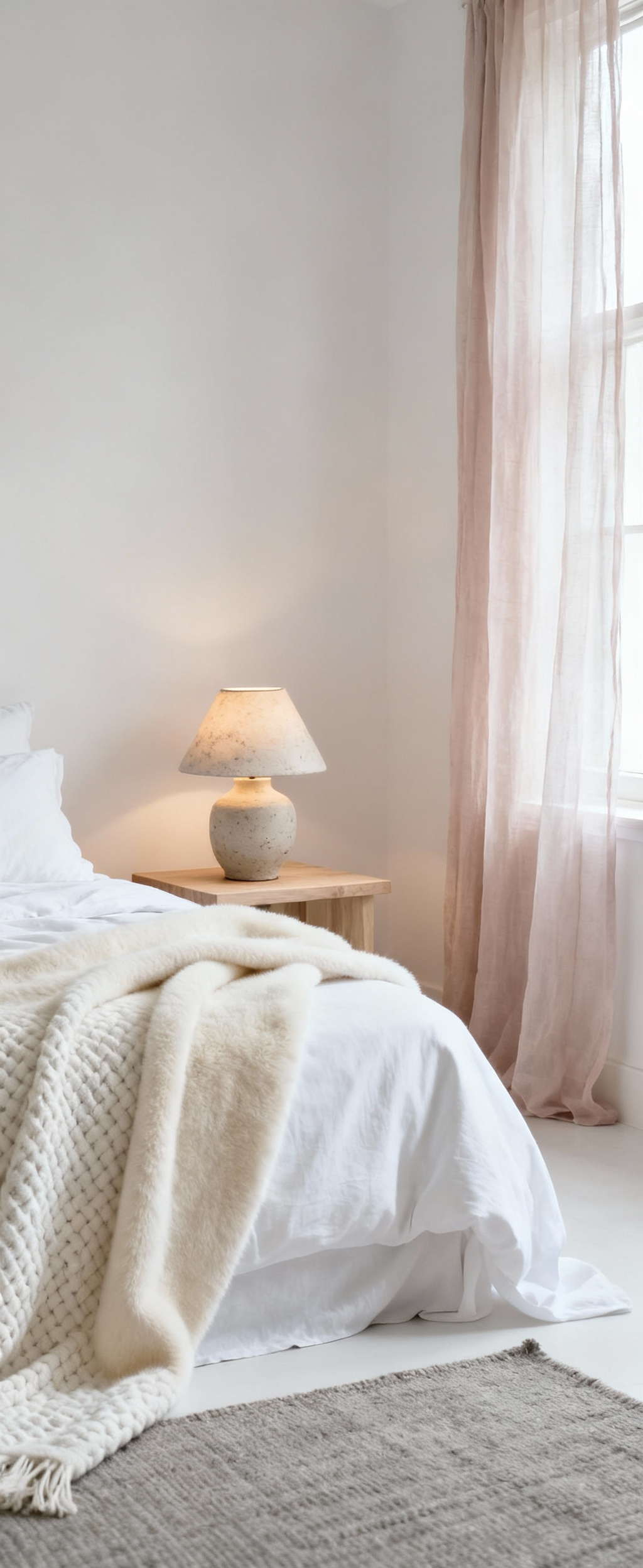
Layer a bone-white cashmere throw on a bed with sheets that have a cooler, almost-blue tint. Paint the walls a soft white with a hint of grey, and the trim a crisper, purer white. Our eyes pick up these subtle differences, which create a quiet vibration and an unspoken complexity. It’s the difference between a one-note song and a rich, layered chord. It’s this nuance that gives a white room its enduring soul.
19. The Synesthetic Echo: Curating Olfactory and Auditory Elements to Complete the White Tableau
The most immersive spaces engage more than just sight. A truly complete white bedroom design considers the “synesthetic echo”—the scent and sound that complete the sensory picture. The goal is to create an ambient background that reinforces the feeling of serene purity. For scent, this means avoiding anything heavy or artificial. Instead, use a diffuser with clean essential oils like white tea, sandalwood, or a hint of lavender.
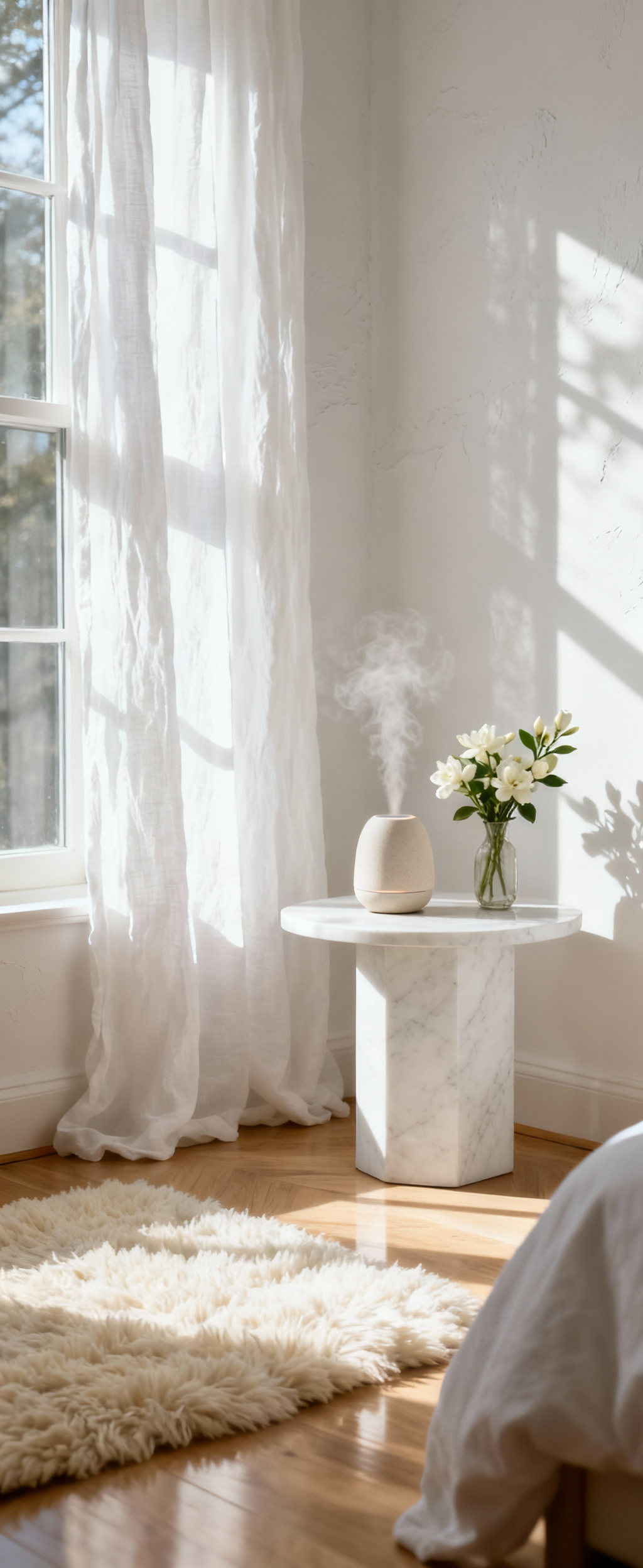
Sound is equally important. High-quality textiles like wool rugs and heavy linen drapes naturally absorb sound, creating a quiet, hushed atmosphere. You might also consider a subtle white noise machine with sounds of gentle rain or distant waves to mask intrusive noises. This is the final layer of design—the invisible architecture of scent and sound that makes a space feel like a true sanctuary.
20. Intentional Imperfection: Celebrating Subtle Wabi-Sabi Aesthetics within Pristine Realms
Perfection can be cold. The final touch in creating a soulful white room is the celebration of “intentional imperfection,” inspired by the Japanese aesthetic of wabi-sabi. This is about finding beauty in the authentic, the handmade, and the gently aged. It’s the one element that ensures a room feels human and real.
Introduce a hand-thrown ceramic vase with a slightly uneven glaze, or a linen blanket with natural slubs in the weave. Maybe it’s a single antique wooden stool next to a modern bed. These pieces have character. Their small “flaws” provide a beautiful counterpoint to the clean, pristine elements around them. This is not about being messy; it’s a highly curated choice to include objects with history and soul, which is the ultimate mark of a sophisticated and confident space.
Conclusion
We began with a simple idea: a white bedroom. But as we’ve journeyed through these 20 layers, I hope you see it now as I do—as a rich, complex, and deeply rewarding design challenge. From the scientific choice of a paint’s undertone to the tactile poetry of layered textiles, creating a truly exceptional white room is an act of meticulous orchestration. It’s a dialogue between light, material, and a profound understanding of how we experience a space with all of our senses.
This guide to white bedroom inspiration is about moving beyond simplicity to find sophistication in subtlety. It’s about building an environment that doesn’t just look peaceful but genuinely feels restorative. The calm you seek is found not in an absence of color, but in the intentional presence of texture, the thoughtful manipulation of light, and the quiet harmony of perfectly chosen materials. Now, take these strategies and begin to compose your own symphony in white—a personal sanctuary that is as dynamic and soulful as it is serene.