Picture this: You’re standing in your kitchen at sunrise. The air is still cool, and a soft, golden light is streaming through the window, touching everything with a gentle warmth. You place your hands flat on your countertop. What do you feel? Is it cool and sleek, grounding you for the day ahead? Is it soft and matte, absorbing the morning quiet? Now look at the color. Does it energize you? Does it soothe you? This surface is the heart of your kitchen, the literal foundation upon which you nourish yourself and your family.
Choosing a color for it isn’t just about matching cabinets. It’s about setting the entire sensory and emotional tone for the most vital room in your home. It’s about how sound bounces (or doesn’t), how light plays, how you feel when you’re chopping herbs and smelling their fresh scent fill the air. So much of what you read online is just noise—corporate speak about resale value and fleeting trends. Let’s set that aside and talk about what actually matters: creating a space that feels as good as it looks, a sanctuary that supports your well-being from the ground up.
Laying the Groundwork: Initial Assessments and Vision (Part 1)
Before you even look at a single sample, we need to tune into the existing energy of your space. This is the quiet part, the listening part. It’s about understanding the light, the colors that are already present, and most importantly, the feeling you want to create. Think of it as composing a piece of music—you have to know the key and the tempo before you can write the melody. This foundation work prevents the jarring notes of a mismatched color and ensures the final result is a harmonious symphony for your senses.
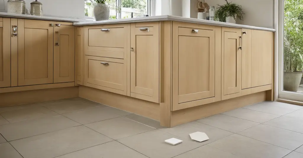
1. Assess Your Kitchen’s Existing Palette: Cabinets, Floors, and Walls
You have to start with what’s already there. The biggest mistake I see people make is falling in love with a countertop sample in a fluorescent-lit showroom and bringing it home, only to find it wages a silent, visual war with their cabinet undertones. Your cabinets, floors, and walls are the established energies in the room. They have a color temperature—a warmth or a coolness that you can feel. Your new countertop needs to either harmonize with them or provide a beautiful, intentional contrast, not an accidental clash.
My simple trick? Take a door off a cabinet and grab a sample of your flooring. Put them together next to a pure white piece of paper. Now you can truly see the undertones. Are your “white” cabinets actually a warm cream? Is your “gray” floor leaning a little blue? Knowing this is your map. It’s what guides you away from a choice that will always feel subtly “off” and toward one that feels settled, calm, and deeply right.
2. Harness the Power of Natural and Artificial Lighting
Light is a living element in your home. The way it moves and changes throughout the day completely alters how we perceive color. The cool, blue-toned light of a north-facing window will make a gray countertop feel even cooler, while the warm, yellow-toned light from a western sunset will bring out the golden flecks in a piece of granite. To ignore light is to choose a color with your eyes half-closed. You’re only getting a fraction of the story.
This is non-negotiable: you must get large samples of your top contenders and live with them for a few days. Place them where the countertop will be. Watch them in the morning, at noon, and in the evening under your artificial lights. How does the color shift? Does it absorb the light and become dull, or does it come alive? Under-cabinet lighting is especially crucial—it’s the task light that will illuminate your surface most directly. Turn it on and see what secrets the stone reveals. This is how you avoid the heartbreak of a beautiful color turning murky in your home’s unique light.
3. Define Your Desired Kitchen Mood and Style
Let’s talk about feeling. When you walk into your finished kitchen, how do you want to feel? “Bright and airy” is a different energetic signature than “cozy and grounded.” “Sleek and minimalist” feels different than “warm and rustic.” These aren’t just buzzwords; they are emotional goals. Your countertop color is one of the most powerful tools you have to achieve that feeling. A vast expanse of bright, polished white quartz will bounce light and energy around, creating a feeling of spaciousness and clean vitality. A dark, honed soapstone will absorb light, creating a quiet, intimate, and grounding mood.
Before you browse, write down three to five words that describe your ideal kitchen mood. Words like calm, vibrant, serene, dramatic, earthy, welcoming. Keep these words with you. When you look at a sample, ask yourself, “Does this color feel serene? Does it feel welcoming?” This intuitive check-in ensures you’re creating a space that aligns with your inner world, not just a passing trend on Pinterest. This is how a kitchen becomes a sanctuary.
4. Prioritize Practicality: Stain Resistance, Durability, and Maintenance
I confess, I used to believe that beauty should come first, no matter the cost. Then I lived with a beautiful, porous marble countertop that stained if you so much as looked at it with a glass of red wine. It was a constant source of low-grade anxiety. A kitchen should be a place of creative joy, not stress. The sensory experience of constantly worrying about spills, etching, and scratches completely negates the visual beauty of the material. A surface that requires constant vigilance is not a surface that supports a life of ease.
Here’s what’s real: Your lifestyle dictates your material. If you have young kids, cook with a lot of lemons and tomatoes, and can’t be bothered with sealing your counters every year, then an engineered quartz or a dense granite is your best friend. They offer peace of mind. Their resilience allows you to relax and actually live in your kitchen. Always stress-test a sample. Put a drop of coffee, wine, and lemon juice on it. See what happens. A countertop should serve you, not the other way around.
Now that we’ve grounded ourselves in the reality of your space and lifestyle, let’s move into the more tangible world of choosing your material. Think of the first part as setting your intention. This next step is where that intention begins to take physical form.
Laying the Groundwork: Initial Assessments and Vision (Part 2)
Before we can dream in color, we have to ground ourselves in the practical. This isn’t the most glamorous part, but I promise you, getting this right is what makes the rest of the process joyful instead of stressful. It’s about creating a realistic container for your vision.
5. Establish a Realistic Budget for Countertop Materials
Can we talk about money? It’s often the elephant in the room, but ignoring it is the fastest way to break your own heart during a renovation. Everyone sees the beautiful material, but they forget to budget for the artistry that turns a slab of stone into a functional countertop. Fabrication, delivery, installation, sink cutouts, and that special edge detail you love—these can add up to 50% on top of the raw material cost.
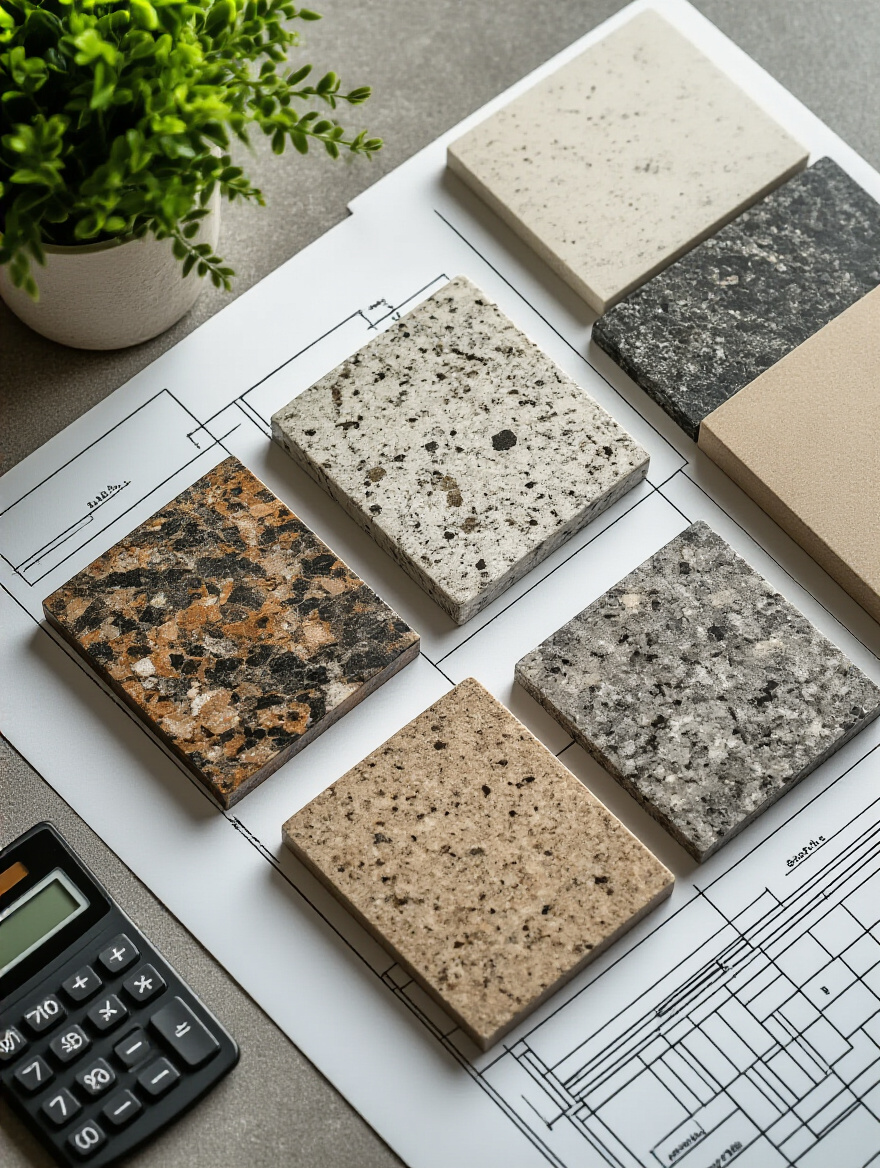
My honest advice is to get at least three itemized quotes. Don’t just look at the final number. Ask for a breakdown. What are you paying for labor? For the specific edge? For removal of the old top? Also, and this is crucial, add a 10-15% contingency fund. You just never know. This buffer isn’t for fancy upgrades; it’s for the unexpected things that save your sanity. This realistic approach doesn’t limit your creativity; it focuses it, guiding you to the most beautiful options you can truly afford, stress-free.
With our foundational work complete, it’s time to play with color and harmony. This is where we start blending the technical with the intuitive. We’ll look at how colors speak to each other and how to create a palette that feels cohesive, alive, and authentically you.
Strategic Color Selection and Harmonization (Part 1)
Now for the magic. Color is light, energy, and emotion all rolled into one. Choosing your countertop color is like choosing the anchor note for your kitchen’s symphony. Everything else will play off of it. Let’s explore how to choose a color that not only looks beautiful but also creates a deep sense of harmony.
6. Master the Art of Warm and Cool Undertone Coordination
Undertones are the secret language of color. They’re the subtle whispers of yellow, blue, or pink hiding beneath the main color. You can have two “gray” cabinets that clash horribly because one has a cool blue undertone and the other has a warm green one. Getting this right is what separates a space that feels calm and cohesive from one that feels… off, and you can’t quite figure out why.
The simplest way to become fluent in undertones is comparison. Remember that pure white paper trick? Use it again. Place your potential countertop sample next to your cabinet door with the white paper nearby. You’ll instantly see if the counter’s “white” leans creamy yellow (warm) while your cabinet’s “white” leans icy blue (cool). Don’t fight the undertones. Work with them. Choose a countertop that shares the same underlying temperature as your other fixed elements for a space that feels deeply, soulfully resolved.
7. Embrace the Timeless Appeal of Classic Neutral Countertop Colors
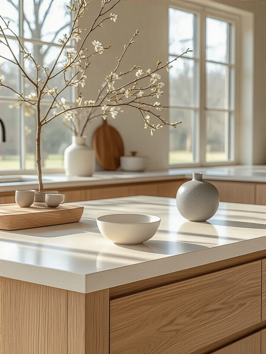
There is a profound sense of peace in a neutral palette. Colors like white, soft gray, warm beige, and even deep charcoal are the quiet heroes of design. They don’t scream for attention. Instead, they create a serene canvas that allows other sensory details to come forward—the vibrant green of fresh basil, the rich grain of a wooden bowl, the metallic gleam of your faucet. A neutral countertop is a long-term commitment to calm.
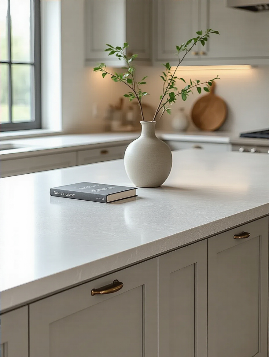
This doesn’t mean boring. A neutral countertop offers incredible freedom. You can change your wall color, your accessories, your art—all without worrying if it will clash with your biggest investment. I had a client choose a beautiful, soft gray quartz. Over the years, she’s painted her kitchen walls pale blue, then warm white, then a deep, earthy green. The countertop worked beautifully with all of them, providing a constant, grounding presence that adapted to her evolving style. That is the power of a well-chosen neutral.
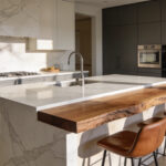
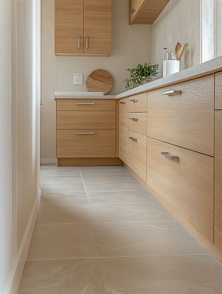
8. Introduce Depth and Warmth with Complementary Wood Tones
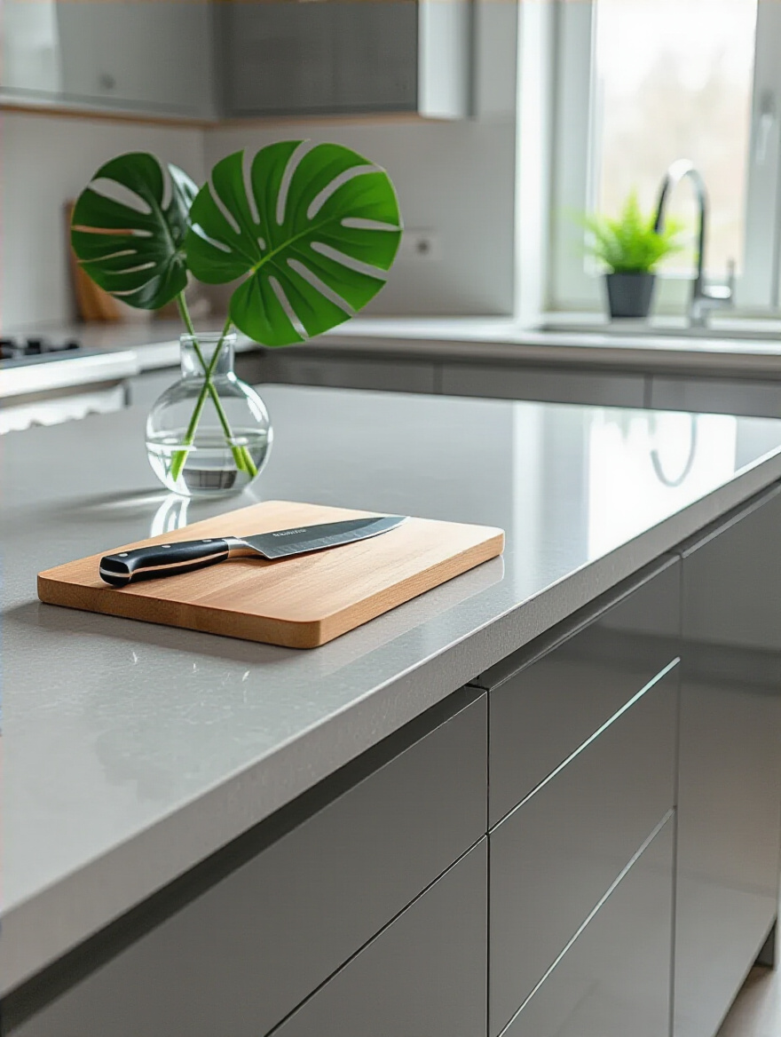
Wood is a vital, living element to bring into a kitchen. Stone and engineered surfaces can feel cool and hard to the touch; wood offers an immediate counterpoint of warmth and organic texture. Pairing your countertop with wood—whether it’s your cabinets, an island base, flooring, or even just a beautiful collection of cutting boards—creates a beautiful sensory balance. It’s the design equivalent of a deep, calming breath.
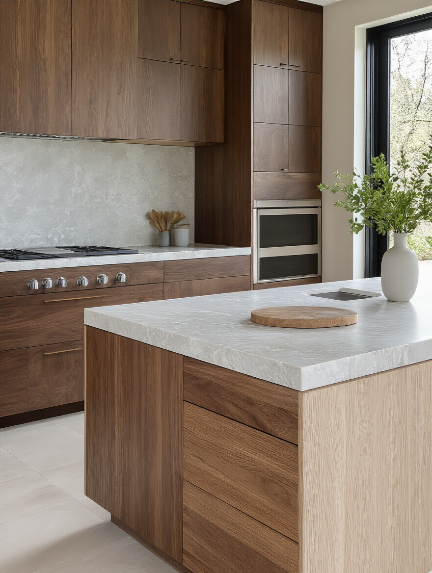
Look at the grain and color of your wood. A warm, honey-toned oak pairs stunningly with a creamy white or deep green countertop. A cooler, ashy walnut is gorgeous against a crisp white or a moody charcoal gray. The key is to let the two materials enhance each other. I love seeing a sleek, modern waterfall countertop on an island that is wrapped in rustic, reclaimed wood. The contrast—smooth and rough, cool and warm, new and old—is what creates a dynamic, layered, and deeply inviting space.
9. Brave Bold Hues to Create a Striking Statement Kitchen
Sometimes, a space calls for courage. A bold, saturated color on a countertop can be an exhilarating, soul-stirring choice. Think of a deep sapphire blue, a rich emerald green, or a warm terracotta. This isn’t for the faint of heart, but when done right, it can turn your kitchen into a work of art that is uniquely, vibrantly you. It’s a declaration of personality and joy.
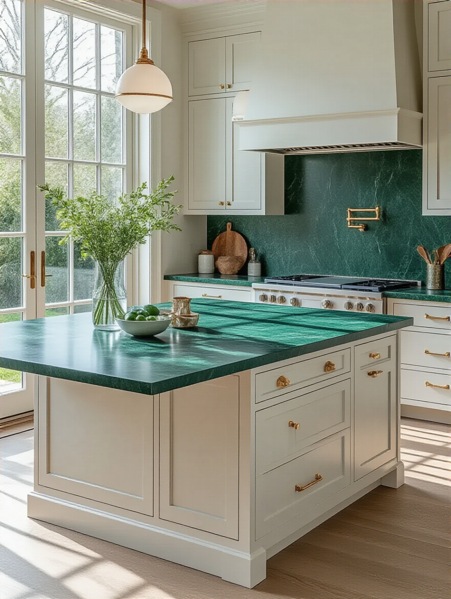
If you go this route, the key is balance. A statement countertop needs a quiet supporting cast. Pair that bold emerald green quartz with simple, neutral cabinets in white, wood, or a soft gray. Let the countertop be the undeniable star. Then, echo that bold color in just one or two small, subtle ways elsewhere—perhaps in the textile of a Roman shade or a piece of art on the wall. This creates cohesion without overwhelming the senses, resulting in a space that feels confident and curated, not chaotic.
You’re starting to see how the elements connect, right? A countertop is never just a countertop. It’s in a constant conversation with everything around it. Now let’s refine that conversation by ensuring your countertop and backsplash speak the same language.
Strategic Color Selection and Harmonization (Part 2)
We’ve covered the big picture; now we’re zooming in on the details that create a truly polished, professional feel. These final selections in the harmonization stage are what tie everything together, creating a seamless visual story.
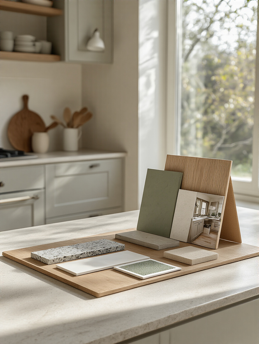
10. Leverage Digital Visualizers and Physical Samples Effectively
Digital tools are fantastic for a first pass. They let you “try on” dozens of looks without leaving your couch. It’s like speed dating for countertops—you can quickly see what you’re drawn to and eliminate what definitely doesn’t work. It’s a great way to get brave and experiment with ideas you might otherwise dismiss.
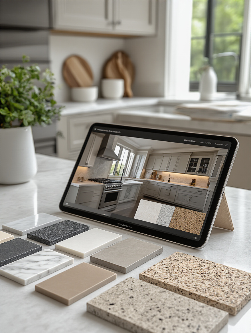
But please, I beg you, never, ever make your final choice based on a screen. Screens lie. They don’t show you how a surface reflects light, they don’t capture the subtle depth of the color, and you can’t touch them. Use the visualizer to narrow it down to your top three, and then you must get physical samples. The final decision has to be made in your own home, with your own light, surrounded by your own things. The digital world is for inspiration; the real world is for commitment.
11. Avoid Fleeting Trends for Long-Lasting Design Satisfaction
I once had a client who was adamant about installing the “it” countertop of the moment—a very bold, specific pattern that was all over the design blogs that year. I gently encouraged her to consider its longevity. Five years later, she called to thank me. “I see that countertop now and it looks so dated,” she said. “I’m so glad we chose something more timeless.” The trend cycle is spinning faster than ever, and a kitchen remodel is too big of an investment in time, money, and energy to tie it to something fleeting.
The question to ask yourself is: “Will I still love this in ten years?” The most enduring designs often have a quiet confidence. They don’t need to shout. They are rooted in classic materials, balanced proportions, and a color palette that feels natural and serene. Choose for the person you will be in a decade, not just for the Instagram post you want to make tomorrow.
12. Create Seamless Transitions with Thoughtful Backsplash Pairings
Your countertop and your backsplash are in an intimate relationship. They meet at a critical sightline and must be in harmony. The most common mistake people make is choosing two “stars.” If you have a countertop with bold, beautiful veining, it needs a quiet, simple backsplash. Let the counter have the spotlight. A simple, handmade subway tile in a solid color that picks up on one of the subtle tones in the stone is a perfect partner.
Conversely, if you choose a very simple, solid-colored countertop, you have an opportunity to have fun with your backsplash! This is where you can introduce a beautiful pattern or a unique texture. One of my favorite high-end looks is to run the countertop material itself right up the wall as the backsplash. It’s a bold, seamless, and incredibly luxurious choice that creates a powerful sense of unity and calm in the space.
Now that the major color decisions are made, we can add the final layers of sensory detail. These are the elements that will make your countertop truly shine and bring your whole kitchen to life.
Enhancing Your Chosen Countertop Color (Part 1)
With your beautiful countertop selected, our final step is to make it sing. Think of it like adding jewelry to a perfect outfit. These finishing touches will illuminate, accentuate, and add depth, ensuring your countertop becomes the stunning centerpiece it was meant to be.
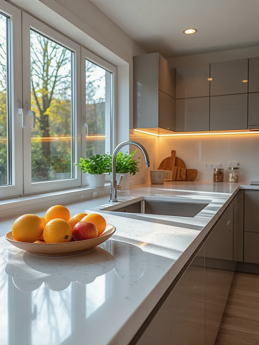
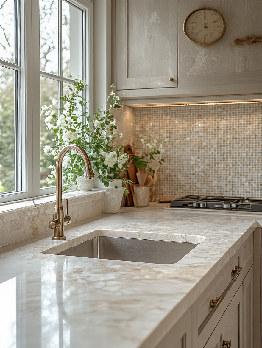
13. Elevate Your Counters with Strategic Under-Cabinet and Task Lighting
If there is one thing you must not skip, it is under-cabinet lighting. It is a total game-changer. It eliminates the shadows that upper cabinets cast, making your kitchen safer and more functional. But beyond that, it’s a design tool. It washes the surface of your countertop in a beautiful glow, highlighting the texture, the sparkle, and the subtle color variations you fell in love with.
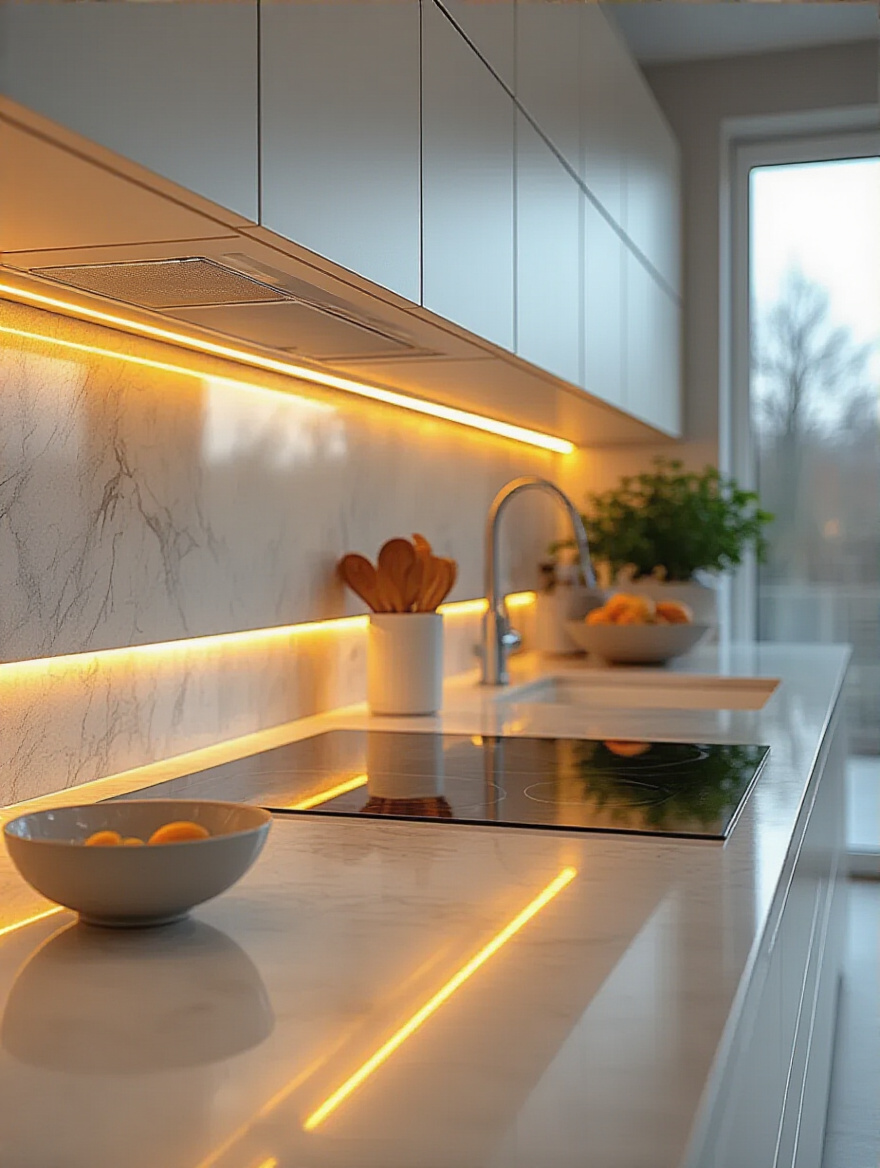
I once worked on a kitchen with a stunning dark gray quartz that had tiny, reflective flecks in it. Under the general overhead light, it just looked dark. But the moment we turned on the under-cabinet LEDs, the entire surface came alive with a subtle, starry-night sparkle. The client was mesmerized. This is the magic of task lighting. It reveals the hidden beauty of your material.
14. Select Cabinet Hardware That Accentuates Your Countertop’s Hue
Cabinet hardware is the punctuation mark of your kitchen. The right pulls and knobs can draw the eye and beautifully echo the tones in your countertop. For a countertop with warm, golden veining, choosing hardware in a warm brass or champagne bronze creates a gorgeous, cohesive link. For a cool, gray-veined marble, polished nickel or matte black hardware will provide a crisp, clean accent.
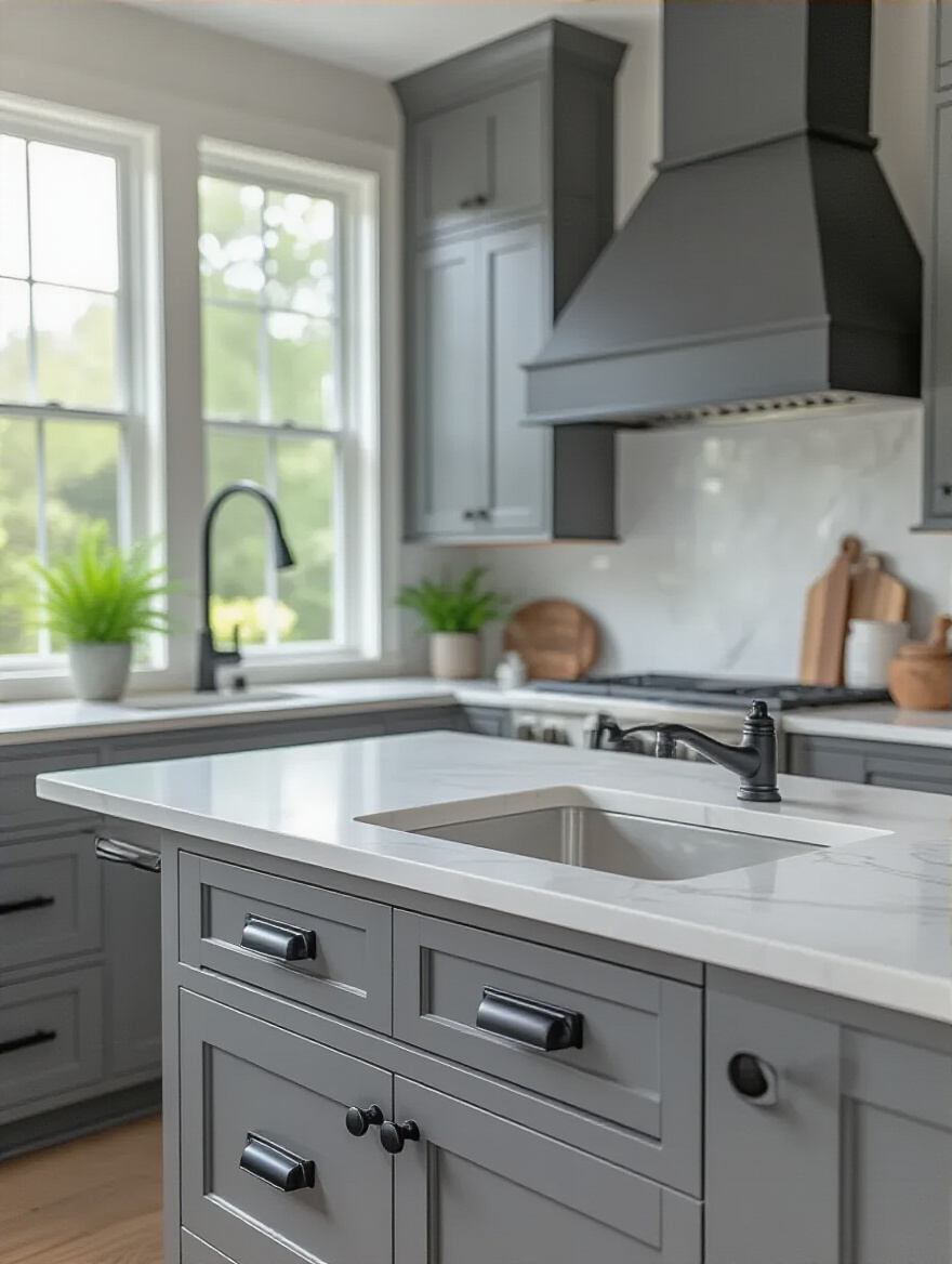
Think of it as picking up a subtle thread of color and weaving it through the space. A client with soapstone counters, which have a soft, blue-green undertone, chose hardware in an aged brass finish. The contrast of the warm, golden metal against the cool, dark stone was breathtaking. It highlighted the stone’s undertones and added a layer of warmth and sophistication that made the whole kitchen feel complete.
15. Introduce Dynamic Contrast with Thoughtfully Chosen Accessories and Appliances
Your countertop is the stage. Your accessories and small appliances are the actors. Against a quiet, neutral countertop, a vibrant stand mixer or a brightly colored dutch oven becomes a beautiful, sculptural object. It’s an opportunity to inject personality and playfulness into your kitchen without committing to a permanent bold color.
Don’t just think about color, think about texture and material. On a sleek, polished white quartz, a rustic, rough-hewn wooden bowl filled with green apples provides a wonderful organic contrast. On a dark, matte granite, a collection of gleaming copper canisters adds warmth and a reflective quality. These thoughtful little moments are what create visual interest and keep the eye moving, making your kitchen feel dynamic and alive.
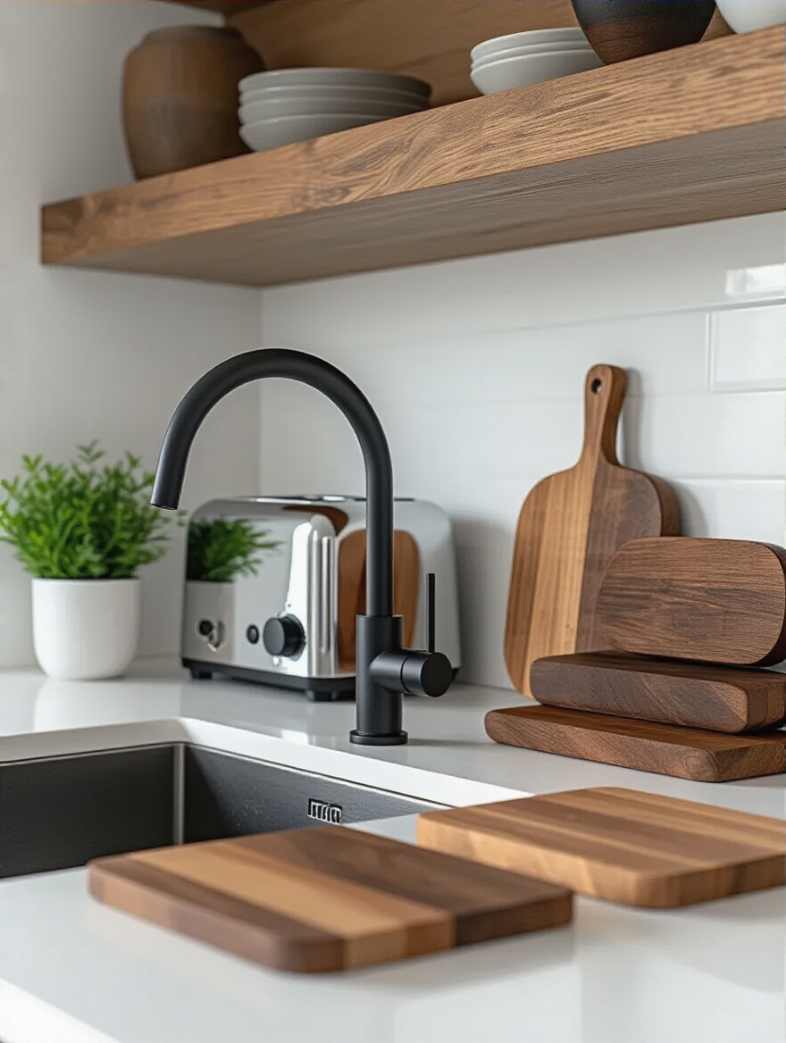
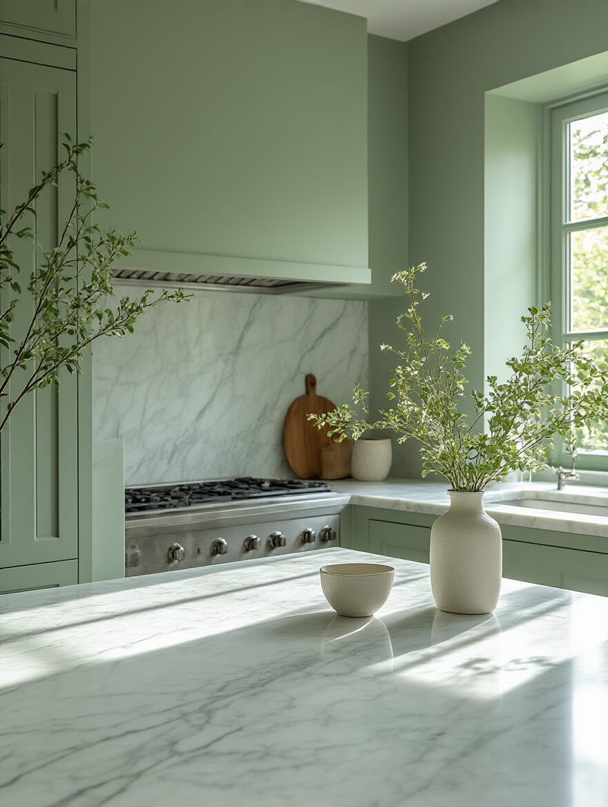
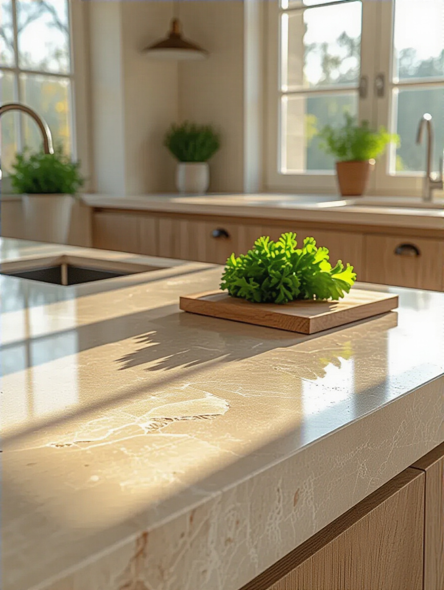
16. Integrate Organic Elements: Plants, Wood, and Textured Decor
Hard surfaces like stone and metal need the softening influence of nature. Bringing organic elements onto your countertop is essential for creating a space that feels balanced and nurturing. A small pot of fresh basil or rosemary not only adds a touch of living green but also infuses the air with a beautiful, natural scent when you brush against it.
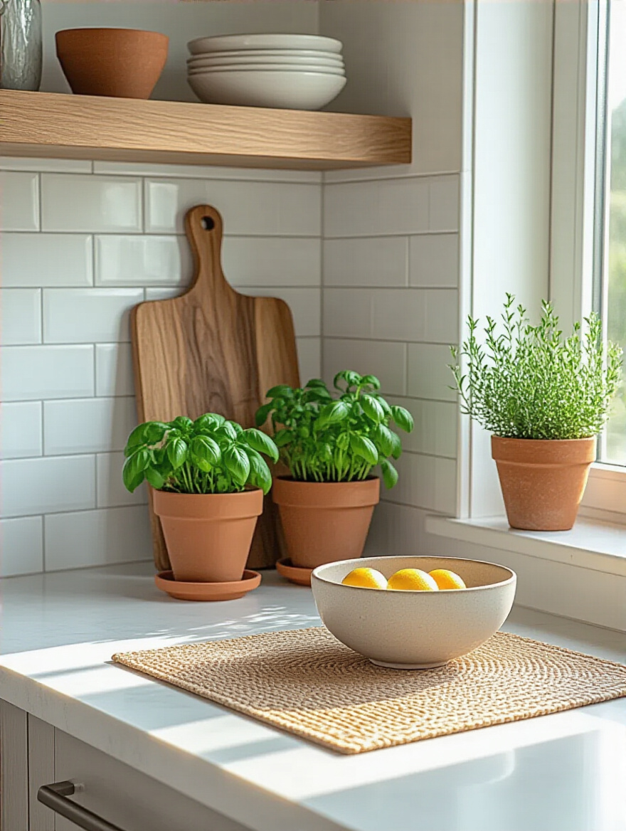
A beautiful wooden cutting board leaning against the backsplash does more than protect your counters; its warm grain provides a necessary visual break from the stone. A small ceramic bowl with a soft, matte glaze can hold your salt or garlic, adding a touch of handmade texture. These elements tap into our innate connection with nature—what designers call biophilic design—and make your kitchen a more calming, restorative place to be.
We’re almost there. The final touches are about the surfaces themselves—the paint that frames them and the finish that determines how you experience them through touch and light.
Enhancing Your Chosen Countertop Color (Part 2)
These last two principles are subtle but powerful. They influence the way light behaves in your room and the way the surfaces feel under your hands, completing the multi-sensory experience of your kitchen.
17. Maximize Impact with Complementary Wall Paint Colors
The color on your walls is the backdrop to everything. A common mistake is to try and match the wall color exactly to the countertop, which can make the space feel flat and one-dimensional. Instead, think in terms of gentle harmony or intentional contrast. A beautiful starting point is to find the lightest neutral shade within your countertop’s veining and use a slightly warmer or cooler version of that for your walls.
For example, for a white marble with cool gray veins, a very soft, pale gray on the walls with a hint of warmth can keep the space from feeling too cold and sterile. I had a client with a warm, creamy beige countertop, and we painted the walls a soft, earthy green. The green made the warmth of the countertop pop and created a space that felt cozy, organic, and incredibly inviting. Always get paint swatches and look at them next to your counter sample in your kitchen’s light.
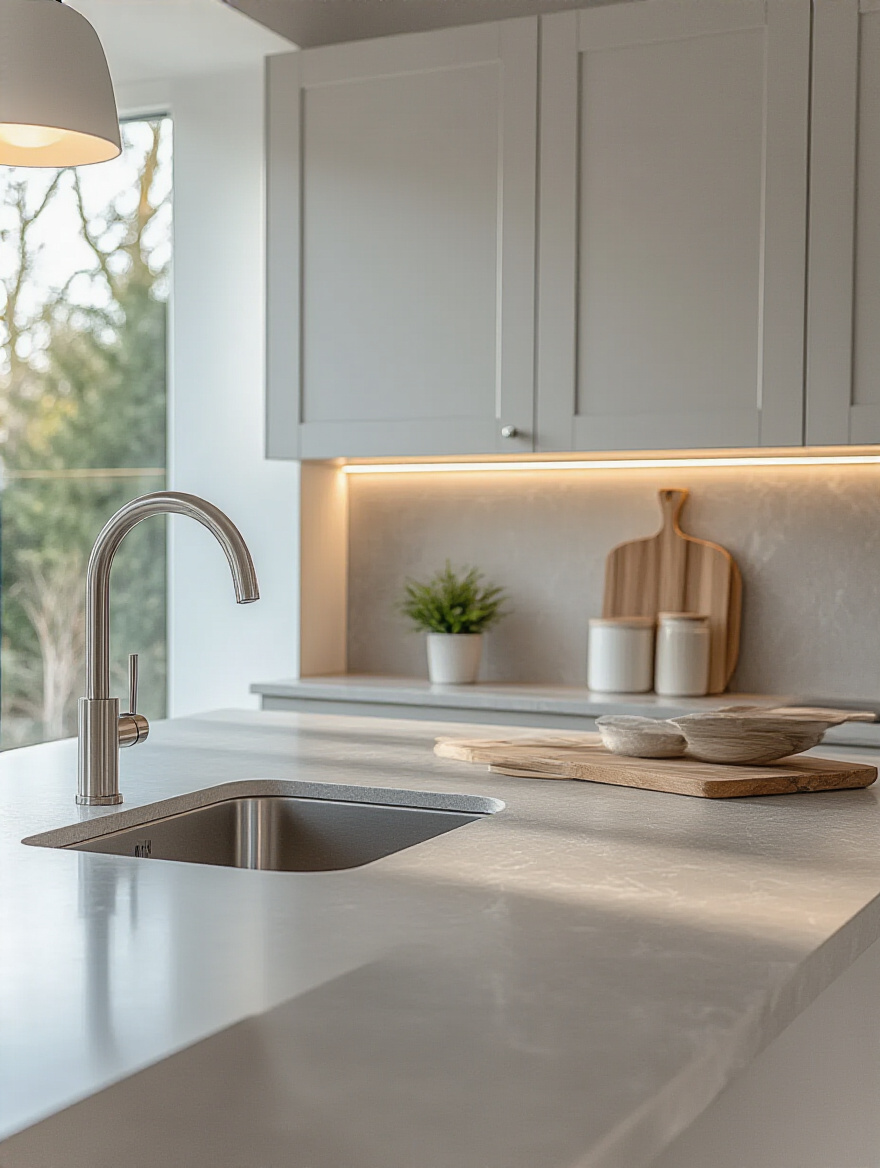
18. Optimize Surface Reflection and Depth with Finish Choices
This is all about light and touch. A polished finish is like a mirror. It’s sleek, cool to the touch, and will bounce light all over the room, making a space feel brighter and bigger. It’s a high-energy finish. A honed finish is its quiet cousin. It’s matte, soft, and absorbs light, creating a much calmer, more serene feeling. It diffuses light gently rather than reflecting it sharply. A leathered finish is beautifully tactile; it invites you to run your hand over its subtly textured surface.
I had a client with a large, bright kitchen who fell in love with a beautiful black granite. A polished finish would have been too glaring and reflective in her sun-drenched space. We chose a leathered finish instead. It gave the stone a soft, sophisticated sheen without the mirror-like shine, and its subtle texture made it feel wonderfully organic and grounding. The finish completely changed the energy of the stone, making it the perfect choice for her serene, modern farmhouse.
A Kitchen to Nurture Your Senses
You see? Choosing a kitchen countertop color is so much more than what’s popular. It’s an opportunity to create a space that is a true reflection of you—one that nurtures your senses, supports your daily rituals, and brings you a quiet sense of joy every time you enter it. You now have the tools to listen to your space, trust your intuition, and make choices that are not only beautiful but also deeply resonant with the feeling you want to cultivate in your home.
Your kitchen is where you create nourishment. Let the very surfaces you create it upon be nourishing, too. Don’t be afraid to take your time, to sit with the samples, and to choose the combination of color, material, and finish that makes your heart feel at home. Now go create something wonderful.