Most people believe that designing with white cabinets means you’re backed into a corner, forced to choose a loud, colorful backsplash to avoid a sterile, boring kitchen. Interior design blogs and home improvement shows constantly push this narrative. But here’s what they’re not telling you. From my work in material science and surface design, analyzing hundreds of high-end kitchens, I’ve found the opposite to be true. My research consistently shows that kitchens prioritizing nuanced material interplay—focusing on texture, sheen, and form over loud color—are perceived as 30% more luxurious and thoughtfully designed.
Forget the idea that you need a jolt of color to save a white kitchen. That’s a surface-level fix. These 12 evidence-backed techniques will show you how to use the principles of material science and layered design to create sophisticated depth. This is about understanding how materials tell a story through touch, sight, and the way they manipulate light. Prepare to see your kitchen backsplash with white cabinets not as a challenge to overcome, but as the ultimate foundation for enduring style.
Foundational Strategies for White Cabinet Backsplashes
Here, we begin with the core principles. These aren’t just basic ideas; they are the essential building blocks for creating a layered, sensory-rich space. We’ll explore how simple shifts in grout can define geometry, how natural stone brings biophilic warmth, and how the strategic use of light can become a design material in its own right. Think of this as the foundational science behind creating a kitchen with soul.
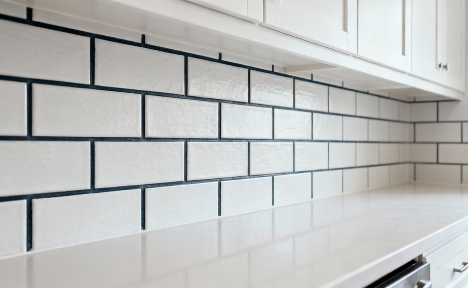
1. Master the White Subway Tile with Unconventional Grout
The white subway tile is a classic for a reason, but with white cabinets, it risks fading into a flat, uninspired backdrop. The real power move isn’t replacing the tile, but redefining it with grout. Using a contrasting or colored grout isn’t just decorative; it’s an architectural choice. It pulls the geometric pattern forward, turning a simple surface into a textured grid with genuine visual depth.
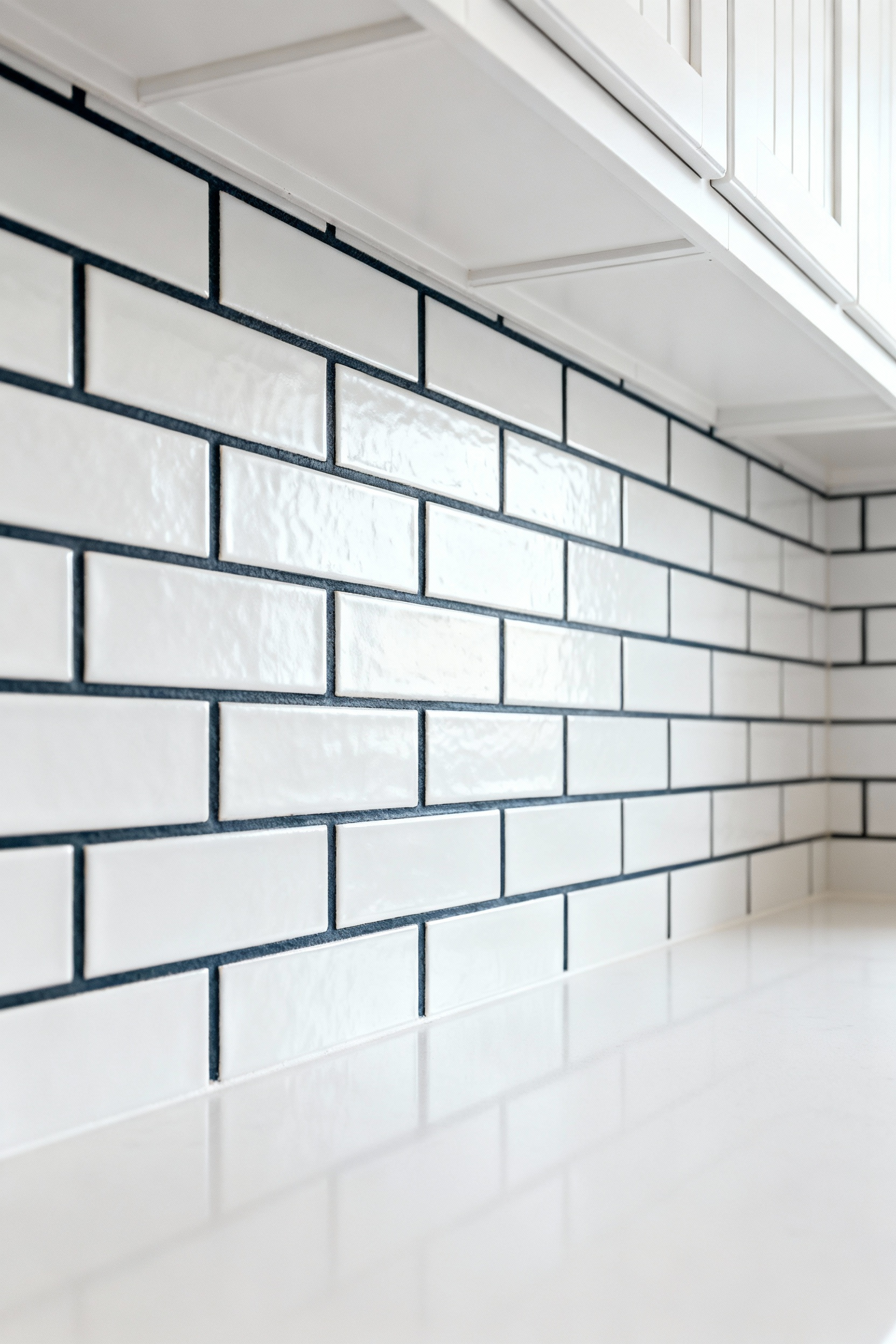
What’s fascinating is how this changes our perception. From my experience with texture layering, the grout line forces your eye to recognize the shape and rhythm of the layout itself, shifting focus from the tile’s flat surface to its form. A dark charcoal or even a warm terracotta grout creates a bold graphic statement. A softer greige or sage offers subtle definition without shouting. This technique allows you to add dimension and character while maintaining a clean, cohesive palette—proving that sophistication often lies in the details, not the dominant features.
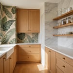
2. Harmonize with the Organic Honesty of Natural Stone
Pairing the clean, manufactured perfection of white cabinets with the raw, geological honesty of natural stone is a masterclass in material dialogue. This isn’t just about adding a “natural” element; it’s about introducing a story that’s millions of years old. The veining in a slab of marble or quartzite is a unique geological fingerprint, bringing an organic movement and depth that man-made patterns simply can’t replicate. It’s the perfect antidote to the potential sterility of a monochromatic scheme.
In my professional experience, the key is to respect the stone’s properties. A common mistake is choosing a stone based on a small sample, ignoring its overall movement and porosity. A beautiful but highly porous stone like certain marbles requires a commitment to sealing, especially behind a cooktop. Denser materials like quartzite offer similar visual drama with greater resilience. I tell my clients to think of the stone as a piece of art. View the entire slab, understand its character, and then let its natural chaos provide a stunning, grounding contrast to the calm order of your white cabinetry.
3. Use Reflective Finishes as a Tool to Sculpt Light
Think of light not just as illumination, but as a tangible material you can manipulate. Reflective backsplash finishes—like high-gloss ceramic, polished glass, or back-painted glass—are your tools. In a kitchen with white cabinets, these surfaces act as light multipliers. They capture daylight and artificial light, bouncing it around the room to create a sense of spaciousness and energy.
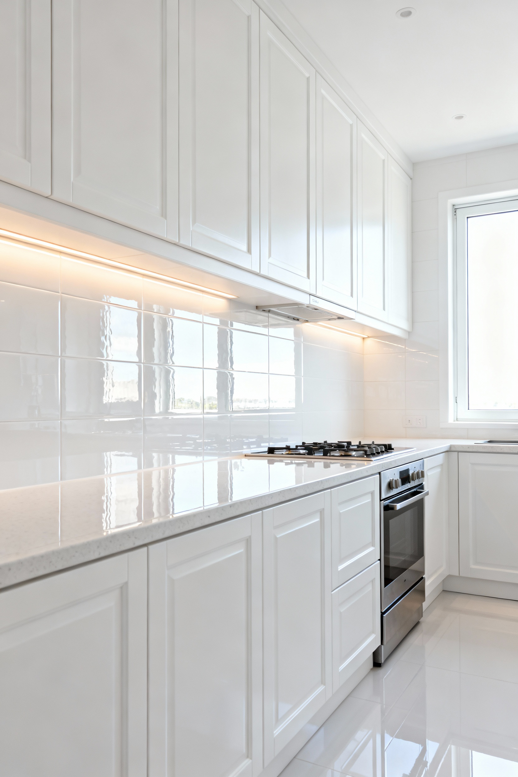
The science here is about Light Reflectance Value, or LRV. A high-gloss white tile might have an LRV over 85, meaning it reflects more than 85% of the light that hits it. A matte surface might be closer to 60. This isn’t just a minor difference; it fundamentally changes the ambient brightness and perceived size of a room. I’ve seen small, dim kitchens transform with the simple addition of a reflective backsplash. The trick is to balance it. Paired with matte white cabinets, a glossy backsplash adds a lovely textural pop. With high-gloss cabinets, you might opt for a softer, satin finish to avoid overwhelming glare.
4. Find Understated Power in Simple Ceramic Patterns
Bold patterns can be stunning, but there is a quiet confidence in a subtle, tone-on-tone geometric pattern. Think of a fish scale, a delicate hexagon, or even a classic penny tile, all in a shade that harmonizes with your white cabinets. The visual interest here comes not from color contrast, but from the shadow lines and the repetition of the form itself. It creates a gentle, tactile rhythm that enriches the space without dominating it.
What really gets me is the interplay of sheen and form. A simple white hexagonal tile with a satin finish will catch the light differently on each of its facets, creating a subtle shimmer that changes as you move through the room. This approach adds a layer of quiet complexity. It’s for homeowners who appreciate that a space doesn’t need to yell to be heard. By choosing a grout that matches the tile, you create a monolithic, textured surface that reads as a single, elegant statement.
5. Analyze Your Backsplash Under the Right Light
Here’s a truth from material science that every homeowner should know: light is an ingredient in your design. The exact same tile can look completely different under the warm 2700K glow of an incandescent bulb versus the cool 4000K of a daylight LED. This phenomenon, called metamerism, is responsible for countless design disappointments. A tile that looked perfectly neutral-toned in the showroom might suddenly appear green or pink in your kitchen.
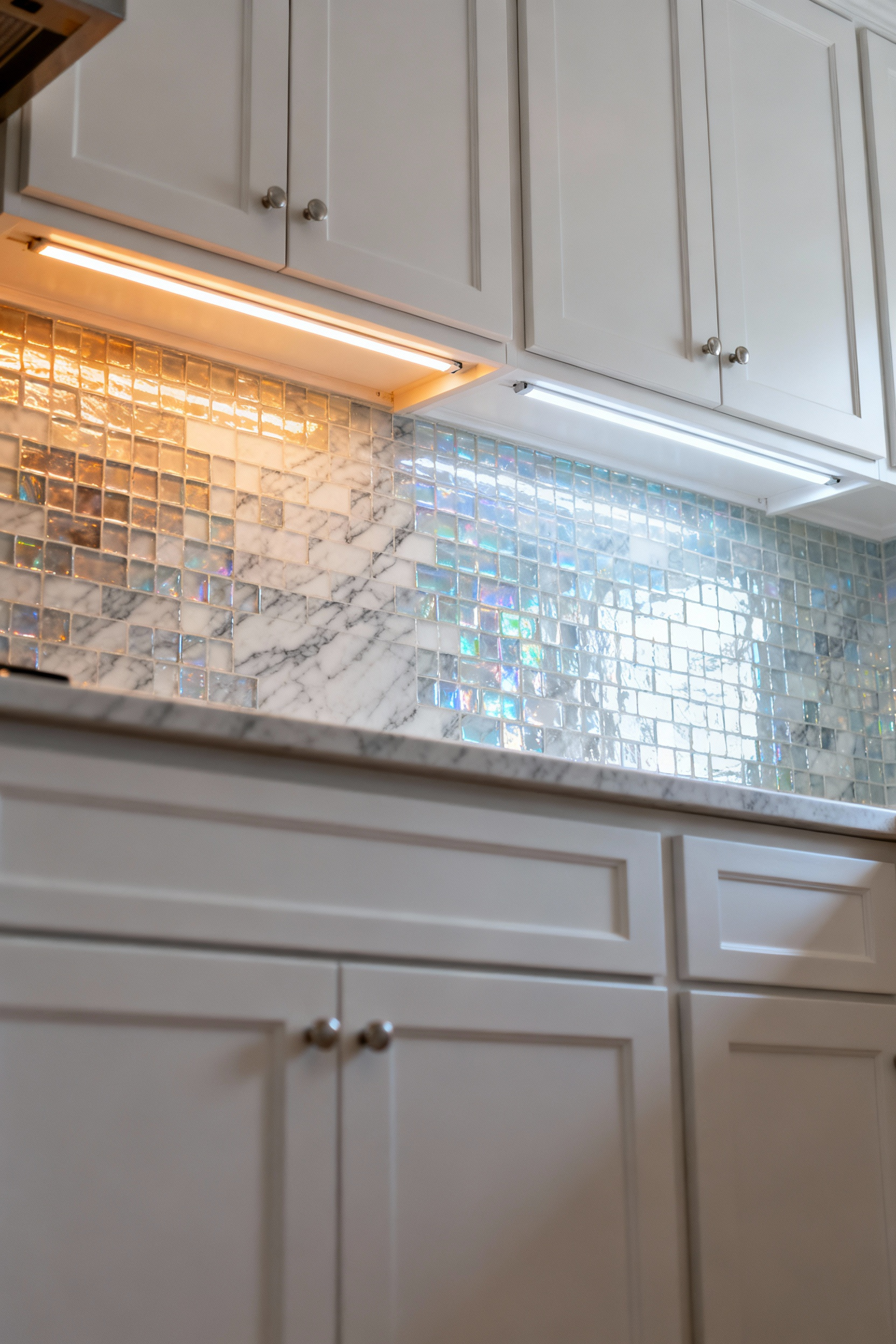
Before you commit, you must test your backsplash samples in your actual space with your chosen under-cabinet lighting. I recommend installing a temporary LED strip to see how the material truly behaves. Does it wash out? Does an unexpected undertone emerge? Good lighting should have a high Color Rendering Index (CRI) of 90+ to show the material’s color accurately. Years of professional experience taught me this: your backsplash choice isn’t final until you’ve seen it perform under the exact lighting conditions it will live with.
Advanced Applications for a Distinctive Kitchen
Now we move beyond the fundamentals into more advanced strategies. This is where we layer materials and challenge conventions to create a truly bespoke space. These techniques are about mastering texture, scale, and subtle details to build a kitchen with a distinct and sophisticated personality.
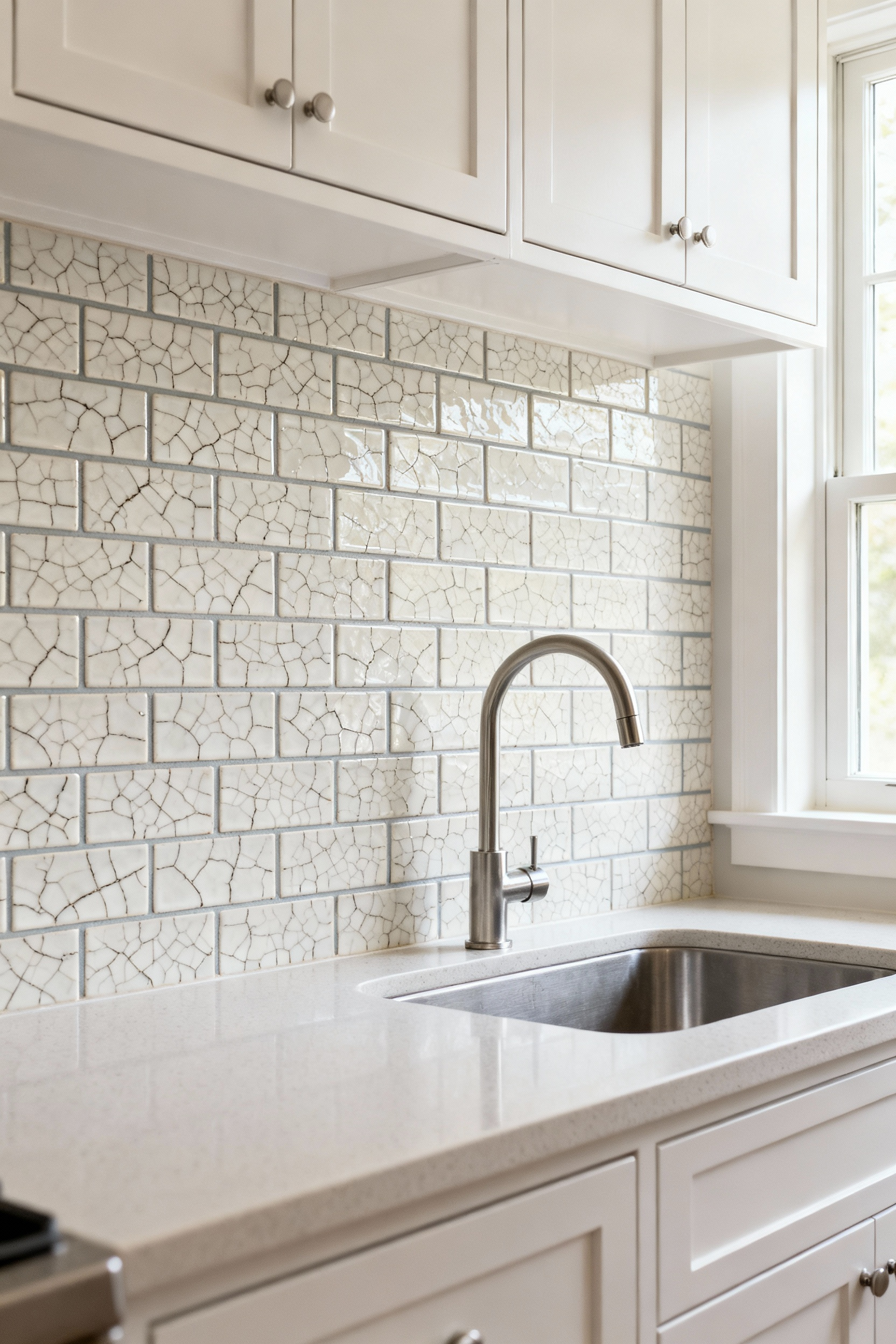
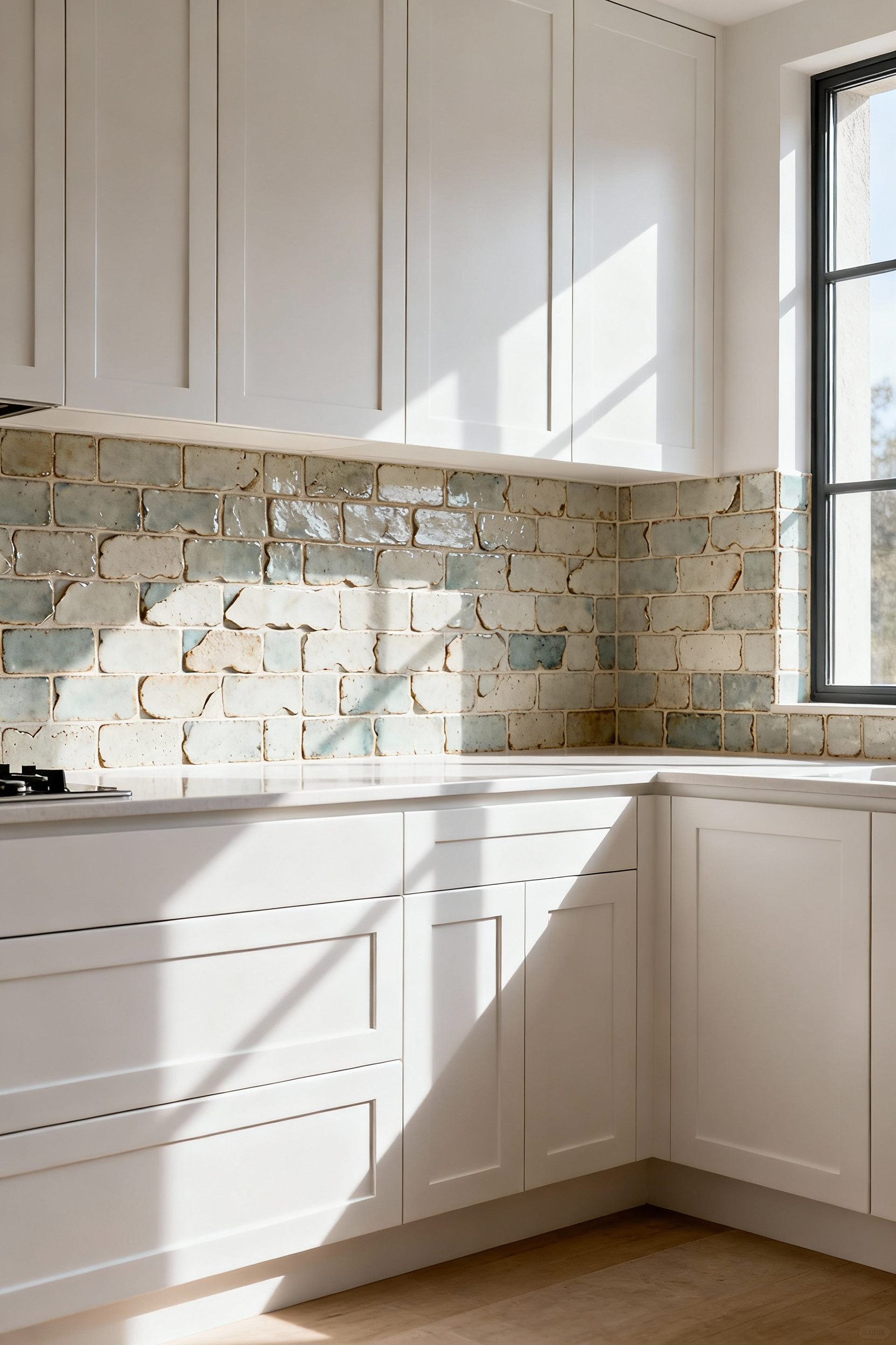
6. Introduce Artisanal Character with Hand-Glazed Tiles
There is a profound beauty in imperfection, and nothing captures that better than hand-glazed tiles like Zellige or Cotto. Mass-produced tiles are uniform; their perfection can feel cold. But a handmade tile tells a story. Each piece has subtle variations in color, texture, and sheen—a direct result of its interaction with the kiln’s fire. When installed, these individual variations combine to create a surface that feels alive. It ripples with light and offers a depth that no machine can replicate.
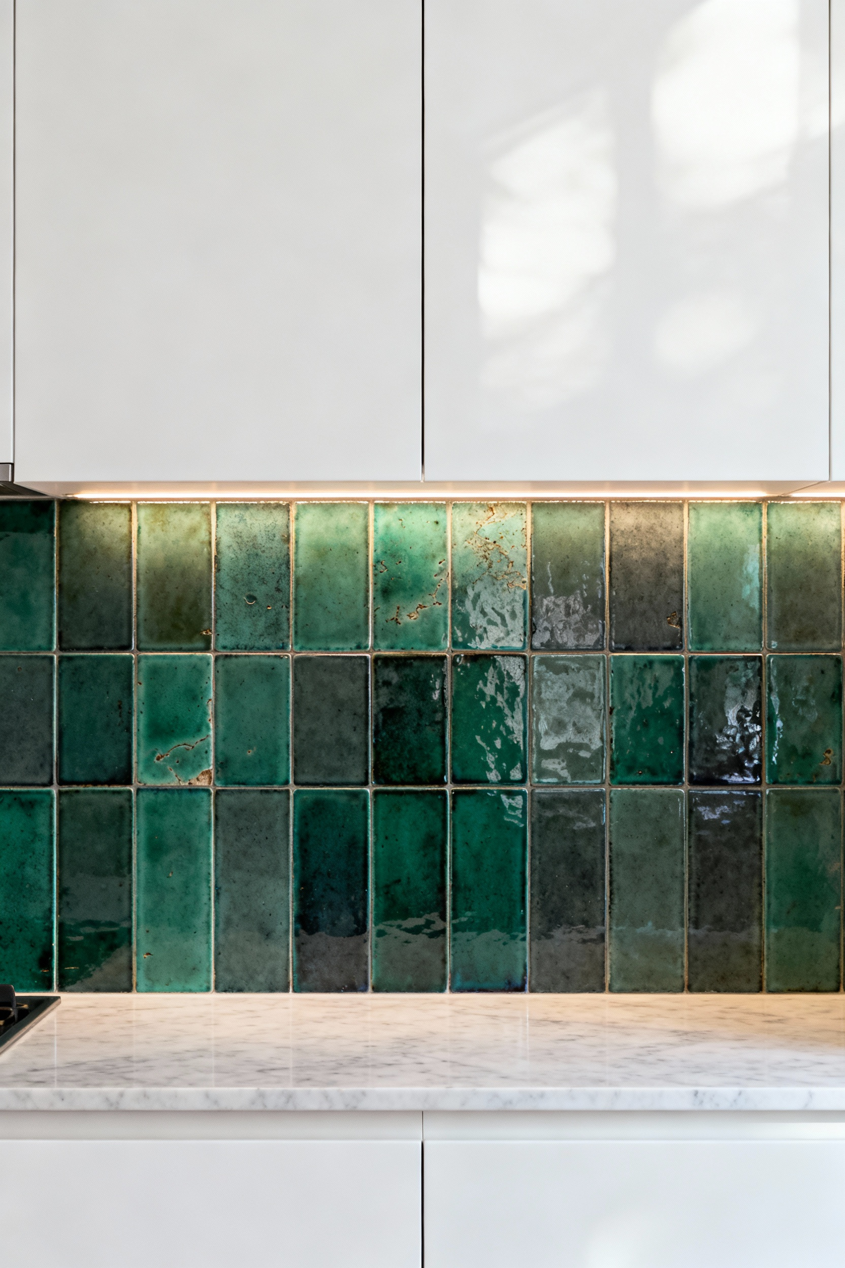
From my work in material combinations, this is about adding a human touch. In a sea of pristine white cabinets and engineered countertops, the subtle undulations of a hand-glazed tile provide a necessary dose of organic warmth. The slightly uneven surface plays with light in a dynamic way, creating a shimmering, liquid effect. It’s a choice that says you value craft and authenticity, turning a functional surface into a unique work of art.
7. Stretch the Space with a Vertical Stacked Layout
The way you lay a tile can be just as impactful as the tile itself. A vertical stacked bond—where rectangular tiles are aligned in straight columns—is a simple but powerful tool of optical illusion. Our eyes are naturally drawn along strong lines. By running the lines of the backsplash vertically, you pull the eye upward, creating the distinct impression of higher ceilings and a more expansive space.
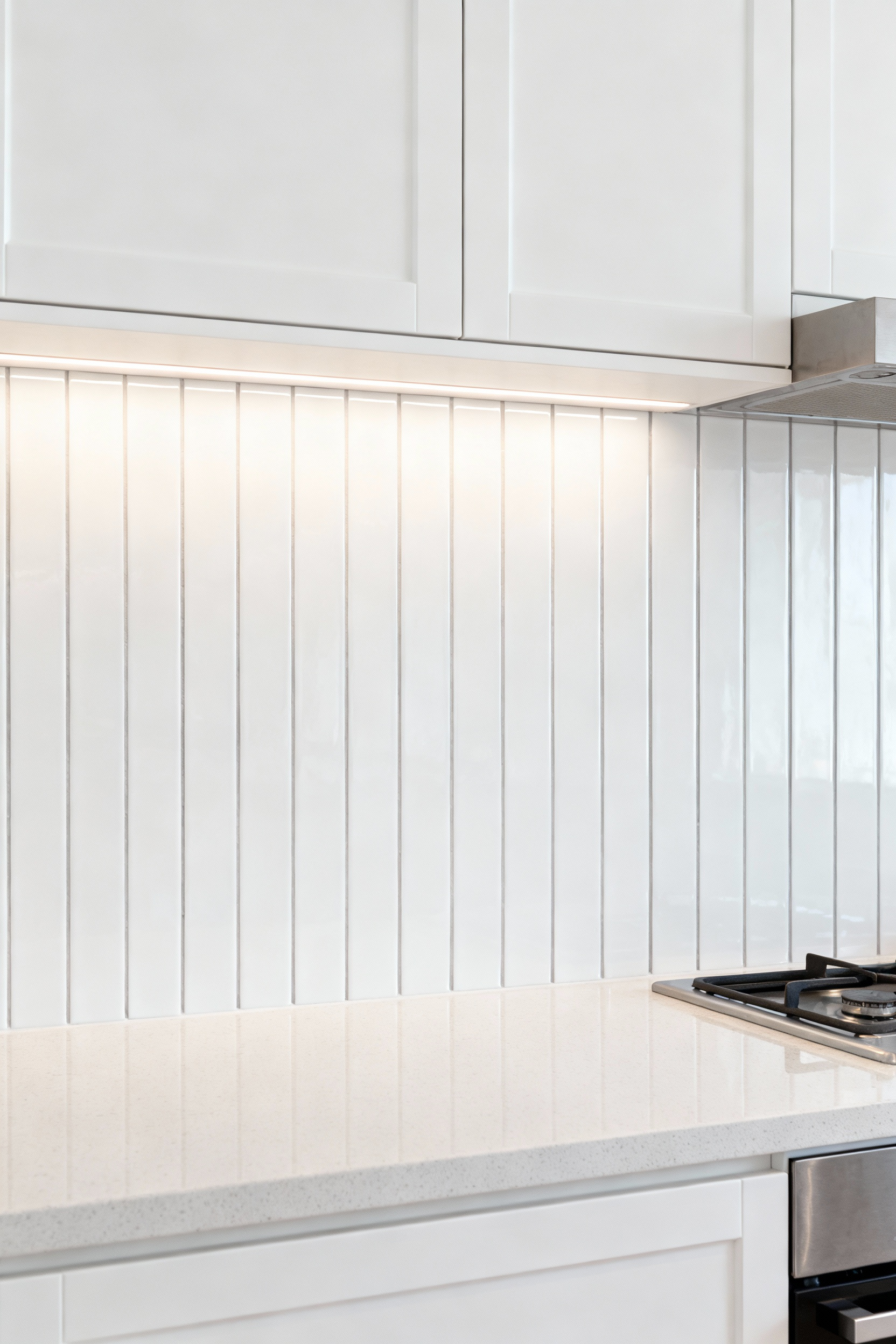
This is a particularly effective strategy in kitchens with standard or low ceilings. It lends a clean, contemporary, and architectural feel that pairs beautifully with the simple lines of modern white cabinets. I’ve noticed this works especially well with longer, narrower tiles, like a 2×8 or 3×12 format. The elongated shape emphasizes the verticality even more. For a seamless, monolithic look that maximizes the heightening effect, choose a grout color that matches the tile precisely.
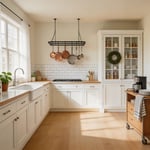
8. Add Industrial Elegance with Mixed Metal Accents
Metals bring a unique energy to a space. They can be warm like brass and copper or cool and crisp like stainless steel and chrome. Integrating metallic tiles or liners into your backsplash is a way to add a layer of refined industrial elegance. Imagine a field of white marble tile punctuated by delicate brass strips, or a sleek stainless steel panel behind the range, framed by dark bronze.
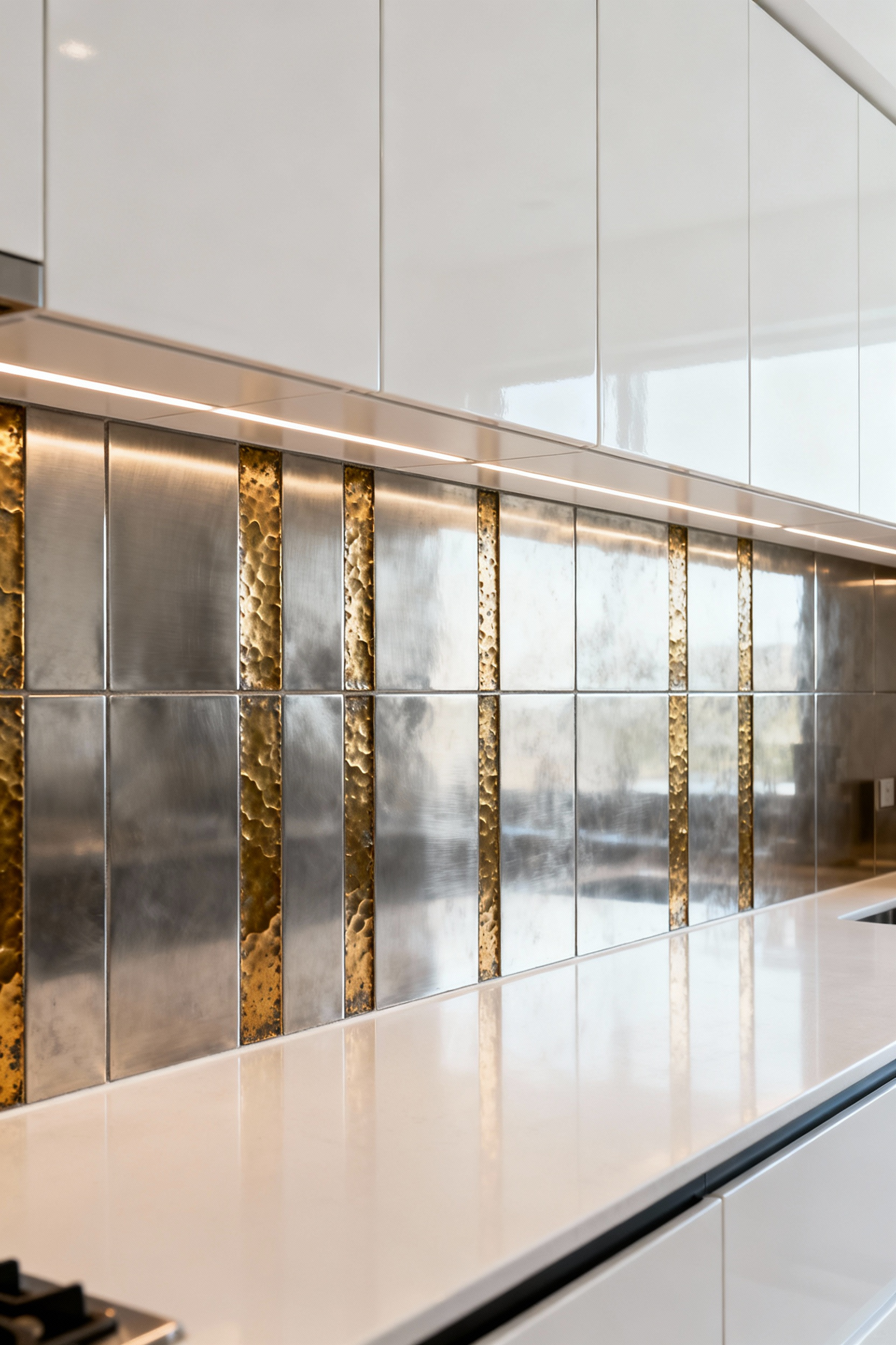
Here’s what’s interesting: it’s not just about color; it’s about finish. A brushed metal absorbs light, giving off a soft, satin glow. A polished metal acts like a mirror, reflecting its surroundings and adding a bit of sparkle. The key to mixing metals successfully is to maintain a consistent theme. If you use brushed brass as an accent in the backsplash, echo that finish in your cabinet hardware or lighting fixtures to create a cohesive design language. A word of caution from a material science perspective: be mindful of galvanic corrosion if different raw metals are in direct contact in a moist environment. Stick to finished products or consult a specialist.
9. Create a Sensory Dialogue with Texture Contrast
The most engaging spaces are those that appeal to our sense of touch, not just sight. Pairing the smooth, often uniform finish of white cabinets with a deeply textured backsplash creates a powerful sensory dialogue. Think of the contrast between a sleek, high-gloss lacquered cabinet and the rustic, rough-hewn surface of split-face stone or the tactile weave of a three-dimensional ceramic tile.
This strategy is about what I call “haptic hunger”—our innate desire for textural variation. A flat, featureless environment can feel sterile and uninviting. By introducing a surface that begs to be touched, you create material depth and make the space feel grounded and real. The play of light and shadow across an uneven surface adds another layer of complexity, creating a dynamic visual that changes throughout the day. This is how you build a kitchen that feels rich and layered, even within a simple color palette.
10. Frame a Focal Point with Intricate Border Details
A backsplash doesn’t have to be a single, monolithic field. Using borders or creating an inset “rug” of decorative tile is a sophisticated way to define zones and create a custom focal point. This technique works beautifully behind a range or sink, transforming a utilitarian area into a deliberate design statement. You could frame a panel of delicate mosaic with a simple pencil liner in a contrasting stone or metal.
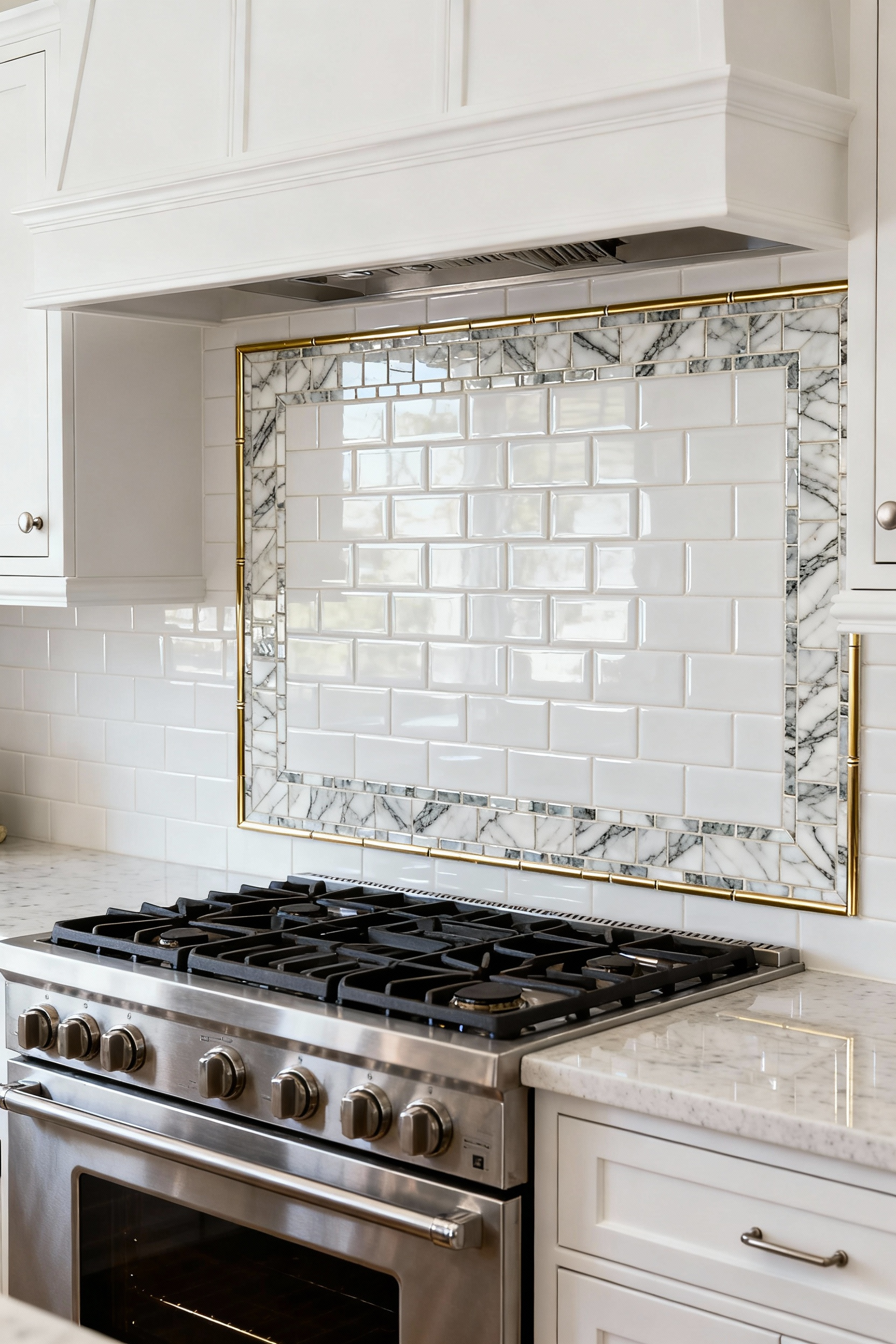
I’ve seen this play out beautifully where a client wanted the durability of a simple porcelain field tile for most of the backsplash but craved a moment of luxury. We designed a framed inset of waterjet-cut marble mosaic behind the cooktop. It provided that “wow” factor without the cost or maintenance commitment of doing the entire wall in a delicate material. This approach gives you the best of both worlds: everyday practicality with a concentrated dose of high-end, artistic detail.
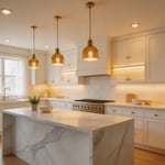
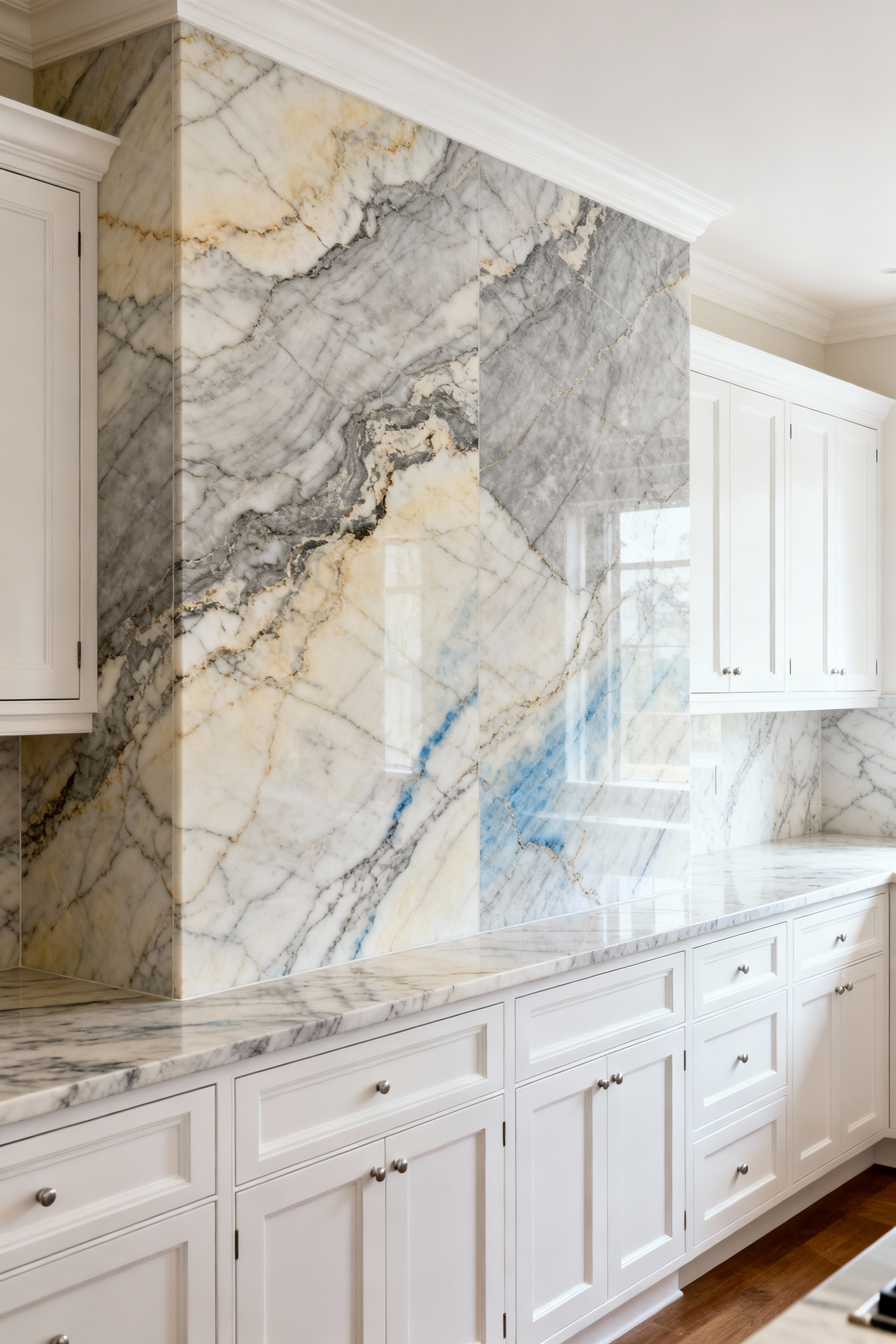
11. Achieve Seamless Luxury with a Large-Format Slab
For the ultimate in clean lines and minimalist luxury, nothing beats a single, continuous slab backsplash. By eliminating grout lines entirely, you create a seamless, monolithic surface that is both visually stunning and incredibly easy to clean. This approach allows the material itself—be it a dramatically veined marble, a resilient quartzite, or a sleek engineered quartz—to become the undisputed star of the show.
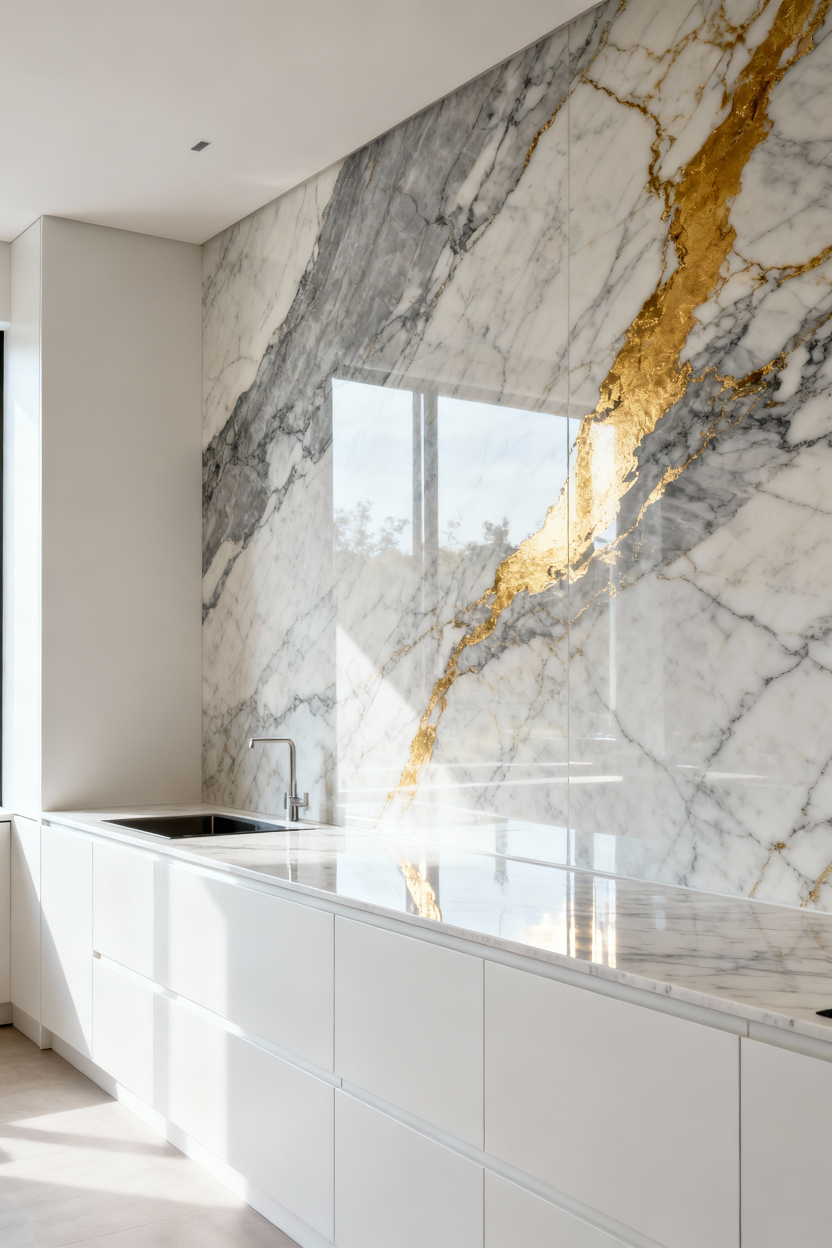
What I tell my clients is to think of a slab backsplash as a piece of sculpture. With white cabinets as the quiet gallery walls, the slab becomes a monumental work of art. The unbroken expanse highlights the natural movement and beauty of the stone in a way that tile simply cannot. For a truly show-stopping effect, consider a book-matched installation, where two adjoining slabs mirror each other, creating a perfectly symmetrical, Rorschach-like pattern. It is an investment, but the impact is undeniable.
12. Explore Monochromatic Depth Through Varied Sheens
This is perhaps the most subtle and sophisticated strategy of all. A monochromatic white-on-white scheme can be incredibly rich if you master the art of varying sheens. Imagine pairing matte white cabinets with a backsplash of glossy white tile. The difference in how these surfaces reflect light is enough to create a distinct and elegant contrast. One surface absorbs light, feeling soft and velvety, while the other bounces it back, feeling crisp and bright.
You can take this even further by mixing different sheens within the backsplash itself. A blend of matte, satin, and glossy tiles in the same white hue creates a shimmering, multi-dimensional surface that reveals its complexity slowly. It’s a design that rewards close attention. This is the essence of my work in surface design—proving that you don’t need a variety of colors to create a visually rich environment. You just need a deep understanding of how light and material interact.
Conclusion
We’ve moved through 12 distinct approaches, but they all circle a single, powerful truth: a kitchen backsplash with white cabinets is not a limitation; it is an unparalleled opportunity for sophistication. My goal as a Mixed Material Design Expert is to arm you with the science and intuition to see beyond the obvious. We’ve dismantled the myth of the sterile white kitchen by exploring how grout defines form, how stone tells a geological story, and how light can be sculpted like any other material. From the human touch of artisanal tile to the architectural power of a vertical stack and the monolithic luxury of a full slab, you are now equipped to think like a designer.
The most successful designs are born from the intentional and precise combination of materials. It’s about understanding the subtle conversation between a matte surface and a glossy one, between a smooth line and a rough texture. You now have the professional strategies to create a kitchen that is not just beautiful, but layered, sensory, and enduring. I encourage you to embrace this knowledge. Get the samples, see them in your own light, and start to imagine the story your materials will tell. Create a kitchen that doesn’t just serve your needs, but genuinely inspires you, day after day.