In the world of cottage kitchens, where timeless charm and cozy ambiance reign supreme, the careful selection of hues holds the power to transform a space from ordinary to extraordinary. Beyond mere aesthetics, the colors we embrace can shape the very mood and atmosphere of this cherished gathering place, evoking emotions that linger long after the last dish has been washed and put away.
As we embark on a journey through the enchanting realm of cottage kitchen color palettes, we invite you to embrace a philosophy that celebrates the marriage of tradition and modernity. Drawing inspiration from the enduring elegance of colonial and Georgian Revival styles, we will explore the art of curating hues that not only delight the senses but also pay homage to the rich tapestry of our architectural heritage. From the serene embrace of soft pastels to the rustic warmth of natural wood tones, each color palette holds the promise of creating a space that is both visually captivating and deeply personal.
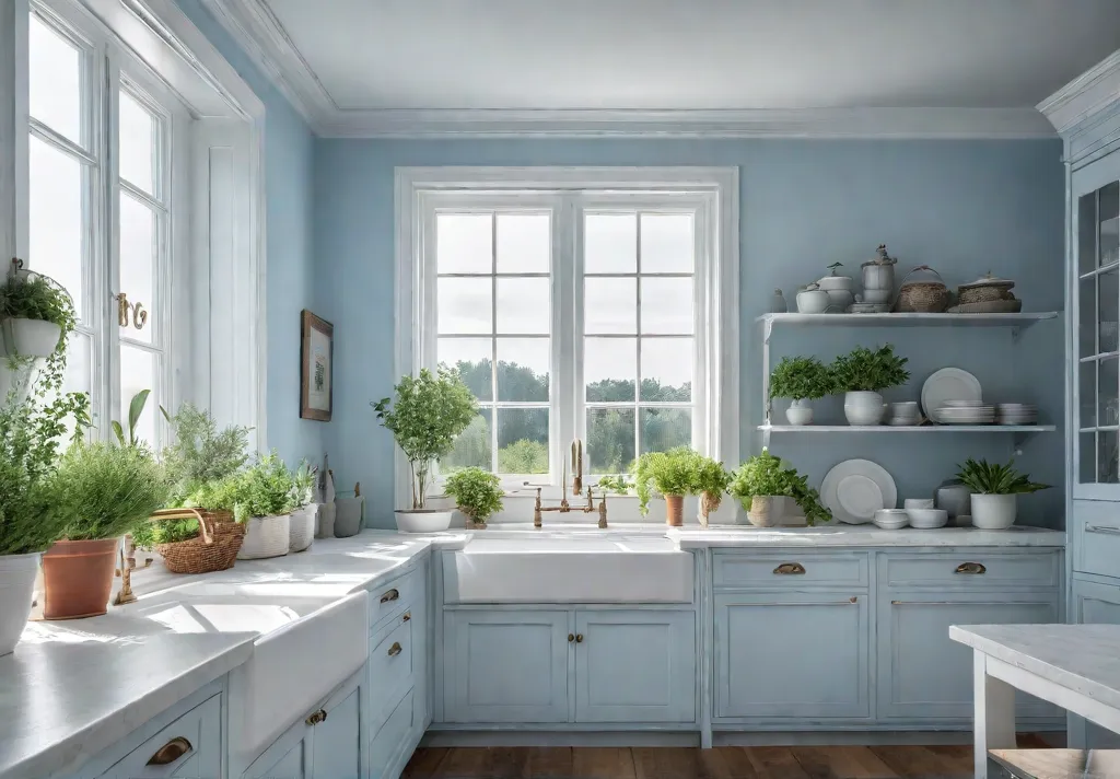
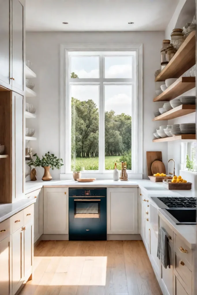
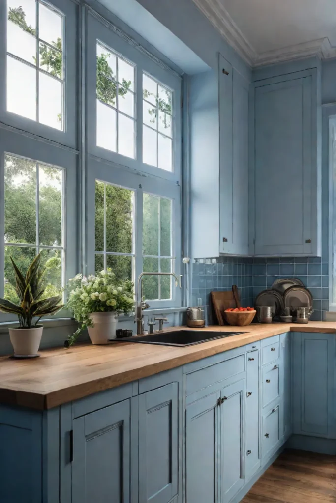
The Power of Light and Airy
The charm of a cottage kitchen lies in its cozy, intimate ambiance. However, smaller spaces can often feel confined and dark, especially in kitchens with limited natural light. Embracing light and airy hues is a strategic solution to combat this challenge, creating an illusion of spaciousness while maximizing the reflection of available light.
Best Light and Airy Hues for Cottage Kitchens
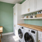
When selecting light and airy colors for your cottage kitchen, consider soft whites, pale neutrals, and muted pastels. These hues have a natural ability to make a space feel brighter and more open. Some timeless options include:
- White Dove: A warm, creamy white that radiates a welcoming glow.
- Chantilly Lace: A delicate, airy white with subtle gray undertones.
- Pale Smoke: A whisper of a gray that adds depth without heaviness.
Pairing Light and Airy Colors with Other Elements
While light and airy hues are the foundation for creating a sense of airiness, thoughtful pairing with other elements is key to achieving a cohesive and visually appealing cottage aesthetic. Consider incorporating natural wood countertops, vintage light fixtures, and pops of color through accent pieces or a vibrant backsplash.
To ensure your light-filled kitchen doesn’t veer into sterile territory, embrace texture and warmth through the strategic use of materials and finishes. Opt for a matte or eggshell paint finish to minimize glare, and incorporate cozy textiles like linen tea towels or a rustic rug to add depth and character.
For north-facing kitchens that struggle with natural light, consider colors with warm undertones, such as creamy whites or soft beiges. These hues will counteract the cooler light, creating a welcoming and inviting atmosphere.
Light and airy colors are a foolproof choice for small cottage kitchens, but their true magic lies in the thoughtful pairing with other elements. By embracing texture, warmth, and strategic pops of color, you can create a serene and inviting space that embodies the essence of cottage charm.
In the next section, we’ll explore the calming allure of pastel perfection, where soft hues take center stage in creating serene spaces.
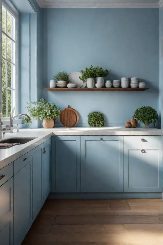
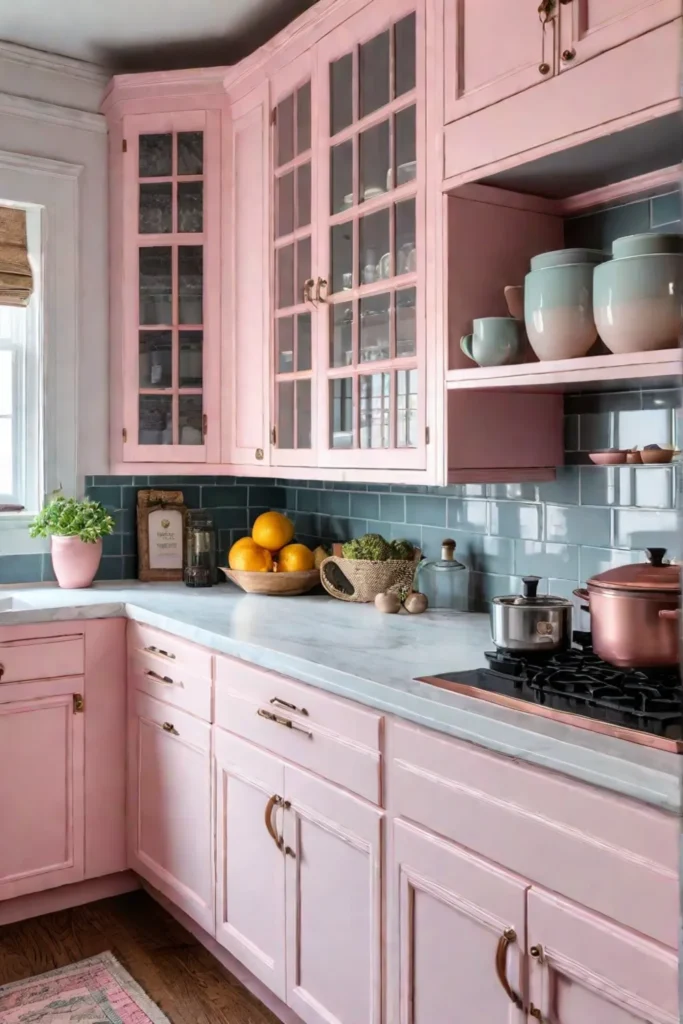
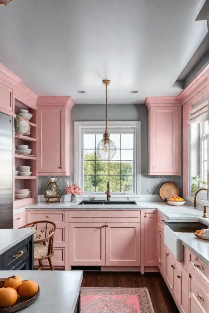
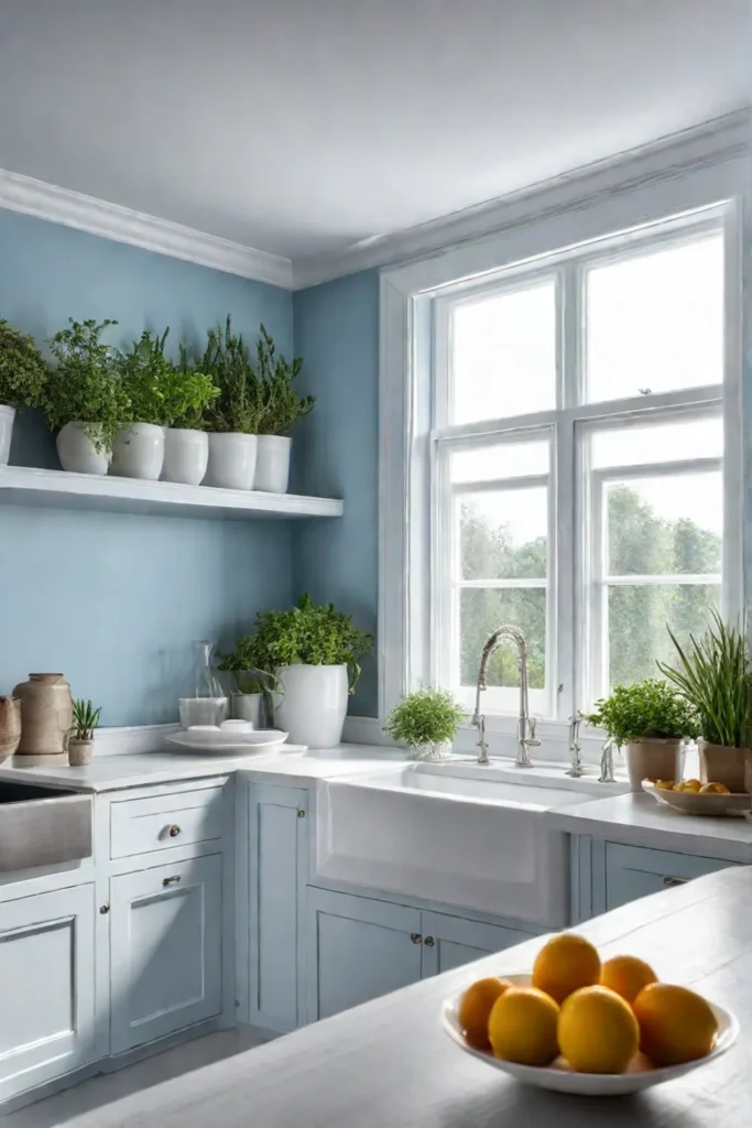
Pastel Perfection: Soft Hues for Serene Spaces
Pastels have a way of evoking a sense of tranquility and warmth, making them an ideal choice for creating a serene and inviting atmosphere in a cottage kitchen. These soft hues add a touch of personality without overwhelming the space, allowing the intricate details and craftsmanship of the room to shine.
Choosing the Right Pastel for Your Kitchen
When selecting pastels for your cottage kitchen, consider the mood you wish to create. Soft blues can instill a sense of calmness, while gentle greens evoke feelings of freshness and rejuvenation. Dusty roses and muted pinks add a touch of romantic charm, while pale yellows radiate sunshine and cheer.
Creating a Cohesive Look with Pastel Accents
To create a cohesive look, start by introducing your chosen pastel shade as an accent color. A pastel-hued kitchen island or a set of painted cabinets can serve as a subtle focal point, drawing the eye while still allowing the room’s architectural details to take center stage.
Balance the softness of pastels with crisp whites or creamy neutrals, ensuring the space maintains a light and airy feel. Incorporate pastel accents through textiles, such as curtains or cushions, or small decorative pieces like ceramics or glassware.
For a touch of whimsy, consider incorporating pastel hues into your backsplash or flooring. A pastel-tiled backsplash can create a charming and unexpected pop of color, while a soft, patterned floor adds warmth and visual interest.
When paired with exposed brick or wooden beams, pastels can create a harmonious contrast, blending the rustic charm of natural materials with the delicate beauty of soft hues. This combination evokes a sense of timeless elegance, reminiscent of the colonial and Georgian Revival styles that have endured for generations.
In the end, pastels are a charming and versatile option for cottage kitchens, offering a range of possibilities to create a soothing and stylish space that reflects your unique personality and design sensibilities.
While pastels offer a serene and delicate charm, the rich warmth of natural wood tones can infuse a cottage kitchen with a sense of rustic elegance. In the next section, we’ll explore how to embrace the beauty of exposed beams, wood floors, and cabinetry to create a cozy and inviting space that celebrates the enduring craftsmanship of bygone eras.
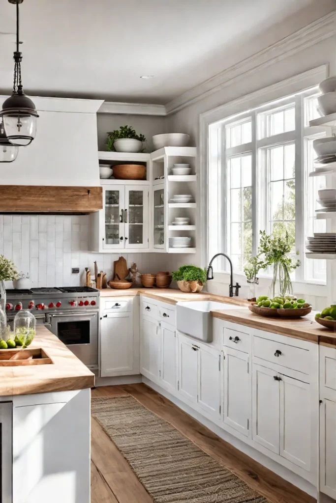
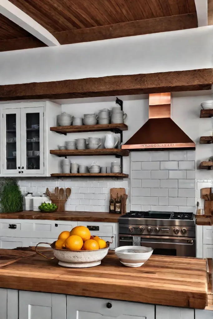
Embracing Natural Wood Tones: Rustic Warmth
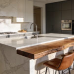
In the realm of cottage kitchens, natural wood tones offer a timeless and inviting warmth that perfectly complements the cozy ambiance. These organic elements possess an innate ability to infuse spaces with character and texture, creating an atmosphere that feels both rustic and refined.
Different Types of Wood and Their Effects
Each variety of wood imparts its unique charm to a kitchen. Lighter woods, such as maple or ash, reflect light beautifully, lending an airy and open feel to even the most compact spaces. In contrast, richer hues like walnut or oak imbue a sense of depth and sophistication, evoking the warmth of a crackling fire on a crisp autumn evening.
Incorporating Wood Tones in a Small Kitchen
The strategic incorporation of wood elements can work wonders in a petite kitchen. Consider installing oak cabinetry or a butcher block countertop to anchor the space with a touch of rustic elegance. Reclaimed wood shelves not only provide Functional Storage but also add a captivating focal point, their aged patina telling stories of a bygone era.
Open shelving is a particularly effective way to showcase the beauty of natural wood while preventing a cramped feel. Pair these warm tones with light, airy walls for a balanced and inviting atmosphere that embraces the best of both worlds.
When it comes to caring for wood in a kitchen environment, regular oiling and gentle cleaning are key. Opt for sustainable sources, such as responsibly harvested or reclaimed wood, to ensure your kitchen’s natural elements align with your eco-conscious values.
In essence, natural wood tones are a timeless choice that imbues cottage kitchens with character and warmth. By strategically incorporating these organic elements, you can elevate the visual appeal and create a space that feels both cozy and inviting, even in the most compact of quarters.
As we explore the art of strategic color accents, let us embrace the potential for pops of vibrant hues to breathe new life into these charming spaces.
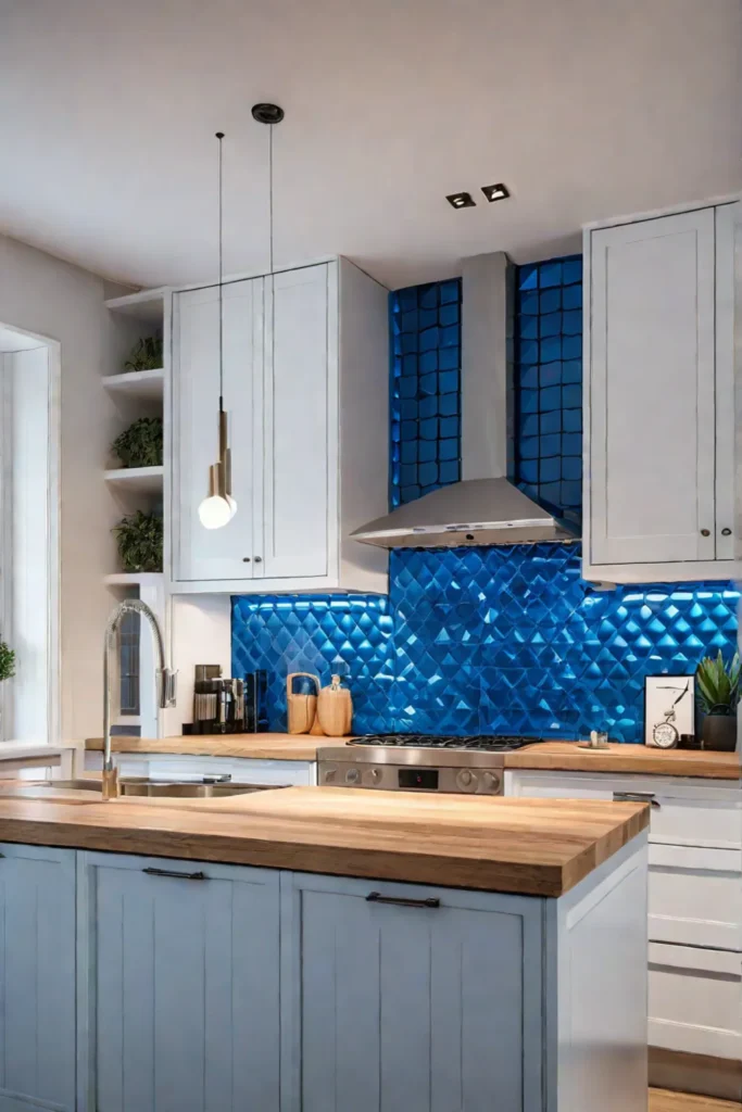
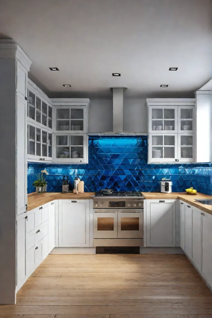
The Art of the Pop: Strategic Color Accents
A well-curated pop of color can breathe new life into a cottage kitchen, injecting personality and vibrancy into a space that might otherwise feel monotonous. While neutral palettes provide a timeless foundation, a strategic splash of vibrant hue prevents the room from feeling flat or one-dimensional.
Choosing the Right Pop of Color
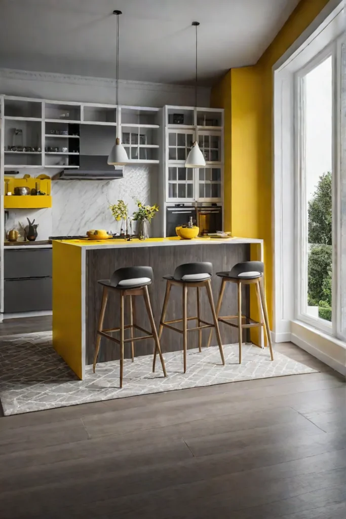
Selecting the perfect accent color is an art form unto itself. One must consider not only the existing color scheme but also the desired ambiance and mood. For instance, a bold crimson might stimulate the appetite, making it an ideal choice for a cozy breakfast nook. In contrast, a sunny yellow can inspire creativity, lending itself well to a space where culinary experimentation takes place.
Placement and Proportion for Maximum Impact
Once the ideal hue has been identified, thoughtful placement and proportion are key to achieving a harmonious and visually appealing design. A single, well-placed pop of color can serve as a striking focal point, drawing the eye and adding depth to the space. Consider a vibrant backsplash, a statement piece of furniture, or a boldly patterned textile to achieve this effect.
Alternatively, multiple pops of color can be strategically dispersed throughout the room, creating a cohesive and dynamic visual experience. However, caution must be exercised to avoid overwhelming the space. The key is to strike a delicate balance, allowing the accents to complement one another while ensuring that the overall design remains cohesive and inviting.
To illustrate, consider the impact of a set of sunny yellow stools paired with a patterned blue curtain. The two pops of color work in tandem, infusing the space with energy and vibrancy while maintaining a sense of harmony. Or, perhaps a bold red vase takes center stage, its vibrant hue drawing the eye and serving as a focal point amidst a sea of neutral tones.
For those seeking a more subtle approach, start small with a single accent piece and gradually introduce additional pops of color as desired. This allows for a gradual transformation, ensuring that the space evolves organically and remains true to your style.
In the end, the art of pop lies in the strategic and thoughtful use of color accents. When executed with care and intention, these vibrant touches can elevate a cottage kitchen from mundane to extraordinary, creating a space that is both visually captivating and deeply personal.
As we transition to the next section, we will explore the profound impact of color psychology in the kitchen, delving into how hues can shape our moods and emotions, ultimately influencing the overall ambiance of this cherished space.
Color Psychology in the Kitchen: Creating the Right Mood
The kitchen serves as the heart of the home, a gathering place where memories are made and culinary adventures unfold. As such, the colors we choose for this space hold immense power in shaping the atmosphere and evoking specific emotions. By understanding the principles of color psychology, we can thoughtfully curate a palette that harmonizes with the desired mood and function of our kitchen.
Colors for Energy and Socialization
For those who envision their kitchen as a vibrant hub of activity, where lively conversations and boisterous laughter fill the air, warm and energizing hues are the perfect choice. The golden glow of a sunshine yellow, for instance, can infuse the space with a sense of warmth and cheer. Imagine a cozy breakfast nook bathed in this radiant hue, inviting family and friends to linger over steaming cups of coffee and share stories from the night before.
Alternatively, a bold and fiery red can add a touch of drama and excitement to the kitchen. This passionate hue has long been associated with stimulating the appetite, making it an ideal choice for a dining area where culinary masterpieces are savored and appreciated. Temper its intensity with warm wood tones and muted accents for a harmonious balance.
Colors for Calmness and Relaxation
For those seeking a serene oasis amidst the hustle and bustle of daily life, cool and tranquil hues offer a soothing respite. The gentle embrace of a soft blue can instill a sense of peace and tranquility, creating an inviting atmosphere for quiet moments of reflection or intimate gatherings with loved ones. Envision a cozy dining nook awash in this calming shade, where candlelight dances across the table, and the stresses of the day melt away with each savory bite.
Alternatively, the verdant hues of nature’s palette can infuse the kitchen with a sense of harmony and balance. A sage green or muted olive tone can evoke feelings of renewal and rejuvenation, making it an ideal choice for a space where culinary creations are crafted with care and mindfulness.
When selecting colors for your kitchen, consider not only the desired ambiance but also the cultural influences and personal preferences that shape your perception of color. While some hues may hold universal associations, others may evoke unique emotions based on your cultural background or individual experiences.
By thoughtfully incorporating color psychology into your kitchen design, you can create a space that not only nourishes the body but also soothes the soul. Whether you seek a lively and energetic gathering place or a tranquil retreat, the right palette can transform your kitchen into a haven that truly reflects your lifestyle and personal tastes.
As we transition to the conclusion, let us reflect on the enduring allure of the cottage kitchen and the timeless charm it embodies.
Final Thoughts
As we bid farewell to our exploration of cottage kitchen color palettes, we are reminded of the profound impact that hues can have on the atmosphere and ambiance of this cherished space. More than mere aesthetic choices, the colors we embrace hold the power to evoke emotions, shape moods, and create lasting memories that will be cherished for generations to come.
Let us not forget the timeless allure of light and airy tones, which possess an innate ability to infuse even the most compact spaces with a sense of airiness and tranquility. Nor should we overlook the serene beauty of soft pastels, whose delicate hues can transform a kitchen into a tranquil oasis, a respite from the hustle and bustle of daily life.
And yet, amidst this celebration of serenity, we must not neglect the warmth and character that natural wood tones can bring to a space. Like the enduring craftsmanship of bygone eras, these organic elements possess an innate ability to imbue a kitchen with a sense of rustic elegance, inviting us to linger and savor the simple pleasures of life.
As we embrace the art of strategic color accents, let us remember that a well-curated pop of vibrant hue can breathe new life into even the most understated of spaces, injecting personality and vibrancy into the very heart of our homes.
In the end, the true beauty of cottage kitchen color palettes lies not merely in their aesthetic appeal but in their ability to shape our emotions and create lasting memories. May these cherished spaces serve as a reminder of the enduring power of color to nourish not only our bodies but also our souls, inspiring us to embrace the timeless charm of our architectural heritage while forging our unique paths toward a life well-lived.