Can we talk about why everyone thinks beige is the most boring color on the planet? It’s a pet peeve of mine. People see “beige bedroom” and picture sad, uninspired walls the color of cubicle fabric from 1998. They think it’s a cop-out. A failure of imagination. They’re dead wrong.
Beige isn’t a color. It’s a canvas. It’s the single best backdrop for the things that actually make a room feel amazing: light and texture. As a lighting designer, I see beige as a secret weapon. It doesn’t fight for attention. Instead, it absorbs, reflects, and bends light in ways that bold colors can’t, allowing you to create atmosphere out of thin air. It lets wood grain feel warmer, linen feel softer, and shadows feel deeper. Forget bland. A well-designed beige room is a masterclass in subtlety and sophistication. It’s the quiet confidence that doesn’t need to scream.
So, if you want to create a bedroom that feels like a five-star hotel suite combined with your favorite cozy sweater, you’ve come to the right place. We’re going to break down how to do it right.
Strategic Planning for Your Beige Canvas
Alright, let’s get the “eat your vegetables” part out of the way first. I know planning isn’t the exciting part, but I promise, five minutes of thinking here will save you thousands of dollars and dozens of hours of frustration. This is where you lay the foundation. Get this right, and everything else falls into place.
1. Mastering Beige Undertones for a Perfect Match
You’re probably thinking, “Caleb, it’s beige. How complicated can it be?” Very. The single biggest mistake people make is grabbing a can of “beige” paint without understanding its undertone. That’s how you end up with walls that look vaguely yellow and sickly under your lamps at night, or a room that feels muddy and depressing on a cloudy day. Beige isn’t one color; it’s a family, with hidden pink, yellow, green, or gray undertones.

The key is to match the undertone to your room’s light. I had a client once whose north-facing bedroom got cool, blueish light all day. They painted it with a yellow-toned beige, thinking it would “warm up the space.” Instead, the cool light and warm paint fought each other and created this murky, sad green-gray mess. They hated it. We repainted with a beige that had a soft pink undertone, which worked with the cool light, and the room instantly felt warm, sophisticated, and cohesive.
The shortcut? Get your paint swatches, and hold a piece of pure white printer paper next to them. The undertone will immediately pop. Test your final choices by painting large squares on multiple walls and watching them at different times of day. What looks good in the morning sun might look terrible under your evening lamplight.
With the perfect hue chosen, you have to decide how it will interact with light, which comes down to its finish.
2. Choosing the Optimal Wall Paint Finish for Warmth
Now that you have your perfect beige, don’t blow it by picking the wrong finish. The sheen of your paint dramatically changes how light behaves in your room. Everyone defaults to eggshell because it’s “washable,” but for a bedroom, you want to create a soft, enveloping feeling, not an easily wiped-down corridor. A shinier finish, like satin or semi-gloss, reflects light harshly. It creates hotspots, highlights every single imperfection on your wall, and feels cold and clinical.
Your best friends in a bedroom are matte and flat finishes. They absorb light instead of reflecting it. This diffusion of light creates a soft, velvety look that makes the color feel richer and deeper. It instantly dials up the cozy factor and makes the space feel like a cocoon. I once walked into a beautiful bedroom where every element was perfect—the furniture, the fabrics—but they’d used a satin finish on the walls. The glare from the windows and lamps made the whole space feel agitated and cheapened the effect of the beautiful warm beige they’d chosen.
My go-to shortcut is to paint the ceiling the exact same matte beige as the walls. This is a pro-level trick that makes the room feel boundless. It blurs the hard lines where the wall meets the ceiling, enveloping you in a single, soft color and making the space feel infinitely more serene and intentional.
Now that the walls are sorted, we have to figure out where to put everything so you can actually move and breathe.
3. Planning furniture layout for Seamless Flow and Function
You can have the most beautiful beige paint and the coziest textures in the world, but if your room is a furniture obstacle course, it will never feel tranquil. A good layout isn’t just about what fits; it’s about creating clear pathways for movement and for light. Your brain registers clutter and cramped paths as stress. A serene room needs negative space—the empty areas around the furniture.
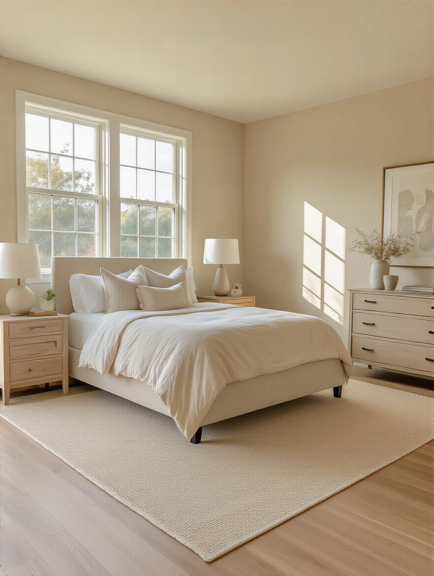
The biggest rookie mistake is pushing every single piece of furniture flat against the walls. It feels like the safest choice, but it can actually make a room feel smaller and more static. Your bed is the star of the show. Anchor it on the main wall, ideally the one you see when you first walk in, and make sure you have at least 24-30 inches of walking space around the sides and foot of the bed. Anything less and you’ll be doing a permanent clumsy shuffle.
Here’s the shortcut I wish I’d known when I first started: use painter’s tape. Before you buy a single thing or break your back moving that dresser for the fourth time, measure your furniture and tape out its footprint on the floor. You can literally walk through the layout and feel if it’s too tight. It takes ten minutes and will save you a world of hurt.
Before you start swiping your credit card, let’s make sure all these ideas actually work together.
4. Developing a Visual Mood Board for Design Harmony
Okay, I know. “Mood board” sounds a little arts-and-crafts. But this is your blueprint. This is your reality check. This is what stops you from impulse-buying a chevron-patterned pillow at midnight because it looked good online. A mood board is not just a Pinterest board full of images you like. A real, useful mood board is a physical collection of the actual materials you plan to use.
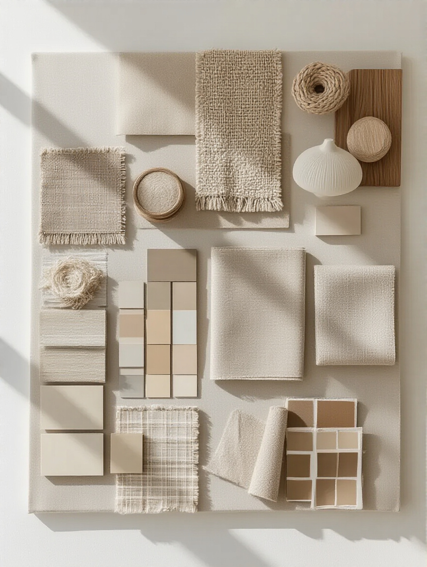
You need to gather physical samples. Get your paint chip, a swatch of the linen for your curtains, a sample of the wood for your nightstand, and a piece of the metal for your lamp. Lay them all out together. Look at them in your room’s natural light. Look at them under your artificial light. This is how you catch problems before they become expensive mistakes. You’ll see right away if that “greige” fabric has a weird green undertone that clashes with your warm beige walls.
The common BS about this is that a digital board is good enough. It isn’t. Your screen’s color calibration is a lie. What looks like a soft, warm oak on your laptop could show up as a screaming orange honey oak in real life. Insist on physical samples. It’s the only way to know for sure that your vision of harmony will actually be harmonious.
Curating Core Furniture & Textiles
With your plan in place, now comes the fun part: picking the foundational pieces that will form the heart of your serene sanctuary. These are the big-ticket items that define the room’s comfort and style.
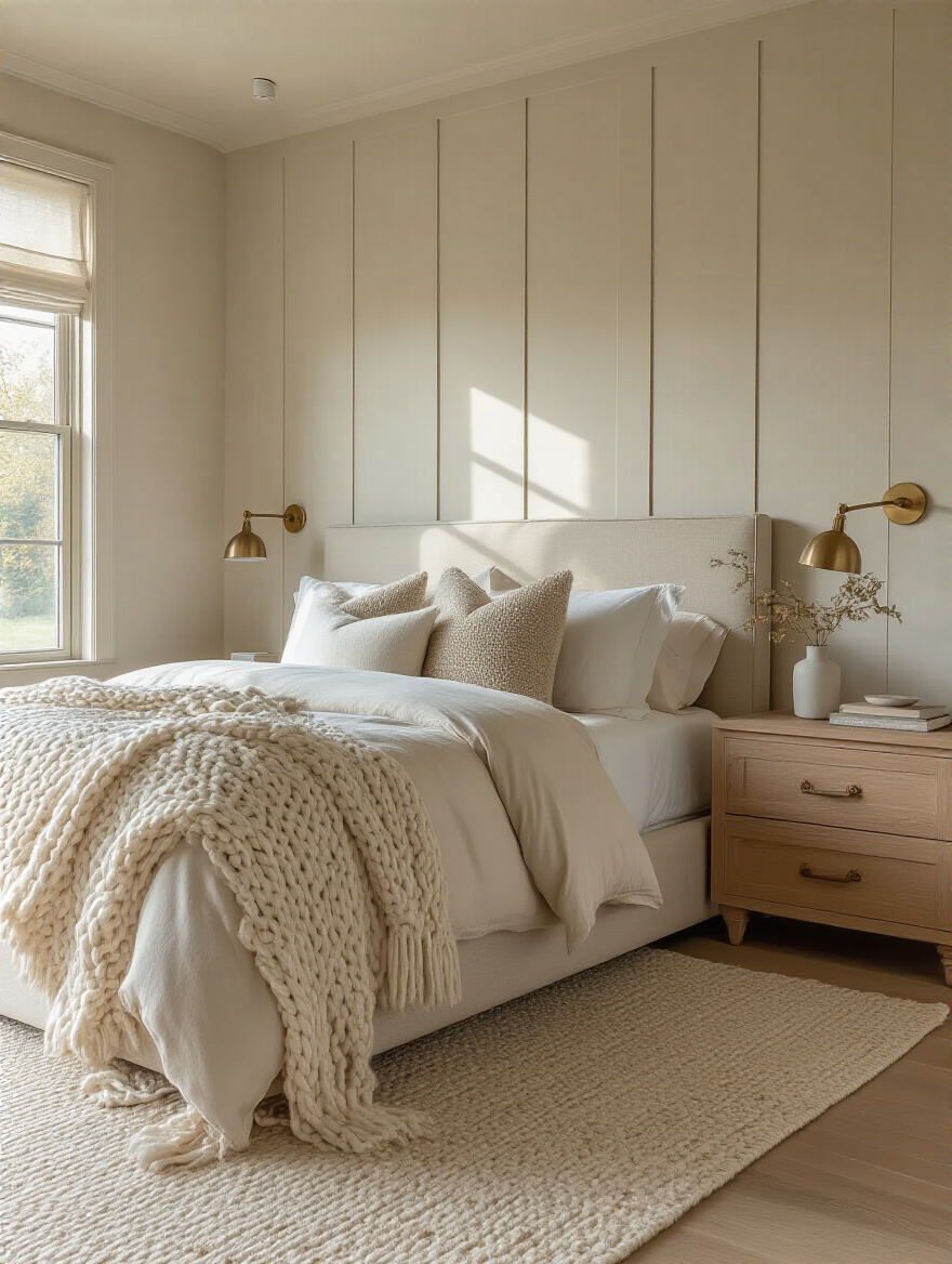
5. Selecting Luxurious Layered Bedding for Ultimate Comfort
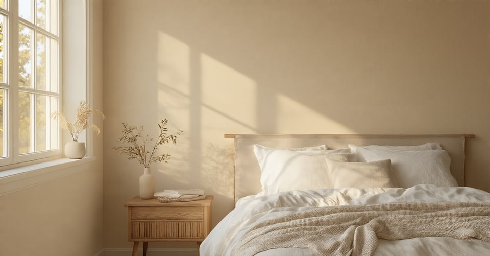
In a beige bedroom, your bed isn’t just a place to sleep—it’s the main event. It’s the giant, soft canvas where you’ll layer most of your texture. This is not the place to skimp. You can have the most expensive bed frame in the world, but if you top it with a cheap, flat duvet and scratchy sheets, the entire room will feel cheap.
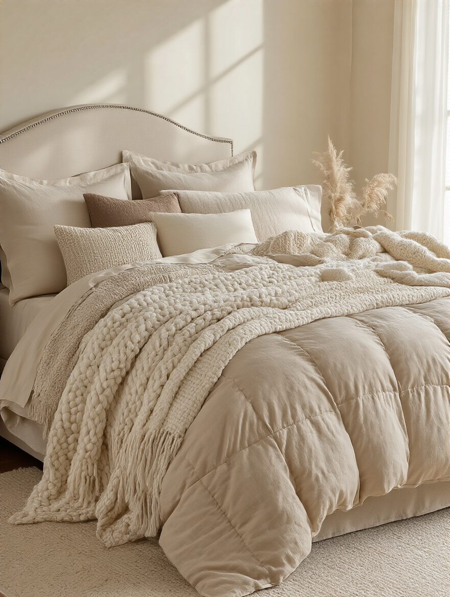
The secret to a luxurious-looking bed is layering. Start with high-quality sheets (linen or a good long-staple cotton). Then, a good duvet—and I mean the insert. I learned this the hard way: for years I spent money on fancy duvet covers, only to stuff them with a lumpy, thin polyester insert. The bed always looked sad and deflated. Invest in a fluffy, quality down or down-alternative insert. It’s what gives your bed that “I want to dive into it” look. Then add a quilt or coverlet, and finally, a textured throw.
Your goal is to mix and match textures within your beige palette. Think smooth sateen sheets, a crisp linen duvet cover, a chunky knit blanket, and maybe a velvet pillow. Each layer has a slightly different shade of beige and a different feel, which is what creates visual depth and makes the bed look inviting and profoundly comfortable.
Now that your bed is a cloud of comfort, we need to anchor it to the ground.
6. Integrating Large Area Rugs to Anchor Your Space
A small rug in a big room is like a man wearing a shirt that’s two sizes too small. It just looks wrong. A rug’s job in a bedroom is to anchor the bed and its surrounding furniture (like nightstands) and create a single, unified “zone.” When your rug is too small and only sits under the bottom third of your bed, it makes all the furniture look like it’s floating aimlessly in space.
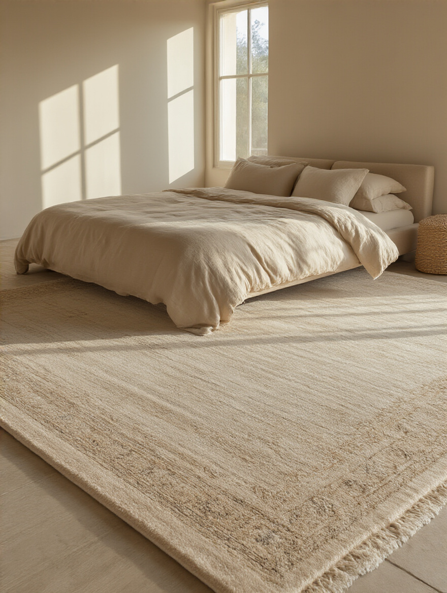
This isn’t just about looks; it’s about feeling. Stepping out of a warm bed onto a soft, plush rug is a fundamentally more serene experience than hitting a cold, hard floor. A large rug also absorbs sound, literally quieting the room and contributing to that sense of tranquility. It’s a non-negotiable element for a truly comfortable space.
Here’s the simple shortcut: get a bigger rug than you think you need. For a Queen bed, you should be looking at an 8×10 foot rug at minimum. For a King, a 9×12. The rule of thumb is that the rug should extend at least 18-24 inches beyond the sides of the bed, and your nightstands should sit comfortably on it. Again, use painter’s tape to map it out. It’s the best way to visualize the scale before you commit.
Next up, we’ll bring in some natural warmth and texture to complement the softness underfoot.
7. Choosing Complementary Wood Tones for Warmth and Contrast
One of the fastest ways to make a beige room fall flat is to have no contrast. Wood is your secret weapon here. The organic grain and natural warmth of wood provide a beautiful, necessary counterpoint to the softness of your beige walls and textiles. It adds depth, character, and a connection to nature that is inherently calming.

But please, I’m begging you, do not try to match all your wood tones perfectly. A “bedroom set” where the bed, dresser, and nightstands are all the exact same stain and wood looks dated and one-dimensional. The goal is to create a curated, collected-over-time feeling. The key is to mix 2-3 wood tones that share a similar undertone. For example, pair a warm walnut with a lighter, warm-toned oak. Or, for a cooler beige palette, mix a light ash with a dark, almost-black stained wood for dramatic contrast.
This is all about balance. Your floor might be one wood tone, your bed frame another, and a dresser a third. As long as they feel like they’re in the same family (all warm or all cool) or provide a deliberate, sharp contrast, the result will be a rich, layered look that feels incredibly sophisticated.
Building on that theme of softness, let’s talk about the one piece of furniture that can instantly elevate the comfort level.
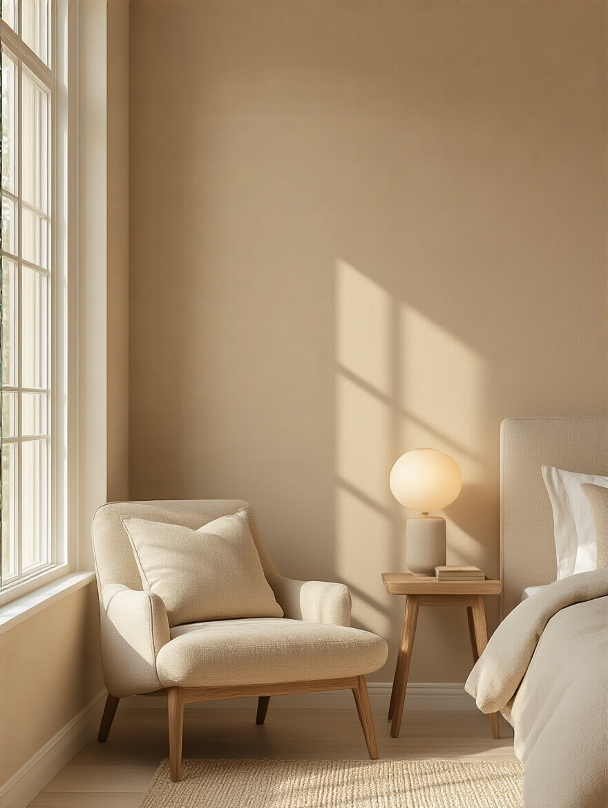
8. Opting for Upholstered Headboards for Added Softness
An upholstered headboard is more than just a style choice; it’s a functional upgrade for comfort. Think of it as a giant, permanent pillow for your wall. It immediately softens the hard architectural lines of the room and provides a comfortable surface to lean against while you’re reading or having your morning coffee in bed. From a technical standpoint, it also acts as an acoustic panel, absorbing sound and making the room feel quieter and more serene.
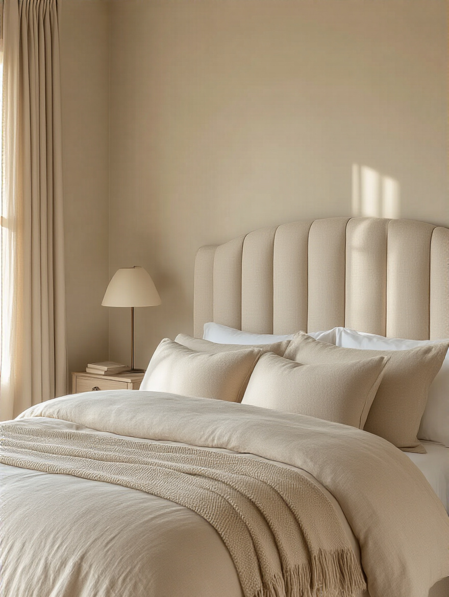
When choosing a fabric, think texture. A rich velvet, a nubbly bouclé, or a classic linen in a shade of beige that complements your wall color will add another crucial layer of tactile interest. The scale is important here, too. A tall, grand headboard can be a stunning focal point, while a lower, wider one can make the room feel more expansive and modern.
This is one of the easiest ways to add a dose of hotel-like luxury to your space. It’s an explicit signal that this room is designed for comfort and relaxation, not just for sleeping. It’s an invitation to lounge, to linger, and to unwind.
Of course, all the comfort in the world won’t feel serene if your stuff is everywhere. Let’s tackle the clutter.
9. Incorporating Functional and Stylish Storage Solutions
You can’t have tranquility and clutter in the same room. It’s impossible. Visual noise creates mental noise. Every stray pile of clothes, stack of books, or tangled charger cord is a tiny little stressor that chips away at the calm you’re trying to create. Good storage isn’t just about hiding your junk; it’s about creating a sense of order that lets your mind relax.
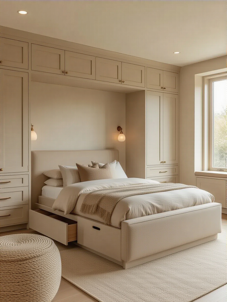
The trick is to find storage solutions that blend seamlessly into your beige aesthetic. Think a beautiful light oak dresser, a storage ottoman upholstered in a beige fabric at the foot of your bed, or even sleek, built-in wardrobes painted the same color as the walls. Multi-functional furniture is your best friend. A bed frame with built-in drawers, for instance, can completely eliminate the need for a bulky, room-shrinking dresser.
The biggest mistake I see is people buying storage before they’ve decluttered. Don’t do that. First, get rid of everything you don’t need. Then, assess what’s left and find a specific, intentional home for it. This approach ensures your storage is perfectly tailored to your needs, rather than just becoming a slightly more organized box for your clutter.
Enriching with Textural Layers
Okay, we’ve laid the foundation. Now we get to the magic. This is where a simple beige room becomes a rich, sensory experience. Texture is everything in a neutral space. It’s what you feel with your hands and see with your eyes as light plays across different surfaces.
10. Blending Varied Fabric Weaves for Tactile Interest
If you only take one thing away from this conversation, let it be this: texture is your new color. In a beige room, you can and should go wild with different fabric weaves. The goal is to create a symphony of textures that your hands and eyes can explore. Think about the difference between a smooth, cool silk pillowcase, a nubby, raw linen duvet, a plush, soft velvet cushion, and a chunky, heavy cable-knit throw.

Each of these materials reflects light differently and feels different to the touch. That variation is what creates depth and stops the room from looking like a flat, boring beige box. You want to layer these textures everywhere—on your bed, your curtains, your accent chair, your rug. This is how high-end designers make monochromatic rooms look so impossibly rich and inviting.
A common pitfall is being too timid. A slight difference between two types of cotton isn’t enough. You need real, discernible contrast. Pair something rough with something smooth, something shiny with something matte. This interplay of textures is what will make your beige bedroom truly captivating.
A perfect example of this is the piece we’ll talk about next, which brings an instant dose of cozy.
11. Introducing Plush Knitted Throws for Irresistible Coziness
There is almost no single item you can add to a room that says “cozy” more loudly than a chunky, plush knitted throw. It’s a universal symbol of comfort and warmth. Draped over the corner of your bed or the arm of a chair, it acts as an invitation—a signal to come, sit down, and relax.

This is about more than just aesthetics. A good throw adds a heavy, substantial layer of texture that breaks up the large, smooth surface of your duvet. A giant cable-knit or a fuzzy alpaca wool throw provides a strong visual and tactile anchor. Look for one in a shade of beige that’s either a few shades lighter or darker than your main bedding to create a subtle, sophisticated contrast.
The shortcut to making it look effortlessly stylish instead of messy is the “casual drape.” Don’t fold it perfectly into a rectangle. Instead, grab it from the middle and let it fall naturally over the foot of your bed or a piece of furniture. It should look inviting and a little bit lived-in, not rigid and formal.
From the bed, let’s move to the windows and talk about how to control the most important element of all: light.
12. Selecting Lightweight Linen Drapes for Soft, Filtered Light
As a lighting guy, window treatments are critically important to me. They’re the moderators between the harsh, raw sunlight outside and the serene atmosphere you want inside. And for a tranquil beige bedroom, there is nothing better than lightweight linen drapes. They are the ultimate light-diffusers.
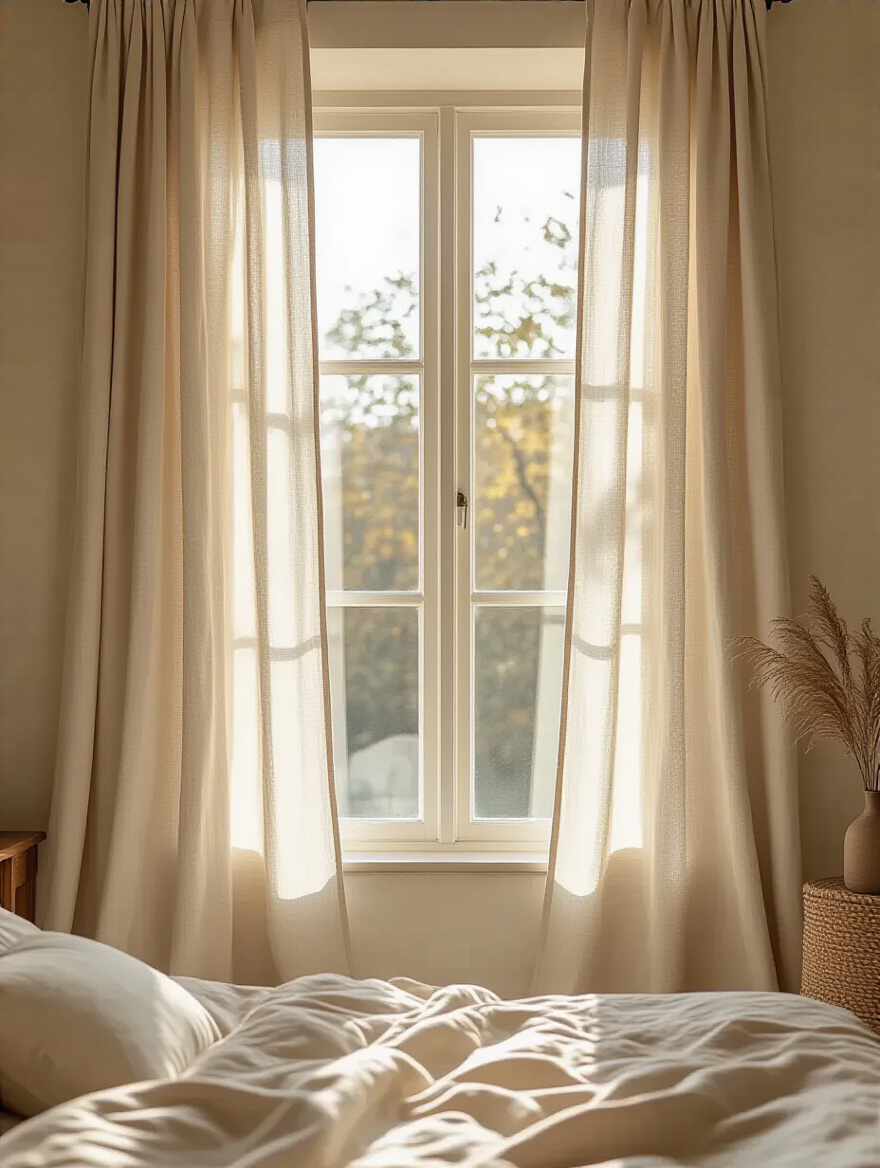
Heavy, blackout curtains can be great for blocking light, but they often make a room feel heavy and cave-like during the day. Linen, with its natural, slightly open weave, doesn’t block the light; it filters it. It takes the sharp, direct rays of the sun and softens them into a gentle, ethereal glow that fills the entire room. This soft, diffused light is incredibly flattering to beige tones and instantly makes a space feel airy and calm.
For a truly high-end look, hang your curtain rod high and wide—about 4-6 inches below the ceiling and extending 6-12 inches past the window frame on each side. Let the drapes just “kiss” the floor or even puddle slightly for a relaxed, luxurious feel. The goal is to create a tall, continuous column of soft fabric that frames the window and makes your ceiling feel higher.
With the big fabric elements in place, let’s get into the details that make a bed look professionally styled.
13. Piling Decorative Cushions for Layered Comfort and Style
Decorative cushions are the easiest way to inject layers of texture and subtle color into your bedroom. They’re the finishing touch that takes a bed from simply “made” to “styled.” But there’s a method to the madness. Just throwing a bunch of random pillows on the bed will look cluttered.

Here’s the formula for a perfectly layered bed: Start with your sleeping pillows at the back. In front of them, place two large “Euro” square cushions (usually 26×26 inches) in a foundational texture like linen. In front of those, add two slightly smaller standard-sized cushions in a contrasting texture, like velvet or bouclé. And finally, finish with a single accent cushion in the front—maybe a long lumbar pillow or a small round one in a unique texture or subtle pattern. This creates a satisfying pyramid of plushness.
Here’s the ultimate shortcut: always buy pillow inserts that are 1-2 inches larger than your pillow covers. A 20×20 inch cover needs a 22×22 inch insert. This is the secret to getting that full, plump, karate-choppable look you see in magazines and hotels. A floppy, under-filled pillow is the saddest thing in the world.
Now let’s apply this layering philosophy to the entire room, beyond just fabrics.
14. Mixing Diverse Material Finishes on Surfaces and Walls
To really make a beige room sing, you need to think beyond fabric textures. The interplay between different materials is just as important. Think about a smooth, matte painted wall next to a rough, fluted wood panel. Or a sleek, cool marble tabletop holding a warm, brushed brass lamp. This is advanced-level design, and it’s what creates true sensory richness.
You want a balanced mix of hard and soft, rough and smooth, reflective and matte. Imagine a room with a soft linen headboard, smooth plaster nightstands, a high-pile wool rug, and cool metal light fixtures. Each material engages the senses differently and reflects light in its own unique way, creating a dynamic environment that is anything but monotonous.
A great rule of thumb is to try and incorporate at least three different material finishes on any given sightline. Your eye will land on the bed and see the softness of the headboard, the warmth of the wooden nightstand beside it, and the gleam of the glass lamp on top. This subtle complexity is what makes a space feel deeply considered and luxurious.
Elevating with Strategic Accents & Contrast
Your beige sanctuary is built. It’s textured, it’s layered, it’s comfortable. Now it’s time to add the finishing touches—the small, strategic elements that add personality, focus, and a touch of drama without disrupting the calm.
15. Adding Thoughtful Subtle Color Pops for Visual Interest
Your beige room is a beautiful, serene foundation. Now, it needs a little punctuation. A subtle pop of color is what will keep the space from feeling bland and give the eye a delightful place to rest. But the key word here is subtle. We aren’t throwing a bright red pillow onto the bed and calling it a day.
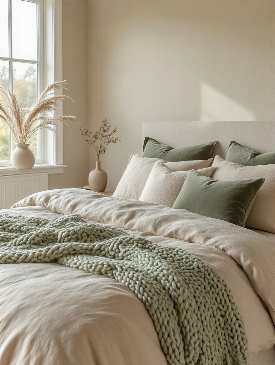
Think in terms of muted, earthy tones that complement your beige. A dusty rose, a deep terracotta, a soft sage green, or a slate blue can all work beautifully. The trick is to use your chosen accent color in small, controlled doses. Maybe it’s a single lumbar pillow, the color of a ceramic vase on your dresser, or a thread running through the pattern of your area rug.
The “Rule of Three” is your friend here. Try to sprinkle your accent color in at least three places in the room—a large dose (like a throw blanket), a medium dose (like a pillow), and a small dose (like the spine of a book on your nightstand). This creates a sense of rhythm and makes the color feel intentional, not accidental.
Next, we’ll layer in the most powerful mood-setting tool of all. This is my area of expertise.
16. Incorporating Diverse Lighting for Ambiance and Function
This is the most important element, and the one everyone gets wrong. A single, harsh overhead light—what I call the “interrogation lamp”—is the fastest way to kill the mood in any room, especially a bedroom. It casts unflattering shadows and makes everything feel flat and sterile. Good lighting is about creating layers of light for different moods and functions. You need at least three types:
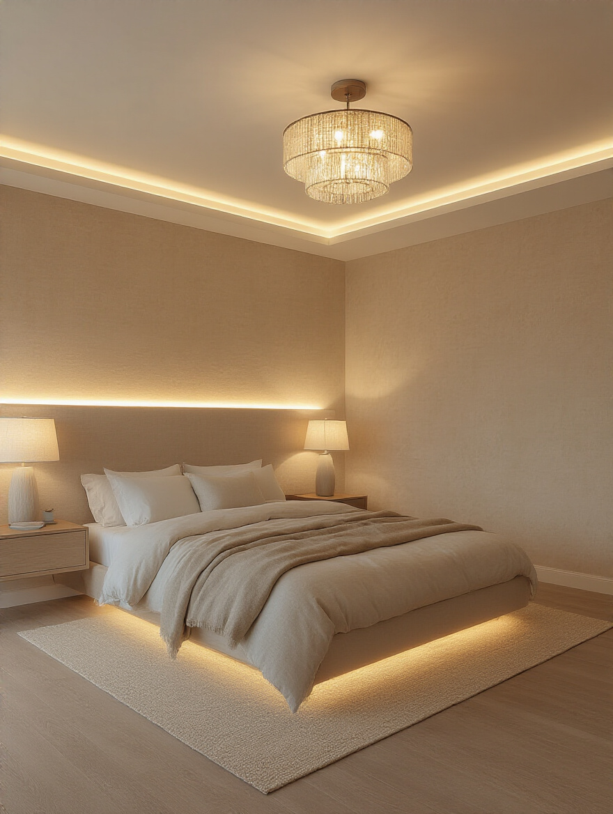
- Ambient Light: This is your general, overall illumination. It can come from a dimmable central fixture, cove lighting, or even a couple of well-placed floor lamps. It sets the base level of light.
- Task Light: This is focused, functional light for specific activities. The most important in a bedroom is a bedside lamp or sconce for reading. It should be bright enough to prevent eye strain but contained enough that it doesn’t light up the whole room.
- Accent Light: This is the fun stuff. It’s a small spotlight aimed at a piece of art, an LED strip behind your headboard creating a soft glow, or a tiny lamp illuminating a plant. Accent lighting creates depth, highlights texture, and adds a touch of drama.
Every single light in your bedroom should be on a dimmer. Period. This is non-negotiable. And pay attention to the color temperature of your bulbs, measured in Kelvin (K). For a serene bedroom, you want a warm light, somewhere between 2700K and 3000K. This warm glow enhances the coziness of the beige tones and signals to your brain that it’s time to relax. Cool, blueish light (4000K+) is for offices and hospitals, not your sanctuary.
To add some reflective sparkle, we need to strategically place some shiny objects.
17. Curating Distinctive Wall Art and Mirrors for Personality
An empty wall in a beige room is a missed opportunity. Wall art is where you inject your story and personality into the space. It can be a large abstract piece with subtle colors, a gallery wall of personal photos in complementary frames, or even textural art like a woven wall hanging. It gives the room a focal point and prevents it from feeling soulless.
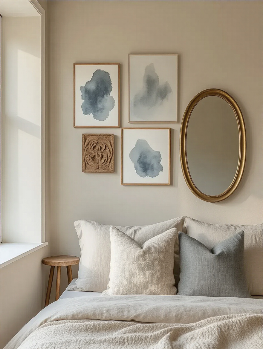
Mirrors are a designer’s secret weapon for two reasons. First, they are light bouncers. Placing a large mirror opposite a window will effectively double the amount of natural light in the room, making the whole space feel brighter and more expansive. Second, they create an illusion of depth, which can make a small room feel significantly larger.
Here’s the pro tip that most people miss: always, always consider what the mirror is reflecting. A mirror is essentially a moving picture on your wall. You want it to reflect something beautiful—the light from a window, a beautiful piece of art, or a well-styled corner. Don’t position it where it will give you a perfect view of a messy closet or a cluttered hallway.
Next, we’ll add another layer of light-catching shine with some metallic touches.
18. Integrating Sophisticated Metallic Finishes for Glimmer
Metallic accents are the jewelry of a room. They add a touch of glamour and sophistication, and they catch the light in a way that no other material can. A little glimmer here and there adds a crucial point of contrast to all the soft, matte textures of your beige palette.
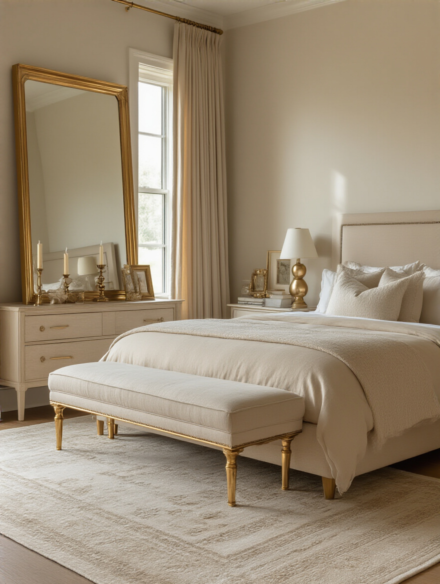
The key is to choose your metal tone based on your beige’s undertone. If you have a warm, sandy beige, warm metals like brushed brass, antique gold, or copper will look stunning. If you have a cooler, grayish beige (a “greige”), then cool metals like polished chrome, brushed nickel, or even matte black will feel more cohesive.
You don’t need a lot. A little goes a long way. Think about the frame of a mirror, the base of a lamp, the pulls on your dresser, or a small decorative tray on your nightstand. These small touches will catch the ambient and accent light, creating little pops of brightness that make the whole room feel more dynamic and luxurious.
Personalizing with Signature Touches
Your room is technically complete. It’s beautiful, functional, and serene. But it doesn’t feel like yours yet. This final stage is about infusing the space with your unique identity, making it a true personal sanctuary.
19. Placing Strategic Greenery for Organic Vibrancy
Every single room is improved by adding something living. Plants bring a dose of organic life, vibrant green, and natural texture that you just can’t replicate with any man-made object. In a serene beige bedroom, a plant provides the perfect, gentle pop of color and vitality. It’s a breath of fresh air, literally and figuratively.
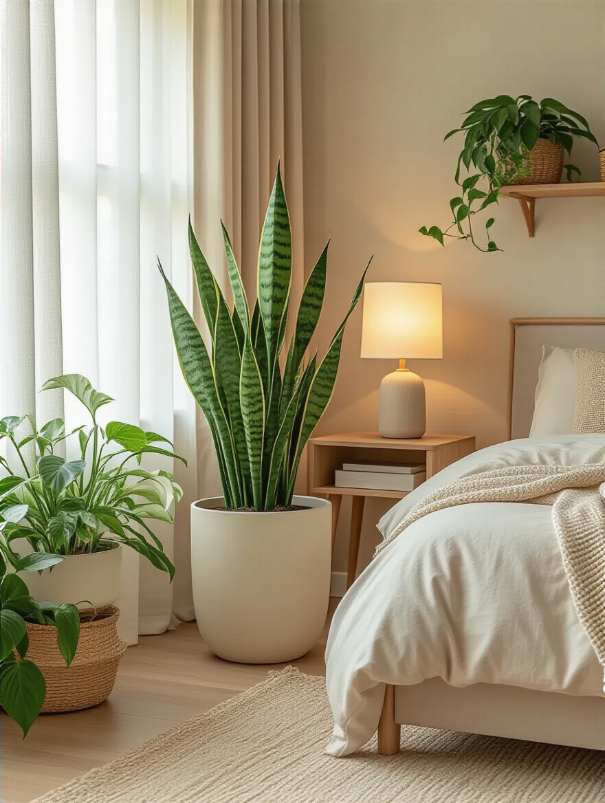
You don’t need to turn your room into a jungle. A single, beautifully sculptural plant in a corner, like a Fiddle Leaf Fig or a Snake Plant, can be enough to create a stunning focal point. Or, a small trailing plant like a Pothos on a high shelf can add a delicate touch of green. The key is to choose a plant that suits your room’s light level and your ability to keep it alive.
Make sure to choose a planter that complements your aesthetic. A simple ceramic pot in a neutral color (white, grey, black) or a natural woven basket will integrate seamlessly into your serene beige scheme while adding another layer of beautiful texture.
Now, let’s appeal to a sense we haven’t touched on yet: smell.
20. Infusing Comforting Signature Scents for Relaxation
Ambiance is a multi-sensory experience. You can create the most visually calming room in the world, but if it smells stale, the effect is ruined. Scent is one of the most powerful triggers for memory and emotion. Creating a signature scent for your bedroom is like creating a sensory cue for your brain to relax.
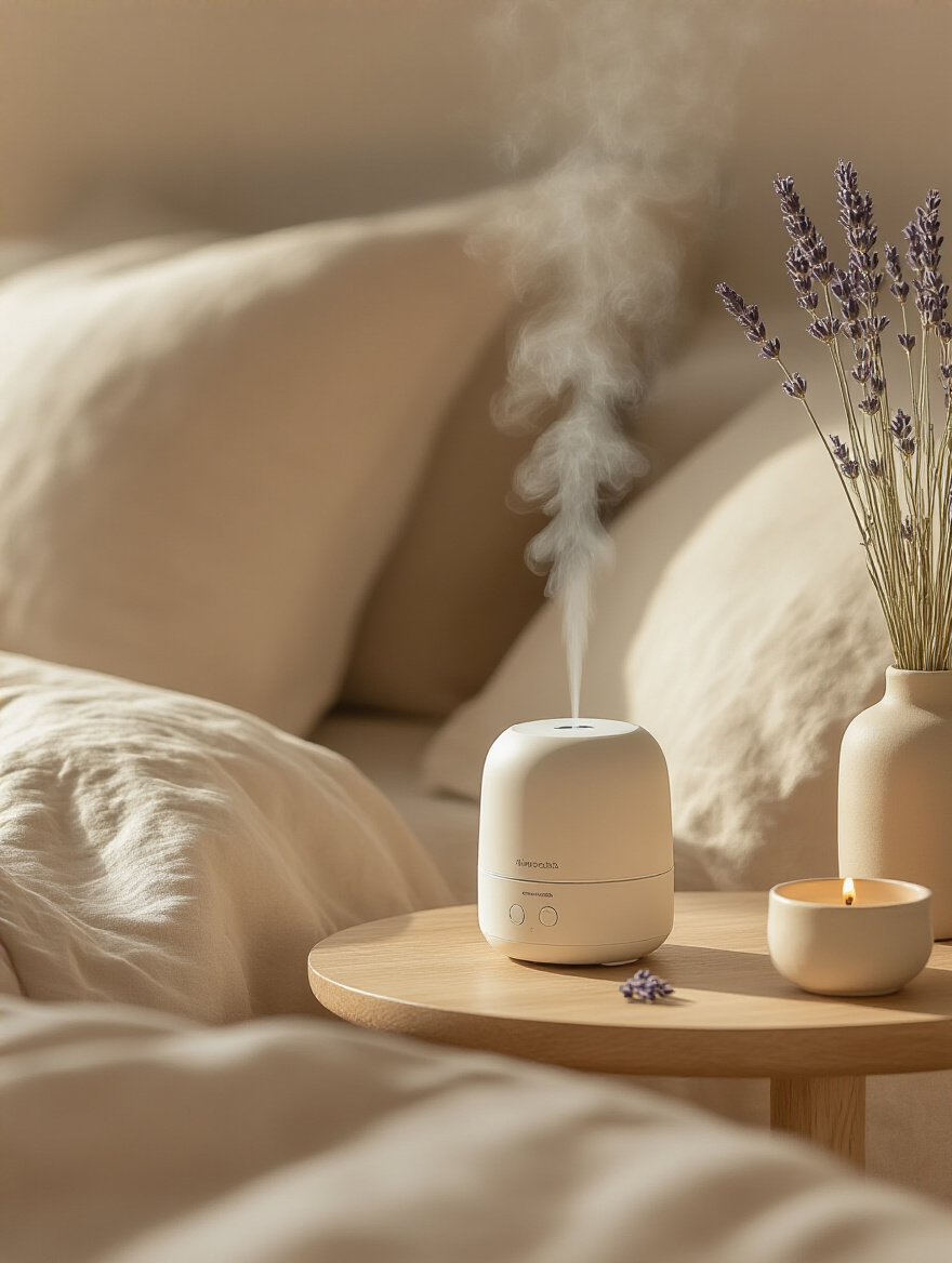
Choose a scent that you personally find calming, not what a magazine tells you is “relaxing.” For many, that’s lavender, chamomile, or sandalwood. For you, it might be a subtle vanilla or a clean cedarwood. The key is to use a high-quality, natural source, like an essential oil diffuser or a soy wax candle. Synthetic air fresheners often have a harsh, chemical undertone that can be more jarring than calming.
The goal is to create a very subtle, almost-not-there layer of scent that you associate with unwinding. Turn on your diffuser or light your candle about 30 minutes before you plan to go to sleep. Over time, your brain will build a powerful connection between that aroma and the act of resting, making it easier to switch off the stresses of the day.
Finally, the most important touch of all: your story.
21. Showcasing Personal Collections for Authentic Character
This is what transforms a “designed” room into your room. It’s the final layer that tells your story. This isn’t about creating clutter; it’s about curating and displaying the objects that have meaning to you. It could be a small stack of your favorite art books on the nightstand, a collection of unique ceramic mugs from your travels displayed on a floating shelf, or a few framed black-and-white photos of people you love.
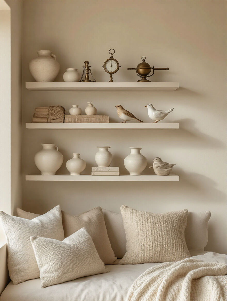
The key is to curate, not just place. Group similar items together to give them more impact. A single small seashell on a large dresser can look lost, but a collection of five beautiful shells arranged in a small tray becomes a purposeful, personal moment. Your serene beige backdrop is the perfect canvas to make these items stand out and feel special.
This is the most personal step, and it’s the one that will ultimately make your bedroom feel like a true sanctuary. It’s the constant, quiet reminder that this space is yours and yours alone—a reflection of your life, your journeys, and your passions.
Conclusion
So, there you have it. Beige is anything but boring. When you see it not as a bland color but as a versatile canvas, you unlock its true power. It’s a backdrop that allows light, texture, and your personal story to take center stage. A well-designed beige bedroom isn’t about the absence of color; it’s about the presence of calm, comfort, and deep, personal tranquility.
By mastering the technical details like undertones and lighting layers, and embracing the artistry of mixing textures and personal objects, you can craft a space that does more than just look good. You can create an environment that actively helps you unwind, recharge, and feel truly at home. So go ahead, embrace the beige. Your very own serene, sophisticated, and deeply personal sanctuary is waiting.